This inviting house is a masterclass in using bold, clever color combinations
The open plan layout has wonderful flow and a ton of character, thanks to clever color choices

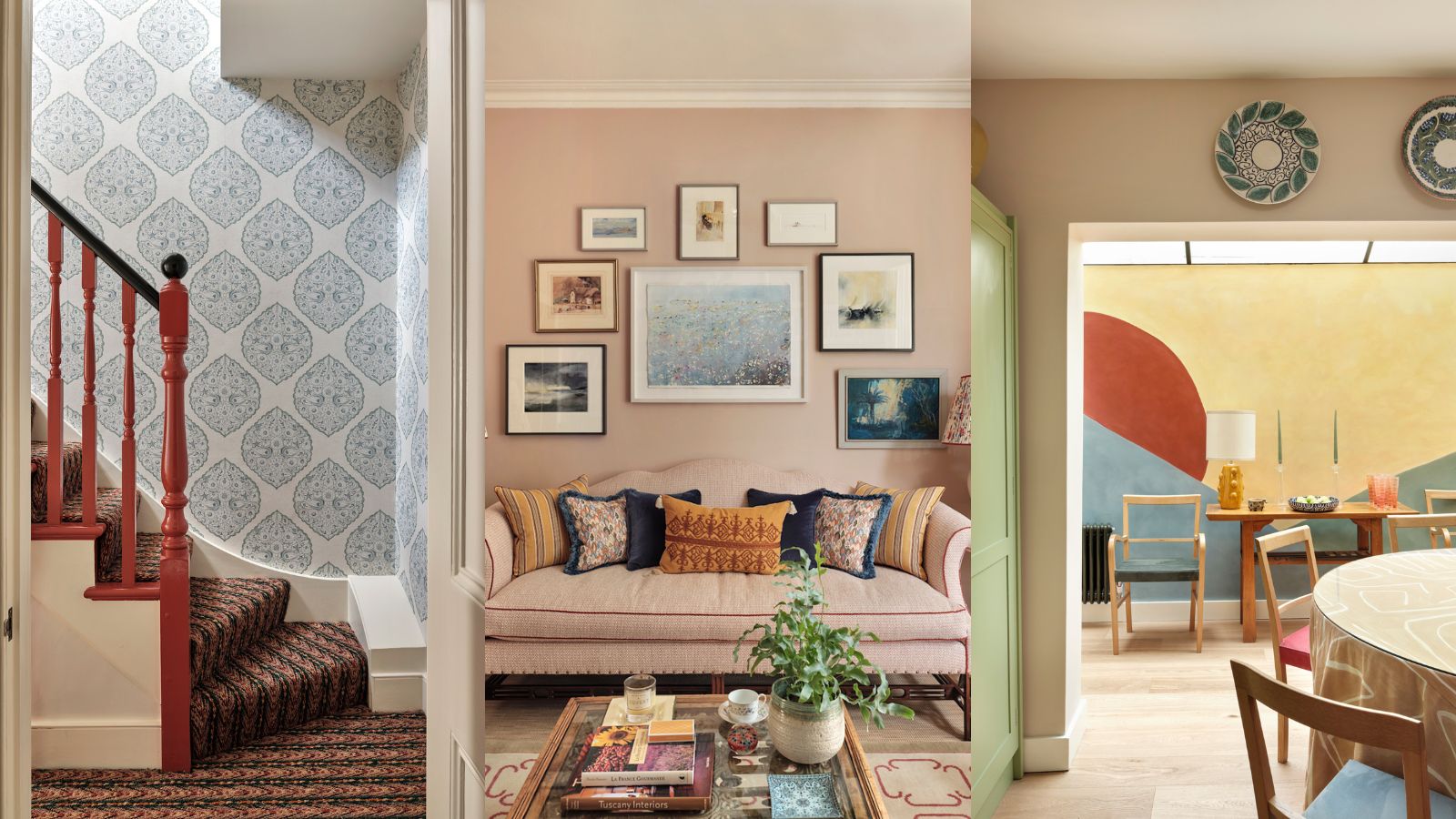
When Kate Aslangul, interior designer at Oakley Moore Interior Design, was asked to remodel this home, she saw the chance for a complete reinvention.
'My client has owned the house for a long time and the decoration was tired, dated and very dark and heavy,' she tells us. 'The house was in need of some repairs, so this gave me the perfect opportunity to reinvent it and the chance to transform it into the one-of-a-kind home the client dreamt of.'
Kate used clever room color ideas to connect the spaces, decorating with art already owned by her client to infuse the spaces with character.
Article continues below 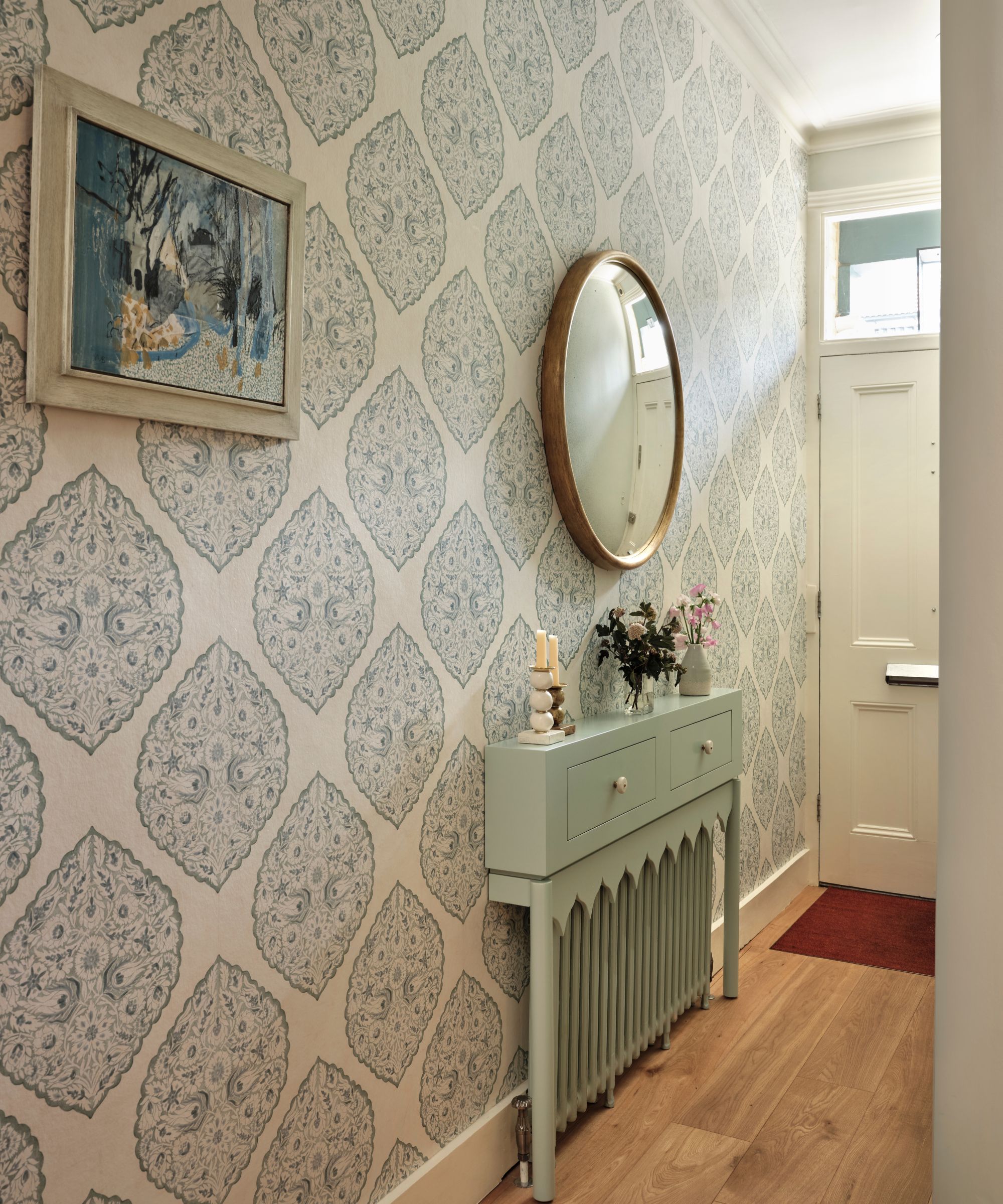
'At the beginning of the project, I spent a lot of time with the client getting to know what he needed and wanted from the house. The starting point for the research for every project is the first the client and then the property. I listen to how they use the space and what is their dream lifestyle and then my job is to interpret this. I want our clients to live better in their homes,' explains Kate.
'It was very important to him too that his home was comfortable, warm, and welcoming, that the spare room was cozy, feminine and a cocoon as he often has friends and family to stay. The house also had to be his sanctuary, a place to recharge. He had accumulated way too much furniture for the house from his travels, and much of it not to the right proportions for the architectural style of the space so we needed to unclutter.'
'The key to this project was to create a furniture layout and flow, working out what pieces we should keep and what pieces we would need to source. My client is passionate about art and opera, is well travelled and has lived for extensive periods in both the USA and Paris as well as the UK, has a home in the South of France and is a generous host who loves to entertain, so it was key that the finished house reflected his journeys, passions, and interests.'
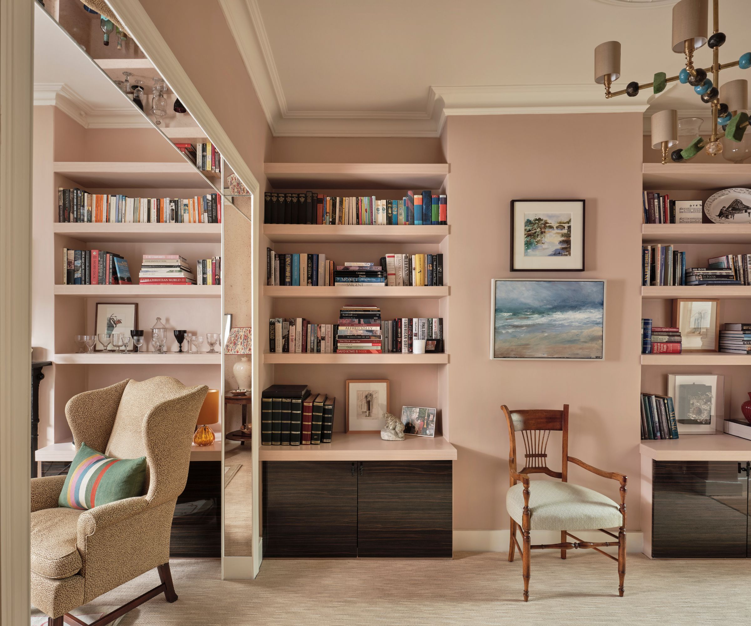
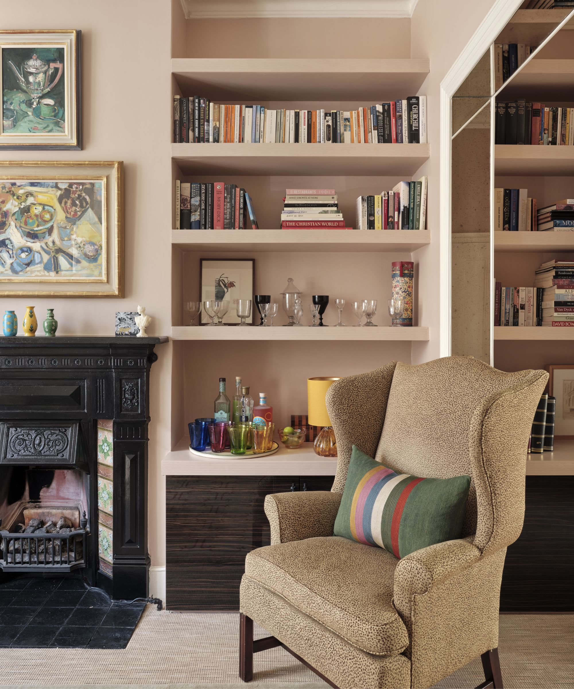
'For the color schemes for the project, I looked to the client’s extensive art collection, which I was given free rein to redistribute through the house, and details like the original Victorian tiles in the sitting room fireplace.
Design expertise in your inbox – from inspiring decorating ideas and beautiful celebrity homes to practical gardening advice and shopping round-ups.
'I wanted the space to feel like a journey, to create a tempo and flow through the property. As you arrive outside the first thing you see is we painted the façade in Inchyra Blue from Farrow & Ball, and chose Aerial Tint from Edward Bulmer which is paler, the paler color drawing you into towards the door.
'The Lee Jofa wallpaper in the entrance immediately sets a joyous tone. The console table-come-radiator cover, I call them Tablette tables, was made bespoke with the ogee design to tie in with the wallpaper. A convex mirror from Reid & Wright distorts the reflection and widens the hallway.'
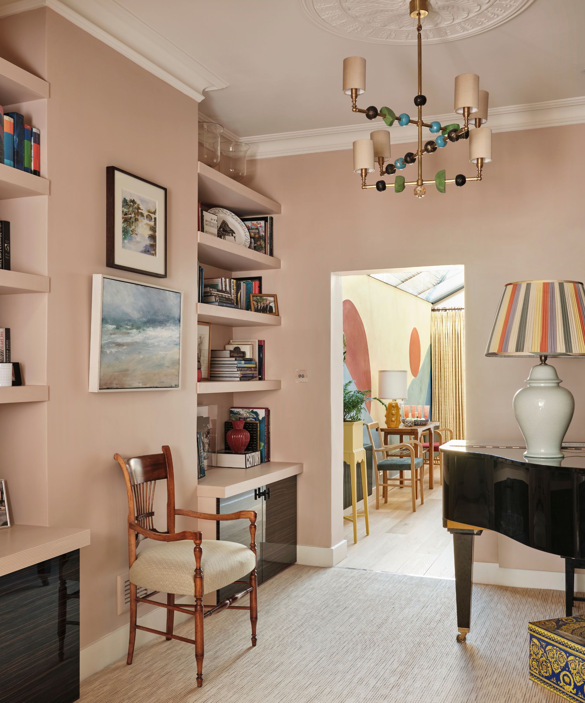
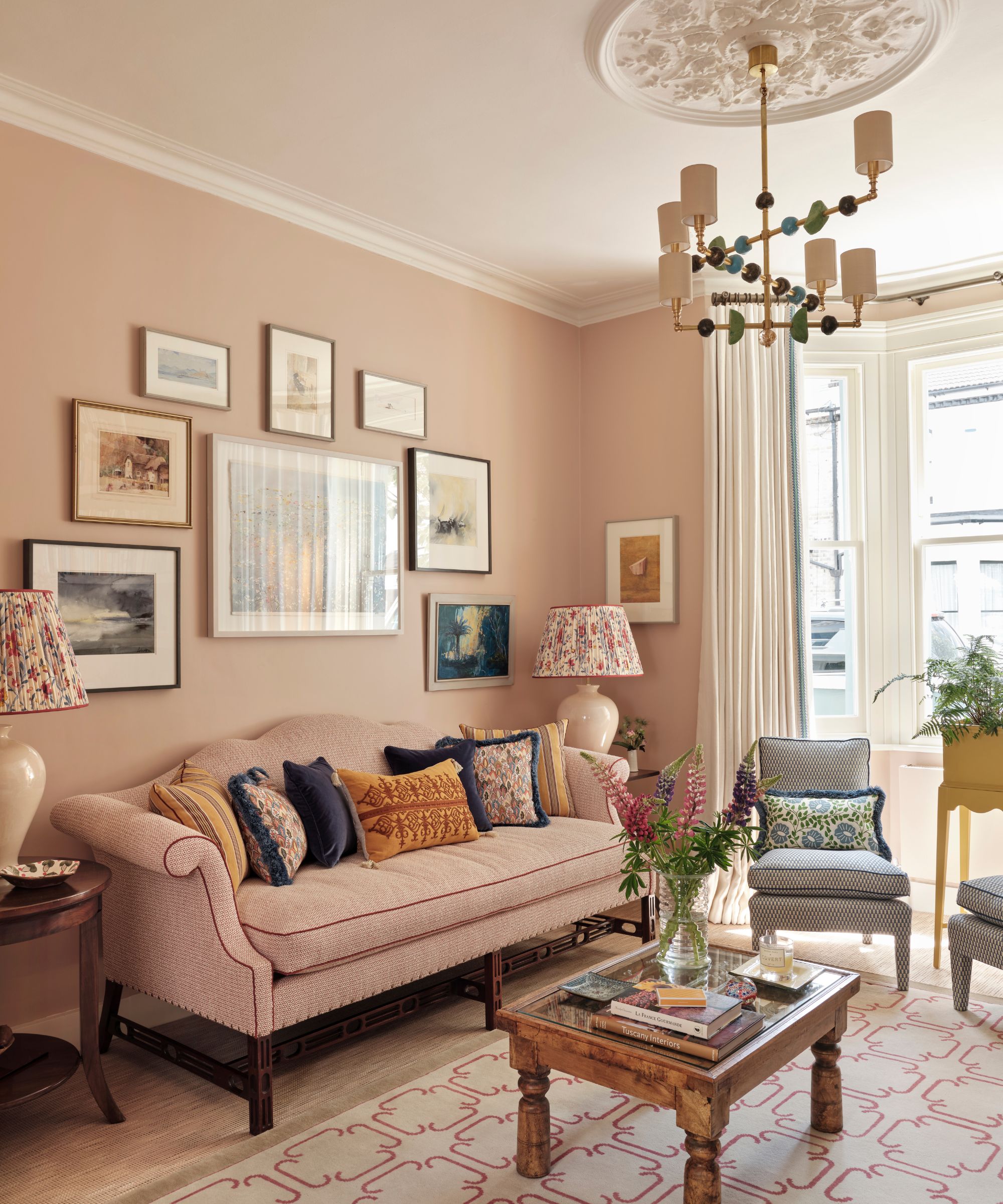
'A scheme is always about balance. In the sitting room (above) the original tiles in the fireplace are a vivid green and blue which is picked up in details throughout the room; we worked with Margit Wittig to design a pair of chandeliers using her resin pearls, we used a Christopher Farr trim on the elegant cream linen curtains. The walls are painted in Setting Plaster from Farrow & Ball.
'I like to repurpose furniture where I can and give old friends a new lease of life. I loved the shape and detailing of the client’s existing sofa which he had bought whilst he was living in the USA and so we arranged to have it reupholstered. I sourced the rug from Robert Stephenson, it works so well with the sofa show wood, and we tweaked the rug design adding details to the border.
'The lampshades from Susan Deliss are made up in a vintage French fabric. We picked paintings from his collection including works by Canadian painter Luc Martineau, Leonie Fox-Pitt and Luke Elwes. I love the mix of old and new and the structured color palette really makes the room feel as though it has always been there. The client loves the sense of calm and serenity in this room.'
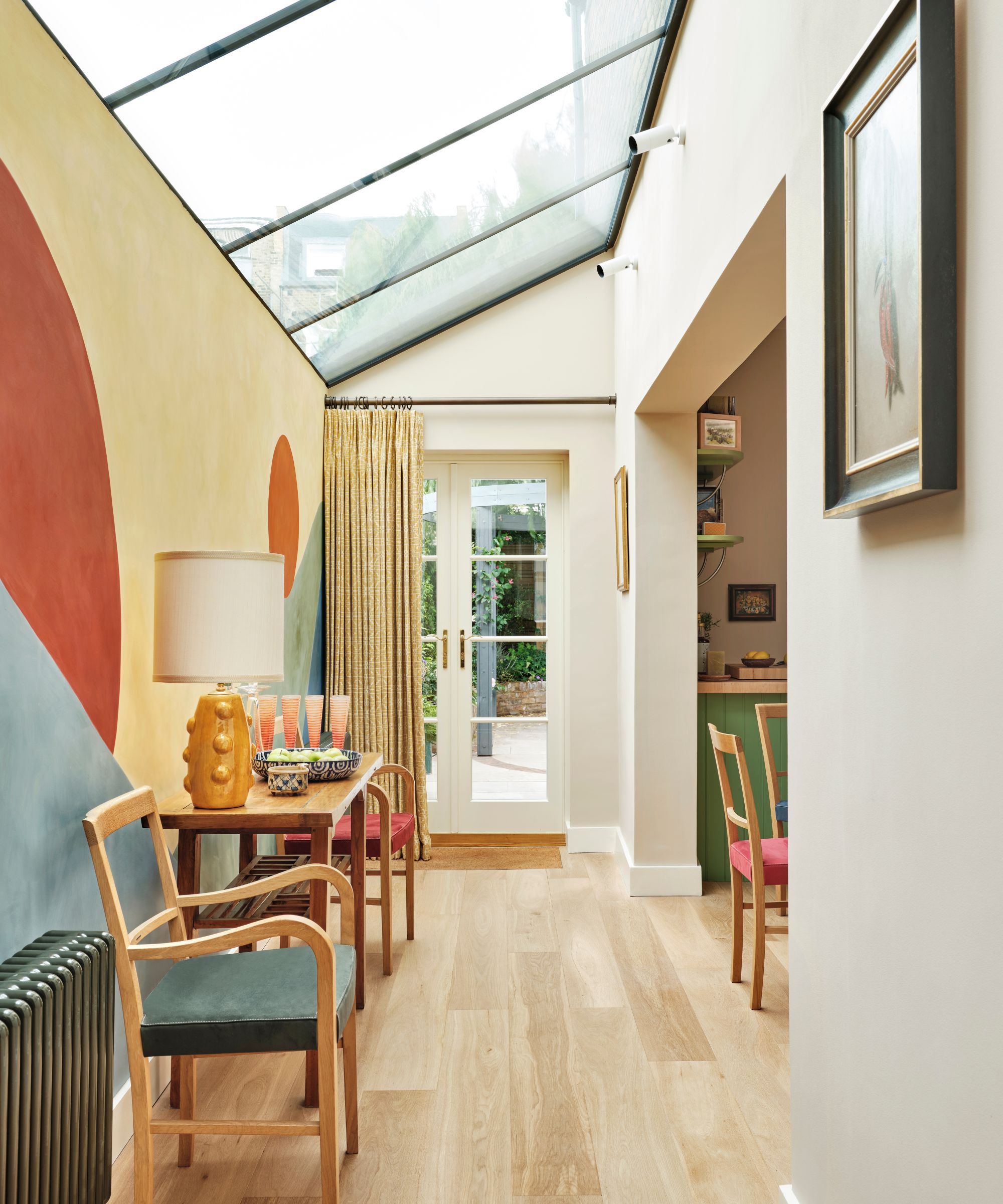
'As a former photographer sightlines are key to me,' explains Kate. 'To tie the sitting room areas to the back of the house I simply used a carefully chosen jajim striped cushion and a multicolor striped lampshade in key positions to lead the eye through (both from Nushka). Our Oakley Planter is a versatile piece of furniture allowing plants to sit beside the wall or in the window and can be moved wherever you might want it.'
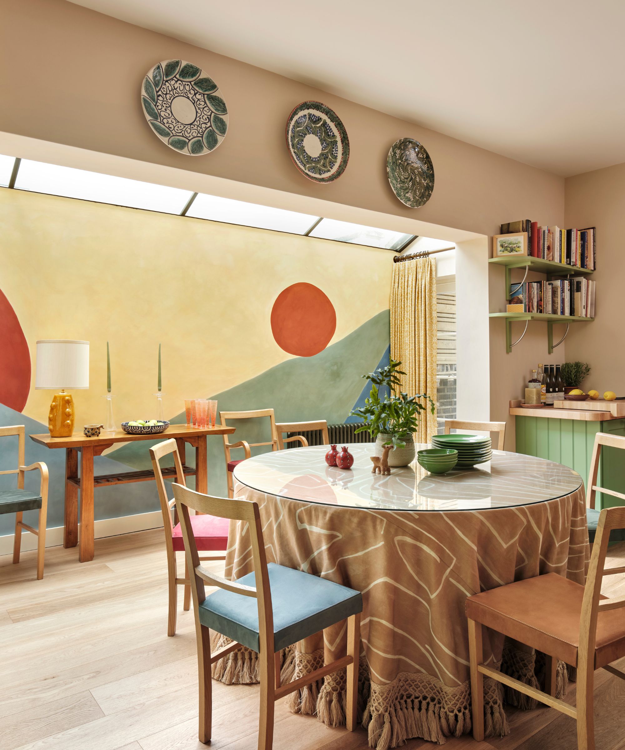
'I decided to make a feature of the kitchen/dining room wall which can be seen from the sitting room and piano space and was inspired by the work of Etel Adnan, a Lebanese American artist who lived in Paris.
'I love her color palette and use of shape to create landscapes which are more organic than figurative. Working with the artist and designer, Holly Hamlyn, I designed a scaled mural referencing Adnan’s work which we painted in Bauwerk limewash paints. The joyful mural ensures a summer feel all year round with its Provençal colors. I chose the George Spencer faux suede range to upholster a set harlequin dining chairs each picking out a different color from the mural.'
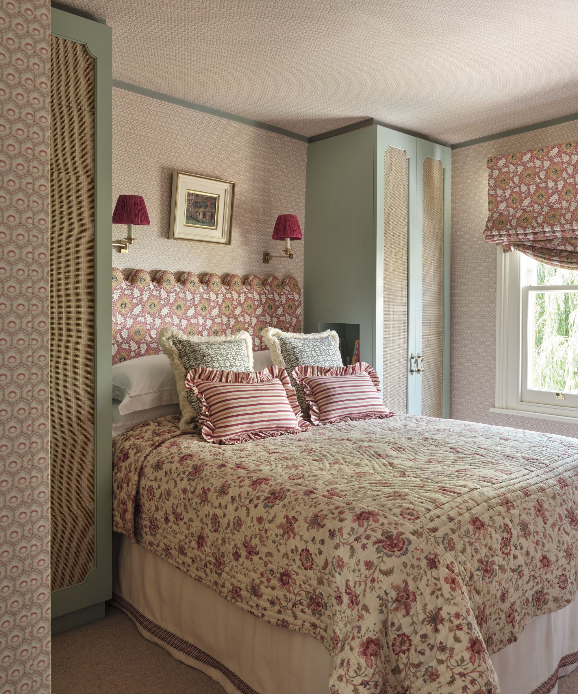
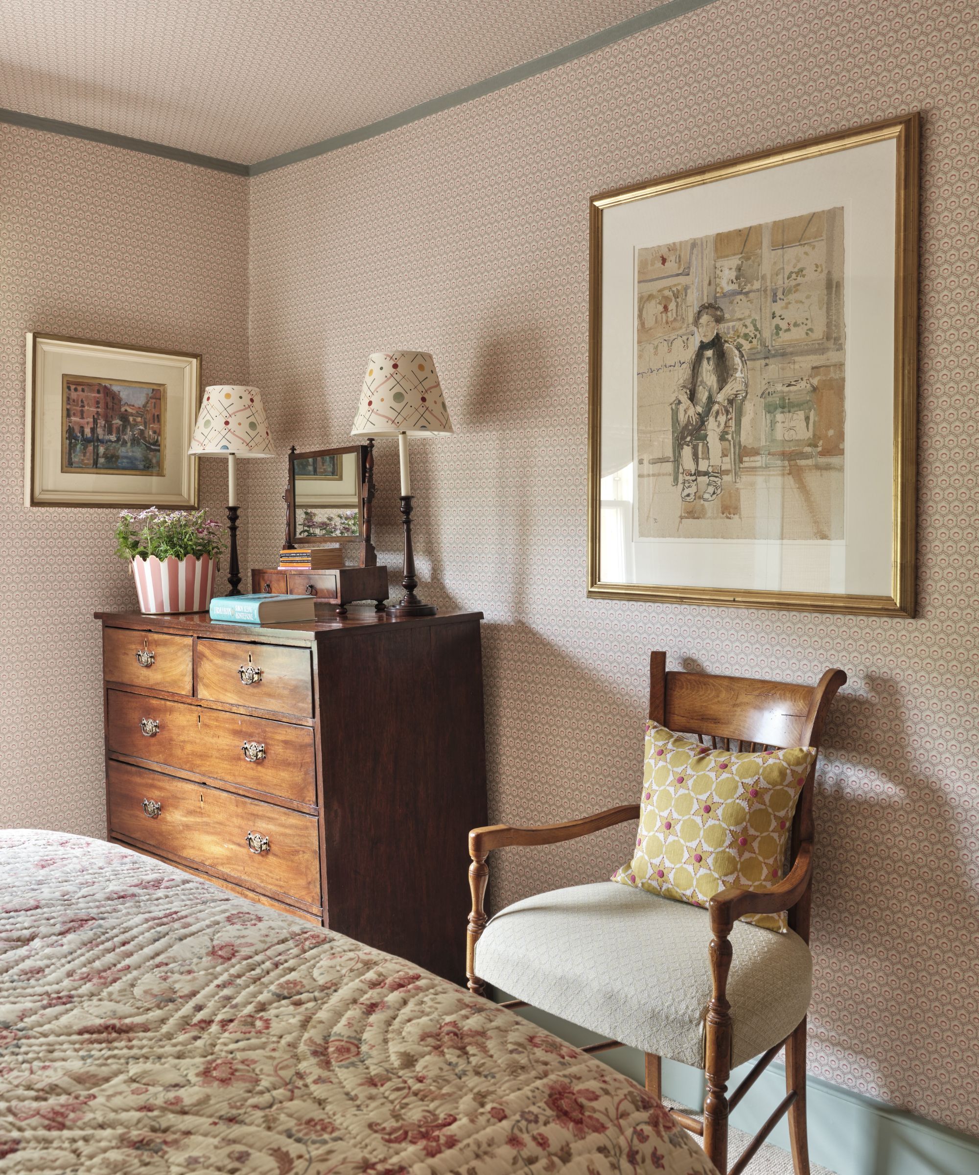
'My client was very keen that the spare bedroom (above and below) be incredibly cozy and well appointed. He has lots of visitors and wanted the room to stand out from the ordinary. I love designing small rooms, these invariably are the rooms which need the most thought in order to make every inch work.'
'My client was very keen that the spare bedroom be incredibly cozy and well appointed. He has lots of visitors and wanted the room to stand out from the ordinary. I love designing small rooms, these invariably are the rooms which need the most thought in order to make every inch work.
'My design is reminiscent of something I had seen in French country houses, and the quilt is a French 19th Century vintage piece I spotted at Ardingly. The cream valance has a trim which helps give the impression that the bed has lots of space as if it is elevated from the floor and the cream balances out the patterns in the room. The inspiration for this room came from the painting of the old lady which I hung opposite the bed.'
'There is a warm sense of calm in the master bedroom (below), which is papered in a hay colored grasscloth, topped with a braid of upholstery nails. The color scheme for this room was inspired by the paintings by Alice Scrutton (in photo on side wall),' says Kate.
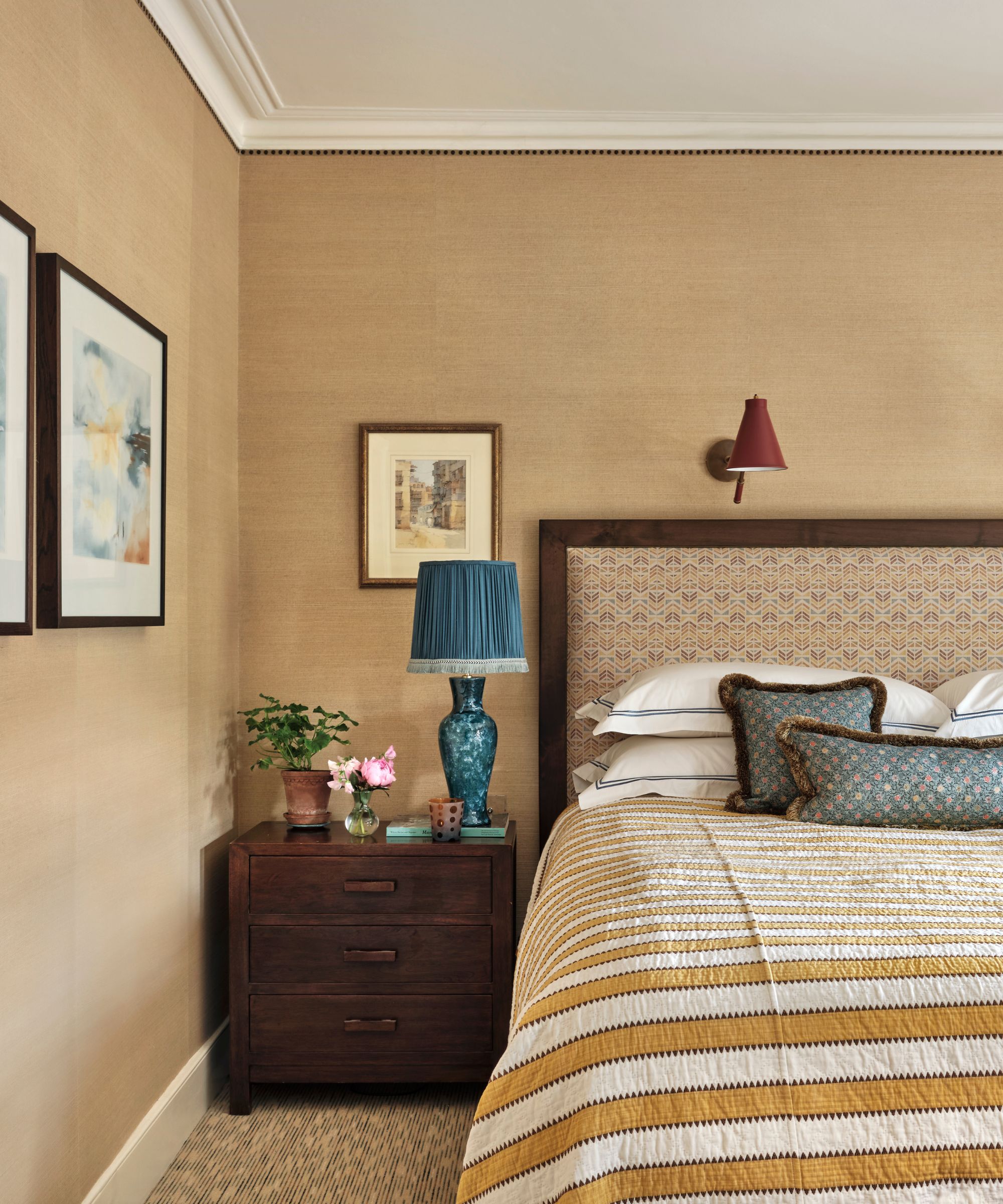
'The table lamps are available through Oakley Moore. The window dressings give a certain aura to the space, a little bit grand yet cozy. The headboard/blind and curtain fabrics are from the Kindred Collection by A Rum Fellow x George Spencer.'
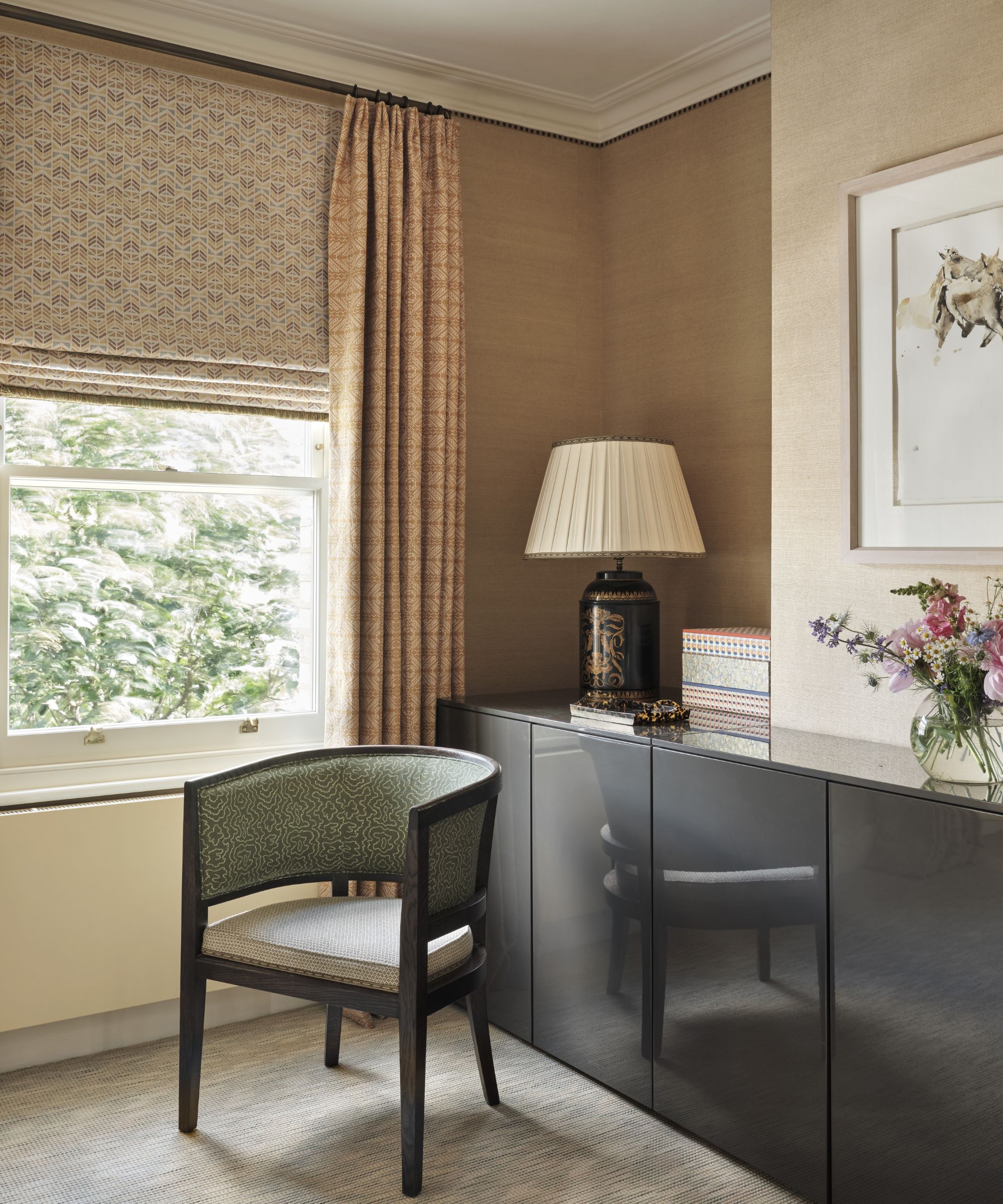
'The Flora Soames fabric on the blind in the dressing area softens the masculine line of the closets.'
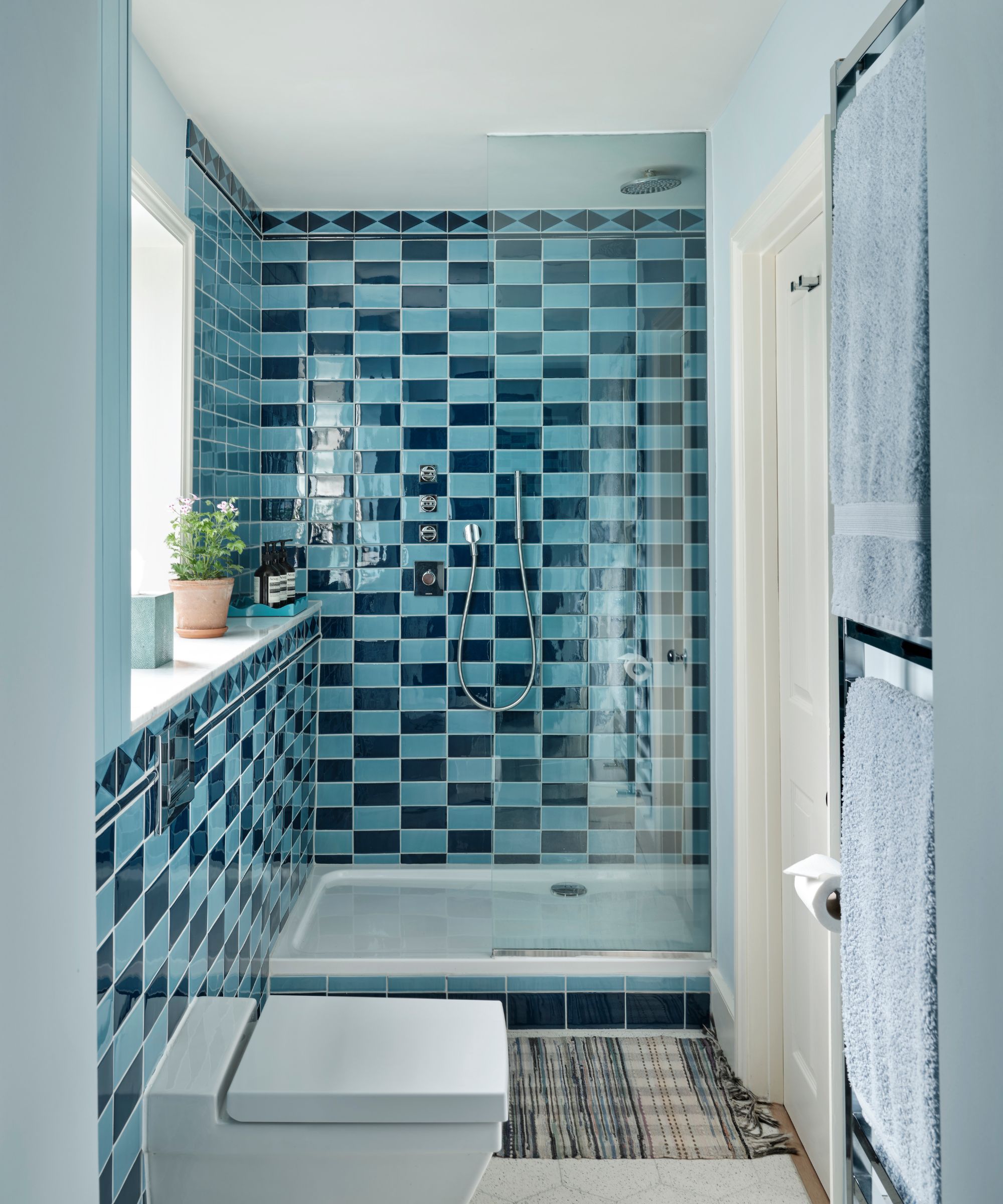
'The master bathroom (above and below) is a story of tiling. We worked with Balineum to get the colors right for the tiles to create this tonal chequered effect. The inspiration for this came from an African basket I bought years ago in a market in Kenya.'

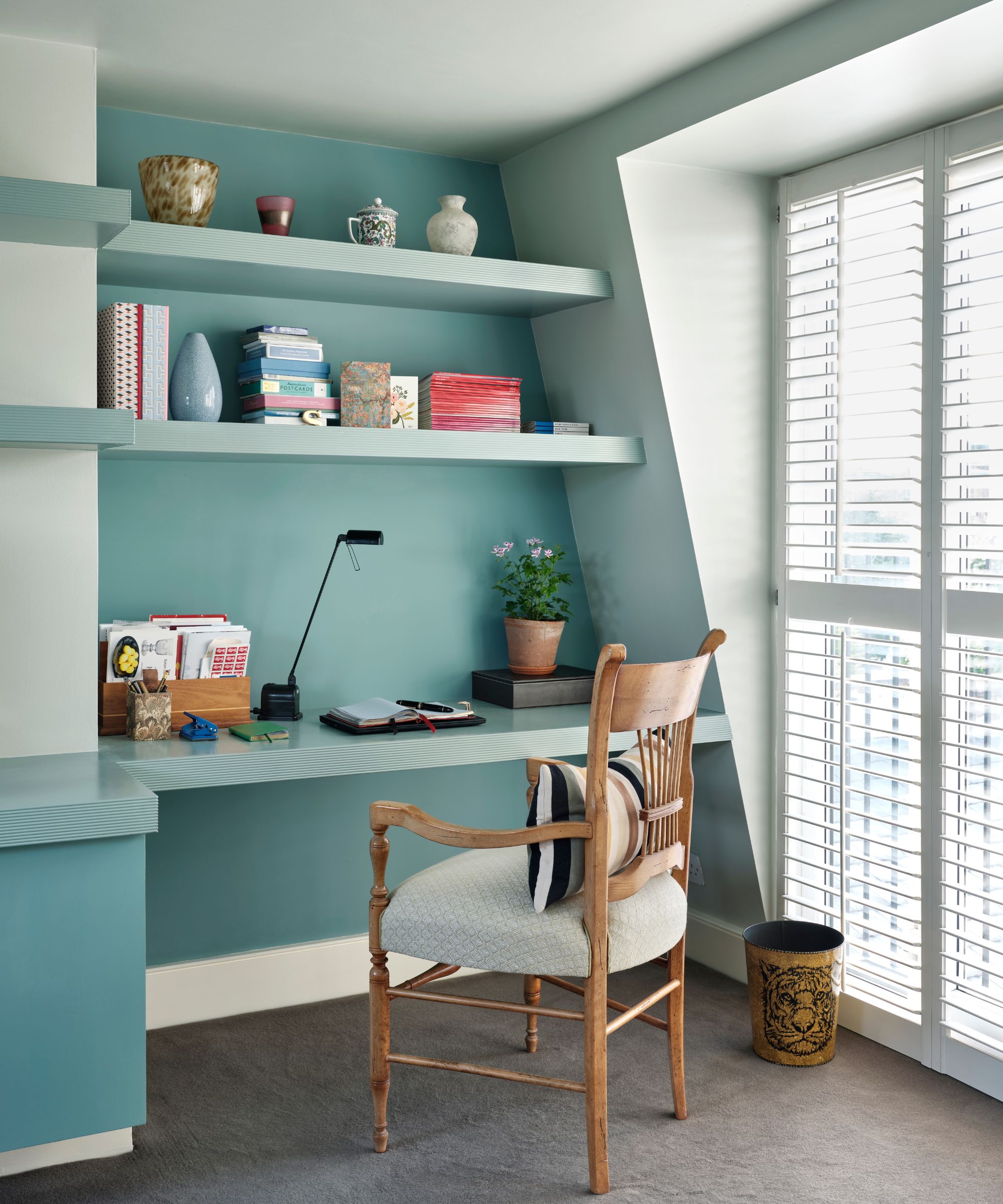
'The home office (below) under the eaves is a story of color: three different blues give depth and a softness to the space. Farrow & Ball Cromarty on the walls and ceiling, Edward Bulmer Vert de Mer on the wall behind the desk and the lower cupboards (seen just to the left of the image), Edward Bulmer Aquatic on the shelves.'
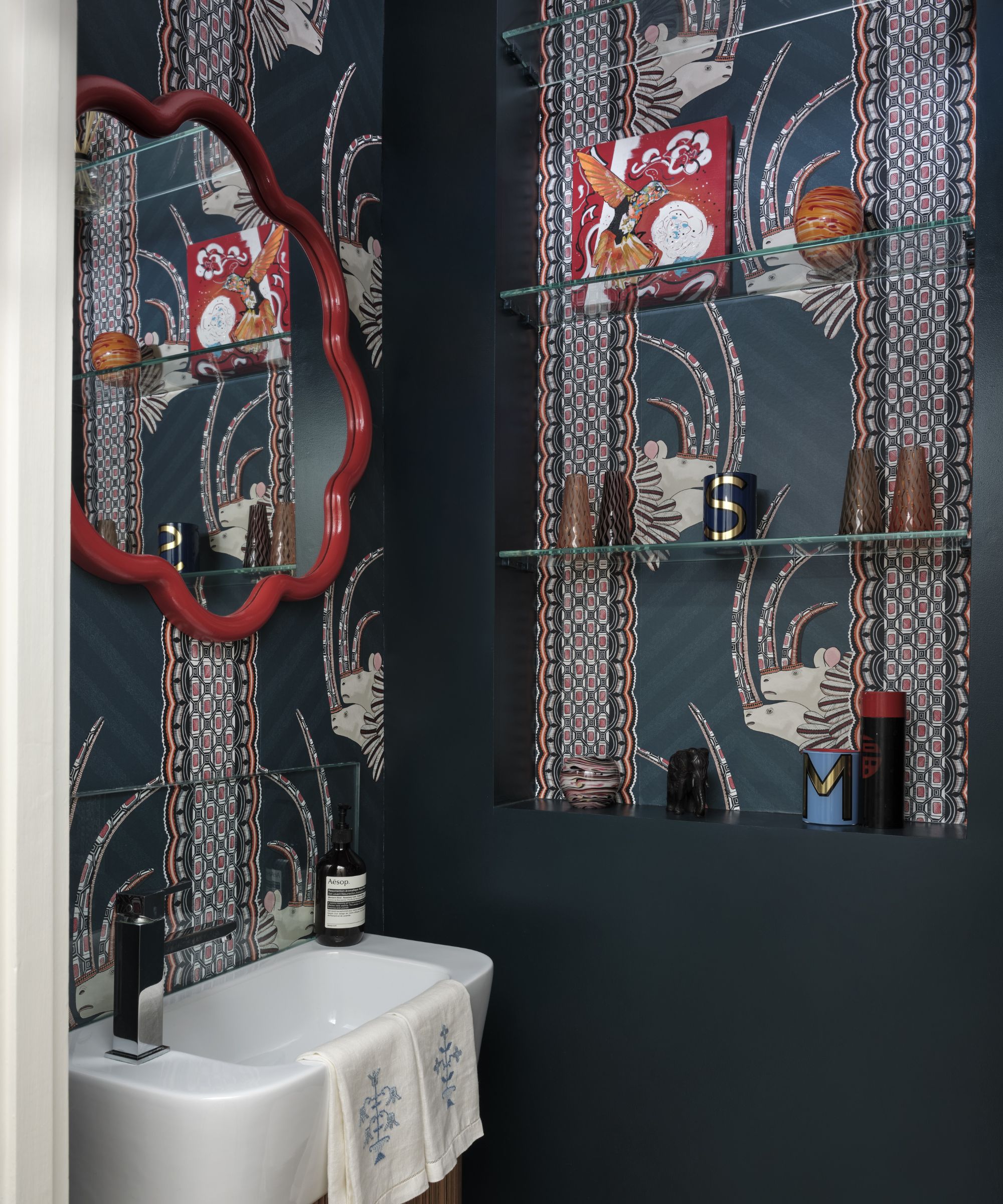
'Whimsy abounds in the downstairs powder room, which features an exotic Cole & Son wallpaper and the Flora mirror from Balineum. Small space, big impact.'
'Throughout the house the lighter, softer colors and the continuous flow make the house feel much more spacious than in its previous incarnation and infuse you with a joyous warmth,' concludes Kate. 'I worked with the dream client who was trusting and open to my ideas and ready to make some bold choices, luckily, he is very happy with them. This project was a total joy to design, every room is my favorite room.'
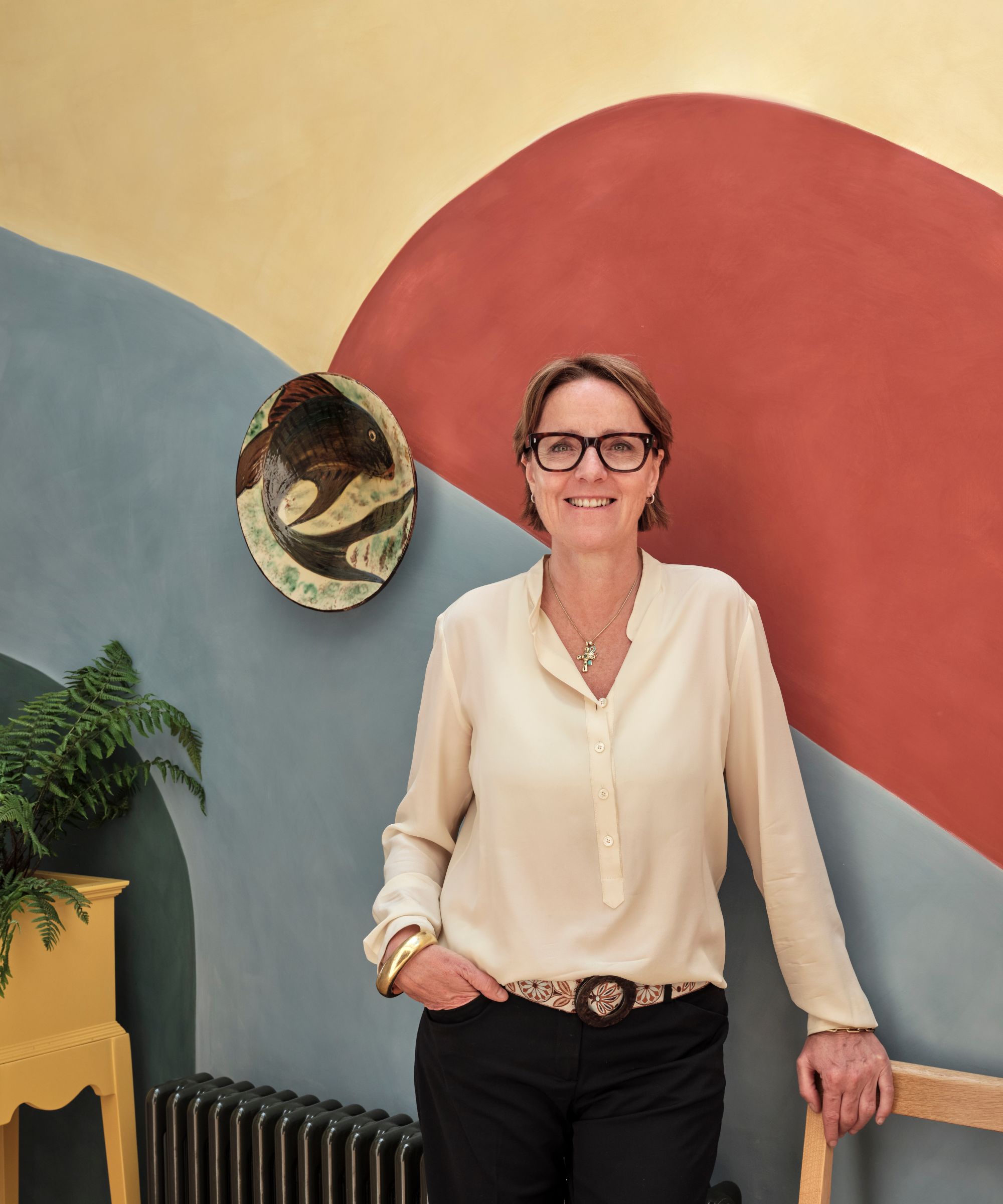
Oakley Moore is an award-winning interior design studio based in London, working worldwide, founded by former photographer and PR Kate Aslangul (pictured). Kate has an instinctive eye for how to use space productively, coupled with a confident flair for playing around with color, pattern, texture, and form to create the perfect balance of harmony and tension. Oakley Moore prides itself on creating original tailored interiors with bespoke pieces to sit alongside antiques and the rest of the decorative scheme.
Photographer: Astrid Templier
Designer: Kate Aslangul, Oakley Moore Interior Design

Lola Houlton is a news writer for Homes & Gardens. She has been writing content for Future PLC for the past six years, in particular Homes & Gardens, Real Homes and GardeningEtc. She writes on a broad range of subjects, including practical household advice, recipe articles, and product reviews, working closely with experts in their fields to cover everything from heating to home organization through to house plants. Lola is a graduate, who completed her degree in Psychology at the University of Sussex. She has also spent some time working at the BBC.