How to whole-house color scheme – for a cohesive look
As Creative Director for London Design Studio Ward & Co, I know how to carry a color scheme through a whole house for space-enhancing impact. Here, I pass on my expertise


Choosing a color scheme for one room, never mind a whole house, may seem like a daunting task for some. Not afraid of a challenge, we at London design studio, Ward & Co, are experts at color scheming and understand the subtle art of how to carry a color throughout a home, utilizing tone and depth to create spaces to suit our clients.
Using the color wheel to create a cohesive scheme might sound a breeze for one room, but how to take on a color scheme that works from room-to-room throughout a whole house?
This may sound overwhelming when starting a project but when executed elegantly, careful color planning can give a home a wonderful sense of connection and flow. Choosing colors and tones can be a very effective decorative tool and a great way of adding a touch of personality to your whole house. Vibrant or subtle, color has the ability to completely transform a room.
Article continues belowExpert ways to a whole-house color scheme
Here, Rosie, Ward & Co’s Creative Director, shares seven of her best tips to make a bold design statement with color as the focal point in your home, demonstrating why designers use whole house color schemes to perfection.
1. Choose a whole-house color scheme based on mood
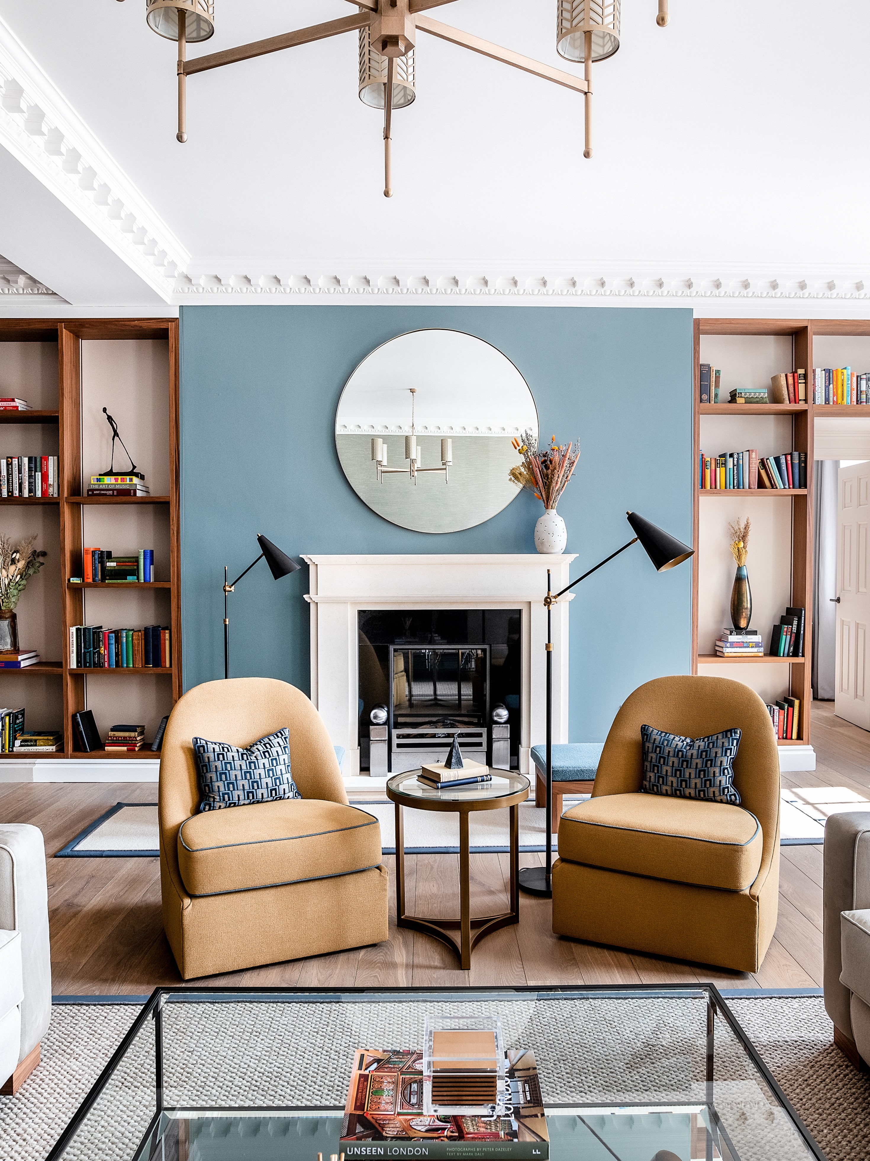
Picking a color scheme for a whole property takes a lot of thought, and commitment and can be influenced by multiple factors including location and lifestyle.
When deciding on a color scheme that will suit the whole house, we begin by looking at the location of the property, the area and situation it is in, which can often make for an obvious color choice.
It’s really important for us to take the time to have conversations with the client to gain a clearer understanding of their own personality, lifestyle and overall desired aesthetic for their home space.
Design expertise in your inbox – from inspiring decorating ideas and beautiful celebrity homes to practical gardening advice and shopping round-ups.
In a recent project in Covent Garden’s iconic Piazza in London, the chosen color palette across the apartment of sumptuous blues was felt to be inherently British, reflecting the exquisite craftsmanship displayed throughout. This calming color scheme created the perfect spot to unwind away from the lively cobbled streets below.
2. Use one color to create connection and flow between spaces
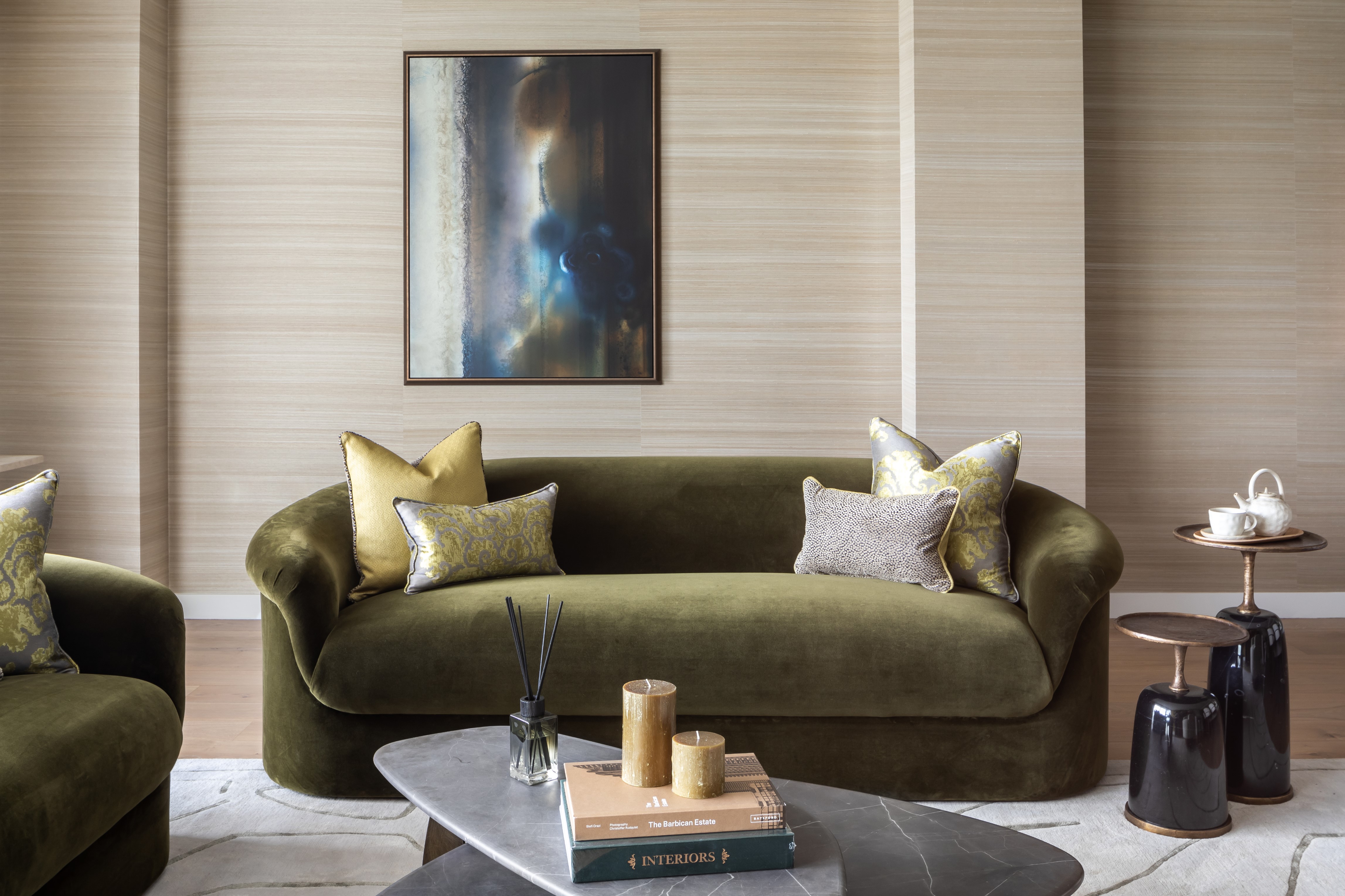
Picking a color scheme requires an understanding of how shades work together. It must flow and be easy on the eye.
We recommend using a variation of one color to create connection and flow between spaces. It’s important to maintain a sense of continuity, perhaps by choosing complementary colors where rooms connect, or using shades from the same color family to form a seamless color journey.
When an entire home is considered as "one" rather than a collection of individual rooms, there is instantly greater fluidity between different areas.
3. Work with natural lighting
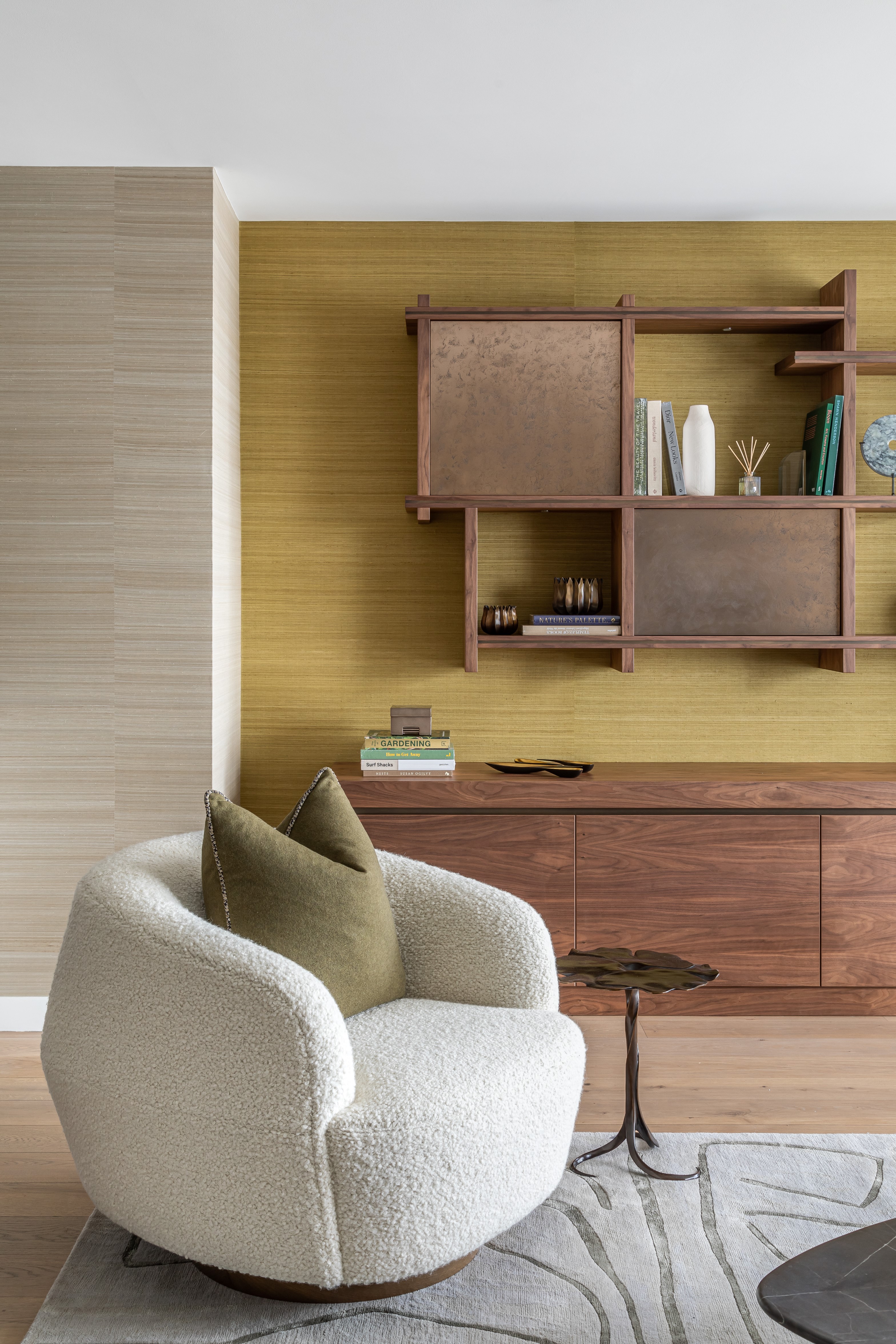
An important external factor when selecting a color scheme is the level of natural light that feeds into the room, and its impact on the perception of colors.
You must think of how light plays into the situation – how much natural light comes into the room and the intended use of the room. Natural light in north-facing rooms is cool and bluish, whereas natural light in south-facing rooms will make dark colors appear brighter.
The magic of whole house color schemes is that they can be adjusted to the light levels in each room. Don’t view lighting as a limitation – unusual color pairings will work and importantly can be adjusted by room to suit the natural light that space receives, and the time of day you use the room.
4. Introduce pops of color with accessories to neutral schemes
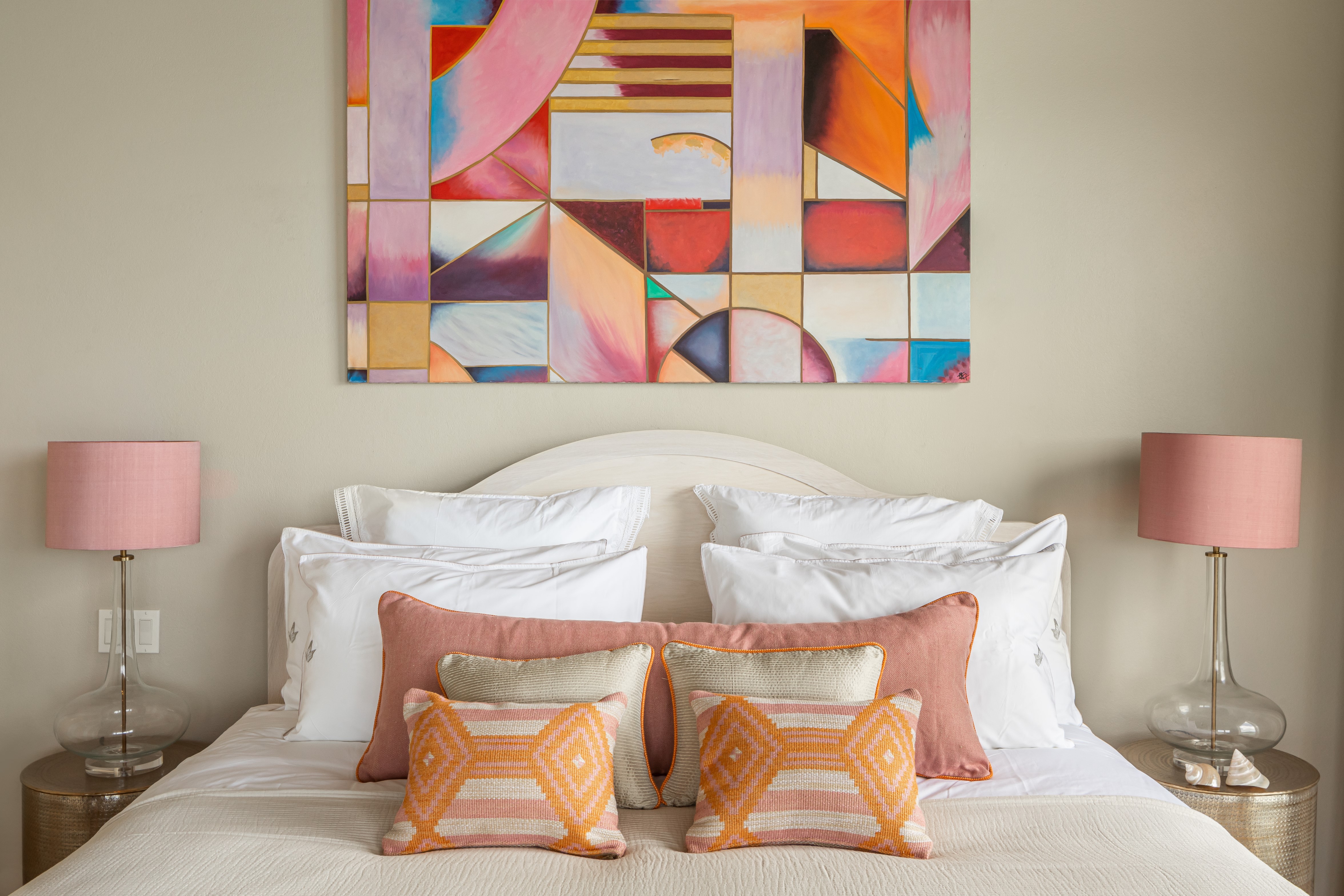
As a result of spending more time at home, more people are now on board with adventurous patterns, texture and bold color.
If you’re not a fan of bright colors, incorporating pops of color is a great way of injecting some playful design. A living room space wrapped in neutral shades can be complemented with bold, deeper tones through colored accessories such as cushions, lamp shades and ornaments. This will bring a room to life, and can also be easily changed should you desire a less permanent color scheme.
Twin this with the playful use of texture, and you can fill even the smallest of spaces with joy. Rugs, artwork, lighting and objects don’t necessarily need to fit in with the scheme – they can provide a welcome contrast, for example adding a jute chunky rug can add texture and depth and balance the space, drawing your eye to the color.
5. Add modern elements to historic buildings
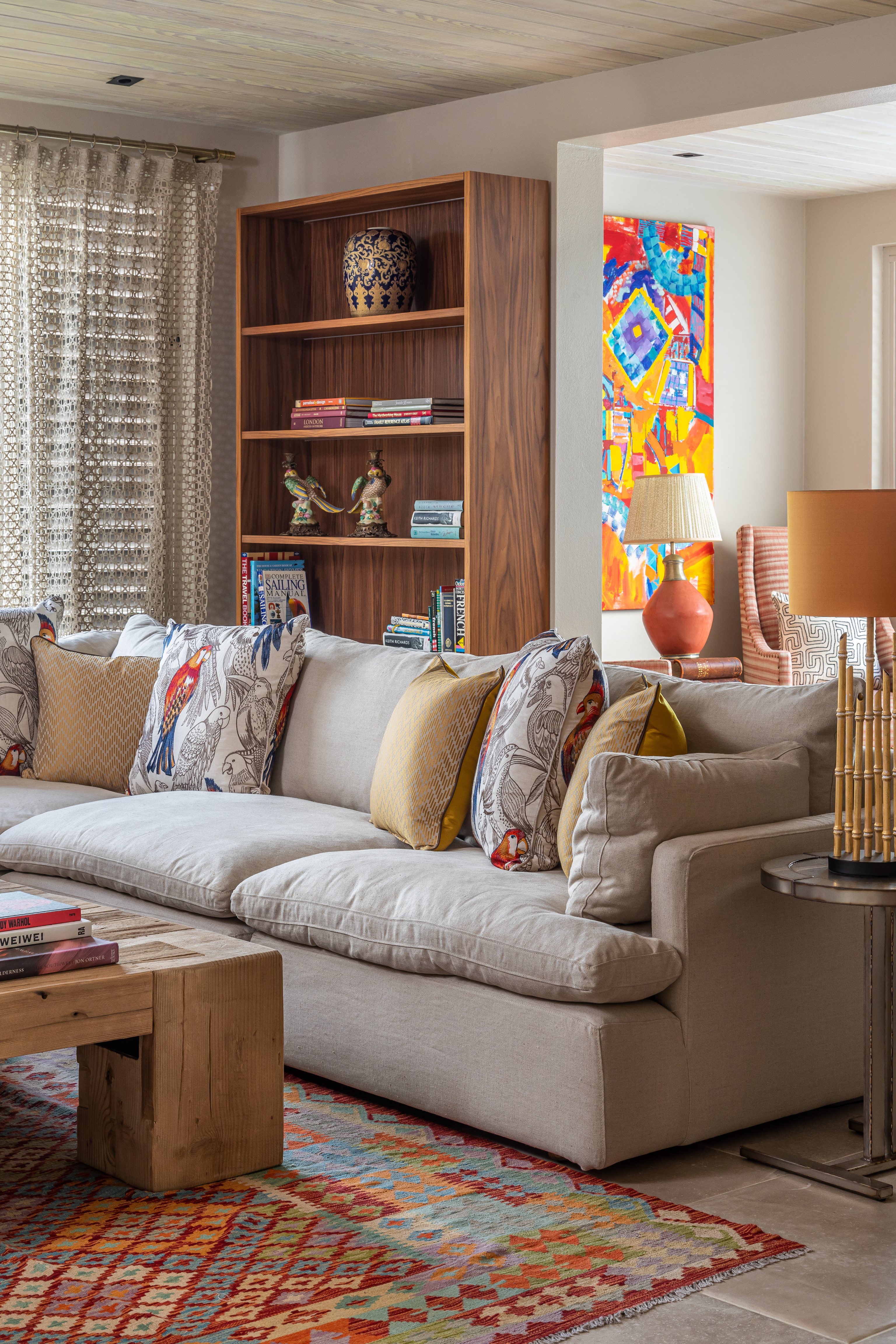
The beauty of color drenching is that it can be applied to a variety of spaces, both modern and old.
I would say color drenching suits historic homes more, because there’s more interest within the cornicing and skirting boards, so it provides a contrast. It can be a smart way of making a room with period features feel more contemporary.
A slightly deeper tone on older woodwork juxtaposed with a lighter tone on the ceiling can work beautifully. Color drenching also works really well with pattern, so a traditional parquet floor with a bold patterned rug would be a great choice.
6. Choose the room you frequent the most as your starting point
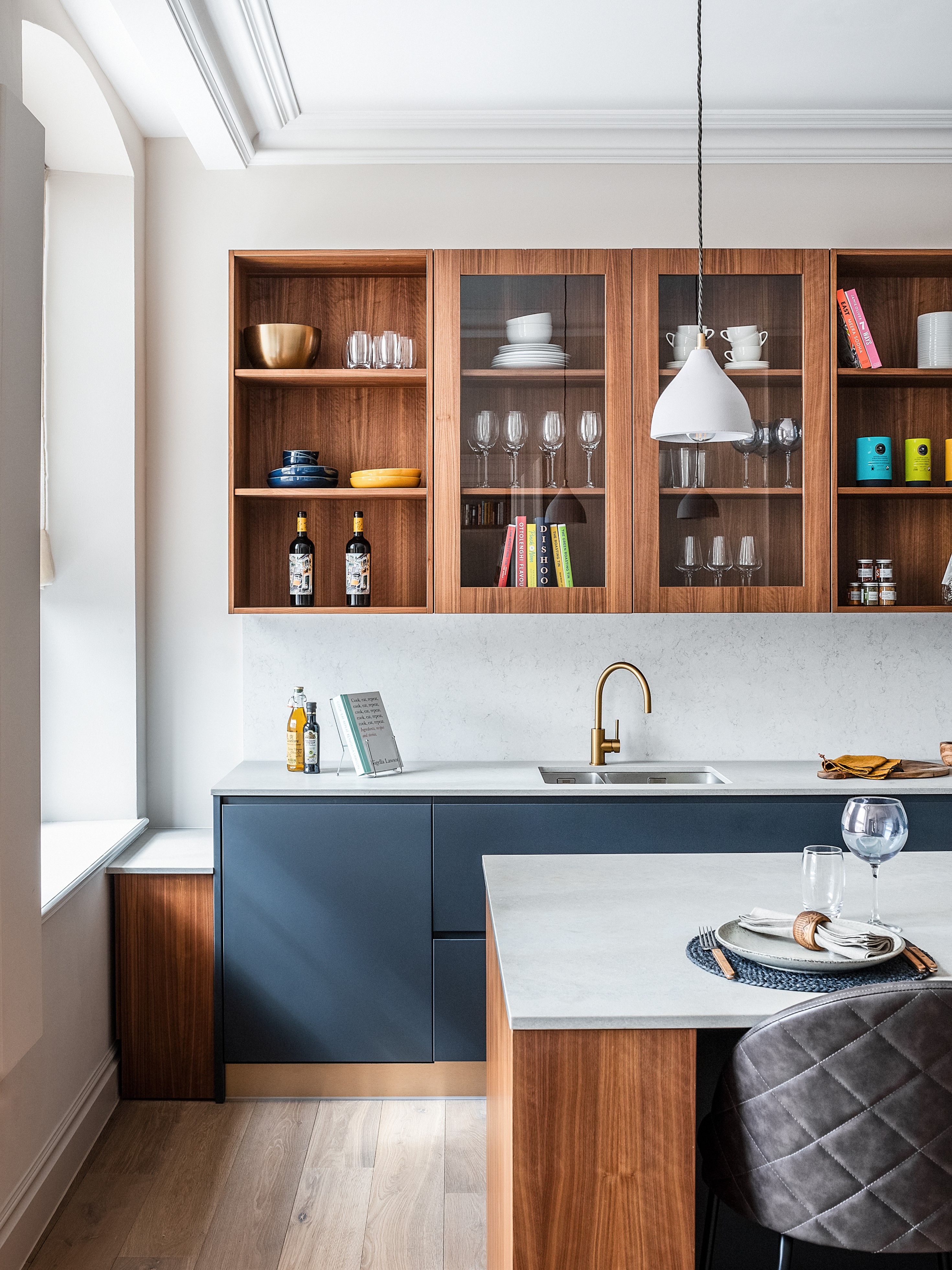
Choose the room that you frequent the most as a starting point for your whole house color scheme. More often than not, this is the kitchen or main living room.
In our previously mentioned Covent Garden Piazza project, we showcased a bold use of color drenching in the kitchen, the perfect environment for experimenting with color. We complemented stone-topped cabinetry with satin gold taps, distinctly warm tones and added padded faux-leather bar stools for a contemporary yet practical look.
7. Arrange colors into spectrums or seasons
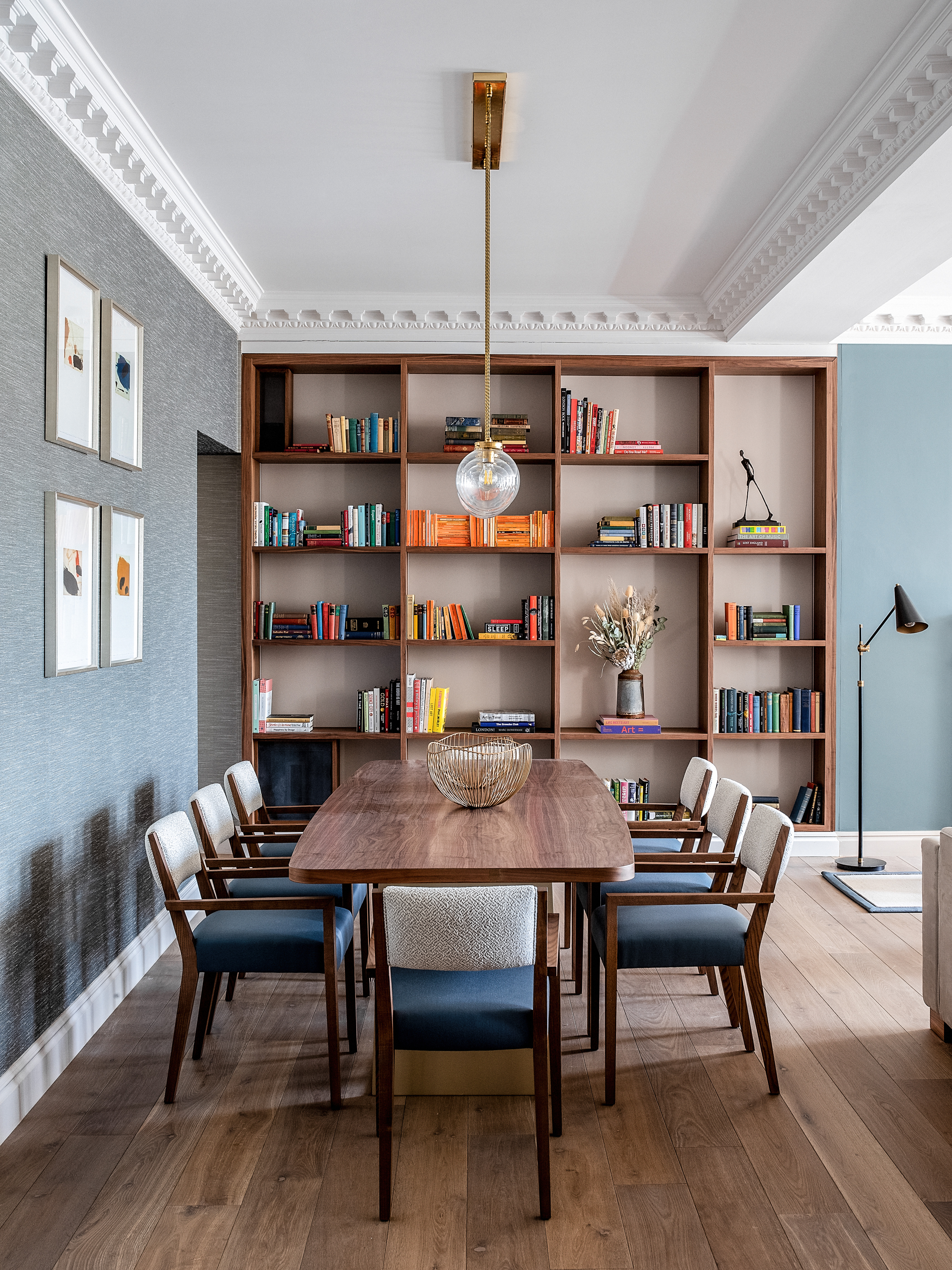
Incorporating a spectrum approach is essential to ensuring that each room provides continuity whilst retaining its unique individual character.
When each room within a house complements each other, it can be hugely comforting, and naturally creates a much calmer environment to live in, particularly when space is limited.
To deliver this well, colors should be arranged into spectrums or seasons – winter and spring lend themselves to cooler tones such as blues, greys, violet and shades of white, whereas summer and autumn offer up a rich palette ranging from pale neutrals to deep browns and hues of aubergine – I love olive green at the moment.
Is it okay to paint a whole house one color?
It is okay to paint a whole house one color, but this only really works if the color chosen is either a neutral (white, cream, pale beige or light gray) with different accent colors layered over the top, or if you use different tones and shades of the same color in different rooms, chosen to suit that particular room.

Rosie Ward is the Creative Director at Ward & Co., the London-based interior design firm founder by her mother, Sarah Ward, in 1986. The award-winning studio develops interiors for city apartments, countryside homes, historic estates, restaurants, bars and more, in London, Suffolk, and beyond.