The Library: The Key Principles That Define a Well-Designed Home – And Why They Work
When you understand the key interior design principles, you can take confidence in your design decisions, trust your gut, and create a space that feels like home

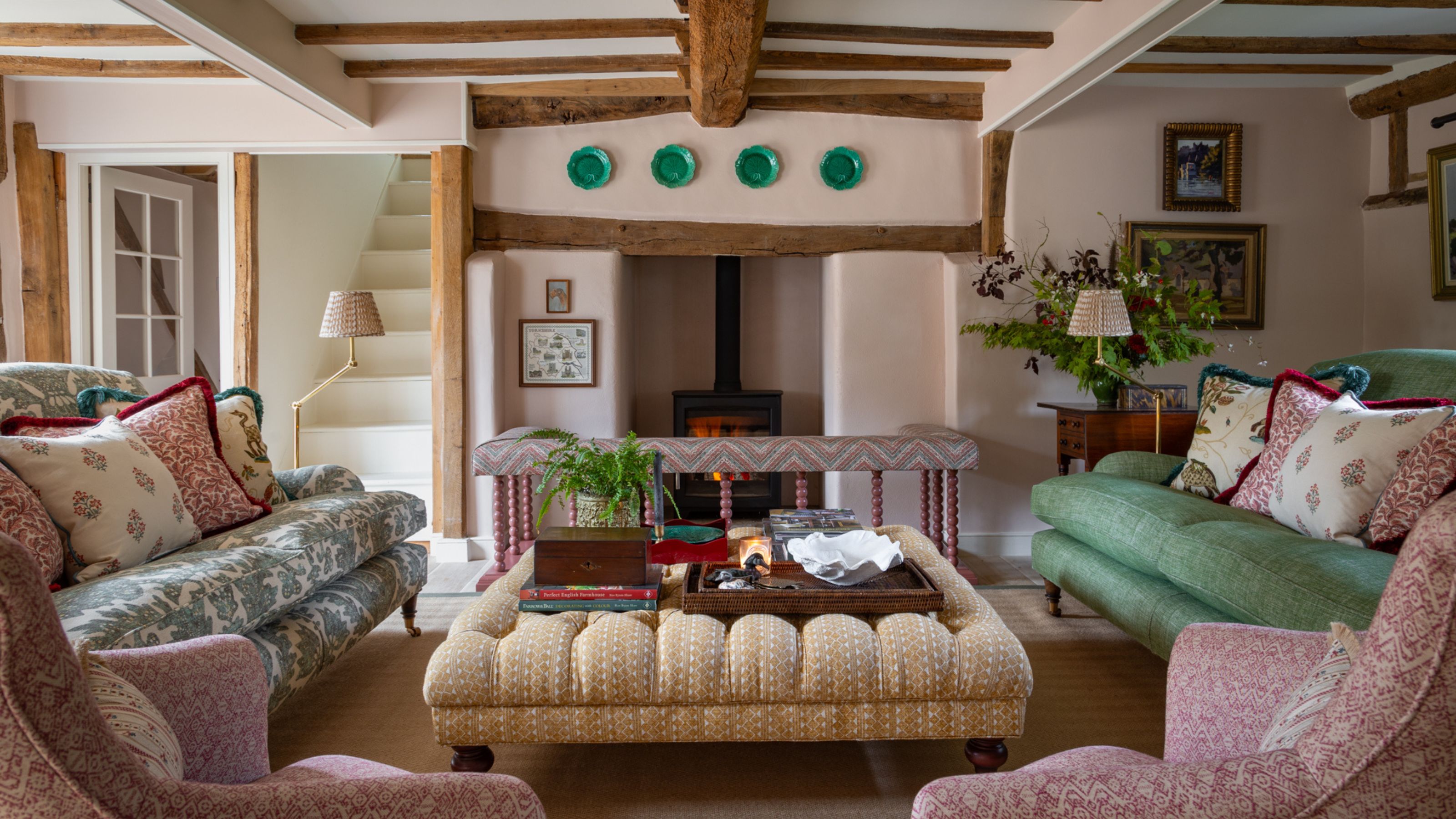
Interior design might sound simple – picking colors, furniture, layouts, all lovely choices to make – that is, until you actually have to design a room from scratch. It’s both an art and a science, and, as with any subject, once you understand the fundamentals, everything else becomes infinitely easier.
Decorating a room is a bit like creating a three-dimensional piece of artwork that can withstand the comings and goings of family life and the wear and tear that comes with it. From color palettes and fabrics to lighting and layouts, there really is a lot going on, and without knowing the best interior design tips, it’s easy to doubt yourself and become overwhelmed before you’ve even begun.
So, in this month’s The Library, we are going back to basics and walking you through the five key principles of interior design: balance, rhythm, emphasis, proportion and scale, and harmony. Learn the essential principles and get ready to make better design decisions that result in a beautiful, functional space that feels like you.
The Essentials
As with any design ‘rules,’ they are never set in stone – never to be followed so tightly that a home feels overly curated. Designer Sean Symington summarizes it perfectly:
‘I think rules in design are there to be bent, and if you’d like, broken altogether,’ comments Sean. ‘Character is what makes a room feel personal, and sometimes the most interesting spaces come from choosing something unexpected.’
‘That said, I always come back to the core principles of design to anchor a scheme. They provide the foundation, and once that’s in place, you have the freedom to layer personality, texture, and a bit of rebellion.’
Balance
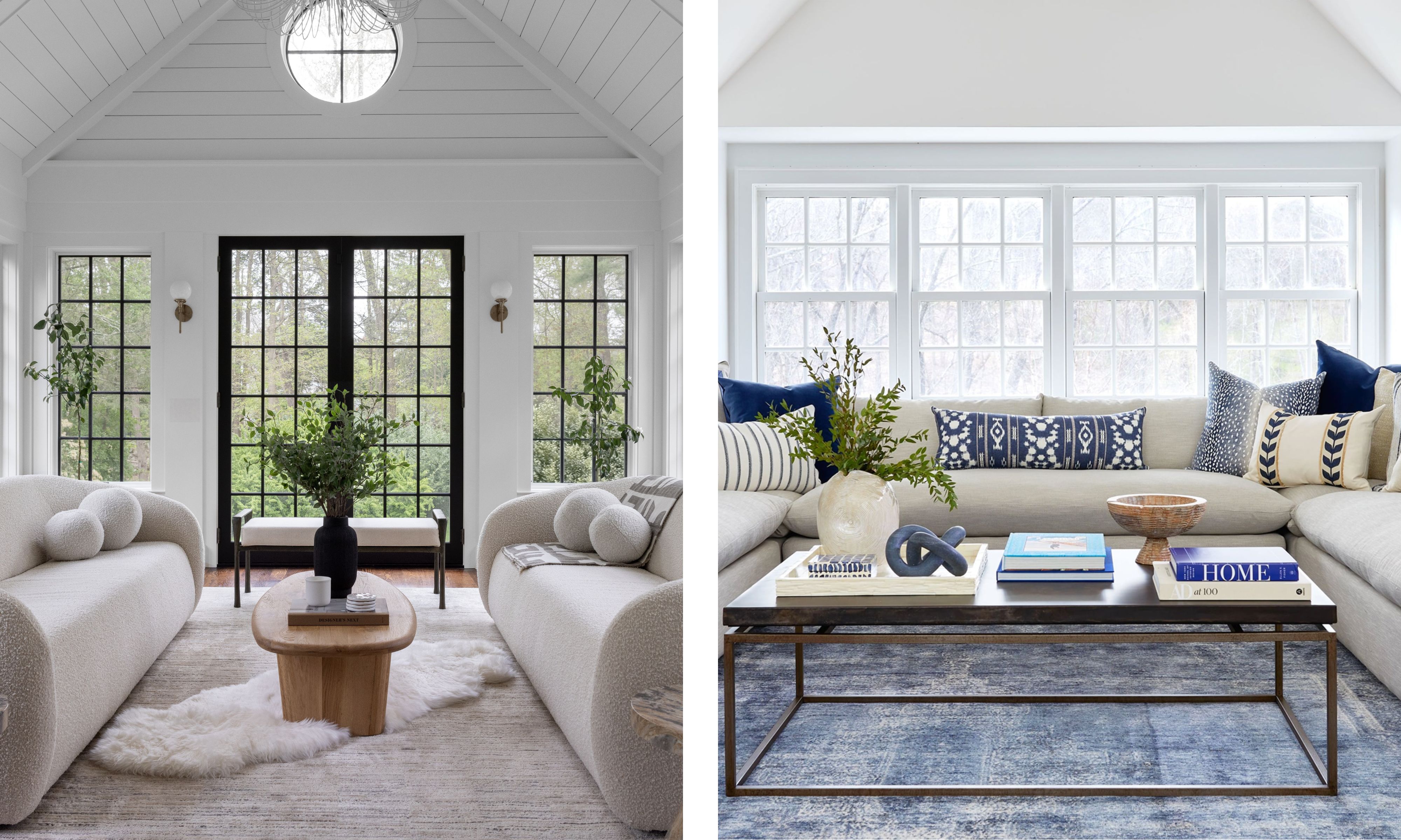
There are three types of balance in interior design: symmetrical, asymmetrical, and radial. When you use these well, it makes your space feel ‘just right’ when you walk in. So if a room feels ‘off’ or uncomfortable, it could well be that it’s off-balance.
Design expertise in your inbox – from inspiring decorating ideas and beautiful celebrity homes to practical gardening advice and shopping round-ups.
Symmetrical balance is the classic crowd-pleaser that never fails to make a space feel calm and orderly – you can draw a vertical or horizontal line through the room and each side will feel equally weighted. ‘There is something so appealing about a symmetrical living room with matching sofas facing each other, and a pair of elegant sconces flanking a sculptural statement mirror above the fireplace,’ says Kathy Kuo of Kathy Kuo Home.
Shake up a symmetrical layout with a lamp in a different color or a cushion with a different pattern, just to inject some character and playfulness and prevent it from falling flat. ‘It’s just as important to know when to break up the symmetry through the use of decorative elements,’ agrees Kathy.
‘I love adding a dramatic mural to introduce depth and visual intrigue on the walls. Unexpected artistic elements, like large-scale sculptural objects with unique silhouettes, bring energy and a welcome sense of drama. While symmetry is the foundation, asymmetrical components become the feature.’
Playing with asymmetry when decorating will give your space a ‘stylish but lived-in artist’s apartment’ vibe rather than a prim and proper show home feel. You can create asymmetry by using different elements that have the same visual weight overall. For example, style alcoves in your living room with one bold, statement piece of artwork on one side and shelves full of smaller decorative objects on the other. The sides won’t be a mirror image of each other, but they’ll read as balanced.
Lastly, we have radial balance, which is much less common but visually striking. You’ll often see it in dining rooms – for example, a circular table in the center of the room with chairs around it, or a circular, sunken living room. In radial balance, everything is based around one circular focal point, which draws the eye inward. If you had a large, circular pendant light, you could use radial balance by arranging curved sofas beneath it.
Rhythm
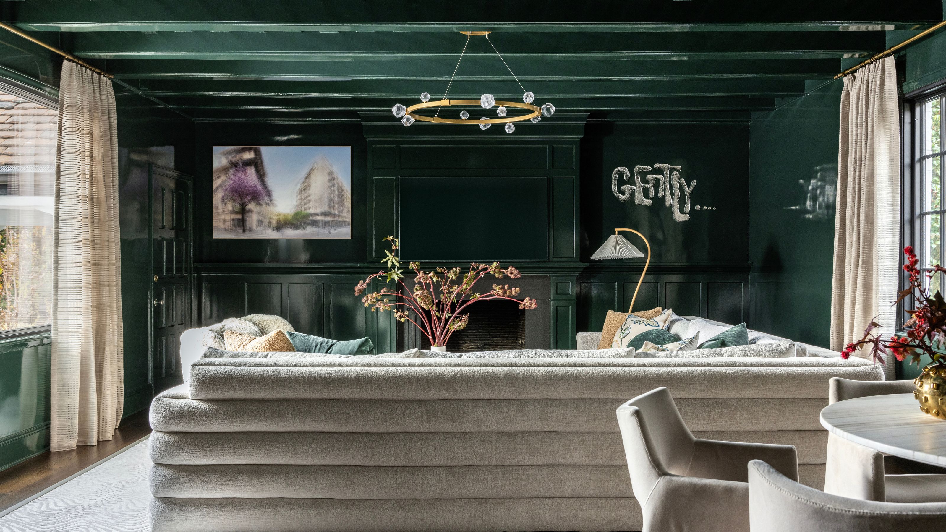
Rhythm in interior design is the visual ‘beat’ of a room, and you can create it through repetition and predictability. Bring rhythm to your space by repeating colors, patterns, and shapes, and spacing them out evenly.
Sometimes, the architecture of your room creates rhythm for you, such as evenly spaced beams on the ceiling or the steps on a staircase. In the example above, the repeated line of the ceiling beams is echoed in the lines on the back of the sofa, and even in the stripes in the curtains. Wood paneling on the walls and door also creates a sense of rhythm.
A simple way to add some rhythm is through your lighting choices. For instance, you can hang a row of identical pendants over your kitchen island. You can also create rhythm through alternation – for example, light and dark cushions on a sofa, or bathroom tiles in a checkerboard pattern.
Alternatively, you could consider using progression: think a gallery wall up a staircase, with prints and photographs arranged in a rising ‘stair’ pattern.
Emphasis
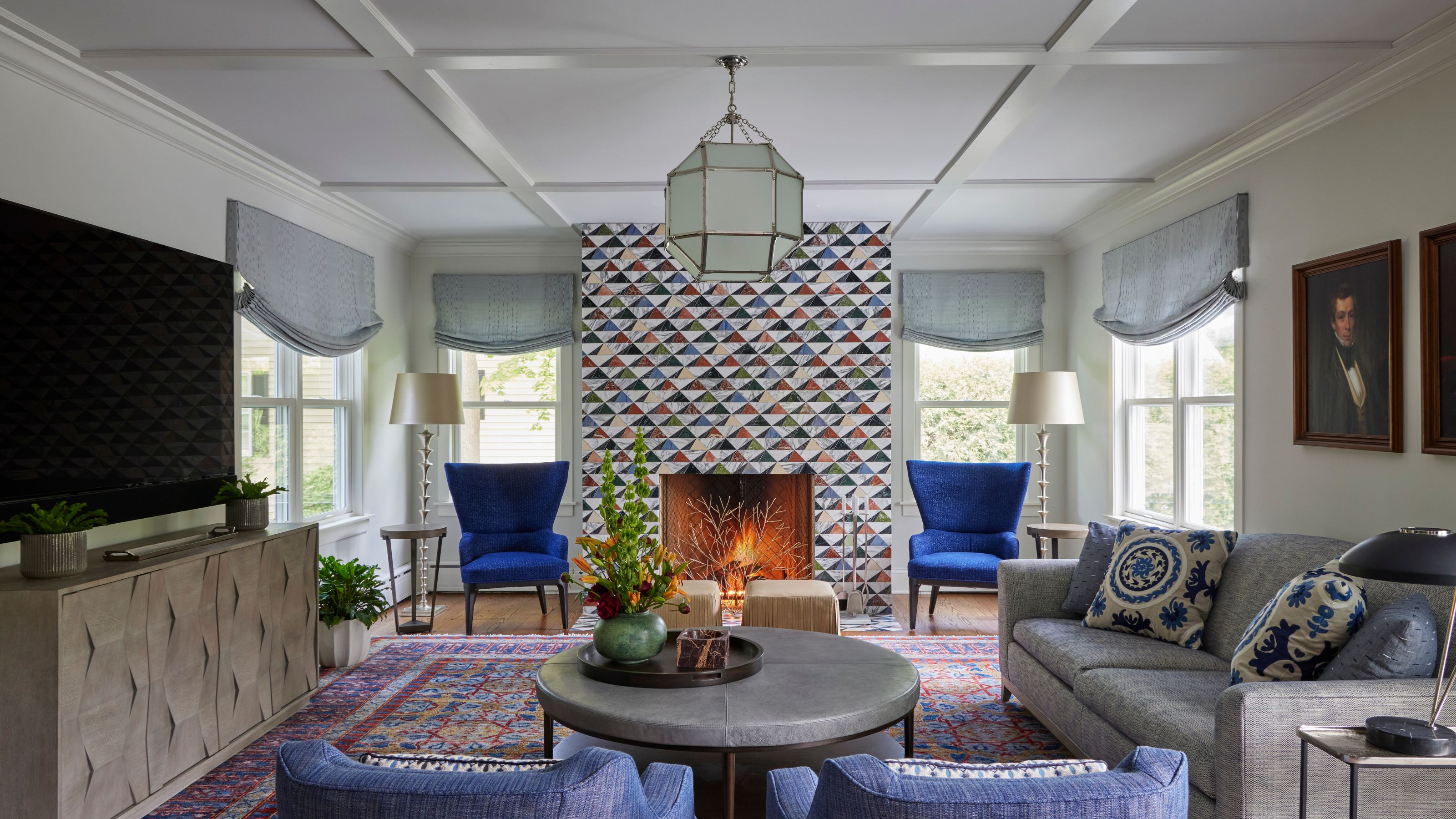
Emphasis is both the easiest principle to spot in the wild and the easiest to get your head around. It’s essentially about creating a focal point that draws the eye and makes a statement – such as a dramatic fireplace, a large window, an oversized ceiling light, or a feature wall. When emphasis is done right, it’s 100% clear where to look first, as in the example above by Elizabeth Drake, with the striking fireplace stealing the show.
‘Our mind likes to connect the dots in a room, such as color, shape, or texture – and a dominant design feature gives the eye a starting point,’ explains Elizabeth Drake of Elizabeth Drake Interiors. ‘At the beginning, I ask myself – what is this space asking for, and where is the wow in it?’
‘Usually, I answer that call with one of these design elements – interesting color choices for walls and trim, or a large, unusual “objet,” such as the sheathing of this box fireplace with large mosaic marble triangles [pictured above], teeing up the color palette. Or installing the unexpected, such as wallpaper on the ceiling with a contrasting chandelier.’
Lauren Saab of Saab Studios explains that emphasis in interior design is important because it creates order and visual hierarchy. ‘Once you’ve established a clear focal point, every other item in the room should support that focal point. The room instantly feels intentional rather than accidental. Emphasis is what allows a room to pull all the details into focus and tell its complete story.’
Most rooms have a built-in focal point – Lauren recommends letting the room’s architecture tell you where the important moments belong. ‘The windows, the wall heights, the natural sightlines all point to where your focal points should live,’ she says. You can also create one by hanging a large chandelier, placing a statement centerpiece on your dining table, or opting for a couch that dominates the space. Alternatively, you can use artwork, which Lauren says is one of the easiest and fastest ways to create emphasis in any space.
Proportion and Scale
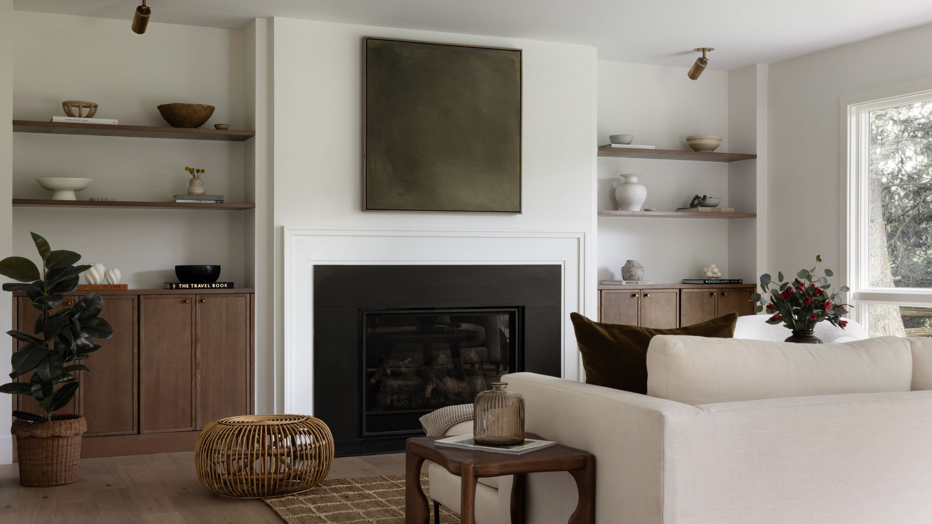
Scale in interior design refers to how big your furniture or artwork is, and proportion is about the relationship between these sizes. They are both key elements of a successful scheme. ‘Proportion and scale are two of the most fundamental principles in design,’ says Sean Symington. ‘When they’re right, a room immediately feels grounded and harmonious.’
Playing with scale is a trick that interior designers and decorators use to create a high-impact space. Often, people wrongly assume that small rooms should have equally small furniture when, in fact, it is quite the opposite – the bigger, the better.
Using a contrasting scale can be done simply – with a large piece of furniture, artwork, a lamp or pendant light, a pattern on a cushion, or an accessory within a room. It takes your scheme to a whole new level – and it’s a technique the world’s leading interior designers employ to fabulous effect.
Choosing large items can make a small room feel a whole lot larger and more impactful than it really is, and of course, a single disruptive, super-sized feature is instantly attention-grabbing. If your room isn’t quite working, it could be that there’s a piece that’s too big or too small, or you might just have too many items of the same size, making things feel cluttered.
‘Whether it’s the height of a headboard, the size of a sofa, or the width of a rug, these elements need to relate to each other and to the architecture of the room,’ says Sean. Tweak those proportions slightly and transform the space from awkward to beautifully balanced.
Harmony
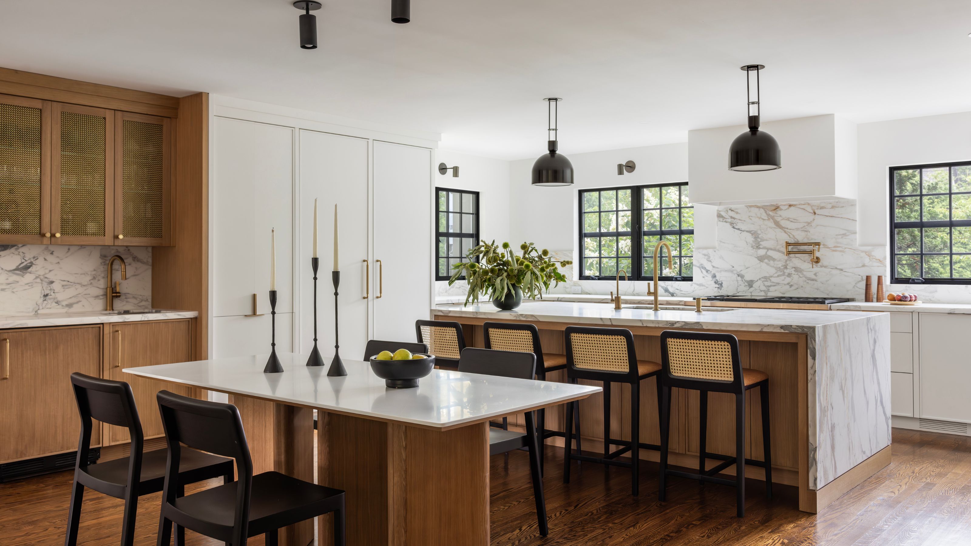
We often talk about ‘cohesion’ in interior design, and that’s ultimately what harmony is about. Bringing all the different elements of your scheme together in a way that’s cohesive, not chaotic. This can be achieved by using the same colour, materials, and design styles – a ‘red thread’ throughout your home.
‘Harmony is what makes a room feel welcoming and settled. It’s the underlying sense that everything in the space is speaking the same language, even if the pieces come from different eras or aesthetics,’ explains Kristina Khersonsky of Studio Keeta.
‘It’s also about knowing that not every piece can be the star,’ Kristina adds. ‘A room full of “main characters” ends up overwhelming the senses. You need supporting actors, pieces that are quieter, simpler, or scaled down, to let the standout moments shine.’
You could choose to create harmony through sticking to a moody, autumnal color palette throughout, choosing one clear design style, or having all of your home’s power outlets, taps and door handles in aged brass. Kristina recommends painting both the walls and the ceiling in the same color to create a cohesive envelope that feels elevated and considered. ‘It’s one of the fastest ways to take a room from basic to thoughtfully designed,’ she assures.
When harmony works, your space feels unified and easy to be in, with a shared design language flowing through each room.
We often talk about ‘cohesion’ in interior design, and that’s ultimately what harmony is about – bringing all the different elements of your scheme together in a way that’s cohesive, not chaotic. This can be achieved by using the same color, materials, and design styles – a ‘red thread’ throughout your home.
‘Harmony is what makes a room feel welcoming and settled. It’s the underlying sense that everything in the space is speaking the same language, even if the pieces come from different eras or aesthetics,’ explains Kristina Khersonsky of Studio Keeta.
‘It’s also about knowing that not every piece can be the star,’ Kristina adds. ‘A room full of “main characters” ends up overwhelming the senses. You need supporting actors – pieces that are quieter, simpler, or scaled down – to let the standout moments shine.’
You could choose to create harmony by sticking to a moody, autumnal color palette throughout, choosing one clear design style, or having all of your home’s power outlets, taps, and door handles in aged brass. Kristina recommends painting both the walls and the ceiling in the same color to create a cohesive envelope that feels elevated and considered. ‘It’s one of the fastest ways to take a room from basic to thoughtfully designed,’ she assures.
When harmony works, your space feels unified and easy to be in, with a shared design language flowing through each room.
Rules to Remember
1. Live in a Space First
If you have recently moved into a space, hold off on decorating immediately. It’s best to live in the rooms before making any design decisions – that way you’ll know the coziest corners, the spaces people gravitate to, and how the light moves throughout the day.
‘We always encourage our clients to live in a space first before they make any expensive or architectural changes,’ agrees interior designer Samantha Todhunter. ‘It is important to not only understand the circulation and flow, but also to define what it is you need from your space, and how you would like it to perform.’
Elizabeth Drake also recommends checking the natural daylight. ‘Let it guide your color palette – i.e., a north-facing room tends to be cool; the light is slightly blue, which can be balanced with a warm color, no matter how pale,’ she says.
2. Always Start with Your Layout
The first step in any design needs to be your layout – and this is where working with a professional interior designer can really help. We become so accustomed to how our home looks that we are unable to visualize alternatives, but a designer will look at the space with a fresh perspective and be able to suggest something that works better and improves your quality of life.
3. Focus on Balance
'The most important principle to follow is intentional balance,' says Pam Forman of PBF Homes. 'While rules like 60-30-10 are a great starting point for achieving a balanced color scheme, the core concept is to ensure that no single element overpowers the others, and every choice works together to create a cohesive and curated space.'
4. Prioritize Plenty of Storage
When designing a space from scratch, give yourself double the storage you think you’ll need. Future you will thank you forever. We might aspire to live minimalist, clutter-free lifestyles, but it’s important to be realistic and create space to store our belongings. Ample storage reduces home-organizing headaches and creates the illusion of order.
‘As two moms, we always think about storage needs, especially in a family room where most of the daily living happens,’ comment Allyson Bronner and Robyn Segal of Peltrie Place. ‘From puzzles and books to toys and extra blankets, it’s nice having the space for extra items and all the little things. We consider every way a family might use the space and tailor the built-ins and layout to support those needs.’
5. Go Big with Your Rugs
‘Rugs must be sized to truly fit a room. Always,’ says Kathy Kuo. ‘The perfect rug doesn’t just finish a design – it elevates the way a space feels and functions.
‘It anchors the furniture, enhances the flow of the room, and brings a sense of cohesion that simply isn’t possible with a rug that’s too small or not proportioned correctly.’
‘Here are a few general guidelines to follow to choose a rug that’s just the right size for your space. In a living room or family room, the rug should extend underneath each piece of furniture, with either the front legs or all legs of sofas and chairs positioned on top.
‘In a dining room, the rug should be big enough to place all the dining chairs on it, even when the chairs are pulled out from the table. In a bedroom, the rug should extend about 28 inches beyond the foot and sides of your bed (if space allows) and up to the front of the nightstands.’
FAQs
What are the three Fs of interior design?
The three Fs of interior design are the floor plan, finishes, and fixtures in a space. In other words, they are the layout, the materials used, and the finishing touches that tie the space together with a pretty, metaphorical bow.
Heather Kellow, founder and principal designer at Four Spaces Design, swears by this rule to help clients visualize the design journey. ‘I often tell my clients that a floor plan is our map,’ she says.
‘Just like you would not take a road trip without knowing where you are going, a floor plan is much like that and helps you avoid house layout mistakes early on. There is often more than one way to successfully lay out your space, and the floor plan helps to visualize that for your client.
‘The floor plan is also where we communicate all the details and notes to trades who will be working with us to execute the design,’ she adds.
What is the 60/30/10 rule?
If you’re just looking to keep things in proportion rather than making a statement, you can lean on the golden ratio, which appears in nature, art and architecture. The idea filters down to the 60/30/10 rule:
60% – the main element, such as the wall colour, large furniture and flooring.
30% – secondary elements, like an accent chair, curtains and other textiles
10% – highlights, like decor and accessories
It's a good idea to use the 60/30/10 rule when choosing your color palette. Take a dominant color for the walls, a secondary color to create visual interest, and an accent color to create intentional focal points.
The Homes & Gardens Library is your definitive guide to timeless design wisdom. From choosing the perfect sofa to mastering the fundamentals of layout, each piece in the series draws on expert insight to guide you through the key principles of interior design. Thoughtfully curated yet easy to digest, it’s the essential reference for anyone looking to create a home that is beautiful, practical, and enduring.

Millie is a freelance writer and qualified interior designer based in Sheffield. She has many years of experience in the world of content and marketing, and previously worked as the head of Solved at Homes & Gardens. Before that, she worked in SEO at News UK in London and New York. She has a first-class degree in French and Italian from UCL and loves to weave decor into her home that reminds her of time spent living and studying in Bologna. Millie believes a clutter-free space that you love coming home every day is the best secret weapon for our well-being.