10 reasons interior designers use whole house color schemes
Find out why creating cohesion throughout your home is such an important decorative tool

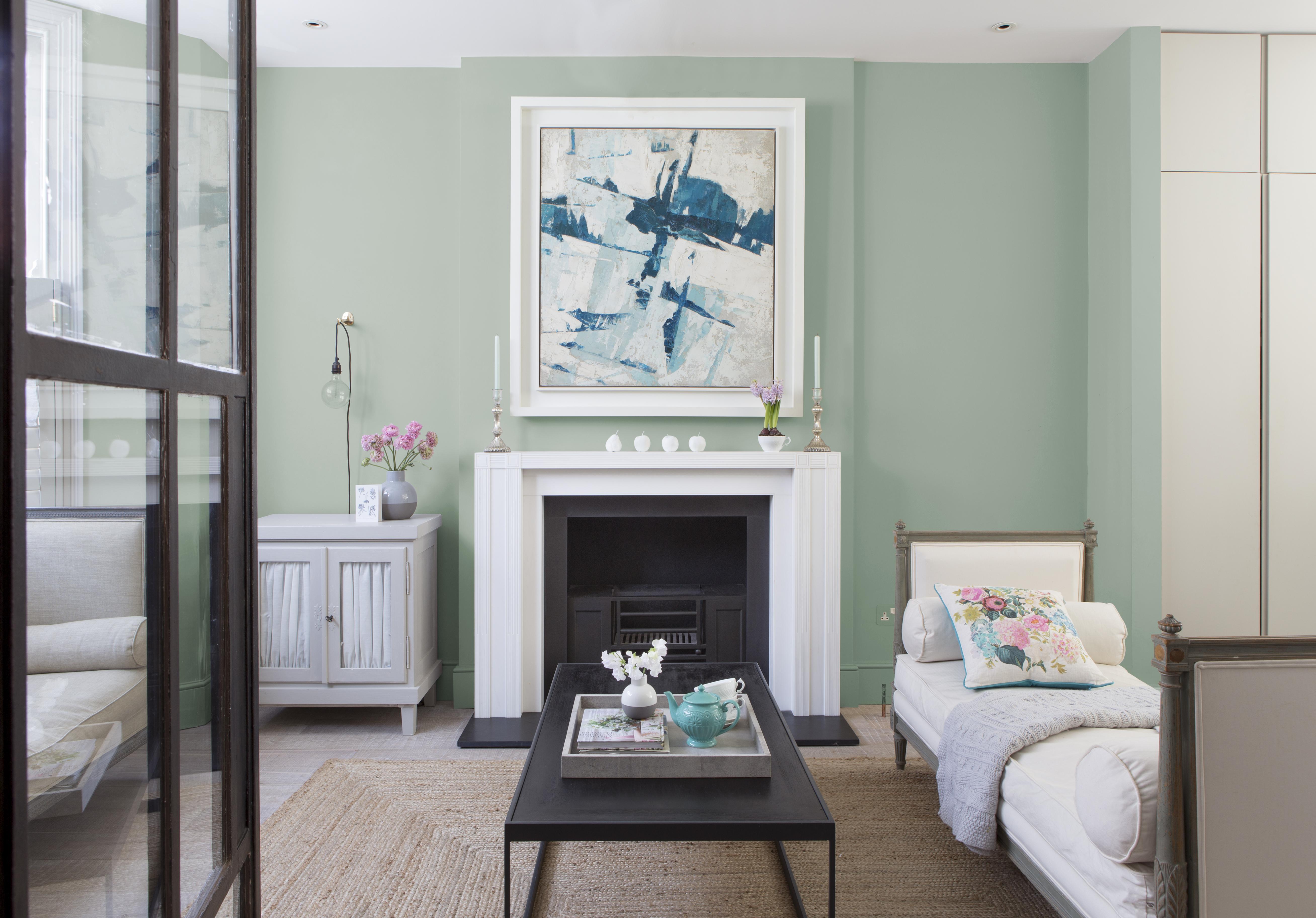
We realize establishing whole house color schemes may sound daunting – it can be hard enough to choose a color scheme for one room alone, so picking one for a whole house does take a lot of thought, and commitment.
Why would you want a whole house color scheme? There are so many reasons – not least of which is that it's something the world's greatest interior designers routinely do to create a fabulously cohesive feel. And, once you have chosen your key shades, the color scheming will flow like a dream.
All you need to do is start with three favorite colors – and a little understanding of how shades work together. Here, we show you how.
Article continues belowSee: The Color Wheel – H&G's complete guide on how to mix colors
1. Whole house color schemes create continuity and flow

One of the most important elements of a whole house color scheme is that it flows and is easy on the eye.
‘Diversity and continuity play equally important roles in a home, but it is a fine line. While it is important that each room has a personality of its own, it is also important that spaces do not jar. Unexpected arrivals can create a sense of chaos and unease,’ says Ottalie Stride, Creative Director at Albion Nord.
‘On the same tangent, room after room of the same color can also be incredibly dull. The key is to create rooms which function to serve different uses. This is a great way to develop schemes; a cinema or bar can be more playful than a kitchen or bedroom but colors can be subtly carried from one to the next so there aren’t any shocking surprises.’
Design expertise in your inbox – from inspiring decorating ideas and beautiful celebrity homes to practical gardening advice and shopping round-ups.
2. You can invert shades from room to room

‘You can enjoy the colors you love all the time by inverting your preferred shades between rooms; this will add a new dimension to your home whilst remaining in keeping with your chosen palette,’ explains Will Thompson of Valspar. ‘For example, a living room space wrapped in neutral shades can be complemented with bold, deeper tones. This can be echoed in the other rooms of the home by simply switching up the dominant color in each space to expand the scheme elsewhere.’
So a pale green shade used on the walls in a living room with blush pink accents could be inverted in a bedroom to show blush walls with green accents.
- See: Living room color schemes – the best colors for living spaces
3. Neutrals will create a calm whole house color scheme
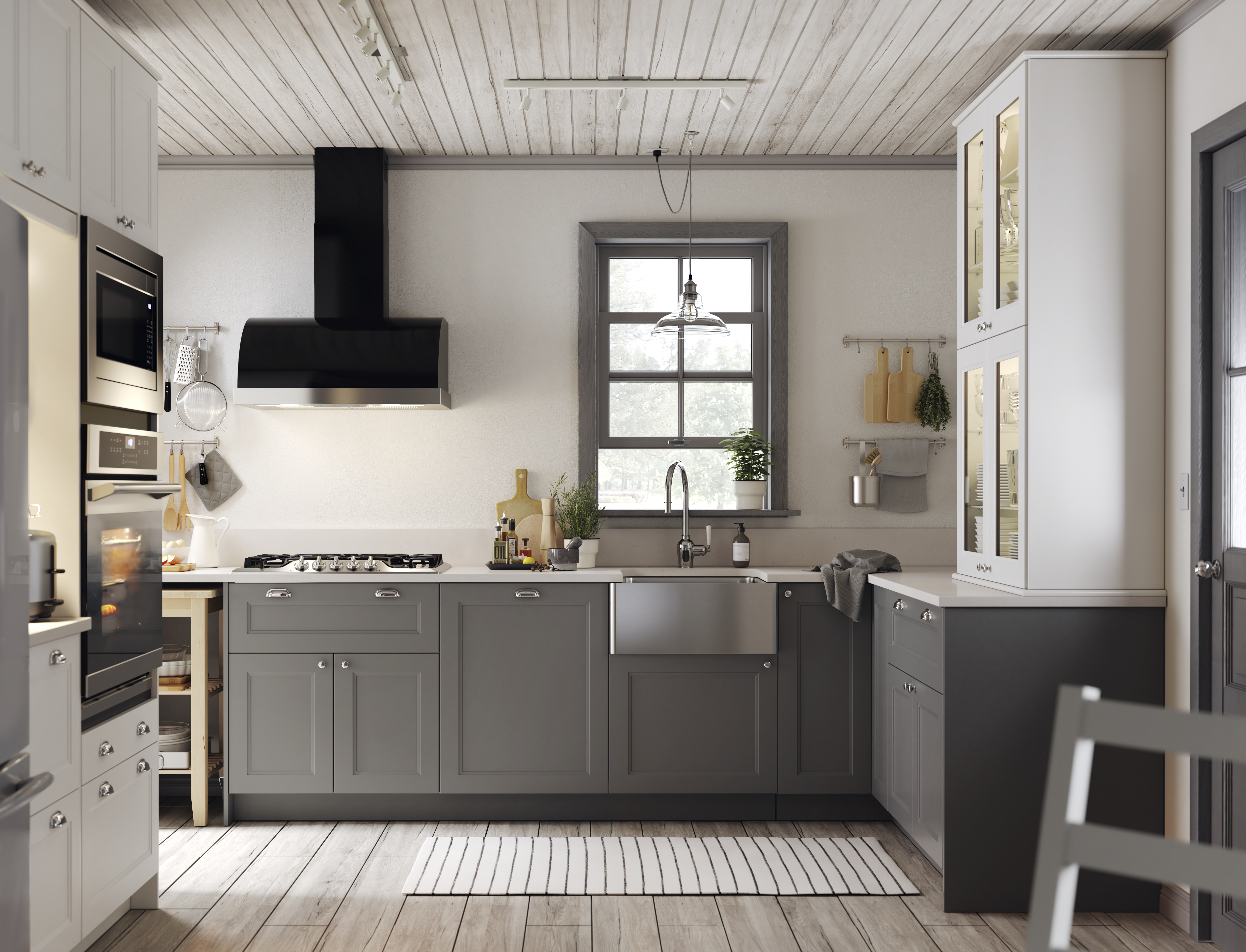
Not a fan of color? No problem. Pull together a calming palette of three neutrals that includes greige – grey/beige. The reason we recommend three colors is that it’s easy to become overwhelmed by too many choices.
Easy on the eye and perfect if you want to lighten up a kitchen that doesn’t get a ton of natural light, these neutral shades create a classic and stylish look. If you want to add a bit of depth, go for a mid-toned grey – it’s such a versatile shade that can be pulled through into other spaces – even if only a grey sofa in the living room.
4. Whole house color schemes can be adjusted to light levels in each room
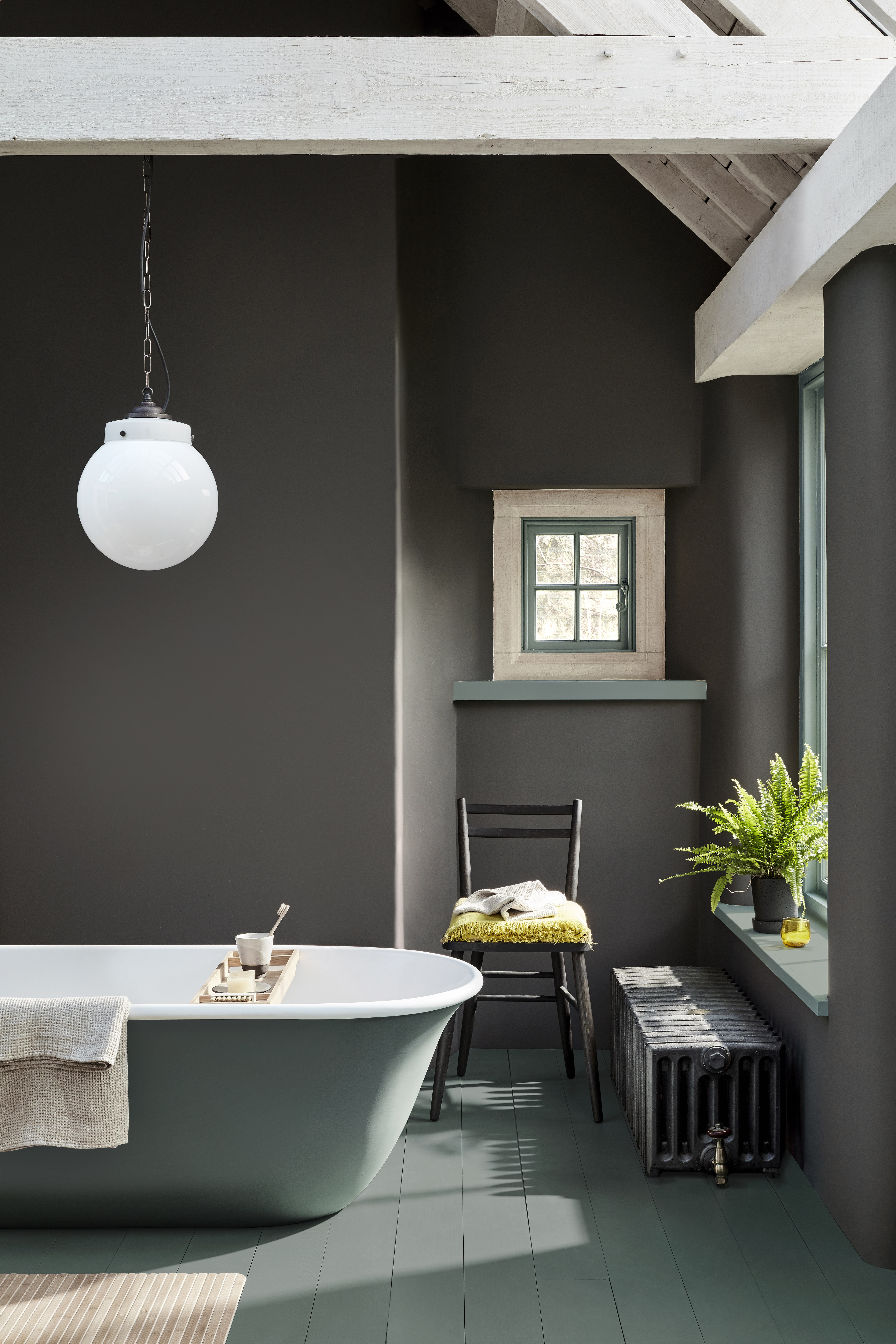
There is a belief that you can only use complementary colors or harmonious shades together for a whole color house scheme, but as long as they work tonally, unusual color pairings will work – and, importantly can be adjusted by room to suit the natural light that space receives, and the time of day you use the room.
For example, north-facing rooms that you want to feel cozy and welcoming will do best with warm colors; south-facing rooms will take cooler colors.
What do we mean by choosing colors that match 'tonally'? Colors have an intensity – pale shades have less, and bright shades have more. Shades that match tonally have the same strength, regardless of their color (as you can see in this bathroom by Little Greene), and in their own way, are harmonious.
5. Whole house color schemes are comforting
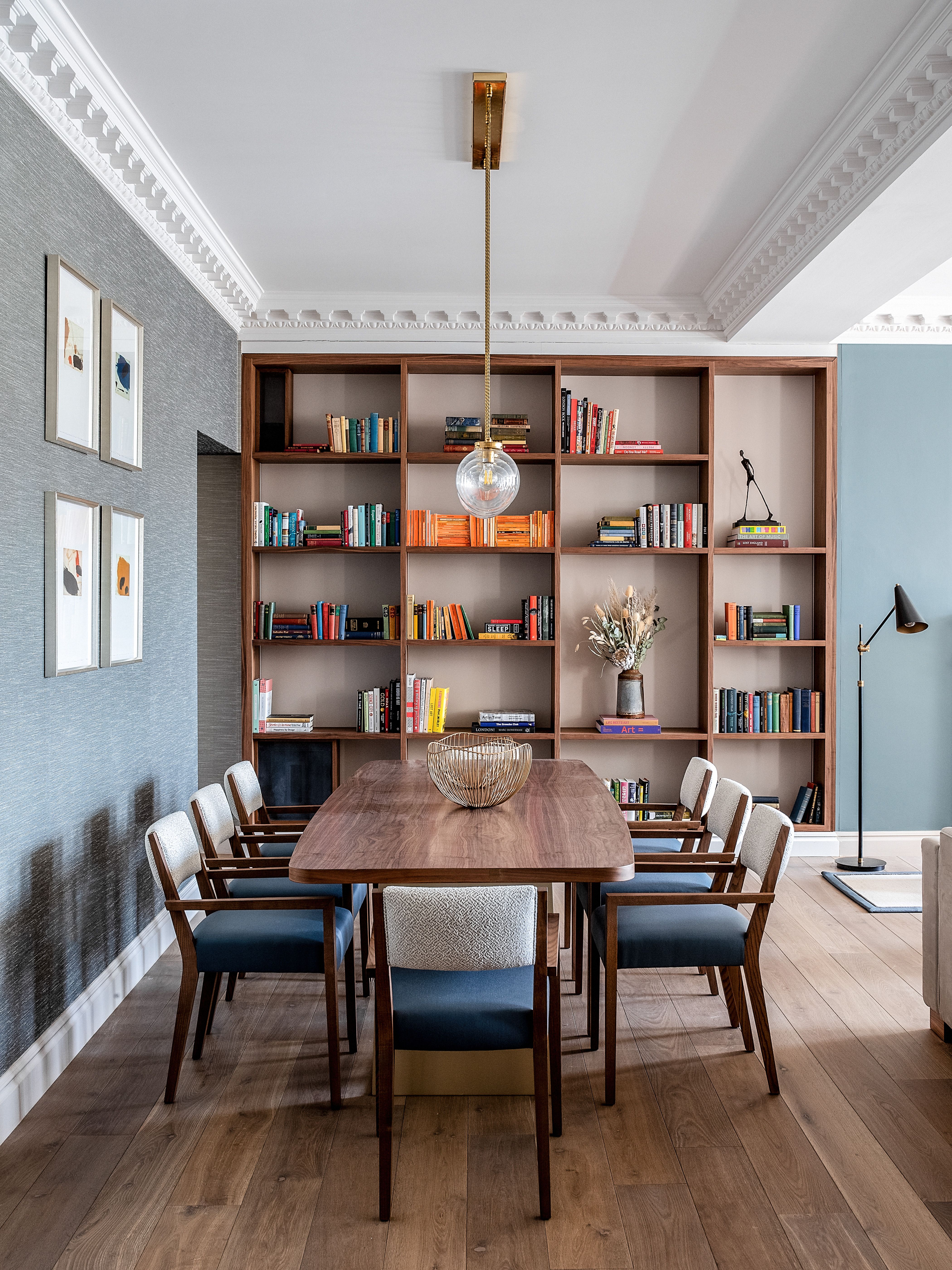
‘When an entire home is considered as "one" rather than a cluster of individual rooms, there is instantly greater fluidity between different zones,’ says Sarah Ward, Co-Founder of Ward & Co.
'When each room complements each other in this way it can be hugely comforting and naturally creates a much calmer environment to live in, particularly when space is limited.’
6. Start a whole house color scheme from your most used room
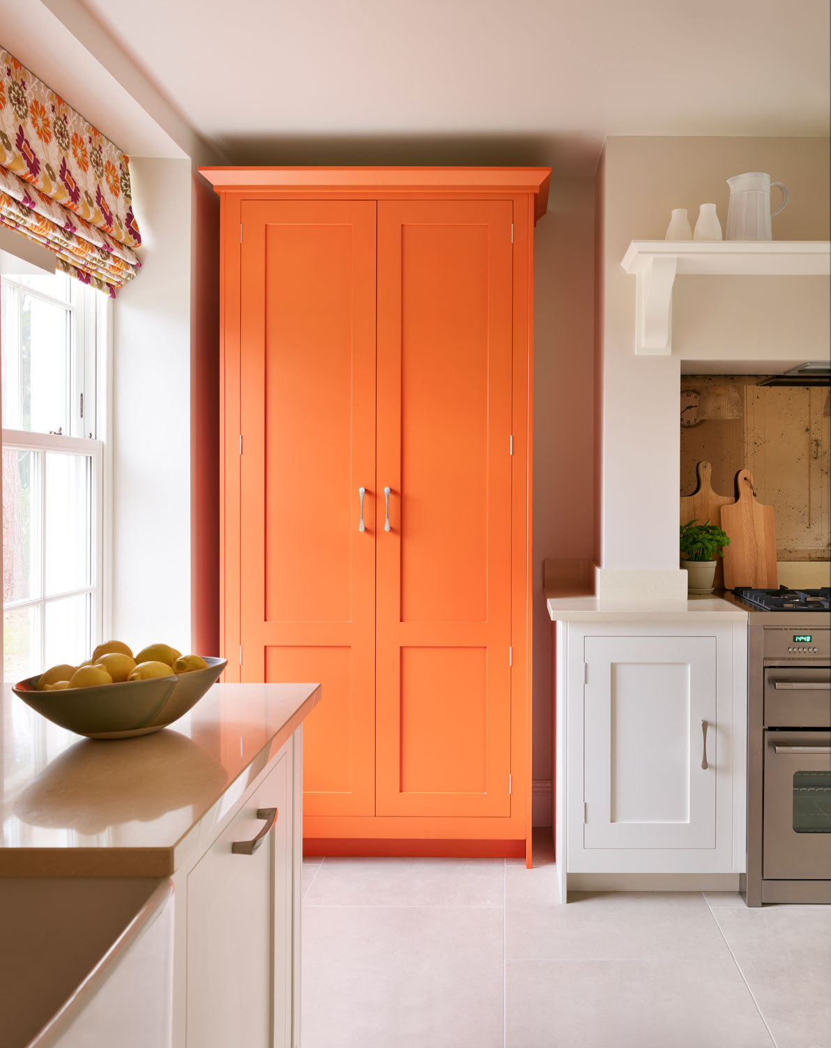
Choose the room that you frequent the most as a starting point for your whole house color scheme. More often than not, this is the kitchen or living space.
Melissa Klink, Creative Director at Harvey Jones says, ‘The kitchen is the perfect environment for experimenting with color on both a large or small scale. Contrasting top and bottom cabinets or using color in a localized area like an island or free-standing cabinet are great ways to add a touch of personality to your whole house color scheme. Introducing tonal colors from the same spectrum is also an interesting way to bring color into the kitchen – this effect can be achieved, for example, by using different shades of the same color across the cabinetry and the island.’
7. Whole house color schemes are perfect for blending open-plan layouts

One idea with whole house color scheming is to keep the downstairs as one color palette, then switch it up upstairs. For example, a beautiful taupe shade with accents of sky blue across the living and dining areas, then the landing and bedrooms could have sky blue as the predominant shade and taupe as the secondary color.
Essentially you’re swapping the accent shades. Follow the example of this space and use metallics and dark wood as the constant between the two floors too – consistency is the main element to making the whole house color scheme work.
8. A family of colors will create a coordinated scheme
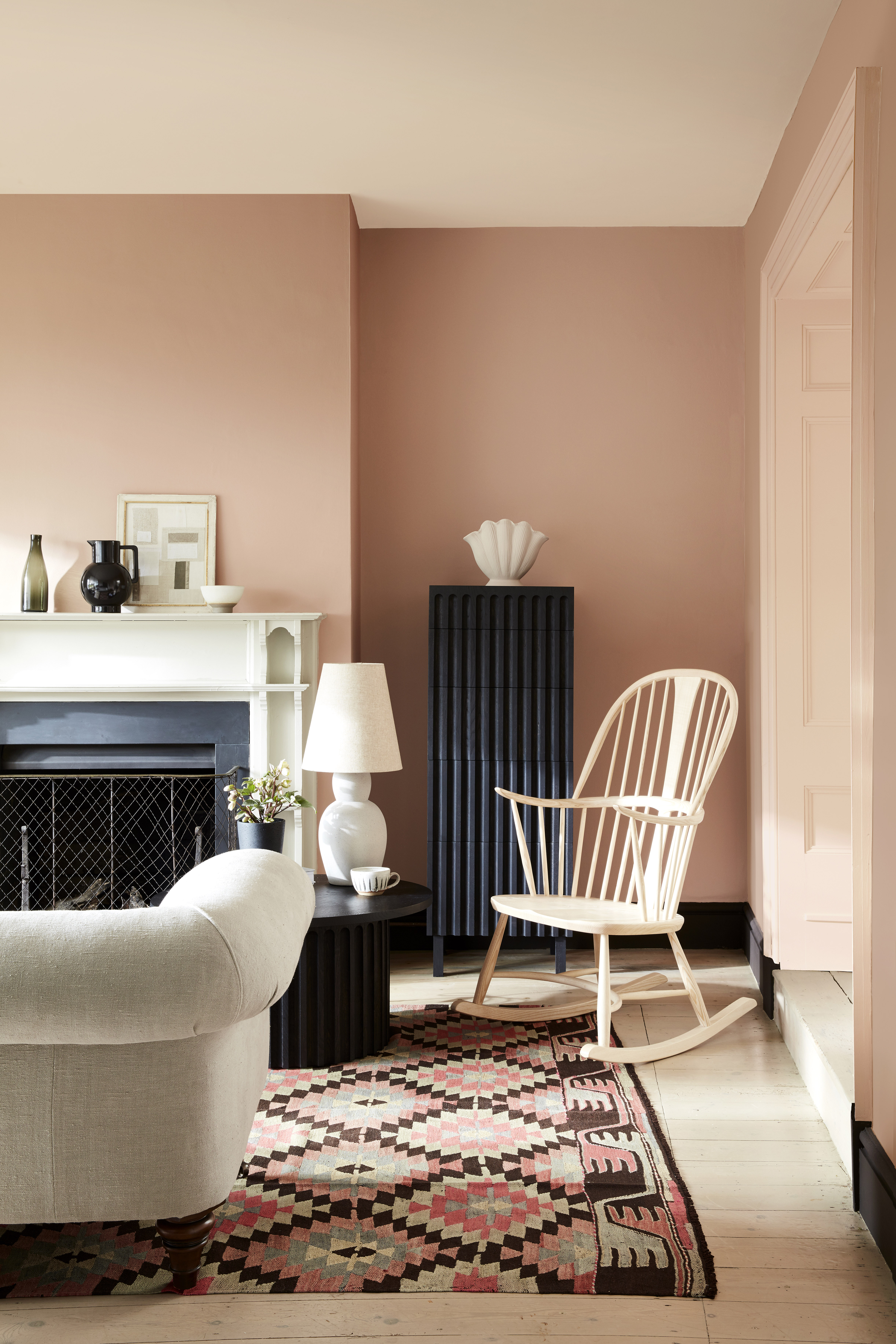
To create a truly cohesive feel, consider, use a family of colors in combination, as Ruth Mottershead, Creative Director at Little Greene explains:
‘Using shades from the same color family will work beautifully as a canvas for a coordinated palette of home furnishings whilst still adding design interest in a subtle way. A good palette to utilize is the Little Greene "Color Scales" collection.
'Our most popular colors sit within families of four graduated tones, made using the same pigments, but in different strengths. Masquerade, for example, appears alongside Masquerade Light and Masquerade Mid; these Color Scales of the earth-pink offer graduated tones.
'These groups of colors are a timeless choice if you are looking for soft, neutral tones to provide natural movement throughout the home. They are easy to use in combination on walls, ceiling and trim as well as providing a seamless color journey from room to room. In addition, the use of the related two strong colors at the bottom of the Color Scales color card allows for highlight and texture to be created without fear of discord.’
9. Whole house color schemes can be adjusted to suit the mood a room you wish to create
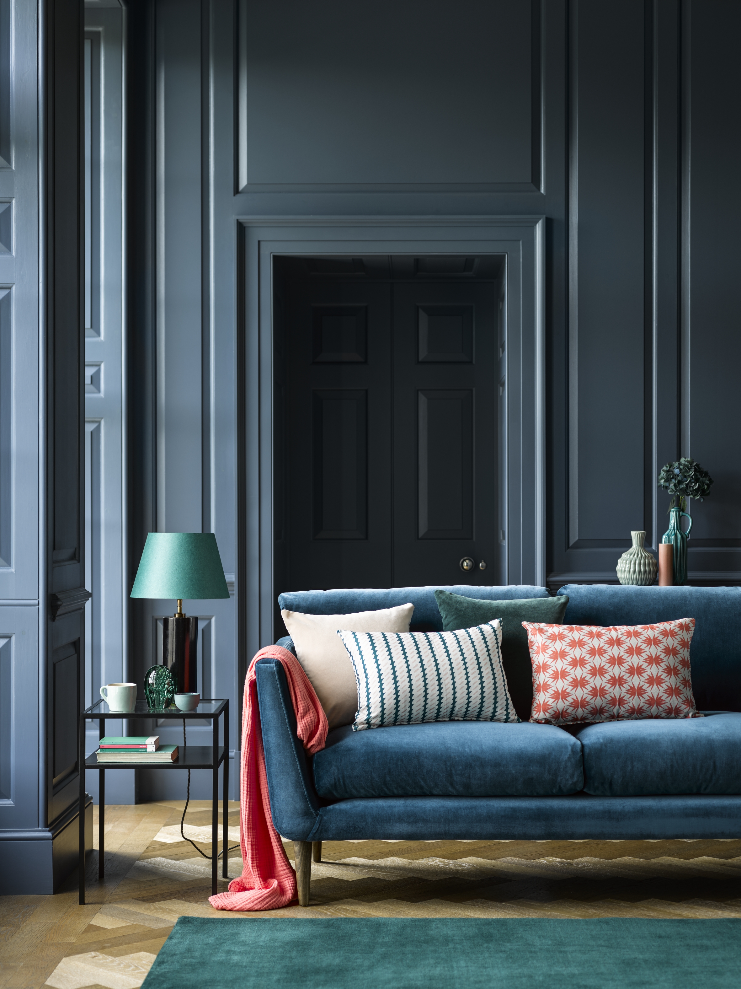
Set the tone for your whole house color scheme by painting every single wall in your favorite color. Use shots of subtle color and bolder accents elsewhere to enhance the mood and impact as you wander around.
A whole house color scheme need not be dull or boring. Here, a dramatic inky blue is a bold choice and one that you shouldn't hesitate to recreate if you dare.
10. Use whole house color schemes to integrate forgotten spaces
See: The 60-30-10 rule – and how to use it to balance a color palette
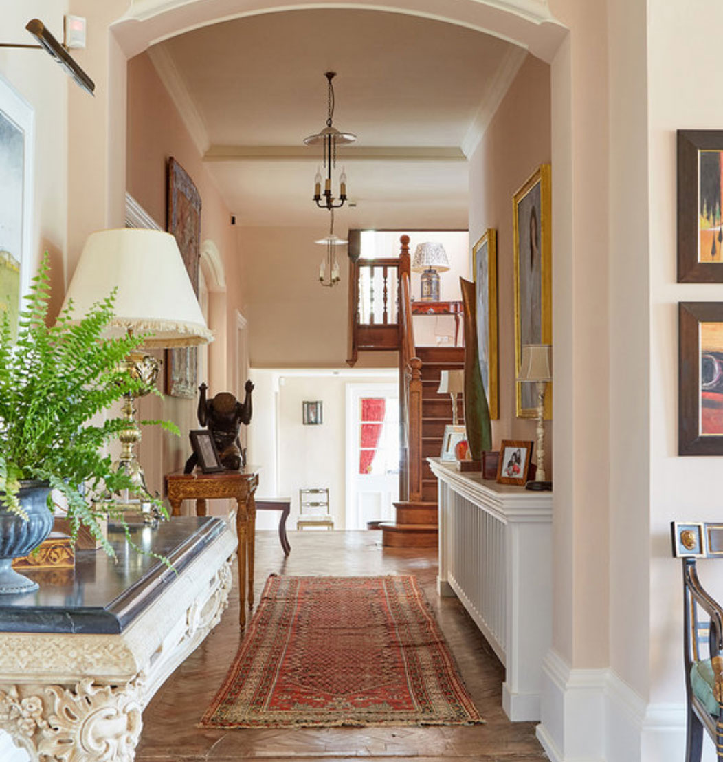
We often neglect the most used areas – the entryway, the hallways and landings – but this is where whole house color scheming comes to the fore. Linking spaces together is integral to this look and you can see how beautifully it works here – the hallway paint color is used in the living space and beyond, too.

Sophie has been an interior stylist and journalist for over 20 years and has worked for many of the main interior magazines during that time, both in-house and as a freelancer. On the side, as well as being the News Editor for indie magazine, 91, she trained to be a florist in 2019 and launched Flowers Inside My Head where she curates beautiful flowers for modern weddings and events. For Homes & Gardens, she writes features about interior design – and is known for having an eye for a beautiful room.