My Case for Color – How to Overcome Your Fears and Use Paint with Designer Confidence
I love embracing bold color, and when you’re willing to follow my lead, you can transform your space with striking, memorable interior schemes


Design expertise in your inbox – from inspiring decorating ideas and beautiful celebrity homes to practical gardening advice and shopping round-ups.
You are now subscribed
Your newsletter sign-up was successful
Want to add more newsletters?
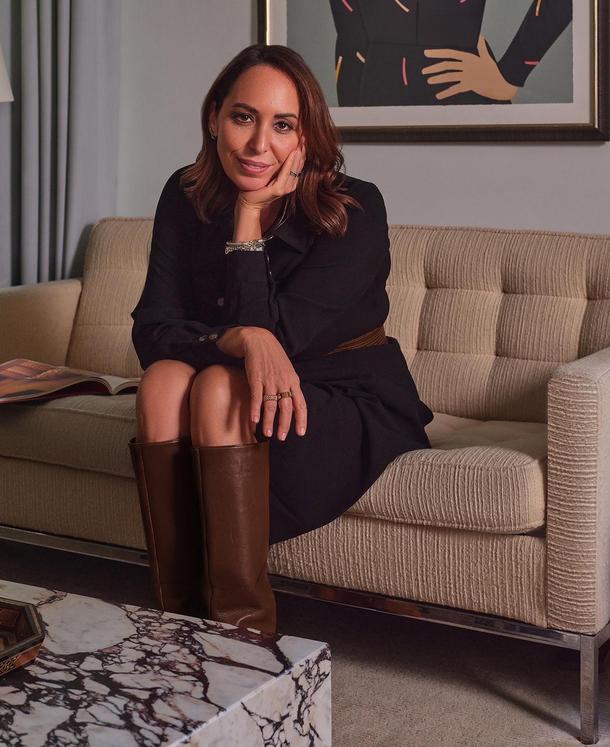
Interior designer Zoe Feldman is one of Homes & Gardens' new Editors-At-Large for By Design, sharing her thoughts on decor through her lens, clever color palettes, and family-friendly materials. See the rest of her articles here.
Using color in the home is often associated with boldness, but its true power lies in subtlety. When chosen with intention, color shapes a space quietly yet profoundly – creating rooms full of nuance, tailored to both the architecture and the people who live within.
Neutrals have their place – of course, I use them often – but relying on them for safety’s sake isn’t timeless (remember Millennial gray?). It’s a non-decision that can leave a space feeling flat or forgettable. That’s never my goal, and I’m guessing it’s not yours either.
Article continues belowMost people aren’t afraid of room color itself – everyone has a favorite – but of using it poorly. And that fear is understandable. We’ve all seen rooms where good intentions went sideways: where a vibrant hue felt overwhelming, chaotic, or disconnected from the rest of the home. It’s enough to send anyone running back to white walls. But when handled well, color becomes the unifying element – the tone-setter – and the part of a room you remember.
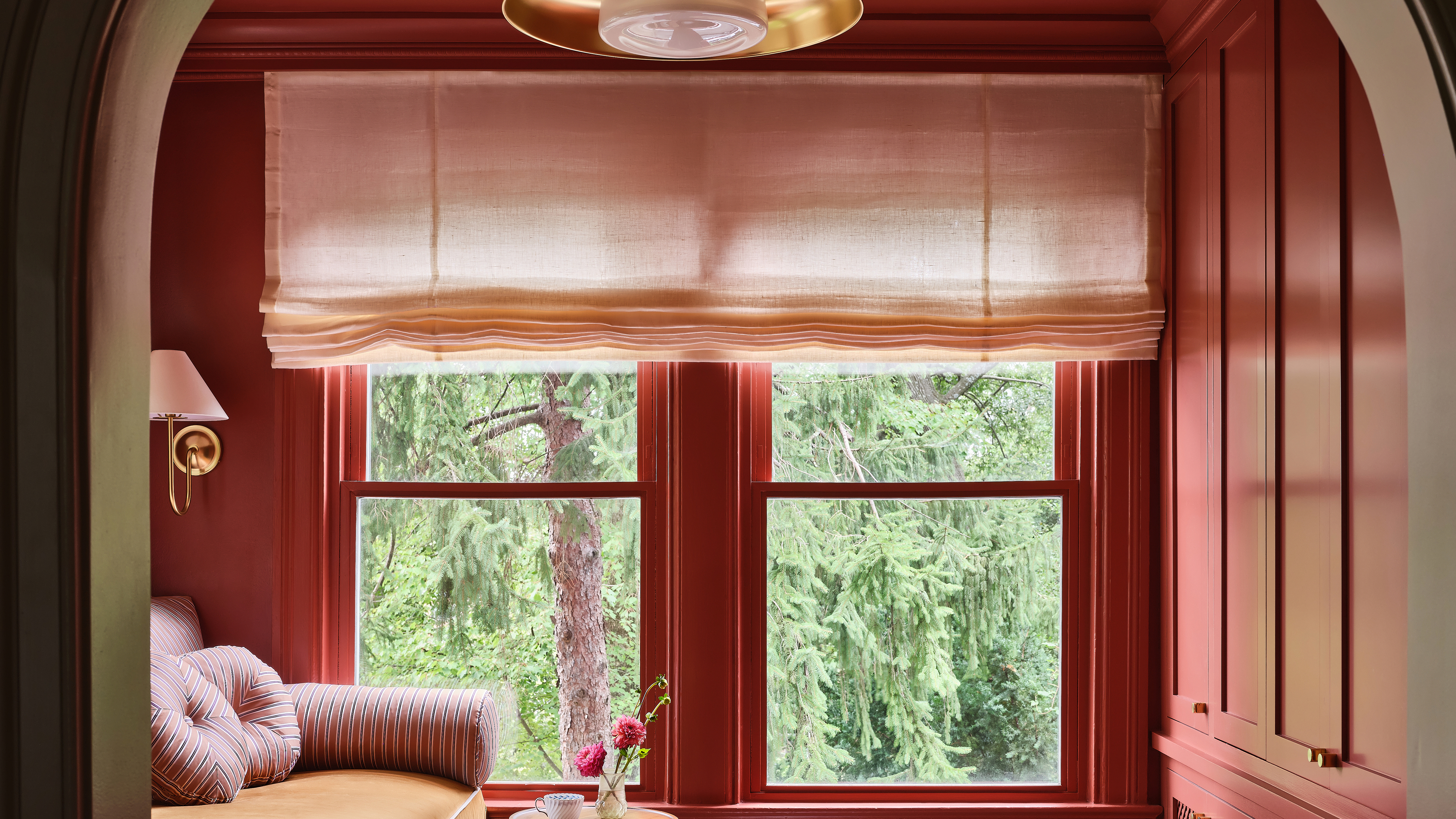
One of my favorite painting techniques is color drenching, where walls, ceilings, trim, doors, and millwork are painted in the same hue. It eliminates visual breaks and structural distractions, creating a seamless, immersive experience. Tiny rooms feel intentionally intimate, while simple millwork gains architectural presence. A color-drenched room feels confident and cohesive – spaces like these invite you to linger.
Function, too, should inform the palette. In family rooms, libraries, and other places meant for relaxation, I lean into rich, enveloping colors: inky blues, smoky greens, saffron yellows, and warm terracottas. These hues are grounding yet generous. In kitchens and sunrooms, I gravitate toward lively greens – even the zesty, almost acidic ones. And for bedrooms, restoration is key: soft pale blues, blush pinks, and muted greens that soothe without slipping into blandness.


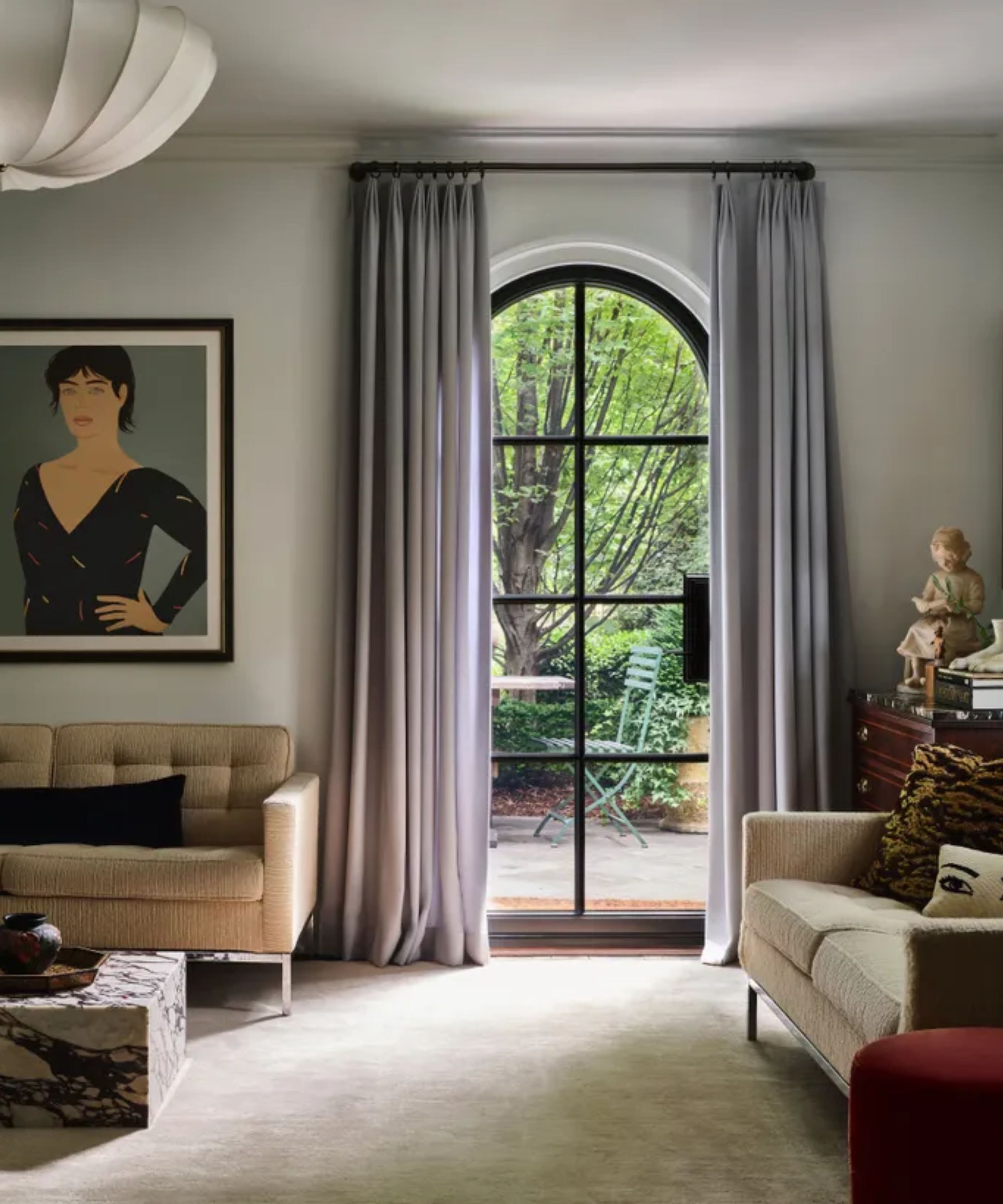
Now, back to decorating with neutrals. Not every room needs to be saturated in color. Some spaces are designed to serve as visual pauses – moments of calm that allow the eye to rest before moving into bolder territory. In these instances, neutrals do the heavy lifting, though they’re far from simple.
Design expertise in your inbox – from inspiring decorating ideas and beautiful celebrity homes to practical gardening advice and shopping round-ups.
In fact, getting a neutral right can be more challenging than working with color. Each carries its own undertone and personality, capable of either lifting a space or leaving it flat. I’m drawn to red-based neutrals for their warm, luminous quality; they give rooms a subtle glow. Green-based neutrals, by contrast, feel grounded and putty-like – perfect for transitional spaces. And I have a soft spot for those barely-there blues that masquerade as white until the light shifts, revealing just a whisper of color.

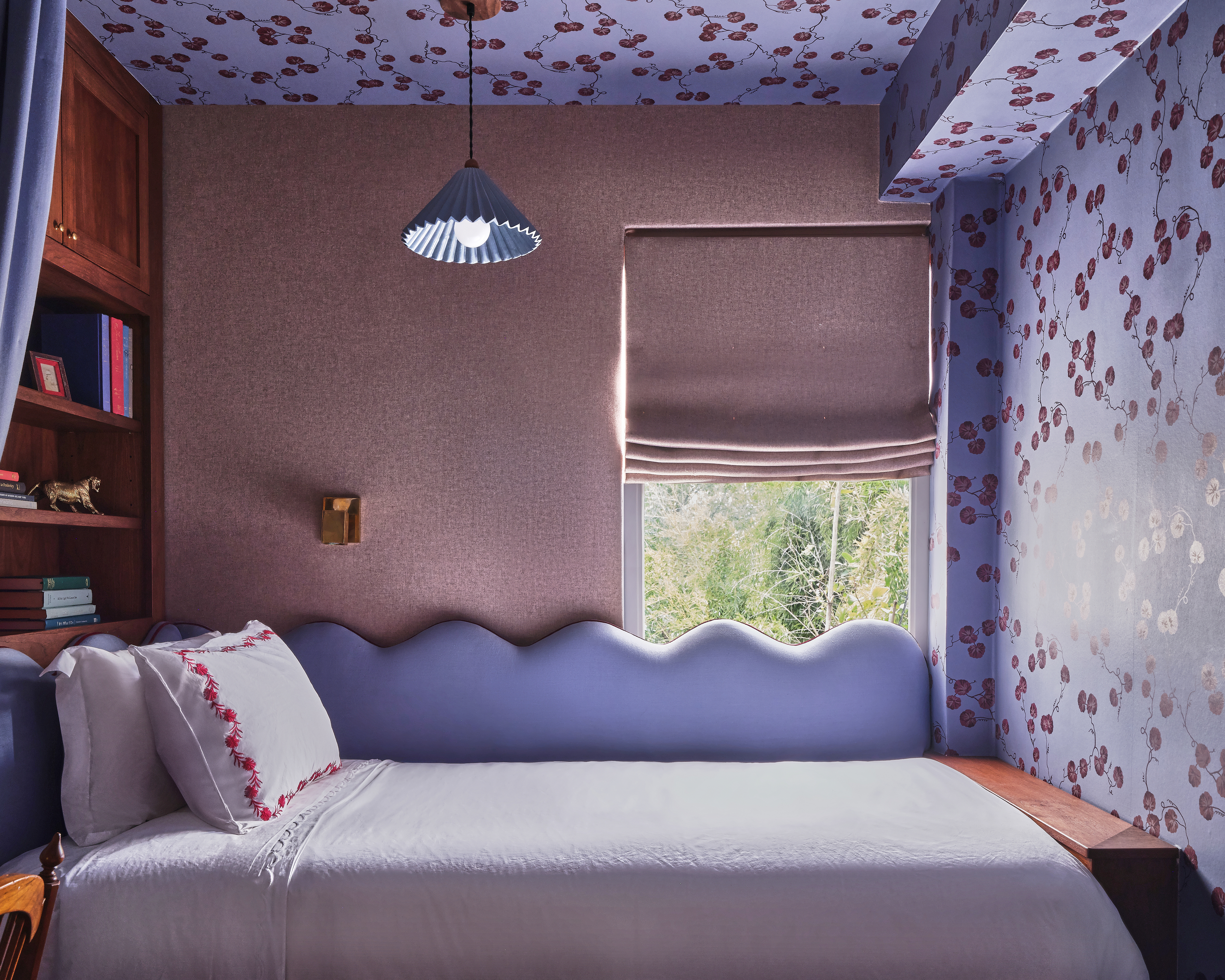
Then there are the rooms where I encourage clients to be bold – spaces like powder rooms and guest bedrooms. These are perfect for experimenting with deeper colors, daring patterns, and unexpected combinations. After all, who doesn’t love telling someone to take 'the blue room' for the night? These aren’t spaces you live in every day; they’re ones you experience in short, memorable moments. That makes them ideal for pushing beyond your comfort zone – go moodier, more dramatic, more surprising.
Ultimately, color isn’t about bravery versus safety – it’s about thoughtfulness. A richly saturated room can feel serene, just as a pale one can energize. The difference lies in intention. The goal isn’t to use color for shock value, but to let it serve the room’s purpose and express who you are at your most interesting.
Neutrals certainly have their place, but they aren’t the only path to timelessness. When applied with care, color becomes part of a home’s emotional memory: the terracotta den where you spend cozy winter evenings, the soft blue bedroom where you’ve watched countless movies, the jewel-toned guest room friends still mention years later. These are not just rooms – they’re experiences.
If you’ve been hesitant to use color, remember it doesn’t have to shout to make an impact. Some of the most powerful uses of color are the quietest. And if it doesn’t feel right? It’s just paint – you can always begin again.

Since setting up her own practice in 2004 in Washington, D.C.’s historic Georgetown neighborhood, Zoë Feldman has launched a second office in New York City and continues to bring her unique take on modernized classicism to homes across the country. Her work has been featured in publications including Architectural Digest, Elle Decor, House Beautiful, Domino, and more. Zoë draws on her love of the practical, the playful, and the deeply personal to create spaces that are as inviting and soulful as they are sophisticated.