I tried Joanna Gaines’ 3 go-to colors – and this quiet luxe palette is all I want for fall and winter 2025
Create balanced and stylish color schemes with these expert ideas from the master herself, Joanna Gaines

Design expertise in your inbox – from inspiring decorating ideas and beautiful celebrity homes to practical gardening advice and shopping round-ups.
You are now subscribed
Your newsletter sign-up was successful
Want to add more newsletters?
I know the struggle of choosing a room color: it’s a minefield of choices, tiny color swatches, and a fear of getting it completely wrong. After years of staring at paint chips, I finally found a foolproof palette that always works – and it comes straight from HGTV’s Joanna Gaines.
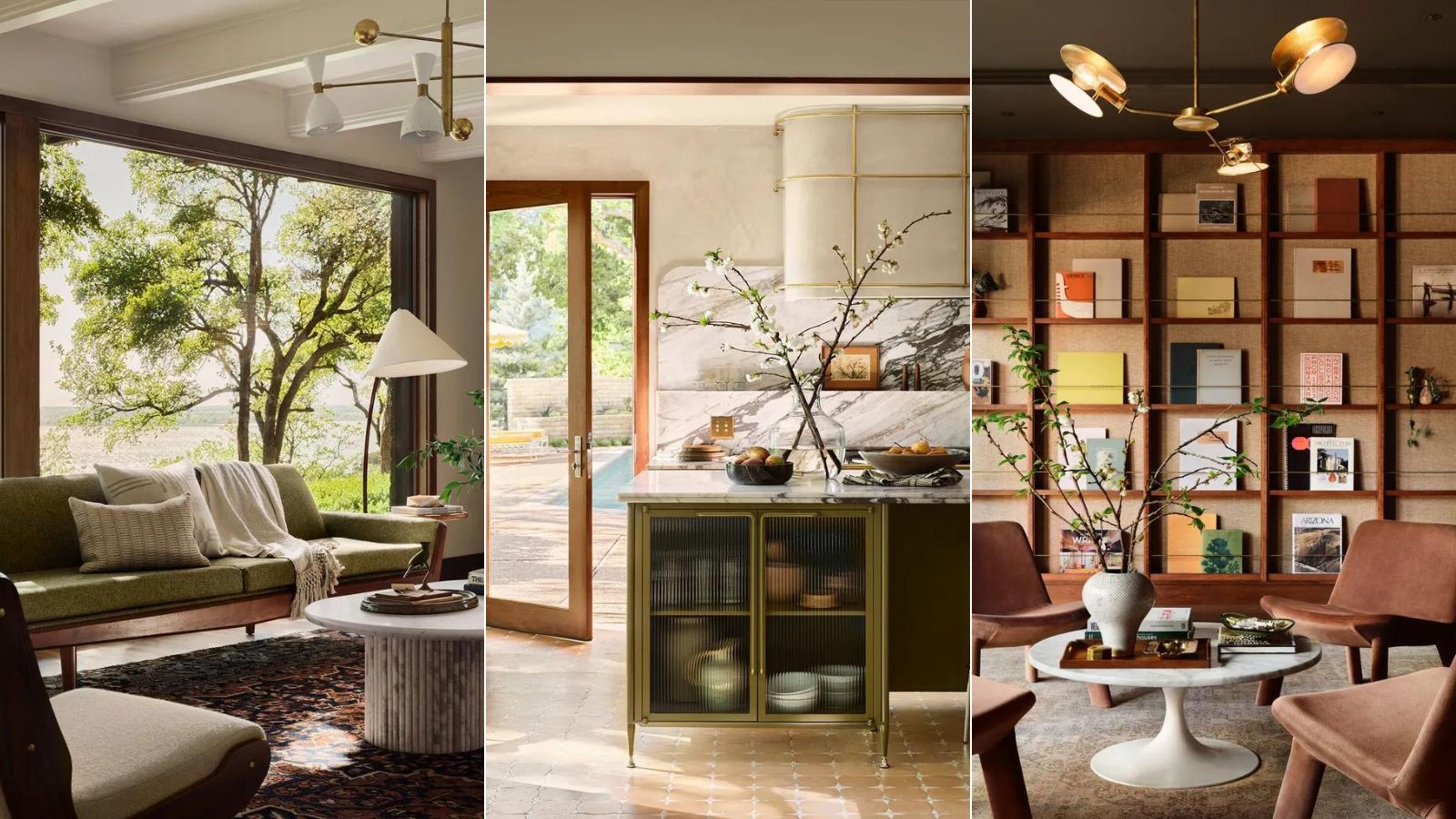
Her tried-and-tested fall color scheme – a sophisticated mix of muted green, warm beige, and rich brown – instantly delivers the sense of warmth and grounded calm we crave as the weather turns. More importantly, I’m impressed by the longevity and timelessness of each color trend, making this a palette that works beautifully long after the holidays are over.
Here is a breakdown of why I love this nature-inspired trio and how I use it:
Article continues below1. Sage green – my go-to sophisticated neutral
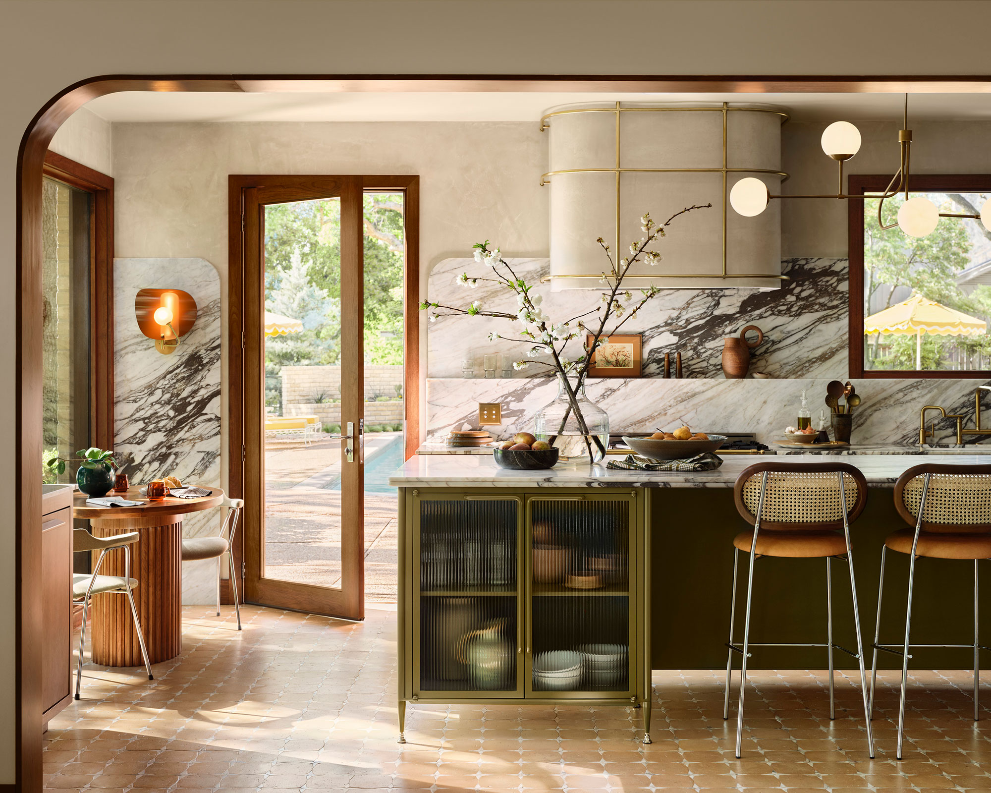
Richly-veined marble beautifully graces the kitchen backsplash, counter, and the top of an avocado green metal island
After looking at thousands of spaces over the years, I can confidently say that if one green room idea rises above all others, it’s sage. This color-shifting hue, with its subtle gray and blue undertones, feels both organic and soulful – never too vibrant, always sophisticated. It’s the shade I return to time and time again because it has the rare ability to act as both a neutral and a statement.
Patrick O’Donnell, brand ambassador for Farrow & Ball, sums it up perfectly: 'Green is a joy to use and a perennial color trend: the primary color of nature. It is the perfect color to deliver calm and serenity, and therefore has the flexibility to be applied in every room in the home, but is especially great for bedrooms and sitting rooms. It symbolizes renewal and growth.'
That calm, restorative quality is exactly why I use sage throughout the home. Whether it’s on kitchen cabinets, bedroom walls, or as a backdrop against warm neutrals, it instantly brings the outside in.
Alice Hood, senior design consultant at Roundhouse, explains the deeper connection: 'Sage green is a comforting color. Even by name alone, it evokes the thought of foraging and nourishment in the natural world, growth, renewal, and life as a whole. It brings the outside in, even in the most urban setting, and studies have been conducted to show that being surrounded by green can relax our nervous system and help us to feel calm, and in some cases, even live longer.'
Design expertise in your inbox – from inspiring decorating ideas and beautiful celebrity homes to practical gardening advice and shopping round-ups.
To me, decorating with green is not just beautiful but beneficial. It creates a grounded, cocooning atmosphere that feels especially right in fall and winter – making our homes feel safer, warmer, and more connected to nature.
2. Warm beige – the new neutral replacing gray
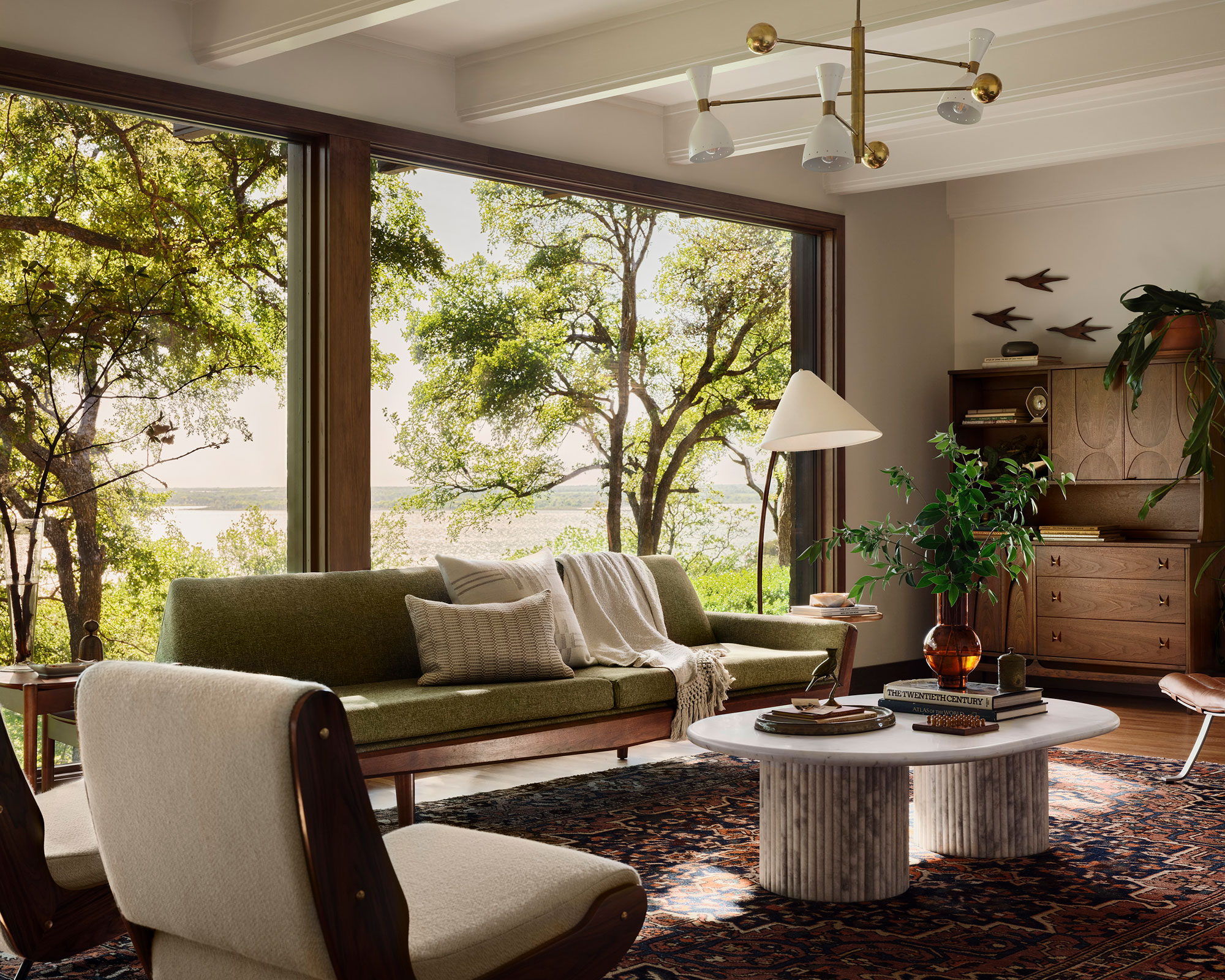
I left sterile white and cool gray behind long ago, and I love that warm beige is finally taking center stage as the leading neutral. It has all the brightness of white, but without the starkness, and it instantly makes a room feel cozy and inviting. If there’s one color replacing gray in 2025 and beyond, it’s beige – and its softer cousins like off-white, sand, and greige. These shades are endlessly versatile, pairing beautifully with just about anything.
Joanna Gaines has long been an advocate, championing beige tones in nearly every one of her Fixer Upper renovations. And it’s easy to see why: beige creates a foundation that feels timeless, natural, and forgiving, giving a room longevity without ever looking dated.
But here’s the real beauty of decorating with beige – it forces you to think beyond color and focus on texture. Interior designer Tamsin Johnson captures this perfectly: 'If I’ve got a calm color scheme, then I focus on texture to bring different layers of interest.'
This is exactly how I use beige in my own spaces. I layer contrasting materials – glossy next to matte, soft linen against raw wood, or smooth stone beside textured wool. As Tamsin notes, 'Varying glossy, shiny surfaces with matt ones adds an extra layer of texture and tactility.'
Natural finishes are especially powerful in beige rooms. 'Stone, wood, and linen can help anchor a neutral scheme so it doesn’t feel contrived or overly designed,' Tamsin adds. They bring a laid-back quality that balances beige’s sophistication with warmth.
Beige is more than a color – it’s a mood. It creates calm without being cold, timelessness without being boring, and comfort without losing elegance. That’s why it’s the neutral I return to again and again.
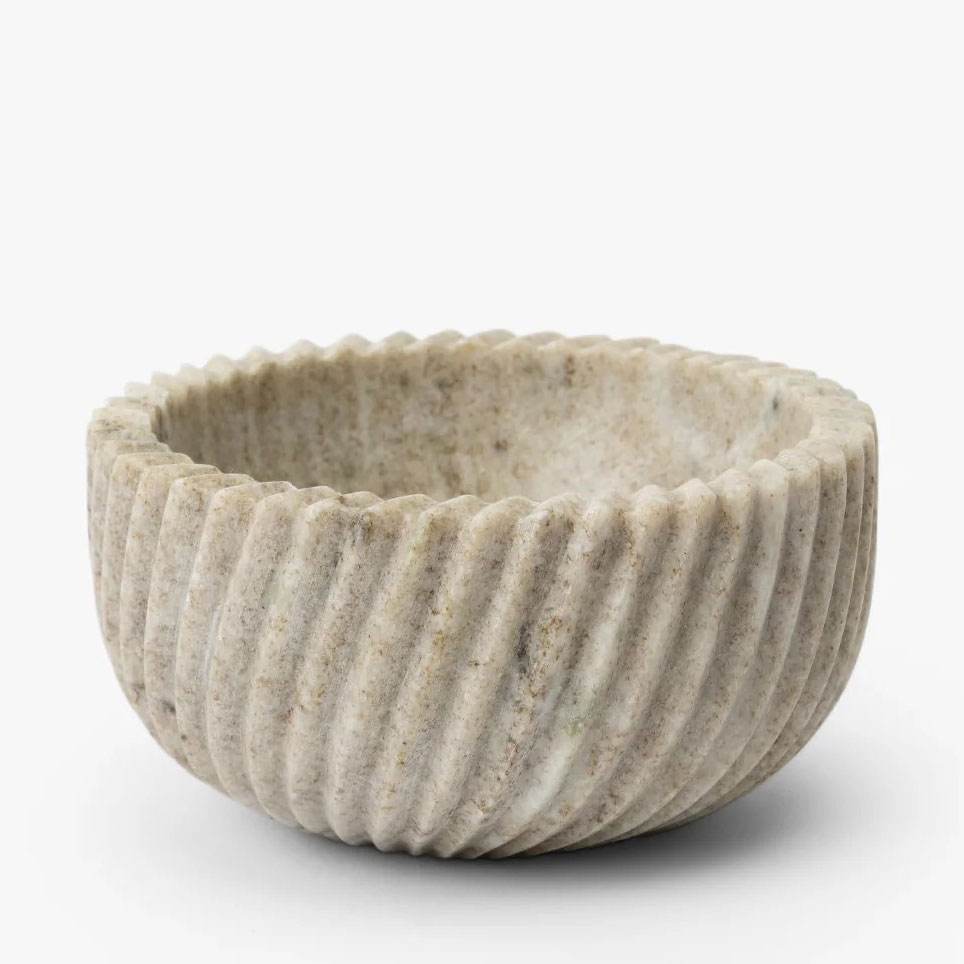
Elevate your table with the Beige Spiral Marble Serving Bowl, a striking piece crafted from smooth beige marble; its bold, sculptural design adds sophistication to any tabletop, making it perfect for serving food, displaying fruits or flowers, or simply as a decorative accent that enhances both everyday moments and special occasions.
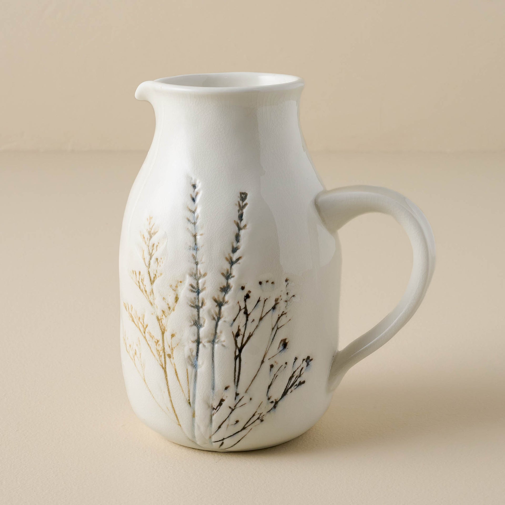
This medium-sized ceramic pitcher features delicate pressed wildflower details on neutral glazed clay, combining elegance and functionality. Ideal for serving both hot and cold beverages, it pairs beautifully with the rest of the Pressed Floral Dinnerware Collection for a cohesive, charming table setting.
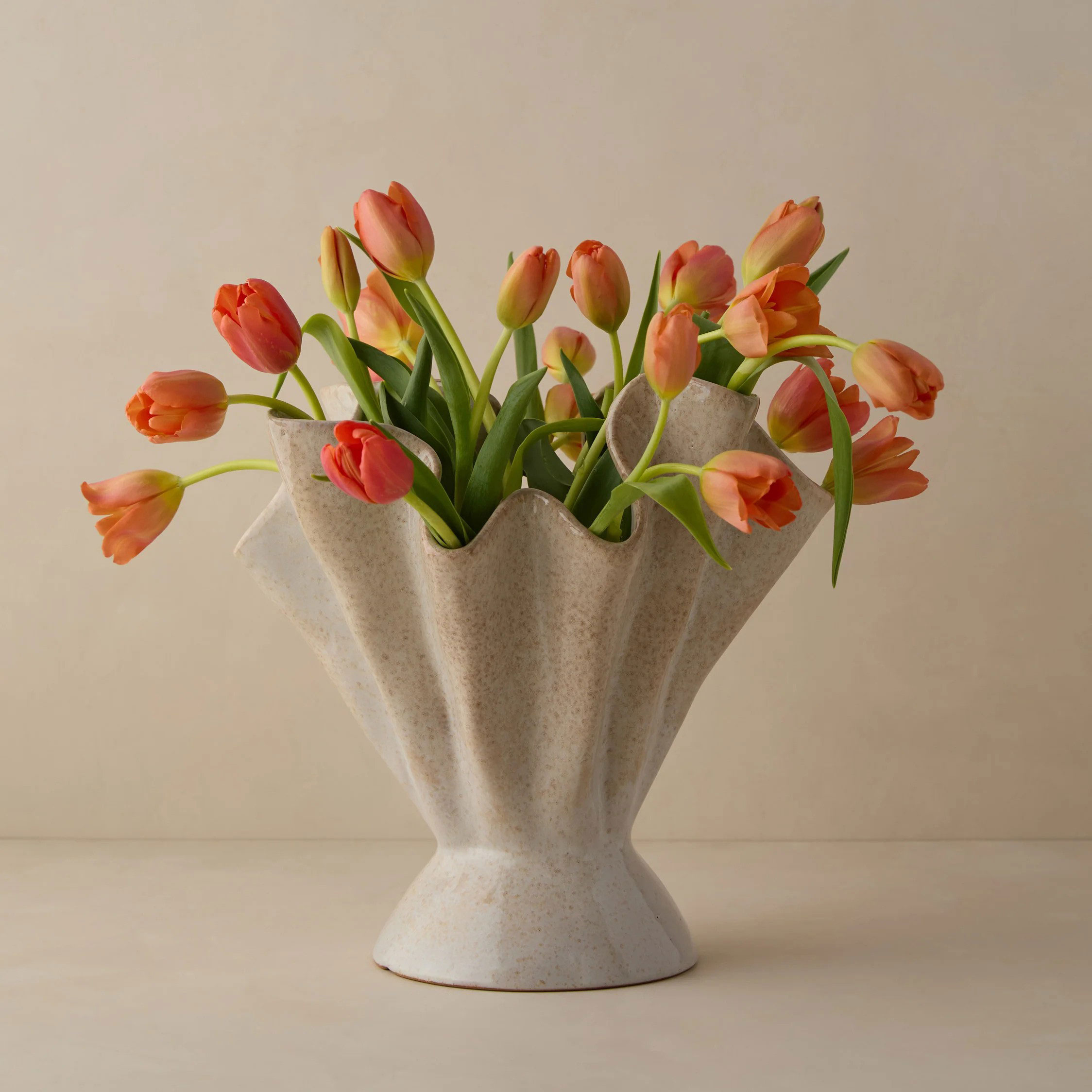
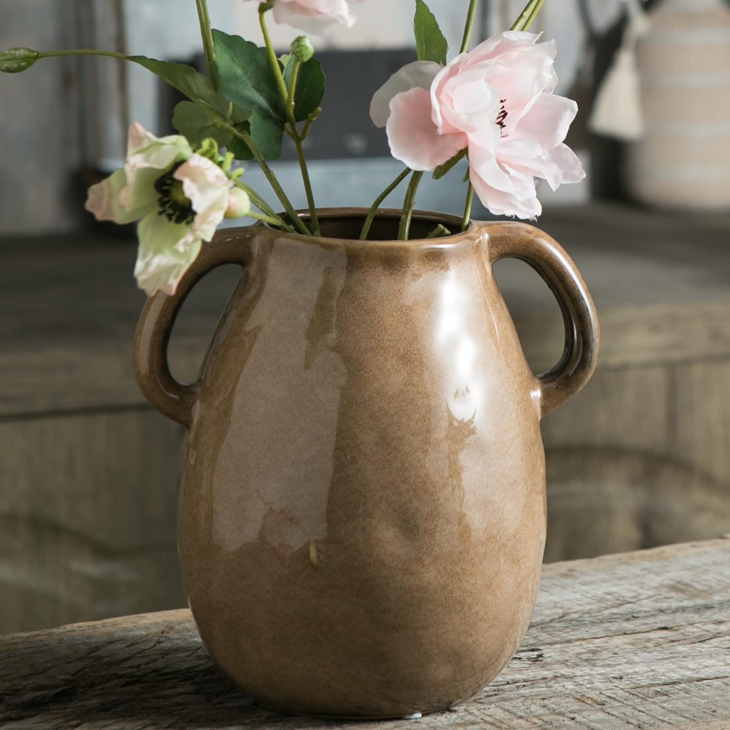
Elevate your tabletop decor with this ruffled stoneware vase, designed to add texture and dimension to any surface. Its organic, sculptural lines create a striking visual appeal, whether displayed empty or filled with fresh or dried botanicals. Each vase features a reactive glaze, ensuring a one-of-a-kind finish that makes every piece unique, adding artistry and character to your home.
3. Earthy brown – my favorite new statement
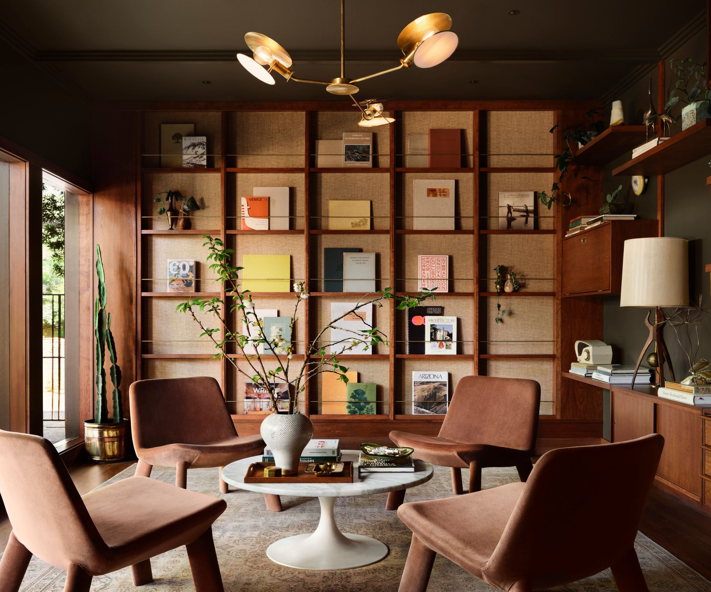
For me, earthy brown is the standout, quiet luxury color of the year. I remember the browns of the ’80s and ’90s, but today’s iteration feels completely different – grounded, elegant, and deeply sophisticated. Inspired by nature’s spectrum of taupes, chocolates, and nutmegs, it brings warmth, comfort, and richness to interiors in a way no other shade can.
What I love most is its versatility. Earthy brown is a dark neutral, which means it can be bold and dramatic when used on walls, flooring, or built-in cabinetry, yet subtle enough to let other hues shine. The key is in the contrast. I often use deep chocolate tones as a moody backdrop, then layer in reflective metals like brass or gold, or pair them with light, textured upholstery. That tension – between dark and light, glossy and matte – is what makes the scheme feel modern rather than dated.
Brown rooms are also enjoying a nostalgic revival. Once considered the 'ugly color' of the ’80s and ’90s, it fell out of favor as minimalism, white walls, and cool grays took over. But now, thanks to our renewed love of nature-inspired palettes, brown is back – and this time, it’s chic. When treated with confidence, it adds unexpected depth, elegance, and coziness.
The nuances of brown are endlessly fascinating. From velvety espresso to soft, sandy taupe, each shade brings a different mood and level of intensity. My advice? Don’t hold back. Brown works brilliantly everywhere – on walls, flooring, joinery, or even a favorite piece of furniture. Use it as a foundation, then play with sharp accents – whether brass details, rich jewel tones, or even bold primary colors. The darker the brown, the sharper the contrast, and that’s when it truly comes alive.
Decorating with brown isn’t just a color – it’s a statement. Done right, it feels timeless, grounding, and effortlessly sophisticated.
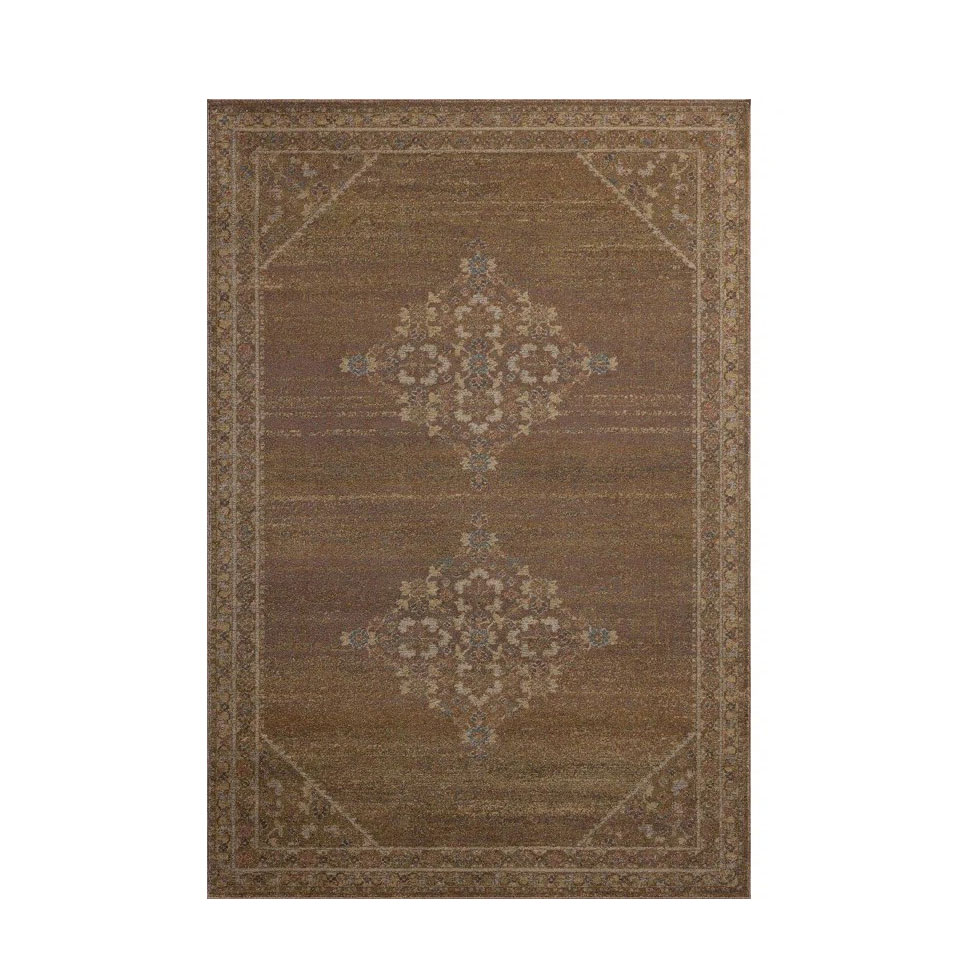
Bringing warmth and comfort underfoot, a statement rug will complete your decorating scheme. As well as being an excellent insulator, cutting down on drafts and thus reducing heating bills, they also enliven otherwise lackluster spaces and can make the most difference to the overall look of a room. If you only invest in one item this season, make it a rug.
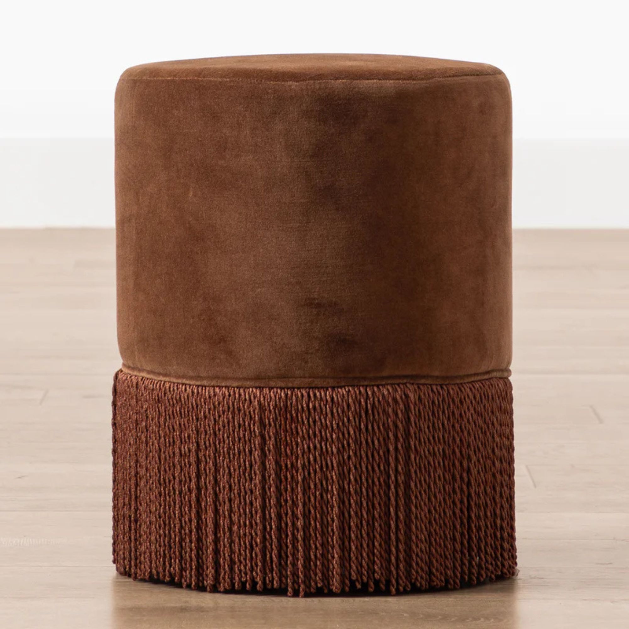
Add a touch of retro-inspired charm to your space with the Astrid Fringe Stool. Upholstered in luxurious velvet and accented with a long, playful cotton fringe, this statement piece reimagines mid-century design with a modern twist. Perfect for adding color, texture, and personality to any room, the Astrid Fringe Stool is as practical as it is eye-catching.
By combining the natural vitality of sage, the calming warmth of beige, and the rich sophistication of brown, I know you can create a home that feels safe, grounded, and beautifully designed throughout the season and for years to come.

Jennifer is the Digital Editor at Homes & Gardens, bringing years of interiors experience across the US and UK. She has worked with leading publications, blending expertise in PR, marketing, social media, commercial strategy, and e-commerce. Jennifer has covered every corner of the home – curating projects from top interior designers, sourcing celebrity properties, reviewing appliances, and delivering timely news. Now, she channels her digital skills into shaping the world’s leading interiors website.
