What’s Replacing Gray in 2026? The New, More Welcoming Neutrals Designers Are Turning to This Year
Discover the colors replacing gray in 2026 along with interior designers' go-to neutral paint shades and decorating tips

Design expertise in your inbox – from inspiring decorating ideas and beautiful celebrity homes to practical gardening advice and shopping round-ups.
You are now subscribed
Your newsletter sign-up was successful
Want to add more newsletters?
While gray was popular in the early 2000s, valued for its versatility and fresh, contemporary feel, the shade has undeniably fallen out of favor over the last decade.
Today, it often receives a cool reception from interior designers, who avoid it for fear of it feeling too cold, drab, or overused. In recent years, we’ve become increasingly focused on how interiors feel, not just how they look, prompting an evolution in the tones we choose to surround ourselves with. As a result, once-popular gray is being replaced with warmer tones that feel comforting and soothing.
There’s no denying gray will always have its place, but with the growing desire for more grounding spaces and natural hues, it seems to have taken a back seat to a spectrum of warmer neutrals. But what exactly are the shades designers are using to replace gray? In search of answers, we reached out to color experts and interior designers to explore the neutral 2026 color trends, along with their practical advice for navigating neutral palettes.
Article continues belowWhat Colors are Replacing Gray in 2026?
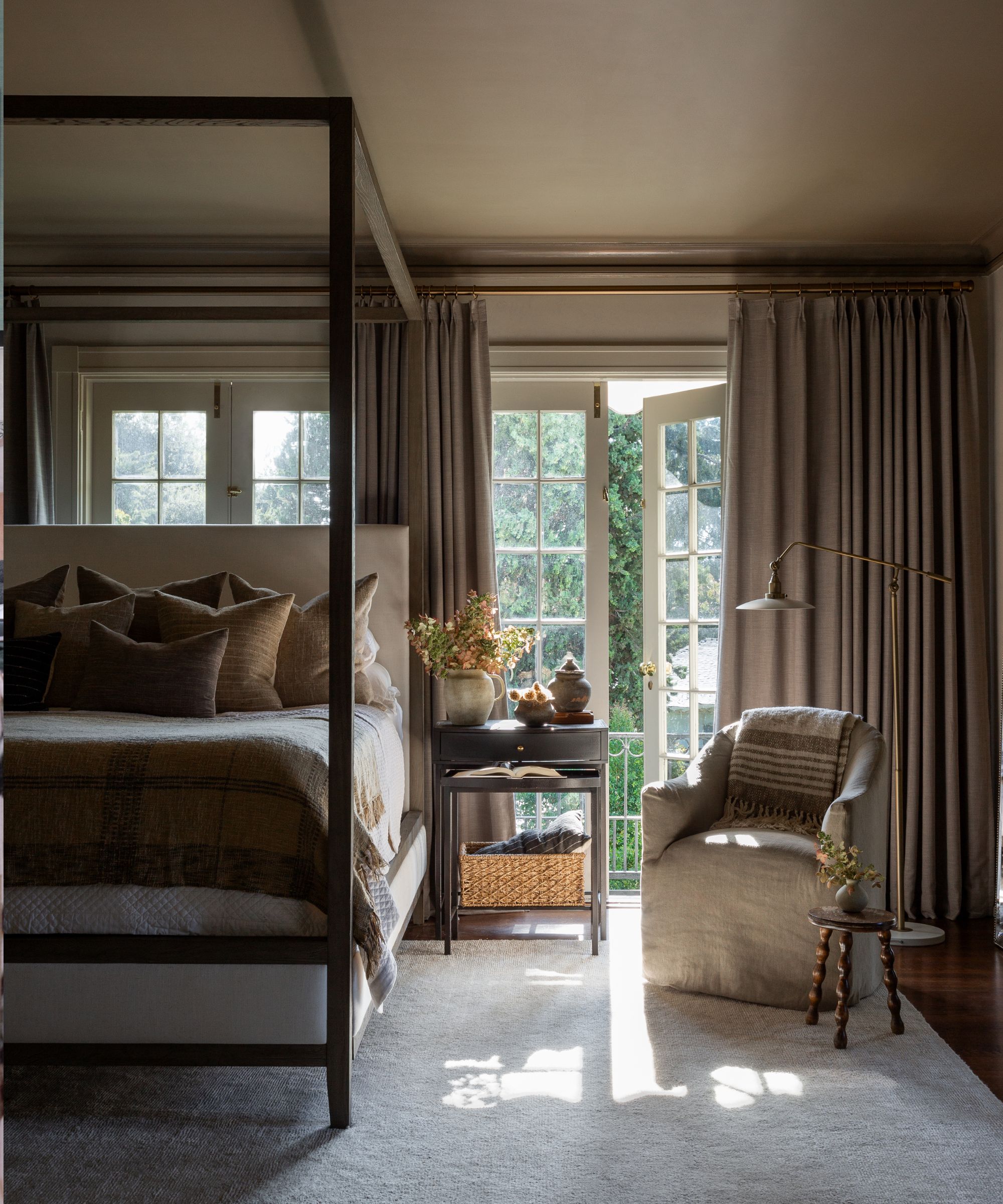
Bedroom with walls in Farrow & Ball Drop Cloth and ceiling in Mouse's Back.
Fueled by a desire to create calming, grounding, and sustainable spaces, steely, cool grays are generally being replaced with warmer neutrals such as beige, greige, taupe, and putty shades, experts say.
However, to answer this question more accurately, it’s important to understand that the world of neutrals is becoming increasingly nuanced, and the definition of what constitutes a neutral has broadened in recent years. While neutrals were once regarded simply as white, gray, and beige, we’re now becoming more attuned to the power of undertones, with paint companies offering a vast spectrum of tonal shades.
‘We’re seeing a broader shift toward warmer, more dimensional neutrals that feel comfortable and timeless. Green-leaning beiges, soft greiges, putty tones, and creamy whites are all gaining momentum as homeowners look for colors that bring warmth and softness,’ explains Emily Kantz, color marketing manager at Sherwin-Williams. ‘These shades offer the versatility people love about gray, but with a softer, more inviting, and natural feel.’
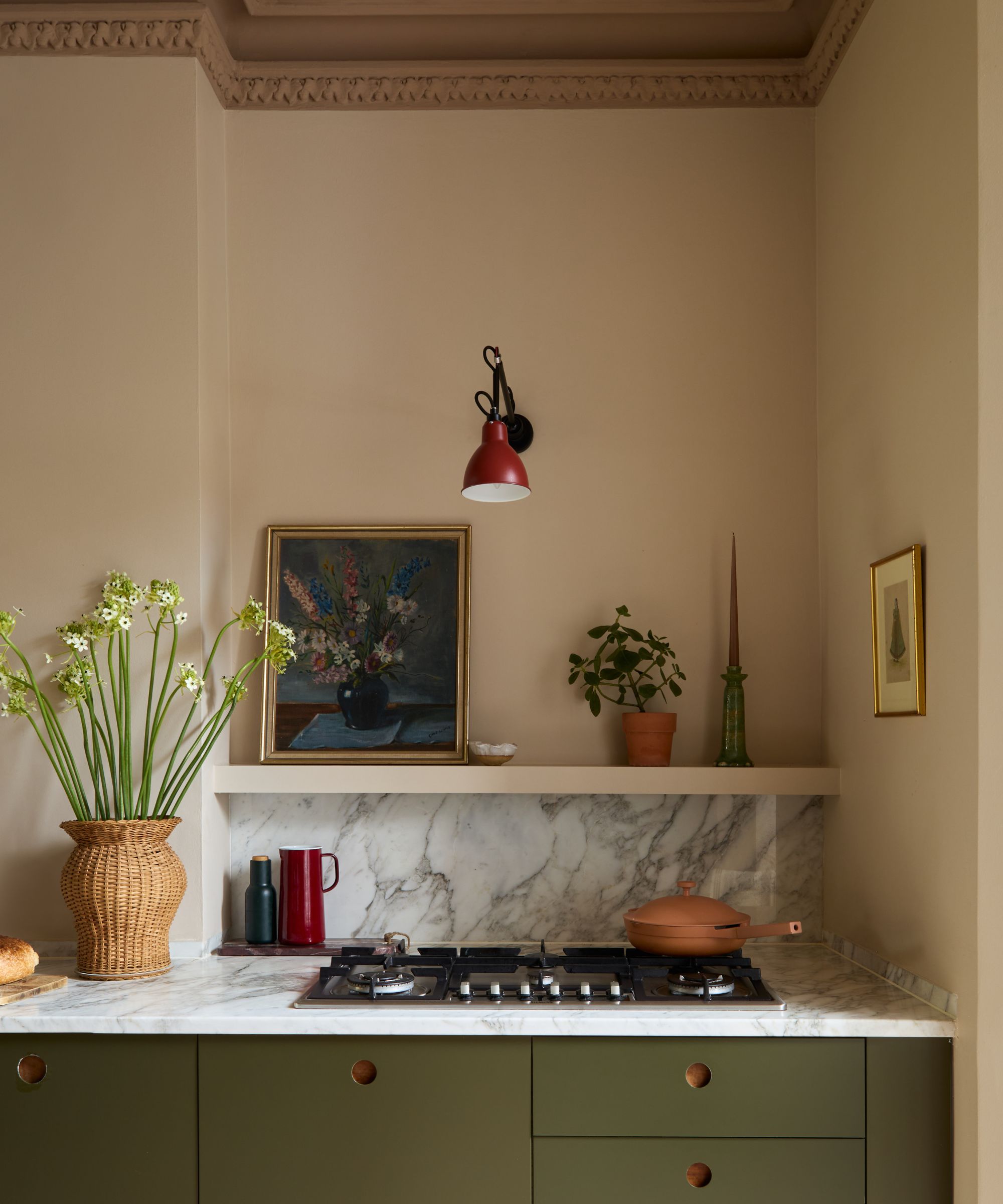
Kitchen with walls in Farrow & Ball Setting Plaster.
In addition to more traditional warm neutrals, designers are turning to soft, earthy pinks, greens, and deeper shades of caramel and brown for their ability to provide gentle foundations with a hint of color. For many designers, these shades are now regarded as ‘new neutrals.’
Design expertise in your inbox – from inspiring decorating ideas and beautiful celebrity homes to practical gardening advice and shopping round-ups.
‘As foundational elements in home design, neutrals are becoming more nuanced than ever before. Today’s neutral palette extends beyond basic beiges or grays – embracing earthy, warm, and richly complex hues. These can range from sandy, sun-washed tones to cool, moss-inspired grays, to soft mauves and in-between hues,’ explains Hannah Yeo, senior manager of color marketing at Benjamin Moore. ‘Comforting and easy to work with, these refined neutrals enhance the architecture and decor of a home, creating spaces that feel harmonious, timeless, and beautifully layered.’
If you’re looking to decorate with neutrals in 2026, you’re in the right place. With help from the experts, we’ve highlighted five key neutral tones to consider, along with some handy decorating tips.
1. Warm Whites
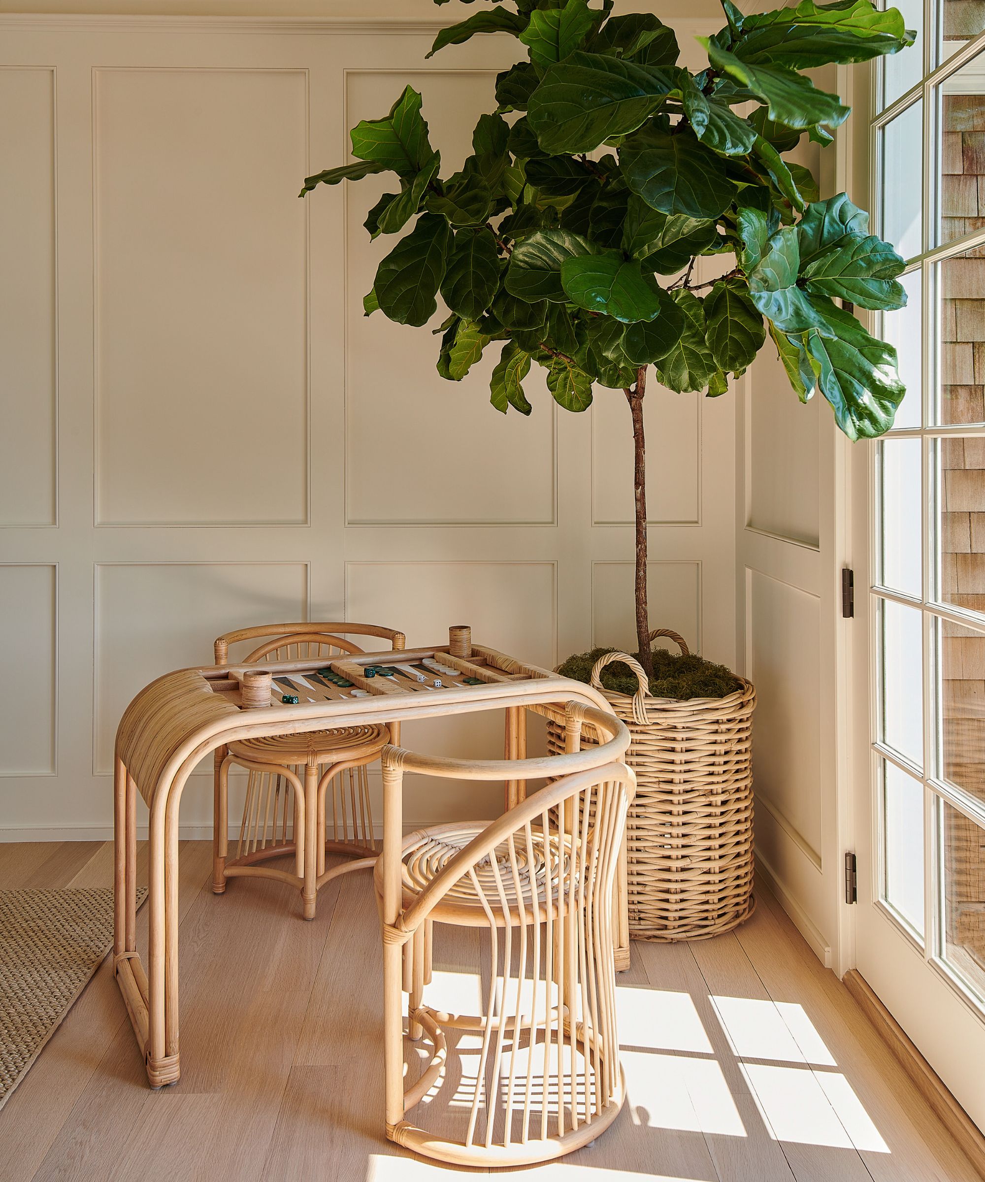
Living area with walls in Benjamin Moore's Swiss Coffee.
It may seem like an easy choice, but as any designer will attest, the world of white paint can be overwhelming. Open any color card and you’ll see a whole host of white shades to choose from, all with subtly different undertones.
Reflecting our growing desire for more comforting spaces, many designers are opting for warm-toned whites over grays to achieve a bright yet cozy feel. However, when decorating with white, many steer clear of tones with too much yellow, with those featuring brown undertones taking the lead. Benjamin Moore's Swiss Coffee is a particular favorite. ‘To many people, white paint is just white paint, but in actuality, the white paint selected can have a profound effect on a room and impact the overall ambiance,’ says Sag Harbor–based interior designer Allison Babcock.
‘Classic and creamy, Swiss Coffee from Benjamin Moore is the perfect warm white without any yellow or pink undertones. It is an ideal shade for any room in the house when you want spaces to feel light and bright, yet still evoke a sense of warmth and peace,’ explains Allison. ‘The shade is highly versatile and works with any style, from traditional to contemporary,’ she adds. ‘It really allows art and textures from accessories and decorative items to shine, including pillows, throws, and wooden features.’
2. Greige
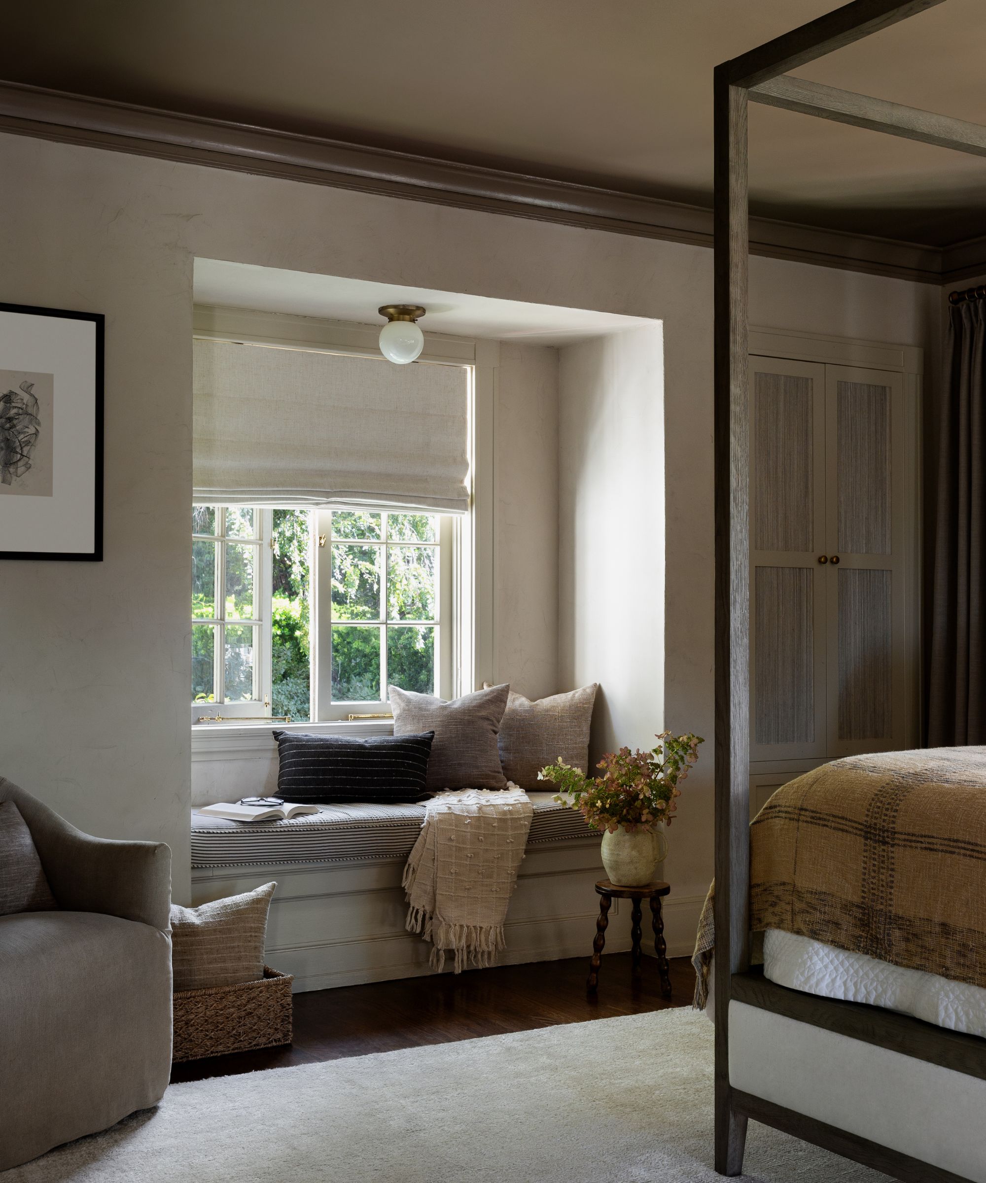
Bedroom with walls in Farrow & Ball Drop Cloth and ceiling in Mouse's Back.
While some avoid gray, fearing it is too cold, many designers still value it as a timeless neutral. As a compromise, greige – a fusion of gray and beige – continues to be a popular alternative to cooler grays. This warm paint shade is loved by designers looking for bright spaces with subtle warmth, but that don’t read too yellow.
‘Gray has not disappeared entirely, but it has evolved. Cooler, steely grays are fading in popularity, while softer, warmer grays with beige or taupe undertones remain relevant. Shades that bridge the gap between gray and beige continue to perform well because they feel balanced, flexible, and easy to live with,’ explains Emily Kantz at Sherwin-Williams.
When it comes to decorating with greige, Farrow & Ball’s Drop Cloth is a designer favorite. ‘Drop Cloth is a soft putty color that is pure perfection,’ says Alexandra Azat, founder of California-based interior design studio Plaster & Patina. When choosing neutral colors, it is important to pay attention to the undertone of the shade. ‘We love using Farrow & Ball because they are such masters of undertone.’
Here, Alexandra used Drop Cloth on the bedroom walls to create a calm atmosphere, pairing it with the deeper greige of Mouse’s Back on the ceiling to enhance the cocooning feel. ‘No matter the lighting, these shades remain strong, rich, brown-backed neutral colors. Be cautious not to choose taupes that can lean purple, red, or yellow, as this cheapens the look.’
3. Green-Toned Neutrals
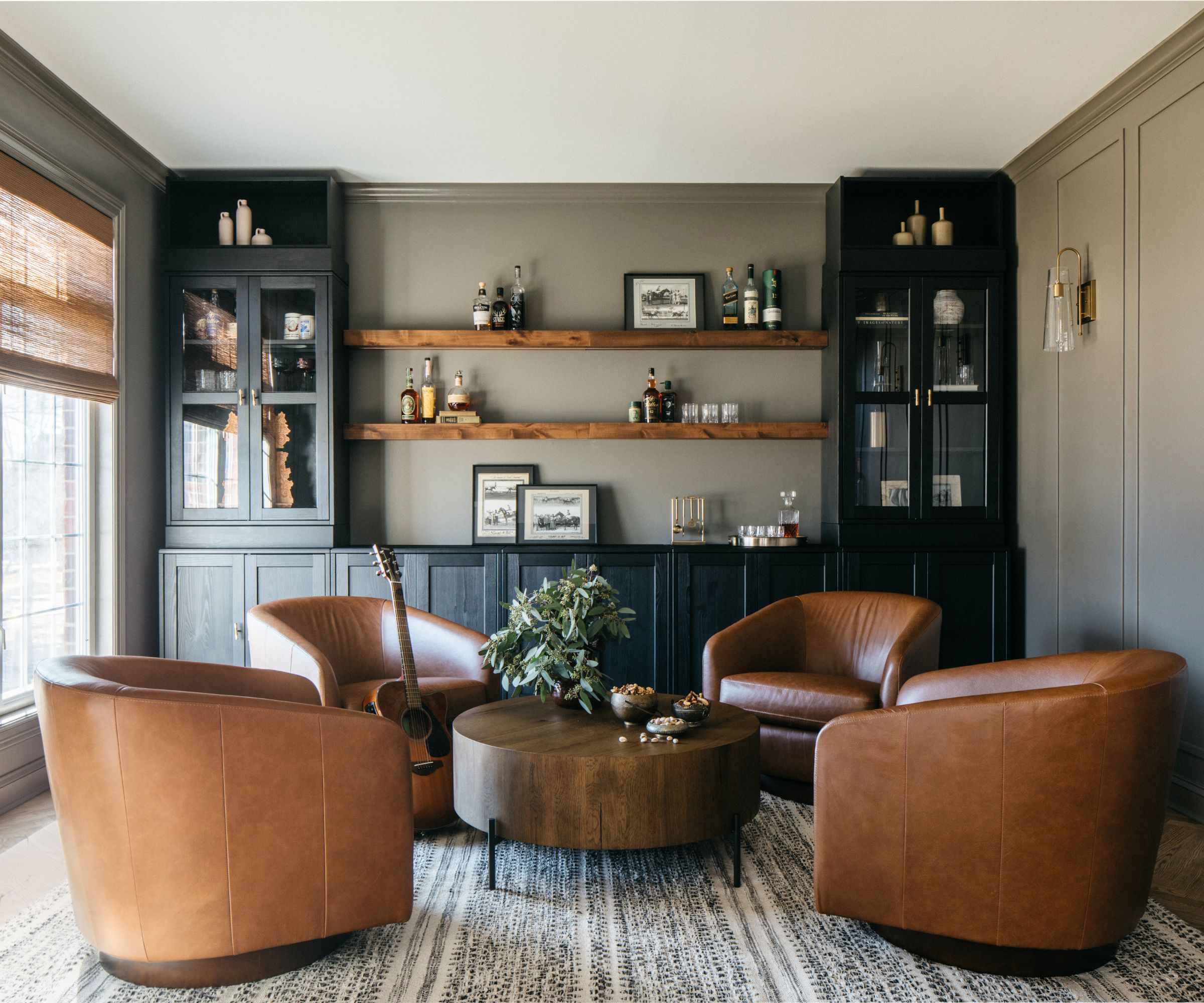
Entertaining space in Sherwin-Williams' Settlement.
Soft, earthy greens, alongside whites and beige paints with green undertones, are on the rise this year as a more calming alternative to gray. Not only are they extremely serene, but they also provide an easy backdrop for layering on-trend earthy olive greens, browns, and natural materials as part of comforting schemes. Cementing their position as a hot color trend, experts at Sherwin-Williams selected Universal Khaki – a mid-tan with green undertones – as its 2026 Color of the Year.
Although they might be in the spotlight, earthy greens and green neutrals have long been admired by designers for their versatility and soothing qualities. ‘Green-toned neutrals are proving that green is a gorgeous, fresh take on neutral. For a lighter side, we love Sherwin-Williams’ Soft Sage. It has a warmer undertone that brings calm to any space,’ says Jody Jones, founder of Blue Indigo Designs. ‘We tend to incorporate wood tones and other organic elements to really highlight the beauty of Soft Sage.’
Deeper, earthy greens and gray-greens also continue to be perennially popular and are often used in place of stormy and charcoal grays by those looking for atmospheric interiors that still feel soothing and conducive to well-being. ‘Adding a bit more drama, Settlement is quickly becoming a favorite shade. We love the sophisticated tone for a moody space – think bourbon rooms,’ says Jody. ‘Settlement invokes an almost heritage vibe with its deep saturation. We tend to pair leathers, wood tones, woven fabrics, and textured baskets to accent this gorgeous color.'
4. Soft Earthy Pinks
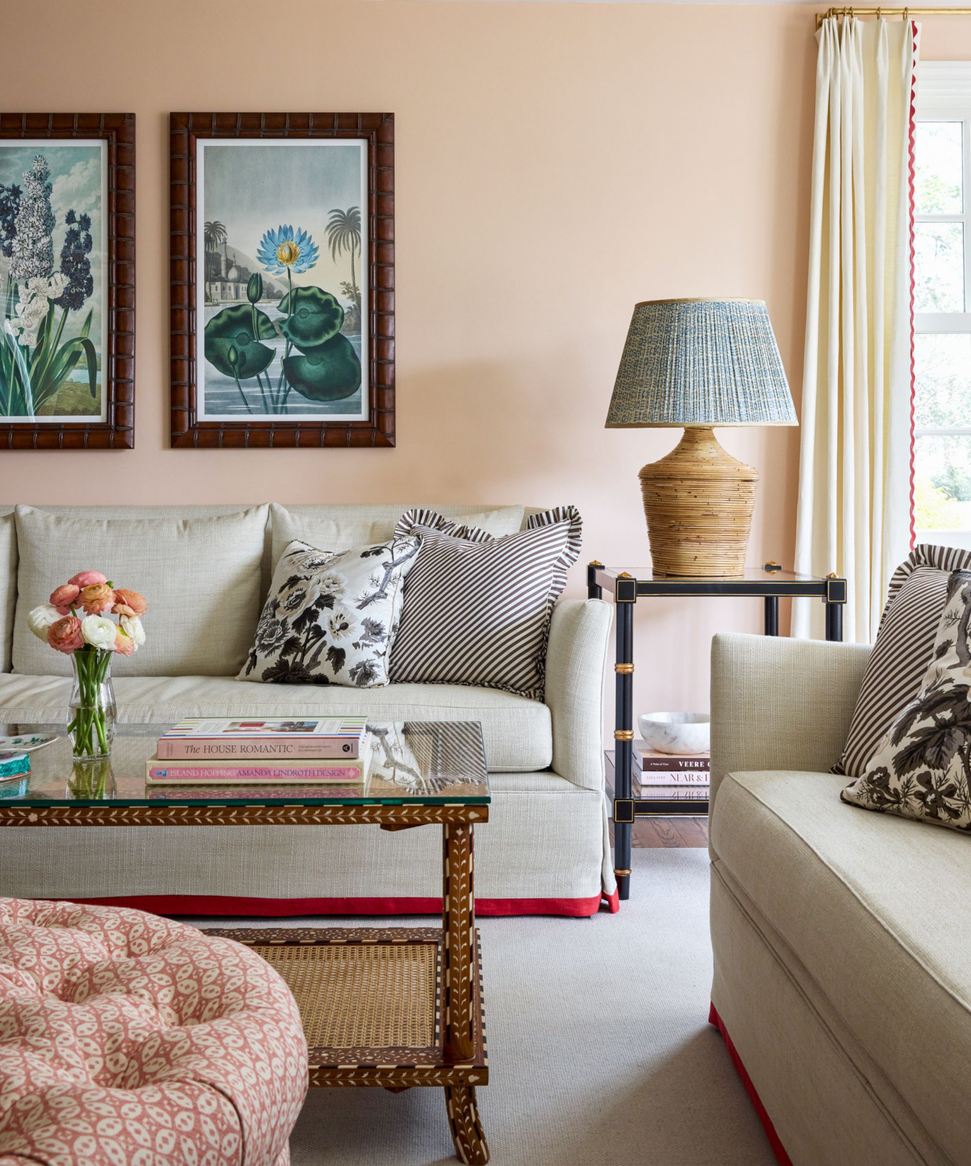
Living room painted in Aristocrat Peach by Sherwin-Williams.
When Millennial Pink stole our hearts back in the 2010s, interior designers quickly rediscovered the value of soft pink as a versatile and flattering base color for interiors. Since then, the shade has continued to evolve, and today soft, earthy pinks and pink-toned neutrals are proving popular alternatives to traditional neutrals like gray, due to their ability to bring warmth alongside a touch of feminine charm.
‘Soft muted pinks, such as Benjamin Moore's Tissue Pink, have become prominent players in today’s interior color palettes. Their warmth and versatility make it easy to incorporate into everyday spaces – whether on walls, textiles, or accessories. In recent years, soft, muted pinks have further established themselves as a gender-neutral choice, creating inviting environments that feel both modern and timeless,’ explains Hannah Yeo, senior manager, color marketing at Benjamin Moore.
Here, Rhode Island-based interior designer Alison Hammatt chose soft shell pink as the base for this characterful, timeless living room scheme. ‘The color is Aristocrat Peach by Sherwin-Williams. I chose it because we wanted warmth in the room, but not at the expense of style and character. This particular shade of pink works so well with wood antiques and patinated pieces. We love how this turned out.’
5. Brown
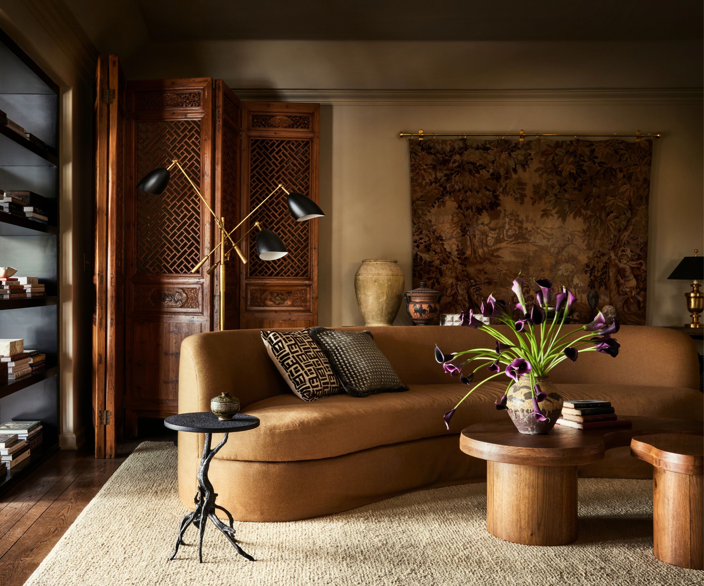
Living room painted in Dunn Edwards' Riverbed.
Venturing to the deeper end of the spectrum, for those looking for intimate and atmospheric spaces, caramel, tan, and honey shades are finding favor with interior designers, taking over from moody steely greys and charcoal.
‘The trend for rich, cocooning living spaces that bring a sense of comfort continues with a move toward the soothing power of darker and mid-tone caramels,’ explains Ruth Mottershead, creative director at Little Greene. ‘Our Sweet Treats palette shows how beautiful, brown-based hues can be used in every room. Due to their gentle nature, they are the perfect choice for bedrooms, bathrooms, and living rooms, or any space you wish to create a restful feel.’
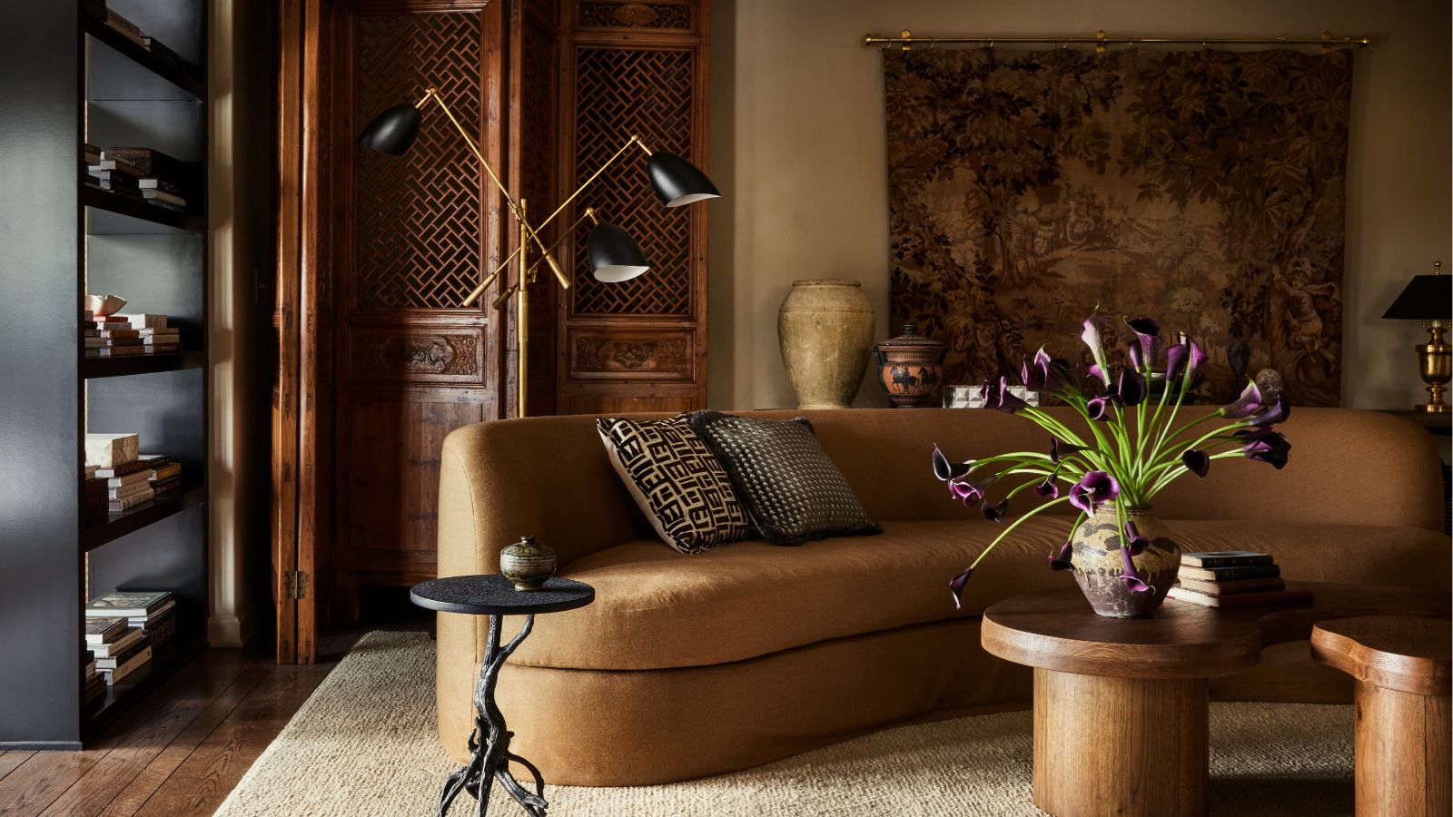
In this living room, interior designer Alexandra Azat leaned into layered tan and brown tones, pairing them with the natural materials of dark wood, textural wool, and rich woven tapestry artwork, which all help enhance the coziness and tactility of the space. ‘For this project, I chose Dunn-Edwards’ Riverbed. I just love this color, and I wanted the room to feel soft and soothing,’ explains Alexandra. ‘The sofa is in a soft Holland & Sherry tan wool – it inspired me as it reminded me of the horse blankets I used to use when I was a competitive horseback rider. I love the equestrian palette, grounded in beautiful browns.’
For those looking for warm caramel and brown paint colors, Hannah Yeo at Benjamin Moore suggests rich neutral hues like Silhouette AF-655 and Sherwood Tan 1054 for creating a comforting, inviting atmosphere. ‘These classic hues work beautifully in small accents or in full – enveloping the backdrop for a cozy space. Pair them with navy for a timeless combination and keep the space warm and welcoming with sandy neutrals, soft linens, and blush accents. Natural wood textures and tactile fabrics add a subtle dimension.’
In recent years, warm neutrals have been replacing gray as the go-to neutral shades, and this trend shows no sign of abating in 2026. Colors with brown undertones are proving popular, including warm whites, greige, earthy greens, plaster pinks, and caramel browns.
‘Designers and homeowners are looking to personalize their spaces with more nuanced neutrals spanning from soft off-whites and warm beiges to taupes, rich browns, and charcoal shades,’ explains Hannah Yeo. 'Their beauty lies in their complexity, with layered undertones that shift depending on lighting and surrounding materials. These earth-anchored colors convey a sense of permanence and reassurance – qualities that homeowners continue to seek.’
Love beautiful design ideas, expert advice, and inspiring decor trends? Sign up for our newsletter and get the latest features delivered straight to your inbox.

Pippa is a contributor to Homes & Gardens. A graduate of Art History and formerly Style Editor at Period Living, she is passionate about architecture, creating decorating content, interior styling and writing about craft and historic homes. She enjoys searching out beautiful images and the latest trends to share with the Homes & Gardens audience. A keen gardener, when she’s not writing, you’ll find her growing flowers on her yard for styling projects.