I have never painted my walls in anything but white – but Anne Hathaway's entryway color scheme has me tempted to try this timeless, yet trendy combination
An earthy pink and a deep red might just be the color pairing that tempts me away from my neutral loving ways


Design expertise in your inbox – from inspiring decorating ideas and beautiful celebrity homes to practical gardening advice and shopping round-ups.
You are now subscribed
Your newsletter sign-up was successful
Want to add more newsletters?
In my home, white walls rule. It's always been the way since I like a blank canvas to let my decor and furniture be the focus. However, this year things have shifted.
I have noticed, from designer spaces (Heidi Caillier has become my go-to for dreamy color inspiration) to the hotels and restaurants I have been to this year (I just got back from a stay in Beata Heuman's Hotel de la Boetie in Paris and stayed in a dark blue color-drenched space), more exciting things are happening with color. Rooms are drenched in deep reds, skirting painted in vivid greens, ceilings plastered in blue limewash.
Among this exciting movement in color trends, my white walls are starting to look a bit sad. So when I saw Anne Hathaway's two-tone entryway, I had found the color inspiration I needed.
Article continues belowA blush pink, paired with a deep burgundy, is just about safe enough for this color-phobe, but still creates that wonderful, colorful, cozy space that's been on my mind for months.
A post shared by Studio Shamshiri (@studioshamshiri)
A photo posted by on
Designed by Studio Shamshiri, Anne Hathaway's entryway is warm and welcoming. The color combination of pink and burgundy feels right on trend for 2025, but these shades are also timeless – the earthy undertones making them feel more traditional than trendy. They also create a nice balance in the room, the pink leaning sweet and feminine, and then the burgundy grounds the paler color to prevent it from becoming too saccharine.
While I do love the look of a color-drenched room, especially one that's totally in a rich burgundy, I am not quite ready to commit to the look yet. This two-tone space makes using a deeper color more approachable, keeping the space light and open while also embracing a moodier hue. This two-tone look can work really well in smaller spaces too, as it will guide the eye upwards, making the space feel loftier.
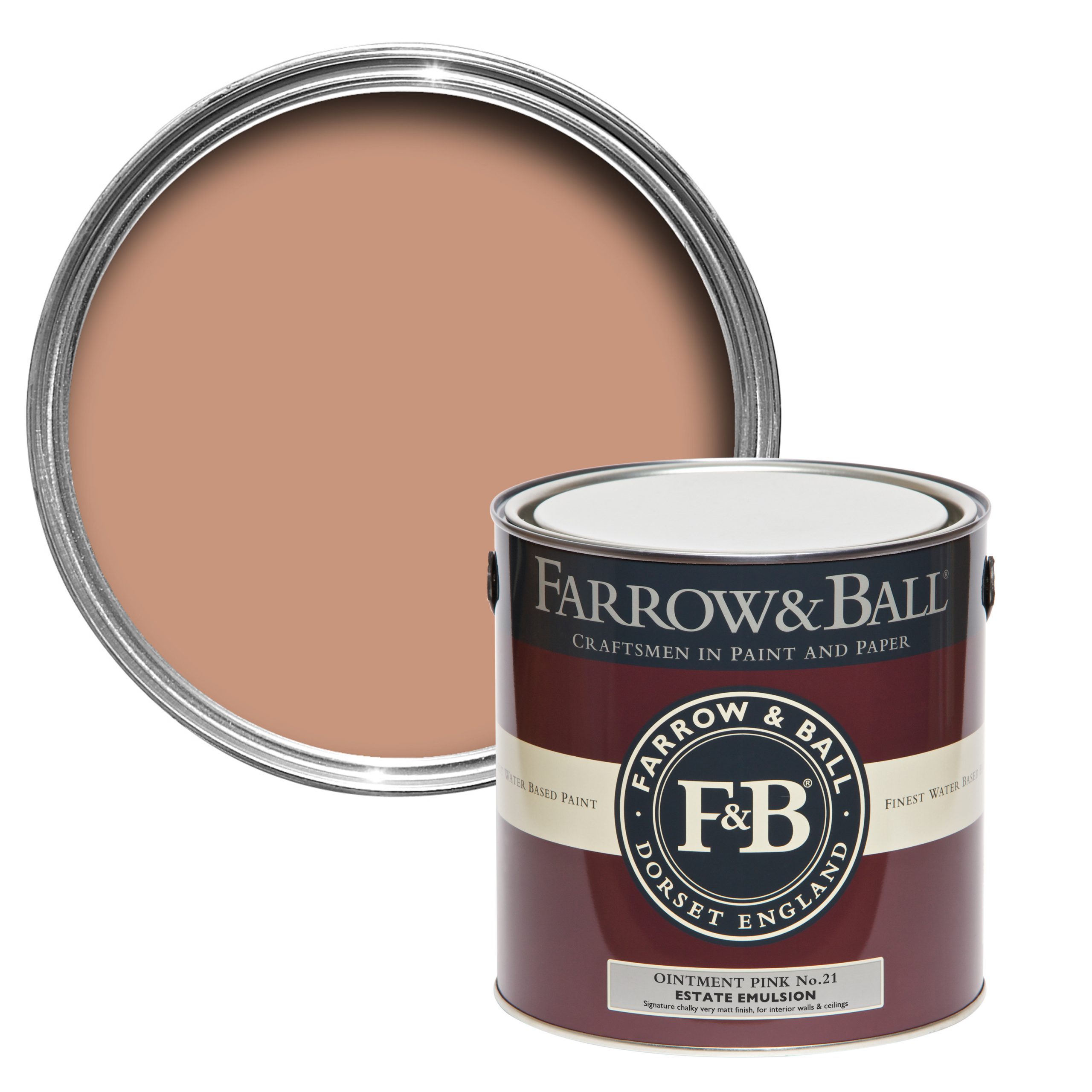
In terms of paint colors to recreate the look, I am testing out a few samples to recreate a similar look in my own bedroom. Inspired by Hathaway's entryway, I want to take a slightly cozier look, taking the burgundy up the walls and going for an earthy pink on the ceiling. For the deep hue, I would recommend Farrow & Ball's Etruscan Red, and for the pink, I am going slightly more orange-toned with Ointment Pink.
Design expertise in your inbox – from inspiring decorating ideas and beautiful celebrity homes to practical gardening advice and shopping round-ups.
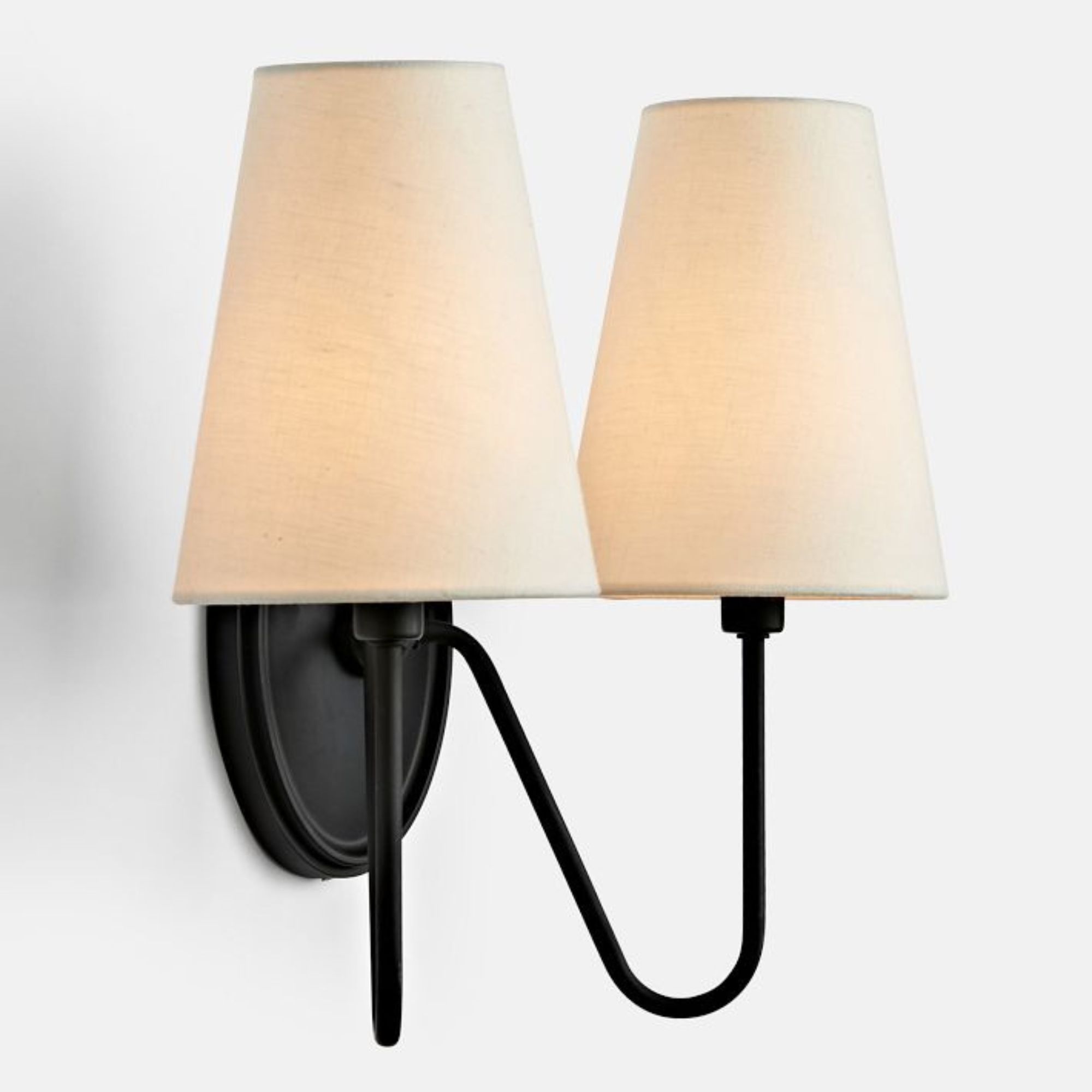
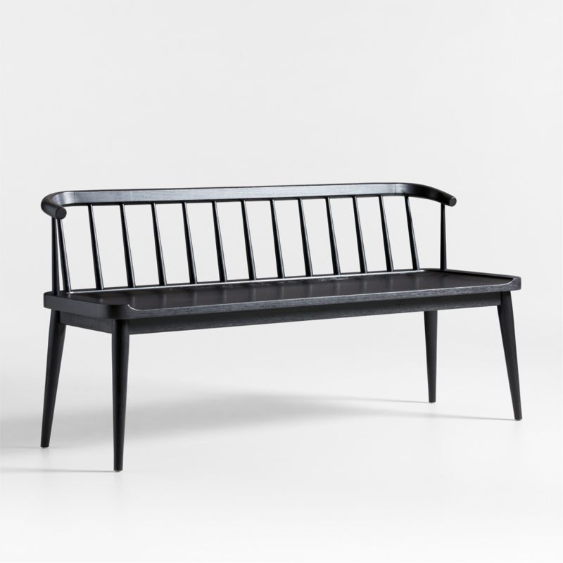
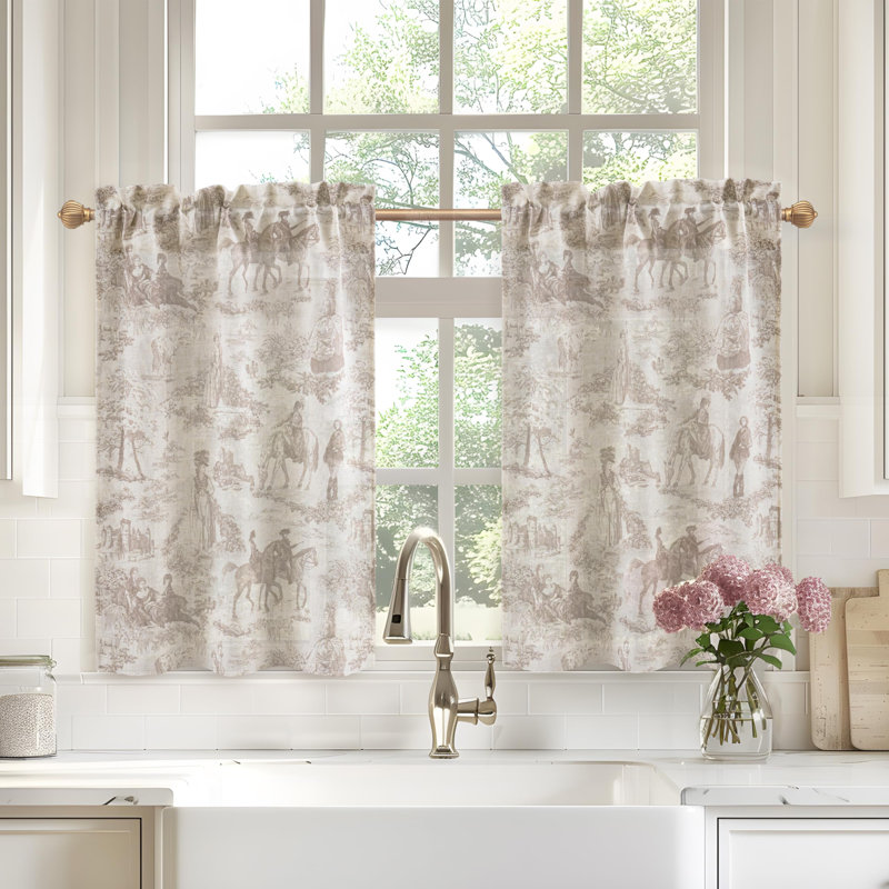
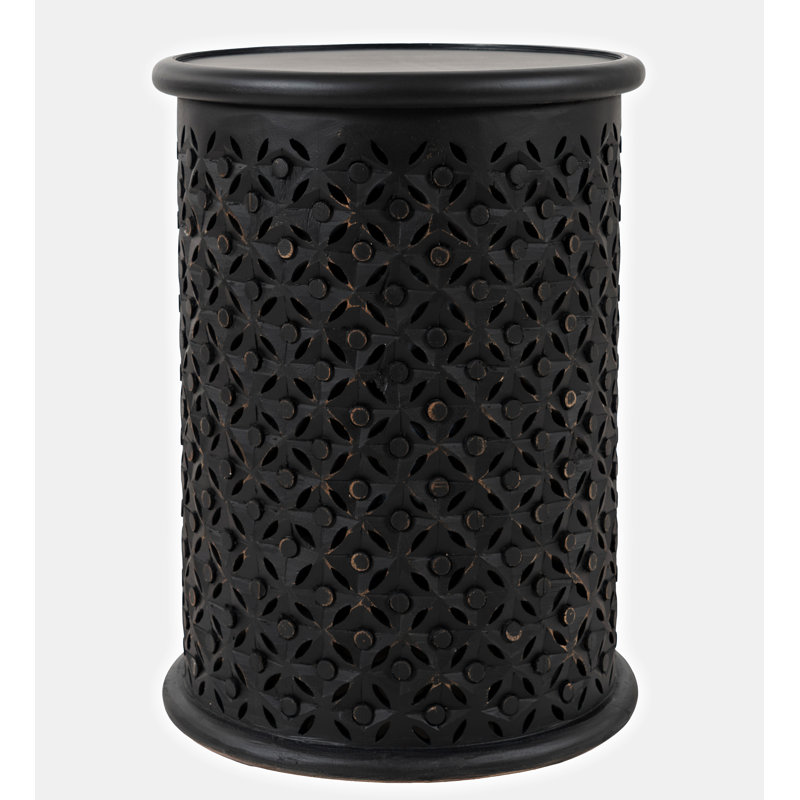
Shop the entryway edit
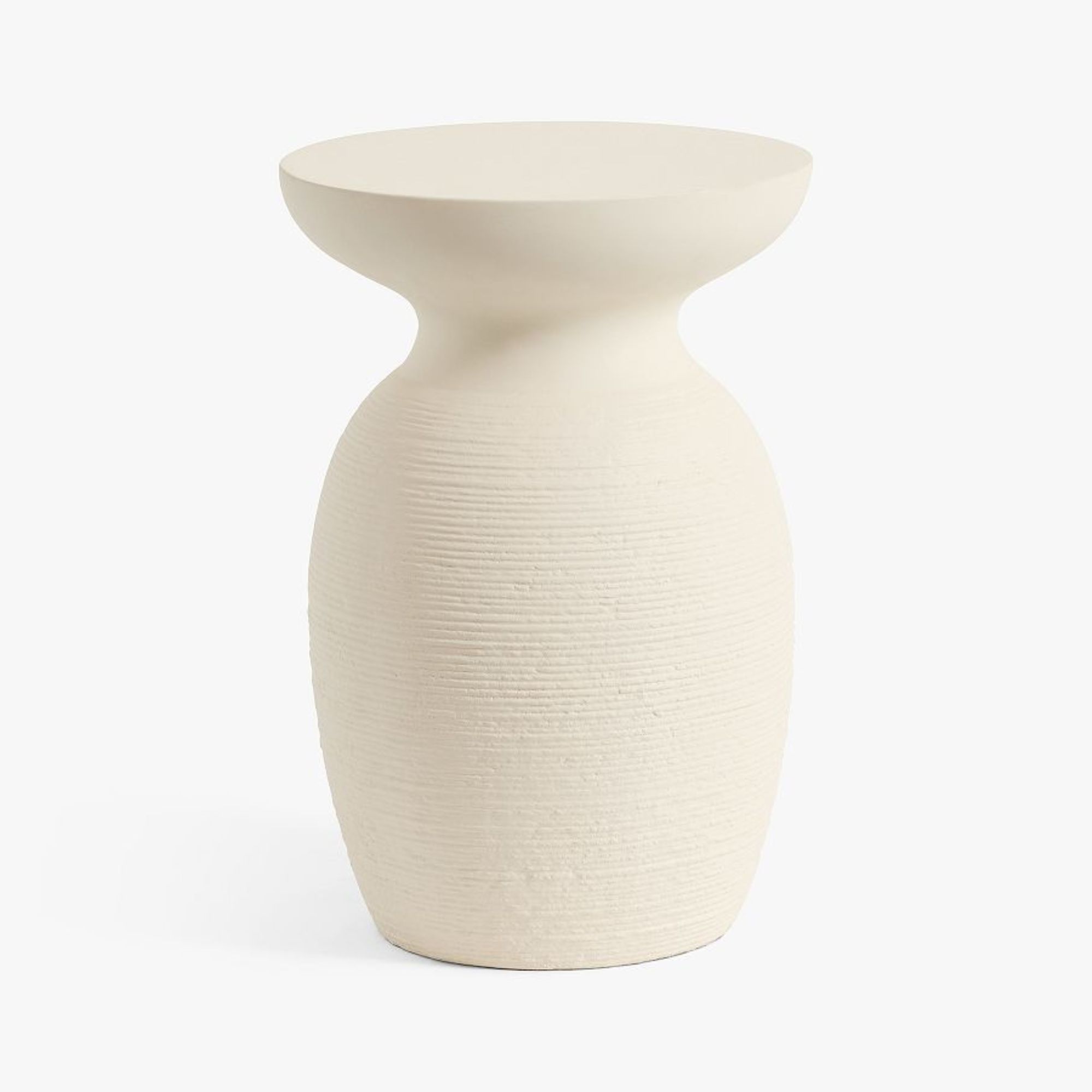
Adding a small surface space to an entryway allows you a spot to create vignettes and a style moment in this busy area. This one is small enough to add flowers and a trinket tray, but not so bulky that it's going to take up too much valuable floor space.

Jennifer is the Digital Editor at Homes & Gardens, bringing years of interiors experience across the US and UK. She has worked with leading publications, blending expertise in PR, marketing, social media, commercial strategy, and e-commerce. Jennifer has covered every corner of the home – curating projects from top interior designers, sourcing celebrity properties, reviewing appliances, and delivering timely news. Now, she channels her digital skills into shaping the world’s leading interiors website.
