This 1920s Farmhouse Was Remodeled One Too Many Times – Until a Thoughtful Renovation Finally Brought It Back to Life
The homeowners, a renowned cook and a coffee enthusiast, wanted a home that reflected their love of good food and good company

Design expertise in your inbox – from inspiring decorating ideas and beautiful celebrity homes to practical gardening advice and shopping round-ups.
You are now subscribed
Your newsletter sign-up was successful
Want to add more newsletters?
When you take on a farmhouse built in the 1920s, you might expect to find original features and unique charm in abundance. However, when the homeowners began this renovation, the house had been remodeled one – or two, or three – too many times over the decades, leaving it with dated features and an unworkable layout.
The owners, renowned cook and food writer Lisa Samuel and her husband, Elie, wanted to take the house design back to its roots, while also putting their own stamp on the property. They brought in designer Lisa Staton to take on the challenge.
The brief was to design spaces that didn’t feel too ‘new’ – not overly curated and more in keeping with the age of the home. Lisa and Elie loved classic British style, which became a major influence on the overall aesthetic. ‘Clean and elegant, with nods to British design and more traditional East Coast moments,’ is how Lisa Staton describes the look. ‘We were actually working on the house when the network TV show about deVOL Kitchens, For the Love of Kitchens, came out, and we were very much influenced by it.’
Article continues below 
'The clients wanted to find a property in the South Hill neighborhood of Bellingham, WA, which is 90 miles north of Seattle, WA, just below the Canadian border and Vancouver, BC. It’s a college town that looks out over a bay,' explains Lisa.
'They were after a property with a view of the bay and a generous yard and garden, which is harder to come by within the city limits. This house dates back to the 1900s but had been renovated many times, much of it feeling very dated, and the layout was awkward and failed to take advantage of the view. The extensive renovation didn’t actually add square footage to the house, but it completely flipped the layout of all the rooms, entailing a full gut renovation.'
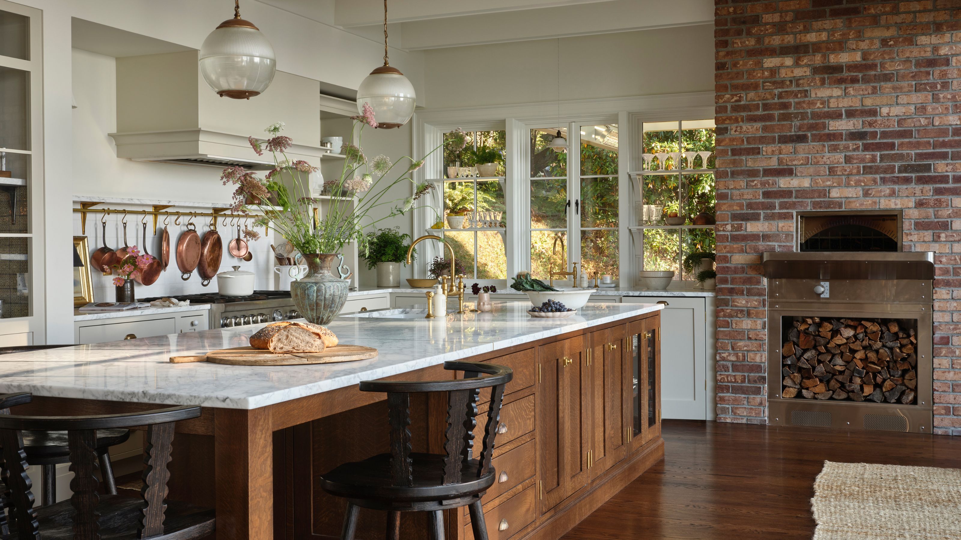
The kitchen was, of course, one of the most important rooms. With the homeowners being both a cook and a coffee enthusiast, it really needed to be the heart of the home – a social, open-plan space perfect for cooking, hosting, and making the best cup of coffee.
The layout of the home was one of the biggest changes. Originally, the kitchen was on the opposite side of the house, but it was switched to make the most of the beautiful views. Along with the kitchen, the dining room was also relocated and is now connected through a glass-paneled coffee station.
Design expertise in your inbox – from inspiring decorating ideas and beautiful celebrity homes to practical gardening advice and shopping round-ups.
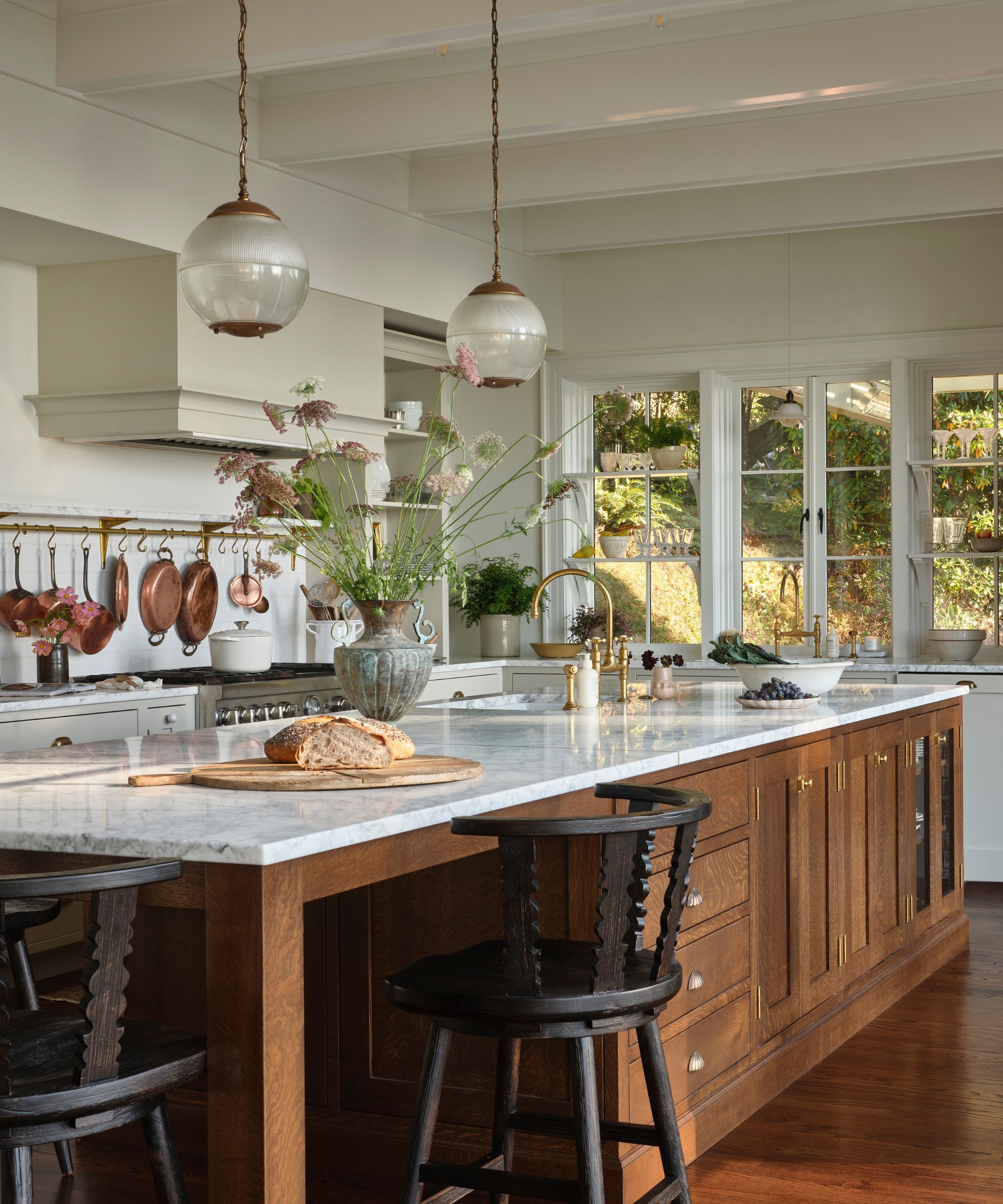
'Lisa is a celebrated cook and cookbook author, and her husband, Elie, has a passion for coffee roasting, good food, and good company,' explains Lisa. 'Allowing for a large, generous kitchen was a must, as was a dedicated coffee bar area.'
'A pizza oven, a kitchen island with ample seating, and a dedicated pantry were also must-haves. Lastly, taking advantage of the generous views of Bellingham Bay was a priority, which necessitated flipping the kitchen to this side of the house as part of the larger renovation.'
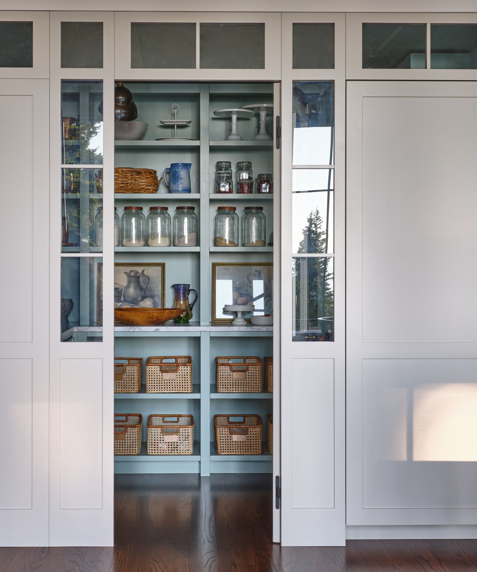
A great cook needs a great pantry. To complement the blues used in the adjoining dining room, Lisa chose a sky blue to color-drench the inside of the pantry. She explains that, ‘The blues and greens were colors the client gravitated toward – and they are also in harmony with the Pacific Northwest landscape surrounding the house.’
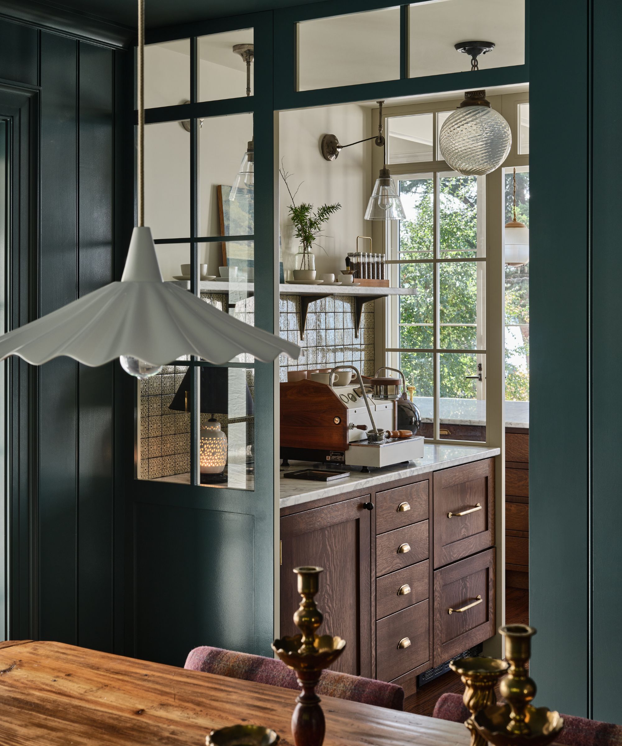
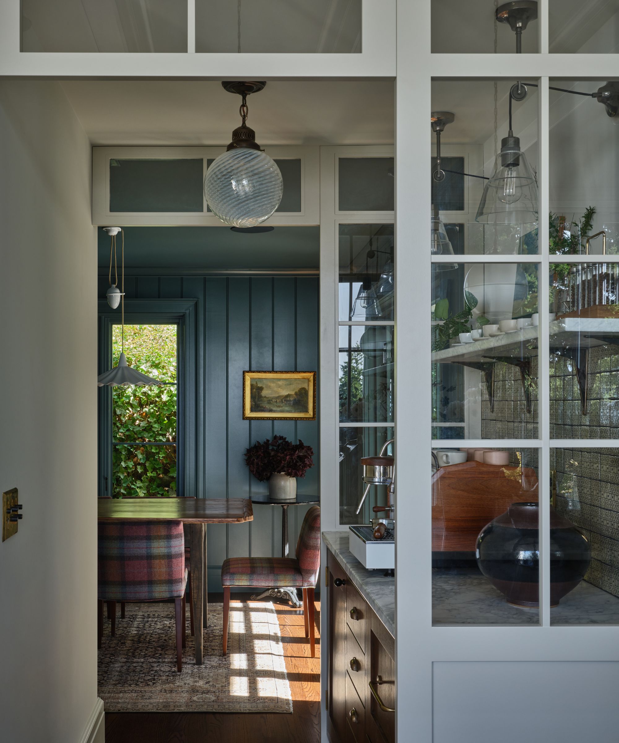
One of the main reasons for moving the main living spaces to this side of the house was to make the most of the light. Rather than blocking it as the kitchen flows into the dining room, a dedicated coffee station sits between the two, allowing light to pass through while also creating a mini zone for serving drinks and for Elie to roast coffee.
Lisa notes she wanted the dining room to be a place to ‘retreat to,’ to ‘feel like a destination unto itself.’ The shift from the light hues of the kitchen into the cozy darkness of the inky teal–clad dining room is certainly noticeable. It draws you in, and despite being so connected to the kitchen, it is a contrasting space with a very different, moodier character.
Upstairs, the layout was just as awkward and, again, didn’t make the most of the aspect of the house. Just as with the kitchen, Lisa reconfigured the second floor so the primary suite had those same wonderful views and natural light.
'We wanted to focus on the view and find a way to accommodate a primary closet, bedroom, and bathroom with both a tub and a shower' Lisa explains. 'You’ll see the primary sink has windows looking out, with mirrors off to the sides so as not to block the view, and generous storage cabinets flanking it.'
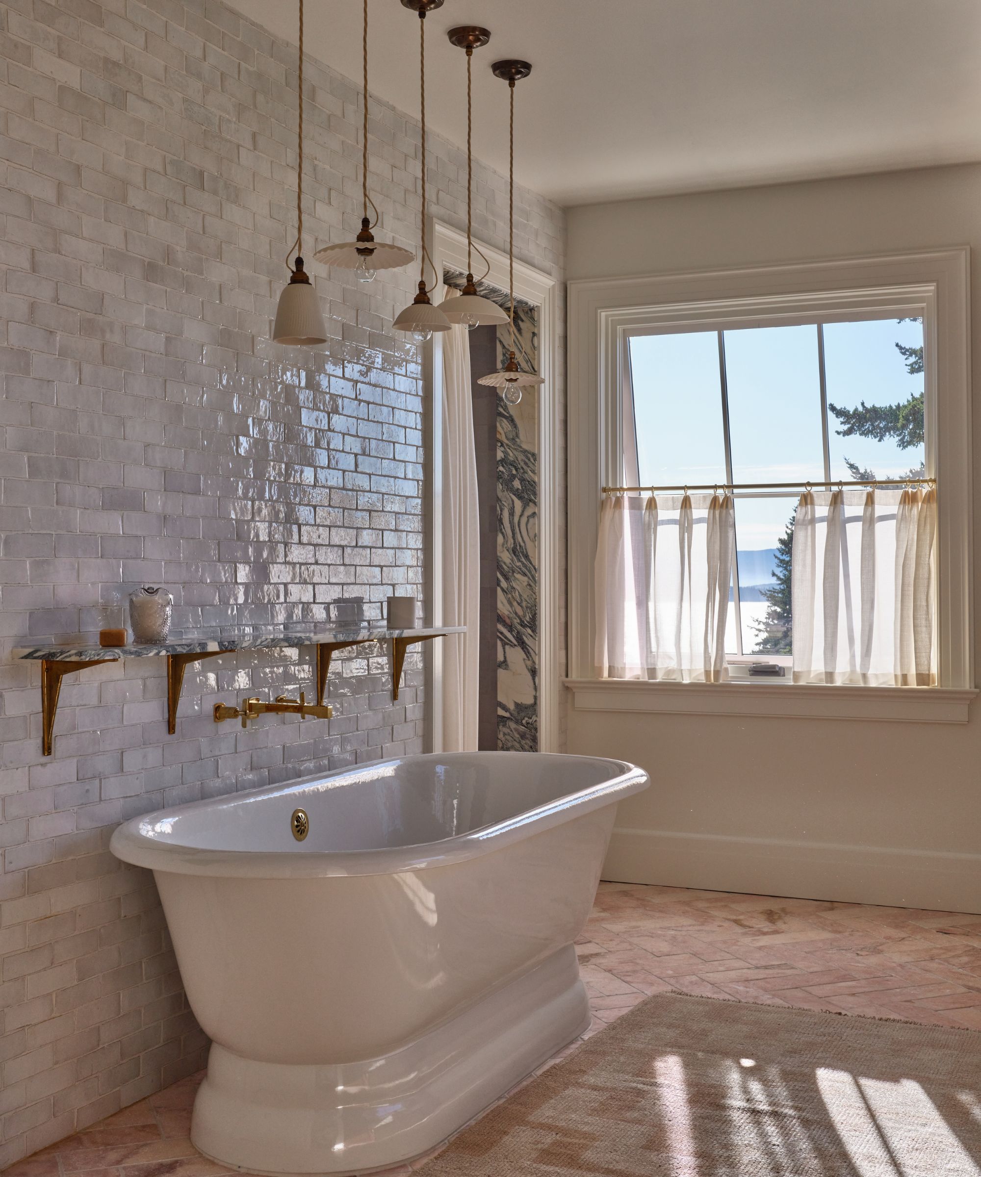
The primary bathroom was one of Lisa's favorite spaces to remodel. The previous space was dark, with small windows and bulky, visually heavy features. Now the space is filled with light, elegant yet textured, with a wall of zellige tiles mixing with the dramatic marble vanity, tumbled marble brick-like flooring, and wooden cabinets.
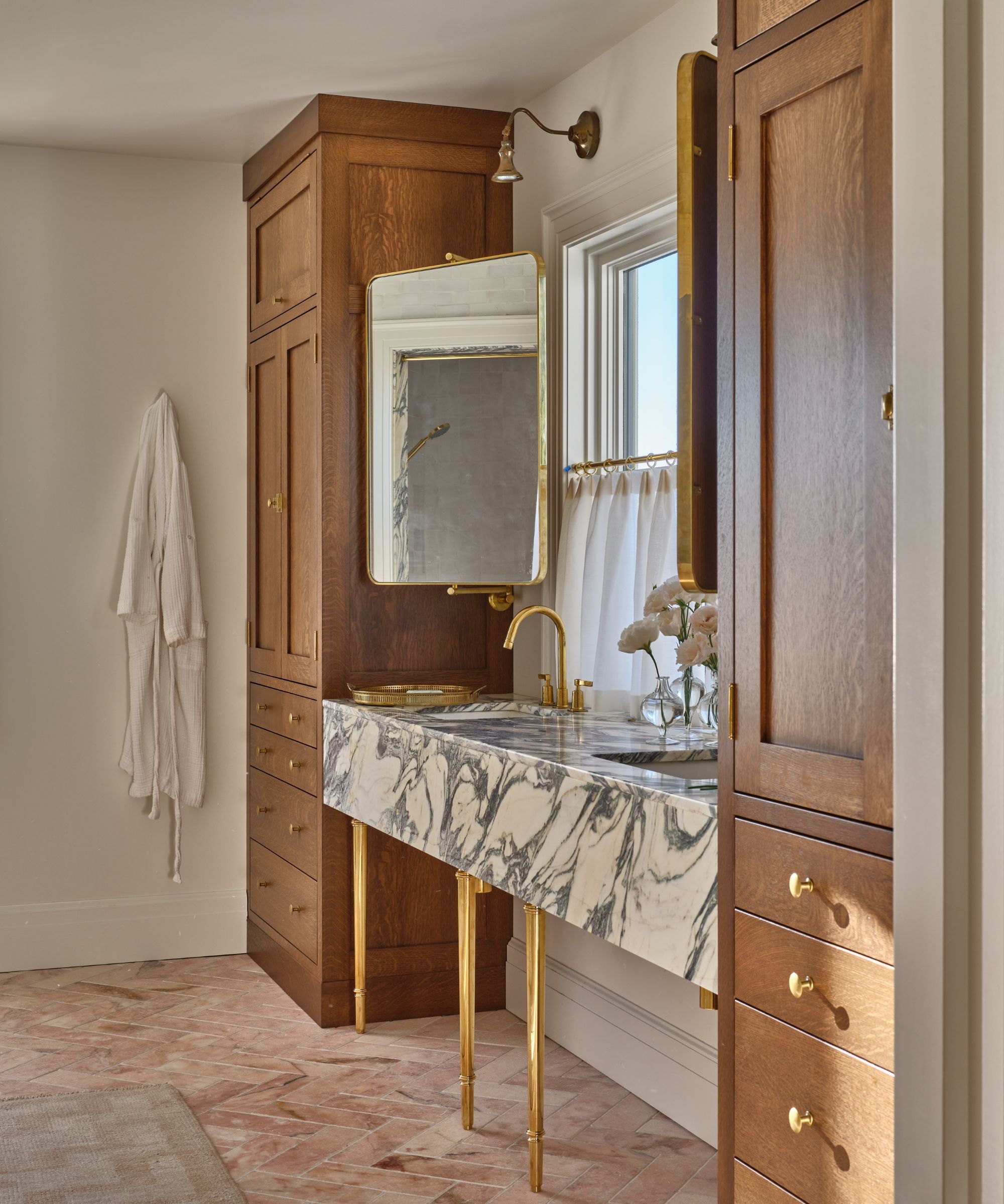
'When our clients purchased this house, they knew that to get the home functioning well for themselves and to have the correct rooms taking advantage of the views, a large renovation effectively swapping spaces would need to be done,' she explains. 'The bathroom and primary suite are among my favorite spaces because we were able to include a freestanding bathtub, windows with mirrors off to the side at the vanity to maximize the view, and a great combination of finishes – stained walnut, a gutsy marble, and beautiful zellige tile work.'
Much like in the kitchen dining space below, the spaces within the main suite are all connected and effortlessly flow from one room to another. Water glass leaded custom doors separate the bedroom from the bathroom and the closet (which similar to the coffee station in the kitchen acts like a walkway from bath to bed).
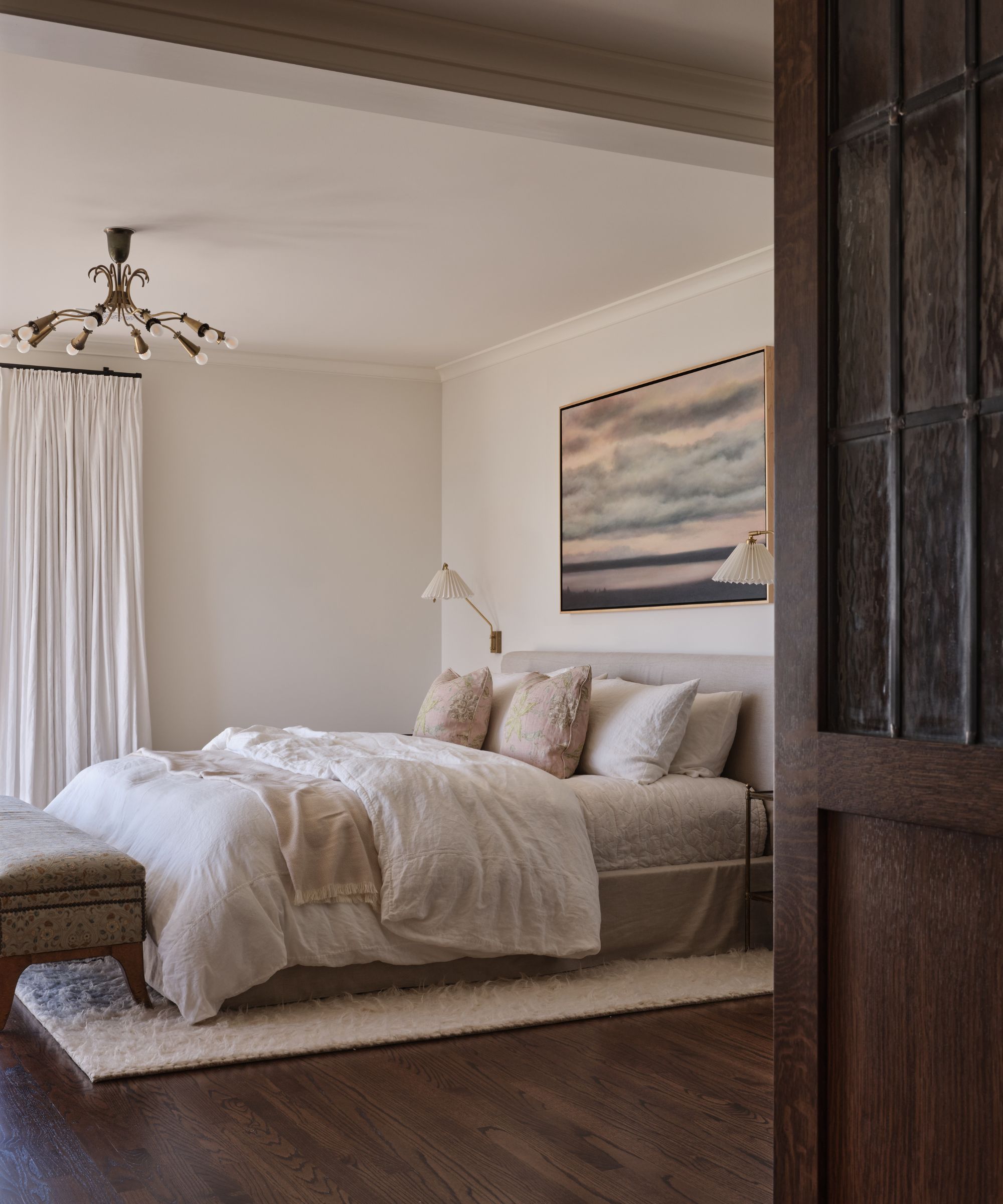
‘The clients were very involved throughout the process, so it wasn’t a “reveal” moment at the end. But I was recently at the house for brunch, and it lives so beautifully!’ explains Lisa.
Unlike many renovation projects, this one did not technically add any square footage to the property. The intention wasn’t necessarily to expand the space – but to reconfigure it, bringing it closer to the home’s original layout and making it work for a modern family.

I am the Head of Interiors at Homes & Gardens. I started off in the world of journalism in fashion and luxury travel and then landed my first interiors role at Real Homes and have been in the world of interior design ever since. Prior to my role at H&G I was the digital editor at Livingetc, from which I took a sabbatical to travel in my self-converted van (not as glamorous as decorating a home, but very satisfying). A year later, and with lots of technical DIY lessons learned I am back to writing and editing, sometimes even from the comfort of my home on wheels.