What colors should you never pair with red? 7 shades to avoid combining with the year's hottest color trend
Red might be the unexpected color of 2024, but there are shades it doesn't pair well with. We asked designers and colors experts what colors to avoid pairing with red

Design expertise in your inbox – from inspiring decorating ideas and beautiful celebrity homes to practical gardening advice and shopping round-ups.
You are now subscribed
Your newsletter sign-up was successful
Want to add more newsletters?
Red has been the color of 2024 so far. When the unexpected red theory was coined back at the start of the year, homeowners and designers alike fell back in love with this once considered too-bold, too-daring shade and we all saw a subtle, more liveable side to the color.
But, red is still a tricky shade to bring into a space (hence why the unexpected red approach was so popular, because it made this bold hue more useable) and there are colors you should definitely avoid pairing with this strong hue.
We asked designers and color experts exactly what are these shades? What colors just don't work when combined with red and what colors should we be using instead when decorating with red?
Article continues below1. Purple
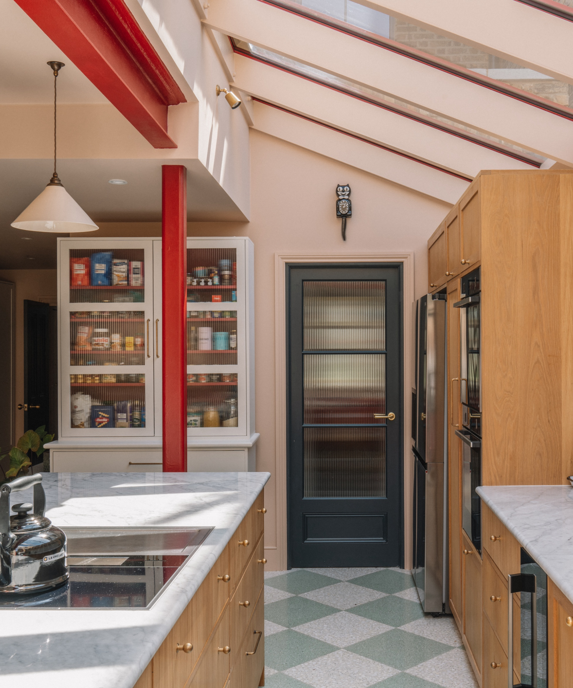
We spoke to Damla Turgut, founder of Otto Tiles & Design US about her color to avoid when using red. She explained, 'Red is such a bold shade, even when it is slightly muted so I would avoid using other similarly dominant tones such as purple, as your room will feel too high in contrast and visually chaotic.'
According to Damla when incorporating red into an interior scheme, it should be the standout accent shade. 'Try pairing it with a muted neutral such as a dusky pink hue. This will ever so slightly take the edge off the red, enhancing the warmth and softness of the interior whilst still allowing the red to shine as a statement color.'
We agree, and love this combination of blush pink and red, it's the perfect color combination to consider if you want to keep things subtle but make more of a statement than an all-neutral scheme.
2. Hot pink
According to Tash Bradley, director of interior design and color psychologist at Lick, when it comes to color pairings, it's best to avoid using tones that will create the same mood and feeling within your space.
Design expertise in your inbox – from inspiring decorating ideas and beautiful celebrity homes to practical gardening advice and shopping round-ups.
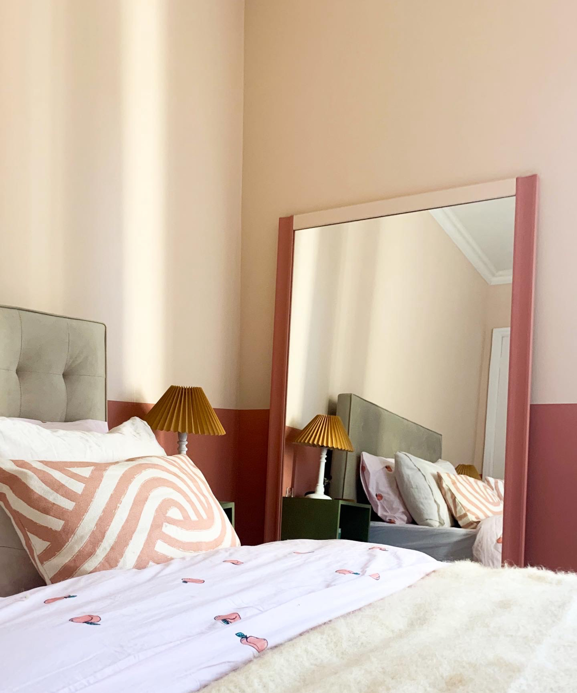
'A great example of this is combining red with magenta pink. Magenta pink is a very hot, stimulating hue and so when it is paired with red it can create an overwhelming atmosphere,' Tash advises.
The best option is to tone down, instead of toning up. Tash adds, 'In contrast, a soft peachy pink, such as Lick Pink 02, is a dream combination with red as it is far more gentle and has soothing grey undertones - like a warm cuddle!'
3. Bright green
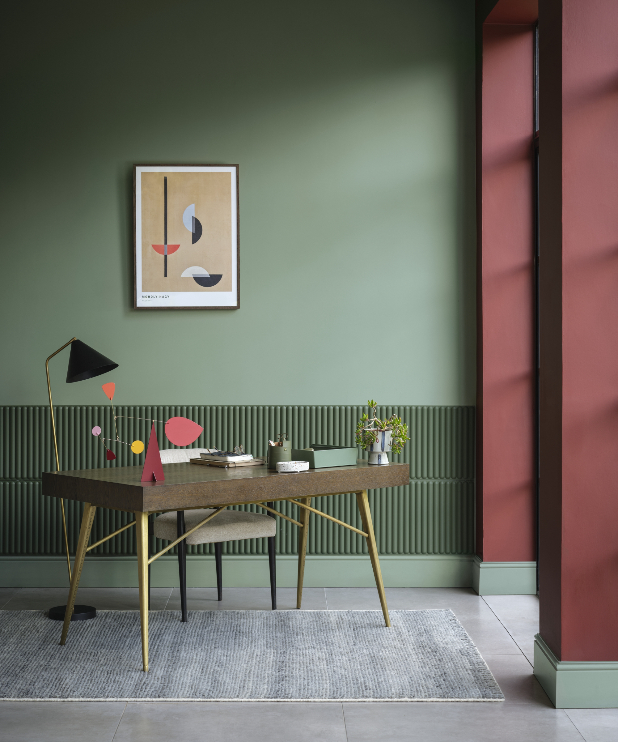
Synonymous with the festive season – should 'red and green never be seen?' We say yes, but it's about getting the shade of green right. Bright green with equally bright red is a no.
'Whilst red and green work beautifully together in nature, these bright tones can feel a little unsettling when translated to your wall color. The secret to combining these shades is to select muted tones which feel more harmonious and are more comfortable to live with,' suggests Helen Shaw, Director of Marketing at Benjamin Moore.
Emily Kantz, color marketing manager at Sherwin Williams agrees, 'It can be done successfully with the use of different shades and complementing colors.' It's about choosing the right tones of each shade, and this home office hits the spot with both colors. Soft and muted, they work together perfectly.
4. Black
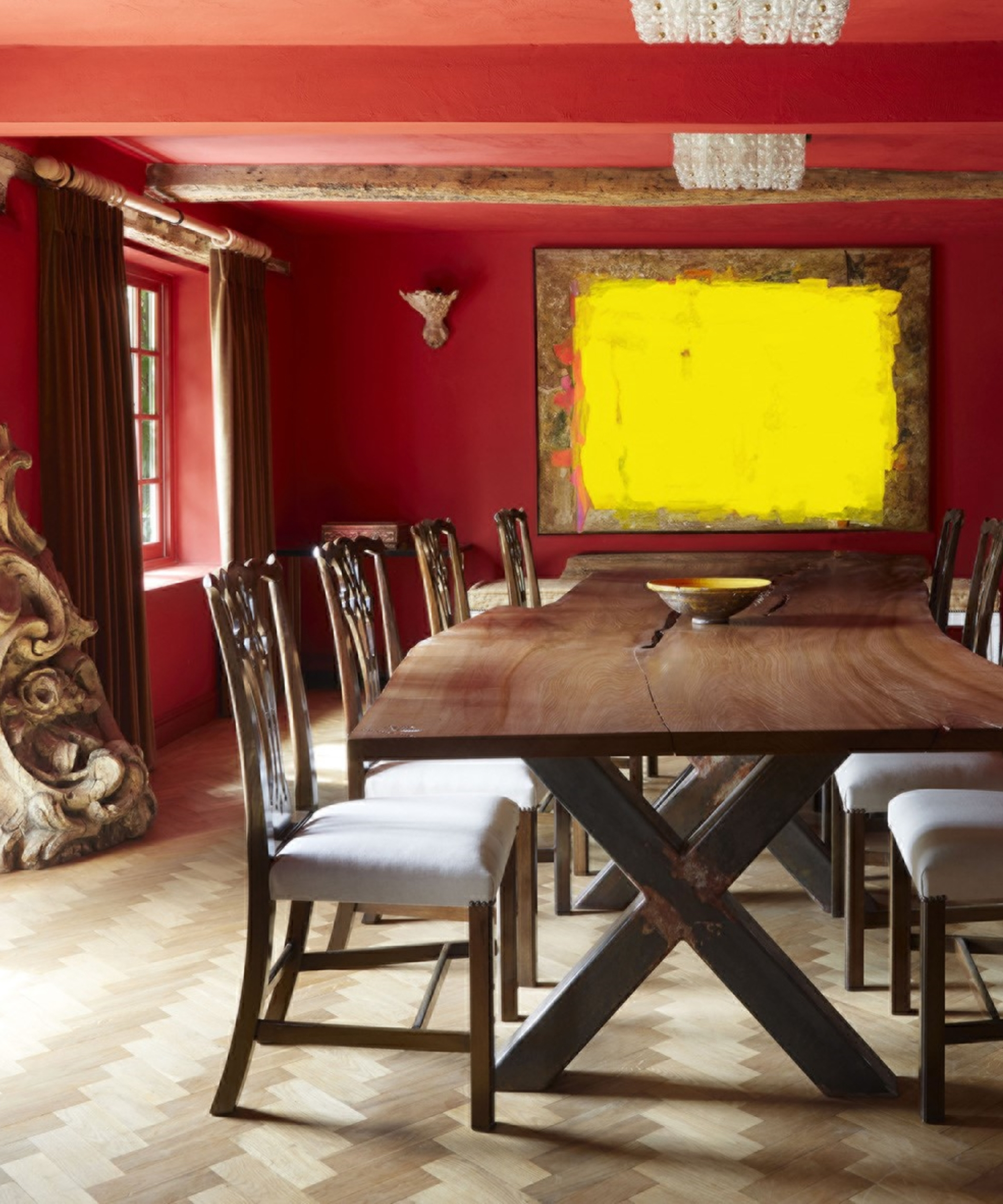
'I feel that red paired with black in many instances can look too harsh and gaud, says Francesca Wezel, founder of Francesca's Paints. 'Red also looks uncomfortable next to terracotta, as they both produce very different looks.'
Emily Kantz adds, 'While I like to avoid generalizing color pairings, since red has so many different shades you can work with – a good rule of thumb would be to avoid pairing red with black. Especially dark red and blacks, since it can make a space feel too dark and dramatic to the point it becomes an uninviting environment.'
For an alternative option, red can look wonderful with sandy tones and yellow according to Francesca, as they bring warmth and energy into a space. This all-red dining doesn't feel too intense, even when paired with the dark wooden furniture as it's still much softer than a harsh black.
5. Blue
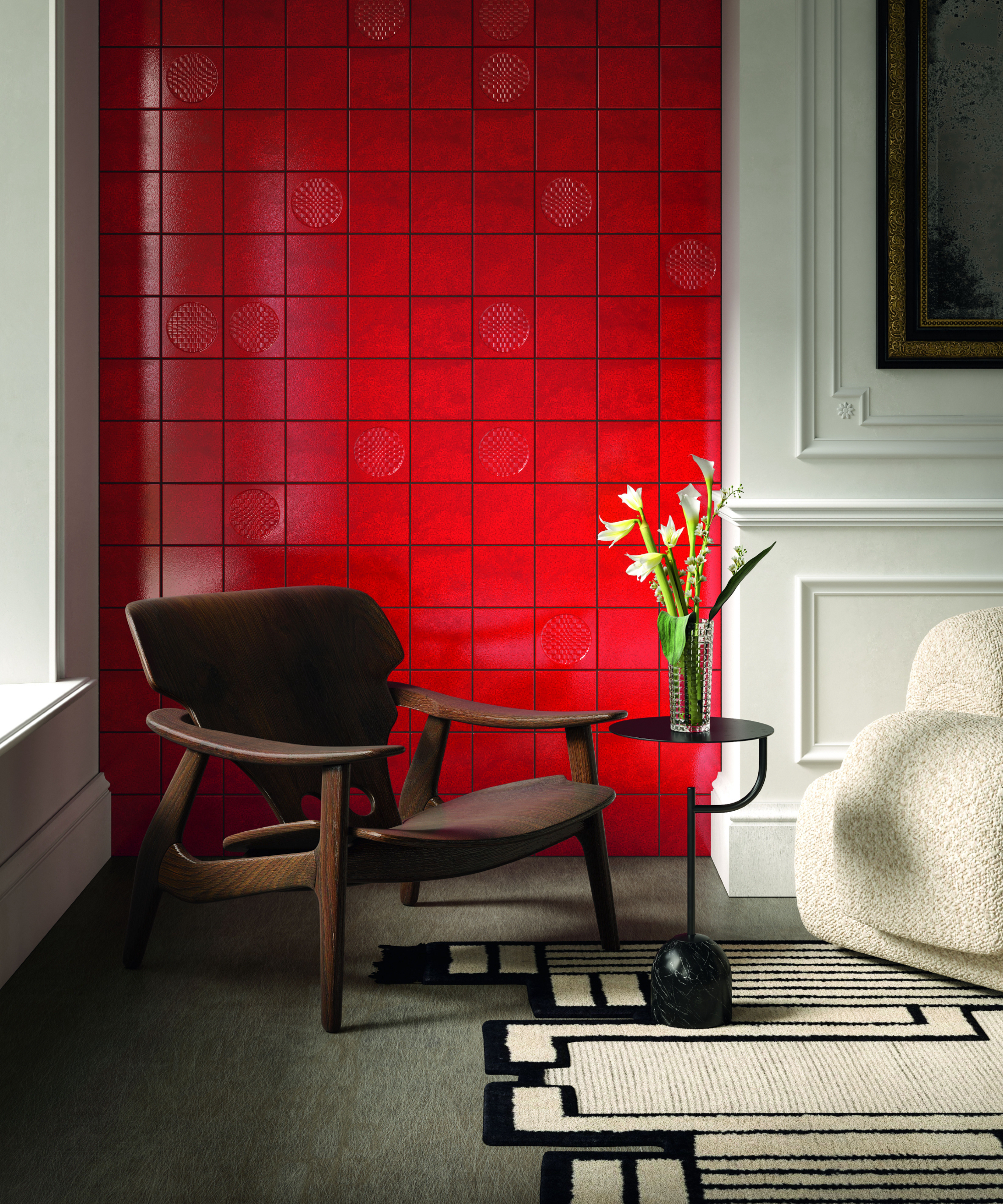
Blue is such a popular color, from sky blue, to cobalt, navy to indigo – it's incredibly versatile. However, it's not a color that goes well with red – even more so when you've chosen a scarlet red.
Instead, consider decorating with neutrals like creamy whites and oatmeal. They perfectly offset a bright red that's very dominant in a space and add a softness that takes a scheme from being overpowering to one that's striking and contemporary. You could then bring into smaller accents of blue thats boldness will be balanced by the neutrals.
6. Neons
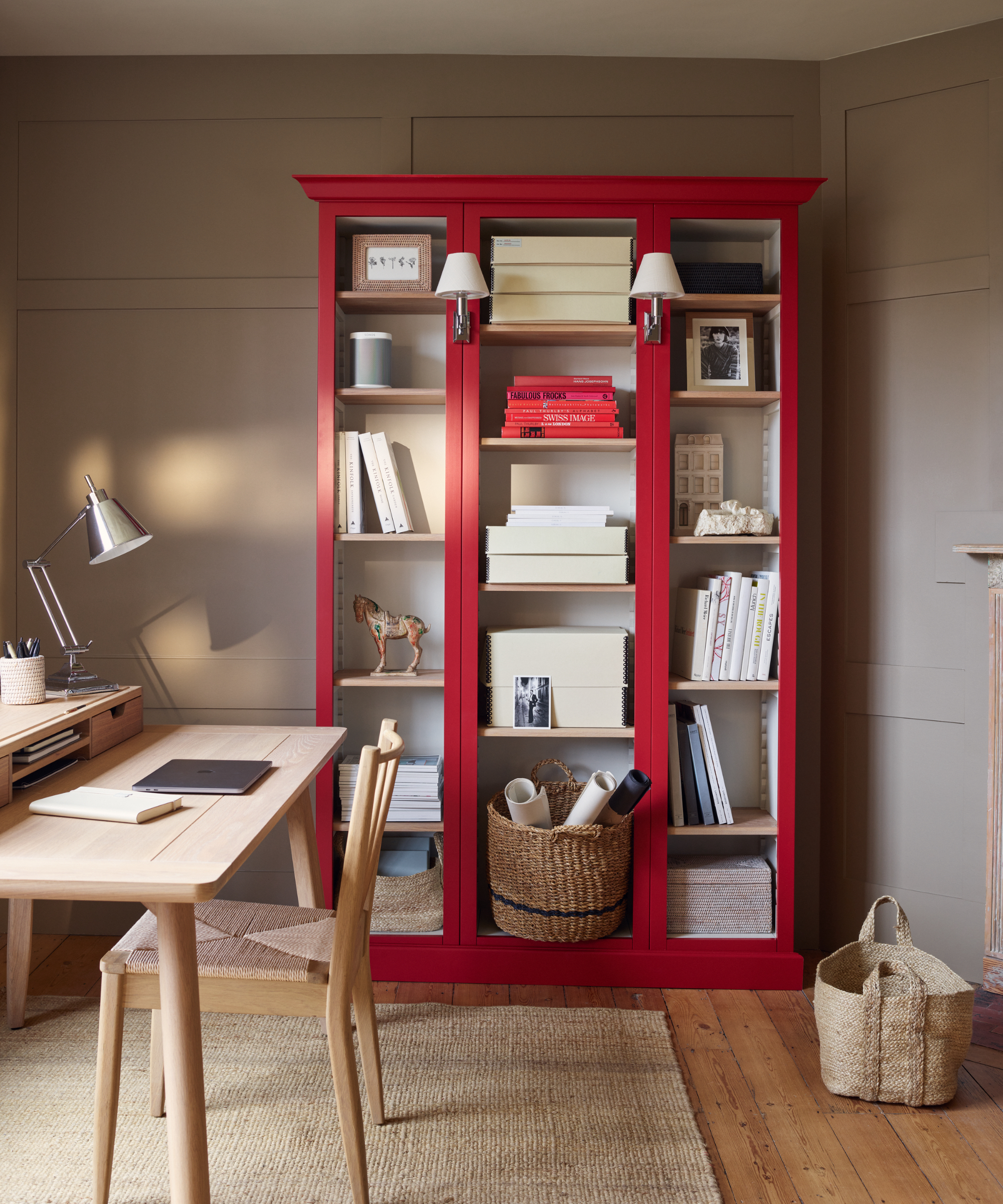
Neon brights have been appearing in the interiors world and do look fabulous with other brights like zingy lemon and lime green. When it comes to teaming them with red, it's a big no from experts.
Fred Horlock, design director at Neptune explains, 'When it comes to pairing colors with red, we recommend avoiding overly bright and neon hues which can clash and overwhelm the shade.'
Fred continues, 'Instead, we encourage pairing red with more subdued and complementary tones or, for a warmer palette use colors with a similar tone, a lighter pink or darker red perhaps, like our Old Rose and Clove colors.'
We love this combination, it's ideal if your space is north-facing and needs a helping hand to warm it up.
7. White
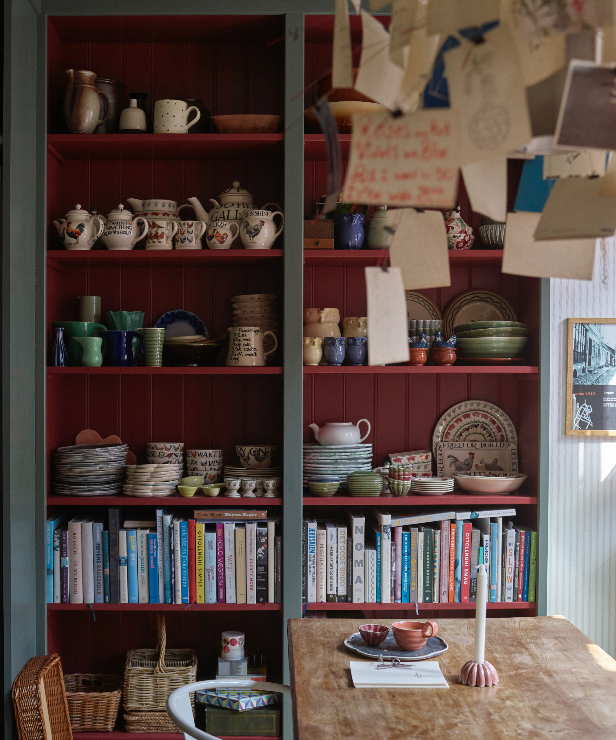
White is always a good bet when it comes to pairing with other colors, but it can be quite cold visually when teamed with red. A great alternative is a soft, warm gray, it's so versatile that it goes with any shade of red.
Here, the red shelving of this display unit is edged in mid-gray. Yes, white could work but it would be too much of a contrast and would distract your eye from anything else going on in the room.
Gray is a much better option, it's still contrasting, but in a more subtle way and adds depth to this eclectic wall.
Red can be a tricky color to pair with because it's so vibrant and show-stopping – it doesn't like to take a back seat! So clever pairings are needed, follow our guide on colors to avoid pairing with red and you'll create a fabulously creative scheme that works perfectly.

Sophie has been an interior stylist and journalist for over 20 years and has worked for many of the main interior magazines during that time, both in-house and as a freelancer. On the side, as well as being the News Editor for indie magazine, 91, she trained to be a florist in 2019 and launched The Prettiest Posy where she curates beautiful flowers for modern weddings and events. For H&G, she writes features about interior design – and is known for having an eye for a beautiful room.