You've heard of the 'Unexpected Red Theory' – but this designer makes a case for a timeless twist on the trend using deep moody hues
If you love calming, neutral-led spaces, here's how to tap into the red trend with a moody take on the style

Design expertise in your inbox – from inspiring decorating ideas and beautiful celebrity homes to practical gardening advice and shopping round-ups.
You are now subscribed
Your newsletter sign-up was successful
Want to add more newsletters?
Arguably the most prominent interior trend to grace the design world so far in 2024, is decorating with red. This color trend is being embraced in home decor to add warmth and liveliness, whether in small doses or to make a much bigger statement.
If you're not used to experimenting with color, decorating with red most likely isn't a shade you'd naturally choose to ease yourself into the world of colorful schemes. But despite any preconceptions about this saturated hue, red is indeed an incredibly versatile color to decorate with. It's not just about vibrant tomato tones; many deeper variations of red create a timeless, cozy look.
Proving just how chic adding a dose of muted red can be, interior designer Alice Gaskell, founder of Alice Grace Interiors took to Instagram to share two red-focused color palettes. We spoke to Alice to learn more about these paint ideas, perfect for those who love calming and considered spaces yet want to add an element of playfulness with a hint of warming red.
Article continues belowA post shared by alice gaskell (@alicegraceinteriors)
A photo posted by on
The key to incorporating red into your color schemes is to first establish a solid neutral color scheme as a base. This doesn't mean choosing just one hue, but rather layering neutral hues that complement each other, each adding depth and dimension to your home.
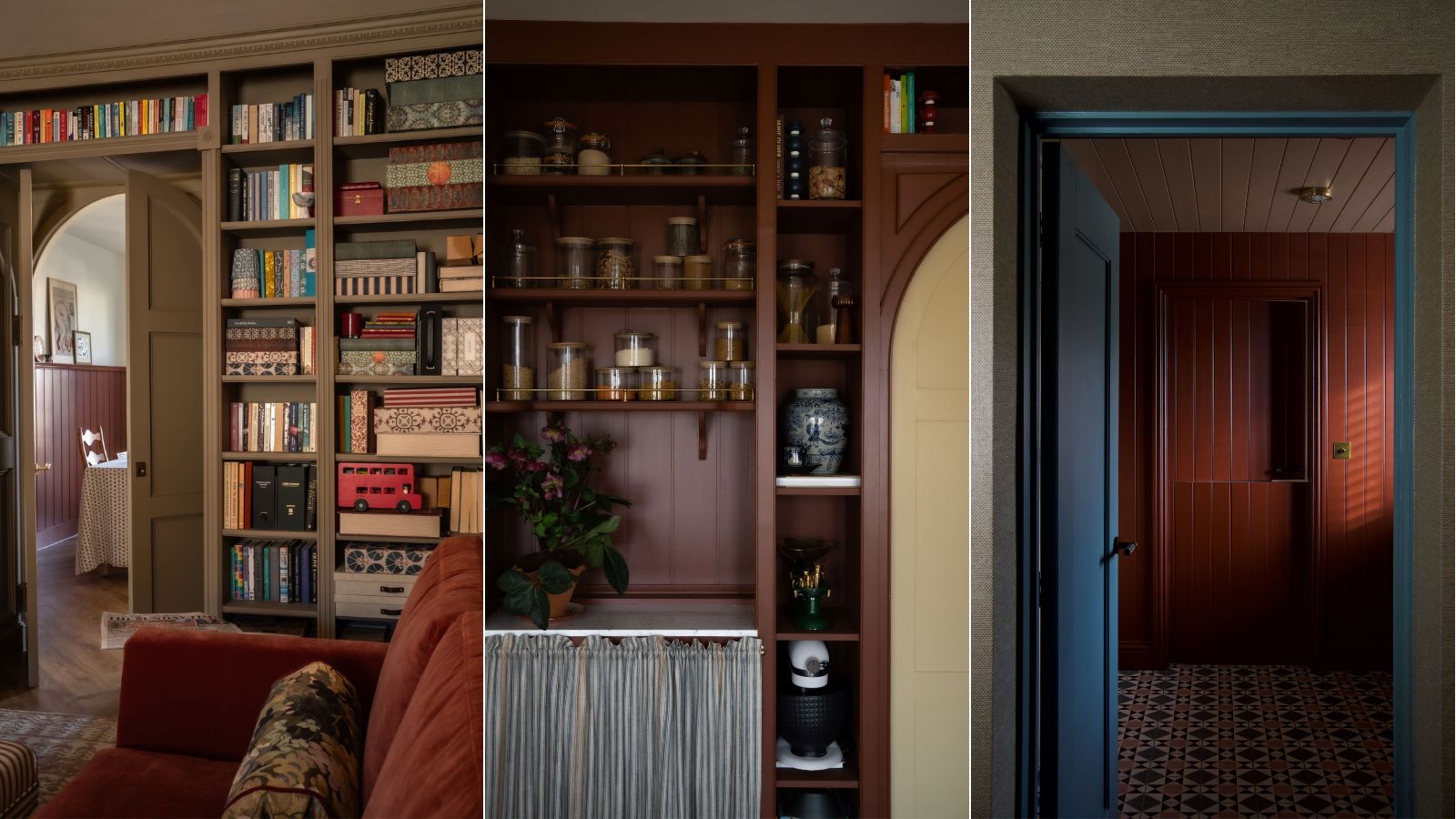
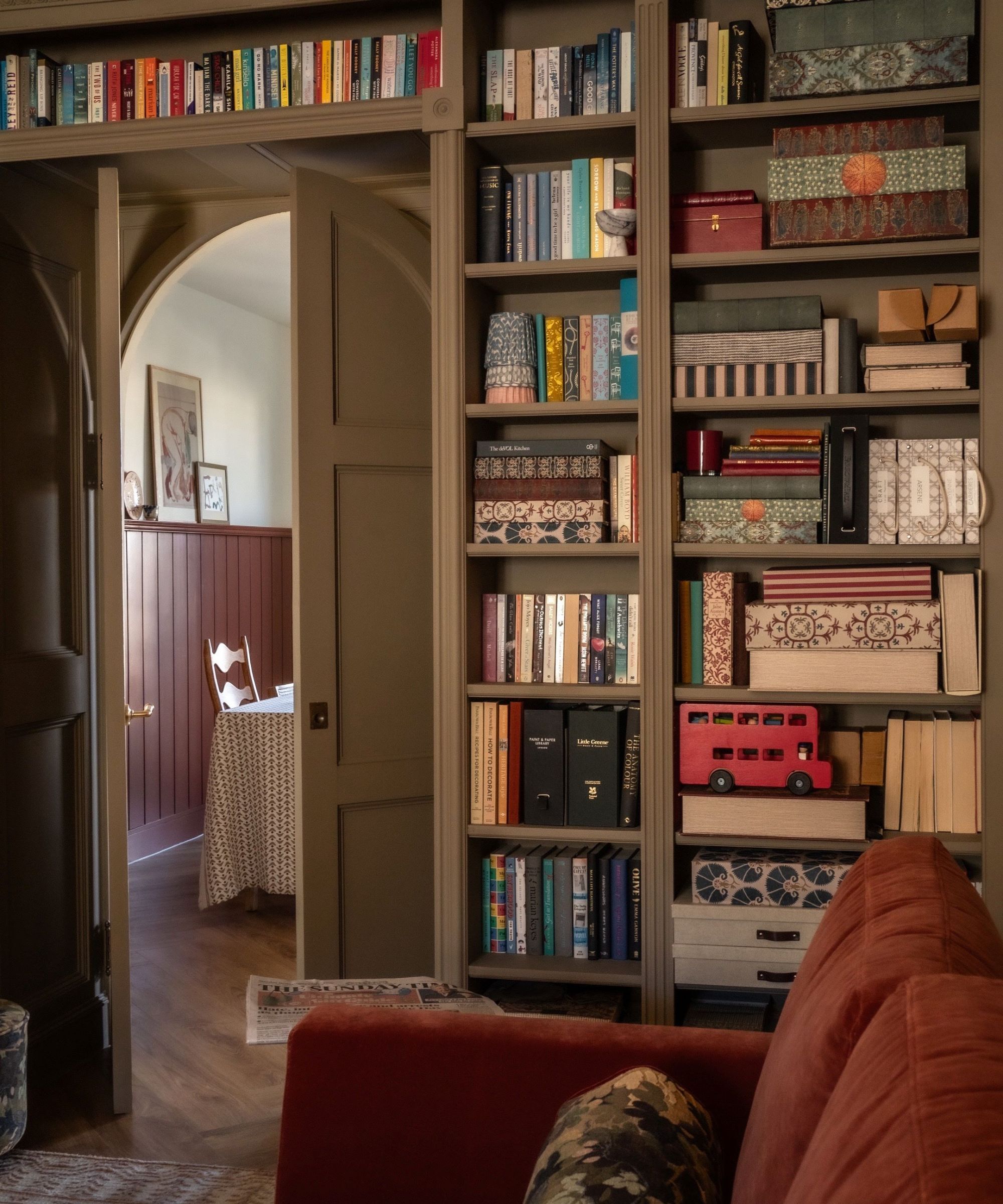
Alice suggests two different color groupings to try, all of which come from Farrow & Ball. The first combines neutral colors Light Gray, Old White, and French Gray, and then Picture Gallery Red as your splash of color. This red paint is a muted hue that has an earthy quality to it, giving it a subtly compared to much brighter reds.
Secondly, Alice also recommends grouping Setting Plaster, Mouse's Back, and Dimity (specifically for the ceiling and woodwork), and then Etruscan Red for that added impact. Far from your classic saturated reds, Etruscan Red is a brown-toned red that is a great option for those who prefer deeper and richer tones.
'Finding a palette that introduces the right neutral, for example, a red or yellow-based white to warm up a north-facing space and complementary tonal options for cabinetry or trims adds depth without being too overwhelming,' explains Alice. 'I think whether you are comfortable with color or not, finding the right neutral for your home can give you the confidence to begin to create a nice family of paints that work really together to enhance the space right from your ceiling to your floor.'
Design expertise in your inbox – from inspiring decorating ideas and beautiful celebrity homes to practical gardening advice and shopping round-ups.
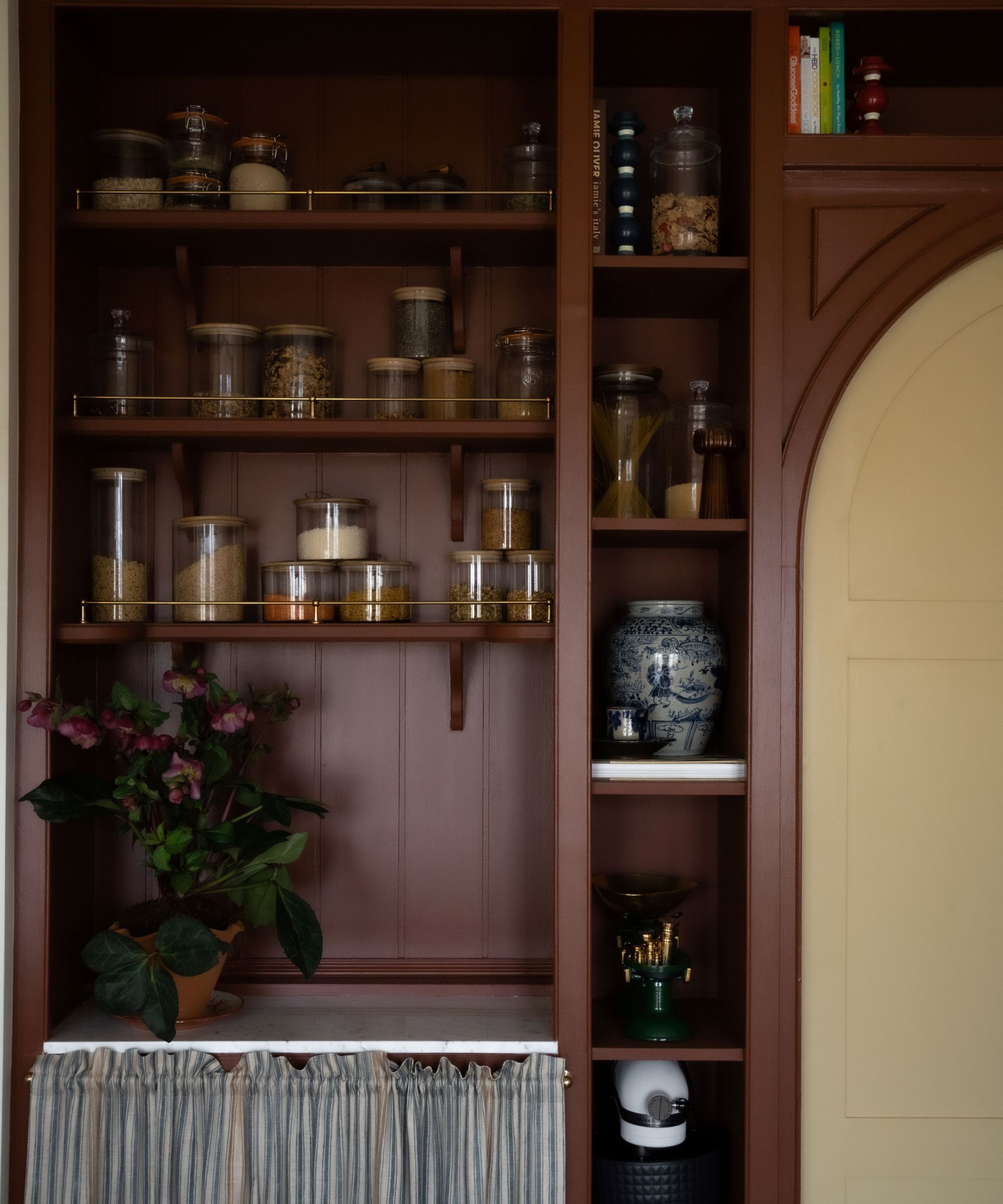
Once you've established your choice of neutrals, you can then think about incorporating the red paint into slightly more unexpected places, as Alice suggests: 'These schemes could start within the heart of your home – potentially a kitchen that could have a calm, relatively neutral palette on the walls and cabinetry, and then introduce a more daring pop of color either on an island, or what's becoming increasingly common is this introduction of a brighter bolder color within a small pantry or larder, or adjoining utility room which feels to many people a lot more manageable and livable.'
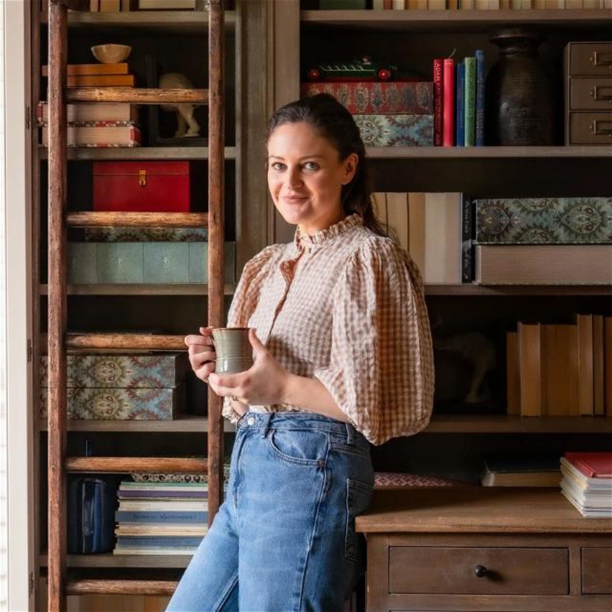
Alice Gaskell is the Owner and Creative Director at UK-based interior design studio Alice Grace Interiors.
'These spaces often lack natural light and a bolder, darker, brighter color can offset your jars of food and recipe books beautifully. This is where people tend to feel more comfortable making paint decisions that are a little more daring.'
By embracing these deep and warm tones of red, you can achieve a color scheme that feels timeless, lasting far beyond its current trending status. And by following Alice's advice and nailing the neutral palette first, you'll easily be able to style these bolder hues in a sophisticated way that doesn't feel overbearing.

Emily is a freelance interior design writer based in Scotland. Prior to going freelance in the spring of 2025, Emily was Homes & Gardens’ Paint & Color Editor, covering all things color across interiors and home decor for the Homes & Gardens website. Having gained specific expertise in this area, Emily is well-versed in writing about the latest color trends and is passionate about helping homeowners understand the importance of color psychology in home design. Her own interior design style reflects the simplicity of mid-century design and she loves sourcing vintage furniture finds for her tenement flat.
