Revealed: Pantone Color of the Year 2022
The powerhouse has spoken – this is the dynamic blue you need to know about for the year ahead


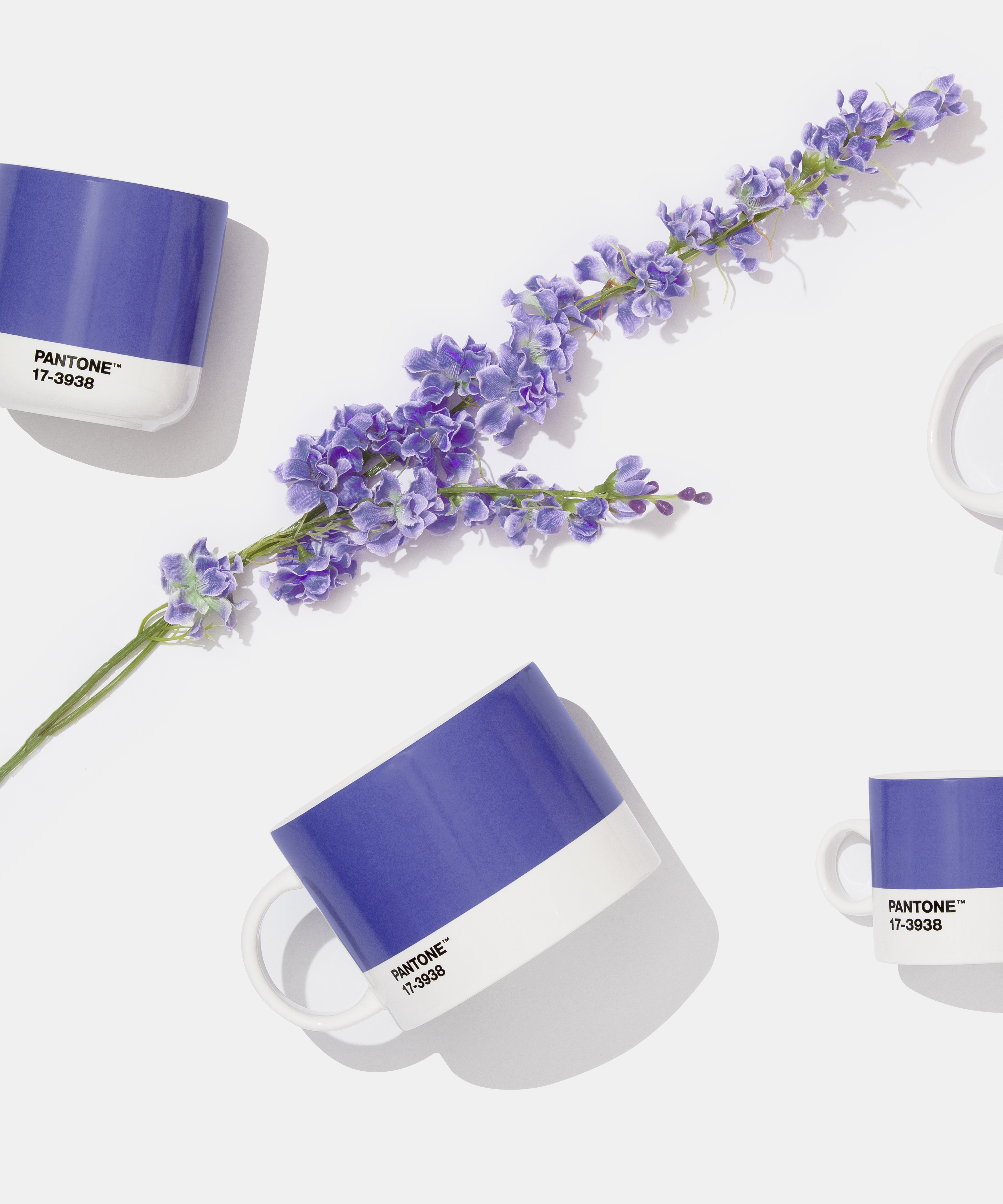
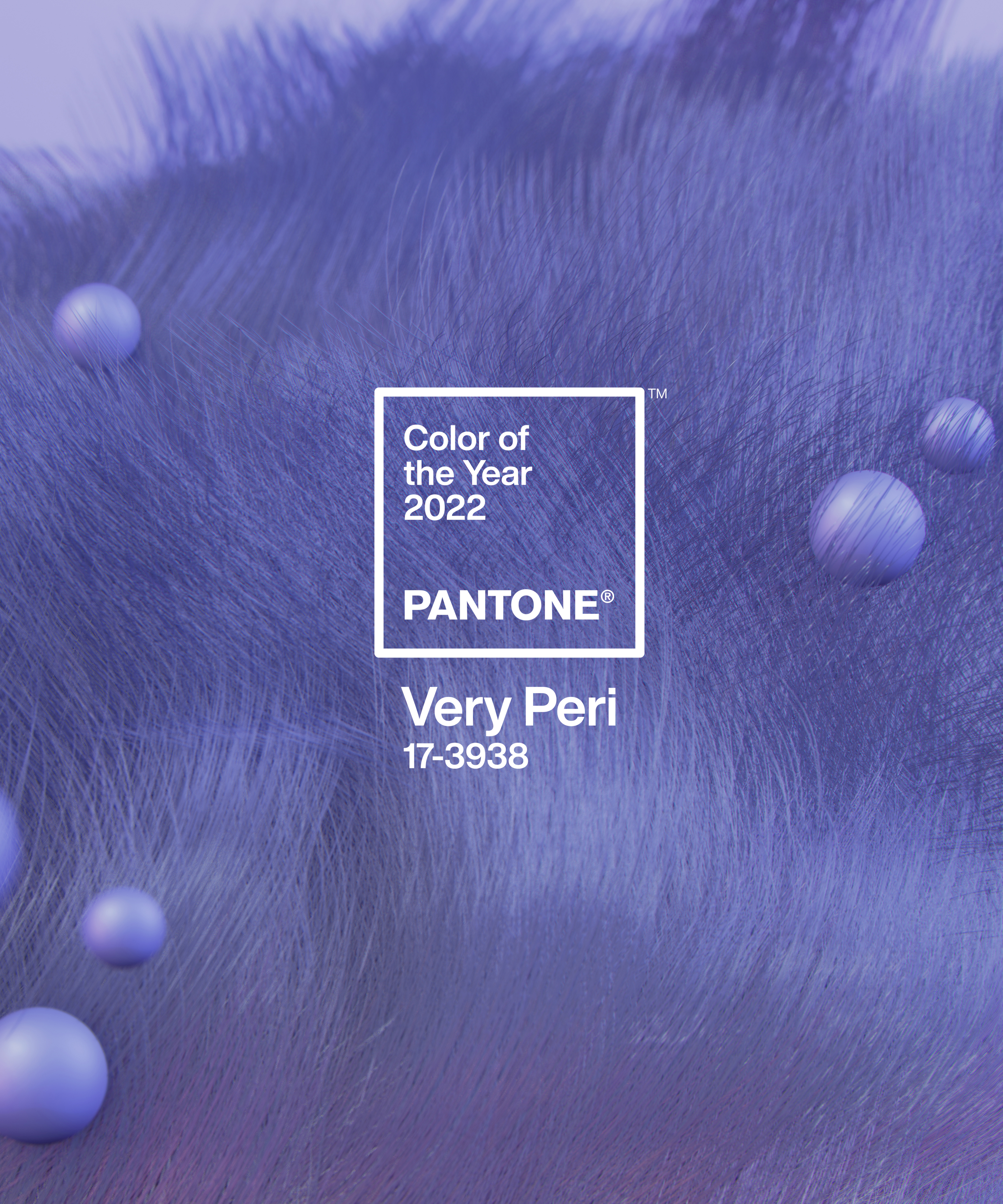
Every year, global color authority Pantone reveals the shade that will make headlines in the seasons ahead. Today, the waiting game is over. Pantone Color of the Year 2022 is Veri Peri – a dynamic ‘periwinkle blue hue with a vivifying violet-red undertone’. This is the color that you’re going to see everywhere – from right now.
Pantone Color of the Year 2022 is set to reshape interior design trends instantly, but why did they choose the shade? With hopes for a sense of renewal in 2022, Pantone chose Veri Peri as a reminder to ‘embrace the altered landscape of possibilities’ and trust in the possibilities of the future.
Combining the faithfulness and constancy of blue with vivid red undertones, Veri Peri empowers you to revolutionize the familiar with something new.
Article continues below 
‘As we move into a world of unprecedented change, the selection of PANTONE 17-3938 Very Peri brings a novel perspective and vision of the trusted and beloved blue color family,’ explains Leatrice Eiseman, Executive Director, Pantone Color Institute. Leatrice praises the color of its ‘joyous attitude and dynamic presence’ that provokes ‘courageous creativity and imaginative expression’ for the year ahead.
But what does this mean for future decorating ideas? We are about to see a refreshing sense of playfulness in our homes. This can mean anything – from the experimentation of unusual color combinations to the introduction of a boldly-hued statement piece in your scheme.
‘Very Peri is suited to an array of different materials, textures, and finishes,’ Patone explains. They add how the shade will provide a ‘pop of color’ when incorporated through a painted wall, accent furniture, or piece of decor. ‘[It will act] as an intriguing and eye-catching accent in a pattern.’

Its combination of blue and red mean this tone is grounded as well as daring – meaning it can stand-alone or as part of your new color combination. This is how to mix patterns in a room this 2022.
Design expertise in your inbox – from inspiring decorating ideas and beautiful celebrity homes to practical gardening advice and shopping round-ups.
Last year, Pantone announced Ultimate Gray and Illuminating (yellow) as their Color of the Year before these hues dominated our interior trends. Naturally, we expect Veri Peri to follow suit. The process begins now.

Megan is the Head of Celebrity Style News at Homes & Gardens, where she leads the celebrity/ news team. She has a history in interior design, travel, and news journalism, having lived and worked in New York, Paris, and, currently, London. Megan has bylines in Livingetc, The Telegraph, and IRK Magazine, and has interviewed the likes of Drew Barrymore, Ayesha Curry, Michelle Keegan, and Tan France, among others. She lives in a London apartment with her antique typewriter and an eclectic espresso cup collection, and dreams of a Kelly Wearstler-designed home.