You would never guess this tiny 1920s jewel box apartment had a Murphy bed in one of its most sophisticated rooms
The brief was ‘Accidentally Wes Anderson, layered, and elevated eclectic', but it had to be achieved on a small scale in this colorful pied-à-terre

Design expertise in your inbox – from inspiring decorating ideas and beautiful celebrity homes to practical gardening advice and shopping round-ups.
You are now subscribed
Your newsletter sign-up was successful
Want to add more newsletters?
A Murphy bed in the dining room might sound like something straight from your first apartment. Visions of pulling a rickety bed down from the wall, moving furniture out of the way to make room for your living space to turn into your bedroom for the next 12 hours. But forget those connotations, this apartment might be small, but it's far from cramped.
Located in the iconic Bellaire Tower, designed and built between 1928 and 1930, during San Francisco’s Golden Age, this condo has been turned into the perfect pied-à-terre. Designer Caitlin Jones Ghajar is behind this jewel box of a space, creating a one-bedroom home that has all the character, color, and charm of a much larger property.
'The clients were empty nesters who desired a place in San Francisco to enjoy writing, and generally create a space for respite and retreat. It is a one-bedroom, one-bath, so we had to think creatively about multiuse spaces and ensuring it could work for their own uses as well as guests,' Caitlin explains.
Article continues below'I first met this client when I was a designer at the San Francisco Decorators Showcase at the ripe age of 25. We completed their primary residence in Marin County, and I feel it was a testing ground for the color, texture, and bold strokes we use in this home. Her parents were also antiques dealers – and I’m sure that contributed to the project brief. I believe they would have loved this special place. One that is a retreat and getaway space that is truly joyful to be in.'
'The project brief from the client was to create a space that was ‘Accidentally Wes Anderson’ layered, and elevated eclectic. They encouraged a primary focus on high-quality and restored second-use and vintage items. Inspired by the Art Deco style, we also chose to mix periods for dynamic layering that is more interesting than sticking to a literal deco palette.'
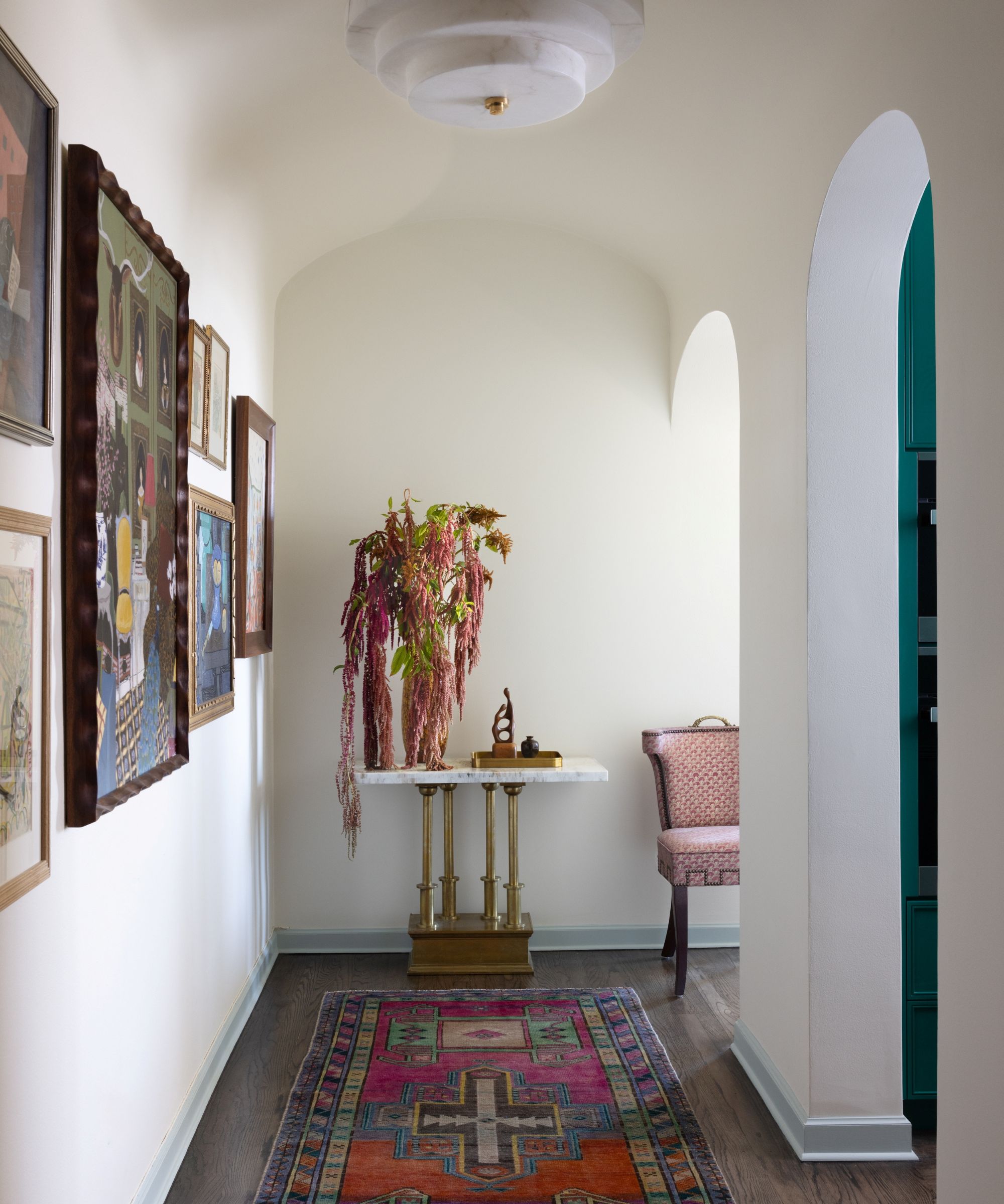
'The perfect example of this mixing of styles comes as soon as you walk into the apartment. The gallery wall in the entryway contains pieces from the 1920s to current, a nod to all the lives this apartment has lived. The end of the hallway used to open to a closet space. We re-oriented the opening to allow for a true entry space, and to create a library space with better adjacency to the living area.'
'As the unit is small, we were highly focused on ensuring each space could be multi-use and that overall the condo would feel larger than its square footage would suggest. The views are expansive, so we aimed to frame those and create a jewel box of a space that feels like a dynamic and luxe hotel suite.'
Design expertise in your inbox – from inspiring decorating ideas and beautiful celebrity homes to practical gardening advice and shopping round-ups.
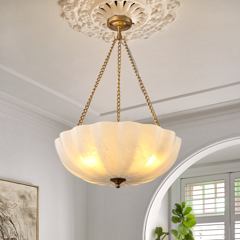
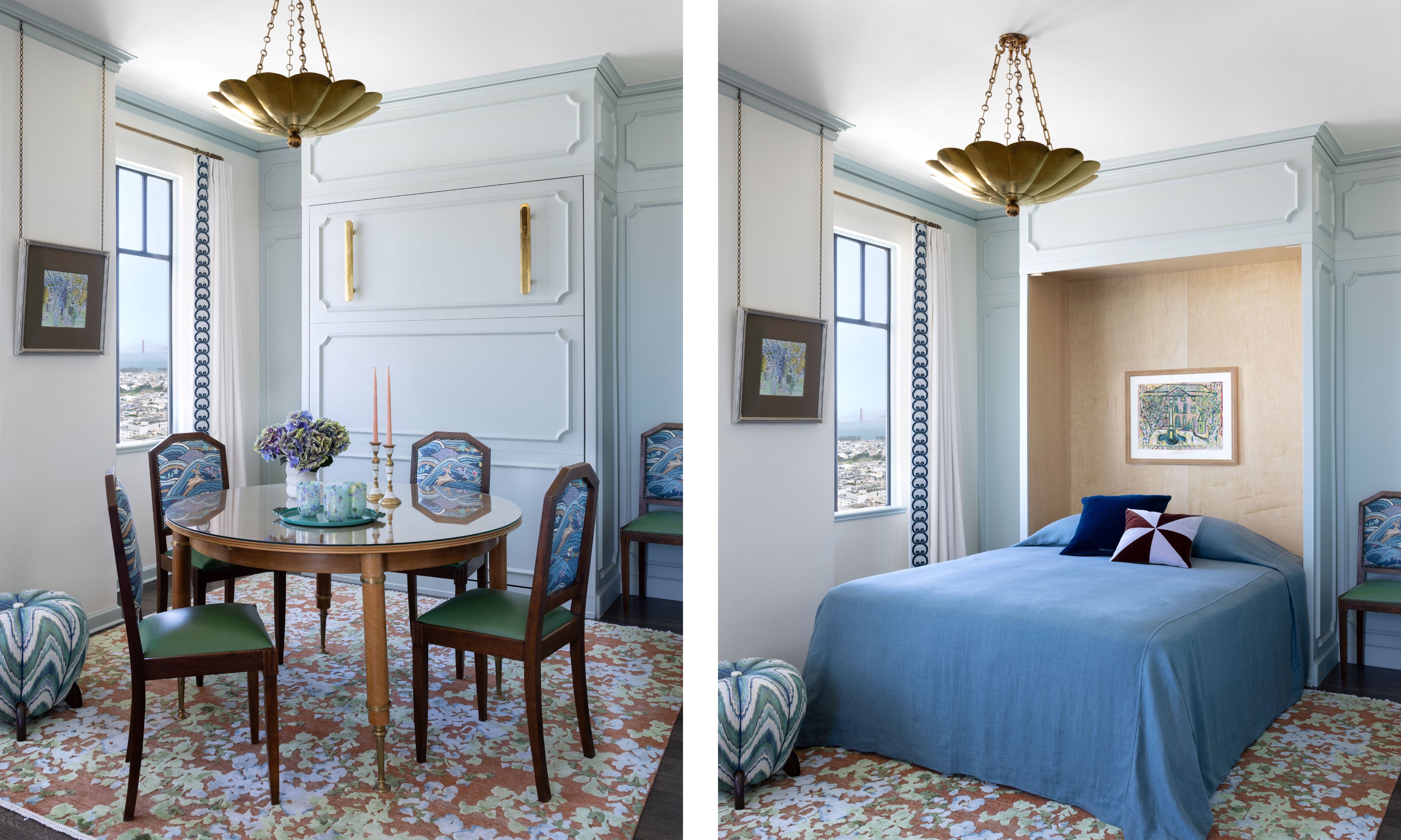
'The vintage French chairs in the dining room were re-upholstered in the Schumacher Rolling Hills as a connection to the vistas beyond, and the chandelier was kept higher than we normally would to ensure an open view. To ensure the space can entertain guests when needed, the original Maison Leleu dining table expands for larger dinner parties.'
'The dining table can also be moved to make way for a Murphy bed cleverly hidden behind this new paneling detail. The Art Deco-inspired pulls from Nanz are both functional and add some welcome sparkle.'
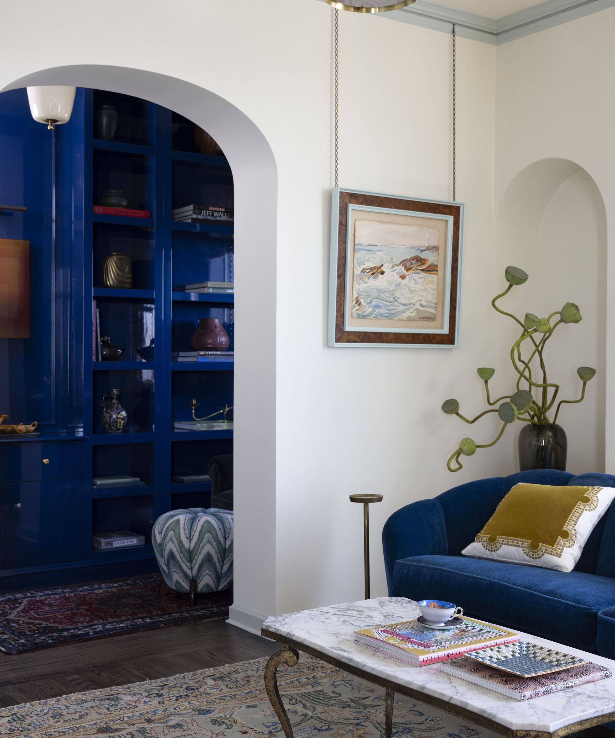
'The client has a very well-honed aesthetic, and welcomes bold choices. We knew we needed to be disciplined in how we chose to implement the plan. We sourced a well-balanced color palette, so the colors are refined, without overwhelming the eye.'
'Each piece of furniture is special in its own right, and they are married to each other to create an overall high-end feel. The bold use of color was a joy to produce, and I loved the challenge of ensuring every space was tied together.'
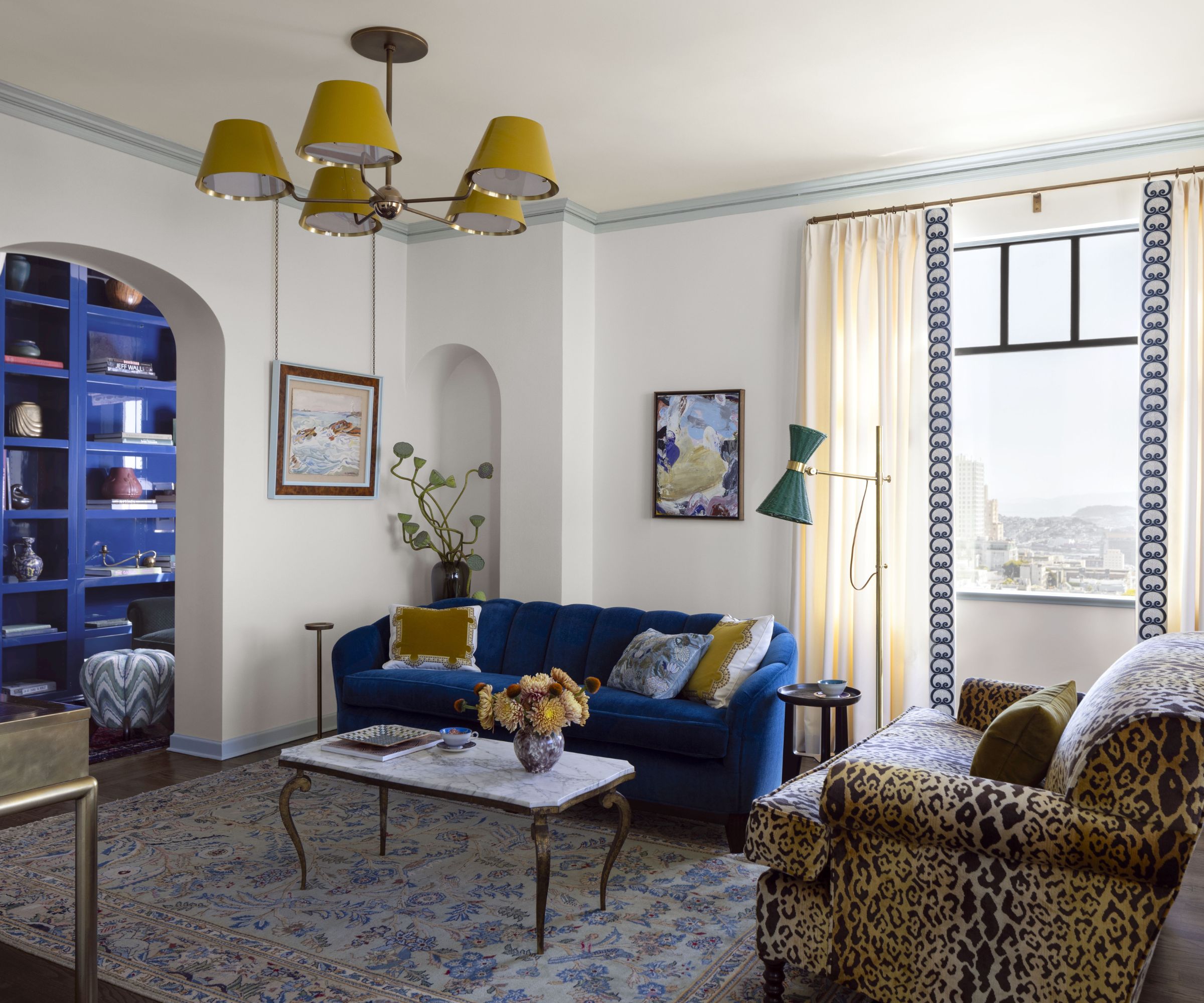
'Alongside the bolder color scheme, high gloss lacquer was a wonderful element we were able to bring in. Due to its durability, it’s not for everyone, but it worked perfectly for these empty nesters. It is another element that brightens and elevates the space.'
'The high-gloss lacquer library blends perfectly with the re-upholstered vintage George Smith sofa. The Curry colored Urban Electric ceiling lights are the pop we picked up in the footstools and Holland and Sherry embroidered pillows. The supremely comfortable sofa has a channel tufted back that is a subtle nod to the architectural plasterwork on the exterior. The art, a thrifted find from Round Top is a pop against the creamy walls.'
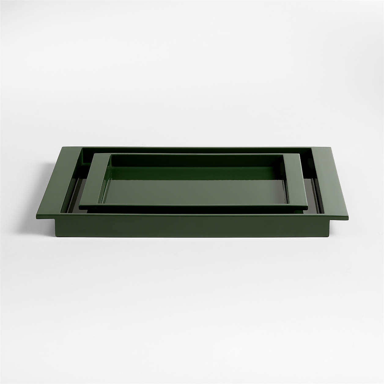
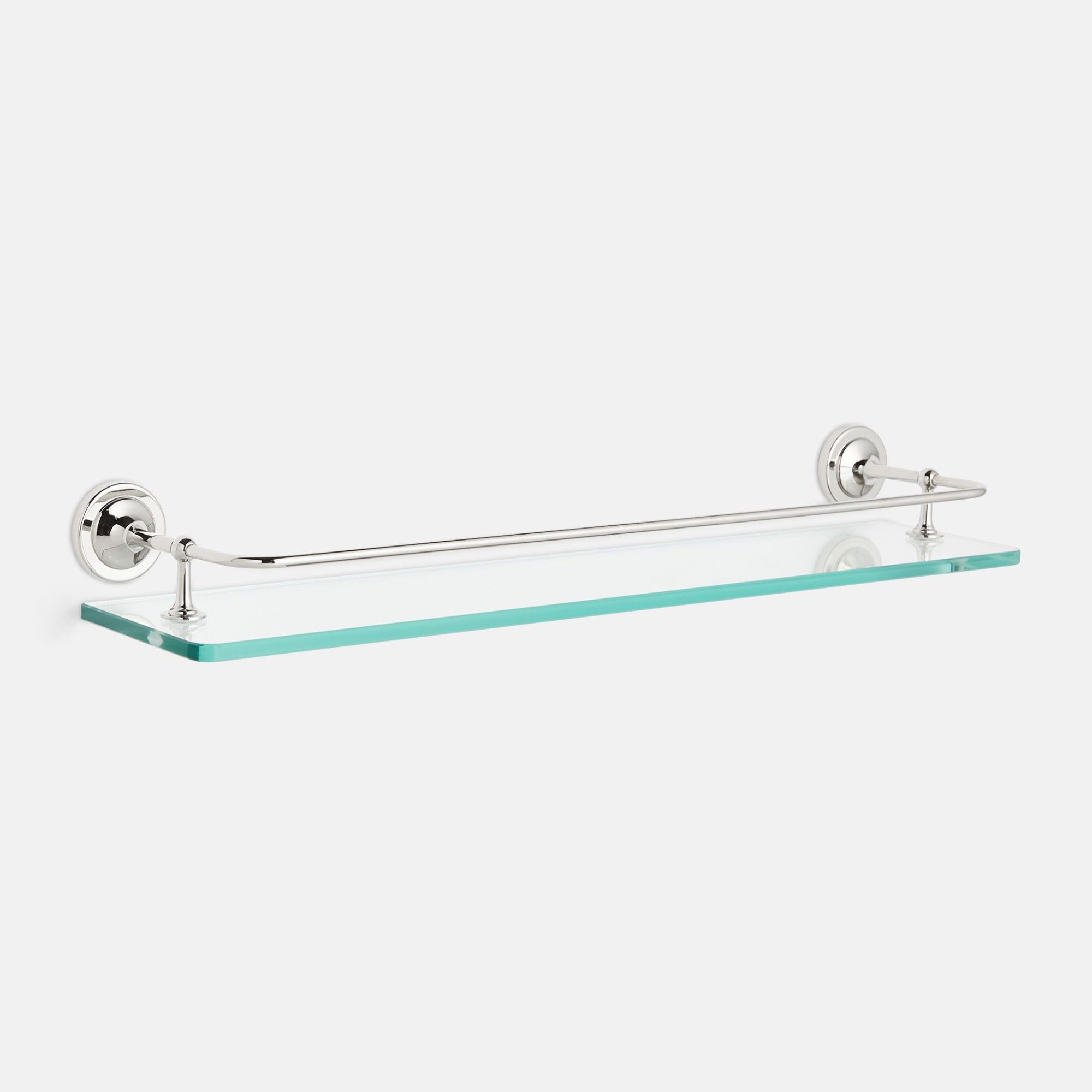
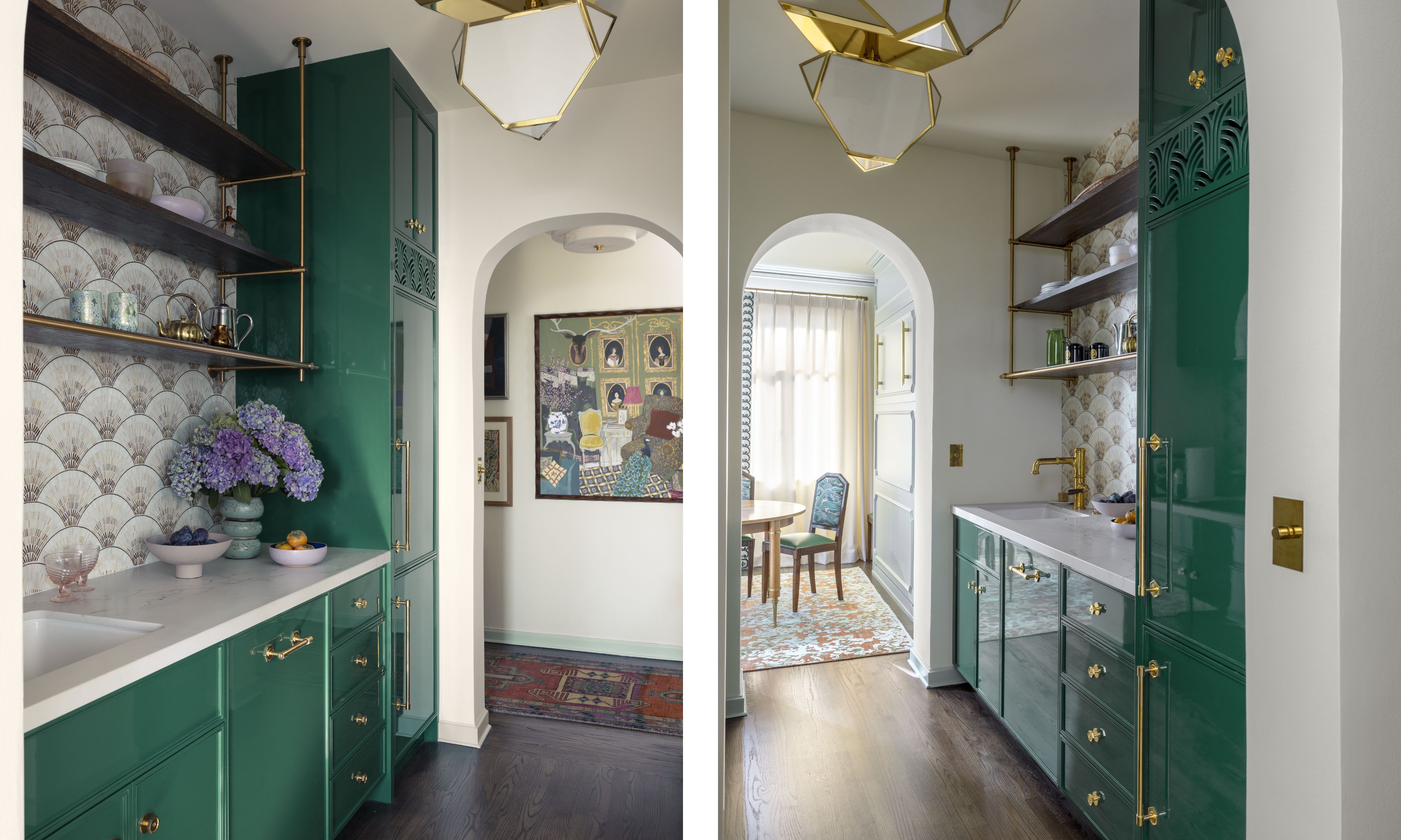
'Lacquer is a real focal point of the kitchen too. Our brief was to take a dark galley kitchen and make it feel like a chic bar. Emerald green lacquer cabinets with custom fan venting panels and the Amuneal hanging shelves attain an elevated look, but the Caesarstone counters make it durable for regular use.
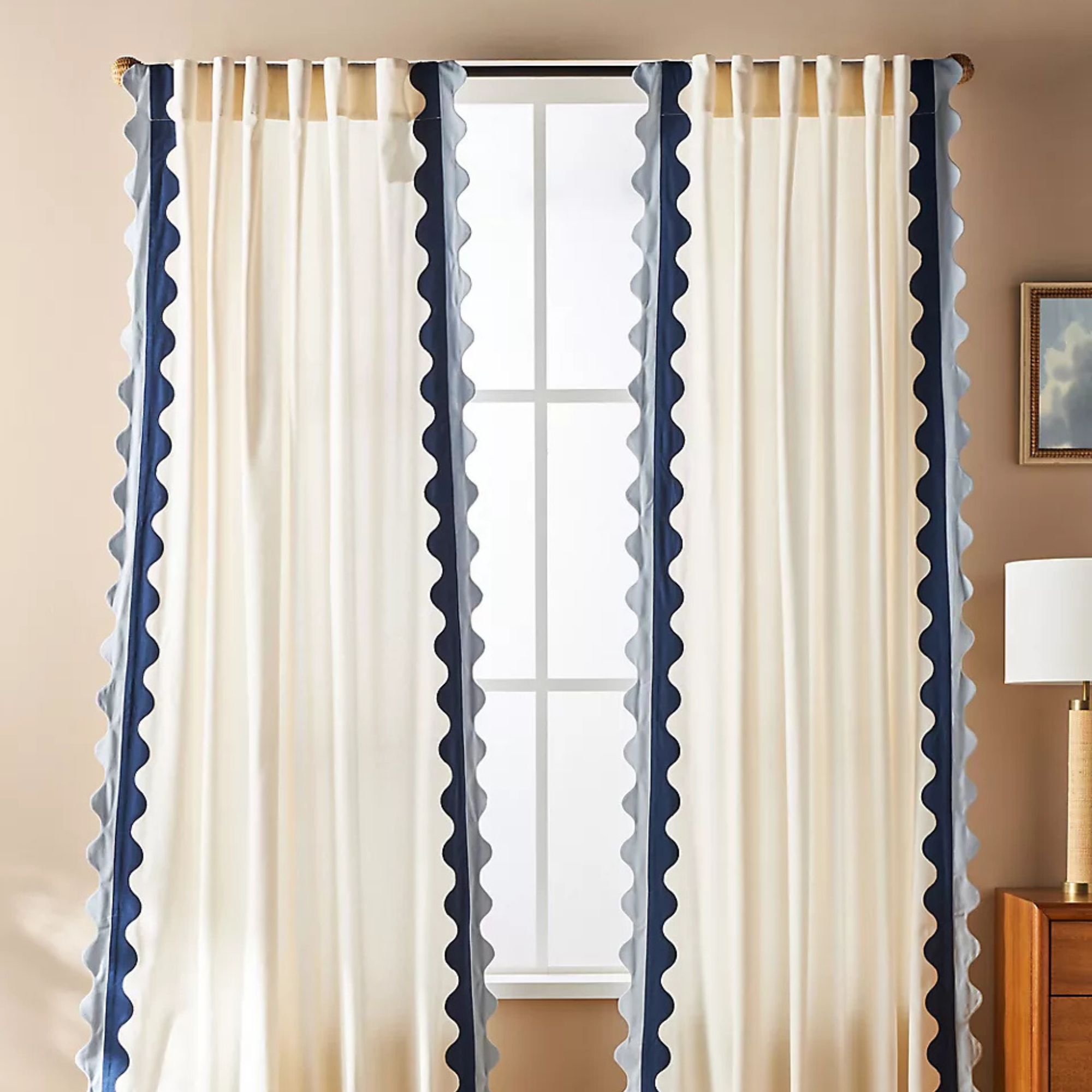
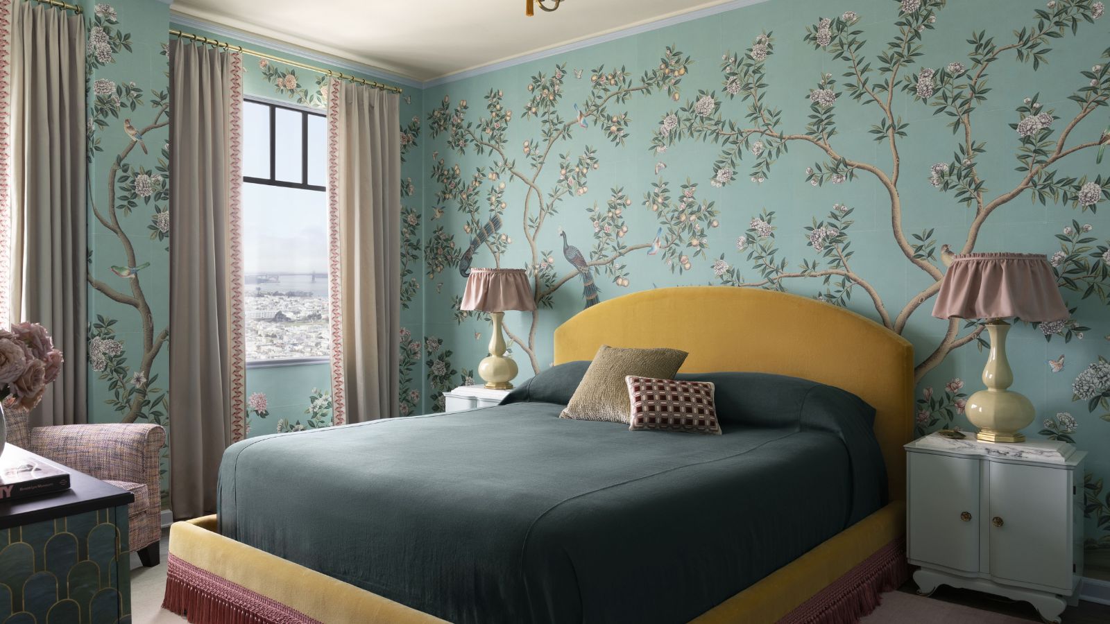
'Nothing is more ‘accidentally Wes Anderson’ than this bedroom – the bed, trim, and wallpaper combination. The blocking of bold tones is married to create a cohesive whole. The vintage rosewood nightstands were newly lacquered with custom Calacatta tops cut for durability. The skirted lampshades add a feminine nod to balance the strong lines of the bed.'
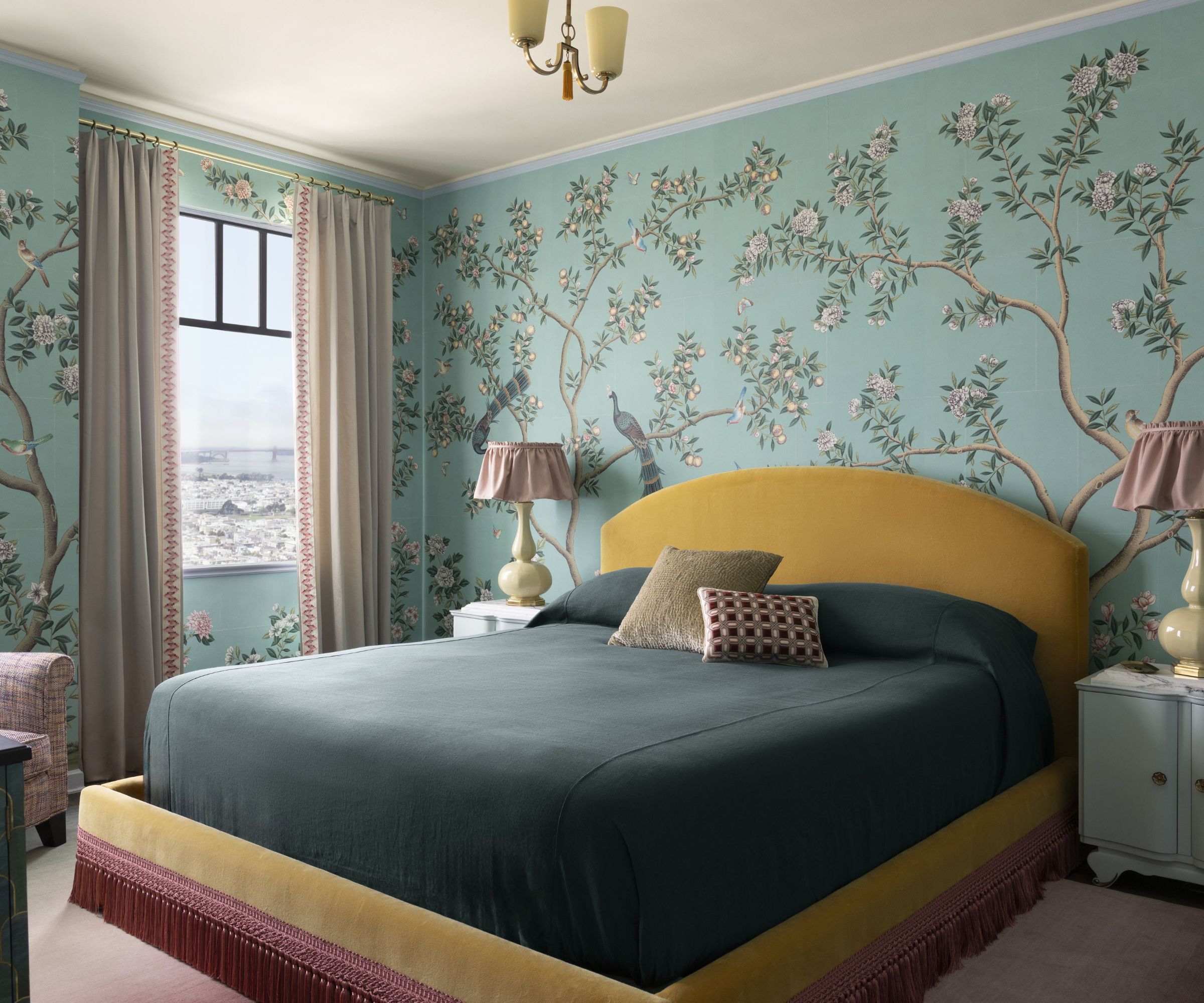
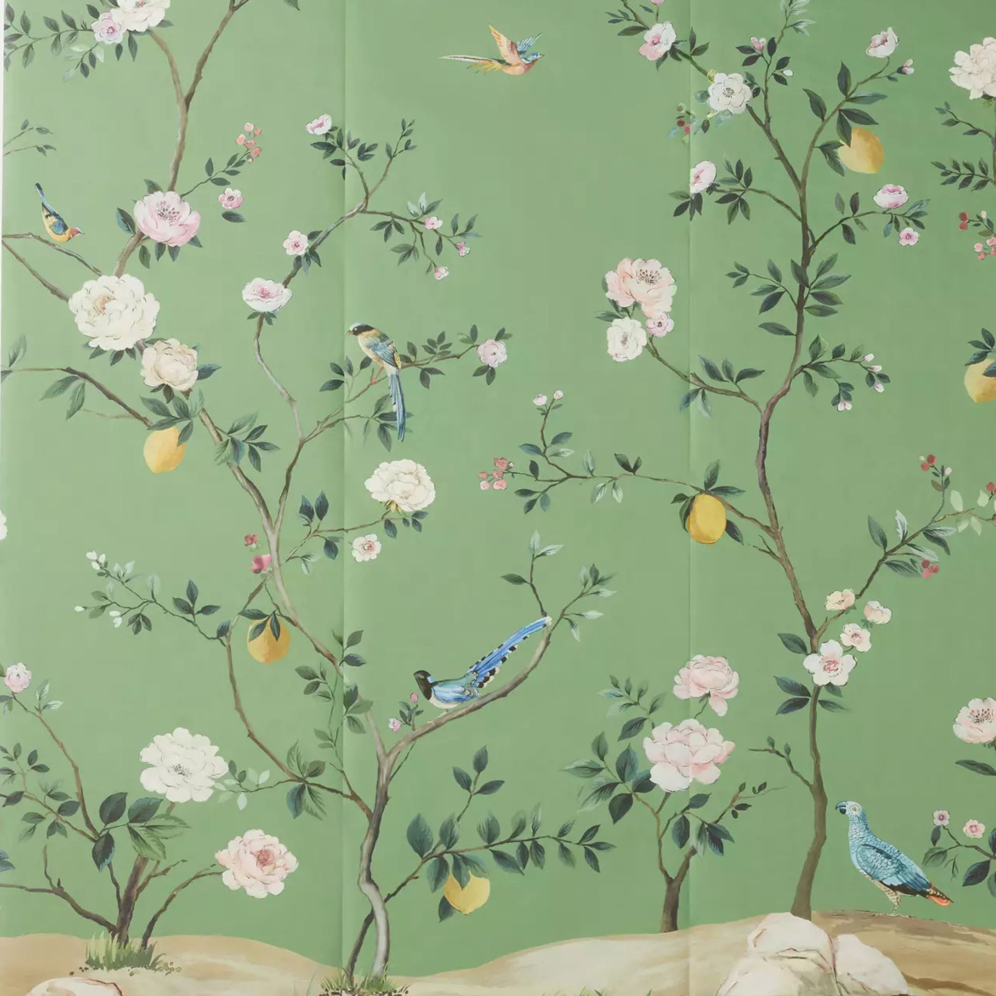
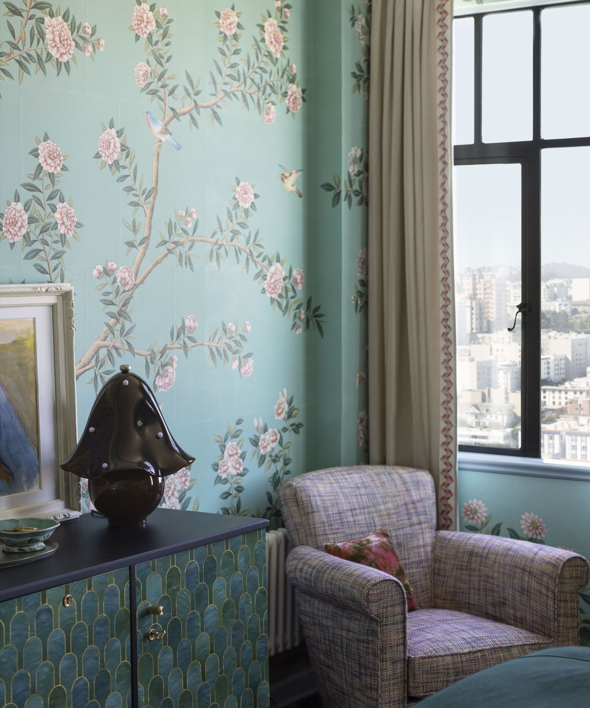
'With the existing period architecture and its many recesses and protrusions remaining untouched, we had to be meticulous with the measuring and execution of the custom Gracie wallpaper. It picks up the tones of the reconditioned 1930s storage piece, newly finished by artisans in a fish-scale pattern, and the soft blue trim accentuates the saturated tones in the room.'
'We created detailed elevations of every wall to ensure the birds and other elements of the wallpaper were perfectly placed. Every color, every bird, and leaf placement was lovingly chosen to lay out perfectly with the architecture and represent the palette of the entire condo. The Holly Hunt chair was something we procured for the owner’s other home, but was re-upholstered for its new spot.'
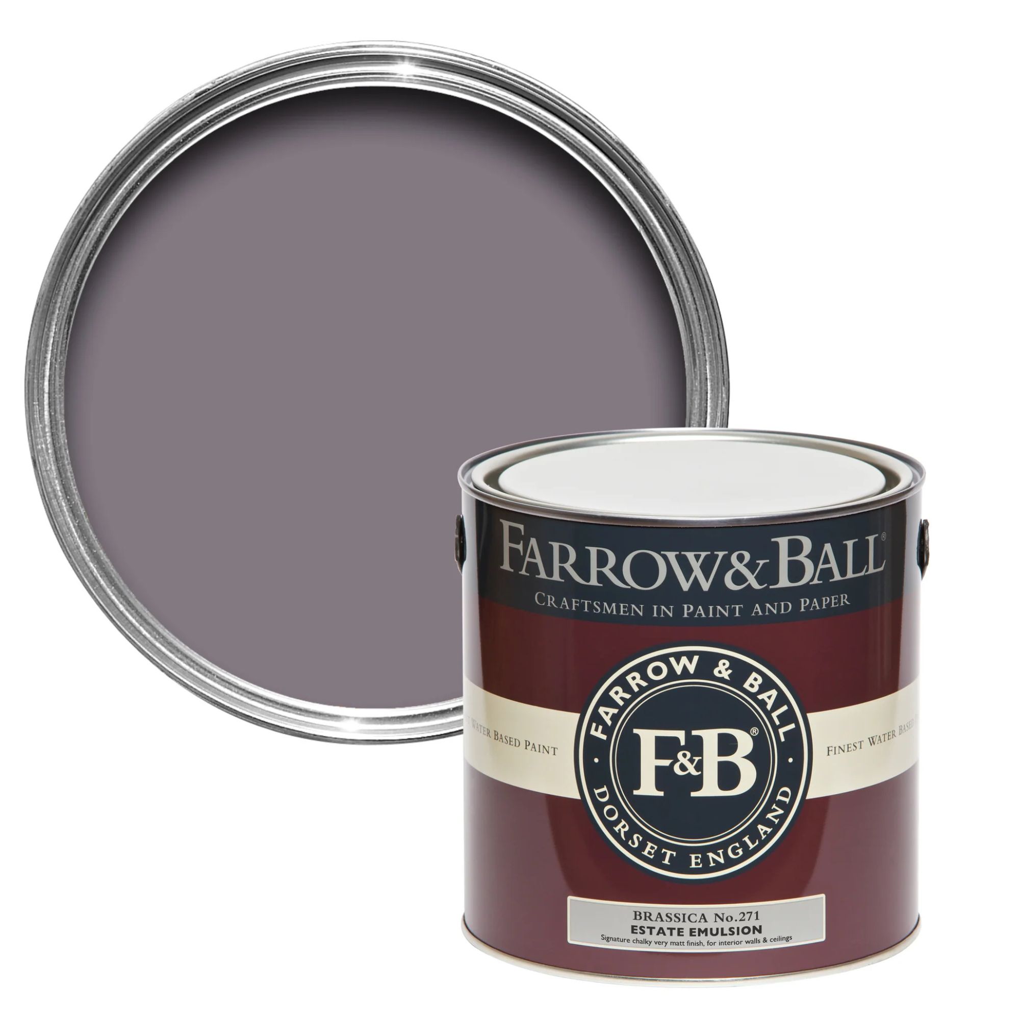
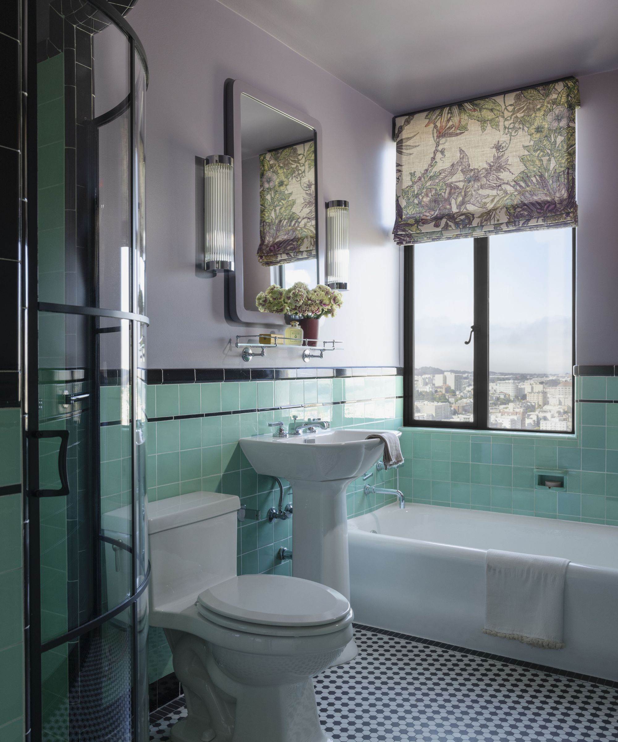
'The clients wished to maintain the aesthetics of the original period bathroom, but there were some functional issues to contend with. After much sourcing, we were able to procure tile that very closely matched the original, so we could patch in where there was cracking. The new, curved shower door makes the small space feel more gracious and aligns with the shower curb. Color drenching in this space balances the rich tones of the tile.'
'This whole project took over a year to complete. Unfortunately, right as we were nearing completion, an atmospheric river tore through the Bay Area, and the original windows leaked, causing floor damage to the unit. Just when we thought we were going to be installing furniture, we had to move back into construction and install new steel windows (no easy feat on the 17th floor!).'
'But the result is beyond what we hoped for. It’s colorful without being flashy, elevated without being stuffy, and period-appropriate without being married to a single aesthetic.'
Shop the look

I am the Head of Interiors at Homes & Gardens. I started off in the world of journalism in fashion and luxury travel and then landed my first interiors role at Real Homes and have been in the world of interior design ever since. Prior to my role at H&G I was the digital editor at Livingetc, from which I took a sabbatical to travel in my self-converted van (not as glamorous as decorating a home, but very satisfying). A year later, and with lots of technical DIY lessons learned I am back to writing and editing, sometimes even from the comfort of my home on wheels.
