Bold patterns and bright updates lift the mood in this traditional style home
Colorful chinoiserie and bright prints put a fresh spin on traditional English country house style in this Texas home

Design expertise in your inbox – from inspiring decorating ideas and beautiful celebrity homes to practical gardening advice and shopping round-ups.
You are now subscribed
Your newsletter sign-up was successful
Want to add more newsletters?
How do you update and refresh a home's interiors, while still keeping the traditional aesthetic of the original building's design? That was the conundrum faced by the owners of this English Tudor estate-style home. The house was built in 1995, in the prestigious Flower Mound suburb of Dallas, Texas, and the owners were looking to update their home and improve its potential for hosting friends and family. The striking results of its recent renovation and redecoration make this one of the world's best homes.
Getting it looking this good was not without its challenges, however, and the homeowners sought professional help from Kim Armstrong Interior Design to plan and implement their home's new look. Kim worked her way through all the main living spaces, and came up with new designs for the bedrooms, too. We caught up with her to discuss the highlights of this lighter, brighter traditional English-style home and discovered that fabrics, pattern and color were key to its transformation.
Living room
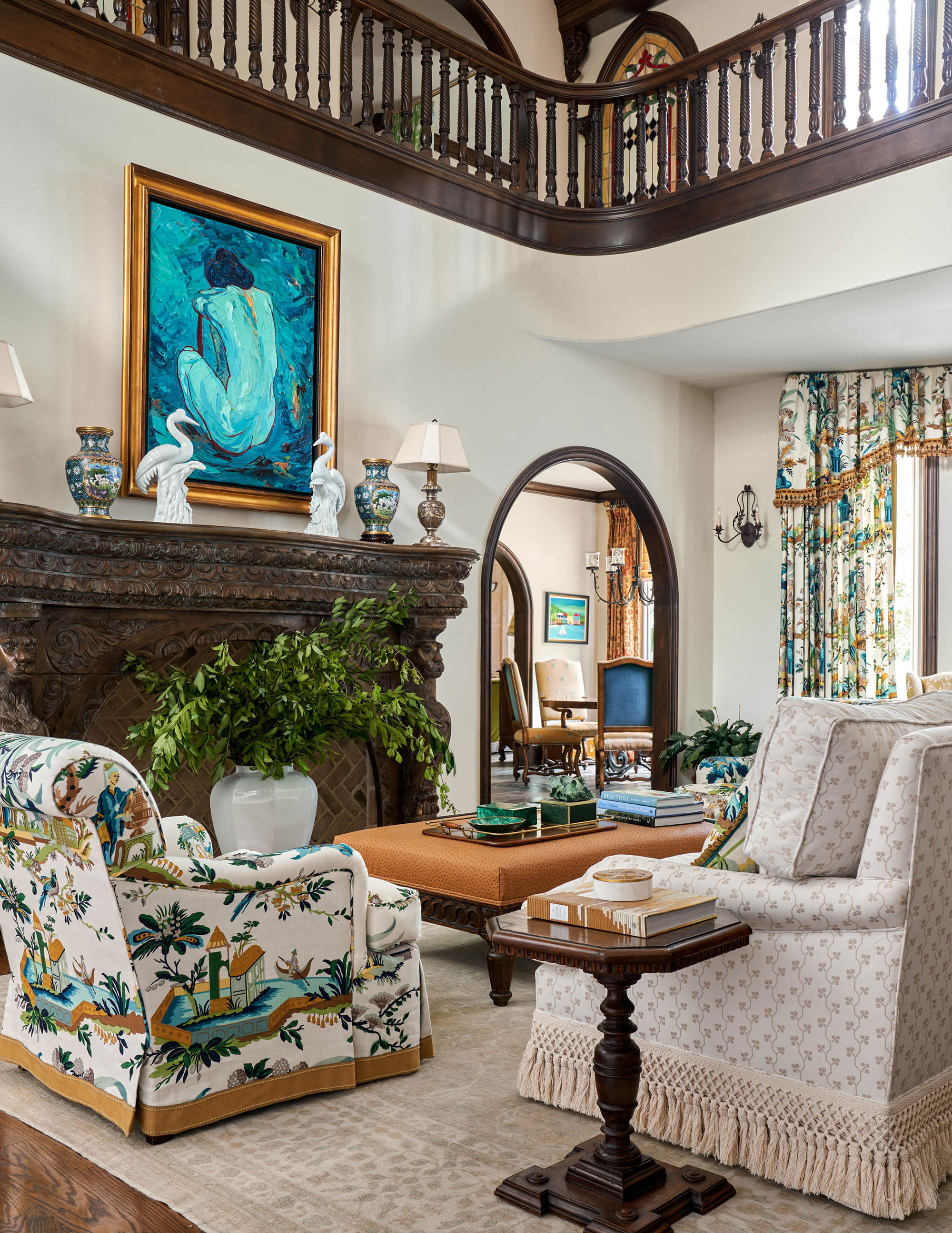
This is the first room you come to from the entrance foyer and, as designer Kim Armstrong explains, it's a central room with views to other areas of the home and even a staircase and galleried landing above. Kim's living room ideas had to take the room's central position into account and set the tone for the home's traditional interiors and fresh new updates.
Article continues below'We started in the living room, as we did throughout the house, by lightening up the wall color to an off-white cream with some subtle taupe undertones. We got rid of the faux finish that was everywhere throughout the house and we also used traditional prints, but in more vibrant colors, so it felt fresh and not muted or dated,' says Kim. One of Kim's favorite features is the fireplace which was original to the house but was an architecturally reclaimed antique. 'I love the grand scale of it,' she adds.
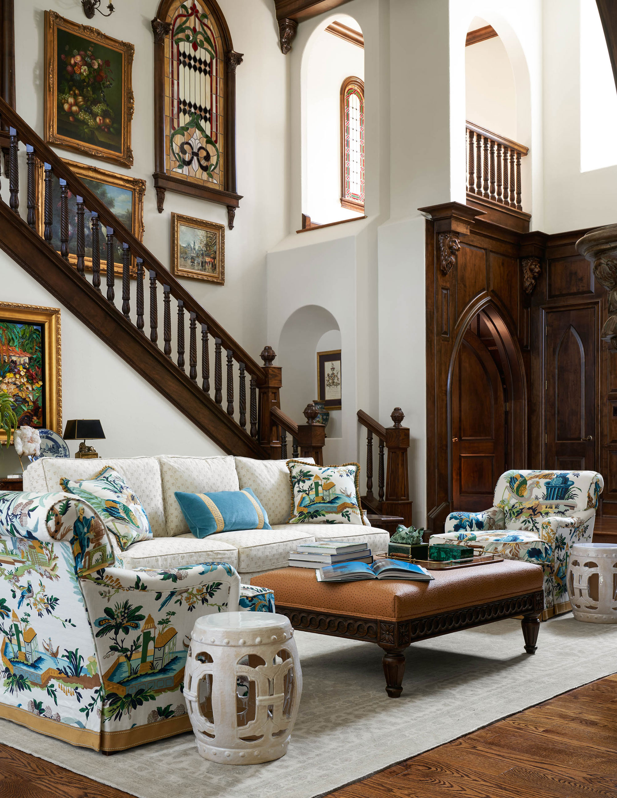
'Our client requested color for this main living room, however this is the hub that takes you to the many different wings of the home, so we needed to introduce color here in a very classic, and timeless way, and also in a way that flows with the different colors that are sprinkled throughout the home,' explains Kim. 'The Brunschwig & Fils Le Jardin Chinois fabric was where we started with the design. I love the Brunschwig & Fils drapes and how it lightens the room but still supports the architecture with the more traditional design.'
The same Brunschwig & Fils fabric has been used for the armchair upholstery, and note how that, together with the pale rug and walls, balances out the dark wood staircase and doors.
Dining room
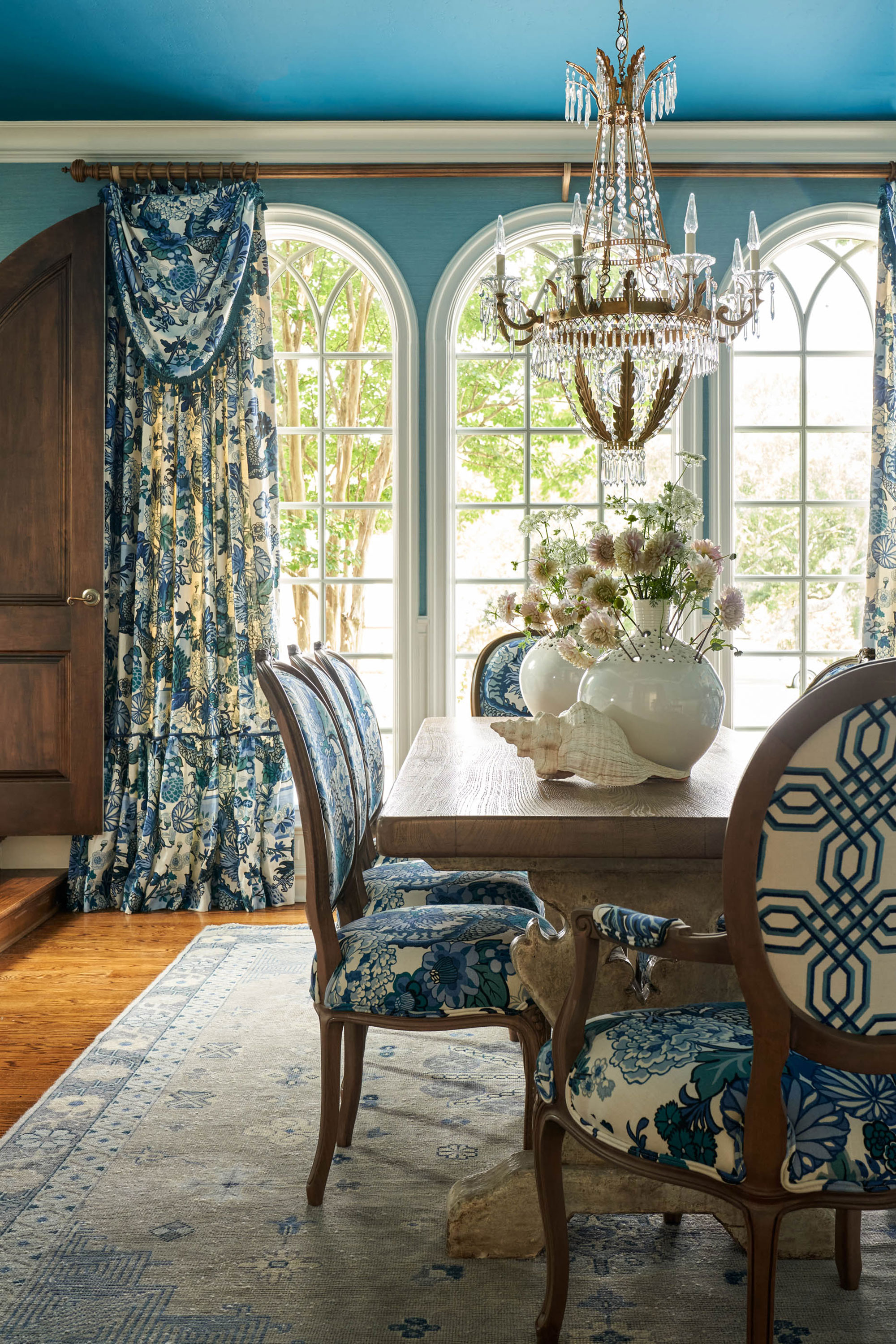
Kim's dining room ideas stemmed from the Chiang Mai Dragon fabric dining chairs the client brought with her from her old house.
Design expertise in your inbox – from inspiring decorating ideas and beautiful celebrity homes to practical gardening advice and shopping round-ups.
'Given the nature of the pattern and the classic blue and white print, we kept with that classic blue and white overall theme,' says Kim. 'The client loves turquoise so one of the blues we introduced had a turquoise undertone. Luckily there are touches of this color in the fabric so it was easy to build in.'
Kim found a grass cloth wallpaper by Winfield Thybony in the perfect shade of blue-turquoise, but decided that too much of this color would have been overwhelming. Building a wainscot and matching the raised panel profile to the gothic arched door proved the best solution. 'This elevated the room and allowed us to use the gorgeous grass cloth without making the room too blue. The white painted wainscot was the perfect balance,' says Kim. 'We added drama to the ceiling by painting it a more vibrant hue of the turquoise blue. It's a little unexpected, and we love the drama it brings to the room.'
Library
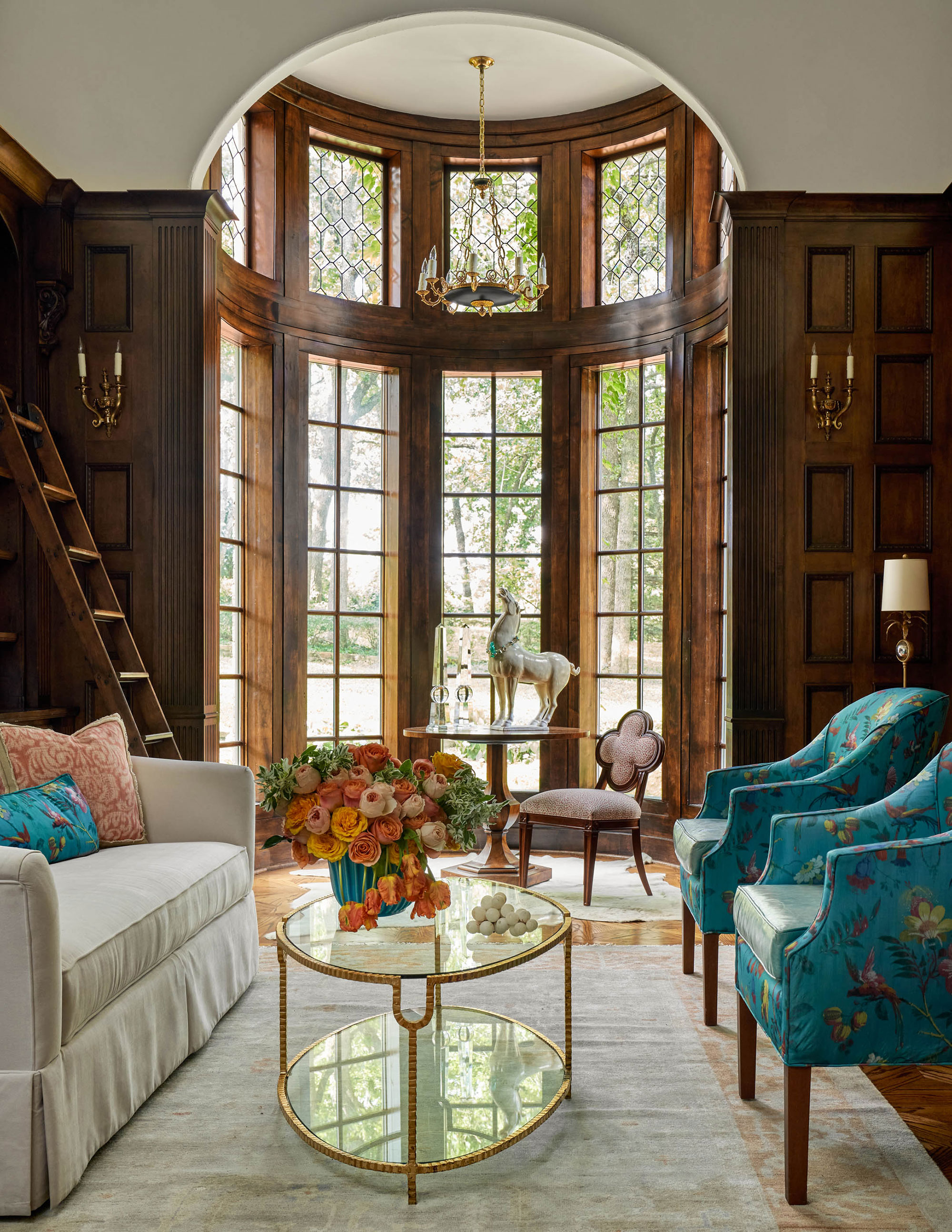
Every self-respecting, manor house should have a library, and this Flower Mound outpost of grand English-style has this absolute gem of a space.
If you're looking for home library ideas for a more traditional space, this stunning reading spot is full of inspiration.
There were challenges, however, in updating the look. 'The wood in this room is dark, it’s impressive but to add dark muted colors, would not have given this room the more updated colorful touch that the client desired.' says Kim. 'We tried to lighten and brighten the room with turquoise, off white and touches of coral-orange.' Using these fresher color options ties in with the designer's choices elsewhere in the home and creates harmony and flow from space to space.
Downstairs den
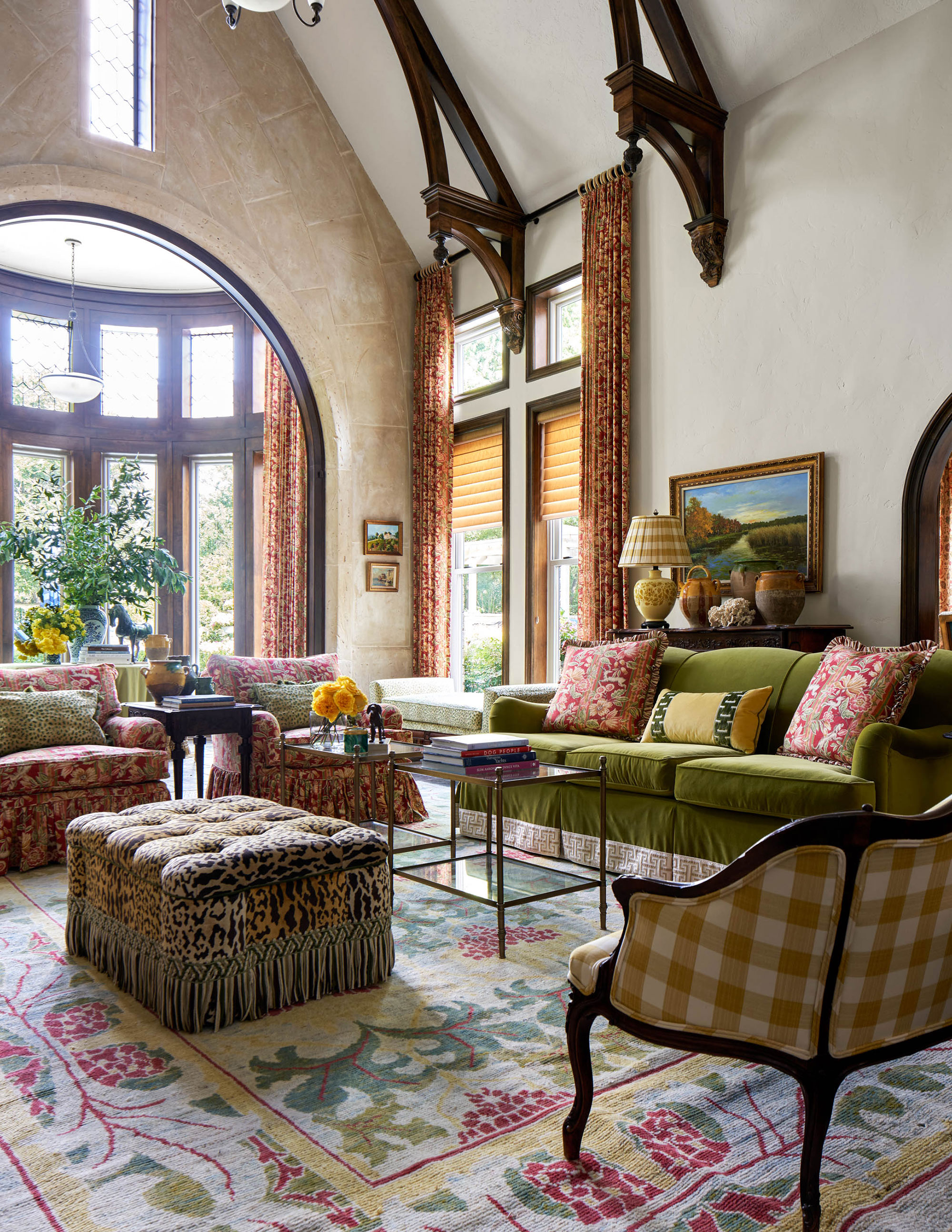
When a room has striking architectural features as with this downstairs den – an extra living room – with its rotunda windows with gothic arches, the décor needs to include bold design elements. A piece of furniture, accessory or artwork can often provide the inspiration for a room scheme, but in this room the mural above the fireplace was actually proving problematic. The husband loved the mural and wanted to keep it, explains Kim, but the colors of the mural were rust-red, olive greens, and golds. 'Not exactly your most updated color trio,' she says. 'However when we discovered the Cowtan & Tout red floral fabric, we knew our problem was solved. The bright cheerful red fabric has just enough of the other colors that we needed to pull the whole scheme together.'
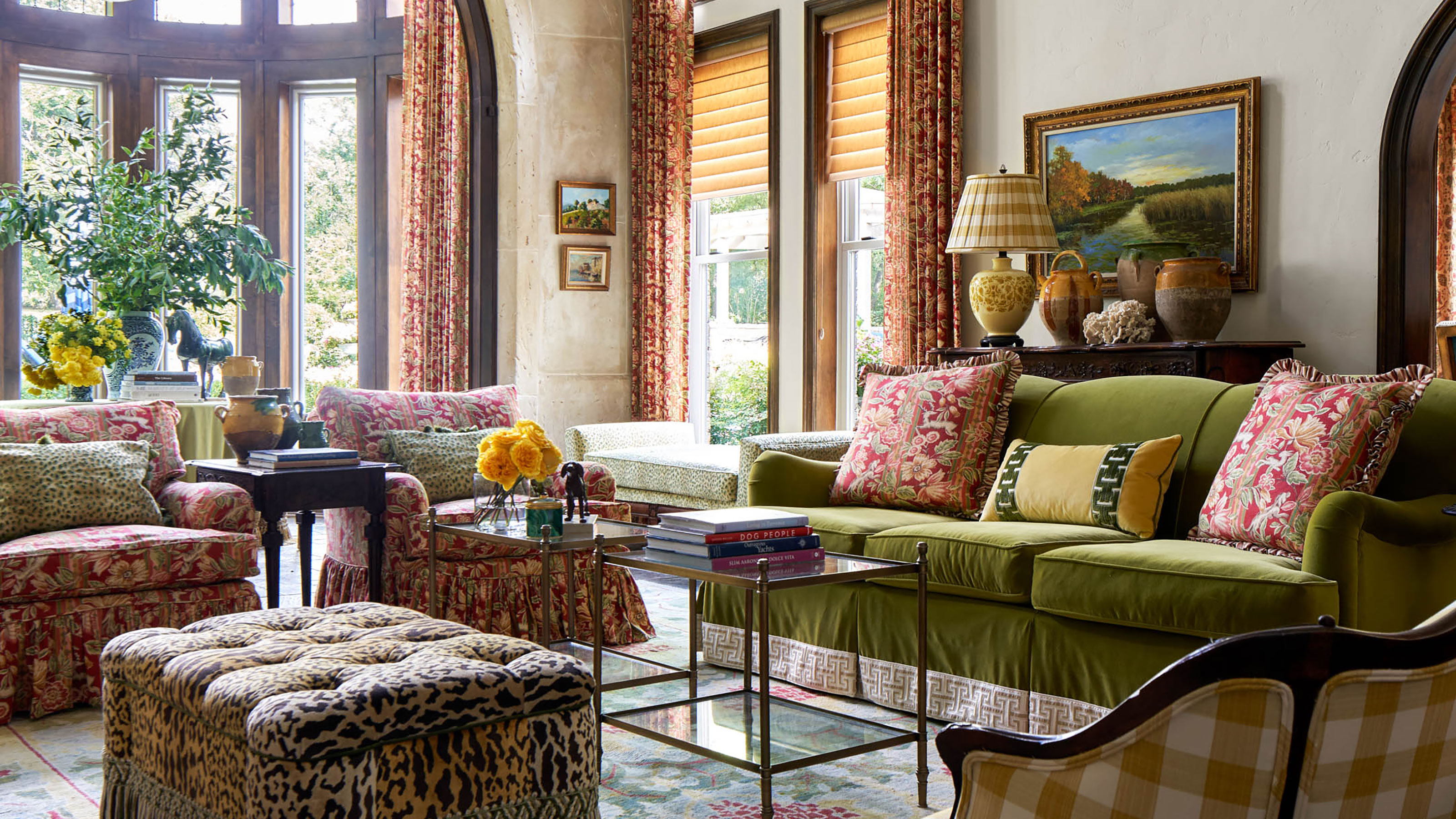
Other pieces that Kim introduced to enhance a more contemporary look in her family living room ideas include a Charles Fraudree-inspired scalloped ottoman, covered in leopard print velvet; a custom green sofa with an oversized tape band trim; and an antique settee from Inessa Stewart in Dallas.
Kim was delighted when she found the area rug at Esmaili rugs in Dallas, 'It’s a contemporary design hand knotted wool from Turkey and was the most perfect find of all to complete the room design.'
Upstairs living room
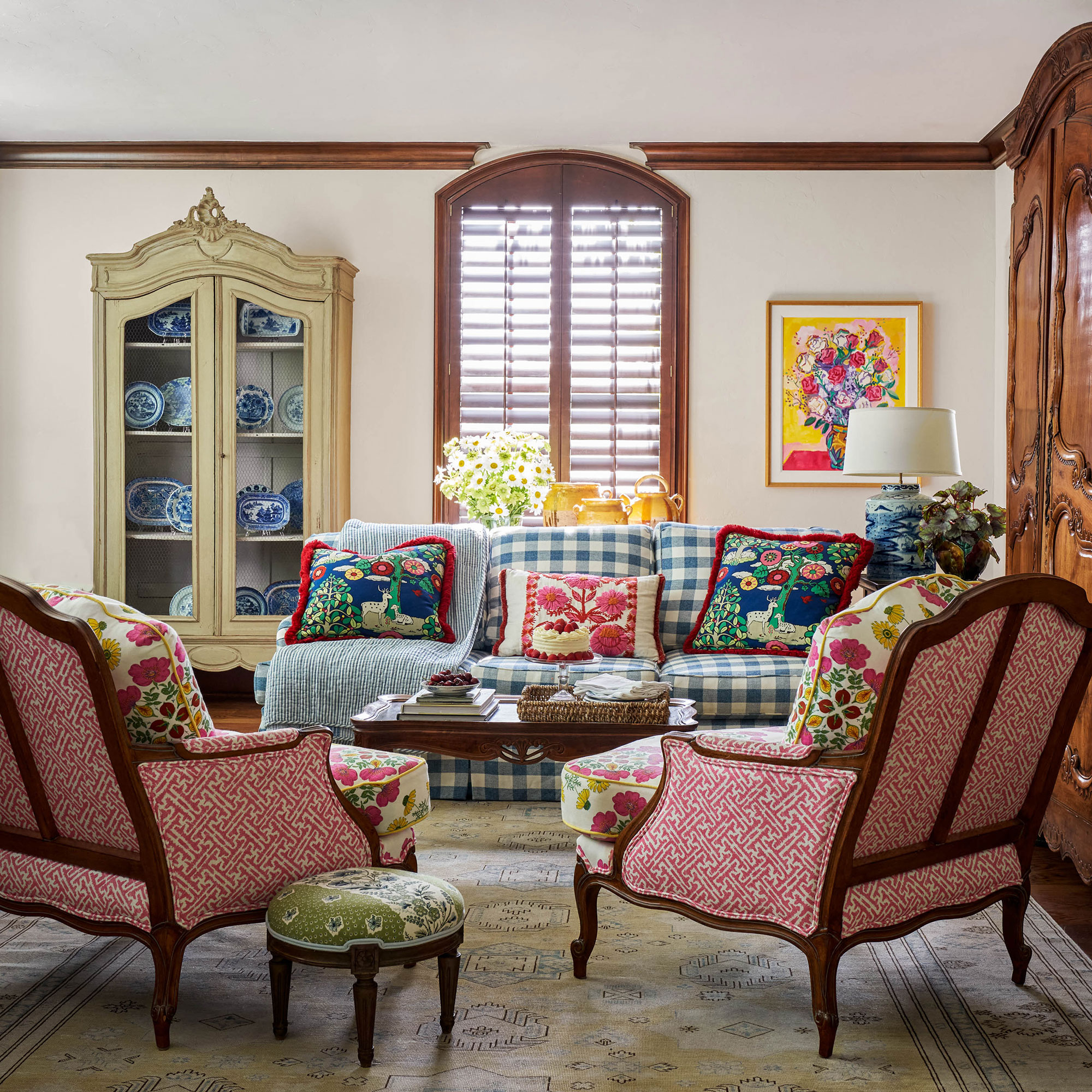
This comfortable upstairs living room is where the homeowners display many of their found art pieces, and the different colors and patterns and comfortable furniture make it a cozy get-away den for their overnight guests.
The vintage French armoires is a perfect place to store a blue and white pottery collection, while a second matching armoire stows the TV. Two antique bergere chairs are covered in a Peter Faso fabric and the blue and white plaid fabric for the sofa is from Lee Jofa.
Bedroom
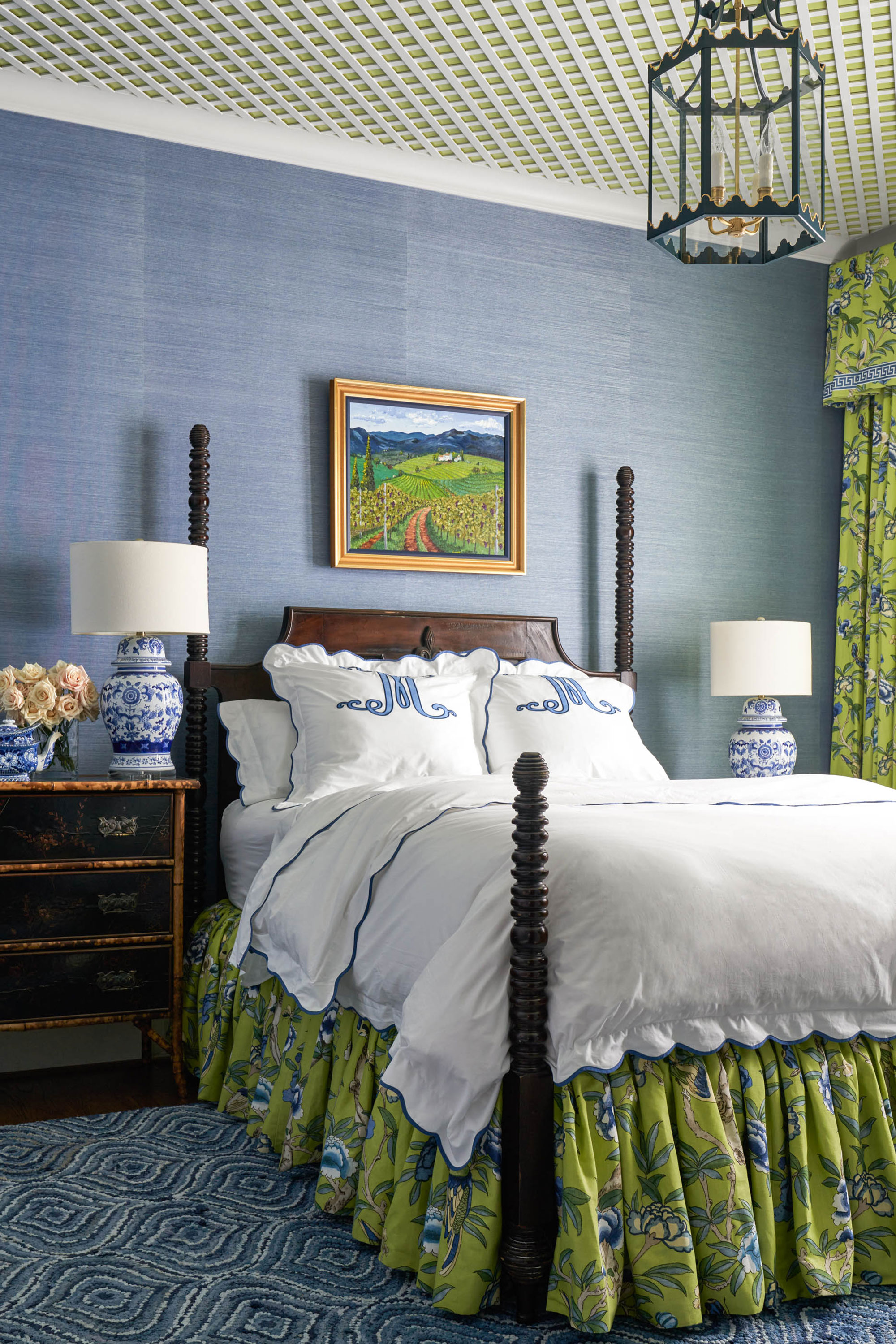
The homeowners love to entertain and wanted to make their guests feel comfortable and welcome. They also wanted to make sure the guest rooms were just as luxurious as the rest of the house. This downstairs guest bedroom offered plenty of scope for new bedroom ideas since it was originally lacking in features. As Kim explains, 'It didn’t flow with the rest of the house, and felt like a bit of an afterthought. It had carpet floors, painted walls, no crown moulding, and the windows had boring sheetrock turned edges.'
Kim and her team installed wood floors, and added blue Thiabaut grasscloth paper to the walls. To give the room some architectural interest, they encased the windows in wood, and added a white lattice to the ceiling.
'We first painted the ceiling a bright grass green that gave the room some depth,' says Kim. 'And we replaced the old boring brown ceiling fan with a custom Colleen Rider lantern – the crown jewel of the room!'
The green print floral fabric is from Thibaut and the bedding is from Williams Sonoma, with custom shams and a bedskirt. The homeowner added a custom monogram to elevate the bought bedding with a look of bespoke luxury.
Guest bedroom
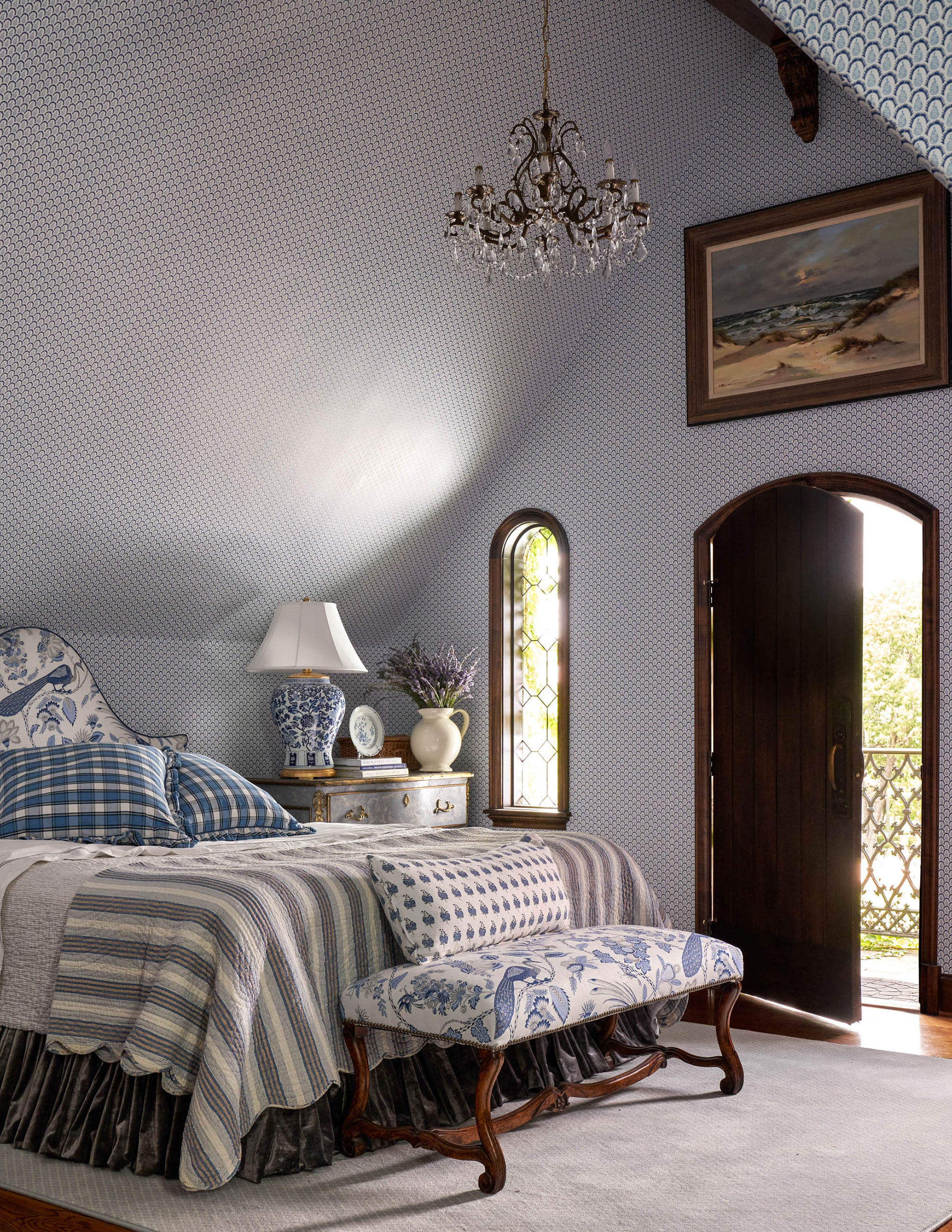
This upstairs guest bedroom is one of designer Kim's favorite rooms, with its steps down into the room, a door to the balcony with steps down to the garden, and a sloping loft ceiling – all unique architectural details that make it special.
Kim had no problems coming up with the perfect design details to enhance the room's existing features. She kept the color palette to different shades of blue and white, bringing in a mix of different patterns and textures in the textiles, to give the room that curated over time feeling.
'The peaked ceilings with the wood trim, provided the perfect foundation for a gorgeous Peter Faso wallpaper,' says Kim. 'We took the wallpaper on the slanted part of the ceiling, which just enveloped the whole sleeping area.'

'I loved that the bedroom suite was large enough to create a separate lounge area where we used matching Peter Faso fabric to enhance that entire European vibe that this room naturally had,' adds designer Kim.
The owners also had some beautiful French antiques that made the perfect additions to the room.
Children's nursery
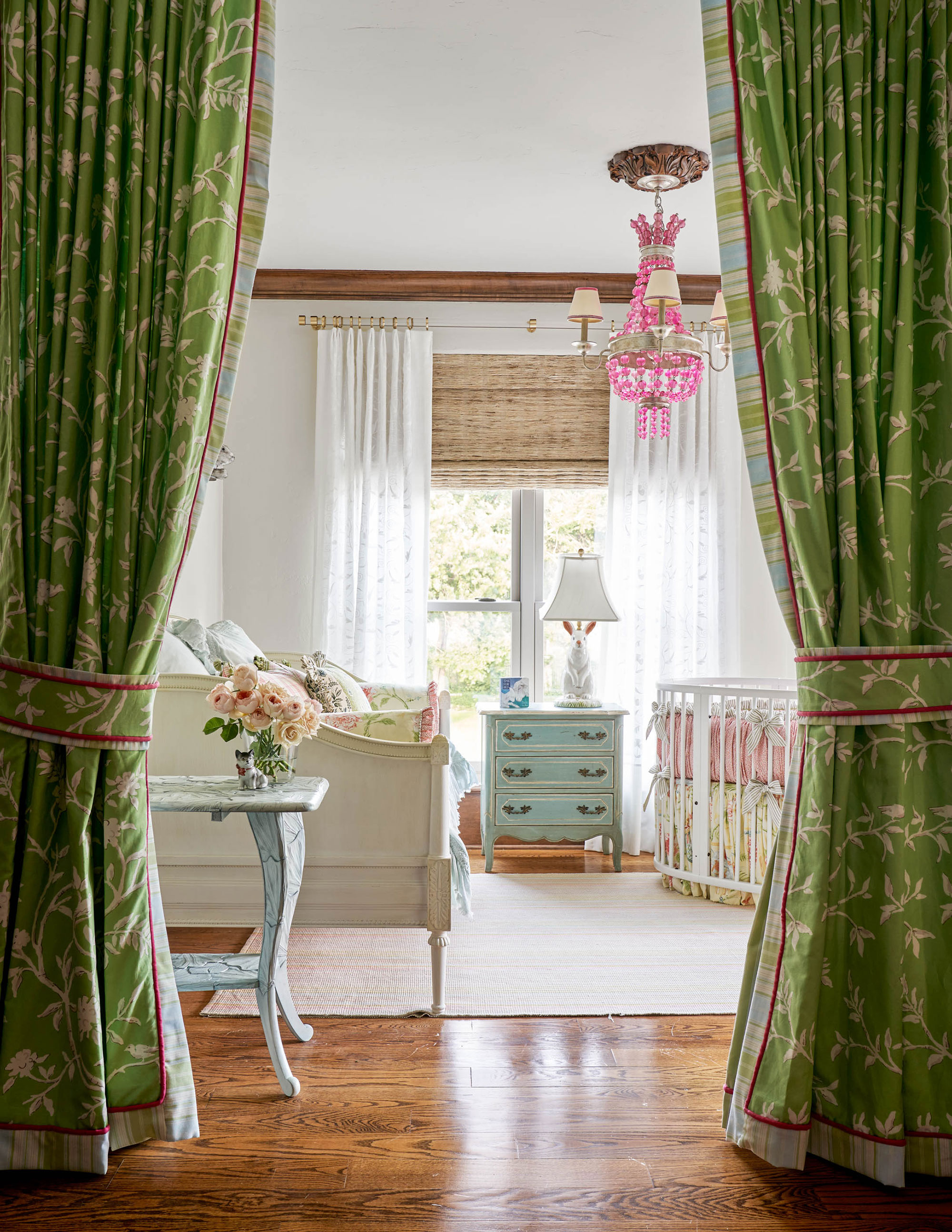
Although this is a large house, of nearly 7,000 sq ft, it only had four bedrooms, and for people who love to host, this was a problem. They really needed an extra bedroom for the smallest grandchildren and a parent or two to sleep.
Kim's solution was ingenious.
'We created a makeshift nursery cum guest bedroom from a card room that was directly off of the upstairs den, and hung drapes from the ceiling that were fully functional, insulated with bump liner, and decorative on both facing sides,' explains Kim. 'This way this room could have complete privacy when needed. We also added black out shades that would darken the room in daytime if baby needed some rest.'
The unusual nursery solution typifies Kim's fresh and creative approach to the design challenges throughout this project. And, as we've seen, her new ideas for this previously somewhat dated home have lifted it out of its 90s timewarp into a bright new era, but one that's still very much in touch with its traditional roots.
Interior design: Kim Armstrong
Photographs: Nathan Schroder
Karen sources beautiful homes to feature on the Homes & Gardens website. She loves visiting historic houses in particular and working with photographers to capture all shapes and sizes of properties. Karen began her career as a sub-editor at Hi-Fi News and Record Review magazine. Her move to women’s magazines came soon after, in the shape of Living magazine, which covered cookery, fashion, beauty, homes and gardening. From Living Karen moved to Ideal Home magazine, where as deputy chief sub, then chief sub, she started to really take an interest in properties, architecture, interior design and gardening.
