8 key updates we love that put the style back into this relaxed California home
A dated colonial house with a tricky layout became a stylish family home that goes with the flow – here's how

- 1. Reconfigure the layout to connect inside and outside spaces
- 2. Use a banquette as an elegant piece of furniture
- 3. Find the right cabinet color to pull the kitchen scheme together
- 4. Make the layout more sociable
- 5. Indulge a powder room with an elegant look
- 6. Mix vintage pieces with clean-lined modern furniture
- 7. Use borrowed light
- 8. Stick to calm, simple elegance for the primary bedroom
One of the biggest challenges in house design in general, and in this California home in particular, is when the exterior style and the interior design are completely out of sync.
No one's suggesting that if you have a historic home you should fill the interiors with antiques and we've all seen some truly beautiful heritage properties with contemporary interiors. However, there needs to be a sense of flow from outside to inside with no jarring of style. Surprises, yes. Shocks, no.
Megan Read, owner and principal of Studio Read Interior Design brought harmony and style to this 1939-built colonial home in Burlingame, CA, a suburb situated between San Francisco and Silicon Valley. 'While the exterior still had the semblance of a colonial style home,' says Megan, 'the interior had traces of design trends from every decade since and lacked any cohesive style of its own. We needed to create a central design language that would feel architecturally authentic while also reflecting the young, modern owners.'
Article continues belowWe asked Megan to pinpoint the 8 key updates she made that put the style back into this home, turning it from difficult and dated to laid back and contemporary, with a smart edge of California cool.
1. Reconfigure the layout to connect inside and outside spaces
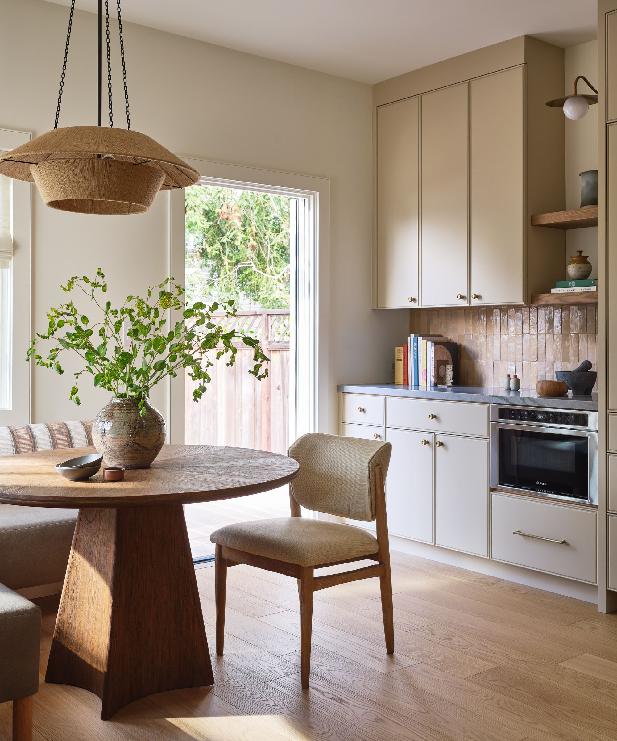
'The kitchen had recently been remodeled to sell,' says designer Megan, 'and the previous owner had pulled together the greatest hits: white Shaker cabinets, navy blue island, stainless steel appliances, and engineered stone counters. The bigger issue was the layout: the laundry room located off of the kitchen was cutting off direct access to the backyard.'
Having an indoor-outdoor connection was a must and the family love to cook, so working closely with the general contractor J.P. Lindstrom Megan set about reworking every inch of this space.
The laundry room became a breakfast nook and is now one of the most loved and light-filled corners of the home. Choosing an eye-catching statement table (by Brownstone) and pendant (from Nickey Kehoe in Los Angeles) sealed the deal on this great family space.
Design expertise in your inbox – from inspiring decorating ideas and beautiful celebrity homes to practical gardening advice and shopping round-ups.
2. Use a banquette as an elegant piece of furniture
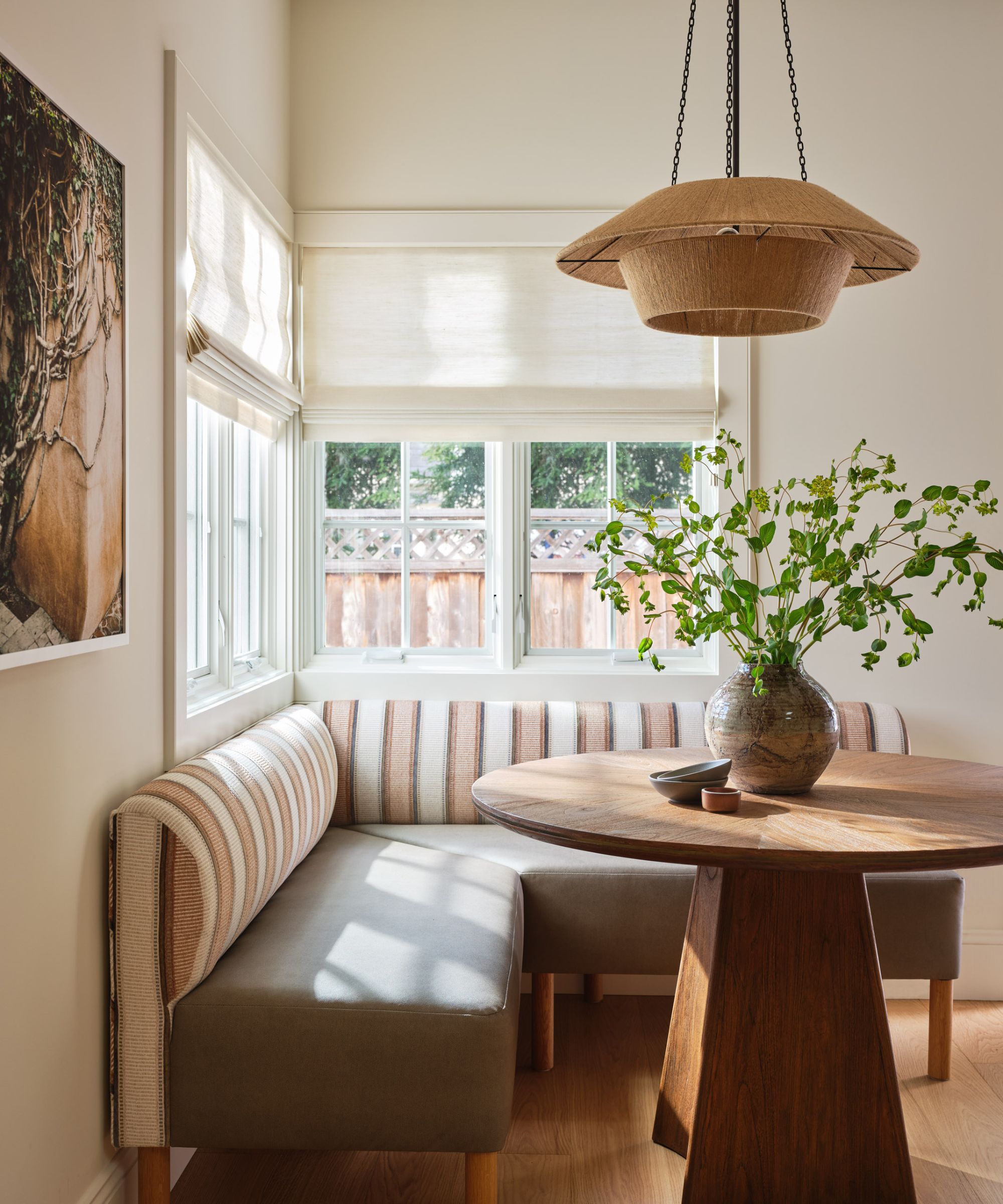
The homeowners were fully onboard with Megan's banquette seating ideas, with one important caveat – they didn't want the banquette to feel like it belonged in a restaurant.
The solution? 'We custom-designed a piece that felt more like furniture. The seat is upholstered in a kid-friendly vegan leather by Holly Hunt and the back fabric is by Pindler,' explains Megan. 'We reupholstered the dining chairs in a Kerry Joyce performance fabric for added durability, essential with a toddler around.

Studio Read Interior Design is a dynamic San Francisco based design firm specializing in custom homes and transformative renovations. As the firm’s principal, Megan prides herself on creating beautiful spaces that are thoughtfully tailored to reflect the lifestyle of each client and the architecture of each space. Her work is versatile and known for embracing the balance of opposites: comfortable and curated, modern and timeless, polished and patinaed, and in this California home's case, laid back and stylish. As a result, each home tells a unique story and is intended to evolve as we do.
3. Find the right cabinet color to pull the kitchen scheme together
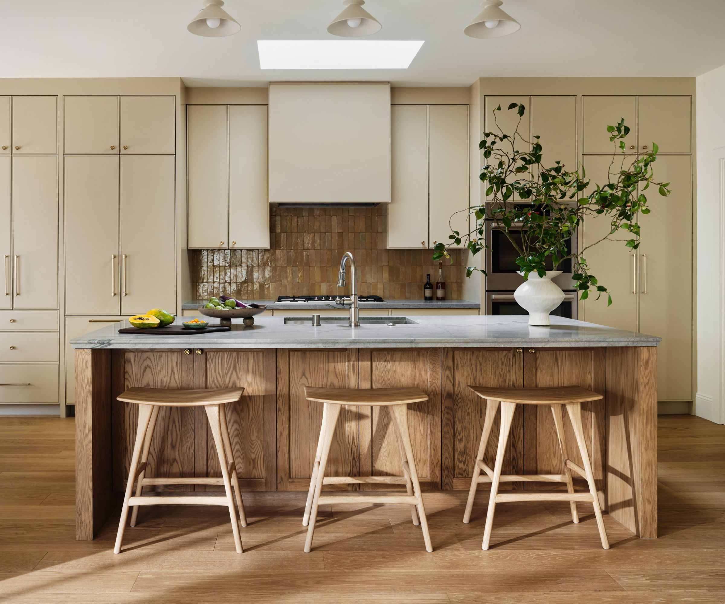
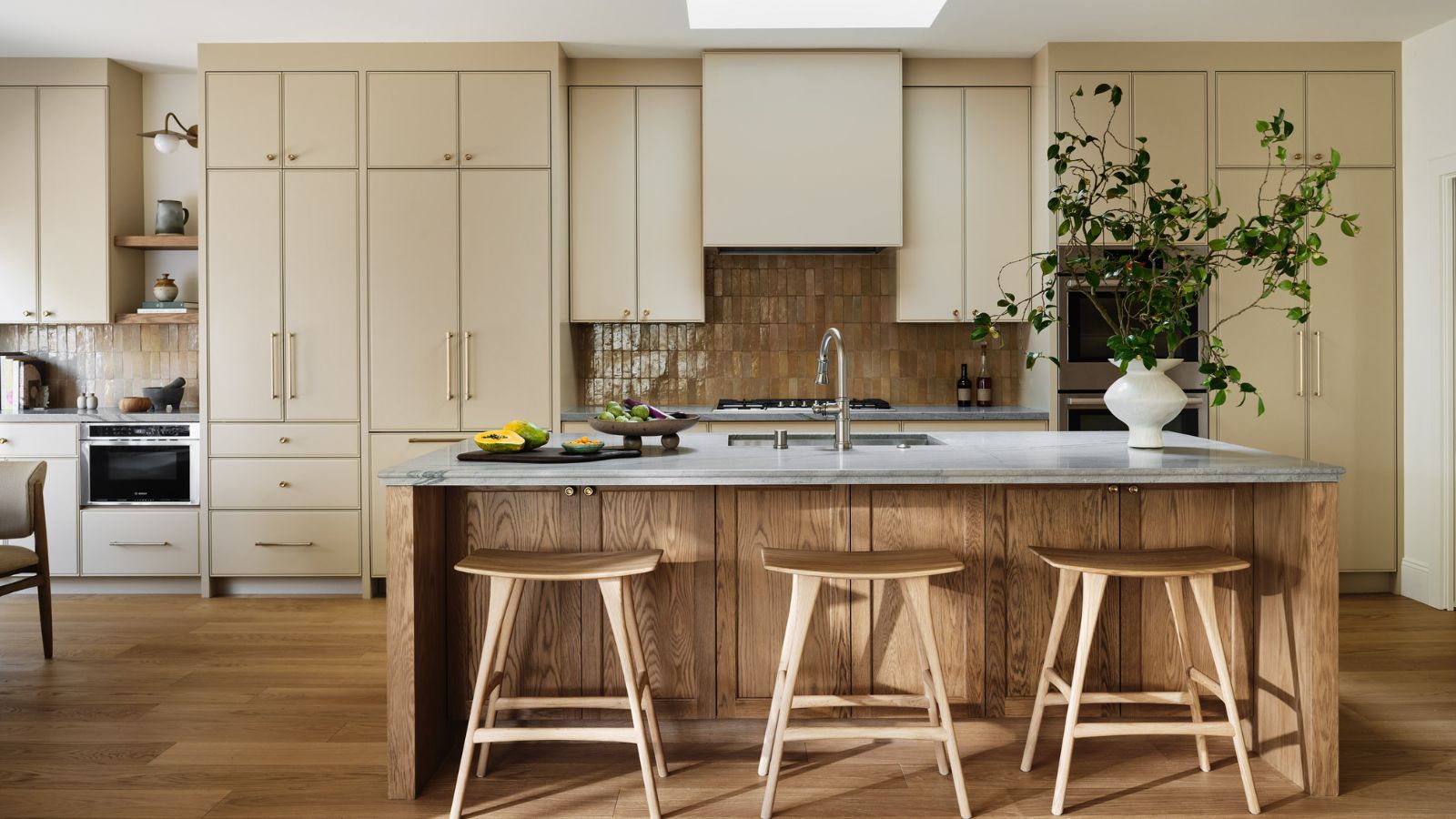
As we tour the new-look house, it soon becomes clear that there's a common theme across all the rooms. A carefully and consciously chosen palette of warm neutrals with pops of deeper pink and blush in places. The kitchen really layers up the neutrals, resulting in a tailored space that's also very livable. Getting the cabinet color right was crucial to this scheme.
'Warmth was a key word we returned to throughout the project, and we knew we didn’t want to design custom kitchen cabinets just to paint them white,' says Megan. 'After many mockups, we landed on Farrow & Ball’s Oxford Stone, and it is the most soothing shade in person. Quartzite counters were selected for their durability and a handmade Zellige tile by Zia Tile adds a soulful element to the space. Pale wood counter stools by Ethnicraft complete the natural layers of color.
4. Make the layout more sociable
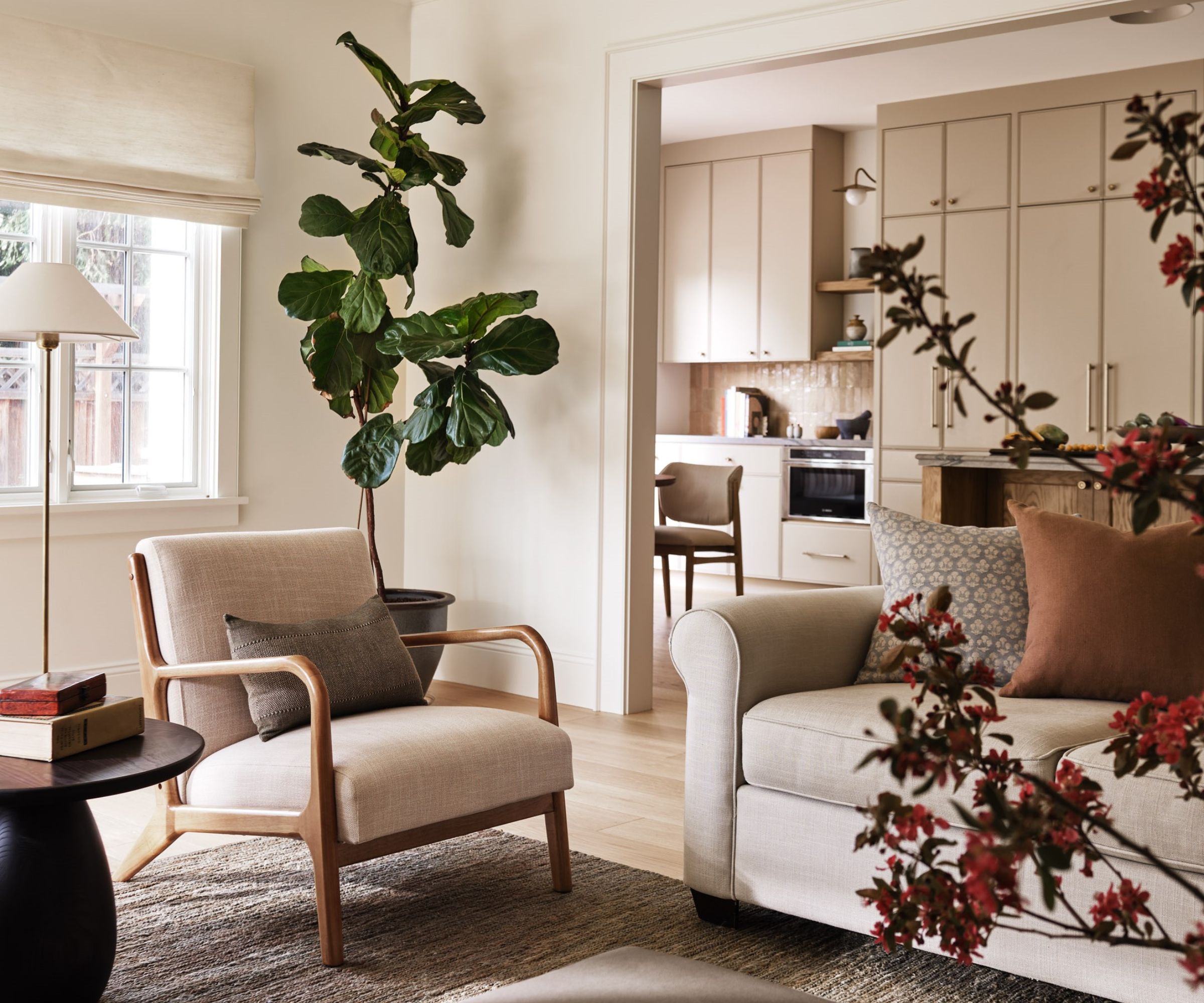
As we heard above, one of the difficulties of the home's previous incarnation was its tricky layout and lack of flow. This resulted in a carved up space with little interaction between the rooms, not at all conducive to family life.
Family living room ideas centered around opening the space right up to the kitchen, with an enlarged opening establishing sightlines between the two most-used rooms in the house.
There were other style issues to resolve besides widening the opening, as Megan explains. 'This room had some of the more head scratching design challenges,' she says. 'Years ago, a previous owner added an addition more resembling an A-frame cabin than a colonial home outside of San Francisco. We cleaned up the ceilings and adding crown molding and expanded the TV wall to allow for a more centralized seating layout. The clients wanted to refrain from investing in major upholstered pieces until they’re out of the toddler years, so we opted for rich and calming earth tones that can easily blend but won’t easily tire. A beautiful hand knotted jute rug by Armadillo is one of those pieces that helped to seamlessly bridge the old and old new and cushions in textiles by Zak & Fox & Carolina Irving add new life to their original pieces.'
5. Indulge a powder room with an elegant look
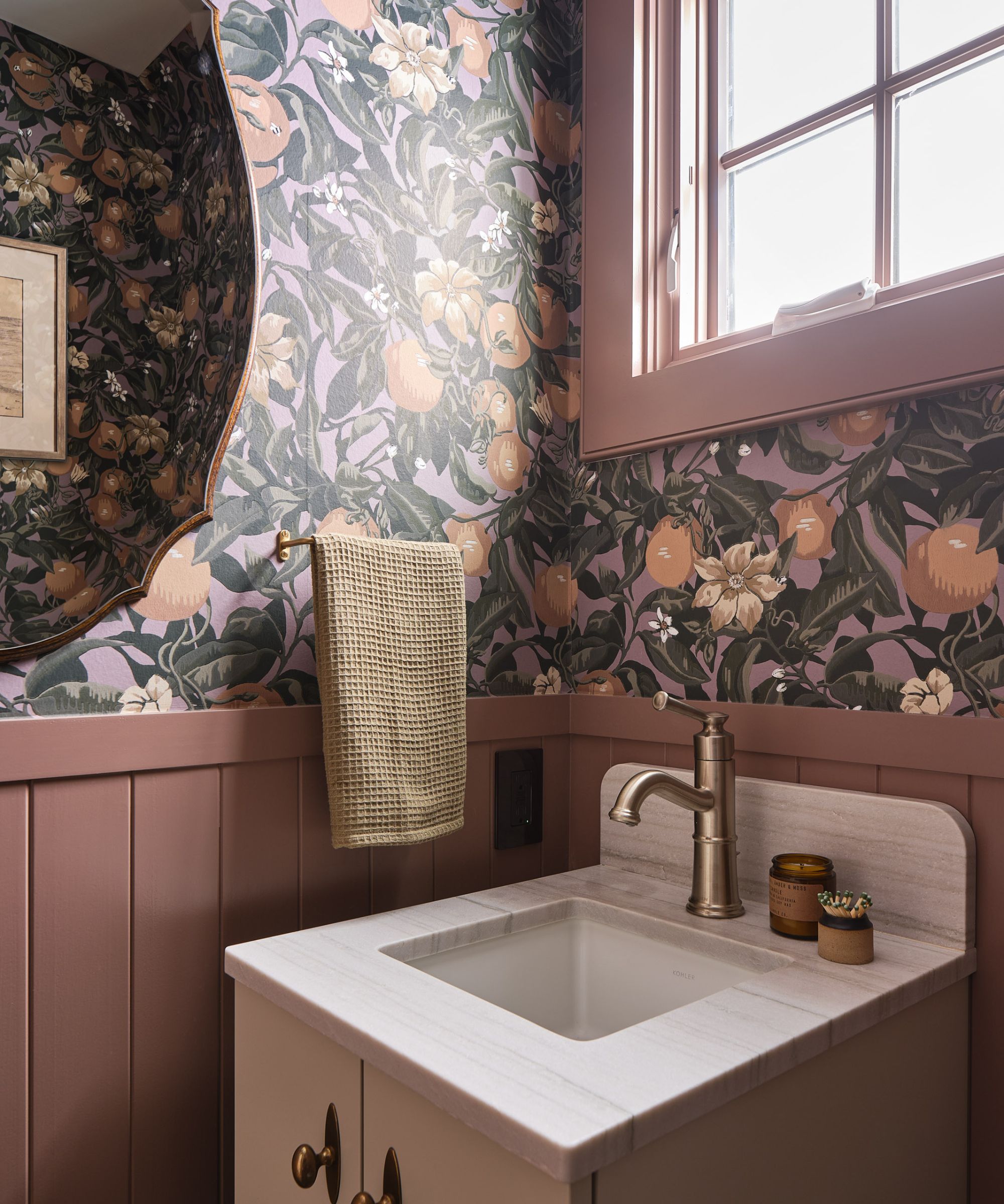
No room is too small for an elegant style update, and this compact powder room glows with its indulgent new look. We love the rich wallpaper design and the paneling painted in Sherwin Williams' Swing Brown, an earthy shade of pink.
'The Zak & Fox wallcovering was actually one of the first materials that was selected for the home and become a guidepost for much of the design that would follow,' explains designer Megan. 'For such a small space, it embodies so much of what we wanted to capture in this home: a nod to the past with a fresh flare, livable color, and the clients' incredibly warm and lighthearted personalities. When this textile was received with enthusiasm in schematic design I remember thinking: okay, I know where we’re going and I know we’re going to have fun getting there.'
6. Mix vintage pieces with clean-lined modern furniture
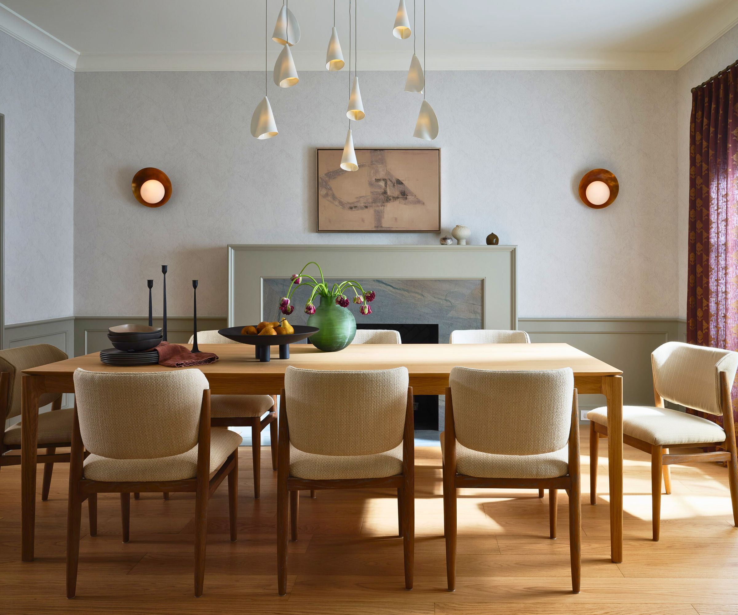
Dining room ideas incorporate a smooth blend of contemporary and vintage elements to create a harmonious transitional design scheme. 'The dining room felt like a great place to reintroduce interior architecture elements appropriate to when the home was built while also having fun with pattern, color and lighting,' says Megan. 'We redesigned the original stone fireplace and added wainscoting that we painted in Farrow & Ball’s Hardwick White. Above the wainscot, we papered the walls in a Schumacher wallcovering that reads like a texture at a distance, but it’s quite abstract up close. We balanced this with embroidered drapery, also by Schumacher, and I love the juxtaposition of these two textiles.'
The homeowners were keen to invest in great lighting solutions and there are some great layers of light in this room including vintage sconces from 1st Dibs and porcelain pendants from Bocci, from The Future Perfect in San Francisco. 'The Danish modern dining table is by Ethnicraft and is a great genre-blending piece,' adds Megan.
7. Use borrowed light
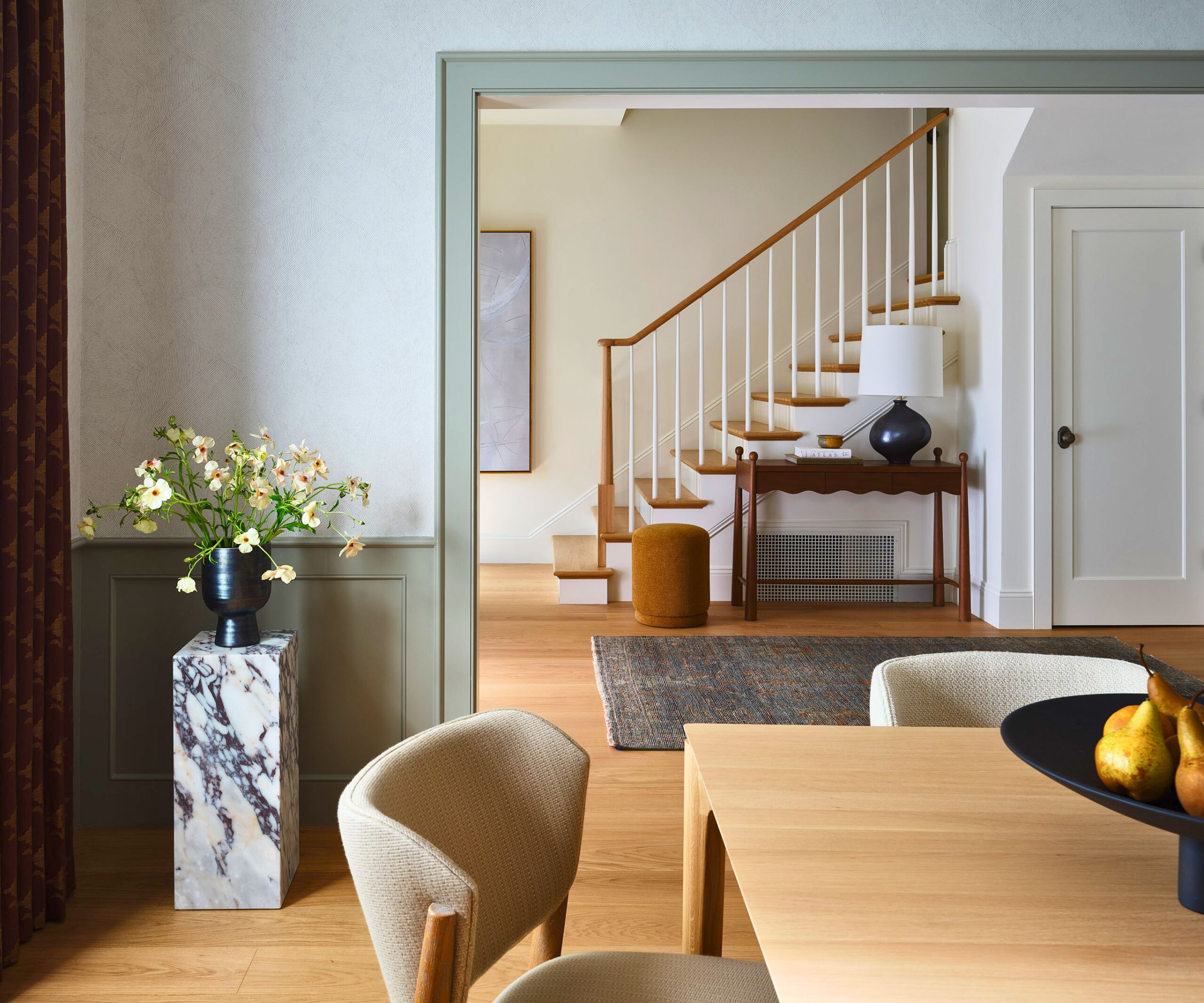
Here's a trick that can work equally well to enhance the sense of space in a small entryway as it does here in dividing up a previously open space. By enlarging or creating a wide opening between the entry and a reception room, in this case the dining room, both spaces benefit and complement one another.
'Originally, the entry and dining area was one open space and lacked a proper sense of arrival,' explains Megan. 'We framed a cased opening into the dining area and it’s amazing how it made the view into this space that much more impactful. We were sensitive to the dining room not becoming the formal room that never gets used so we opened a wall into the kitchen with double pocket doors. This created great flow while still having the flexibility of being closed off when someone wants to sit at the table for a zoom call.'
8. Stick to calm, simple elegance for the primary bedroom
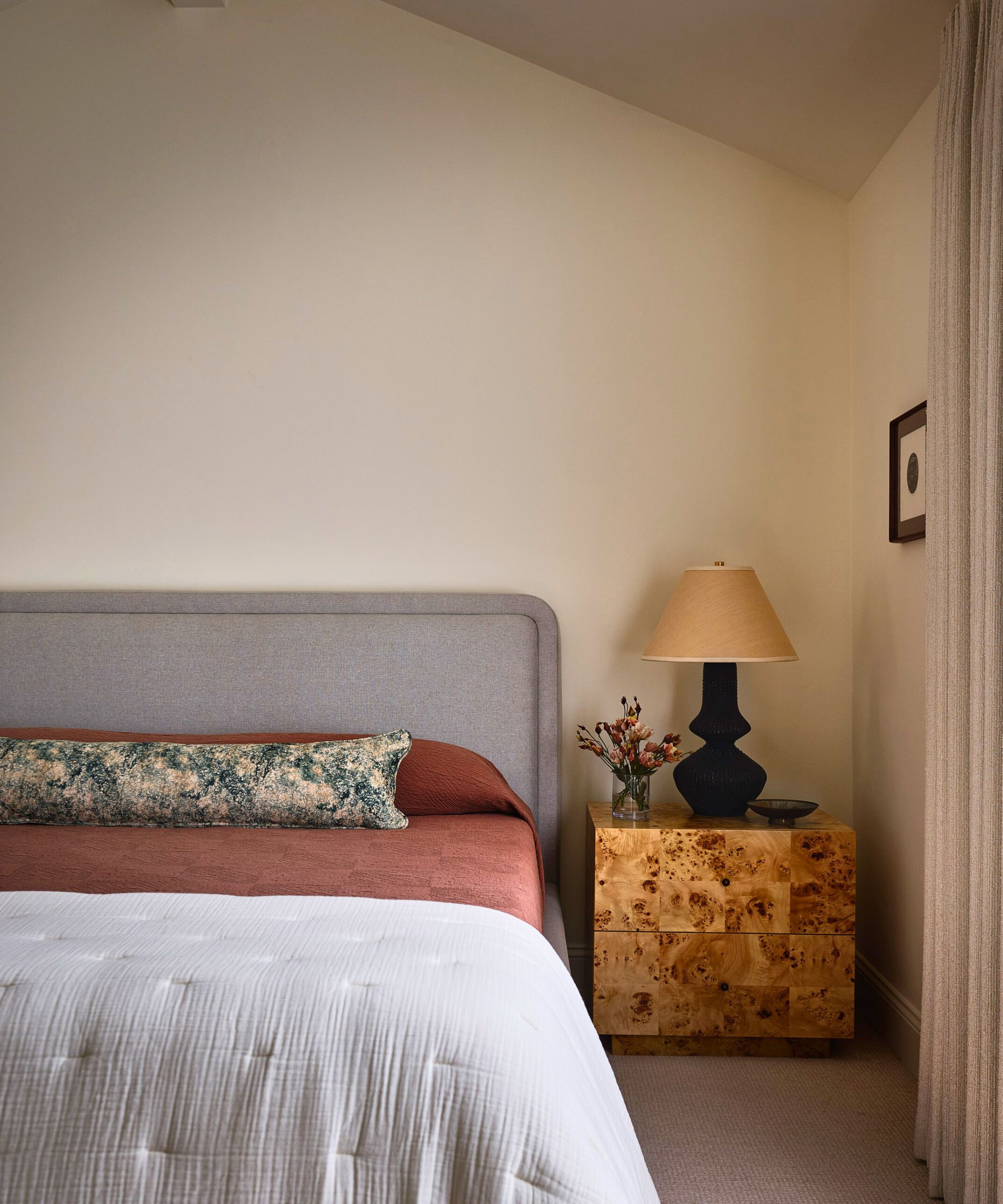
The bedroom ideas for the primary bedroom were all about keeping things calm, simple, and elegant, while referencing the warm natural color palette elsewhere in the home. The pared-back look is supremely restful but the color choices add an extra depth that saves the scheme from a hard-edged minimalist look.
'This is one of the few spaces in the property that only required a lighter decorative touch,' says Megan. 'We wanted to keep the space light and airy, and incorporate richer tones and textures with the textiles and furniture. Custom floor to ceiling drapery in a Holly Hunt fabric has a knubby texture that gives a very subtle 70s vibe. Bedding by Coyuchi & Natasha Baradaran add warmth, along with the burlwood nightstands.'
One dated Californian home transformed into a contemporary California colonial in 8 key updates. And best of all is that these are all things we should definitely try at home!
Interior design: Megan Read at Studio Read
General Contractor: J.P. Lindstrom
Photography: R. Brad Knipstein
Karen sources beautiful homes to feature on the Homes & Gardens website. She loves visiting historic houses in particular and working with photographers to capture all shapes and sizes of properties. Karen began her career as a sub-editor at Hi-Fi News and Record Review magazine. Her move to women’s magazines came soon after, in the shape of Living magazine, which covered cookery, fashion, beauty, homes and gardening. From Living Karen moved to Ideal Home magazine, where as deputy chief sub, then chief sub, she started to really take an interest in properties, architecture, interior design and gardening.
