Design expertise in your inbox – from inspiring decorating ideas and beautiful celebrity homes to practical gardening advice and shopping round-ups.
You are now subscribed
Your newsletter sign-up was successful
Want to add more newsletters?
Back when I was at the height of my renovation project I had to make decisions very quickly. I had construction workers asking me questions left and right, I had to busy myself every night to get the next space ready for a laborer to get into, and all while trying to work a full time job (and do zoom calls with plasterers banging around behind me). It was, to put it mildly, full on.
Inevitably, a few decisions got rushed, and made in the moment rather than fully considered. Like the one about what paint ideas to use for my dining room...
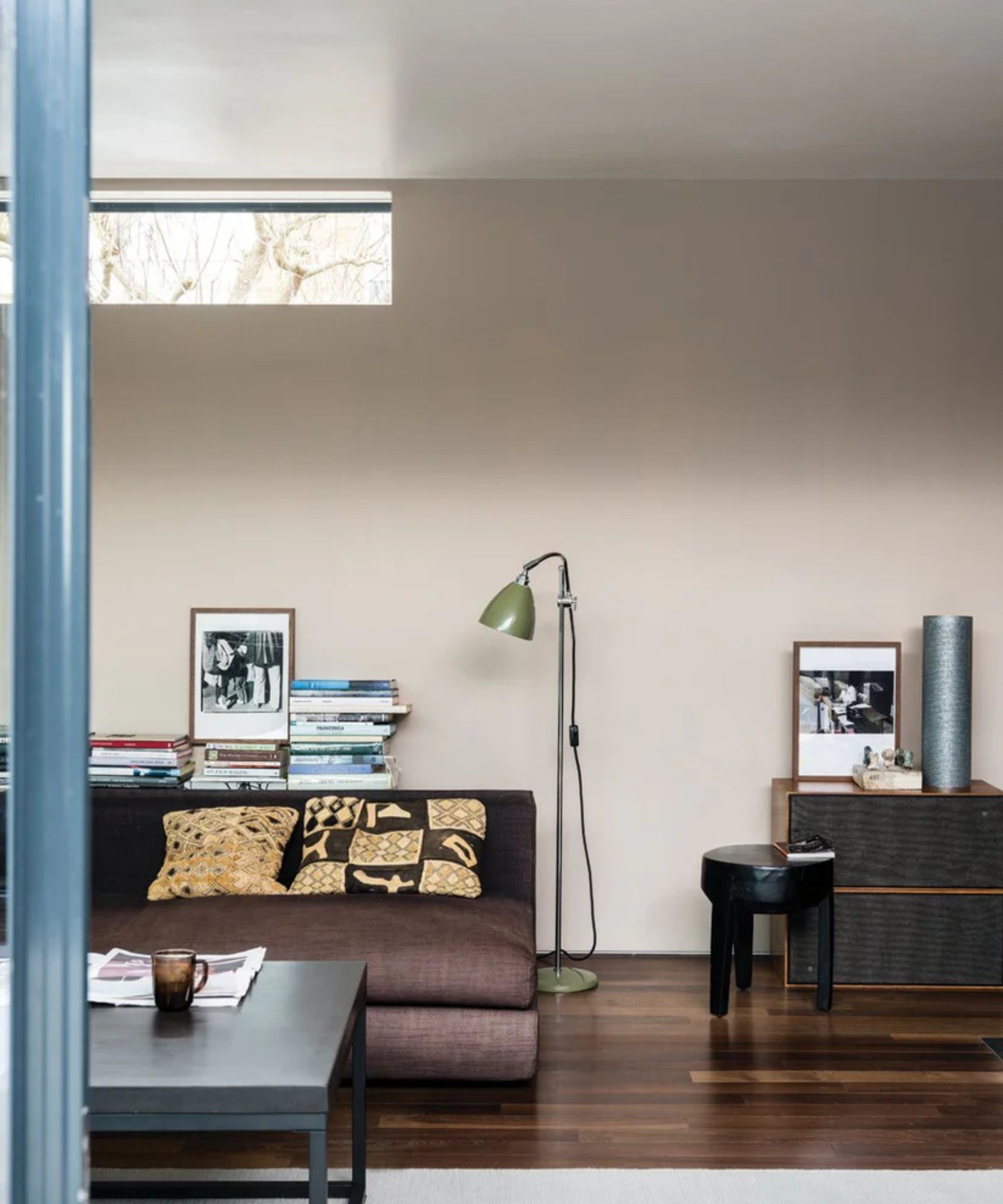
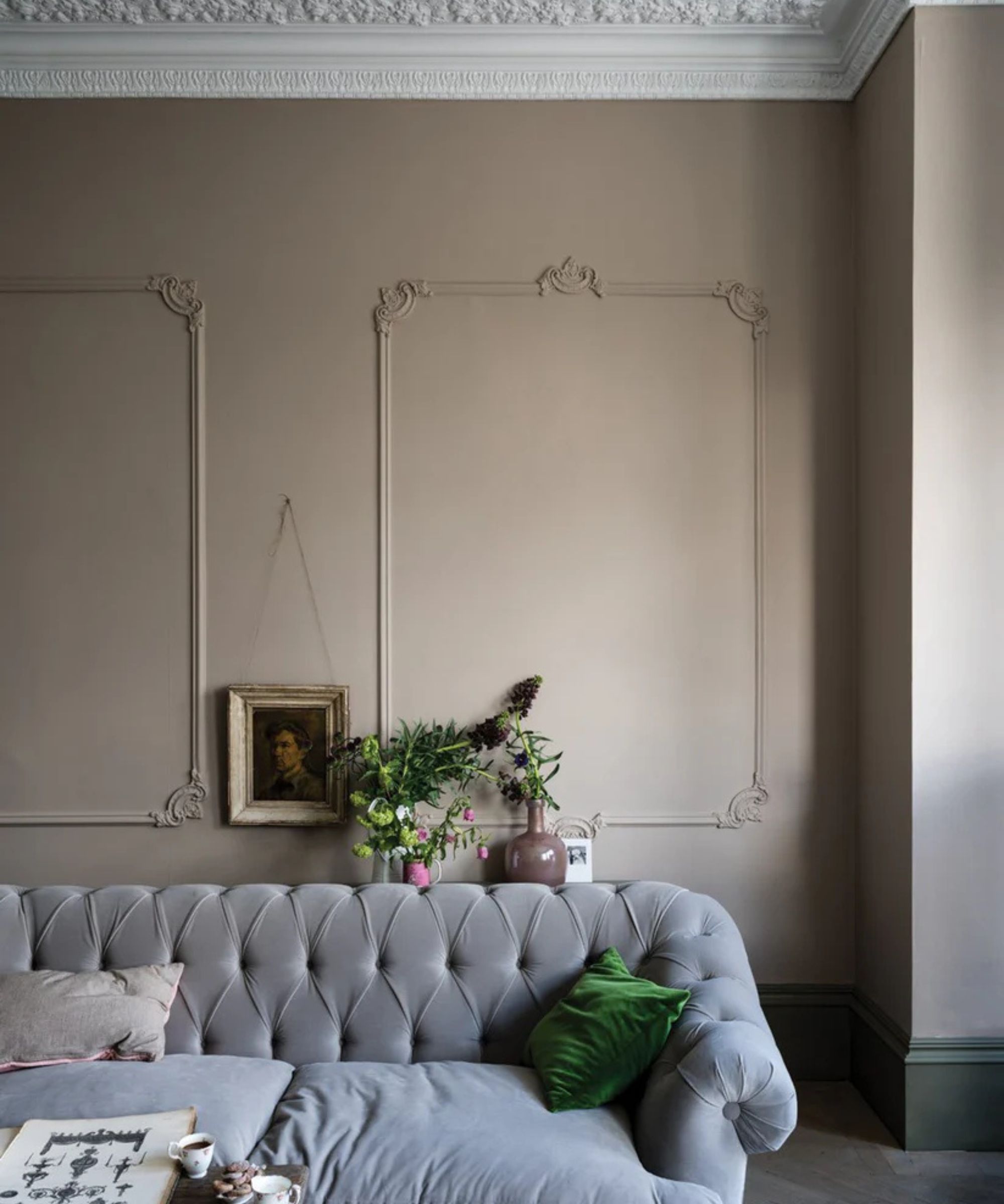
Long before the original dining room got torn apart and a new ceiling added and new flooring laid, we'd decided we wanted to go a soft oatmeal shade on the walls – beige, if you will. Something very calming but with a warm tinge, that would look sandy in the daylight and slightly rich by the twinkle of candles over dinner. Jitney, by Farrow and Ball, would have been my perfect choice.
Article continues belowBut suddenly the dining room was due to be painted in three days to fit in with the rest of the schedule and the dates we had the decorator booked for, and we'd not ordered the paint!
I had an order in already with Mylands, an amazing British paint company known for its depth of pigment. I had chosen their Holbein Chamber white shade for the kitchen, and it seemed easy to just add an extra paint color on top of that. I looked at its paint chart, with Jitney in mind. Portcullis looked about right online, I figured, with the same warm brown tones (seemingly) in the samples I could see on my screen. That would surely do!
If you look at the first two images of Jitney at the top of the page, and compare it to the Portcullis swatch you can see online, you can see why I thought it, would be the same, or close enough. Both look like a soft, warm, slightly brown beige paint. But here's what it looked like on my walls:
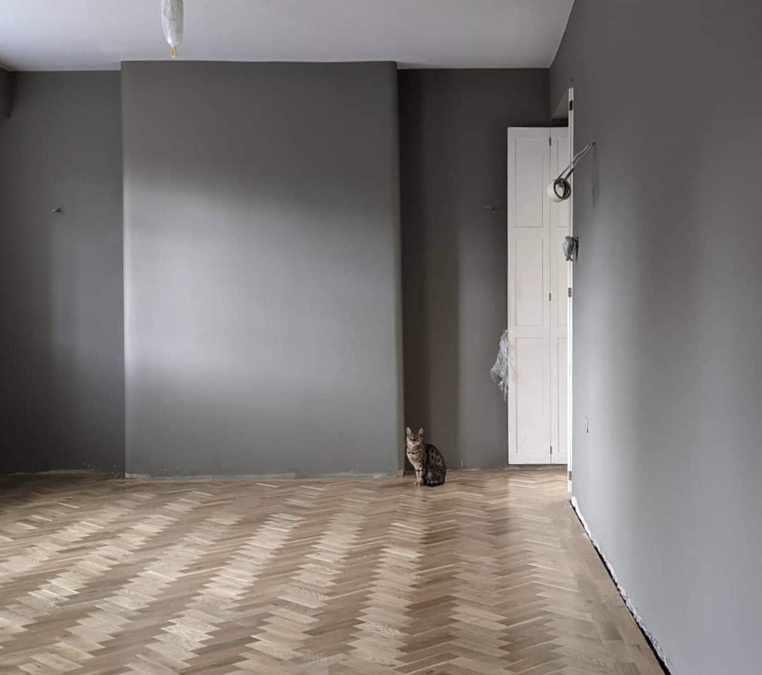
Whereas Jitney takes gray in a soft and subtle direction, Portcullis is bolder, richer, more saturated. As a paint color, I loved it. As the choice for my dining room? It was, well it was a shock.
Design expertise in your inbox – from inspiring decorating ideas and beautiful celebrity homes to practical gardening advice and shopping round-ups.
It meant rethinking my furniture choices, it meant changing the light I had planned, and it meant we didn't use the room so much in the day as I'd planned. Portcullis is nuanced and deep and sophisticated and I would use it again in the right space, but what I would never do is choose a paint color online without swatching it first
Yes, I may have been in the interior design world for 20 years, and I give this same advice all the time, but I broke the rule they teach you pretty much on day one – swatch your paint, and live with the swatches over time.
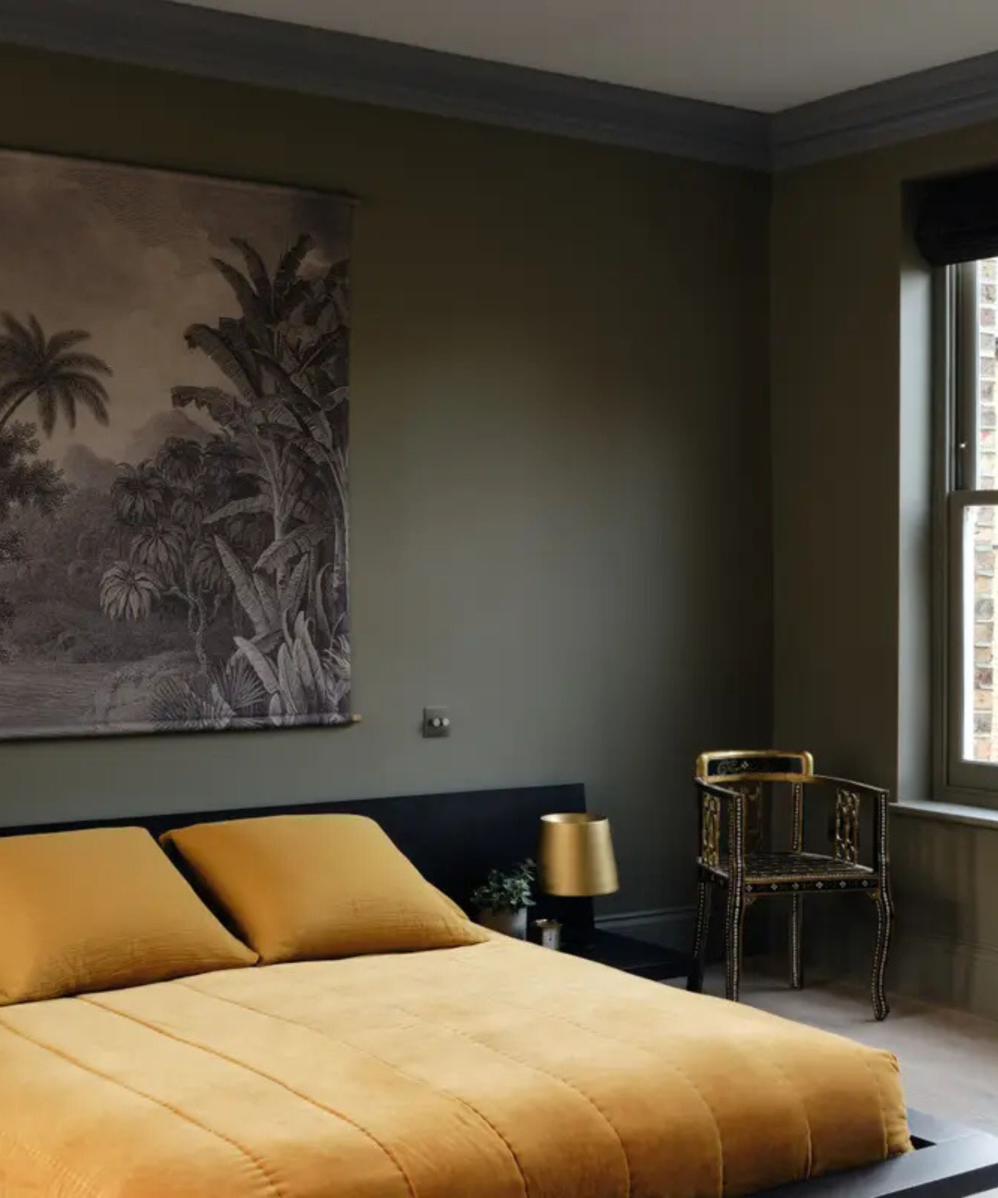
I spoke with designer Ash Wilson, post my mistake and her advice to me was to never rush choosing a paint color. 'For all our projects, we do a general color board for the house per room. But we don't pick the specific paint color until much further down the line, when we have more items developed on-site,' she explains.
'I like to see the color of the kitchen cabinets, the tones of the stone in situ, to see the fixtures in their actuality. And then we sample lots of paints that fit with the color theme we're going for. I don't think you can just pick a paint off a sample card without having seen it in the space.'
'Each house has a different orientation, and you have to see a room in the morning and evening to understand what the light will do in it. You have to place curtain samples against paint swatches in the room they're intended, you look for how they complement and contrast. It can be harder to get lighter or neutral colors right until you really see them in the space.'
All of which is advice I knew, and ignored in the heat of the moment. It's so simple it's embarrassing to admit I didn't follow it, but in the midst of the renovation, my standards went out the window.
We're moving house again soon, and I have a room which I've earmarked Portcullis for. It'll be my home office, and I'll enjoy the deeper tones of this paint in this hopefully creative space. But before I paint anything, I'll be sampling it first. Sampling, and watching as it changes throughout the day.
Pip Rich is an interiors journalist and editor with 20 years' experience, having written for all of the UK's biggest titles. Most recently, he was the Global Editor in Chief of our sister brand, Livingetc, where he now continues in a consulting role as Executive Editor. Before that, he was acting editor of Homes & Gardens, and has held staff positions at Sunday Times Style, ELLE Decoration, Red and Grazia. He has written three books – his most recent, A New Leaf, looked at the homes of architects who had decorated with house plants. Over his career, he has interviewed pretty much every interior designer working today, soaking up their knowledge and wisdom so as to become an expert himself.

