Why Designers Say This Color Should Never Touch a Tiny Kitchen – and What You Should Choose Instead
Because color matters more than you might think in these compact schemes

Design expertise in your inbox – from inspiring decorating ideas and beautiful celebrity homes to practical gardening advice and shopping round-ups.
You are now subscribed
Your newsletter sign-up was successful
Want to add more newsletters?
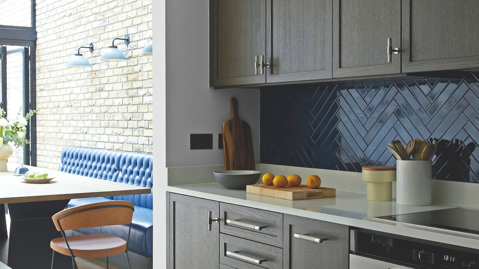
A tiny kitchen can easily become a design dilemma, but nothing puts all of your hard work to waste like choosing the wrong color. And according to designers, cool, mid-tone grays should never touch these compact schemes.
It's all the rage right now to look back and reminisce on all of the design decisions that dominated 2016, but a tiny kitchen is the one room you really shouldn't be considering a gray revival in. Your kitchen color ideas can make or break the design. It sets the tone for the mood, personality, and how big or small your scheme feels.
So it will come as no surprise that a flat, light-absorbing hue like gray will be the opposite of inspiring in such a tiny room. And if you need any more convincing, designers have plenty to say on the matter, as well as a few alternative color suggestions worth considering.
'Cool gray paint colors can work well in spaces with an excess of natural light, or when paired with other elements that add warmth,' says Kathy. 'But in a tiny kitchen, I recommend something different.'
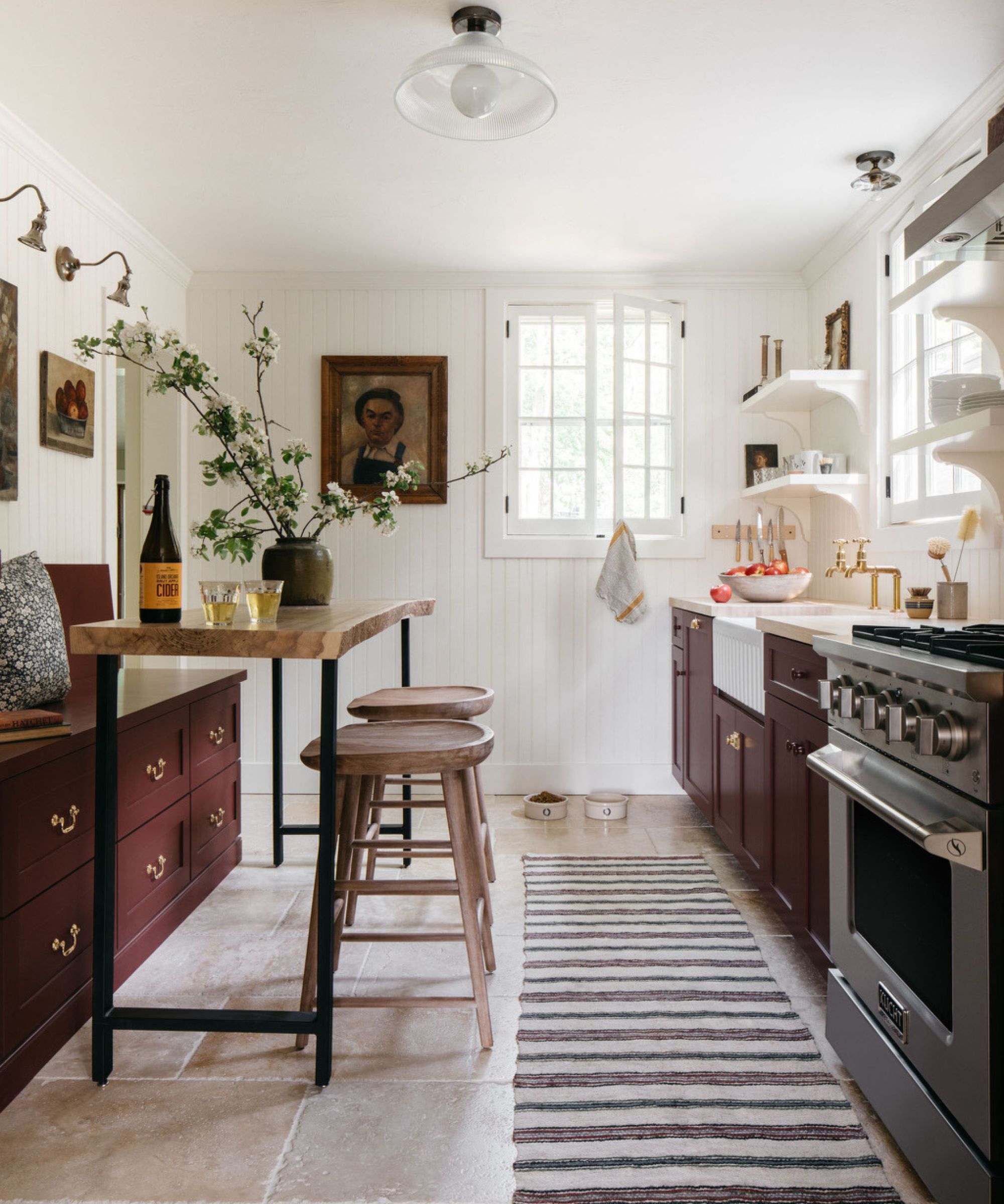
There's a charm to really small kitchens that can make them a joy to decorate. Take this small cottage kitchen tour as a perfect example, where compact proportions were embraced with a considered galley layout and a color palette of warm white and burgundy.
Even this small green deVOL kitchen, filled with deep emerald hues, has a sense of grandeur to it, despite its tiny footprint. But what both of these spaces have in common is that the right colors were chosen to bring warmth and depth to the design – something designers say you won't achieve with a cool, mid-tone gray.
'In a tiny kitchen, we generally want the paint color to make the space feel more expansive and airy than it actually is. Cool gray paint colors have the opposite effect. They tend to absorb light rather than reflect it, making an already small room seem even darker and more enclosed,' says interior designer Kathy Kuo.
And it's not just about how big or small the kitchen feels, but how the color itself reads. 'The color gray can read utilitarian and a bit sterile, even if it has warm undertones; gray colors with cool undertones are particularly harsh and industrial. These hues can make a kitchen feel cold, flat, and uninviting,' she adds.
Design expertise in your inbox – from inspiring decorating ideas and beautiful celebrity homes to practical gardening advice and shopping round-ups.
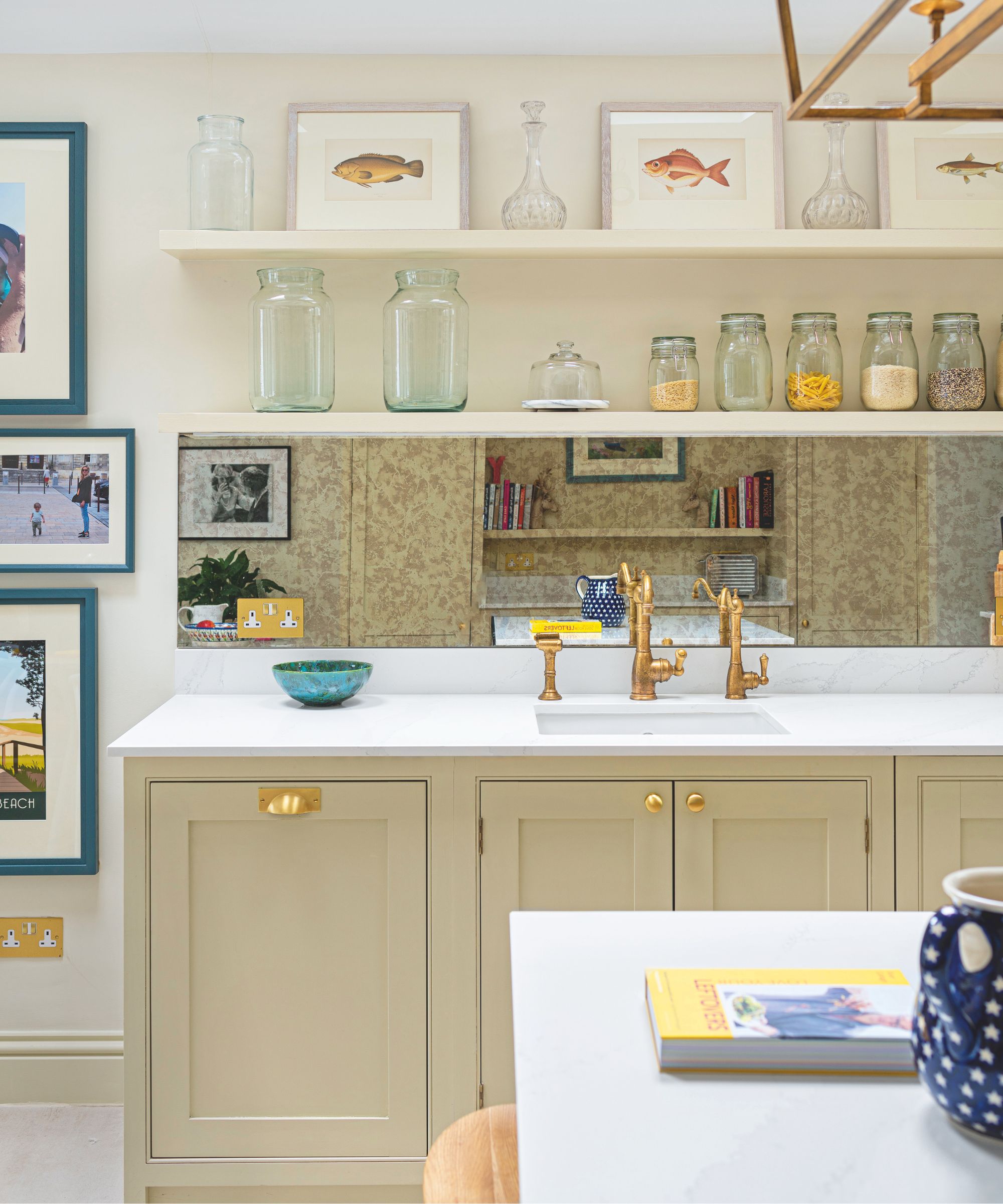
In this scheme, warm neutrals pair seamlessly to create a more inviting atmosphere, exactly what you want from a tiny kitchen.
These things are the opposite of what we want from these rooms – this year's kitchen trends are all about warmth, layering, and soft kitchens, signalling a huge shift in the way we design our schemes to be more than just a cooking space. And as a result of this shift, gray just doesn't feel like an up-to-date or inspiring choice.
'It's a dated kitchen color, and the cool tone creates a harsh contrast between the other finishes,' agrees Maggie Goodrich of Third Street Architecture. 'A cool gray is reminiscent of a trend that was sleek and modern, aiming for a harsh contrast between stark white and cool gray. Design trends are now leaning towards warmer and more personalized spaces.'
'Cool gray often introduces an unintentional coldness. In a kitchen, which is meant to feel welcoming, functional, and lived-in, that cooler undertone can make the space feel flat or even sterile. Especially in smaller kitchens, the color can create a sense of heaviness or gloom rather than warmth and comfort,' adds Cathleen Gruver of Gruver Cooley.
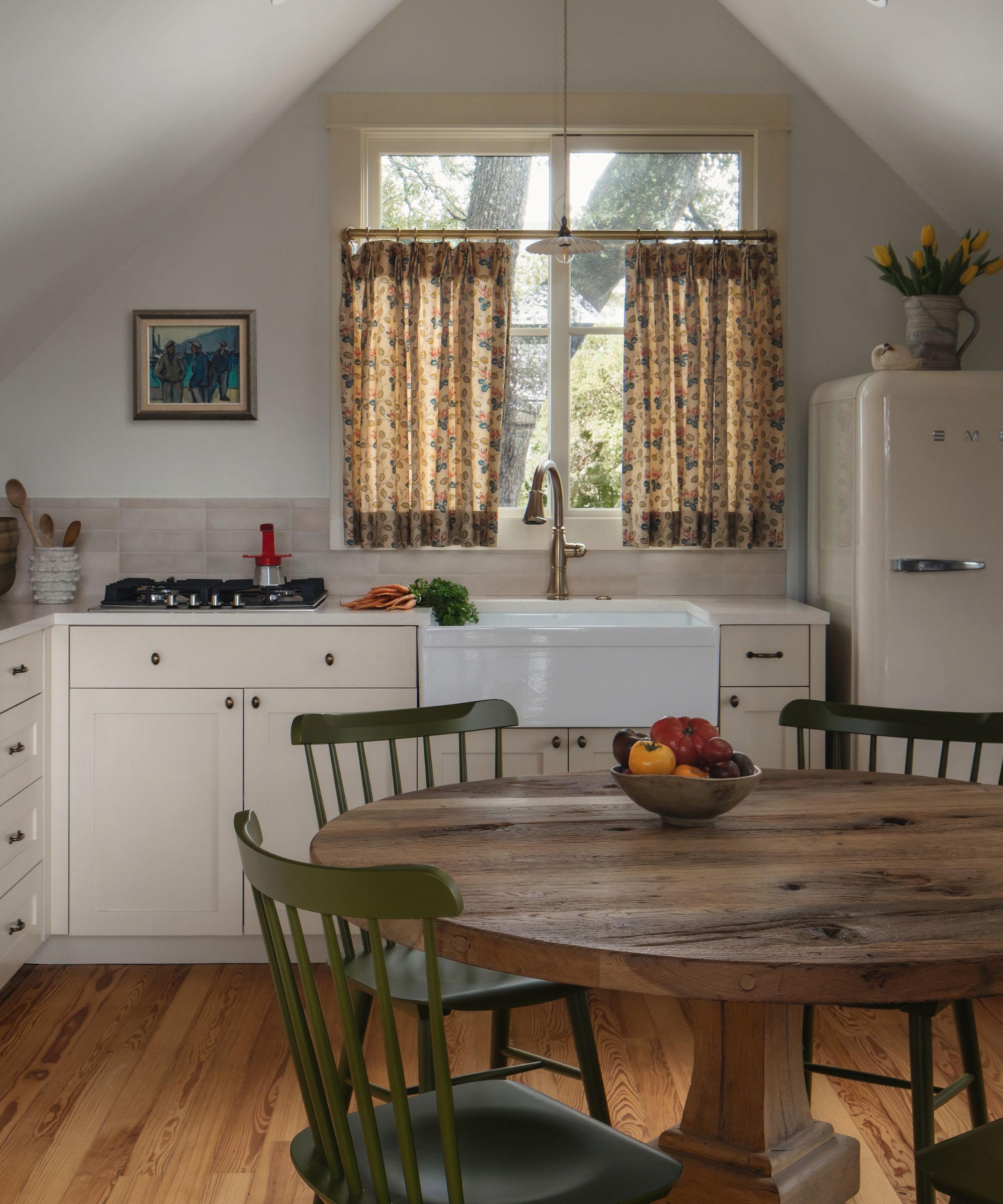
This charming cottage kitchen proves Maggie's point about contrast. The rich wood floors instantly add a more characterful feel and a striking contrast to the warm white cabinetry.
So, what is the better, more inviting alternative?
A tiny kitchen leaves a small amount of space to bring in the warmth and softness that's far more desirable right now, and for designers, nothing beats a beautifully chosen warm neutral that feels timeless yet still layered and lived-in.
'I typically recommend warm off-whites, soft creams, or light greiges with subtle warmth. These tones reflect light far better, helping a small kitchen feel brighter and more expansive, while still providing depth and sophistication,' says Cathleen.
'A warm neutral also creates a more timeless backdrop and pairs beautifully with natural materials like wood, stone, and brass, which adds visual interest without overwhelming the space.'
A neutral kitchen isn't your only option if you prefer something more saturated. Subtle earth-inspired tones can also be a lovely addition to add warmth and character without making the room feel oppressive.
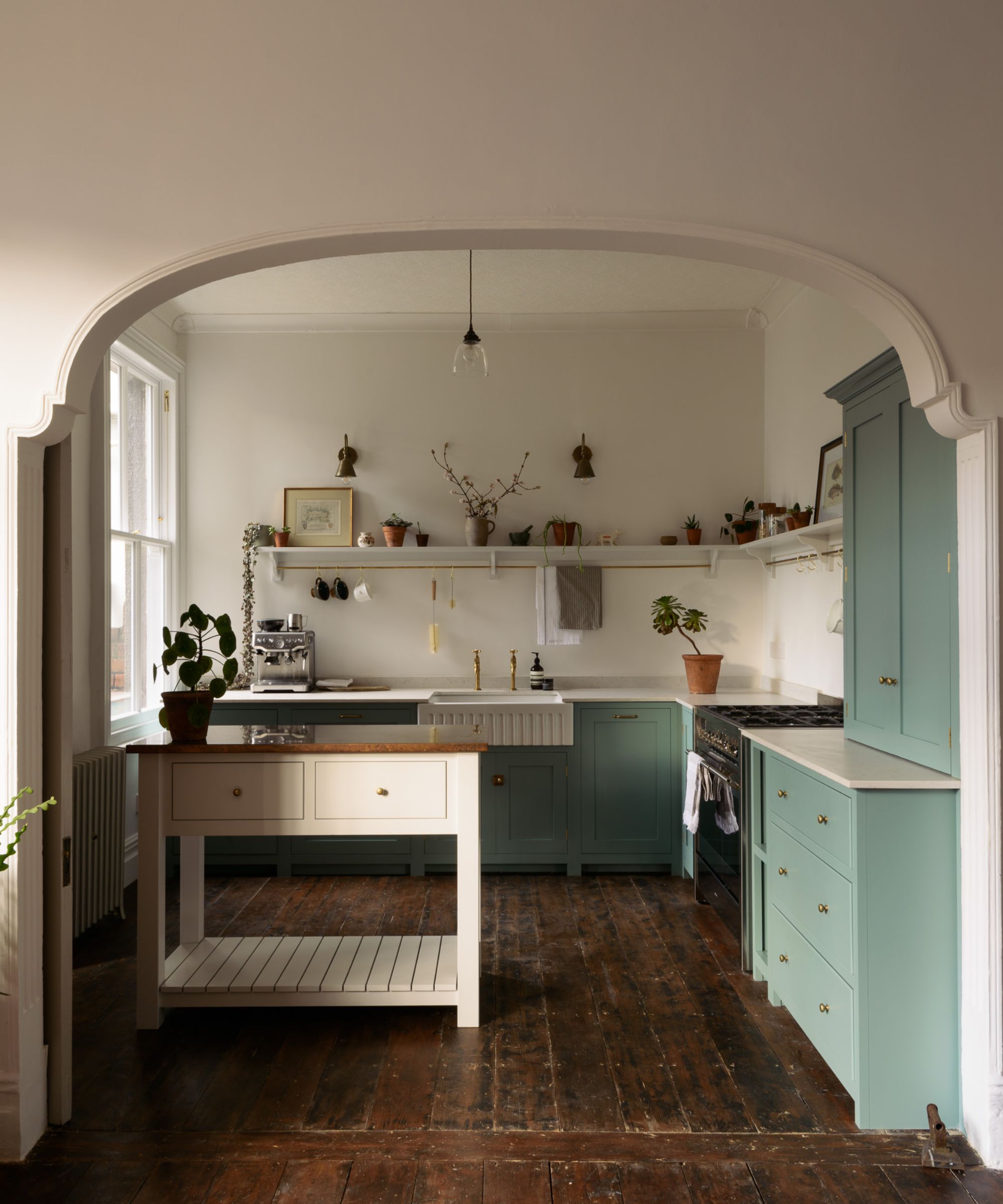
Tiny proportions don't mean you can't embrace color. The blue/green shade on the cabinets in this design adds personality while still feeling bright and full of warmth.
'Creamy neutrals and light, gently muted hues are your friend in this scenario. Think warm alabaster, powder blue, and soft, earthy green. These kinds of colors feel fresh and inviting, and they reflect light to make tight spaces feel more open,' says Kathy.
Once you have chosen the color palette for your kitchen, it's just as important to make sure you introduce them in a way that feels cohesive and considered, yet still with at least one element of contrast to avoid the compact room from feeling one-dimensional, as Maggie explains.
'I would recommend an off-white or warm neutral color. I like to use these colors to keep the cabinet finish neutral, but allow a warm contrast between other finishes,' she explains, recommending hues such as Pashmina and Dulce de Leche by Benjamin Moore.
'Or, match the cabinet color to the general wall color and allow a dramatic countertop or a deep-stained wood floor to shine. I like to use Benjamin Moore White Dove for this direction on projects.'
We're not saying that there is no place for gray kitchens in 2026; it's just not the right choice in a tiny, compact space. Warmer tones have more impact in small proportions, whether it's a creamy neutral or a more organic nature-inspired hue like earthy greens and even rich shades of brown. Just make sure you consider how the light in your kitchen reacts with different colors – it's a detail that has more impact than you may have thought.

I’ve worked in the interiors magazine industry for the past five years and joined Homes & Gardens at the beginning of 2024 as the Kitchens & Bathrooms editor. While I love every part of interior design, kitchens and bathrooms are some of the most exciting to design, conceptualize, and write about. There are so many trends, materials, colors, and playful decor elements to explore and experiment with.