Farrow & Ball's color curator shares the simple size-enhancing trick she uses in her home
Joa Studholme's clever paint technique creates the illusion of space – and she follows it in her own scheme

Design expertise in your inbox – from inspiring decorating ideas and beautiful celebrity homes to practical gardening advice and shopping round-ups.
You are now subscribed
Your newsletter sign-up was successful
Want to add more newsletters?
When searching for a color combination, you could do far worse than follow the teachings of Farrow & Ball's curator, Joa Studholme. As the figure at the top of the paint powerhouse, Joa is not only an expert on paint trends – but she creates them. Therefore, it is unsurprising that she has the answer to one of the most provocative questions in the interiors industry: Can you make a space feel bigger with color? The secret, Joa shares, is in curated color combination.
Speaking to H&G in our podcast, The Well-Crafted Life, Joa shared her interior design tips, including the refreshingly simple paint trick that she uses to enhance the size of her living room in her home – a nineteenth-century Schoolhouse in Somerset.
Joa Studholme's size-enhancing paint technique
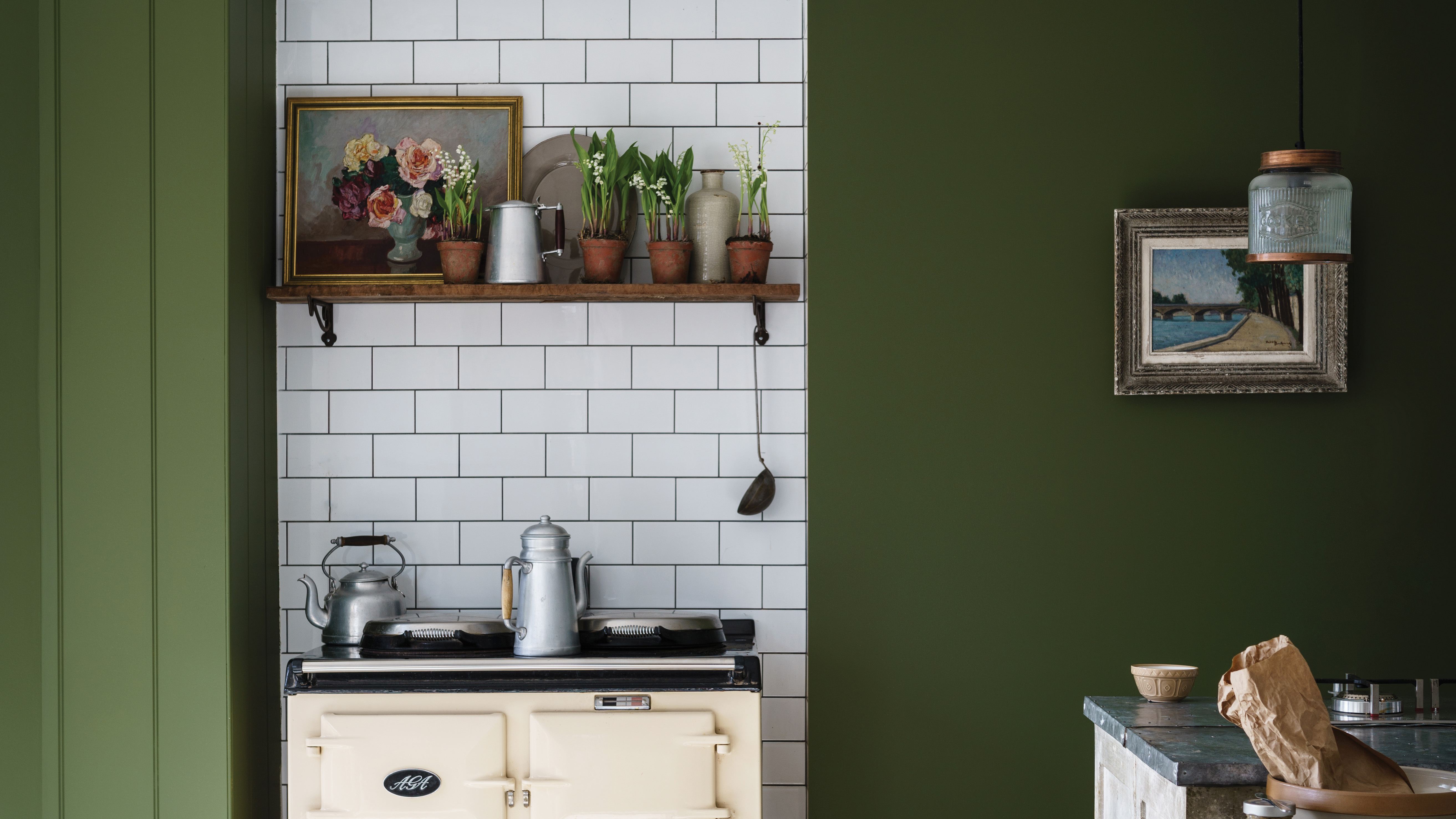
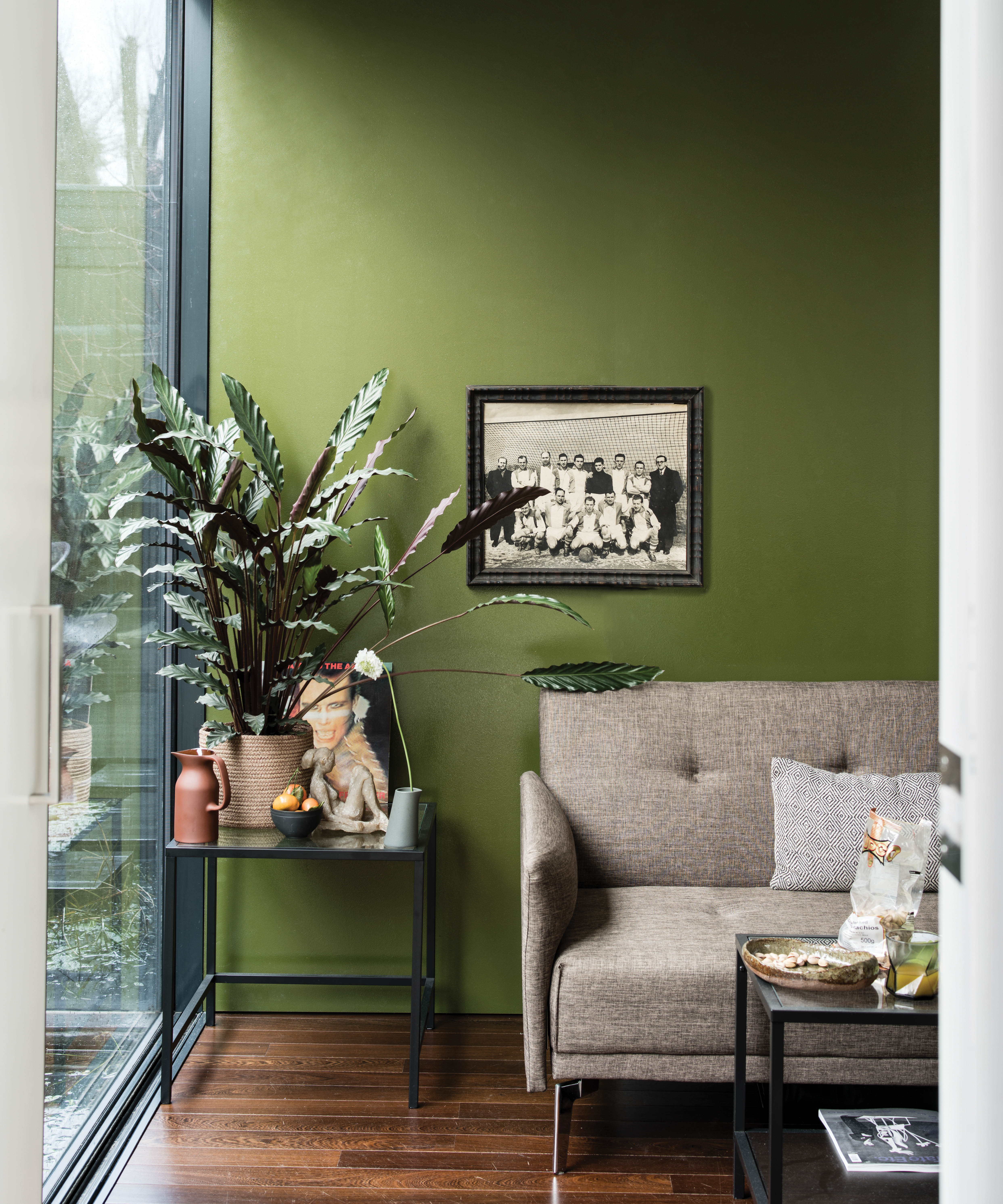
In a home enveloped in verdant fields and rolling hills, Joa explains that Farrow & Ball's Bancha green (above) was a fitting choice for a wall by the front door. However, it is Bancha's contrasting relationship with her white living room (painted in Farrow & Ball's School House White) that makes the color so impactful.
Article continues below'I have a very small dark wall which is where you come through the front door, and it was screaming out to be green so that you could carry on the bucolic greens of the fields around it, and I wanted to create a bit of drama,' Joa begins.
'It means that when you go from that dark hall into the big white schoolroom, that room feels even bigger and lighter in comparison… out of the darkness comes light.'
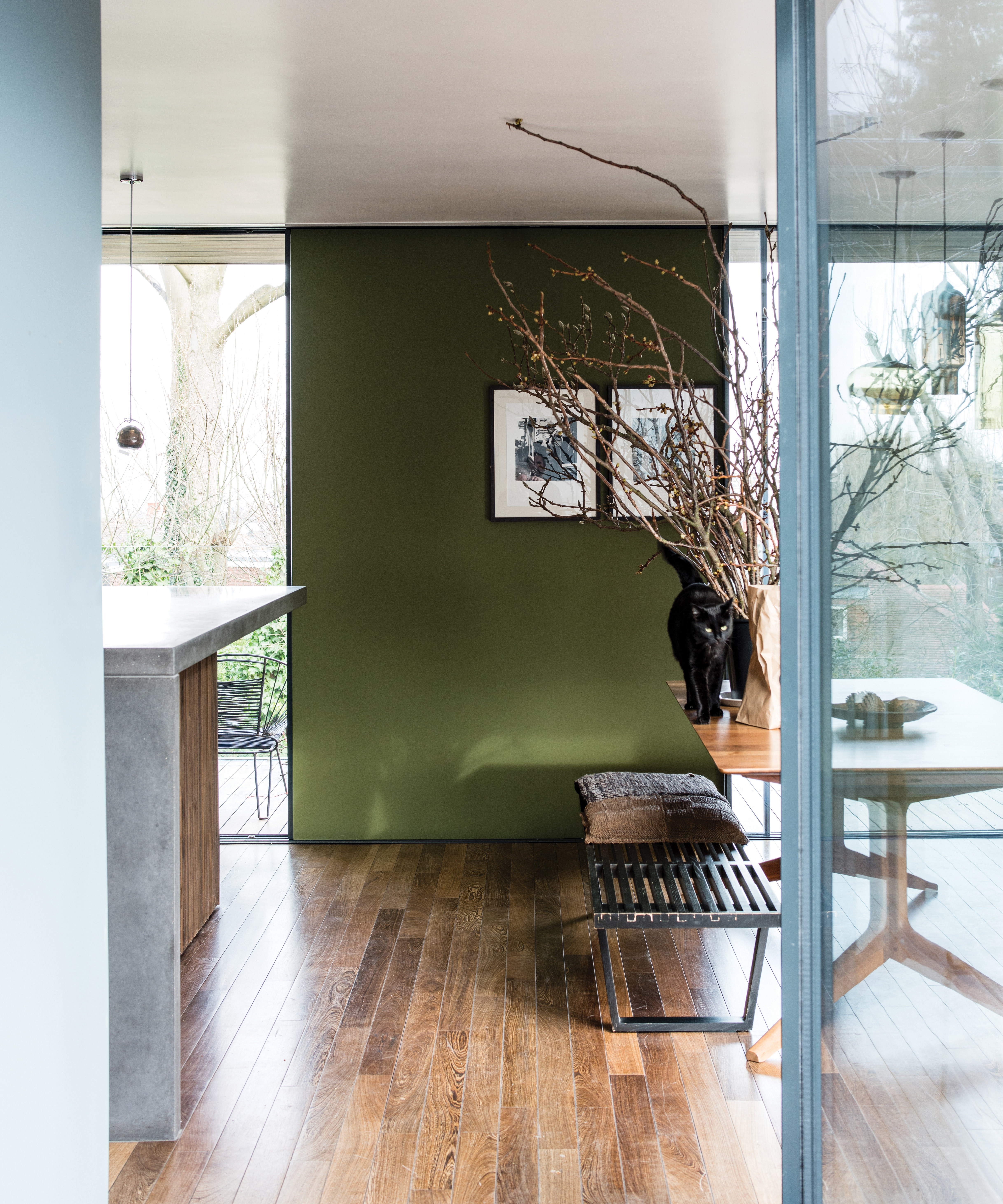
The contrast between the green of her home's entrance thus accentuates the white tones of her historic living room – and we're stealing Joa's technique for our own living room paint ideas. Plus, while we're admiring her space-enhancing color combination, Joa reminds us that white hues are perfect for emphasizing spaces of all sizes.
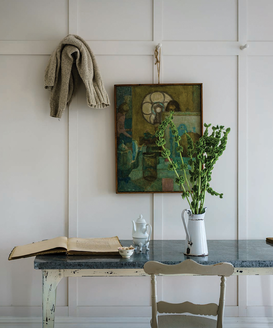
'I had to create a white when I got [to The Schoolhouse], which is Farrow & Ball's School House White (below). I did that to emphasize the size and light of the room – but more importantly, to retain the spirit of the building. It was important to [maintain] the iconic, simple feel.'
Design expertise in your inbox – from inspiring decorating ideas and beautiful celebrity homes to practical gardening advice and shopping round-ups.
Has Joa just reshaped our paint ideas? Of course, she has. This is Joa Studholme, after all.

Megan is the Head of Celebrity Style News at Homes & Gardens, where she leads the celebrity/ news team. She has a history in interior design, travel, and news journalism, having lived and worked in New York, Paris, and, currently, London. Megan has bylines in Livingetc, The Telegraph, and IRK Magazine, and has interviewed the likes of Drew Barrymore, Ayesha Curry, Michelle Keegan, and Tan France, among others. She lives in a London apartment with her antique typewriter and an eclectic espresso cup collection, and dreams of a Kelly Wearstler-designed home.