'I was my own worst client' – designer Gillian Segal on building her own home
Smart space planning was key in this relaxed family home, along with finding a way to blend a mix of favorite design styles

It's the gossip we'd all love to hear from interior designers. Who were their nightmare clients? Have they ever struggled to hide their frustration with a homeowner who just couldn't make up their mind what they wanted? What's the trickiest house design project they've ever done?
Are you sitting down? Because award-winning interior designer Gillian Segal has some surprising insights to share on exactly these topics. Gillian, who came up with the design scheme for this newly built home in Vancouver, Canada, says: 'The client was actually me, the designer! We built this home to accommodate our growing family and I learned on this project that I am my own worst client.'
Take the tour, to find out how Gillian's shocking revelation came about, and while you're about it admire the stunning results she achieved in this relatively compact family home, where smart space planning was key.
Article continues below 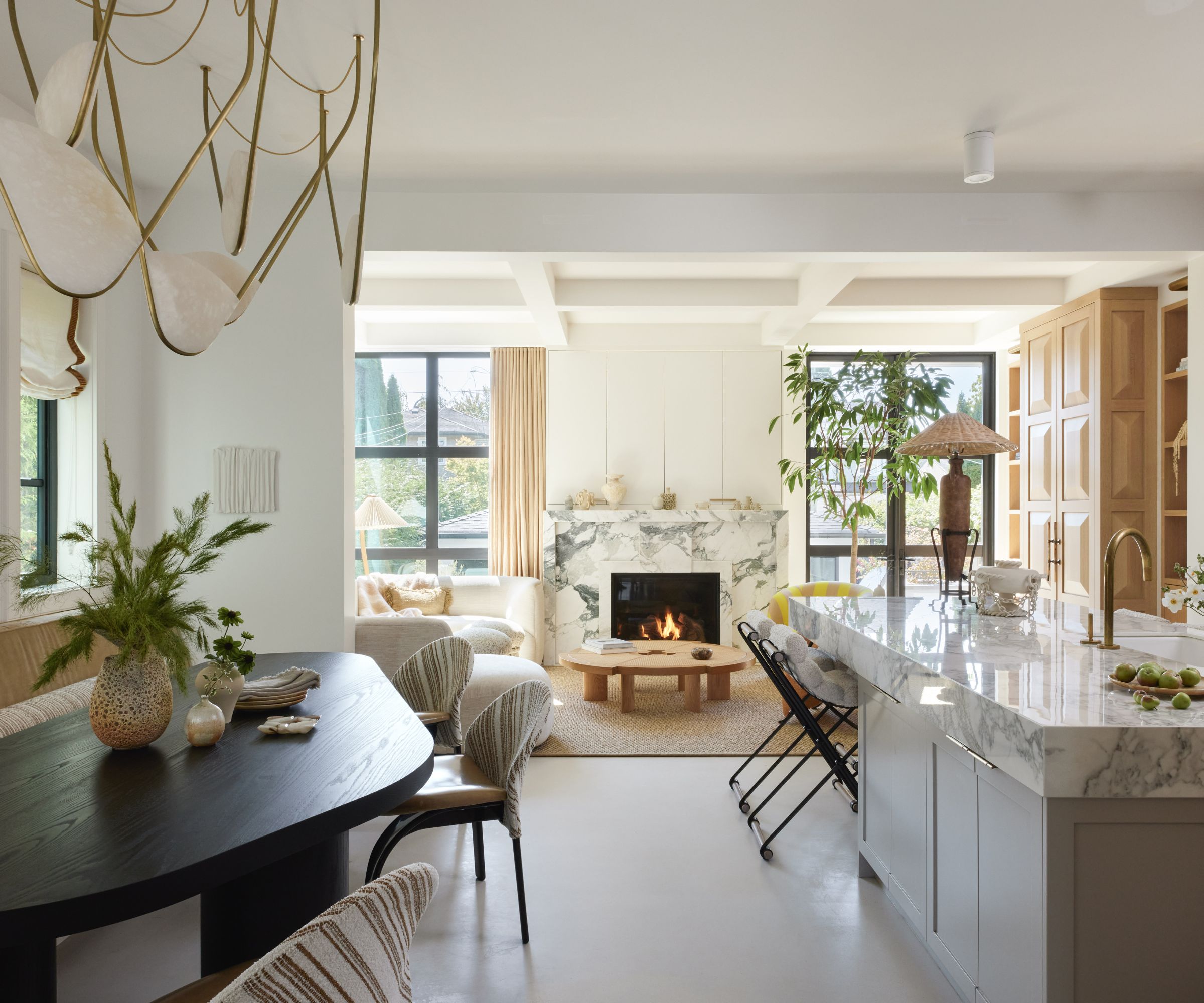
Interior designers surround themselves with inspirational furnishings all day long; they're aware of all the latest finishes for cabinetry, walls and floors, so it's no wonder that designer Gillian would have some serious editing to do before arriving at her chosen look for her own home.
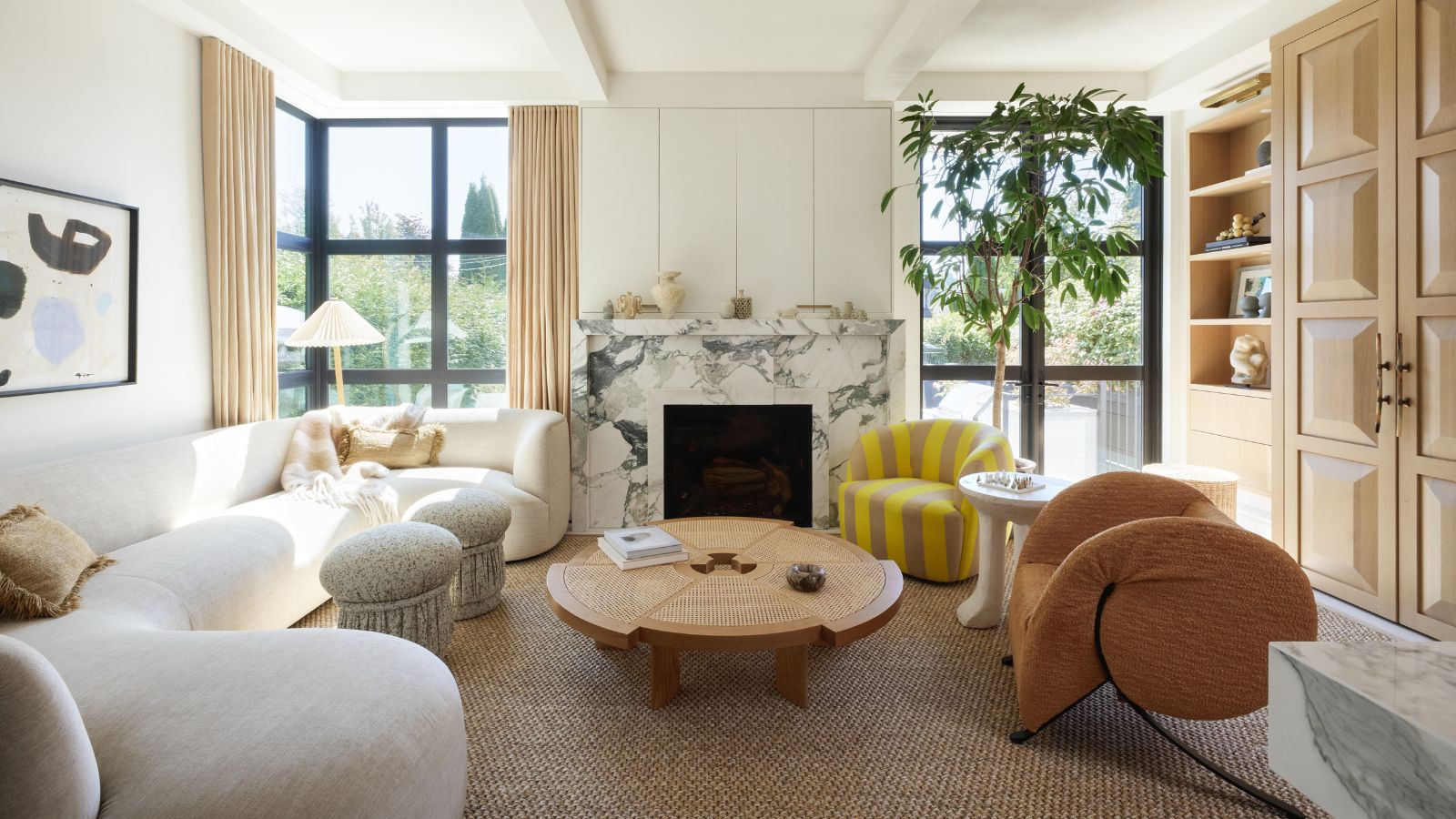
'I would describe it as a modern home with classical references and elements,' says Gillian. 'I find it so challenging to commit to just one style when I love and appreciate so many. Most of my projects, including this one, will often combine elements from a number of periods or genres of design.'
One of the largest challenges was space. The solutions Gillian came up with could be adapted to organize any space. 'We wanted to accomplish a lot in a relatively small single family home, so working on highly efficient space planning was key,' explains Gillian. 'We decided instead of the traditional set up of a formal dining room, and more casual breakfast nook that we would combine these spaces to allow for a larger living room. Similarly, instead of a den and formal living room, we combined the two.'
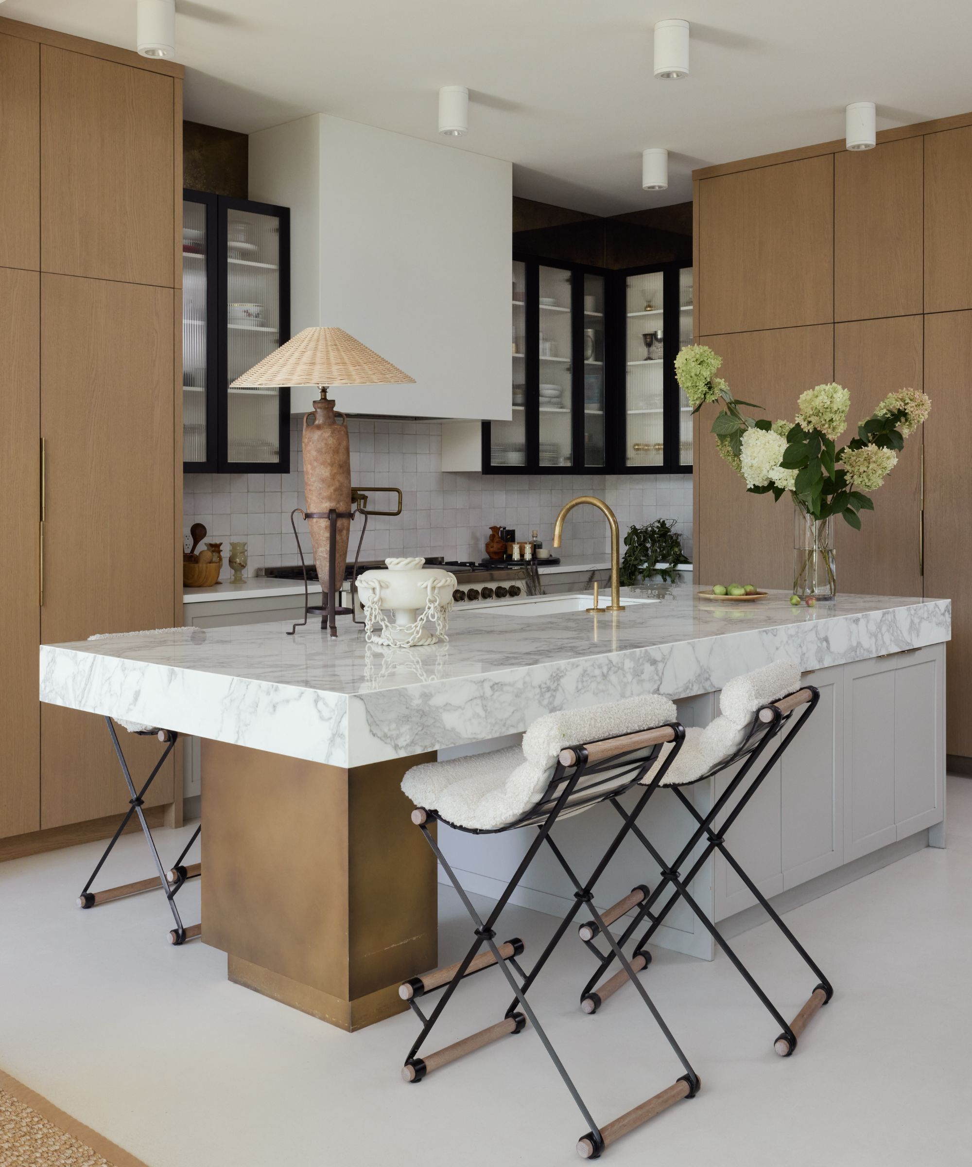
Gillian's kitchen ideas actually took their cue from her flooring ideas. 'I really wanted to do something fresh and unique for the floors (instead of a more traditional hardwood) so I used a white concrete for the floor throughout the home,' says Gillian.
Design expertise in your inbox – from inspiring decorating ideas and beautiful celebrity homes to practical gardening advice and shopping round-ups.
This white background presented Gillian with a blank canvas as far as the cabinetry and island were concerned. 'It gave me the opportunity to use lots of stained wood on vertical textures in the kitchen. I used a fluted glass on the upper cabinets, which were topped with antique mirror panels. The barstools are made by my friend, the incomparable Thomas Hayes.'
Gillian opted for a porcelain slab on the kitchen island (she wanted something that could stand up to lots of abuse with no sign of wear and tear. Not having worked with this product before, an eagerness arose to experiment with it in her own home before recommending it to clients).
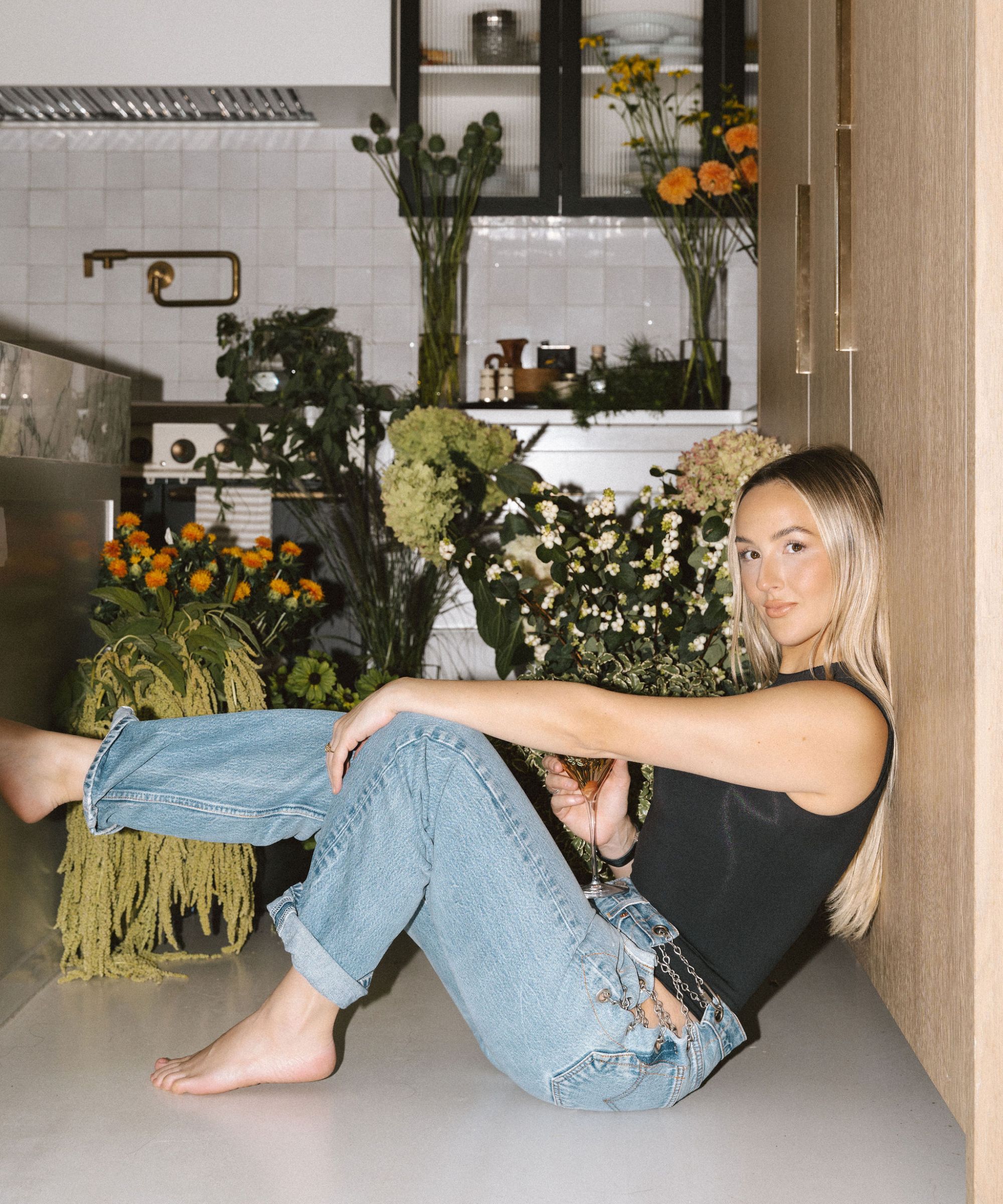
Gillian Segal Design specializes in custom luxury residential, commercial and hospitality projects. With an extensive network of resources and partnerships, Gillian and her team strive to deliver outstanding, hands-on service and beautifully creative solutions that marry their client’s vision with the firm’ s renowned modern eclectic aesthetic. Gillian Segal Design stays on the forefront of design innovation to help clients push boundaries and create spaces that are comfortably luxurious and unique.
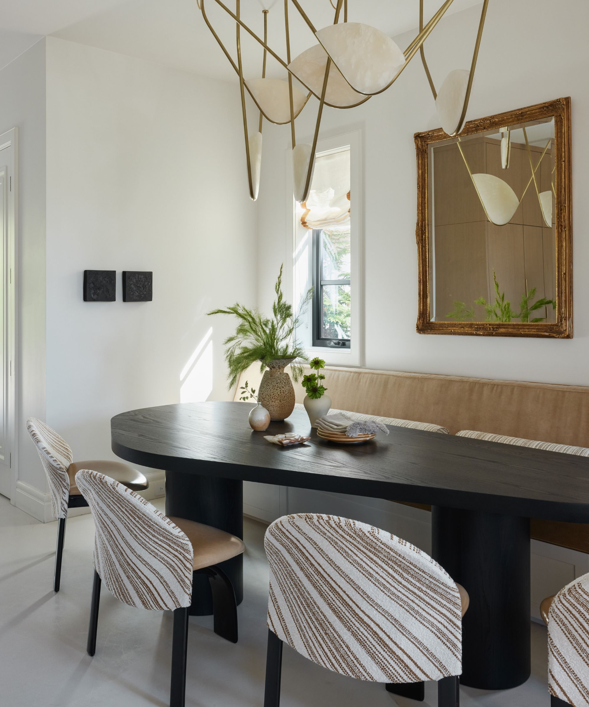
Having decided to combine the two functions into an upscale kitchen-diner, the dining room ideas, and eat-in kitchen ideas really had to pack a punch. The key was in making a careful selection of furnishings that would look good in the open-plan setting. 'Lots of local talent makes this room super special to me,' says Gillian. 'A custom table by Vancouver-based designer, Christian Woo, alongside a light made by Randy Zieber.
'One of the big challenges with a family home was designing pieces that I was aesthetically excited about and could withstand the abuse from my two young children,' adds Gillian. 'Materiality was king with this design. I upholstered the vintage dining chair seats in a hardwearing shiny vinyl, and the backs in a patterned indoor/outdoor fabric. This home was like a masterclass in kid-proof design, and I can very confidently say I am now an expert in this area.
'We wanted a beautiful, family-friendly space that was design forward but was welcoming to anyone who stepped inside. I never wanted it to feel too precious. We definitely achieved this and have made so many beautiful memories in this home.'
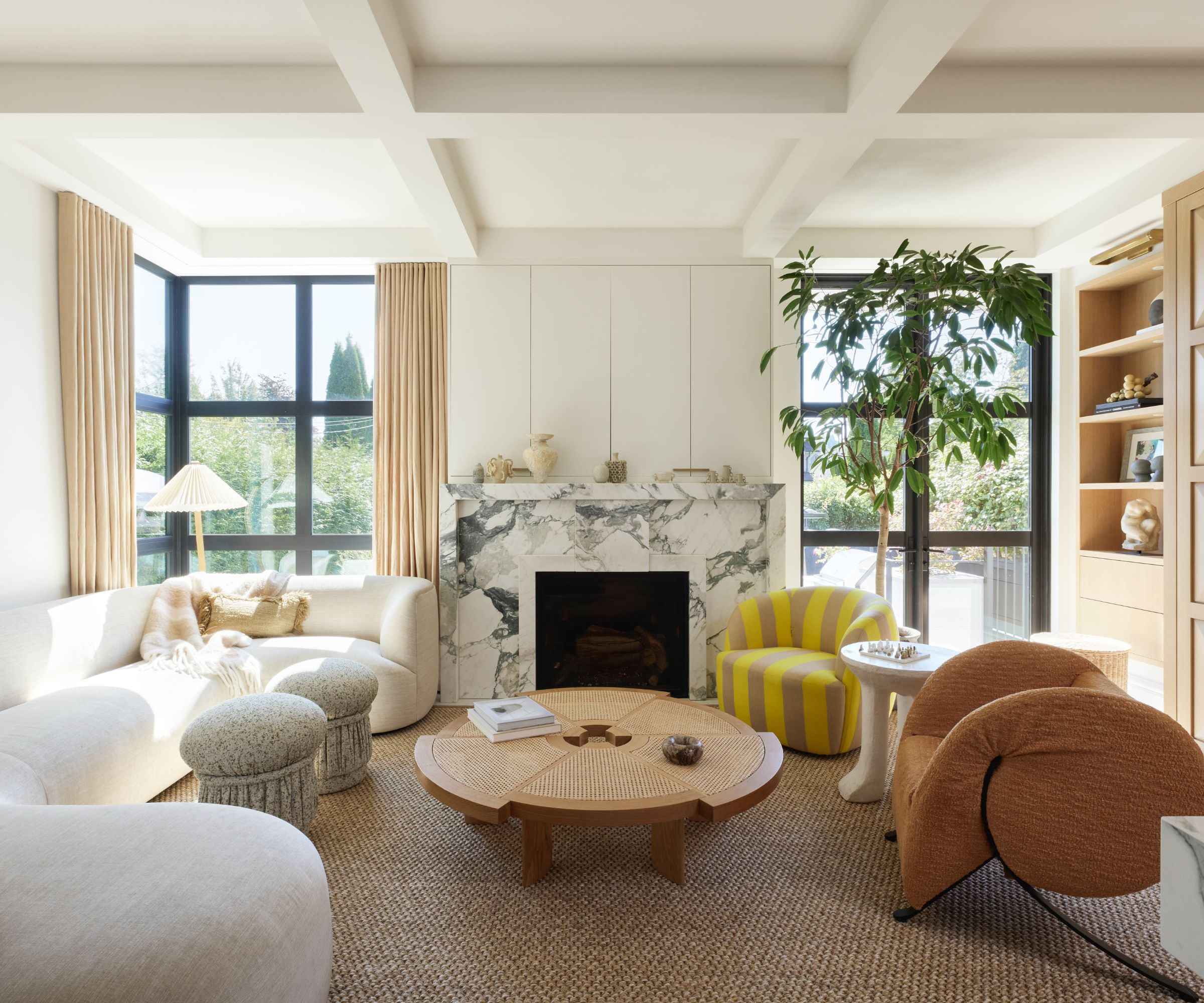
Among the living room ideas, the fireplace is one of Gillian's favorites. 'I designed this bespoke mantel which was made from over 22 cuts of marble. It’s a focal point straight from when you open the front door and we have it on constantly,' says Gilian. 'It’s where we unwind in the evenings and where I snuggle my kids in the morning so it feels really special. I also have a number of commissioned pieces from makers and artists so it feels inspiring to be surrounded by pieces that carry meaning for me.
'A custom Kagan-inspired sofa from FFABB hugs the room and is an amazing piece for a good conversational seating arrangement,' adds Gillian. 'We upholstered it in a performance fabric and even I am shocked at how well it has stood up to what my kids have put it through! The coffee table is from Cassina.'
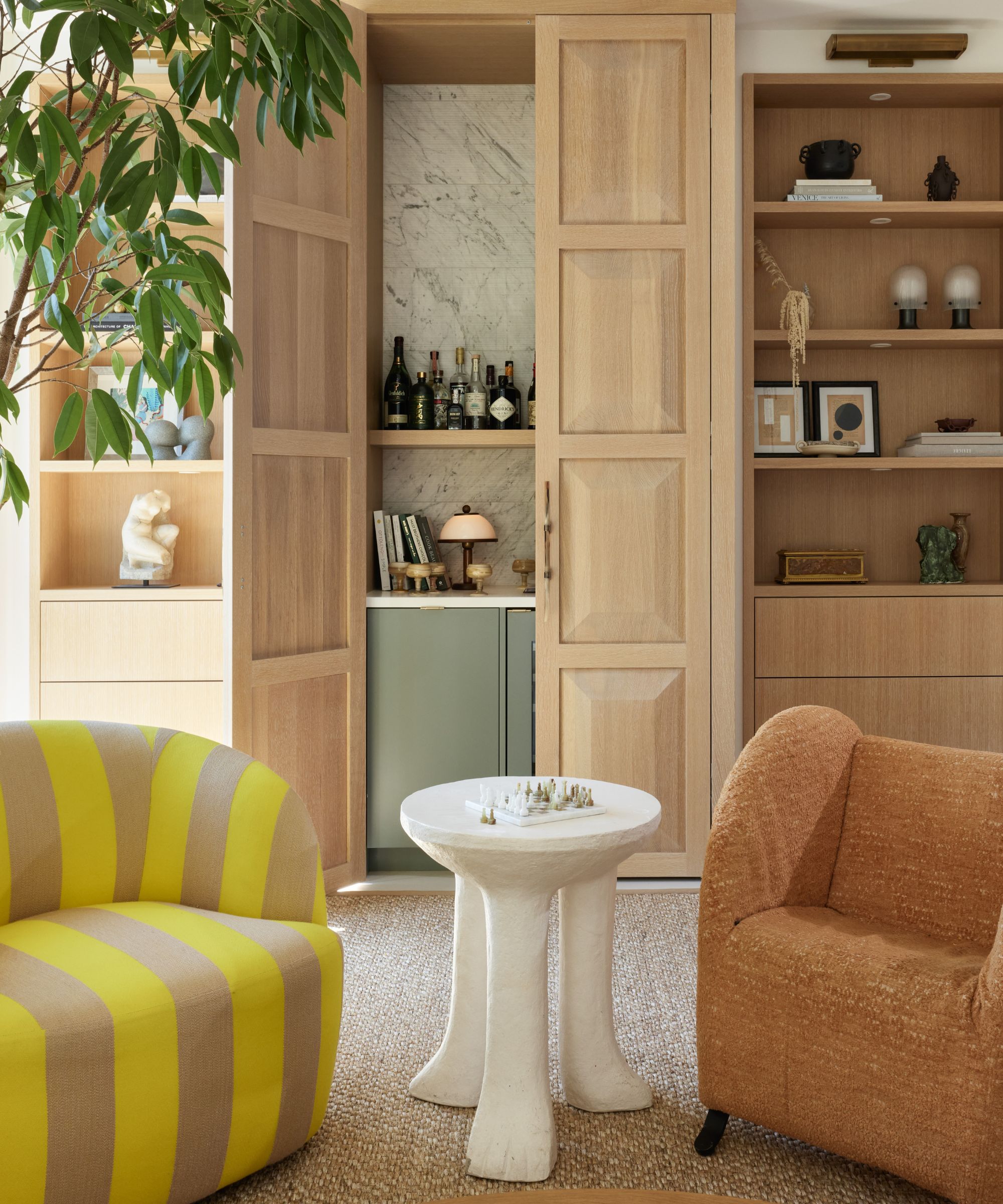
Even in a smaller-scale family home there's always a way of indulging home bar ideas if you try hard enough. To one side of the living room, custom built-ins hide a clever bar set-up, complete with wine fridge.
'One of my favorite pieces is the terracotta-colored vintage virgola armchair,' says Gillian. 'The other chair is an old CB2 design which I reupholstered in a Raf Simons stripe. We custom cut and bound a sisal broadloom for something durable and it made the room feel so much bigger.'
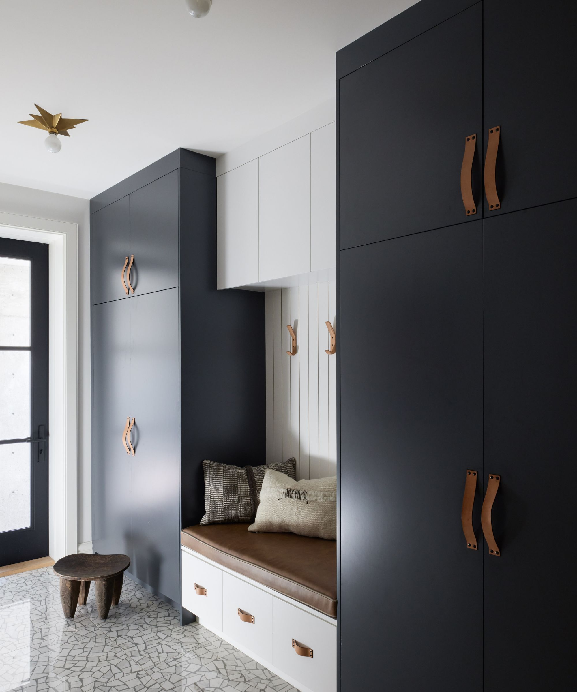
Mudroom ideas have to work extra hard in this house, and not just because space is limited. 'The mudroom is a multipurpose space and even served as my home office during COVID lockdowns,' says Gillian. 'We used a porcelain floor with a terrazzo look, and added lots of millwork for kids' shoes, coats and even a spare freezer.'
We love the contrast between the dark painted cabinetry and the light painted bench alcove, which gives the room a smart edge.
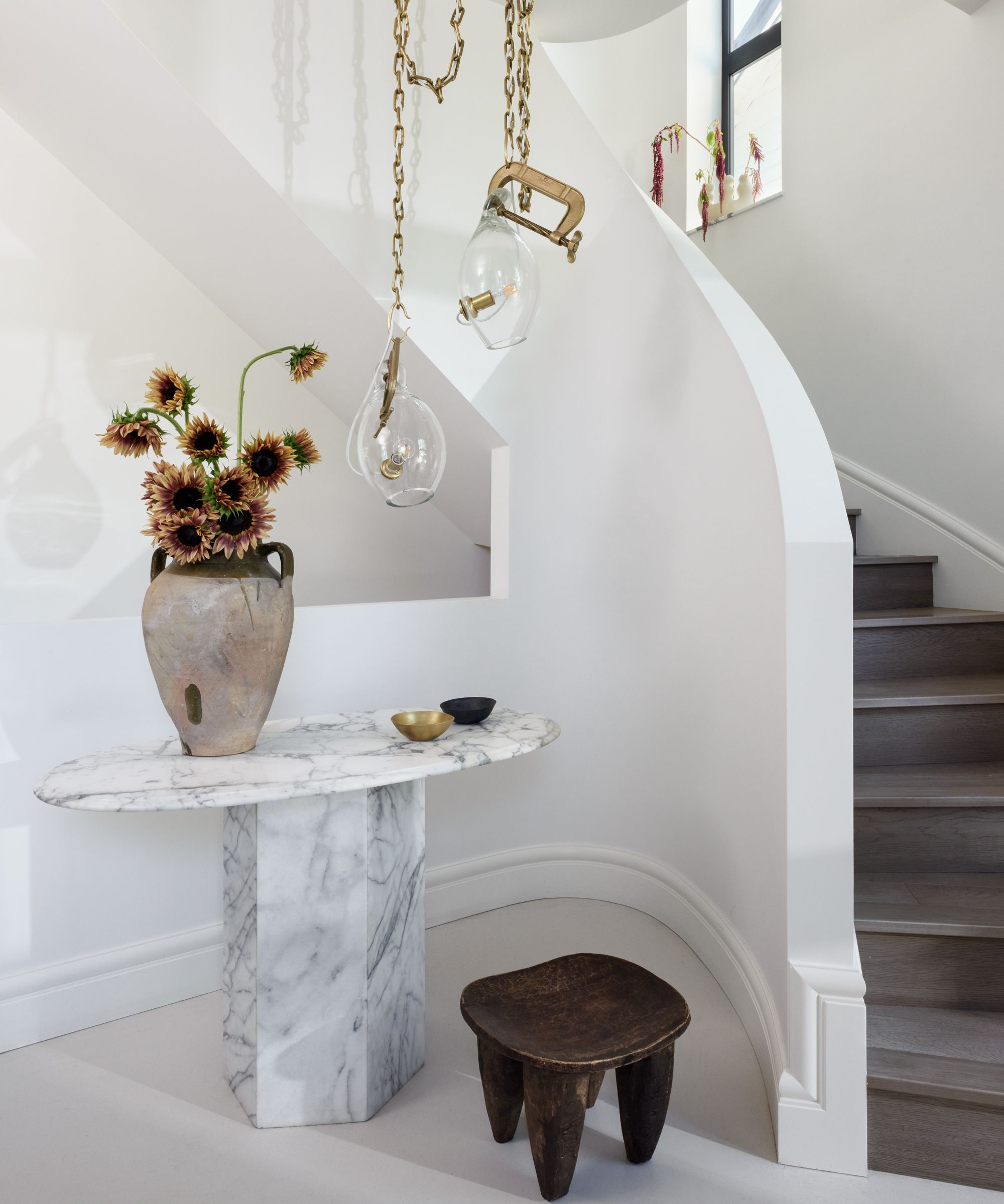
'Our foyer and entryway ideas were really designed around the curved staircase,' says Gillian. 'While it took up more space on our footprint than a standard staircase would have, I really wanted the softness of curves to greet you as you entered with everything else being so rectilinear.'
Pendants by Lindsay Adelman, a commissioned mirror by Hannah Polskin and a vintage marble table and vessel adorn the room.
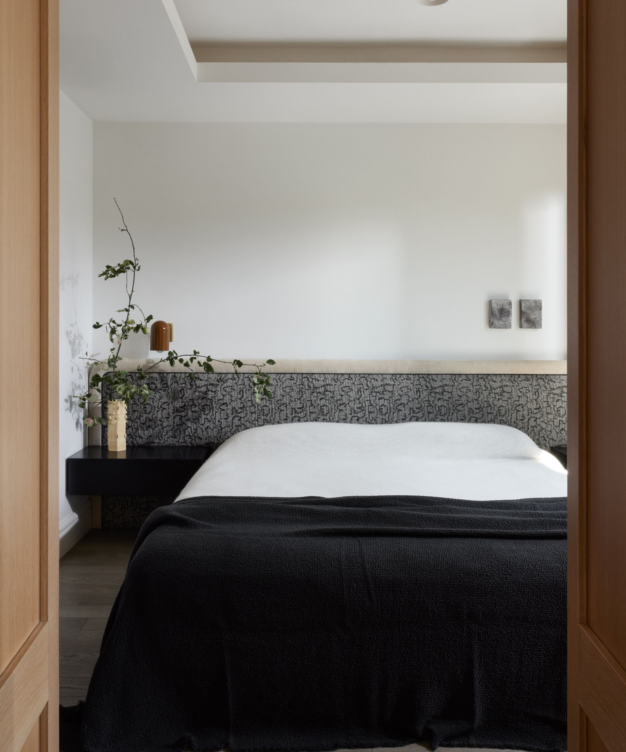
Anyone looking for bedroom ideas for smaller spaces could take inspiration from Gillian's no-nonsense solutions for the primary bedroom.
'We were very tight on space, so integrating as many components as possible was important to maximize space efficiency,' says the designer. 'A custom, built-in headboard with integrated nightstands helped keep things feeling clean (and saved on space).
The bed and nightstands are custom (with a Kelly Wearstler fabric) and the ceiling lights are from Apparatus Studio.

When it came to her kids' room ideas, designer Gillian really went to town. A leafy animal mural provides interest and seems to expand the room beyond its four walls, a great technique where space is limited. Large, low windows are a nice feature for children's rooms, provided they have safety locks.
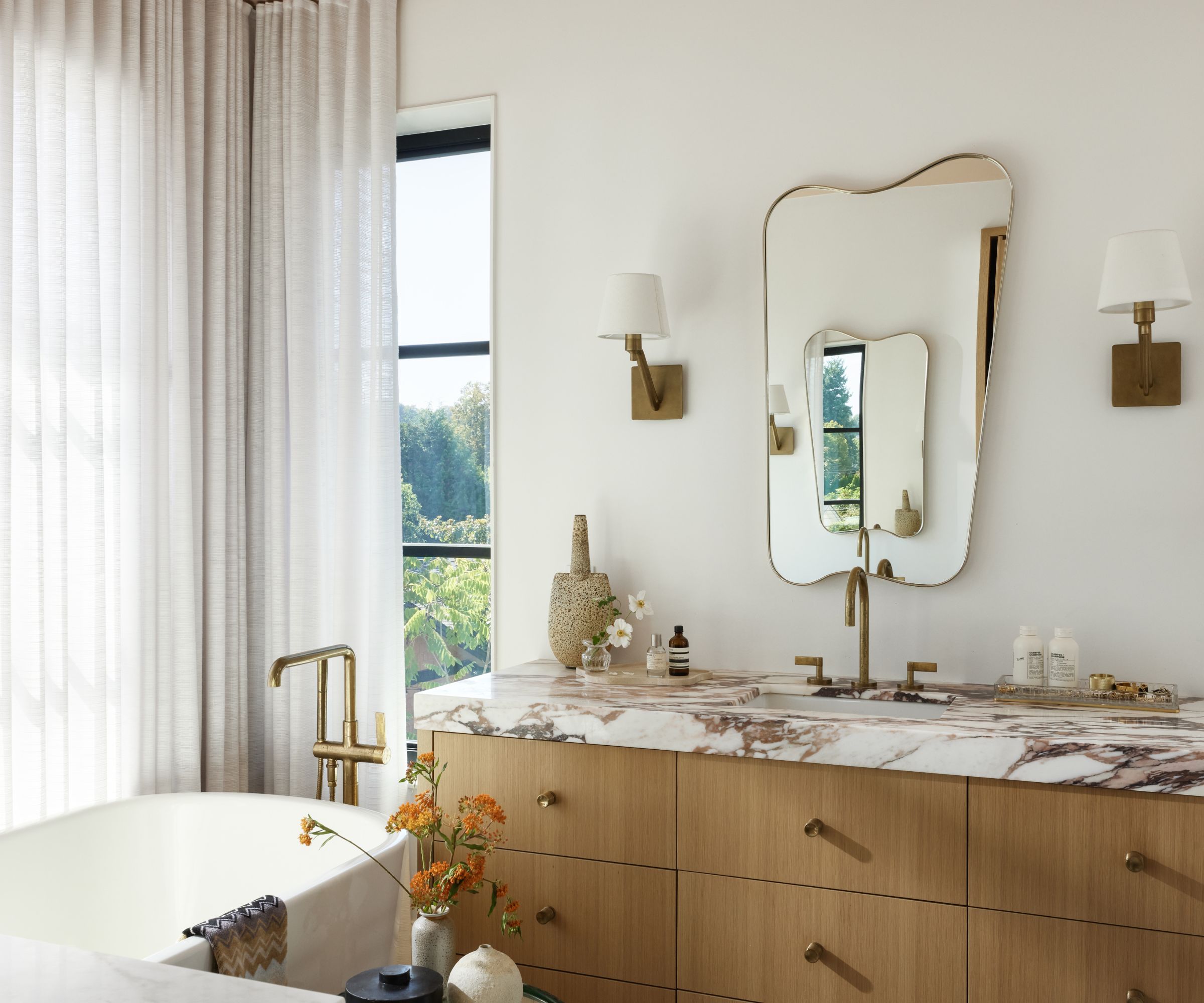
'One of my favorite features with the primary bedroom suite was the millwork wall that separates the bed from the bathroom,' says Gillian. 'The bathroom is a complete surprise behind a hidden door and it doubles as extra closet storage and a make-up vanity for me.'
Bathroom ideas include unlacquered brass plumbing from Kallista, European oak and Calacatta viola. Gillian added an affordable mirror from CB2 and Circa sconces.
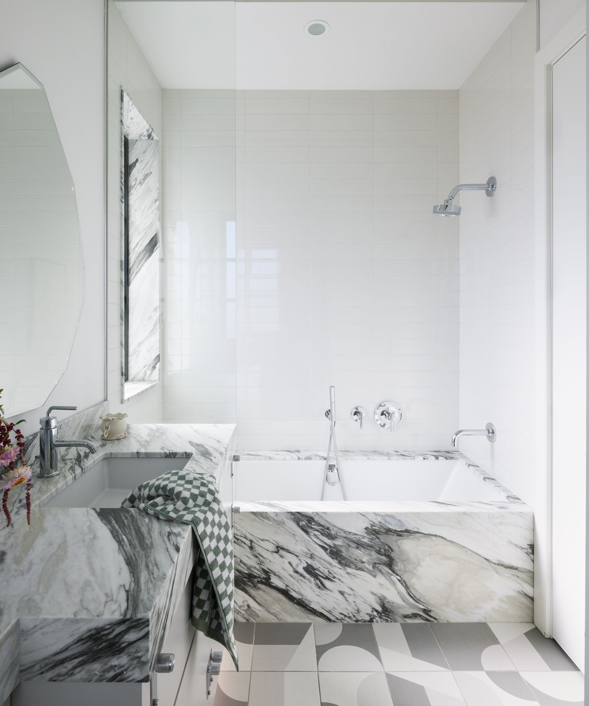
For the family bathroom, Gillian took a different approach. 'I wanted this room to have a sense of fun, so we used a quirky, geometric patterned tile on the floor mixed with a beautiful marble. I had the mirrors custom cut since this was budget friendly and felt fun and light.'
The results are every bit as stylish as the primary bathroom, with the mix of patterns providing a characterful look.
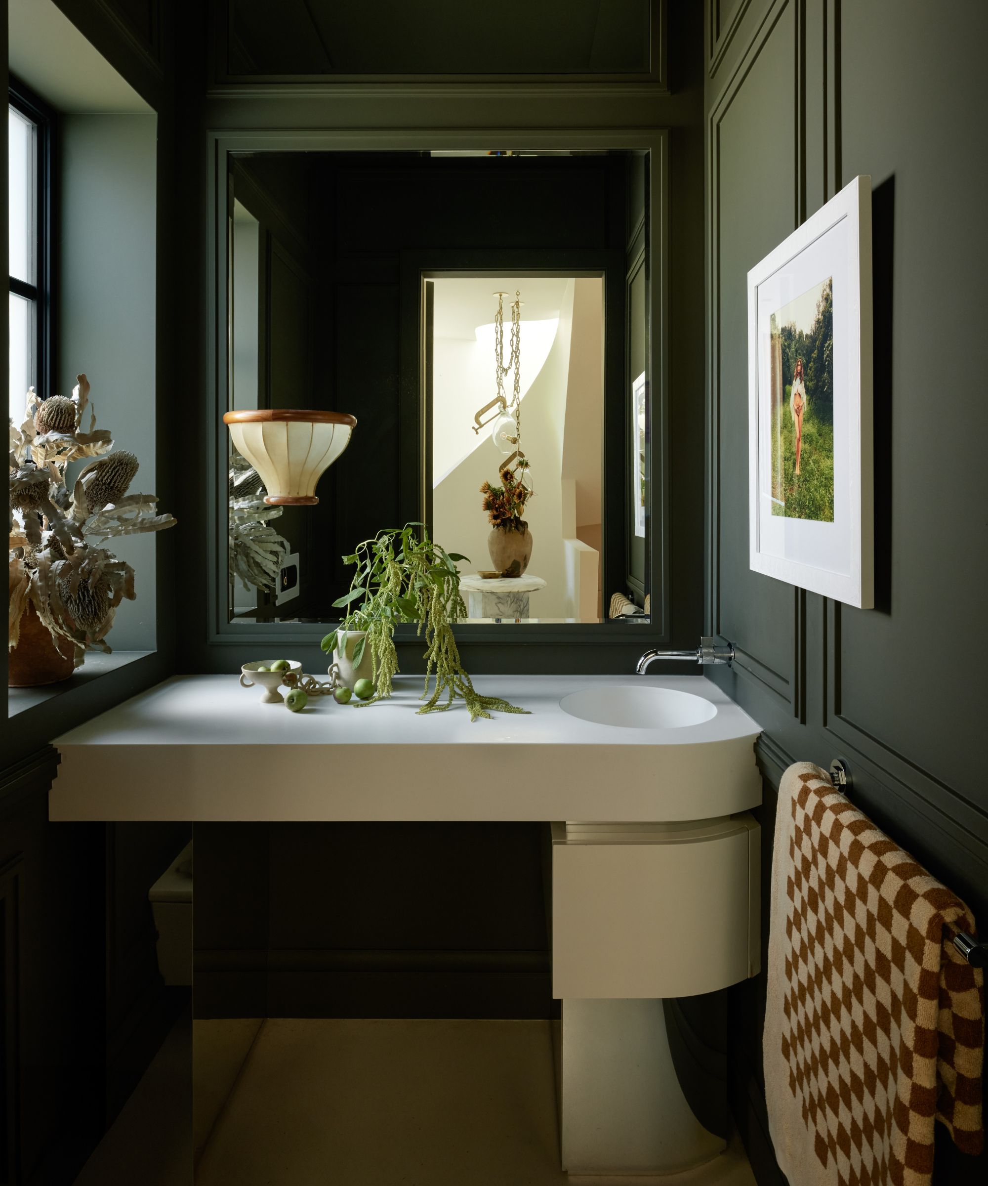
Gillian's powder room ideas were inspired by a 1960s vintage desk from France. 'I decided to emulate its style and shape with our bathroom vanity,' says the designer. 'We didn’t have a generous budget for this room, so I used Corian for the countertop and integrated sink and used a mirrored laminate on the base. We applied moldings to the drywall and I dunked the room in a dramatic green color.'
Keeping an eye on budget, and drawing inspiration from unusual and different sources is the way Gillian has gradually pulled together the designs for her home. 'Embracing a myriad of design styles and genres, continually pushing boundaries, and being exposed to a diverse array of products and ideas, I encountered difficulty in committing to one particular approach,' she admits. 'This journey has undeniably fostered a deep sense of empathy and understanding for the challenges our clients face in navigating their own projects.'
The finished space is a delight. With its clever space-saving solutions, nods to midcentury style, contemporary lines and materials, and some very traditional vintage pieces, this is one family home in a million.
Interior design: Gillian Segal
Photography: Ema Peter
Karen sources beautiful homes to feature on the Homes & Gardens website. She loves visiting historic houses in particular and working with photographers to capture all shapes and sizes of properties. Karen began her career as a sub-editor at Hi-Fi News and Record Review magazine. Her move to women’s magazines came soon after, in the shape of Living magazine, which covered cookery, fashion, beauty, homes and gardening. From Living Karen moved to Ideal Home magazine, where as deputy chief sub, then chief sub, she started to really take an interest in properties, architecture, interior design and gardening.
