Albion Nord's top 5 tips for introducing bold colors in room schemes
Elevate your interior with these color tips from a leading interior design studio

Design expertise in your inbox – from inspiring decorating ideas and beautiful celebrity homes to practical gardening advice and shopping round-ups.
You are now subscribed
Your newsletter sign-up was successful
Want to add more newsletters?
A well-designed interior is the key to creating an inviting space that family and friends will love spending time in. Balancing materials, vibrant colors, and pattern, creating cozy nooks for the ultimate haven are all vital elements in creating a successful scheme.
Below, we look into how room color ideas can be introduced in bold splashes to your interiors, with the help of the experts at design studio Albion Nord, listed this year as amongst the world's best interior designers.
1. Dare to be brave with color in bedrooms
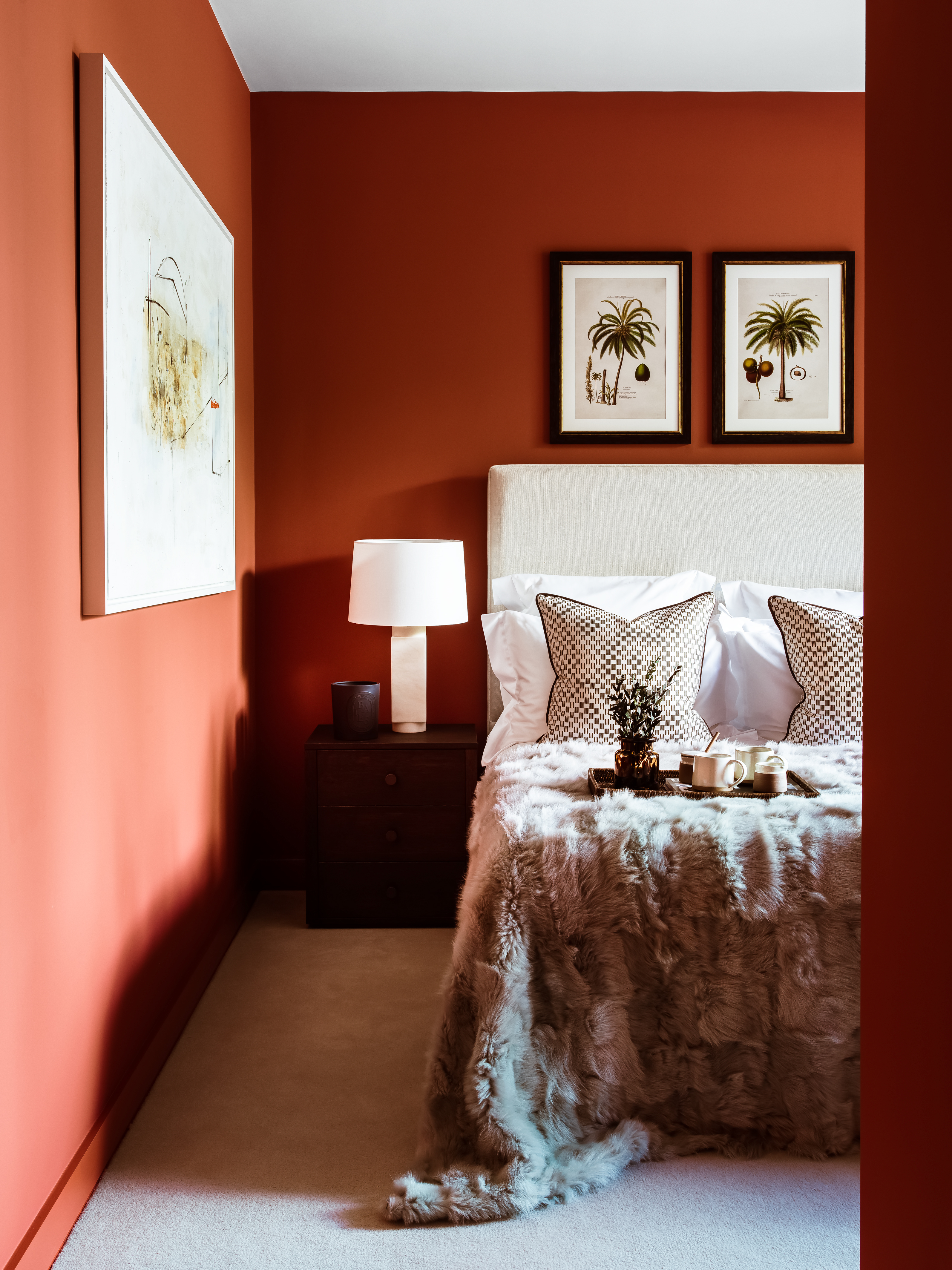
Bedrooms needn't be neutral – warm, bold colors can be extremely inviting.
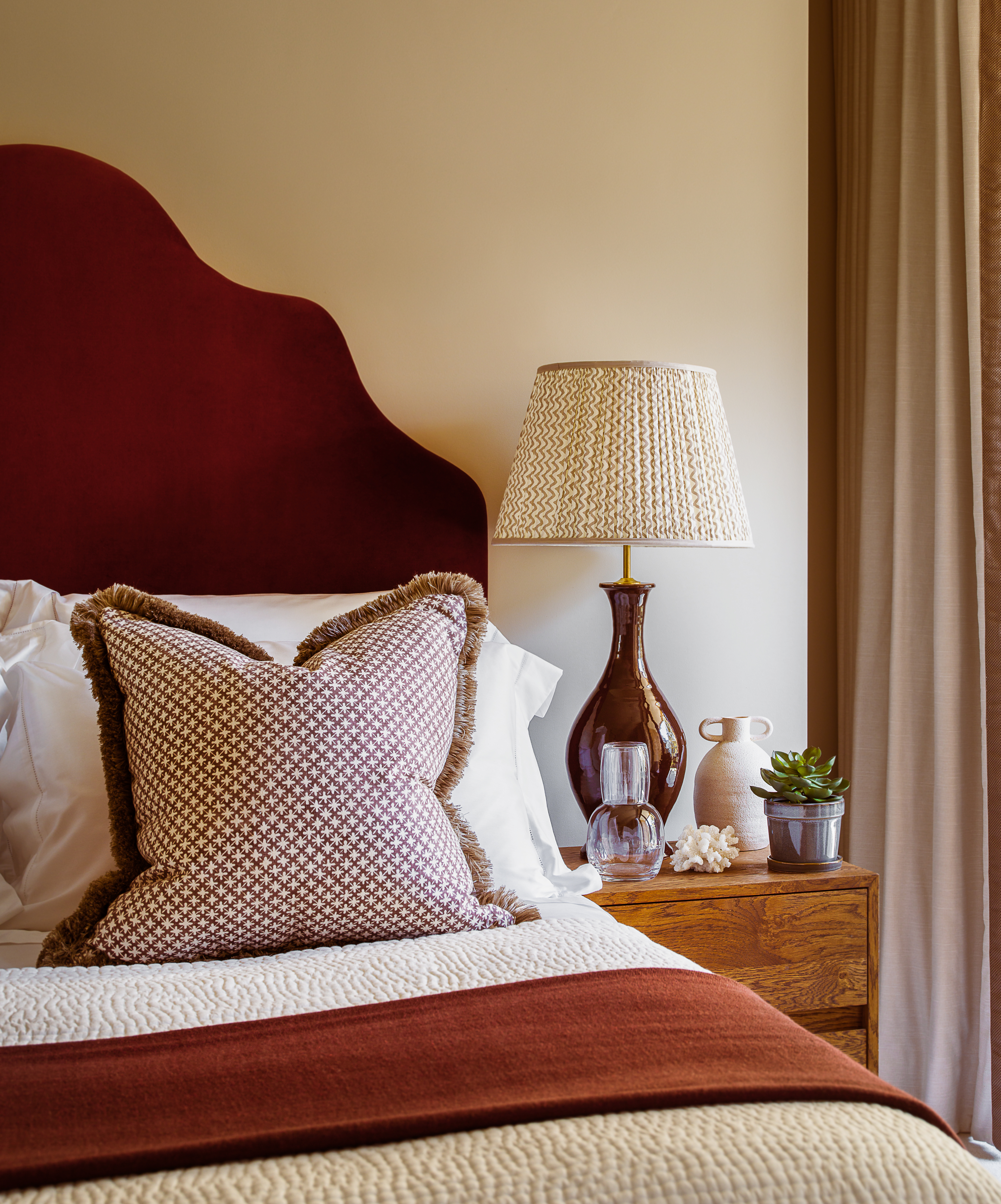
Article continues below‘This orange bedroom is definitely one of my favorite rooms in this project,' says Camilla Clarke, Creative Director at Albion Nord. 'It's easy to shy away from bold bedroom color ideas but it works wonderfully when paired with fresh white sheets and the creamy tones of the headboard and cushions.
'The wall color is a browny red tone from Edward Bulmer called Sang De Boeuf which is beautiful and takes on slightly different tones throughout the day – cozy and rich in the evening and vibrant and warm in the morning.’
2. Use strong, earthy colors for a calm atmosphere

Living room color schemes can also be bold – but restful.
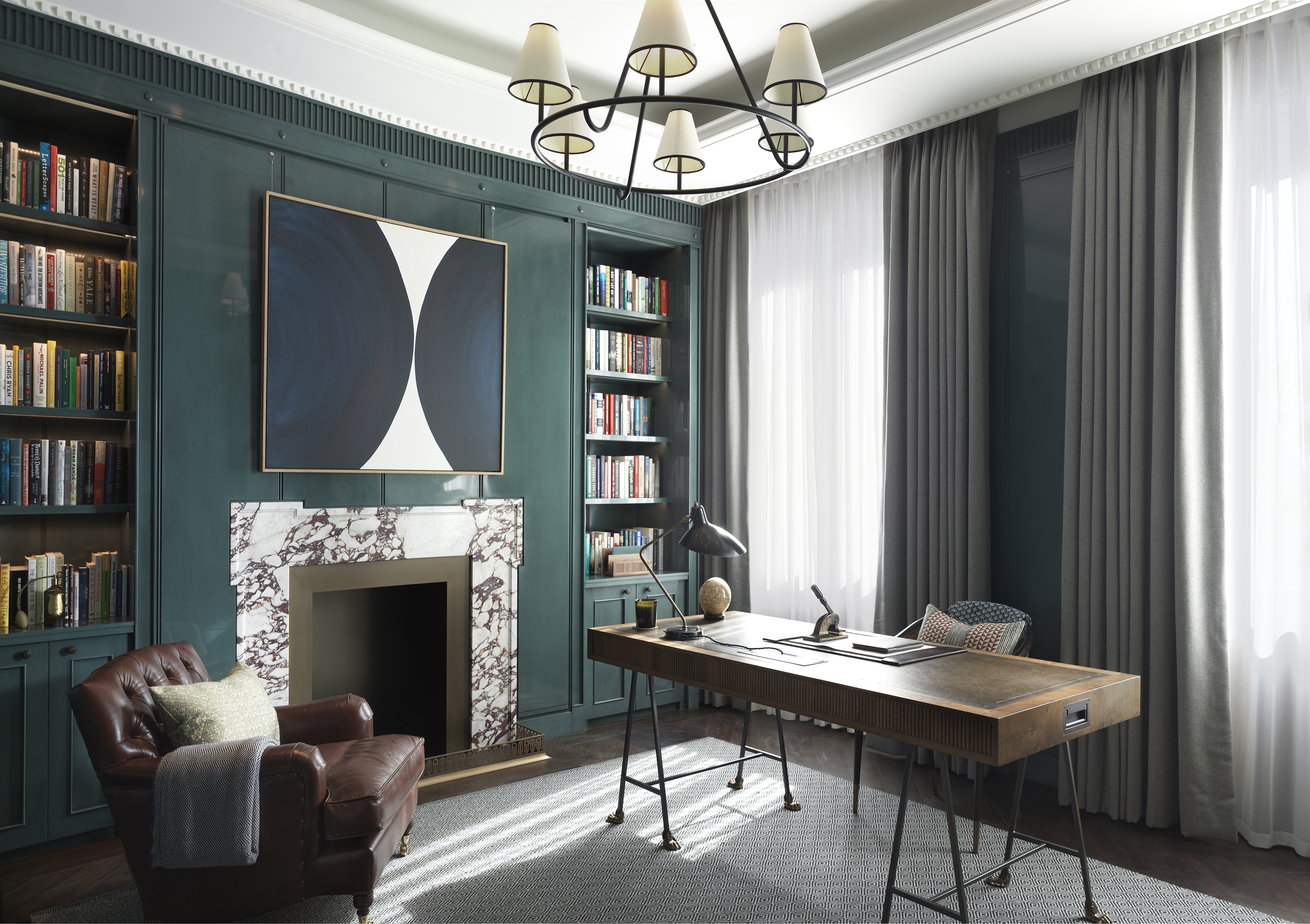
'We love to use earthy colors such as greens, dusky blues, ochres, chocolates, and cream design schemes. I tend to avoid anything grey and look to use architectural creams, or earthy greens. I have recently been drawn to yellows and pinks as they give off such an upbeat feeling,' says Clarke.
Design expertise in your inbox – from inspiring decorating ideas and beautiful celebrity homes to practical gardening advice and shopping round-ups.
“Our favorite hues to use in an interior are muted tones which create calm and soft spaces. We tend to avoid dull greys and swap them out for earthy greens or dusty blues.'
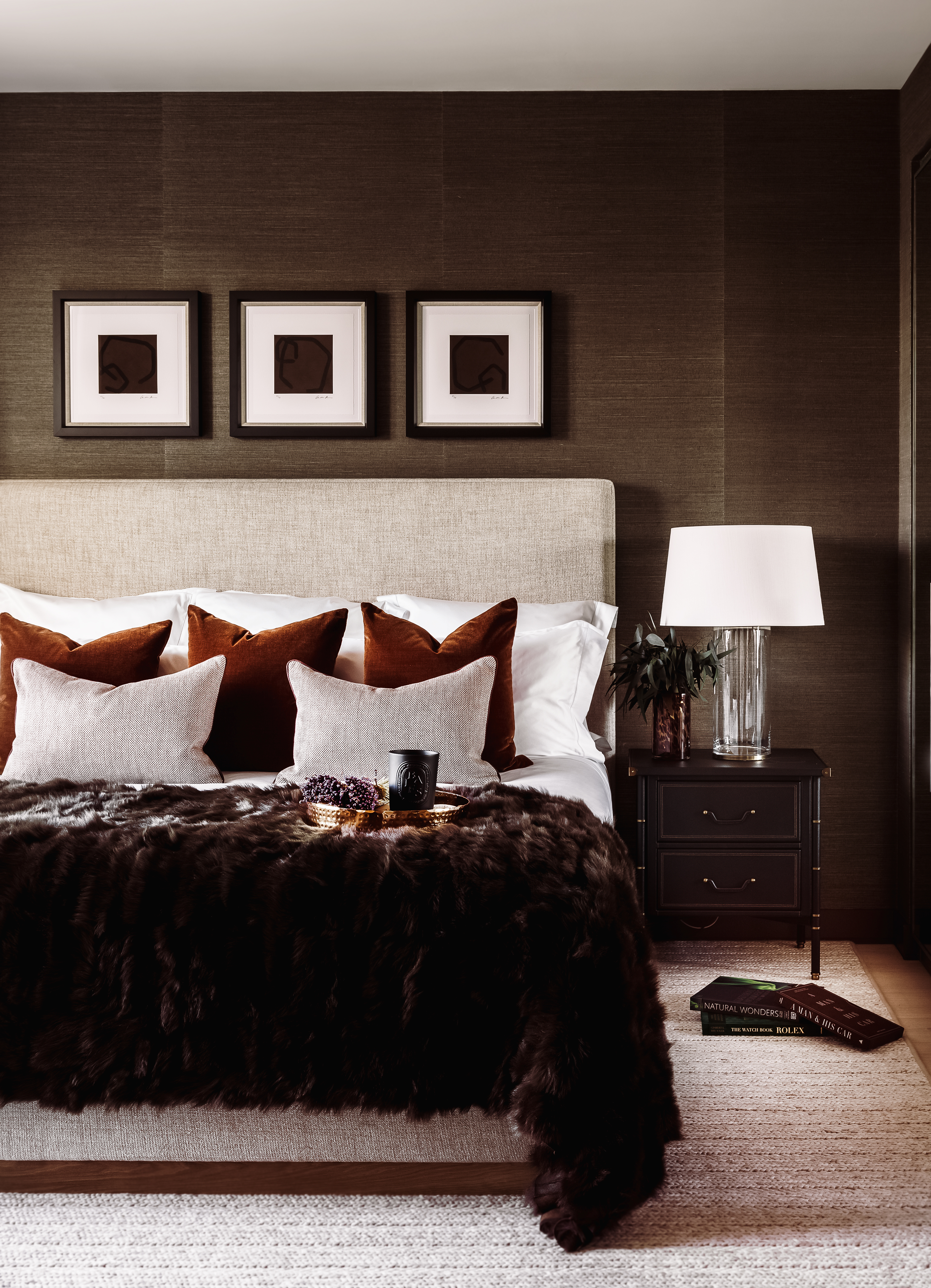
3. Use bold color to define at-home work spaces
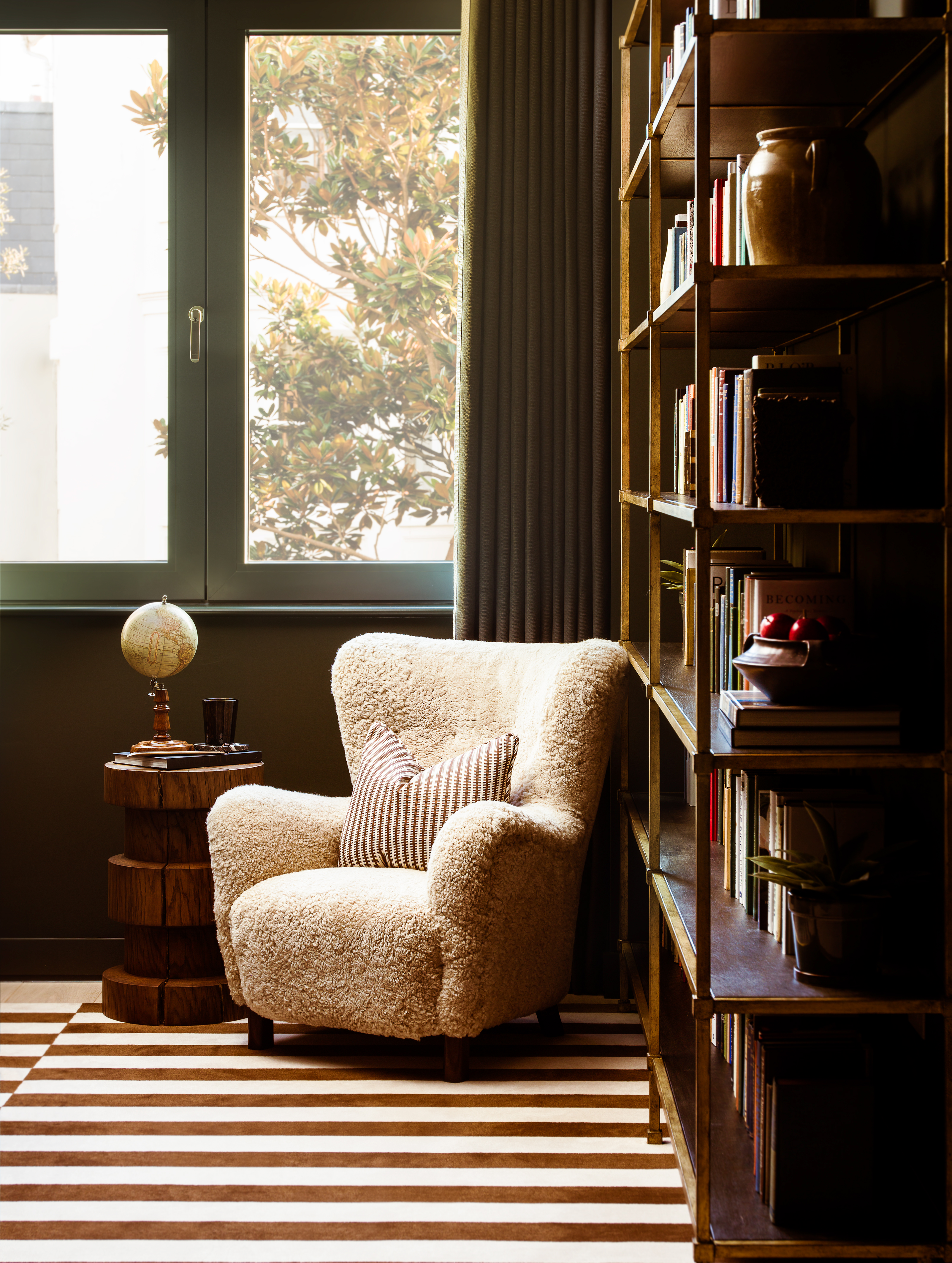
Ottalie Stride, Creative Director at Albion Nord, explains: ‘When personal life requires, occasionally working from home is the stuff of dreams. However, most of us are having to face the harsh reality that a life practically chained inside our homes is presenting.’
She continues: ‘Usually, home is the sanctuary in which we can unwind after a testing day in the office. The trouble is, today, home IS our office. Here, diversity is key. For those of you fortunate enough to have a study at home, you’re off to a head start. If you, like me, don’t have a spare room, try to create a space in which you can go "to work" and leave well clear when your day is done. This way, when you’re out of your "work nook" your home will still feel like home.
'It’s important to differentiate areas in order to get a sense of relief from work. Keep your work zone calm, clutter-free, ideally with a view outside. Good music, a candle and endless mugs of tea all play pivotal and beneficial parts.’
4. Work pattern into a bold color scheme
Clarke believes that mixing patterns and prints in a room is vital when introducing color. ‘We like to use pattern in smaller doses in cushions, armchairs or statement headboards. There are so many beautiful, patterned fabrics out there to choose from, our favorites being anything and everything from Tissus D’Helene, Zak & Fox, Soane, The Fabric Collective and Blithfield,’ says Clarke.
‘We love using antique fabrics found out-and-about at antique markets or fairs. We tend to use them on cushions or frame them as artworks to add a unique point of interest to any room and you won’t see it in anyone else’s house.’
5. Introduce color in art

‘Art adds character and a sense of personality to a space that you can’t always fully achieve through materials and colors in a room. A room without art is a room unfinished. Your wall should be the canvas for your art,’ explains Camilla Clarke.
Clarke believes that when choosing artwork, it ‘must always be done whilst walking around the space, never decide off plan.’ She continues: ‘Always walk around the space and you will feel the natural spots for art to be. This may be next to a window or at the end of a corridor. Remember art doesn’t always need to be hung on the center of the wall it can rest on top of tables or layered next to sculptures or on bookshelves and joinery.
‘We love to use tapestries in hallways as they add richness and warmth to a space that may not have much furniture. They also come in huge landscape sizes which make them great for long hallways or entrances.’

Lucy Searle has written about interiors, property and gardens since 1990, working her way around the interiors departments of women's magazines before switching to interiors-only titles in the mid-nineties. She was Associate Editor on Ideal Home, and Launch Editor of 4Homes magazine, before moving into digital in 2007, launching Channel 4's flagship website, Channel4.com/4homes. In 2018, Lucy took on the role of Global Editor in Chief for Realhomes.com, taking the site from a small magazine add-on to a global success. She was asked to repeat that success at Homes & Gardens, where she also took on the editorship of the magazine. Today, Lucy works as Content Director across Homes & Gardens, Woman & Home, Ideal Home and Real Homes.