Benjamin Moore's August color palette is all about coastal-inspired hues – here's how to decorate with these 5 soothing shades
These are the only paint colors you need for August to create a calming, coastal scheme

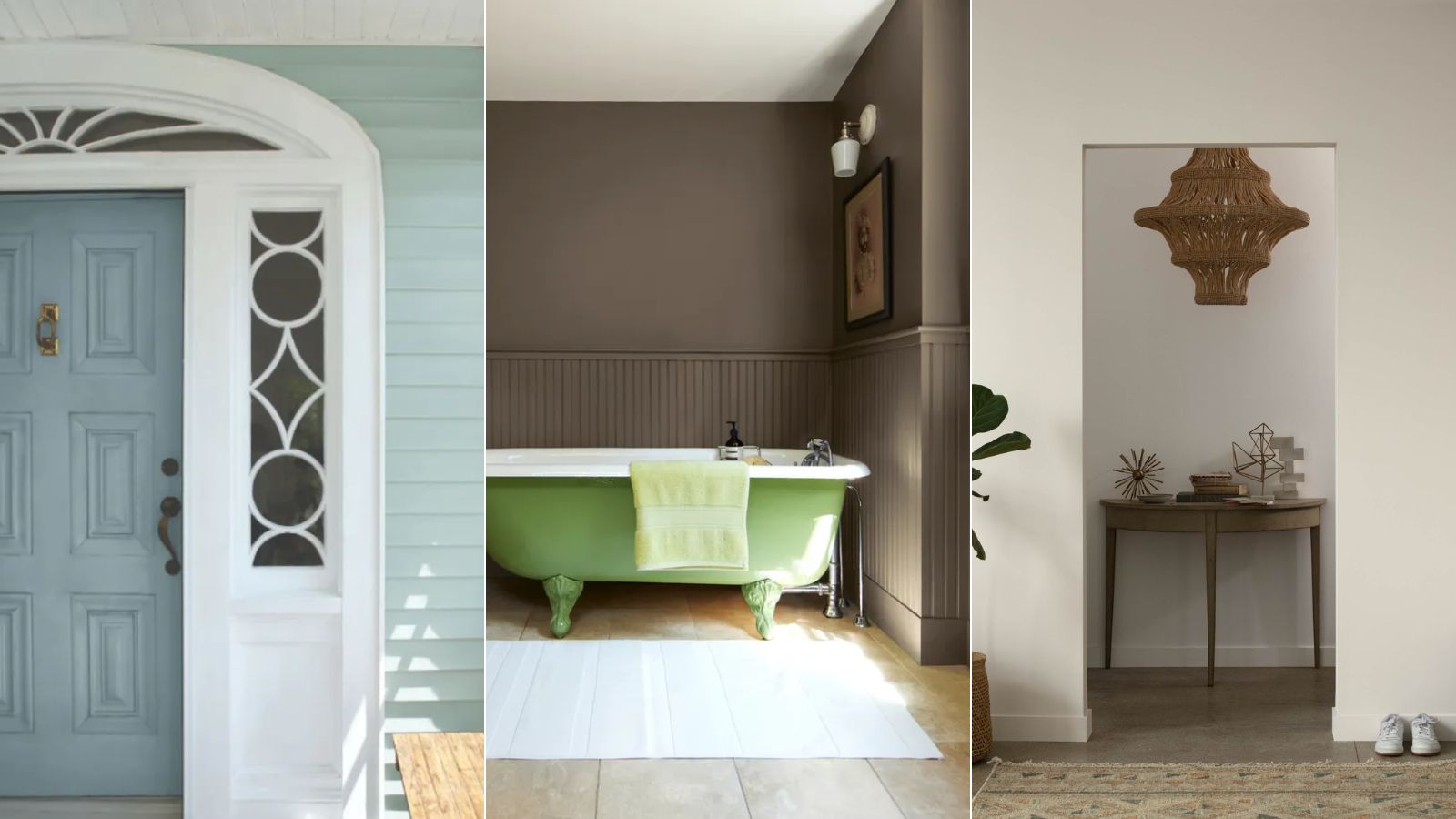
Design expertise in your inbox – from inspiring decorating ideas and beautiful celebrity homes to practical gardening advice and shopping round-ups.
You are now subscribed
Your newsletter sign-up was successful
Want to add more newsletters?
As we look ahead to fall, August welcomes plenty of opportunities to refresh the paint colors within our homes. Waving goodbye to the warm, saturated tones we associate with the height of summer, August is all about resetting the home with calming, pared-back colors.
Having said that, it's not always easy to know where to start with choosing new paint colors, but thankfully, Benjamin Moore has us covered with its August color palette. Inspired by coastal colors, the palette comprises five calming hues that bring a light and airy feel to the home, and they're perfect for all your end of summer room color ideas.
To find out more about this refreshing color palette, read on. We've broken down each of the paint ideas and suggested some of the best ways to decorate with them, with the help of color experts and designers.
Article continues belowA post shared by Benjamin Moore (@benjaminmoore)
A photo posted by on
'The colors we choose to live with can have a big impact on our mood,' says Helen Shaw, Director of Marketing and color expert at Benjamin Moore.
For August, the focus is all about creating a calming feel in our homes. As summer comes to an end, leaning into the soothing, coastal-inspired hues helps our spaces transition seamlessly into the fall months that lie ahead.
'Muted hues are known to have soothing, atmospheric properties and when used in our homes can help create a sense of calm in daily life,' continues Helen. 'August is a great time to let the good vibes of summer inform an interior design refresh.'
The palette includes five coastal-inspired hues: Gardenia AF-10, a bright white with gentle pink undertones; Sea Salt CSP-95, a warm gray; Stardust 2108-40, a slightly darker neutral with both gray and brown tones. The two final colors are the more colorful: Mediterranean Sky 1662, a mid-tone, calming blue; and Dune Grass 492 a pale sage green.
Design expertise in your inbox – from inspiring decorating ideas and beautiful celebrity homes to practical gardening advice and shopping round-ups.
'Embrace the laid-back energy through sandy neutrals, sky blues, and salty grays' adds Helen. 'These hues are reflective of nature so they will create a feeling of grounded serenity that will continue long after the sunshine season has faded.'
How to decorate with the August color palette
1. Create a coastal scheme with blue and green
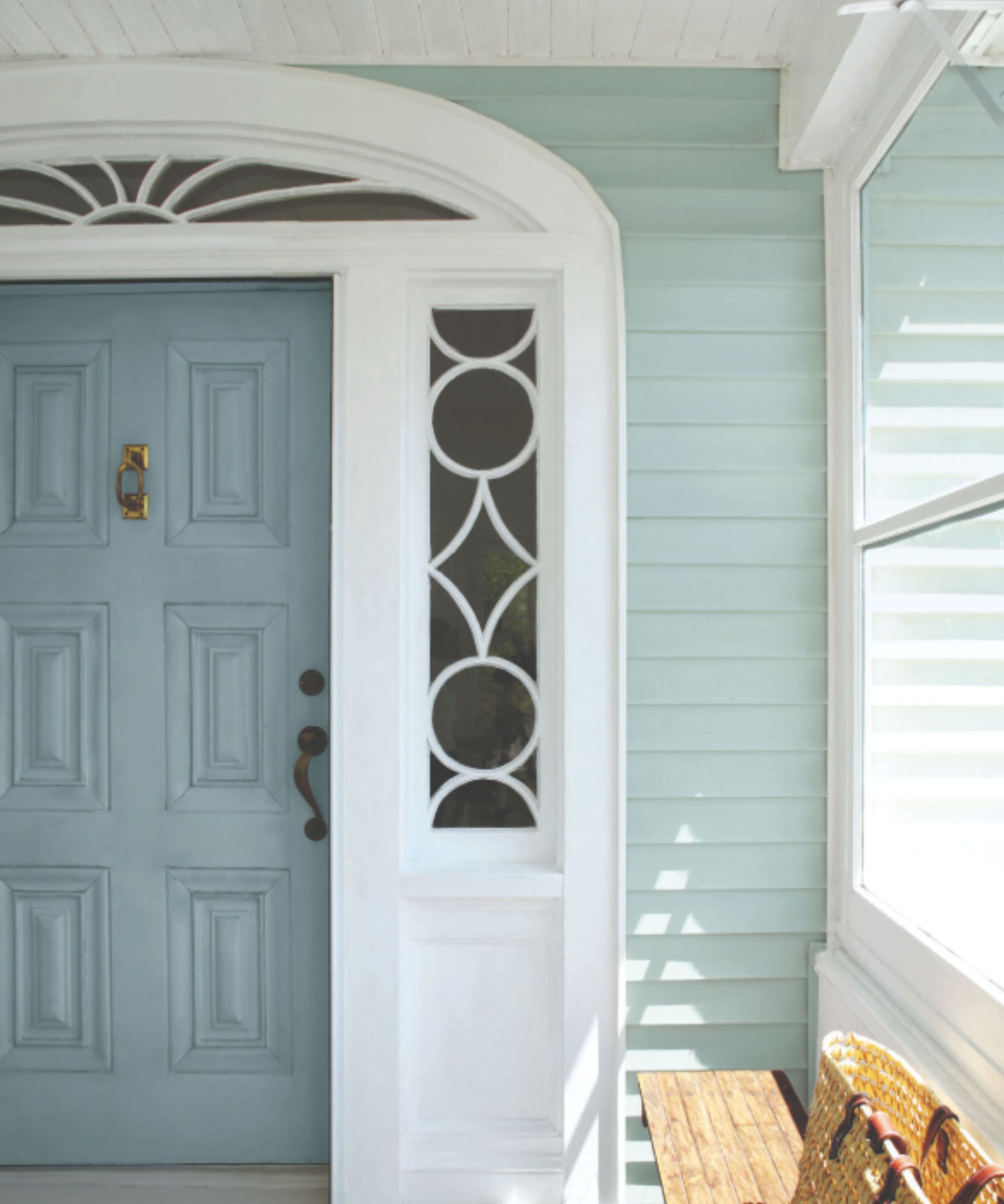
Mediterranean Sky and Dune Grass are the go-to hues if you want to fully embrace a coastal color scheme. Blues and greens are known to be amongst the most relaxing colors, and the soft tones of these two paints make them incredibly liveable and versatile.
'Sage greens and sky blues such as Mediterranean Sky and Dune Grass can help relax our brains and entice creative thinking, making them the perfect backdrop for a home office,' says Helen. 'They are also great canvases for pin boards, pictures, and shelving without being too bold and overpowering.'
Creating a similarly soothing scheme, Benjamin Moore's Wedgewood Gray and Van Courtland Blue are used for this home's exterior, nodding to coastal decor.
2. Use darker neutrals to add warmth
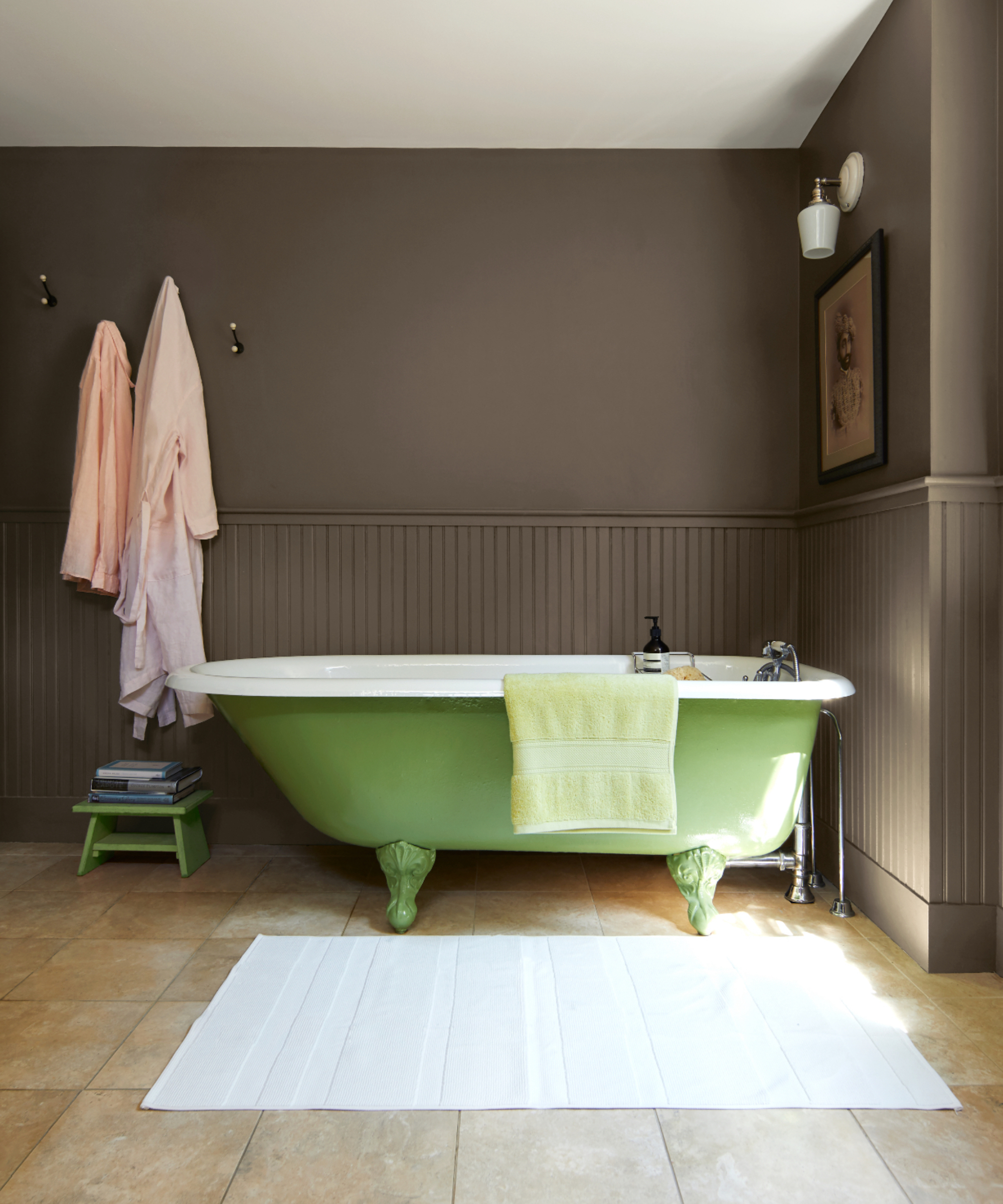
'Darker neutrals such as Stardust offer a surprisingly versatile tone and are a popular choice for color drenching for those seeking a dramatic scheme,' says Helen. Creating a similar look to Whitall Brown which was used in this bathroom, brown tones are a great alternative to neutrals if you want to add more depth and warmth.
'To create an airy and minimalist feel for a bedroom or living room, pair this deep gray-brown Stardust with a softer hue such as Sea Salt,' adds Helen. 'Finish the look with a bright white such as Gardenia on the woodwork and natural textures in throws, pillows, and other decor to create the ultimate relaxing sanctuary this August.'
3. Opt for light neutrals to create a calming space
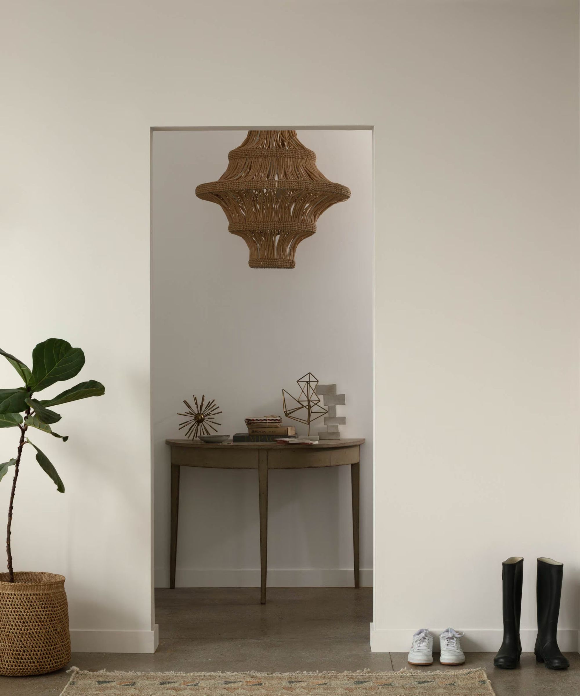
If you prefer a classic, calming scheme that looks great all year long, decorate with the light neutrals in this palette: Sea Salt and Gardenia. In this modern entryway, Sea Salt is used across the walls, creating a pared-back, timeless feel perfect for the end of summer and transitioning into fall.
'Neutral walls can serve as the perfect canvas,' says interior designer Melissa Read, Creative Director at Studio Burntwood. 'To keep them captivating, incorporate oversized artwork or bold prints to draw the eye, and use rugs with intriguing patterns or textures to add depth.'
Whatever your decorating style, the paint colors included in Benjamin Moore's August palette are versatile and timeless. Whether you lean into a coastal look or use the neutrals to refresh your home with a clean and calm look, you can't go wrong with these stylish hues.

Emily is a freelance interior design writer based in Scotland. Prior to going freelance in the spring of 2025, Emily was Homes & Gardens’ Paint & Color Editor, covering all things color across interiors and home decor for the Homes & Gardens website. Having gained specific expertise in this area, Emily is well-versed in writing about the latest color trends and is passionate about helping homeowners understand the importance of color psychology in home design. Her own interior design style reflects the simplicity of mid-century design and she loves sourcing vintage furniture finds for her tenement flat.


