This is how you transform a bland new build into a soulful space – take a tour of a modern yet characterful Singapore apartment
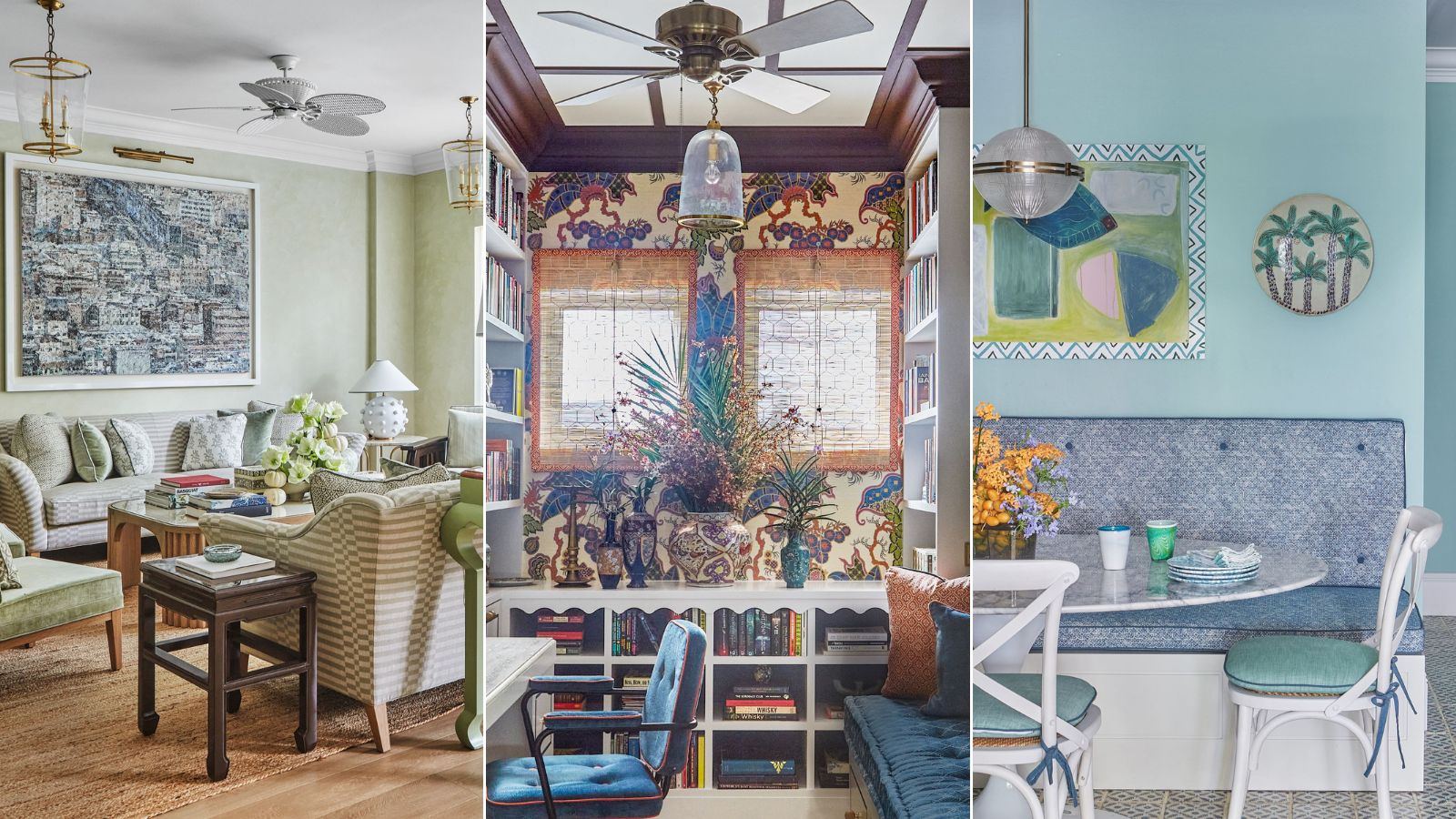
Elizabeth Hay's use of fresh colors and playful patterns has ensured this modern Singapore apartment is full of character

Design expertise in your inbox – from inspiring decorating ideas and beautiful celebrity homes to practical gardening advice and shopping round-ups.
You are now subscribed
Your newsletter sign-up was successful
Want to add more newsletters?
Bringing personality to the design of a bland, dated 1990s apartment in the center of Singapore was quite the challenge for interior designer Elizabeth Hay. ‘The clients bought this apartment wanting to create a home for them and their three children,’ says Elizabeth.
The project was a full renovation as the apartment hadn’t been touched since the block was built. Opening the space up and injecting light into the kitchen was a prerequisite in the houses design.

Pendant, Hector Finch. Tiles, sourced in Morocco.
‘Sometimes with these apartments, the kitchen feels like an afterthought – it was a small kitchen laid out in a galley-style, in the middle of the house with no windows, so making it more functional was a priority,’ says Elizabeth, who concentrated on reconfiguring the layout.
Article continues below‘We gutted the apartment and removed walls, opening up smaller, darker rooms to make spaces more usable and increase natural light.’ Sliding glazed doors between the sitting room and kitchen, and glazed doors between the back laundry and kitchen, coax through an abundance of light.
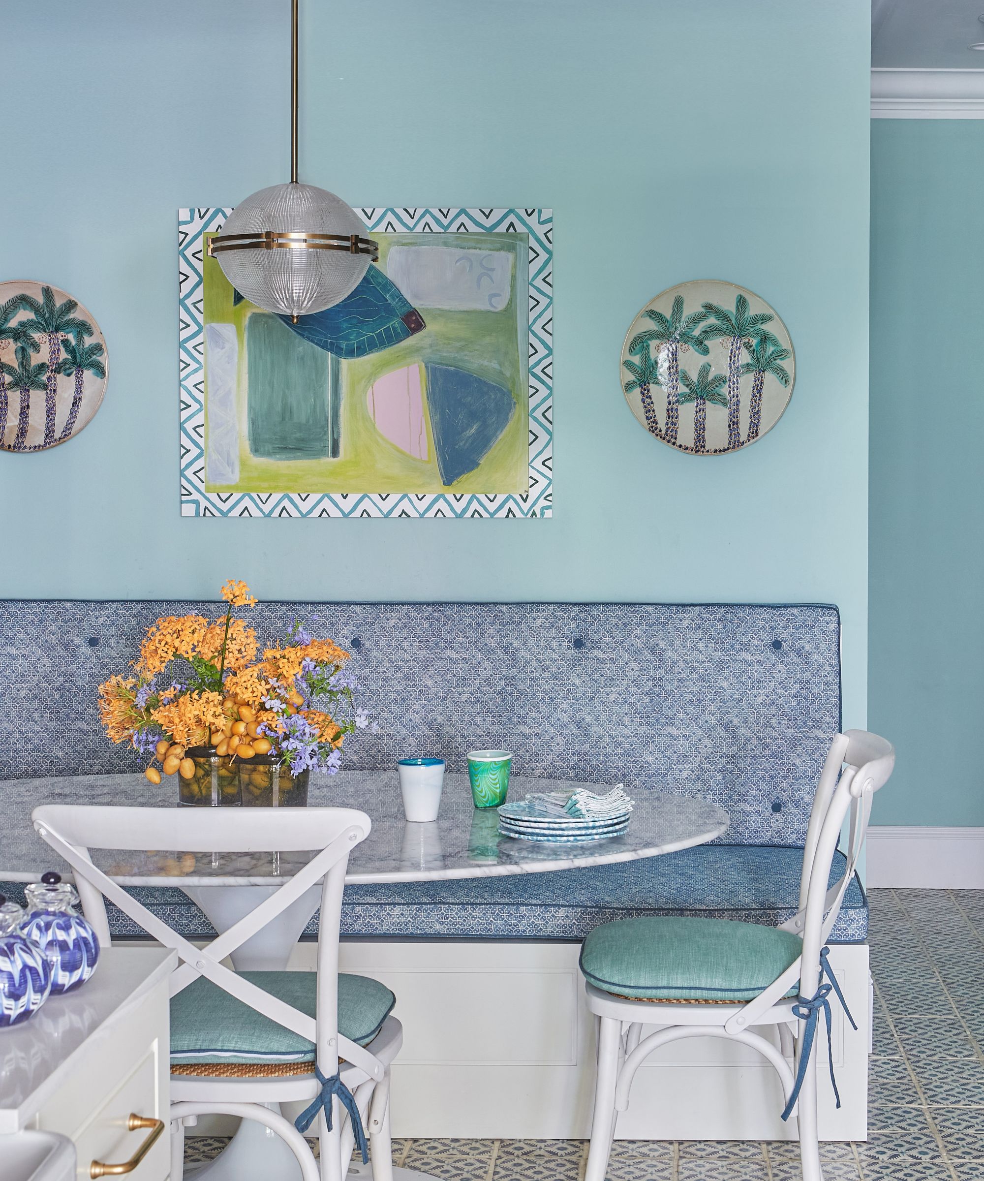
Bench fabric, Schuyler Samperton. Chairs in fabric by Christopher Farr Cloth. Art by Florence Wolsey.
Elizabeth’s signature use of bold color and pattern came into its own. This apartment exudes curated color and showcases a wealth of custom pieces.
The clients required certain areas, such as the open-plan sitting and dining room and the main bedroom, to be serene and relaxing, while a fun and joyful aesthetic was key in the family room and children’s rooms.
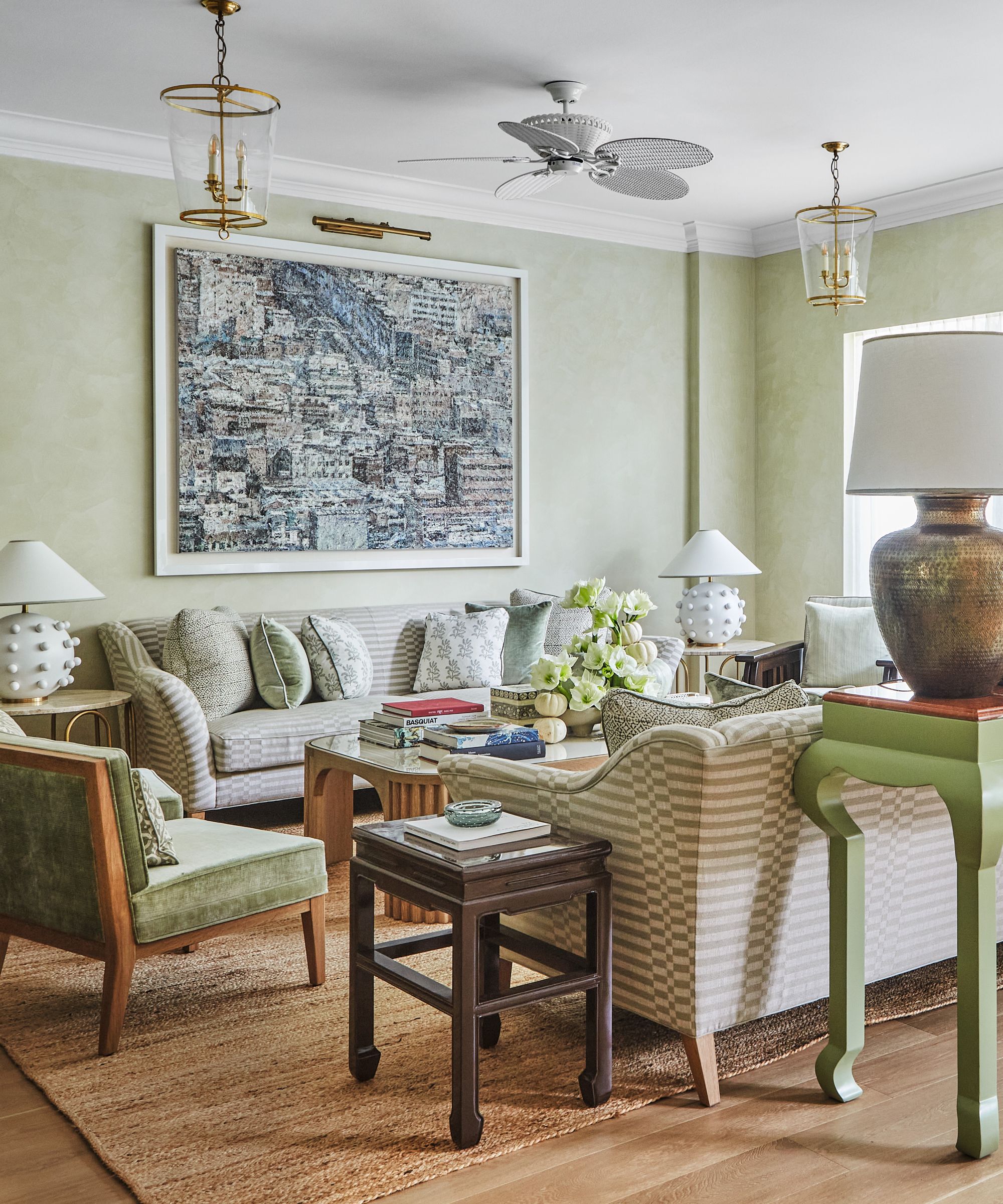
Sofa fabric, George Spencer Designs. Cushion fabric, Les Indiennes. Custom chair velvet, Peter Fasano. Lanterns, Vaughan. Orb lamp, Visual Comfort & Co. Coffee table, The Lacquer Company. Artwork by Jiyeon Song.
Speaking of the children's bedrooms, Elizabeth explains ‘the children are very artistic and were keen to be involved in their rooms; their son specifically wanted a paint splatter wallpaper and they craved color'.
Design expertise in your inbox – from inspiring decorating ideas and beautiful celebrity homes to practical gardening advice and shopping round-ups.
In the sitting and dining space, interest is created using pattern and texture. The soft green space features Venetian plaster walls. ‘It’s such a large area that I felt plain walls would seem boring. I love the Venetian plaster finish - it makes the room feel much cozier and is visually interesting without being too overbearing.’
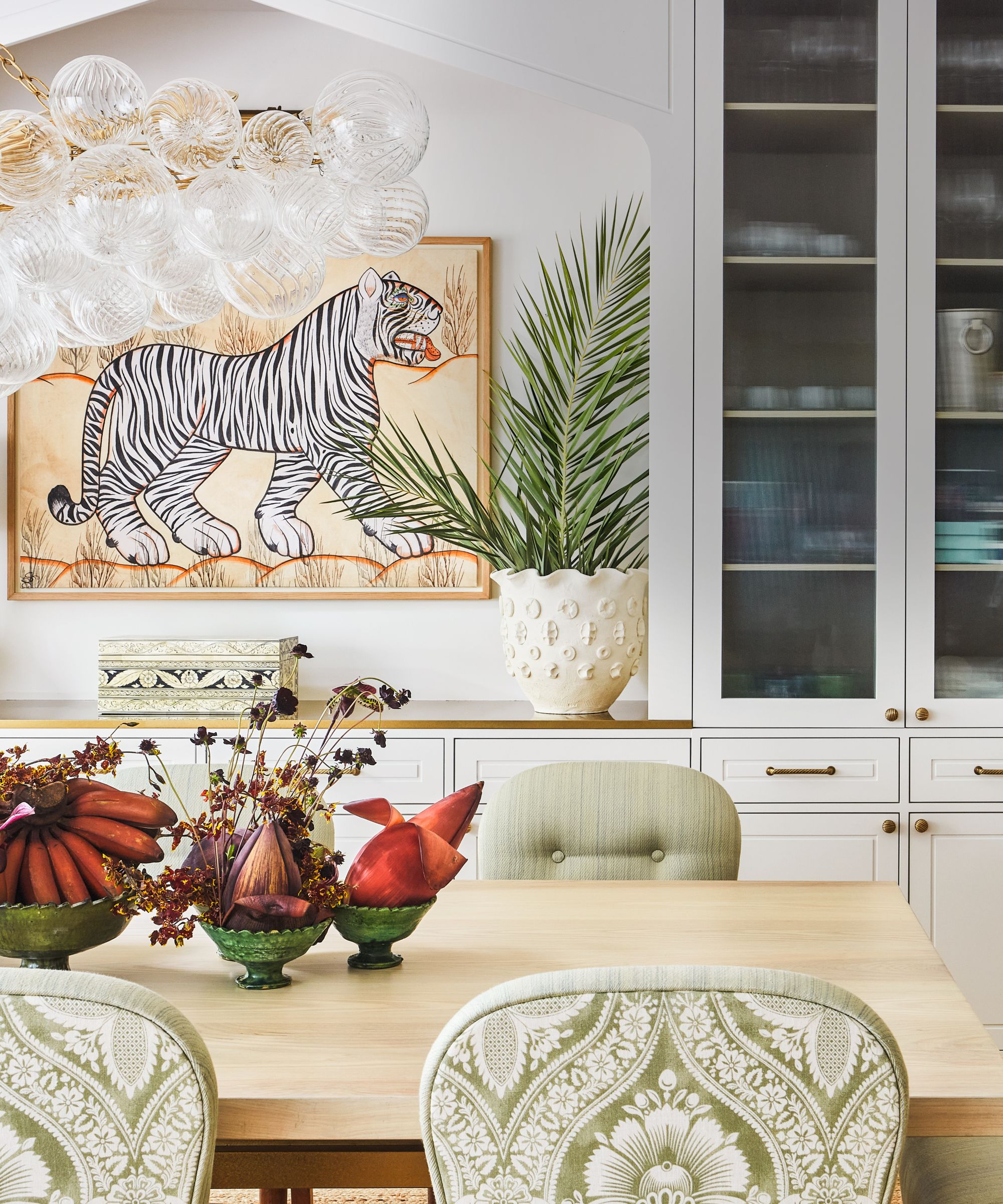
Chairs upholstered in fabic by Christopher Moore and Claremont. Tiger art;
Inlaid box, both Elizabeth Hay Design. Talia chandelier, Julie Neill.
The clients have a collection of Asian art and one of the pieces was chosen early on for the room because it worked well with the colors. Elizabeth played with materials for texture, introducing brass, glass, natural fibers, and bobble lamps.
‘If you’re doing a neutral palette, you need to have lots of texture and interest,’ she says. The pattern was brought in with the fabrics. ‘They all tone very well so it doesn’t feel overpowering.’
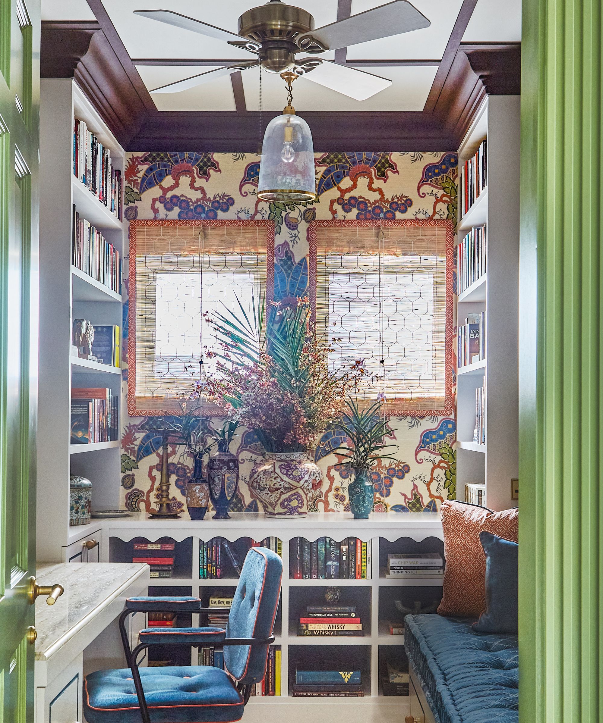
Wallpaper, Clarence House. Pendant, Pooky.
Because it’s an open-plan sitting and dining space, Elizabeth teased the soft green color tones through to the dining area, drawing the eye to the table by upholstering the backs of the chairs with a statement damask design.
One of Elizabeth’s inspired touches is a secret home bar – when the doors are closed, it’s camouflaged behind the Venetian plaster. ‘My client’s husband loved the idea of having a secret bar you could reveal when guests visit.’
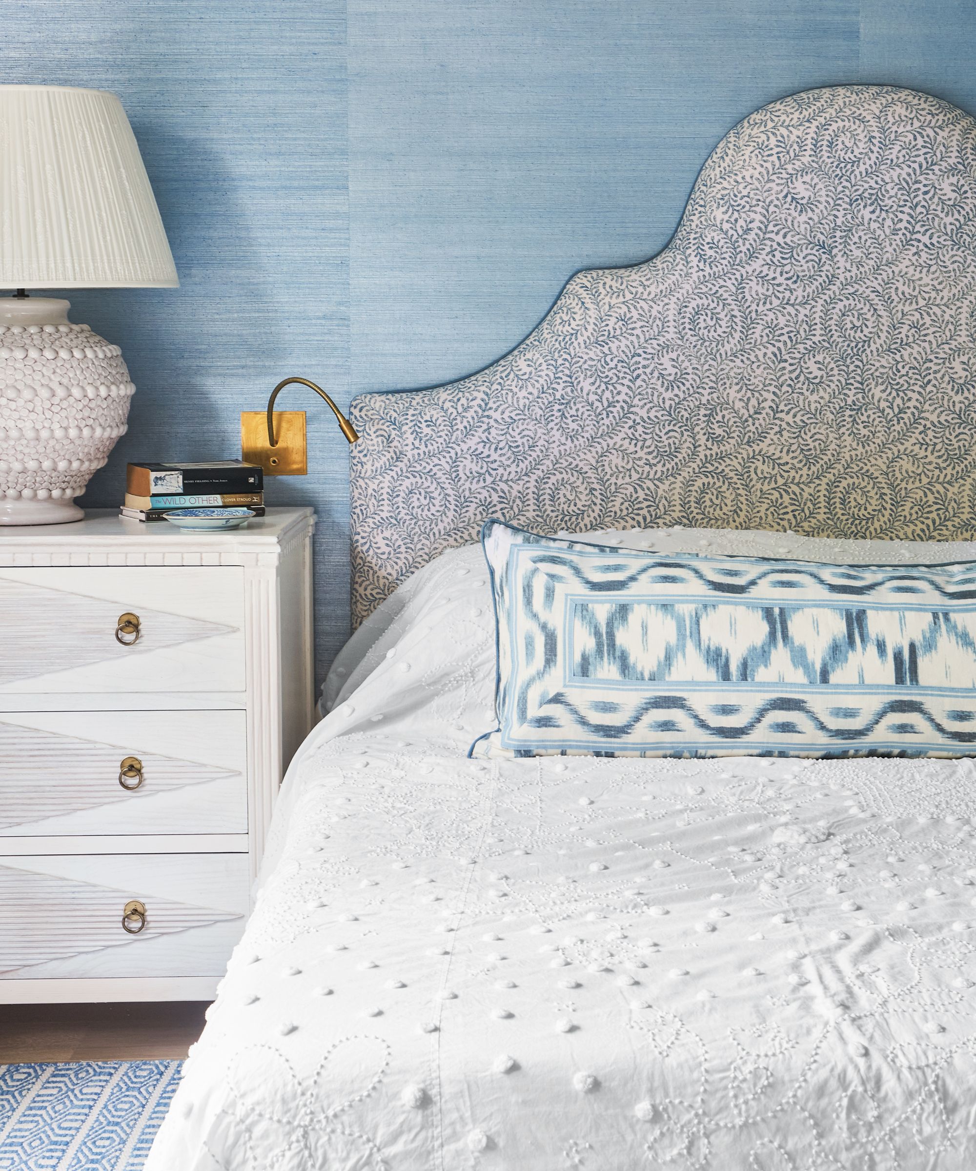
Headboard in fabric by Bennison. Cushion in fabric by Schumacher. Wallpaper, Phillip Jeffries. Table lamp, Richard Taylor Designs.
Stronger colors prevail in the family room, which Elizabeth describes as ‘joyful, cheerful and fun. We wanted to keep it light, fresh and uplifting.’
The tongue-and-groove treatment on the ceiling draws the eye up, while color was introduced with pinky peach carpentry and an ikat sofa so the room feels light and happy.
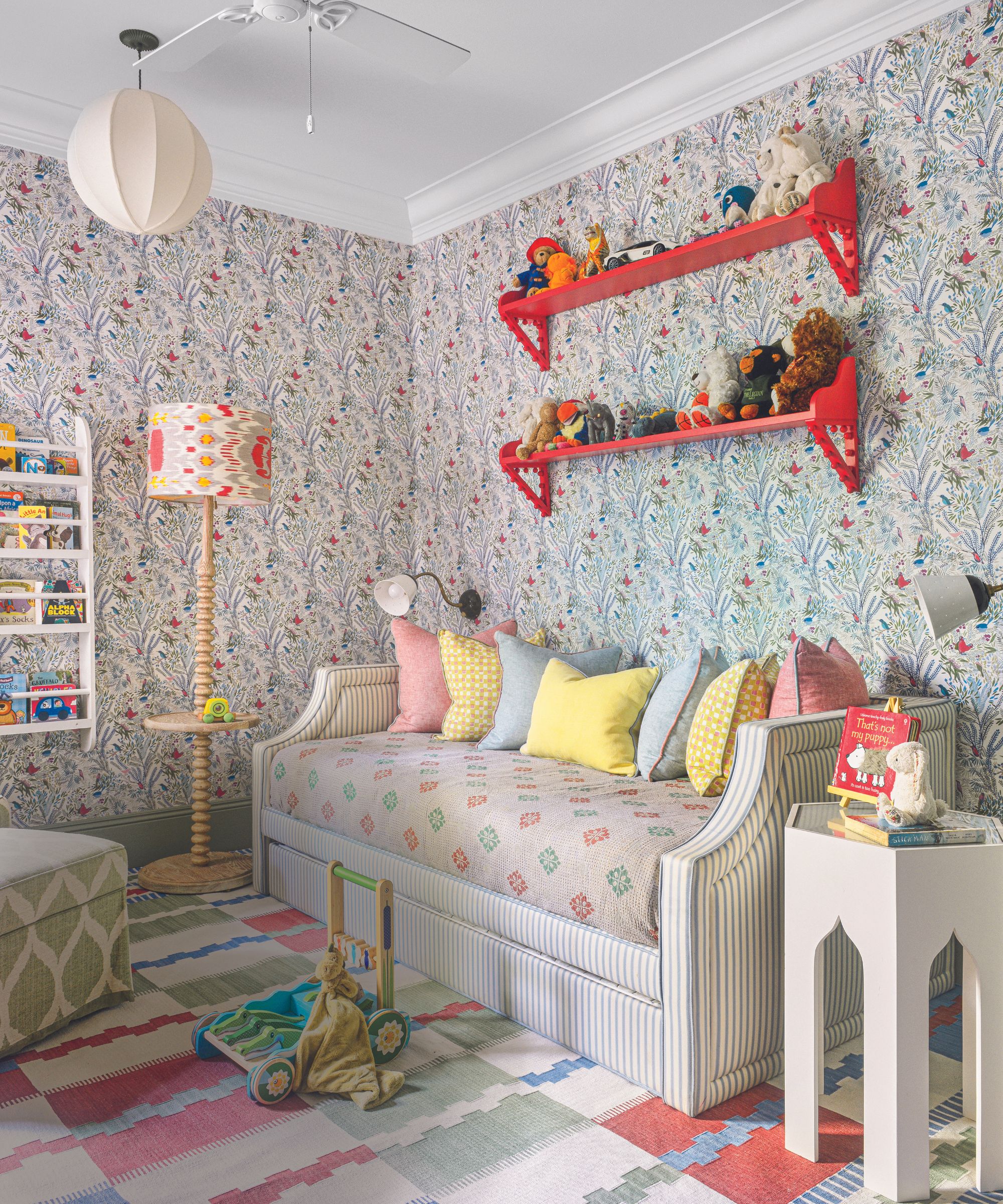
Daybed in Ticking Stripe in Blue, Ian Mankin. Jazz wallpaper, Little Cabari. Floor lamp, Serena & Lily, with custom silk ikat shade.
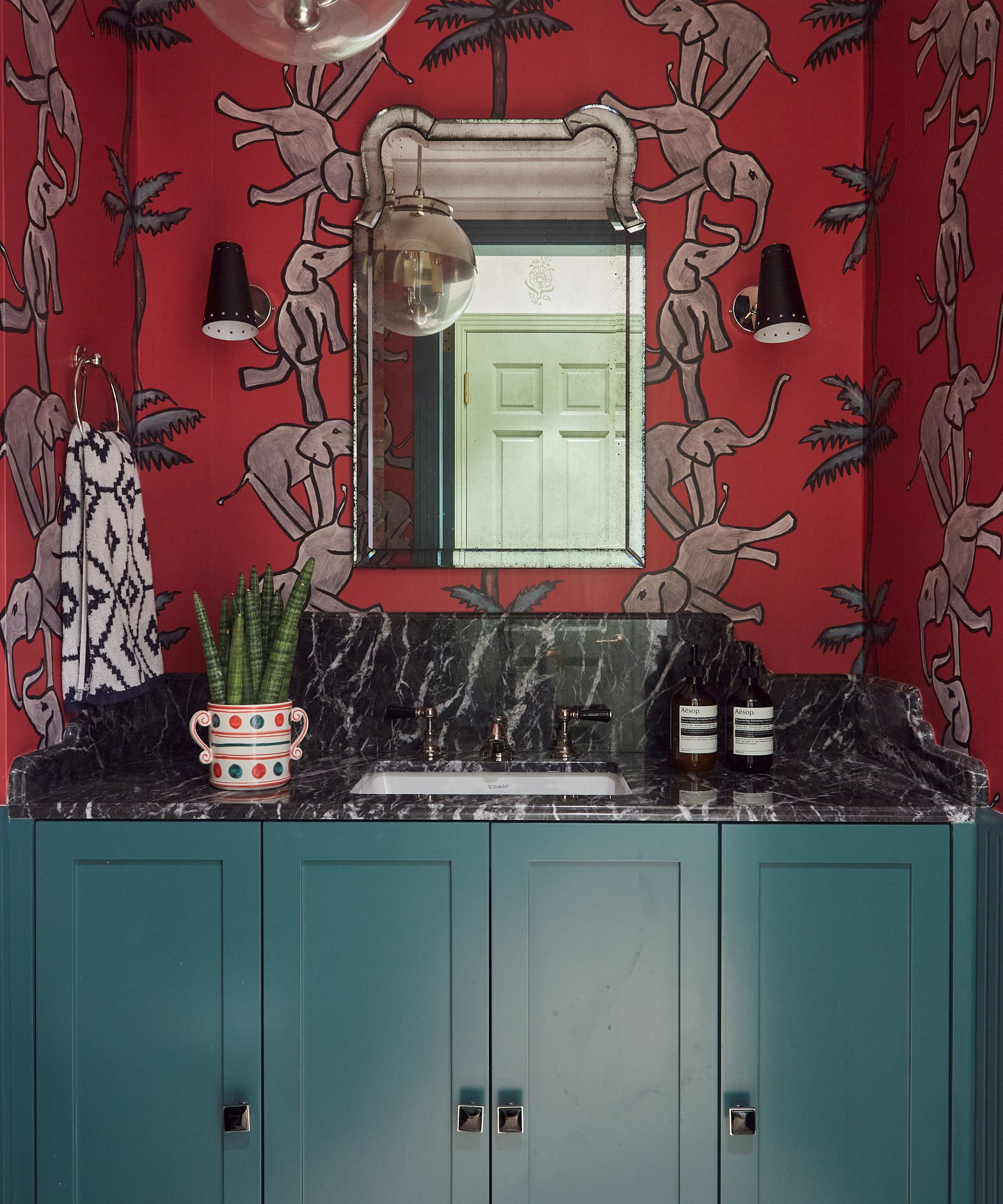
Elizabeth also experimented with perforated brass cabinetry doors to team with the brass lights. The powder room and the husband’s home office showcase additional depth of color. A statement red elephant wallpaper is teamed with a green vanity, while the study celebrates dark hues such as chocolate and deep blue.
‘There’s a lot of color and pattern and it’s very layered,’ says Elizabeth, ‘but the overriding feeling is fresh and light – just what the clients wanted.
Meet the designer
Elizabeth Hay shares her style inspiration
What part of the project were you happiest with?
The reaction of my clients when they first saw the apartment.
Which element was the greatest indulgence?
The de Gournay wallpaper in her study.
What one small change has the biggest impact?
Adding the custom moulded cornice throughout the apartment to make it feel slightly more classic.
Which decorative detail is your go-to?
Contrast piping on all upholstery.
Describe your style in three words.
Multicultural, layered and colourful.
How do you stay inspired?
Travel. My travels around Asia have enriched my design to a huge degree.
Who is your design hero?
Finish the sentence, I know I'm a creative because...
I constantly want to create and try new things.
How should home make you feel?
Safe, happy and at peace.
Can you reveal a shop we should know about?
Granby Workshop for really original handmade tiles.

Interiors have always been Vivienne's passion – from bold and bright to Scandi white. After studying at Leeds University, she worked at the Financial Times, before moving to Radio Times. She did an interior design course and then worked for Homes & Gardens, Country Living and House Beautiful. Vivienne’s always enjoyed reader homes and loves to spot a house she knows is perfect for a magazine (she has even knocked on the doors of houses with curb appeal!), so she became a houses editor, commissioning reader homes, writing features and styling and art directing photo shoots. She worked on Country Homes & Interiors for 15 years, before returning to Homes & Gardens as houses editor four years ago.