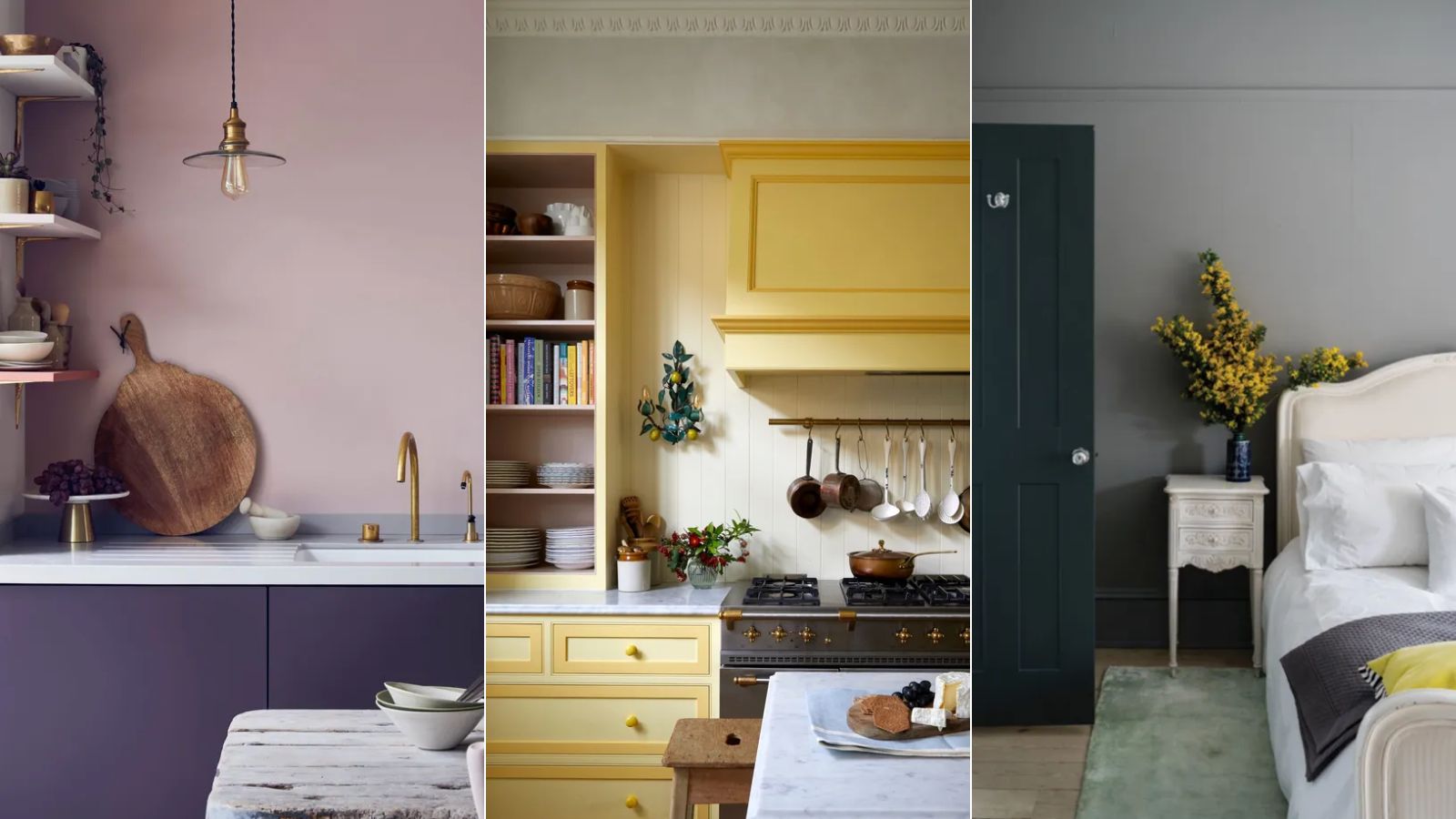
Our interior editors aren’t decorating with these 3 divisive colors in 2025 – here's why
From daring purple to cool grays, H&G's editors are giving these hues a miss this year

Design expertise in your inbox – from inspiring decorating ideas and beautiful celebrity homes to practical gardening advice and shopping round-ups.
You are now subscribed
Your newsletter sign-up was successful
Want to add more newsletters?
The latest color trends are a great source of inspiration when choosing room color schemes, but not every trending shade is for everyone. While some prefer neutral color schemes and others are inclined to decorate with bolder tones, color trends are personal and subjective.
Now that we have a good idea of which shades are 'in' and 'out' for 2025, I thought it would be interesting to ask H&G's interior design editors which colors they're steering clear of for the year ahead.
From their hesitation with the prominent purple trend to their take on neutral tones to give a miss, read on to get H&G's insider take on color trends.
Article continues belowPurple
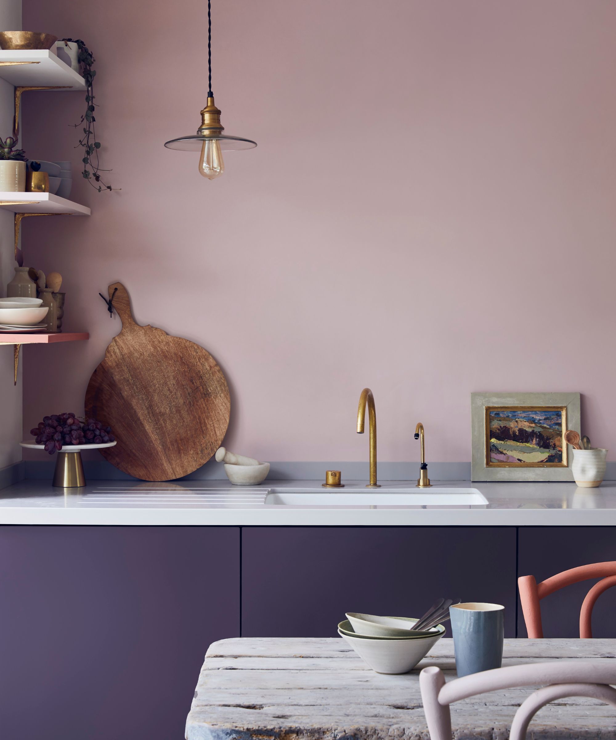
Perhaps the most controversial color to rise to the spotlight in recent months is purple. A deeply nostalgic hue that feels closely linked to the early noughties, decorating with purple is officially back for 2025, from Glidden's Color of the Year, Purple Basil to Benjamin Moore's Color of the Year, Cinnamon Slate.
While some love the nostalgic appeal of this bold hue that ranges from muted lavenders to rich violets, it's definitely not for everyone, including H&G's Style & Trends Editor Charlotte Olby:
'While purple is certainly having its moment in the spotlight as Color of the Year across multiple paint brands, I just can't seem to get on the bandwagon. On a personal level, I think it's because I had a moody dark bedroom as a teenager during my 'Twilight' era and I simply can't imagine how this color could make me feel anything other than nostalgic for puberty if I should use it in my house now as an almost 30-year-old.'
'But it is also just inherently a tricky color to work with. While soft lavender shades can feel serene they're also quite cold, and darker purples often dominate a room, making it feel harder to create a scheme around. It’s a color that demands attention and doesn’t always play well with others. Sure, I can see how some of the deep, rich purple paints can make a beautiful statement (I recently saw a kitchen painted in Lick x Soho House's Purple 03 Dumbo House that almost swayed me) but I think I'm going to stick to less demanding hues in 2025 like butter yellows and soft pale blues.'
Design expertise in your inbox – from inspiring decorating ideas and beautiful celebrity homes to practical gardening advice and shopping round-ups.
Yellow
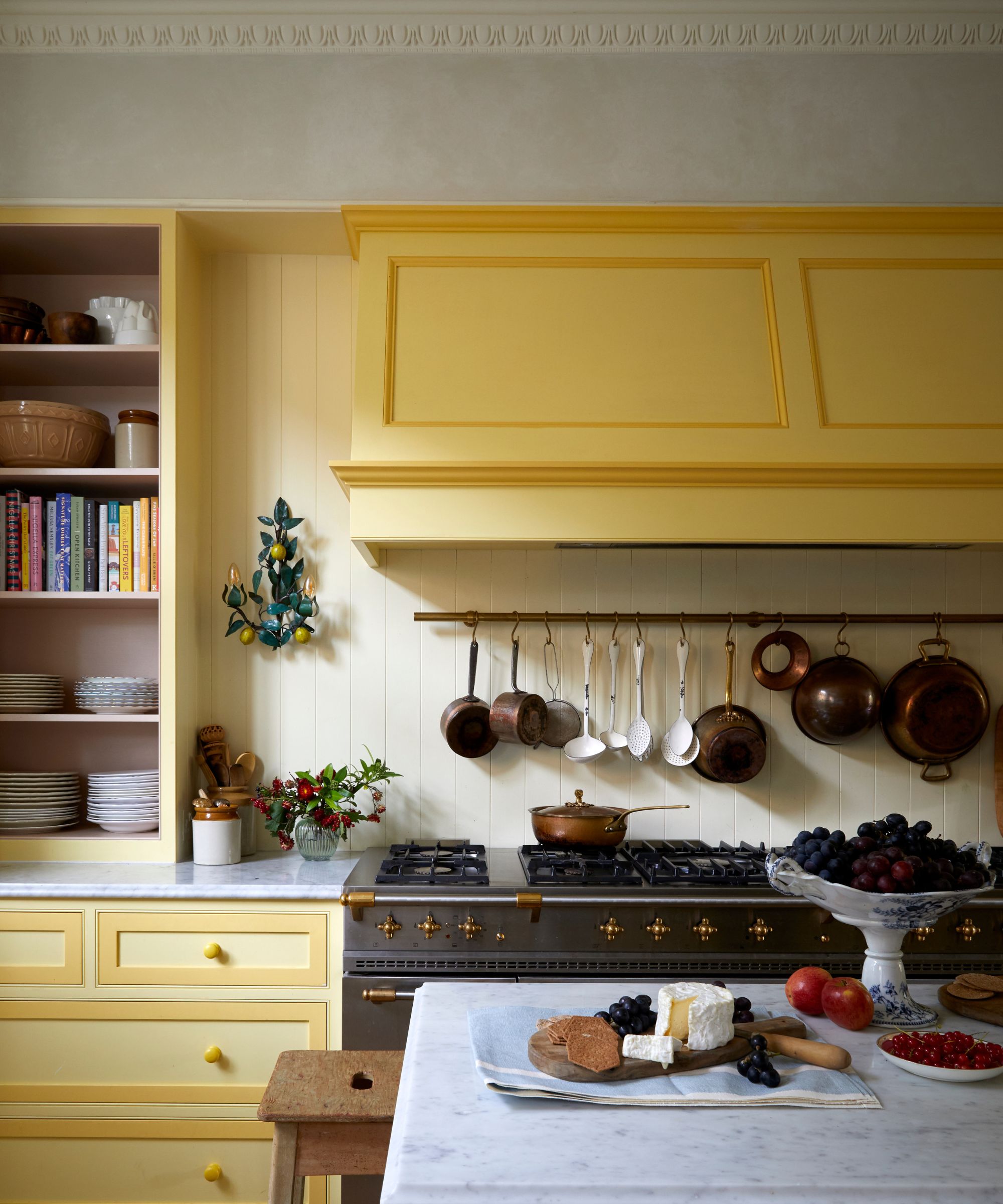
Yellow is another shade that's been cropping up a lot of late. While pale butter yellow paints have seen lots of appeal for their nod to vintage, serving as a 'new neutral'; bright, sunshine yellow paints are back, making an undeniably cheerful yet highly saturated statement.
Although maximalist color ideas go hand in hand with this happy shade, this warming hue isn't for everyone, especially those who favor decorating with neutrals. For H&G's Kitchens & Bathrooms Editor, Molly Malsom, yellow is officially a color to avoid this year:
'I'm definitely steering clear of yellows this year, especially in the kitchen. Wooden cabinetry has been enjoying a revival, and I'm yet to see any yellow and wood kitchen designs that don't feel entirely dated. Warm neutrals and even rich, moody hues are a better choice, but those bright bold shades of yellow are very much out of style for me!'
Cool grays
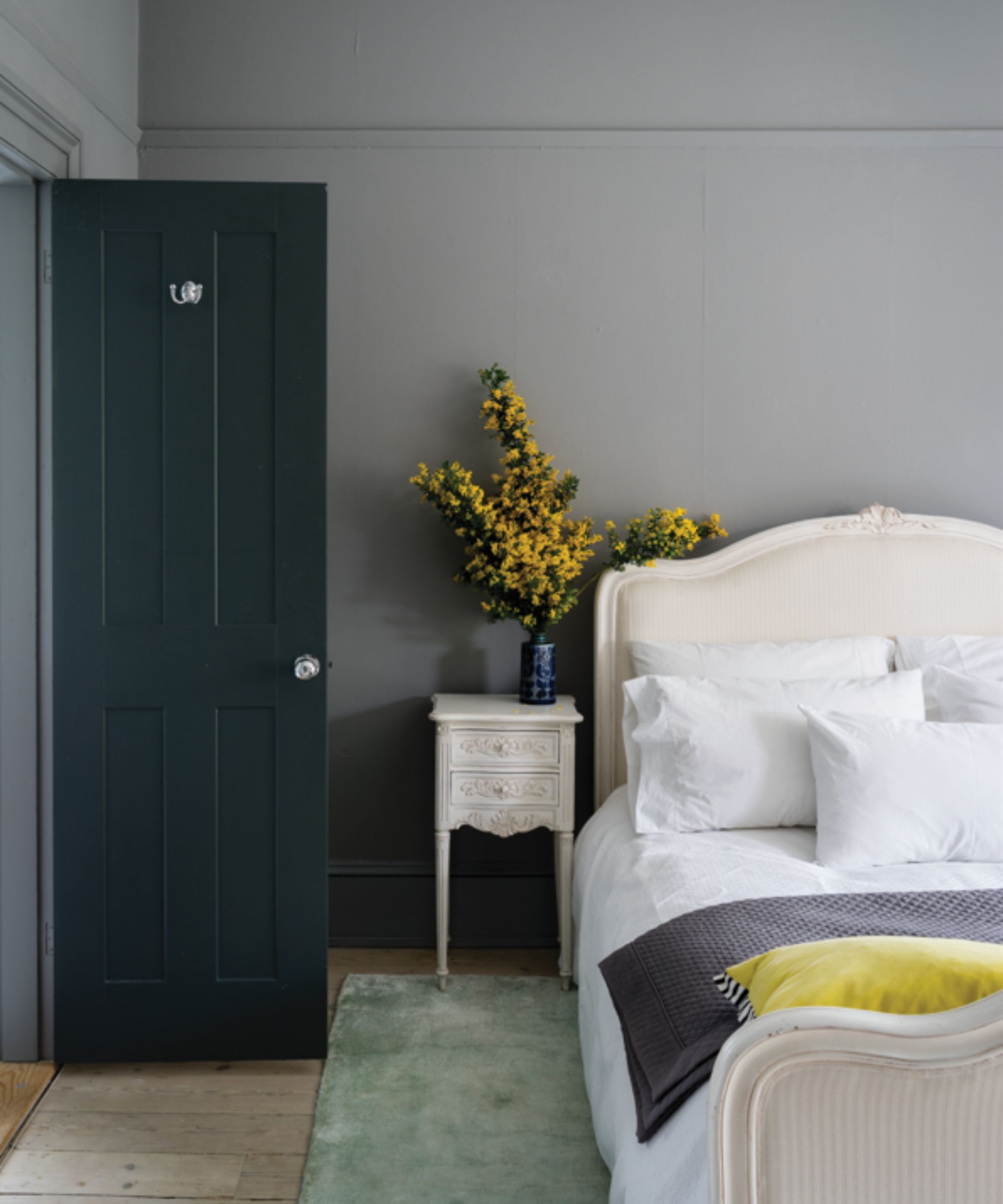
Moving away from bold color trends into the realm of neutrals, there is this year, as ever, plenty of debate around decorating with gray. A color that's declined in popularity significantly in recent years, being replaced by warm neutral paints which generally feel more inviting, it takes a thoughtful approach to get gray room ideas to look great.
While gray paints can of course work well in the right setting, Hebe Hatton, Head of Interiors at H&G is steering clear of decorating with this cool hue altogether in 2025:
'Gray is a color you will never find in my home. I have only come across a handful of rooms that can handle gray, and they have to be filled with warm light and the gray be so close to a beige I am not sure you would even call it gray anymore.'
'Gray makes rooms drab and dull and cold and is a color I will avoid in 2025 and beyond. If you are looking to decorate with gray, leave it off the walls. Instead use it as an accent color on skirting, window frames, or doors and layer it up with lots of warm neutrals so it's a small part of a softer scheme.'
While our editors aren't won over by these colors, that's not to say you should avoid them. Color is personal and it's worth embracing the shades you're naturally drawn to for a personal approach to your decorating.

Emily is a freelance interior design writer based in Scotland. Prior to going freelance in the spring of 2025, Emily was Homes & Gardens’ Paint & Color Editor, covering all things color across interiors and home decor for the Homes & Gardens website. Having gained specific expertise in this area, Emily is well-versed in writing about the latest color trends and is passionate about helping homeowners understand the importance of color psychology in home design. Her own interior design style reflects the simplicity of mid-century design and she loves sourcing vintage furniture finds for her tenement flat.