Pantone’s Mocha Mousse is getting mixed reviews – but as a color editor I think it’s the perfect kitchen color to try in 2025
It may not be the most ground-breaking color, but there's much to love about the understated appeal of Mocha Mousse

Design expertise in your inbox – from inspiring decorating ideas and beautiful celebrity homes to practical gardening advice and shopping round-ups.
You are now subscribed
Your newsletter sign-up was successful
Want to add more newsletters?
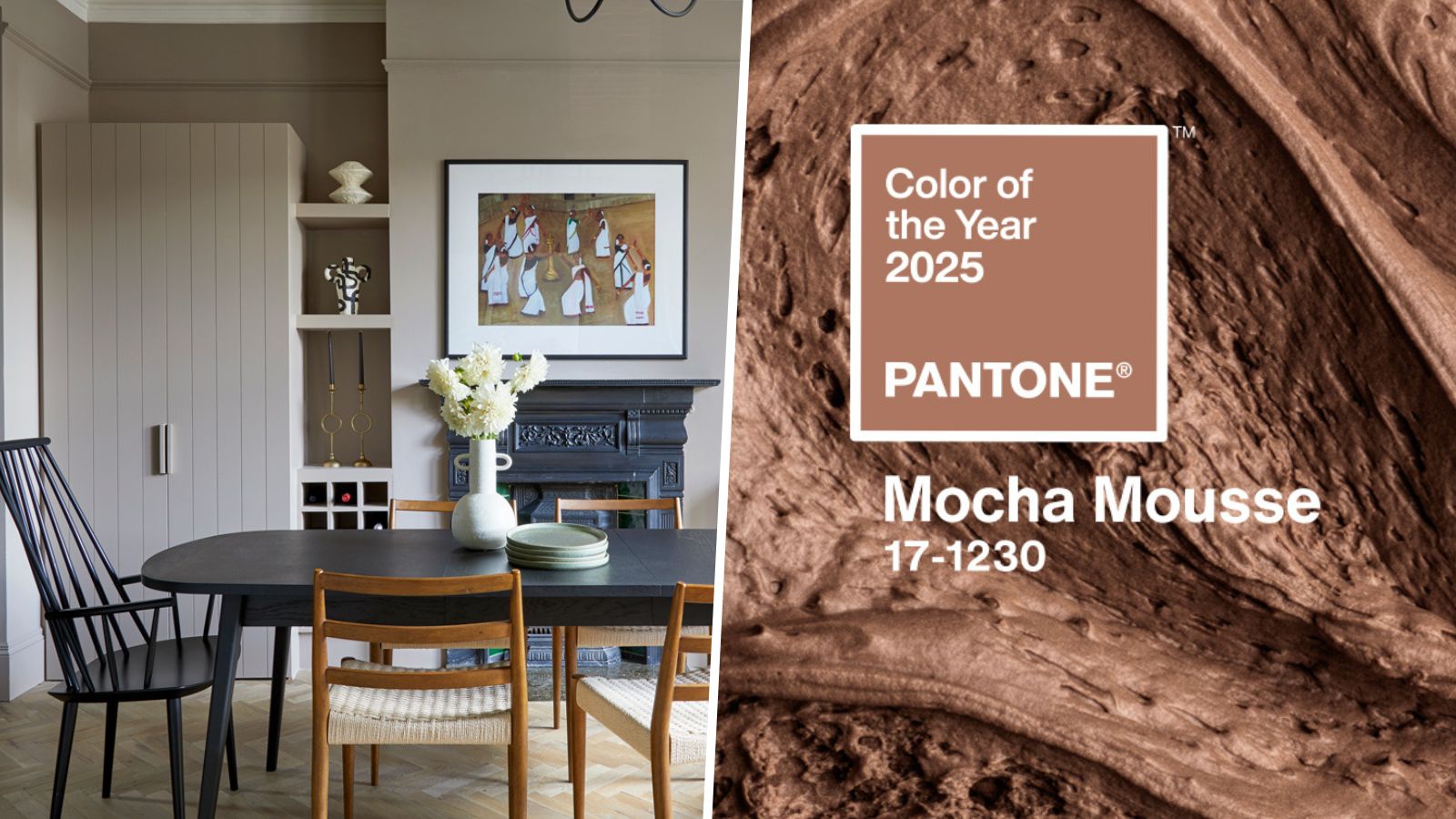
It's been just under one month since Pantone unveiled its much-awaited Color of the Year for 2025: Mocha Mousse. Since then, there have been mixed feelings about the 'mellow brown' – perhaps not bold enough amid a year largely defined by daring color trends.
Given the – by comparison – more adventurous nature of its 2024 offering, Peach Fuzz; Mocha Mousse takes on an unassuming form, but I am fully on board with it.
Liveable and grounding yet offering more warmth and depth than lighter neutrals; read on to learn why I think Pantone's Color of the Year 2025 makes a strong contender for a stylish kitchen color.
Article continues below 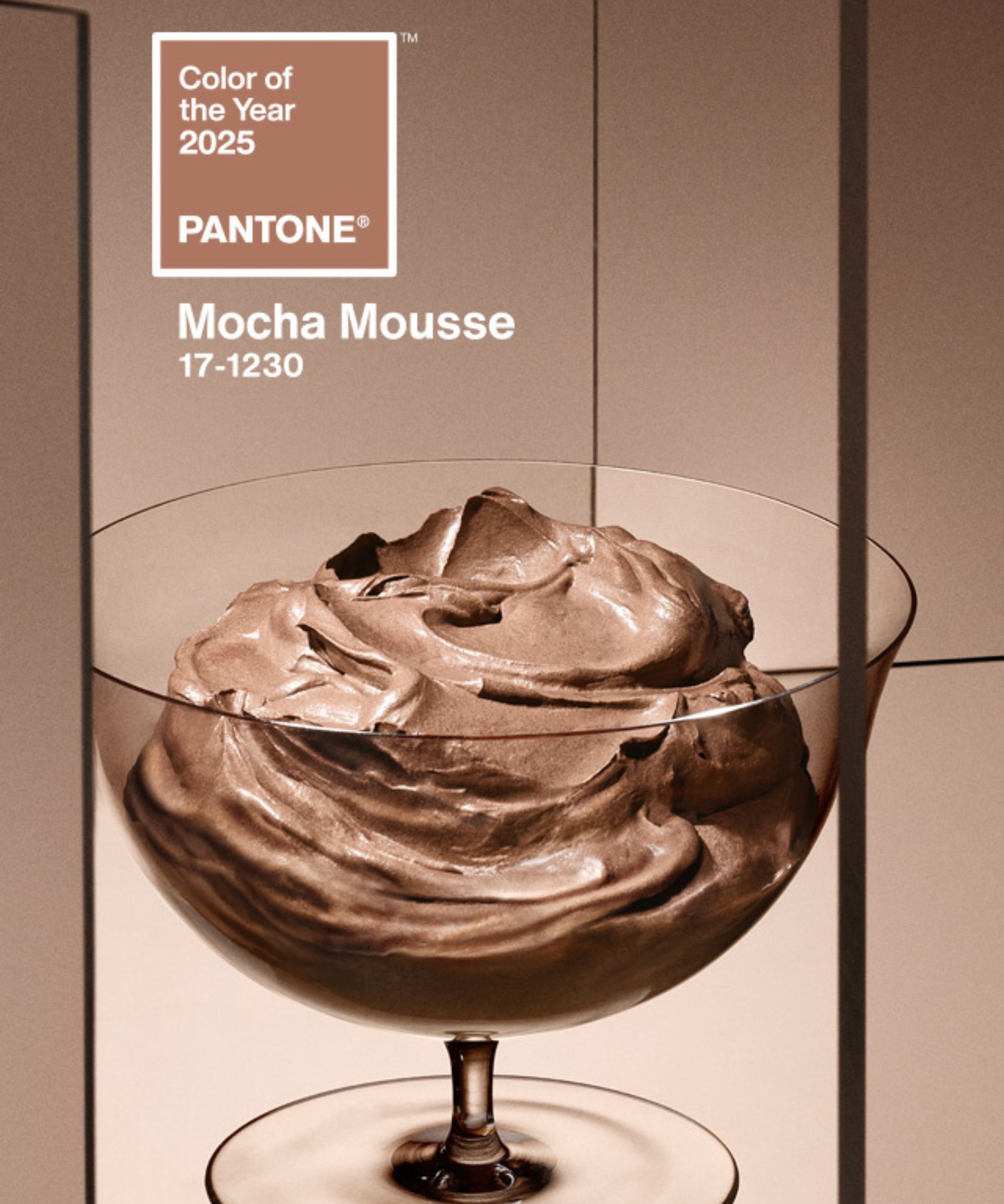
2024 saw plenty of 'new neutrals' ranging from plaster pinks to rich chocolate browns. But when it comes to designing a kitchen, often a costly and well-considered design project, I'm cautious of veering too far into the world of color trends.
For me, paint colors that fall into the Mocha Mousse camp: warming light browns and taupe shades, are a happy medium. They feel more interesting than predictable neutrals such as warm white paints, yet timeless enough to not feel too trendy.
Interior designer Andrew Griffiths, founder of A New Day Studio joins me in enjoying the understated quality of Mocha Mouse, adding that in addition to its calming feel, it's versatile enough to complement many rooms:
'I’m glad that this shade is being given its moment as it's part of a family of colors that I’m a big fan of. It brings both subtle warmth and a calming softness to a space, as well as being a really versatile color, playing well with different hues – both strong hits of punchy color but it’s also a balancing shade that blends with more subtle palettes of earthy tones.'
Design expertise in your inbox – from inspiring decorating ideas and beautiful celebrity homes to practical gardening advice and shopping round-ups.
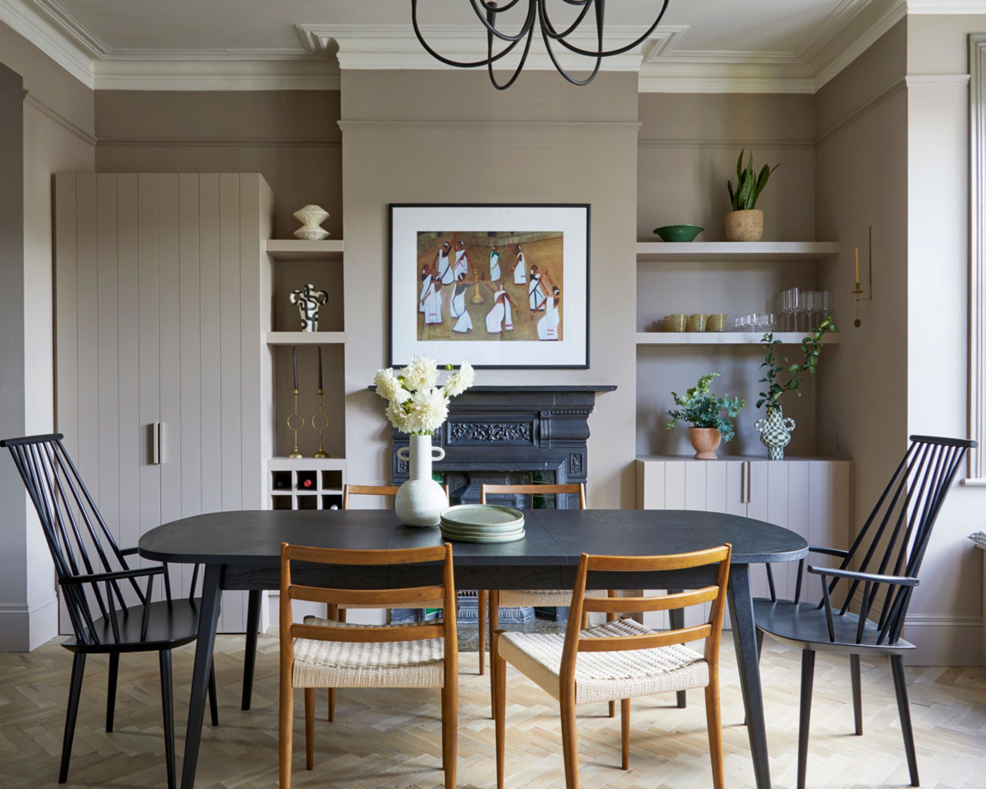
A New Day Design
'I think this brings a comforting feeling to a room, something people are looking for more and more,' Andrew continues. 'The color is a natural evolution from the earthy pinks that have been popular for quite a while now, and I like this move in a slightly darker, earthier direction. For me, this color pairs extremely well with both dark and light woods and when paired with a soft off-white gives a feel of real sophistication and elegance.'
In this dining room designed by A New Day Studio, the beige walls demonstrate how colors similar to Mocha Mousse can create a soothing and stylish backdrop, without feeling overly trend-led.
If, like me, you're inspired by warm and earthy taupes as a color trend for the kitchen, why not try them out for yourself? Below, I've rounded up a few of my favorite Mocha Mousse-adjacent paint colors – if I were doing a kitchen decorating project myself, these would be on my list to try.
Looking for more color inspiration ahead of the new year? Take a look at the most popular paint colors of 2024 from the leading paint brands – from neutrals to bold hues.

Emily is a freelance interior design writer based in Scotland. Prior to going freelance in the spring of 2025, Emily was Homes & Gardens’ Paint & Color Editor, covering all things color across interiors and home decor for the Homes & Gardens website. Having gained specific expertise in this area, Emily is well-versed in writing about the latest color trends and is passionate about helping homeowners understand the importance of color psychology in home design. Her own interior design style reflects the simplicity of mid-century design and she loves sourcing vintage furniture finds for her tenement flat.
