The 3 lessons I've learned about layering pattern on pattern – and how you can do it yourself
As an interior designer, I have become accustomed to layering pattern upon pattern. But it takes a learned approach. This is how I do it

Design expertise in your inbox – from inspiring decorating ideas and beautiful celebrity homes to practical gardening advice and shopping round-ups.
You are now subscribed
Your newsletter sign-up was successful
Want to add more newsletters?
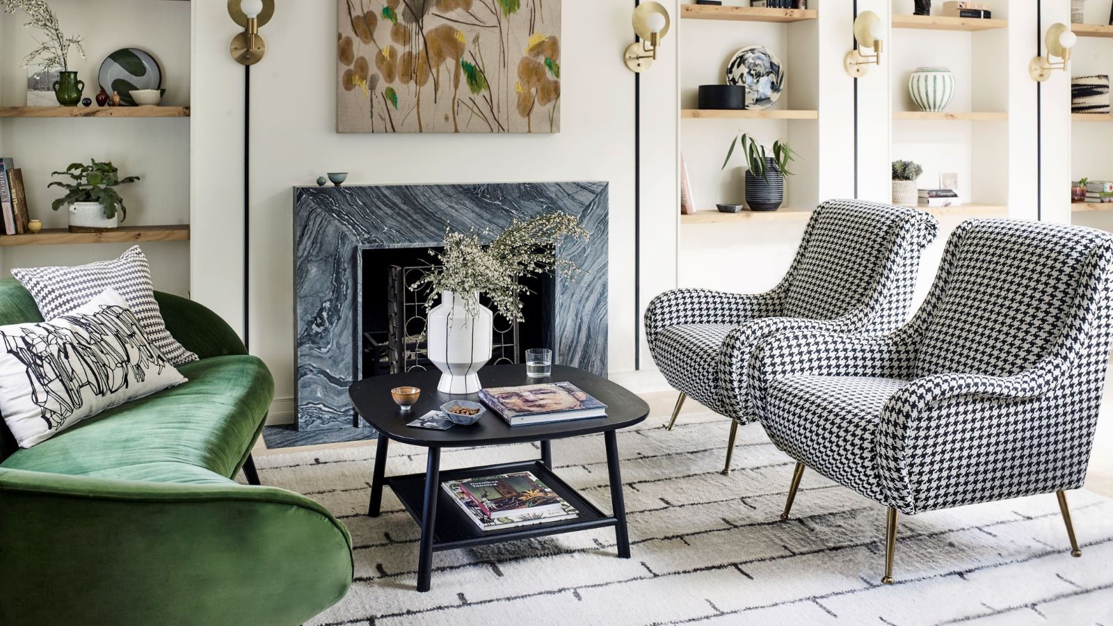
Finding the perfect balance in a room with multiple patterns allows you to showcase your personal style and create a space that reflects your unique personality. In today's world, where self-expression is highly valued, there are numerous avenues, both digital and physical, to demonstrate who you are and what you stand for. From social media to bold fashion choices, personal maximalism is a trend that continues to thrive.
And when it comes to infusing this energy into your home, incorporating decorative patterns is an excellent way to do so. Whether it's through wallpaper, drapery, upholstery, art, blankets, or bedding, patterns can be found on almost every surface imaginable.
While some design enthusiasts have traditionally been cautious about decorating with patterns excessively, I have discovered that the more patterns, the better. However, it is crucial to layer patterns thoughtfully, creatively, and with an eye for harmony to bring a room to life.
1. Pay attention to scale
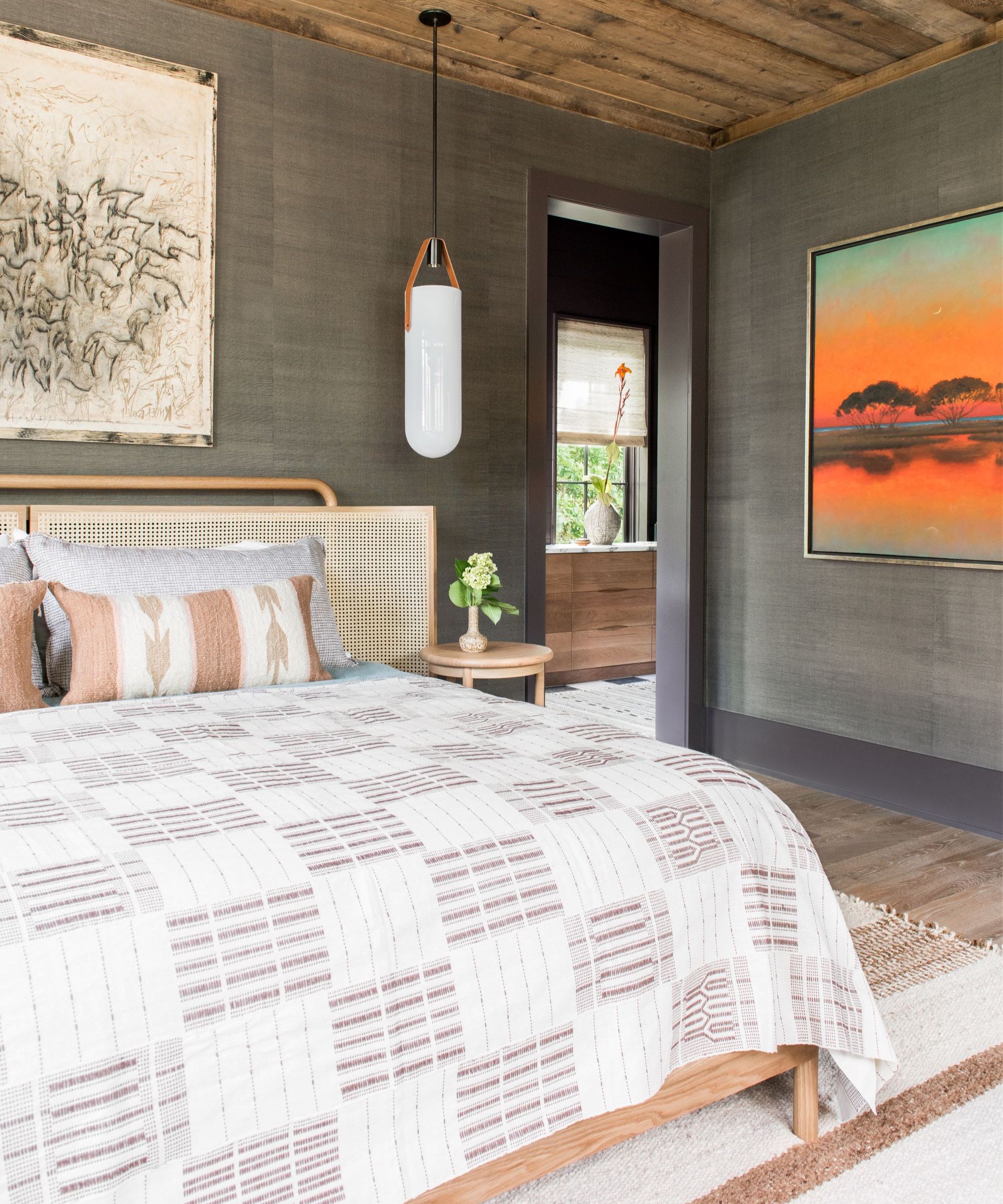
When it comes to achieving balance in a space with layered patterns, scale is of utmost importance. Begin by selecting the largest pattern first, and then gradually work your way down, paying attention to the dominant color palette.
Choose a single tone from the dominant pattern and let it guide your selection of additional patterns. Look for smaller-scale patterns that complement and build upon the larger, more dominant one.
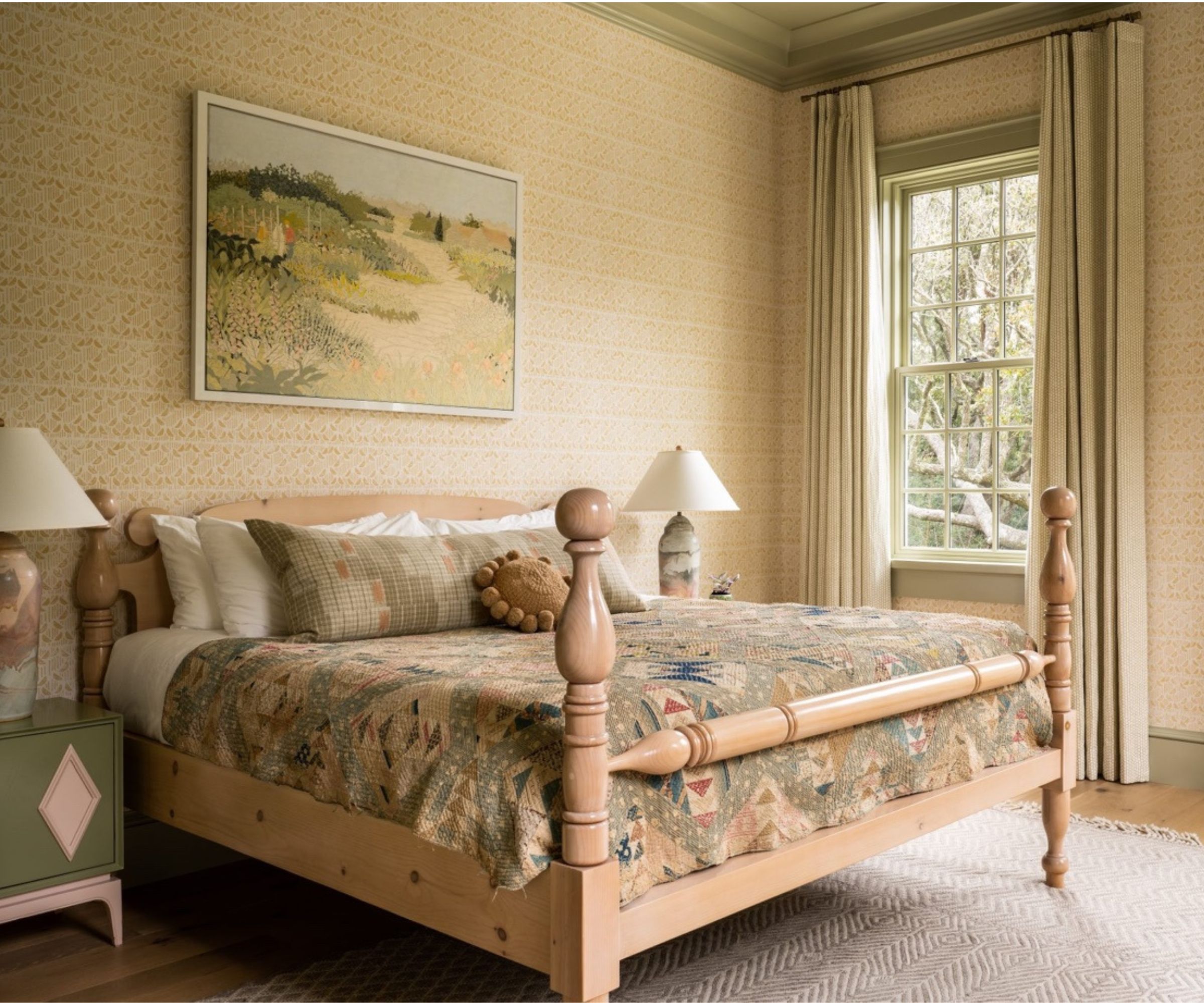
For instance, in a client's bedroom, I incorporated a striking geometric antique quilt with earth tones, light pinks, blues, and greenish-browns, featuring prominent repeating geometric forms.
I used the predominant light green tone to inspire the rest of the room's design, ensuring that the drapery, wall decor, rug, shades, and pillows featured complementary colors and tones (above). The key to achieving harmony and balance is to transition from a singular larger pattern to smaller layered patterns with complementary tonalities, while also introducing lower contrast in your overall selections.
Design expertise in your inbox – from inspiring decorating ideas and beautiful celebrity homes to practical gardening advice and shopping round-ups.
2. Maintain a low contrast
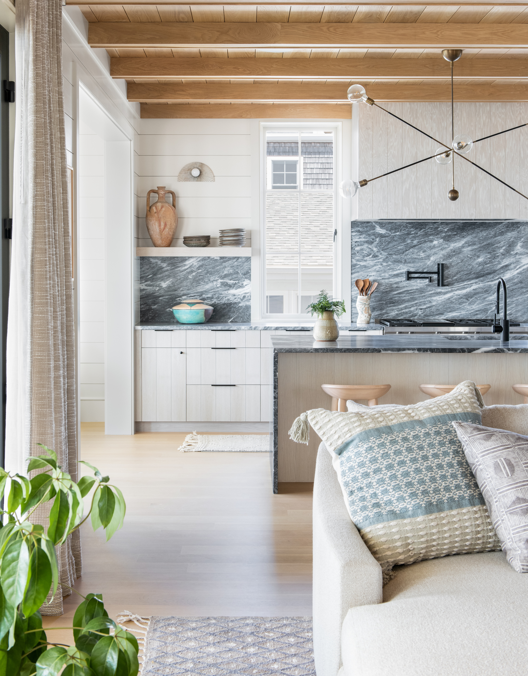
Maintaining a low contrast between patterns is crucial. Opting for larger-scale patterns with lower contrast is generally better than selecting high-contrast options, as it allows for more layering without overwhelming the visual senses.
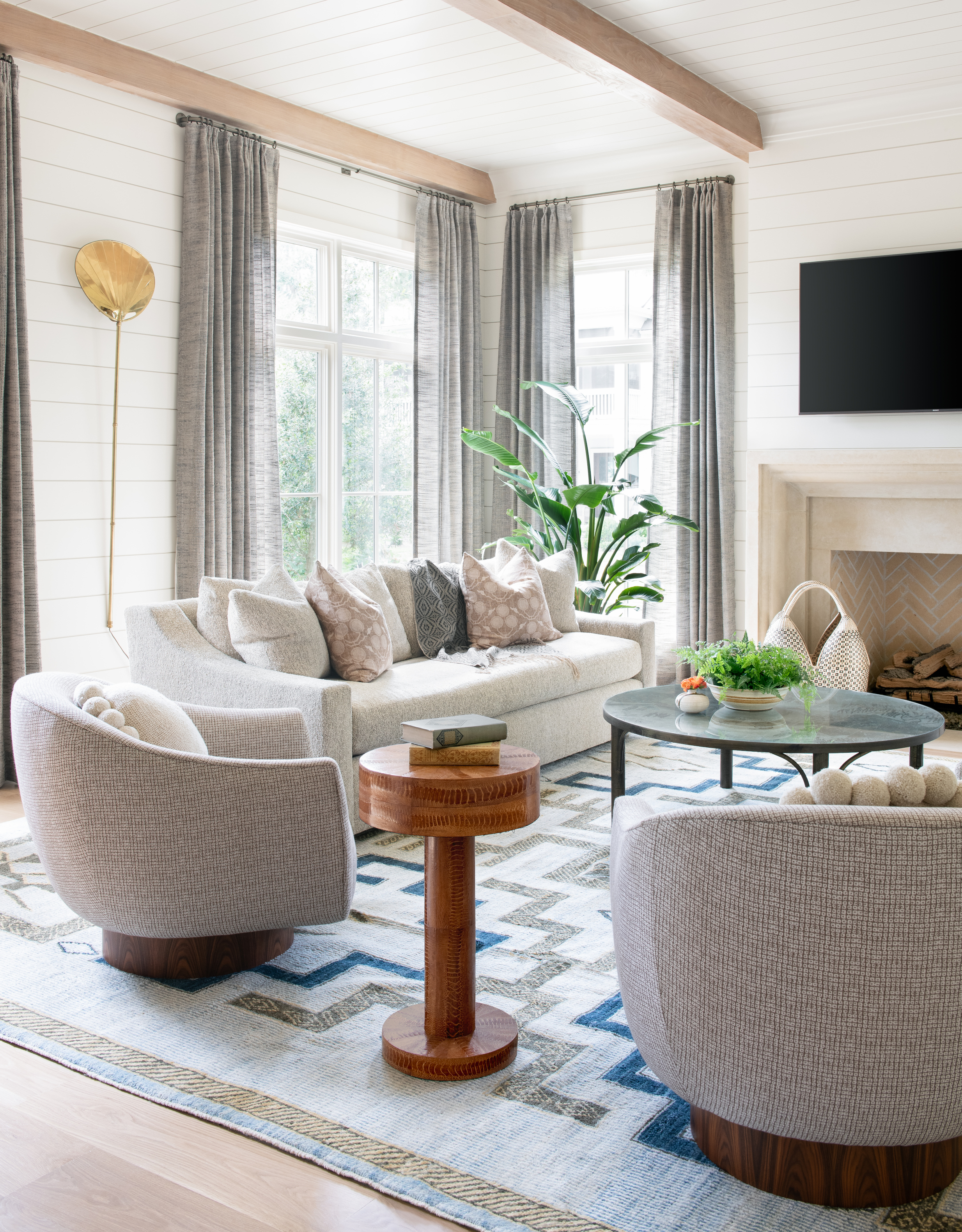
Understanding the importance of tonality and scale, and working backward from a larger scale, can greatly simplify the entire process. With smaller-scale patterns, you can incorporate as much pattern as you desire. Lower contrast enhances the texture and depth of the patterns, providing a more pronounced effect. Don't be afraid to mix and match colors.
3. Use a base color and build on it
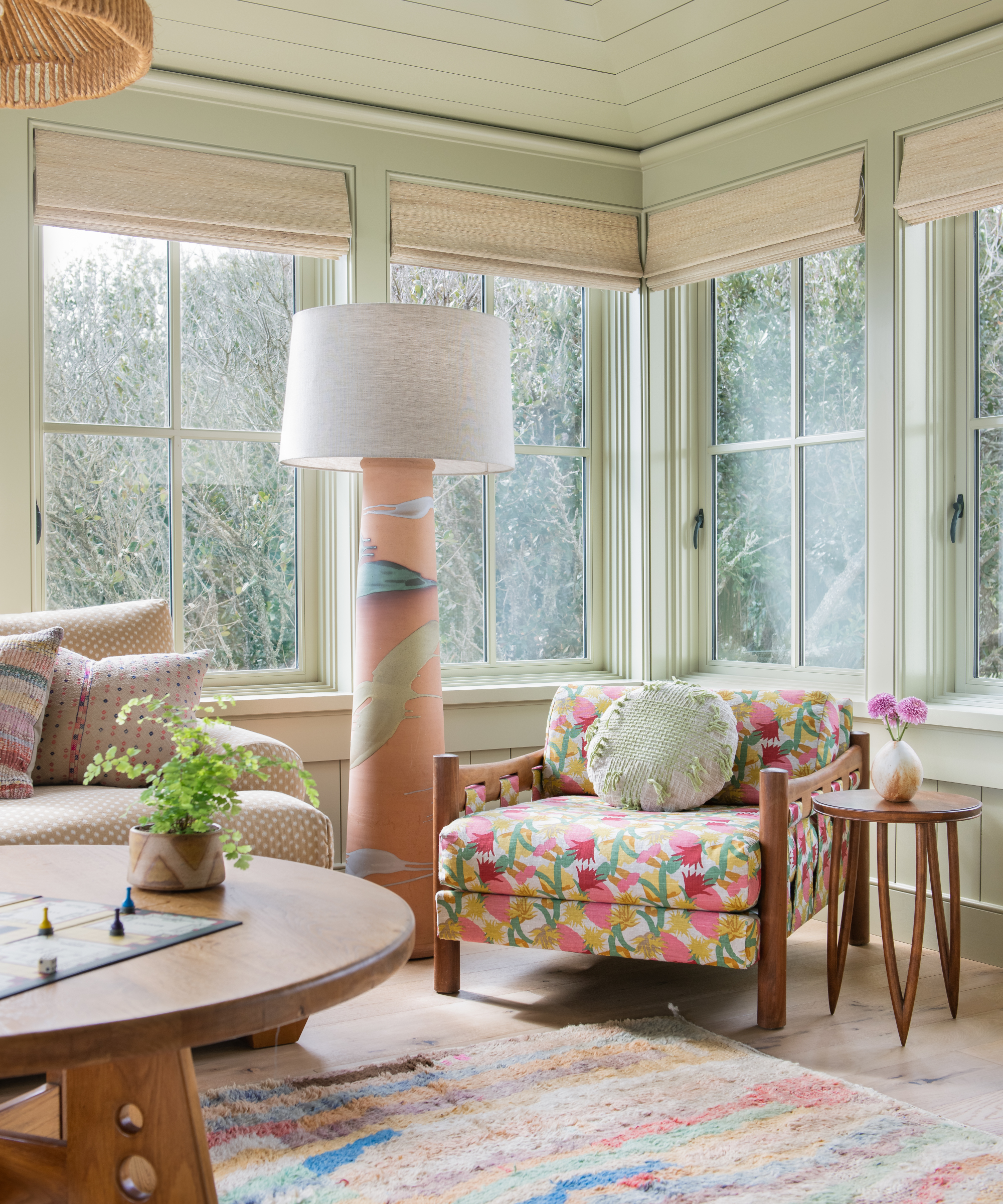
Instead of worrying about matching exact shades, focus on pulling out a base color from one pattern and incorporating it throughout the room. For example, you can extract a color from a rug and utilize 12 different tones within the same color family. Be bold, experiment, and have fun with your pattern selections, slicing, dicing, and mixing them together.

You can even use a painting or work of art as your primary dominant pattern choice. I love the work of Jocelyn Hobbie, who is a master of pattern balance. Her piece entitled Grove (above) is a forever inspiration and radiates the energy of summer.
Embracing multiple patterns in a room allows you to express your personal style and create a visually captivating space. By carefully considering scale, color tones, and contrast, you can strike the right balance and achieve harmony in your design. Remember to let your creativity flourish and don't shy away from bold choices. With the right approach, your room will come alive with an enchanting tapestry of patterns that reflect your unique personality and taste.
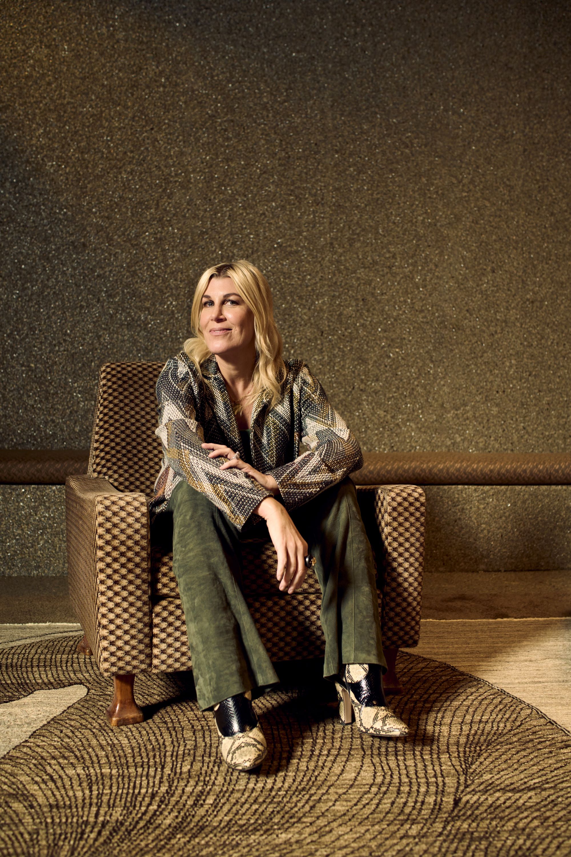
Cortney Bishop, principal design and owner of Cortney Bishop Design, founded the full-service interior design firm in 2007. She holds a BBA in business marketing from the University of Georgia, and pursued her design career by blending her passions for travel, art, fashion and music. Her wide-ranging talent and innate ability to mix patterns and hues has resulted in a robust portfolio of diverse, inspiring residential and commercial projects, each reflective of a client’s lifestyle, personality and aesthetic. Cortney regularly contributes to Homes & Gardens.