Designers Say Scale, Not Style, Is What’s Making Your Rooms Feel Awkward – 5 Easy Ways to Use This Key Principle to Always Make a Space Work
You don’t have the wrong pieces; you have the wrong proportions. Designers break down the principle you may not see, but always feel

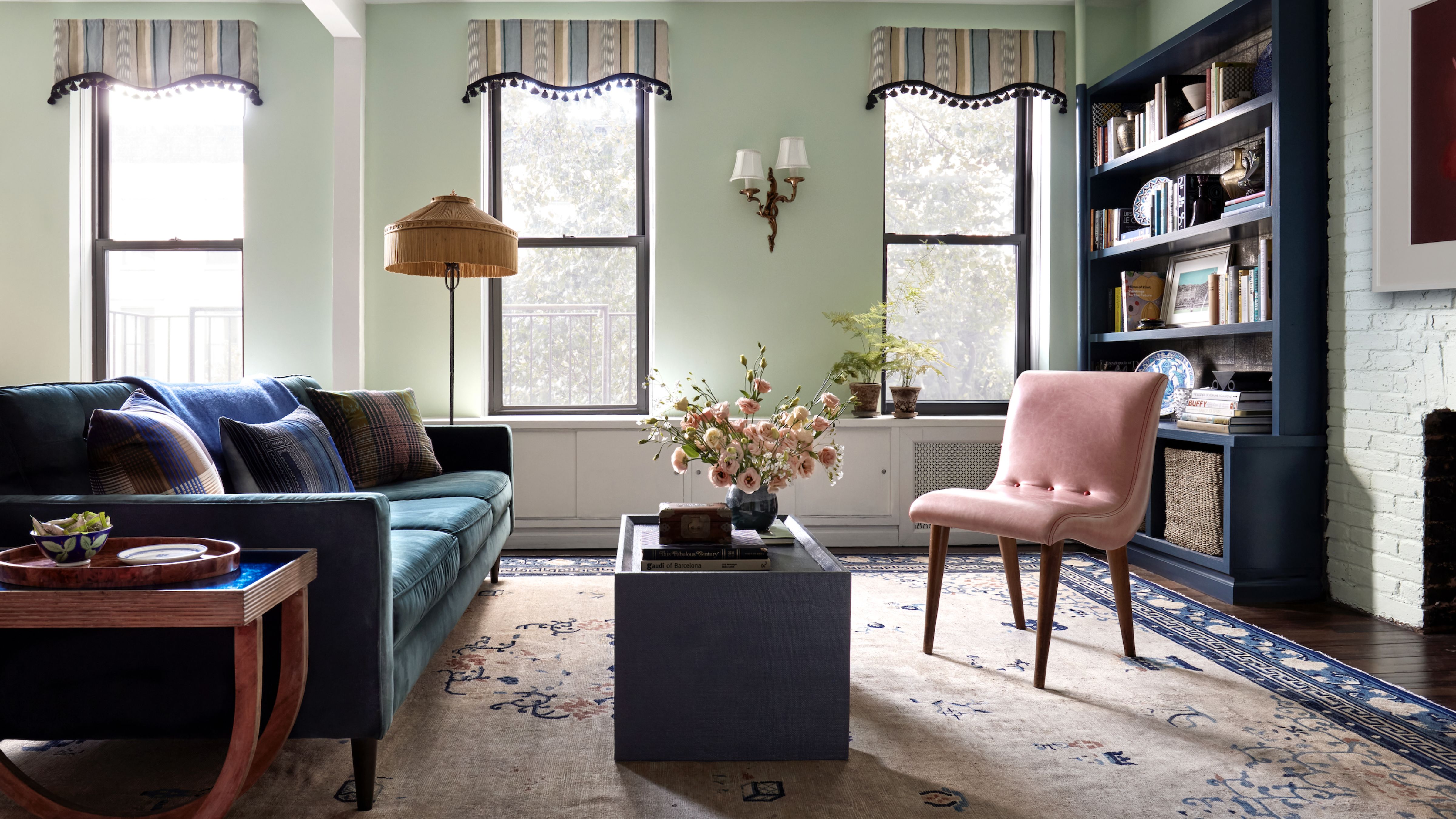
Some beautiful rooms are deeply uncomfortable. You can’t quite explain why. There’s no glaring ‘big light,’ no offensively loud color or pattern to blame. Instead, it’s more like a gangly fifth grader sporting a pair of clumsily cropped jeans post-growth spurt. The problem isn’t the jeans. It’s the scale.
Rooms fall victim to the same issue. And this interior design principle doesn’t discriminate by style. An awkward arrangement can happen just as easily in a pared-back minimalist space as it can in one layered with pattern and personality. You can buy every piece that makes up an influencer-perfect living room, down to the side table and sconces, but if the proportions aren’t right for your space, it will never read as effortless or cool.
When scale works, you feel it immediately. Nothing bumps into anything else. Sightlines make sense. An oversized chandelier, somehow, doesn’t feel oppressive. Harmony clicks. Ahead, designers break down the unspoken rules of scale that no one explicitly teaches, but everyone notices.
Article continues belowWhat is Scale and Why is it Important?
‘If proportion is how a chair relates to a table, scale is how both relate to the room (and to you),’ explains Manhattan-based interior designer Tara McCauley. ‘Think of scale like tailoring: the same outfit can look amazing or just plain wrong, depending on the fit.’
And like tailoring, scale is often felt before it’s identified. ‘Take a step back and look quickly at your room and then away again,’ advises Denver-based interior designer Laura Medicus. ‘Does something feel too big or too small? Is the coffee table too small for the large sofa? That’s usually a scale problem.’ Most people sense when something’s off, even if they can’t articulate that the coffee table needs six more inches or the sofa should sit lower.
A common misconception is that scale is synonymous with size. Scale is really a separate consideration altogether, governing how furniture relates not just to each other, but to ceiling height, circulation, and the human body moving through the room.
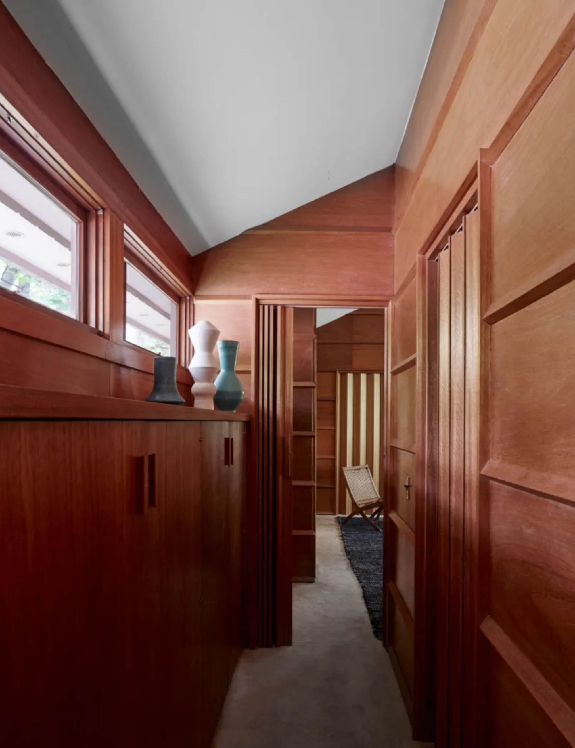
Frank Lloyd Wright was a master of scale. Inside the Zaferiou House, one of his lesser-known but no less compelling projects, asymmetrical ceiling heights and offbeat window placements feel so wrong they’re exactly right.
‘An interesting example is Frank Lloyd Wright’s Robie House,’ observes Natalia de Arteaga, interior designer at Planner 5D. ‘Although it’s a large-scale building, it conveys a sense of warmth and comfort inside. From the outside, the house appears vast and monumental. However, once inside, every space is carefully designed on a human scale,’ she adds. ‘The varying ceiling heights, strong horizontal lines, and built-in furniture visually frame the interiors and create a sense of spaciousness and comfort. This balance allows a large-scale architectural space to feel welcoming, livable, and closely connected to everyday human experience.’
Design expertise in your inbox – from inspiring decorating ideas and beautiful celebrity homes to practical gardening advice and shopping round-ups.
That word – balance – is really the end goal. ‘When scale is done well, a space feels balanced, comfortable, and intentional rather than awkward or overwhelming,’ agrees Tracy Morris, founder of DC-based Tracy Morris Design.
5 Ways Designers Use Scale in the Home
Scale isn’t size or proportion, but it’s often mistaken for both. Designers use it to create harmony, even when they take big swings. These are the tricks that make ambitious spaces actually work.
1. Room-Anchoring Rugs
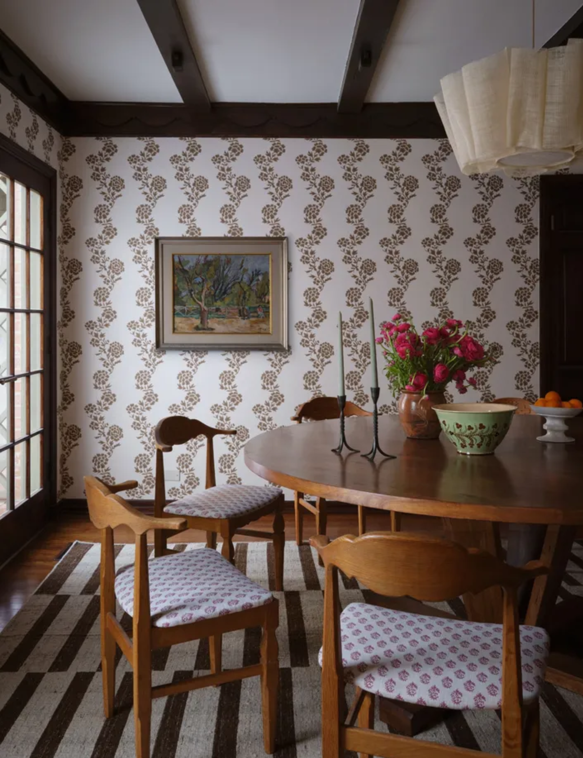
The rug anchors this floral-filled dining scene not just through its bold, graphic striping, but because every piece of furniture sits comfortably on top of it, none jostling for territory.
Nowhere does scale make itself more obvious than with a rug. This is where most of us play it too small, leaving furniture looking like it’s hovering awkwardly above the floor. We tell ourselves we’re preserving square footage, but in truth, it reads more like choosing a blazer one size too tight. Just size up. It always looks better.
‘People often buy a rug which is too small for the room,’ notes Tara McCauley. ‘Don’t be afraid to nearly fill the room – you don’t want a rug that’s just wide enough to be completely covered by the sofa or bed.’ The goal, she explains, is for the rug to feel completely committed to the space.
Exact dimensions will vary, but there’s a reliable rule of thumb. ‘Area rugs should be large enough for all front legs of furniture to sit on them,’ says Tracy Morris.
2. Experimental Lighting
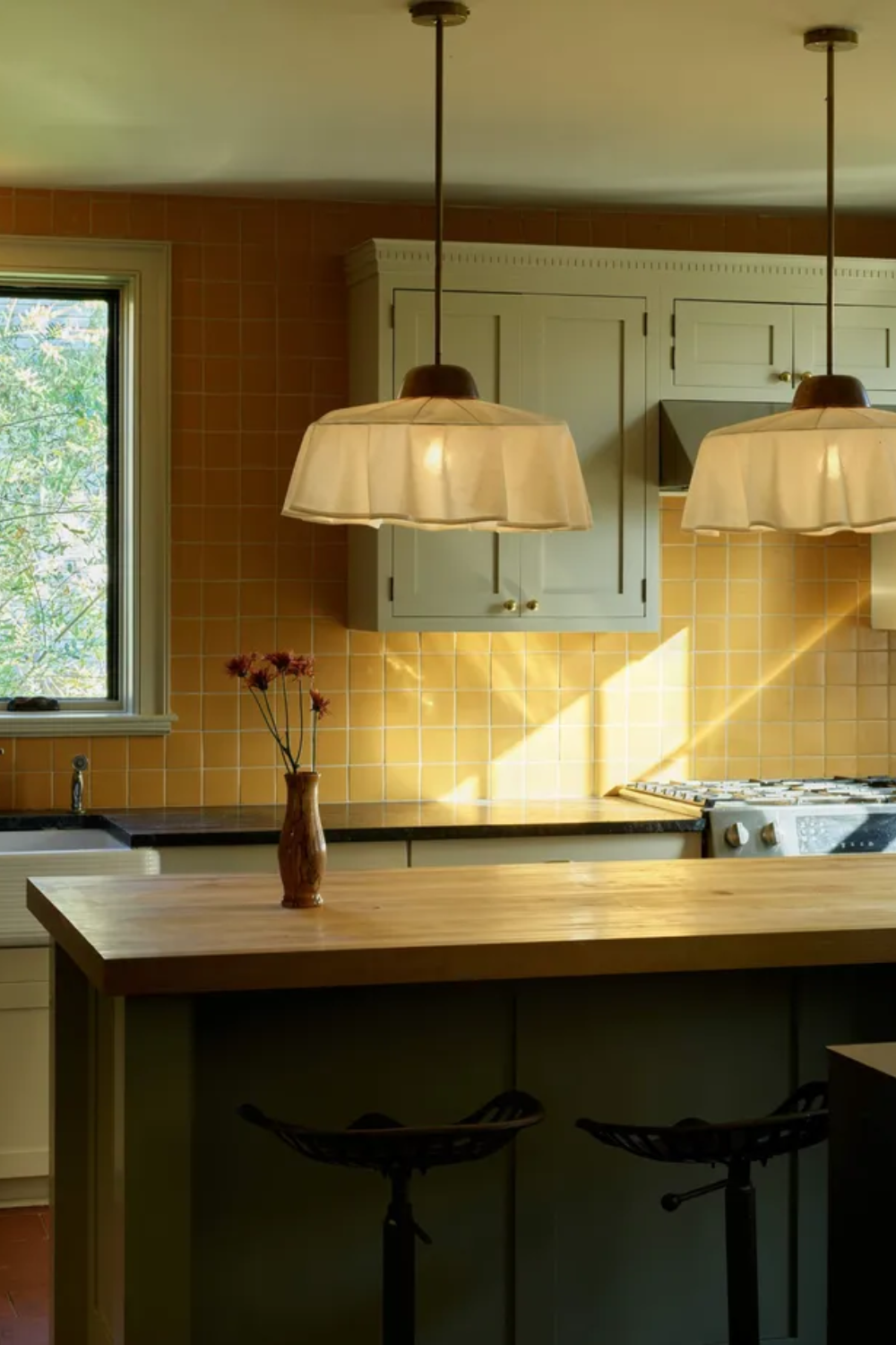
The elongated drop of these kitchen island pendants counterbalances the generous proportions of the fixtures themselves.
From itty-bitty pendants dropped low and asymmetrically beside a bed to comically oversized ceiling fixtures dominating a living room or entryway, lighting is increasingly becoming one of the more popular playgrounds for designers to take risks. When it works, it’s almost always a scale win.
‘An oversized pendant over a round table can look amazing when done correctly,’ says Laura Medicus. But she’s quick to flag lighting as a common danger zone. ‘Be careful with the scale of some pieces – especially lighting fixtures,’ she advises. ‘If you’re not sure, mock up the size of the light you’re thinking of using with a piece of cardboard. Tape it up and walk around the room to understand if you have the scale right.’ You’ll feel it – promise.
‘It is one of the harder things for homeowners to get correct,’ she admits. Master it, though, and lighting has a way of making the rest of the room fall into line.
3. Adding Emphasis to Art
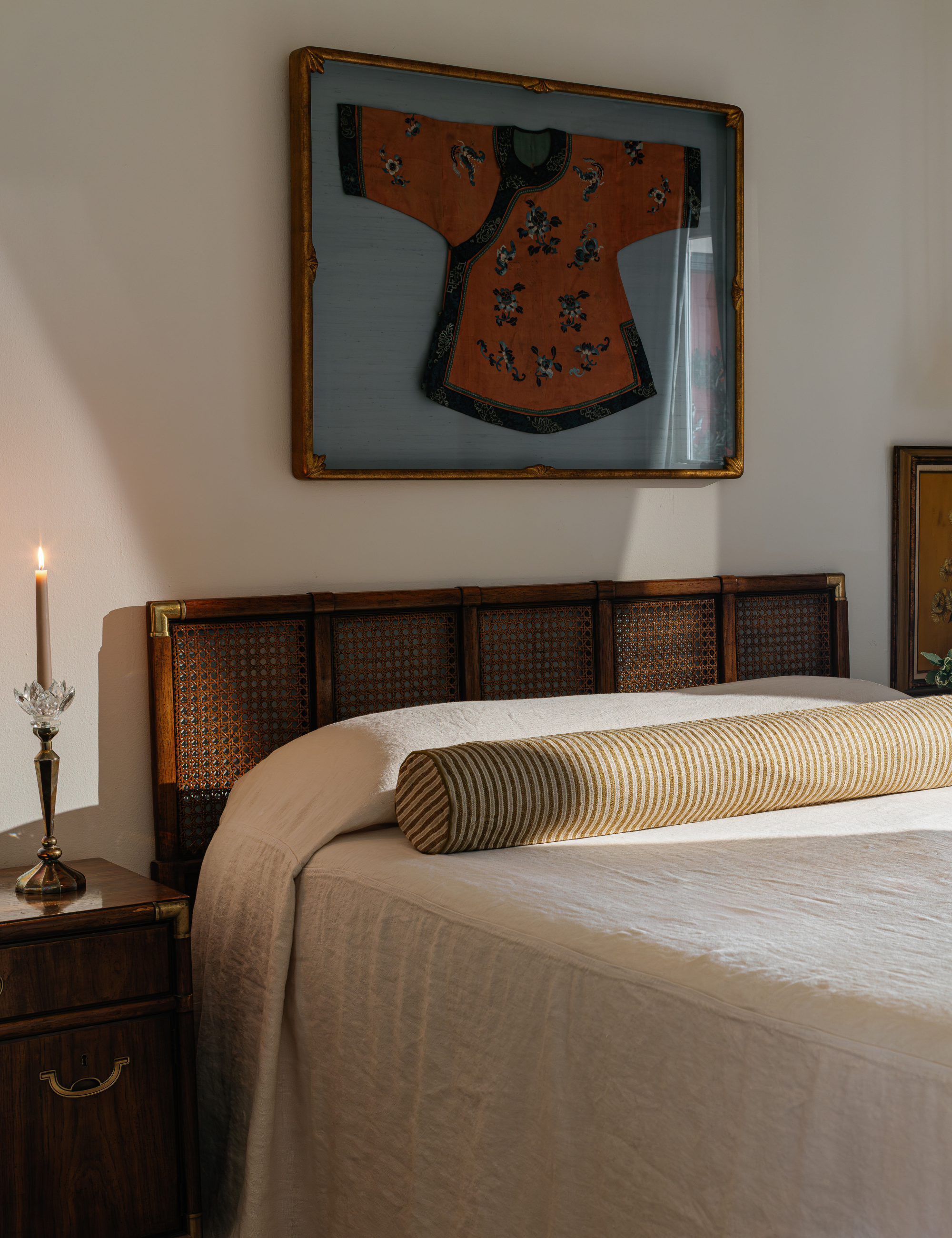
When in doubt, err slightly larger with art. It almost always brings more harmony to a room than the size you think you should choose.
Museums and galleries do this all the time. Beyond curation, they use art to pull the eye upward, reinforce architecture, and give each piece a presence – even when the work itself is objectively small, as is the case with the enduring tiny-art trend.
‘A huge piece of art in a small space can have just as big of an impact as a very small piece of art hung over a bed,’ notes interior designer Laura Medicus.
That said, for purists who prefer their paintings with a bit more gravitas, it helps to think about art the way you think about rugs. More often than not, sizing up gets you closer to the scale you actually want. ‘One grand gesture, like hanging a large-scale painting or photograph above the sofa, is a confident decorating move that always looks better than a piece that’s too small and feels like it belongs in a smaller space,’ says New York City–based designer Tara McCauley – a reality she knows all too well.
Contrary to popular belief, big art, properly scaled, won’t actually overwhelm a room.
4. Substantial Furniture
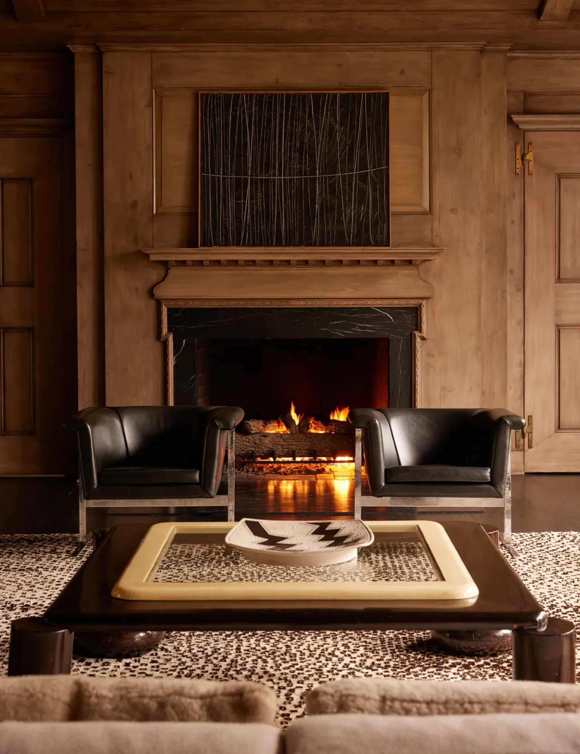
Kelly Wearstler’s signature low-and-wide approach to scale sings in this seating area.
‘A few practical fixes I see make a big difference,’ says Abby Powell, founder of Charlotte-based design studio House of AP – and topping her list is a woefully under-discussed, but crucial, scale lesson to learn: depth.
Of furniture, that is. ‘Choosing furniture with more depth instead of undersized pieces, especially in open spaces,’ Abby continues, ‘is probably the best thing you can do for your living room.’ The payoff is pretty immediate. A room reads more grounded and, perhaps even more importantly, as comfortable as it looks. (Nothing kills the mood faster than a chair that feels like it was designed for display, not sitting.)
So how big is big enough? As with most scale decisions, it depends, but where it really counts, designers agree the sofa shouldn’t play shy. According to DC-based designer Tracy Morris, ‘Sofas should typically be at least 84–96 inches in a standard living room.’
5. Tall Curtains
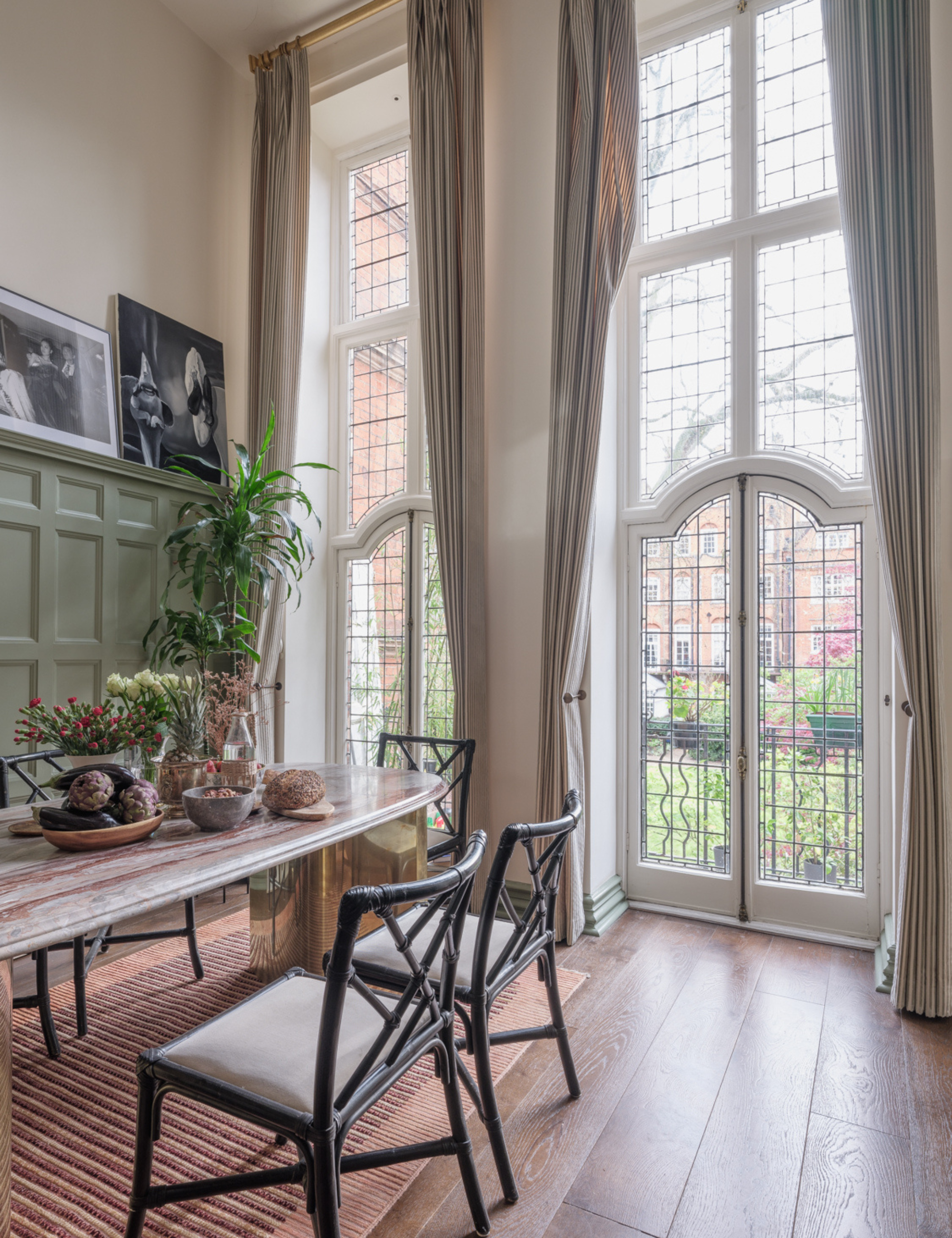
In a Georgian-inspired London dining room, designer Erik Munro introduces drama by hanging curtain panels several inches above already towering window panes.
If you want to demonstrate a fluent grasp of scale, you may have to push past your comfort zone and hang your window treatments higher than you think.
‘Hang curtains as high as possible to emphasize the height of the room,’ notes Manhattan-based interior designer Tara McCauley – advice that also explains why TikTok-famous techniques like the ‘curtain effect,’ where fabric envelopes an entire wall rather than just the window, work. Additional height helps the textile-heavy trend read dramatic, not domineering.
Natalia de Arteaga, an interior designer at Planner 5D, agrees that paying closer attention to ceiling height is key. ‘This helps the space feel intentional rather than empty,’ she says.
The shorthand for scale is bigger – larger rugs, deeper sofas, taller curtains – and while that instinct helps, it’s not the whole story. Scale is about responding to the bones of your space, not blindly sizing up.
Fortunately, fixing scale rarely requires starting over. Scale is often fixed through smarter placement, fewer pieces, and letting one element lead. Chances are, a little rearranging is the missing link you never knew you needed.

Julia Demer is a New York–based Style Editor at Homes & Gardens with a sharp eye for where fashion meets interiors. Having cut her teeth at L’Officiel USA and The Row before pivoting into homes, she believes great style is universal – whether it’s a perfect outfit, a stunning room, or the ultimate set of sheets. Passionate about art, travel, and pop culture, Julia brings a global, insider perspective to every story.