These are the 3 best colors to paint your kitchen right now, according to interior designers
These shades may be trending, but they're also incredibly timeless for enduring appeal

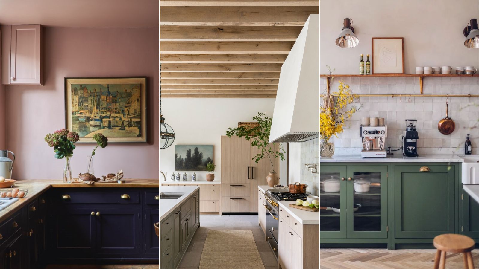
The latest kitchen color trends are filled with inspiration. From deep and dark colors that make a statement to more colorful shades, 2024 has seen so many exciting colors come to the fore in kitchens, giving these hardworking rooms a cozy feel.
But with so many hues topping the kitchen color trends right now, it can be overwhelming to know which to pick. And so, we spoke to interior designers to whittle them down to just three standout shades that are the colors to use in your kitchen right now.
Whether you want to go bold or keep things neutral, the three kitchen color ideas below are a great place to start. Although they're technically trending, each of these paint ideas has a timeless feel, so you won't need to re-paint your space any time soon.
Article continues below3 colors to paint your kitchen right now
Choosing a kitchen color scheme is a decision that will likely involve much deliberation. Since you most likely won't want to have to re-paint this functional space often, the colors you pick need to be practical, liveable, and aligned with your style.
There are many ways to decorate with your chosen shade, whether that's on the walls or across the kitchen cabinets. Either way, think about what's going to be a practical option for this social yet utilitarian room.
1. Warm white
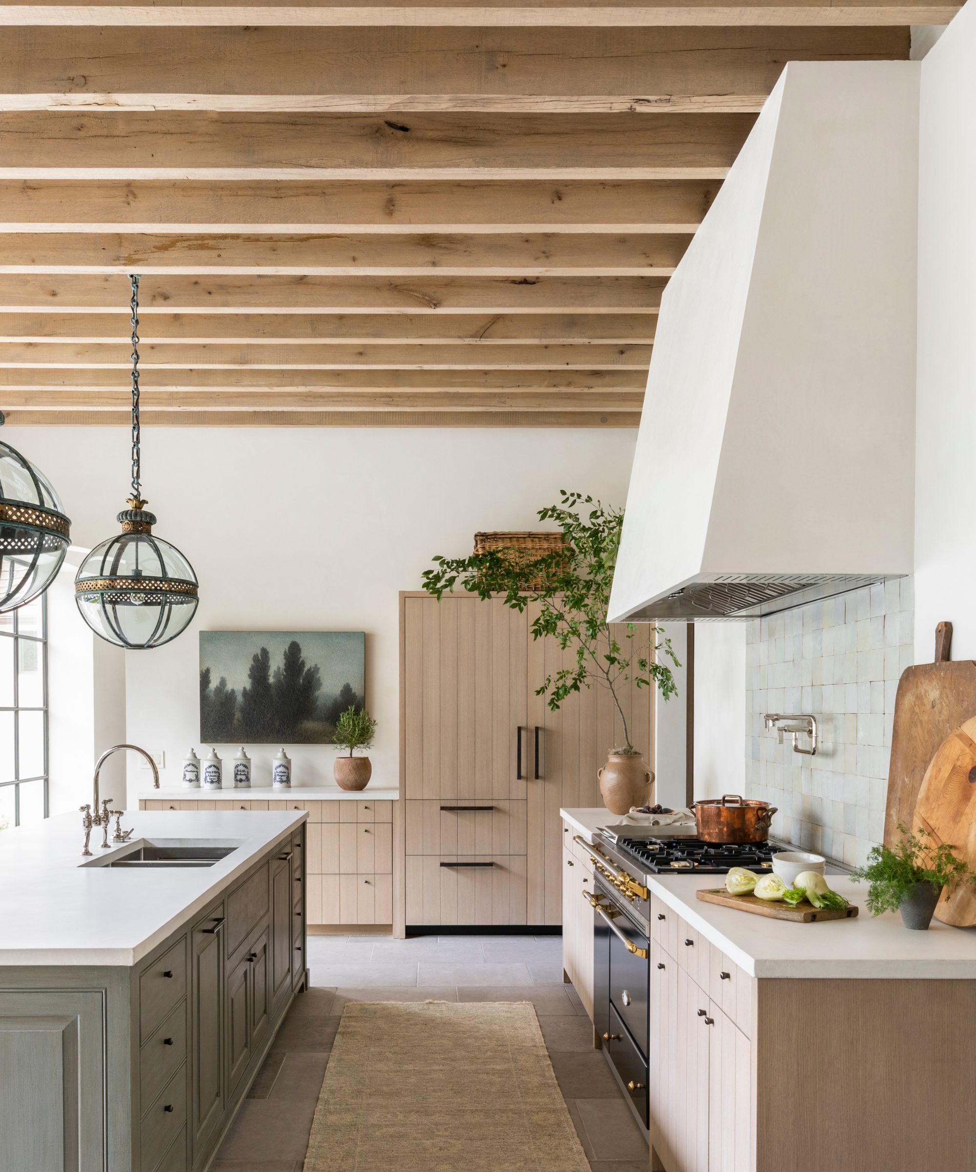
While bold paint colors for kitchens have risen in popularity in recent months, the most neutral of kitchens shouldn't be forgotten about. It's easy to get caught up in colorful kitchens, but that doesn't necessarily make them the most suitable option. A kitchen needs to be designed with longevity so that it's practical and liveable for many years to come, so sometimes neutrals are the best way to go.
That said, gone are the days of stark white kitchens; the appeal right now is all about warm neutral paints. A warm white scheme creates a timeless, light, and airy look that you can be sure won't date, and in a world of quickly-passing trends, there's all the more reason to keep things simple and understated with this universally flattering color.
Design expertise in your inbox – from inspiring decorating ideas and beautiful celebrity homes to practical gardening advice and shopping round-ups.
'Right now, I’m loving warm whites for kitchens,' says interior designer Marie Flanigan, who designed this neutral kitchen that perfectly reflects modern rustic style. 'They create a cozy, inviting feel while still maintaining that clean, crisp aesthetic we all love in a kitchen.'
'A warm white softens the space and feels more lived-in, which is especially important in such a high-traffic area,' Marie continues. 'It complements natural materials like wood and stone beautifully, making it a perfect backdrop for layering textures and finishes.'
Ryan Austin Hagood, principal designer at r.a.d. Interiors is also embracing neutral kitchens, sharing his favorite paint color to achieve this calming scheme: 'For kitchens, Baby Fawn by Benjamin Moore continues to be a favorite of mine because it brings a sense of lightness and airiness that’s ideal for the heart of the home.'
'It’s neutral yet warm, pairing beautifully with both stained wood cabinets and sleek marble kitchen countertops,' adds Ryan. 'The subtle, understated tone of Baby Fawn enhances the natural textures in a kitchen, whether it’s plaster, wood, or stone, creating a balanced and inviting space that feels both fresh and cozy.'
2. Dark green
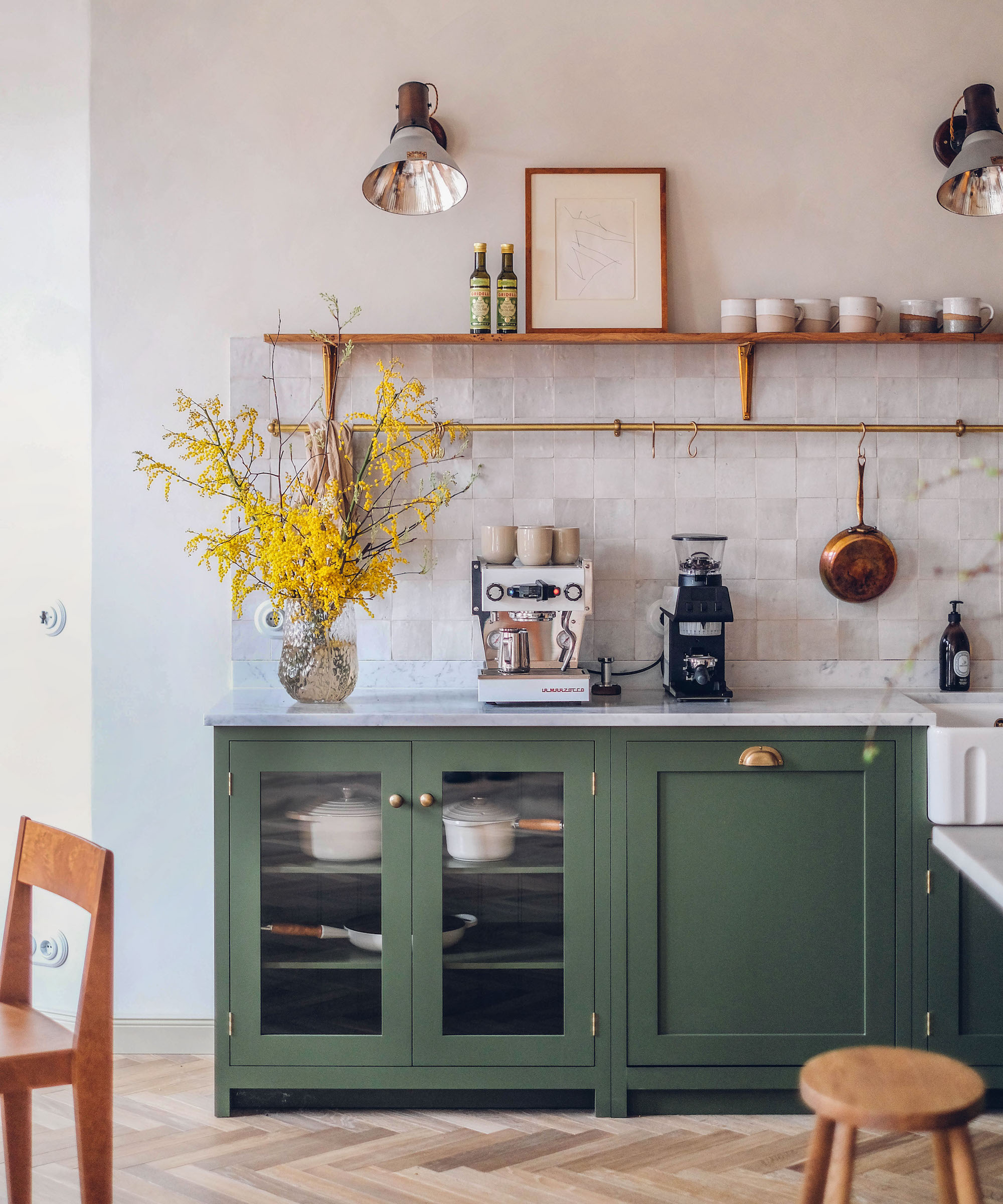
If you want to move away from neutrals and embrace the dark paint trend, we can't think of a more fitting color than dark green. With its warmth, dark green is able to create a bold look without feeling at all drab. Colors like black or even dark blue can overwhelm rooms with cool tones, whereas green provides much more of an approachable look.
Of course, there are various ways to use this color, but our favorite has to be on kitchen cabinets. This way, your cabinetry can act as the statement color feature while your walls provide balance in a warm neutral hue, as seen in this stylish deVOL kitchen.
'Kitchens offer the perfect backdrop for a wide range of colors – we've designed everything from dark and moody kitchens to bright, airy spaces, and even vibrant coastal kitchens,' says Ali Otterbein, director of design at Blakely Interior Design. 'But lately, we’re drawn to rich, sultry hues like Sherwin Williams’ Forestwood. This shade is bold and dramatic, yet remains refined and color-forward. It truly shines in spaces with ample natural light.'
'I am still loving green kitchens,' adds designer Allison Garrison of San Diego-based design firm Allito Space. 'The green could be bright and playful or dark and moody. Either way, mix with wood tones, black and white for the perfect pairing. Green, the color of fresh herbs, just feels right in a kitchen.'
3. Plaster pink
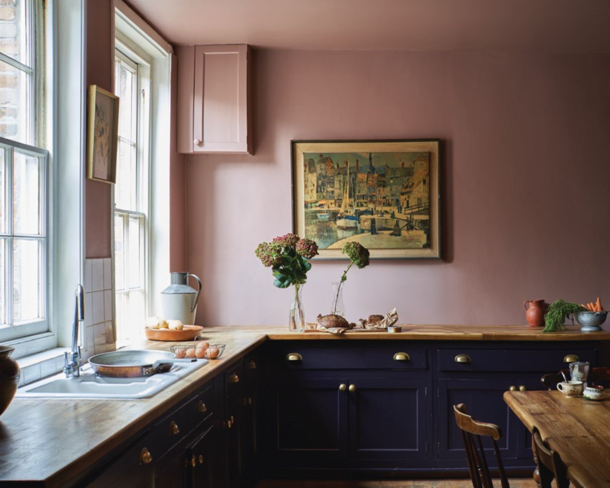
Another key color to consider decorating your kitchen with right now is earthy plaster pink. While it may at first sound overly colorful, the right shade of pink, more like plaster tones than true pink is an on-trend way to bring color into this hardworking room while maintaining a timeless look that isn't going to quickly date.
While wine red shades have been dubbed the color of the season – think rich, warm burgundies and oxblood – these intense, deeply warming shades can risk appearing too seasonal as soon as the warmer months roll around. As previously mentioned, your kitchen should prioritize longevity so earthy plaster pinks are a middle ground, with more interest and depth than neutrals but not too bold or rich.
In this kitchen, Farrow & Ball's Sulking Room Pink is used across the walls, while the cabinets are painted in Paean Black. The darker cabinets provide balance to the pink walls, ensuring the overall look isn't saccharine, but sophisticated and liveable.
Farrow & Ball's Dead Salmon is another plaster pink paint that would work well in kitchens, and it's a favorite of Sarah Rhodes, senior interior designer at Inside Stories: 'Recently we have been stretching client comfort zones with Farrow & Ball's Dead Salmon. This particular color brings a fun twist to an earthy shade of pink which pairs beautifully with a natural Carrara or Calcutta marble countertop. I'm always loving an unexpected colorful kitchen. Mauve pinks, deep aubergine, and everything in between.'
While these colors are trending, they each have a timeless quality so you can be sure they will look great for many years to come. Which one will you be trying for 2025?

Emily is a freelance interior design writer based in Scotland. Prior to going freelance in the spring of 2025, Emily was Homes & Gardens’ Paint & Color Editor, covering all things color across interiors and home decor for the Homes & Gardens website. Having gained specific expertise in this area, Emily is well-versed in writing about the latest color trends and is passionate about helping homeowners understand the importance of color psychology in home design. Her own interior design style reflects the simplicity of mid-century design and she loves sourcing vintage furniture finds for her tenement flat.
