7 kitchen features designers say are always eyesores – and their suggested alternatives that look more elevated
From boring materials to unsightly design mistakes, these are the kitchen features to avoid, according to design experts

Design expertise in your inbox – from inspiring decorating ideas and beautiful celebrity homes to practical gardening advice and shopping round-ups.
You are now subscribed
Your newsletter sign-up was successful
Want to add more newsletters?
From builder-grade features to fleeting trends, there are a few kitchen features designers say rarely look elevated or considered. Even the smallest elements can bring down the overall look and feel of your space.
Which is why it's key to know what to avoid when designing your scheme if you want your kitchen ideas to truly stand the test of time. From cabinet designs to basic materials, there's a lot to consider.
Which is why I've asked interior designers for the kitchen features they always think are an eyesore, and what you should be doing instead. Here are seven that they see time and time again.
Article continues below7 kitchen features designers say are always eyesores
After all the time and energy you spend curating your dream kitchen, the last thing you want is one small feature throwing off the whole scheme. And according to designers, these features are the ones to avoid – not only are they eyesores, but they are all things you won't be seeing in luxury kitchens any time soon.
1. Faux marble countertops
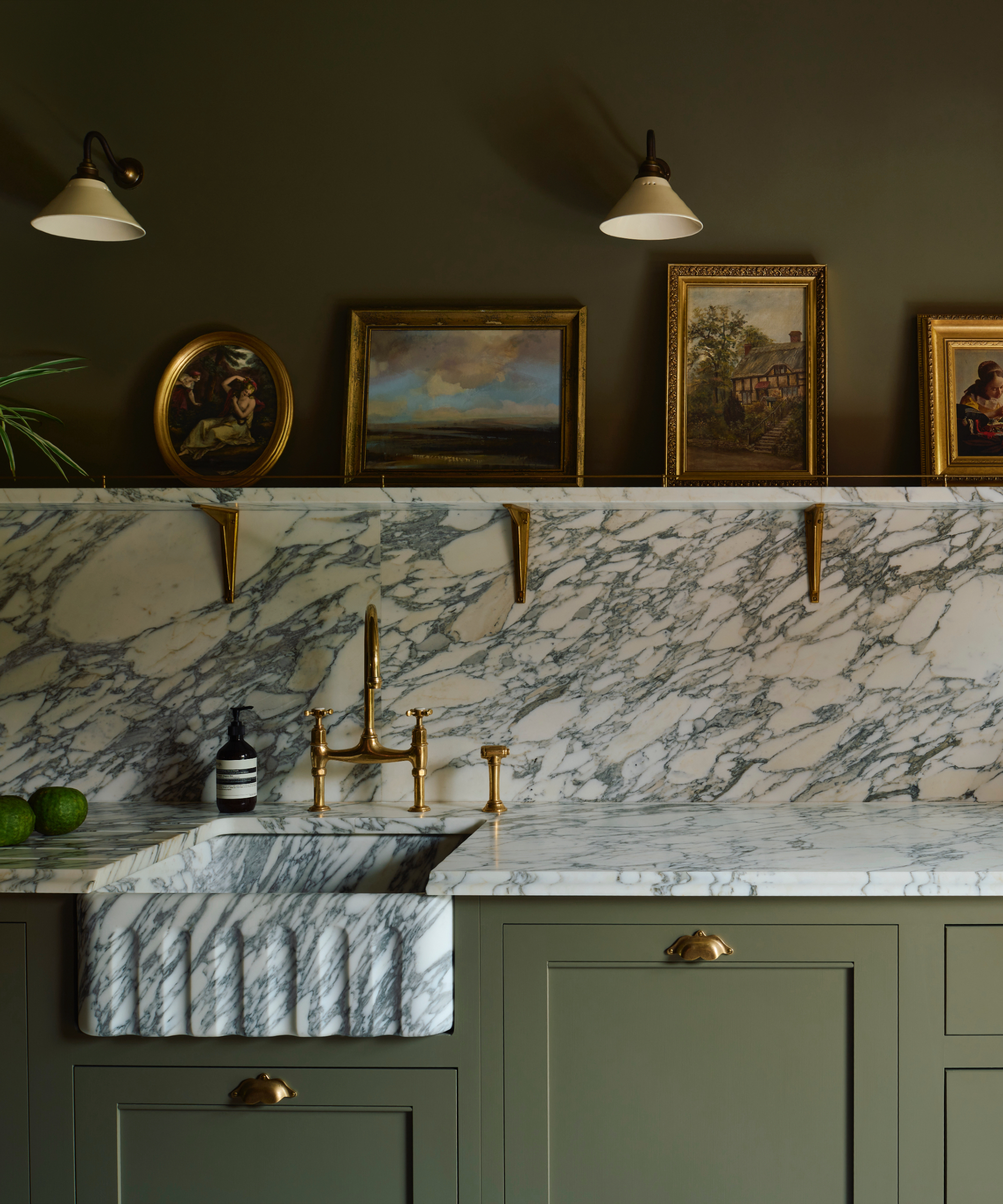
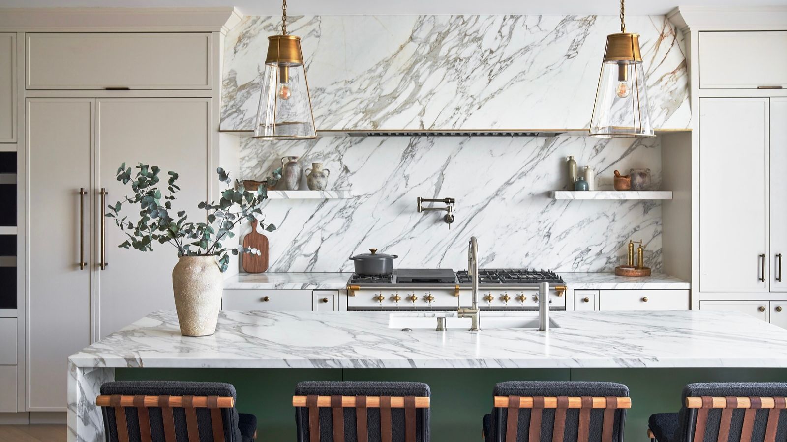
Real marble, like the striking stone countertop and backsplash in this kitchen, is hard to replicate, especially when it features bold veining.
Your kitchen countertops are one of the largest features in your space. Spanning the entire room, it's important to choose the right material for a stylish and enduring design. However, for some designers, imitations of natural stone can fall short – and can make your kitchen look cheap.
'Faux marble countertop rarely captures the depth of the real thing and can bring the overall look of a kitchen down. When the budget allows, natural stone is always our preference. The depth and variation found in marble and other natural stones bring timeless patterns and character that elevate a space instantly,' says interior designer Ami McKay.
However, if natural stone isn't in the budget or is too high-maintenance, there are plenty of marble countertop alternatives to consider, such as porcelain for a man-made option and quartzite for a natural one.
Design expertise in your inbox – from inspiring decorating ideas and beautiful celebrity homes to practical gardening advice and shopping round-ups.
2. A stainless steel hood
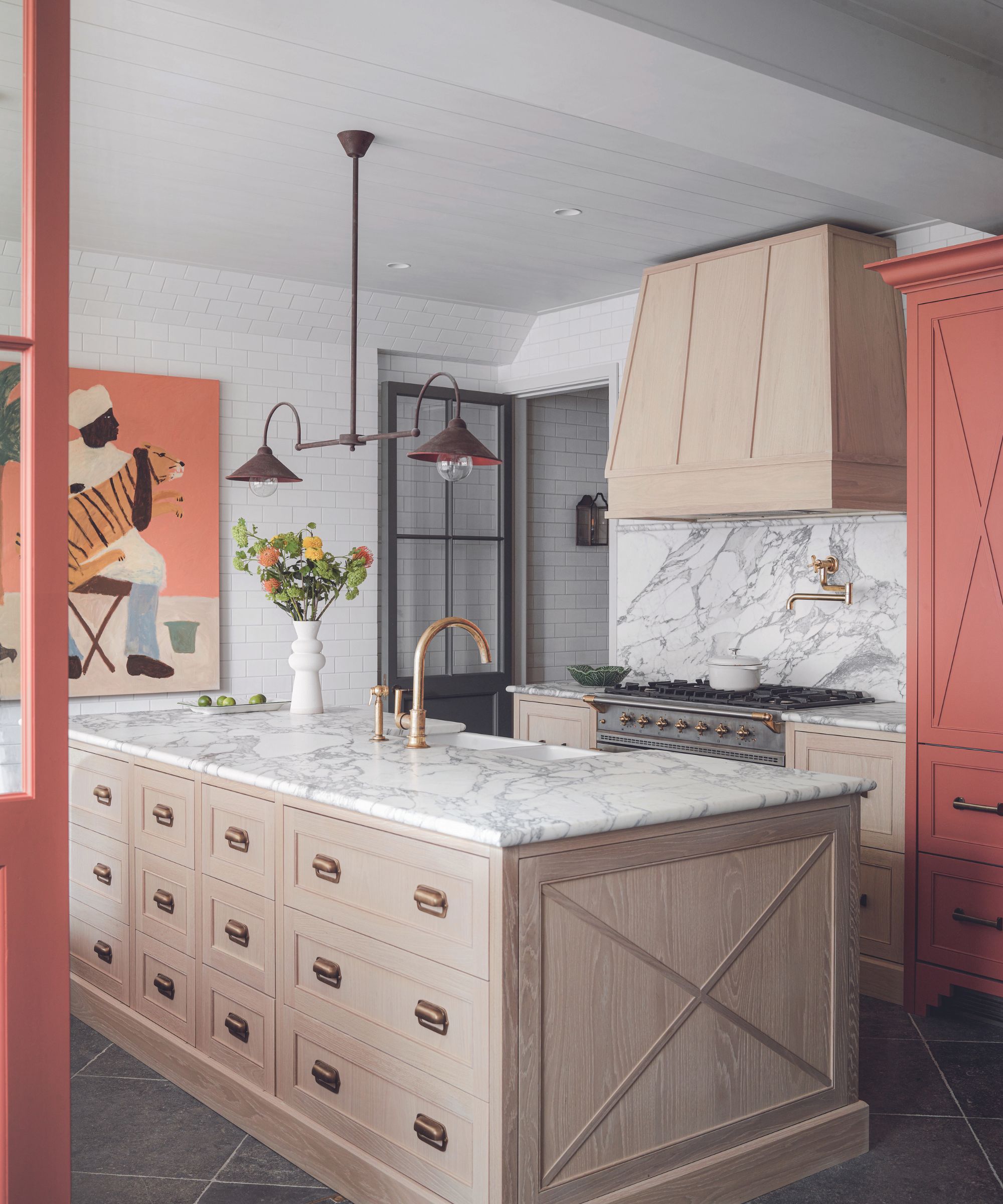
In this kitchen, the range hood has been clad in the same material as the island, instantly elevating the finish.
Some kitchen features feel like a necessity, a functional addition, and in turn become a bit of an afterthought. Your extractor hood is one such feature, but some designs can feel underwhelming and a bit of an eyesore.
'For me, a kitchen eyesore is the classic stainless steel hood. While they serve a function, they can feel cold, bulky, and visually overpowering in a kitchen, especially when everything else in the space is thoughtfully designed. Instead of blending in, they often end up commanding attention in a way that distracts from the overall aesthetic,' says Kailee Blalock, co-founder at House of Hive Design Co.
'I always suggest treating the hood as an integrated design element rather than an afterthought. A plaster or wood-clad hood that ties into the cabinetry or architectural details of the space feels intentional and cohesive. Even adding stone cladding to match the countertops or backsplash can make the hood feel like part of the story, not a stand-alone industrial element. It’s about creating a focal point that enhances the kitchen’s design rather than detracts from it.'
3. Small appliances left out on countertops
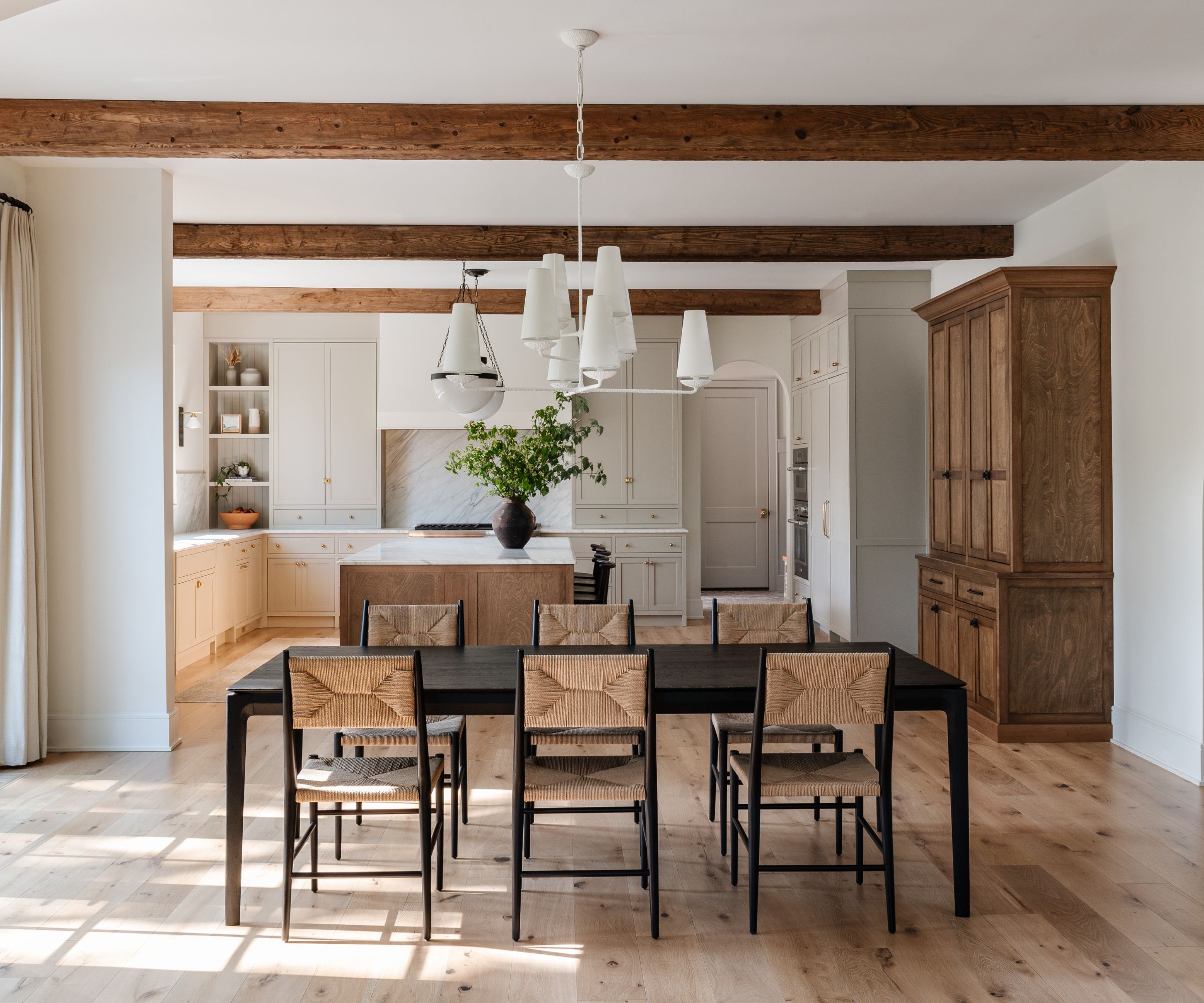
Dedicated cupboards in this kitchen ensure the countertops remain free of visual clutter.
Let's be honest, no one sees cluttered kitchen countertops and thinks of them as anything other than an eyesore. But we're not just talking about assorted items left on surfaces, but rather everyday appliances that should have a tidier place to call home.
'Small appliances left out on countertops can quickly undermine an otherwise tidy and well-styled kitchen. A thoughtful alternative is to house them in a dedicated cabinet, keeping function close at hand without sacrificing visual calm,' says Sarah Brady, founder and creative director at Salt Design Company.
'This can be as simple as sourcing a vintage hutch, commissioning a custom piece from a local woodworker, or opting for a well-designed, prefabricated unit. For added practicality, integrate power strips inside the cabinet so appliances can stay plugged in and ready to use, all while remaining out of sight.'
4. A row of spotlights above a walkway
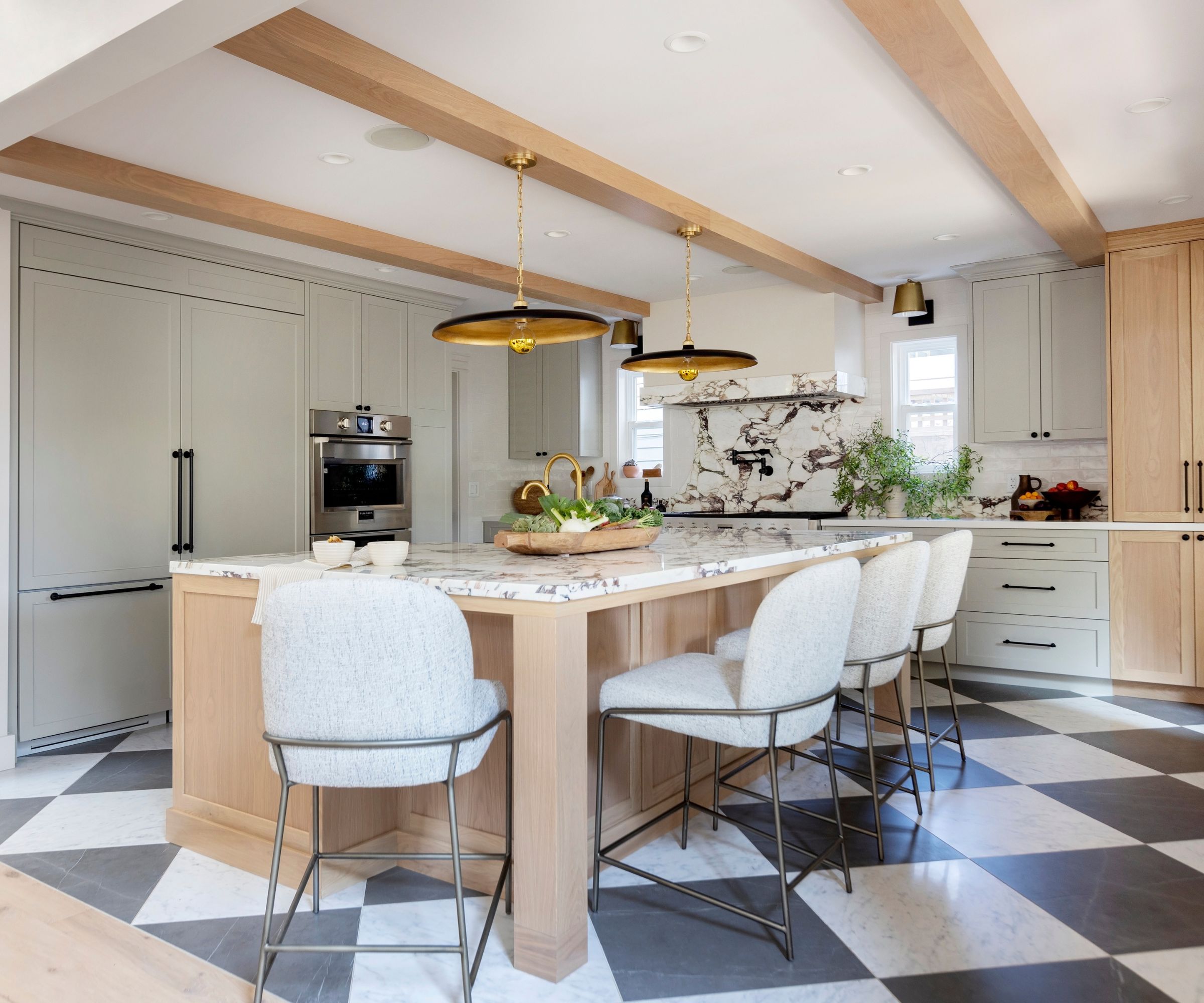
The layered lighting and carefully placed pot lights in this kitchen create a more lived-in feel.
There are occasions when your kitchen can feel a bit off, but it's unclear what exactly the cause is. But if you ask an interior designer, it could be your lighting that's creating a visual and functional issue.
'A row of spotlights down the kitchen walkway feels more like an airport runway than good design. These can create uneven shadows that disrupt function,' says Ami, explaining that this kitchen lighting faux pas always creates an eyesore.
'Instead, place them over countertops and work zones for light where it is needed most. We opt for 2" gimbal recessed lights to highlight cabinetry or a custom hood with a soft, flattering glow.'
Layered lighting is another great choice in a kitchen if you want to create a softer glow. wall sconces, counter lamps, and even under-cabinet lighting offer additional light sources without creating a row of unflattering downlights.
5. Cabinets that stop short of the ceiling
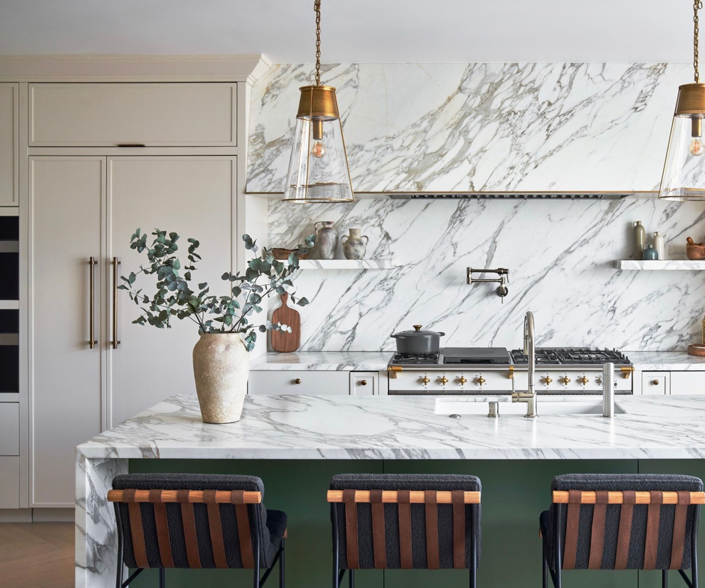
The cabinets have been taken all the way to the ceiling in this design, instantly creating a more polished and bespoke look.
If you've ever wondered whether kitchen cabinets should go all the way to the ceiling, the answer is almost always yes. Short wall cabinets can make a kitchen look basic, and when they feel disproportionate or stumpy, they can create an instant eyesore that throws the whole scheme off.
'My kitchen pet peeve would have to be upper cabinets that don't go all the way to the ceiling. That space always ends up looking like an afterthought when you walk into a kitchen. The goal should always be to draw the eye upwards to make the space look taller and more spacious,' says Chetna Baveja, of Baveja Design.
'Not only does closing that upper space give your kitchen a more spacious feel, but it also lends itself to a more custom look because the cabinets look as if they were built for that specific kitchen. Adding crown molding is a great way to close the gap while also adding character. For a simpler modern look, you can fill the gap with drywall or a faux wood front.'
6. A microwave integrated into a hood fan
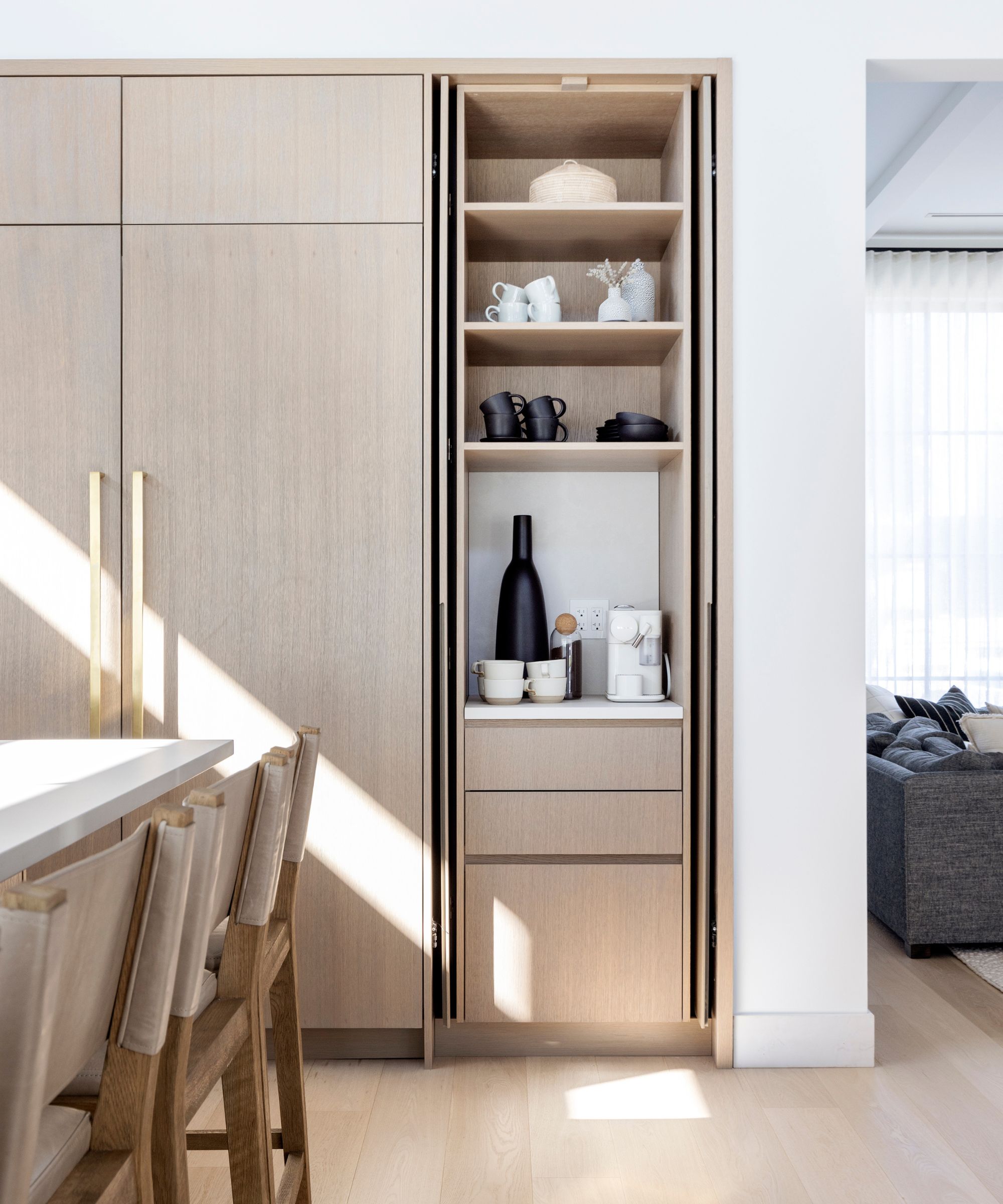
This space proves you don't have to go over the top with an appliance garage. This narrow cabinet offers plenty of shelf space for your microwave that's still easily accessible.
Microwaves are always an area (or appliance) of contention when it comes to where they should be located. For most designers, a pantry, back kitchen, or appliance garage is the best place – and one thing they all agree on is that it shouldn't be combined with a range hood fan.
'The microwave hood fan combination often feels bulky and dated in today’s kitchens. They also take away a key design opportunity for a beautiful, custom hood fan, which is a signature in our kitchen designs,' says Ami.
'A built-in microwave with a trim kit offers a cleaner look. If space allows, consider an appliance garage-style cabinet to tuck away small appliances while maintaining a streamlined aesthetic,' she suggests.
7. A kitchen that lacks layered design
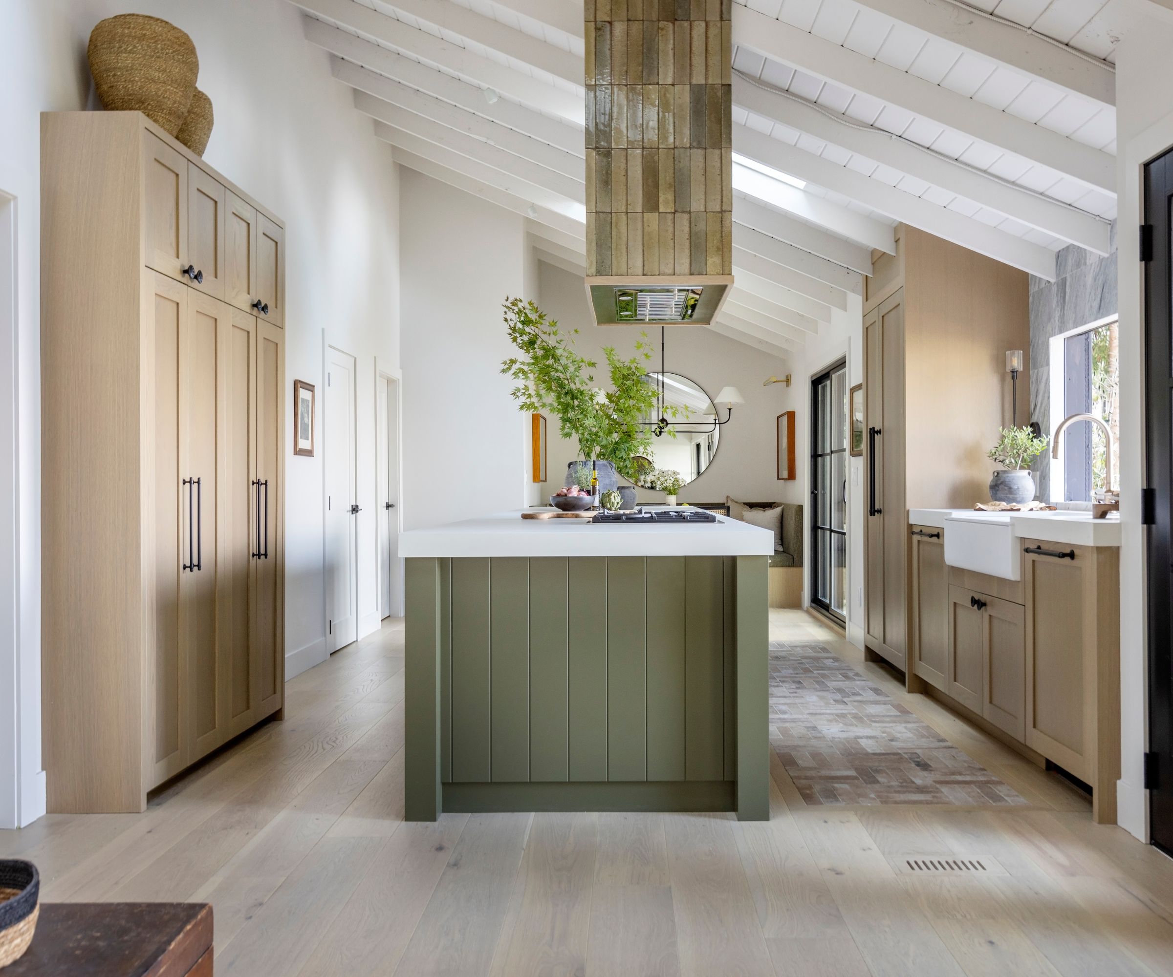
The layers of color, texture, and mixed materials give this kitchen abundant visual interest.
Sometimes, it's not one individual kitchen feature that creates a bit of an eyesore, but multiple elements combined. Designers always talk about how layered designs bring interest and personality to a kitchen – without these layers, your space can feel bland and not so easy on the eye.
'White subway tile, white shaker cabinets, and black hardware are classics, but together they can feel flat and uninspired,' Ami notes. And while they may be considered classic, the lack of layering makes them a bit boring and, in some cases, outdated.
Mixing materials, colors, and textures is a better option for a timeless, visually interesting design. 'To bring personality and warmth to a kitchen, we like to layer textures and colors through stone, wood, tile, and metal to create a rich palette that feels intentional and balanced,' she adds.
Do any of these problem features feel familiar? Overall, they are relatively easy fixes, whether it's adding crown molding to short cabinets, covering an unsightly range hood, or layering new colors and textures. And if you're still in the design phase, it's worth reading up on these kitchen features interior designers are sick of seeing if you want to create a unique, characterful space.

I’ve worked in the interiors magazine industry for the past five years and joined Homes & Gardens at the beginning of 2024 as the Kitchens & Bathrooms editor. While I love every part of interior design, kitchens and bathrooms are some of the most exciting to design, conceptualize, and write about. There are so many trends, materials, colors, and playful decor elements to explore and experiment with.
