Dutch Boy's Color of the Year revealed – and it will make you feel 'cozy, protected and calm'
The tone promotes a simpler lifestyle inspired by the peace and clarity of hues derived from nature

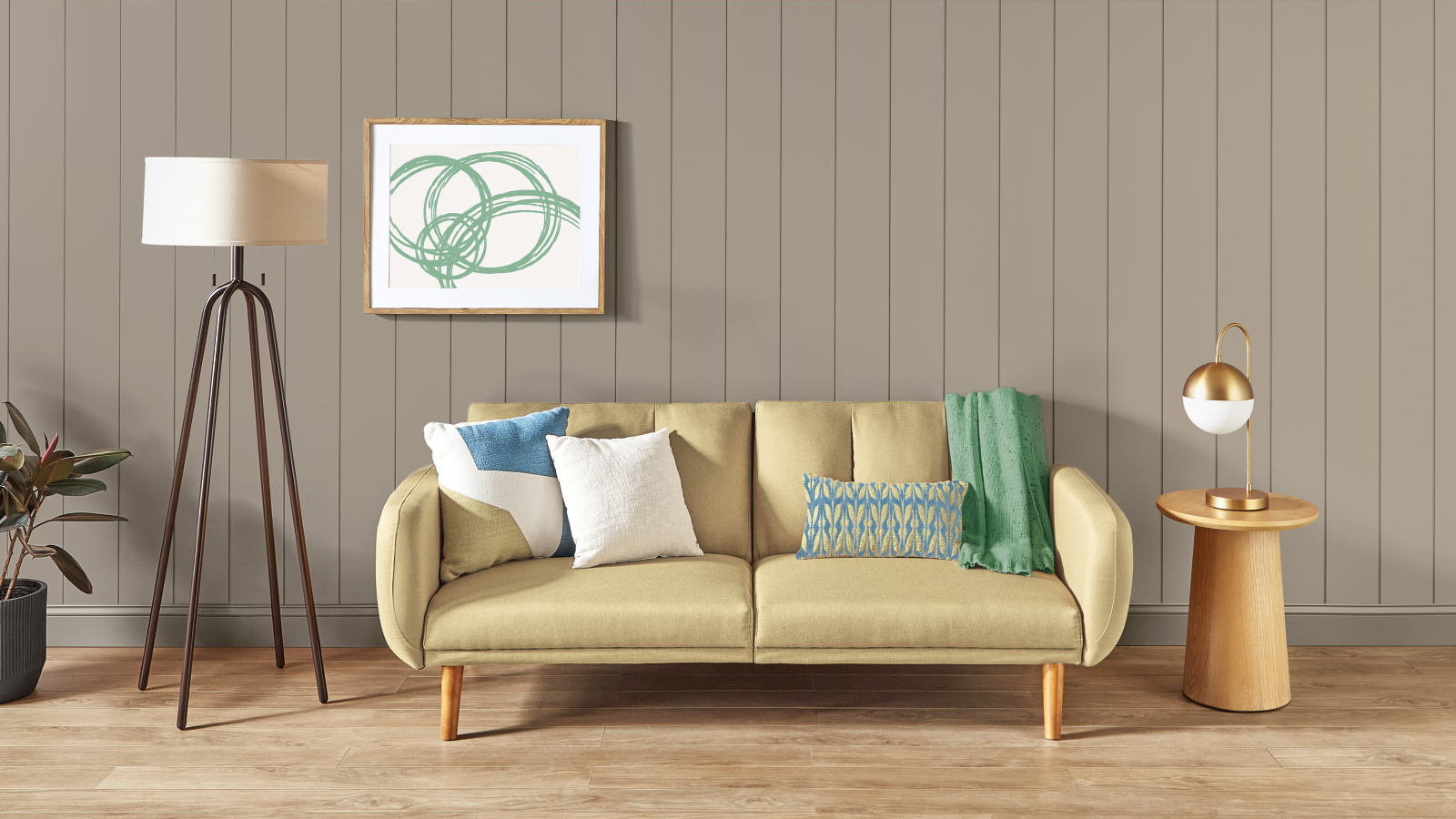
It's Color of the Year season, and this time, it's Dutch Boy's turn to share the top tone for 2023. The hue in question is Rustic Greige, a charming neutral with a slight red undertone that is designed to 'add a touch of sophistication' to every room.
The color that is set to dominate paint trends in 2023 draws from the craving for safety and harmony around the home. It comes after the Cleveland-based company observed how consumers prioritize simplicity and serenity in their most-loved spaces.
'The importance of overall well-being remains a primary focus in everyday lives,' says Ashley Banbury, NCIDQ and senior color designer at Dutch Boy Paints. 'That's why more DIYers are dedicating time and energy to designing personal spaces that make them feel cozy, protected, and calm.'
Article continues belowHowever, there is a more technical element that sets this paint aside from any previous Color of the Year selection.
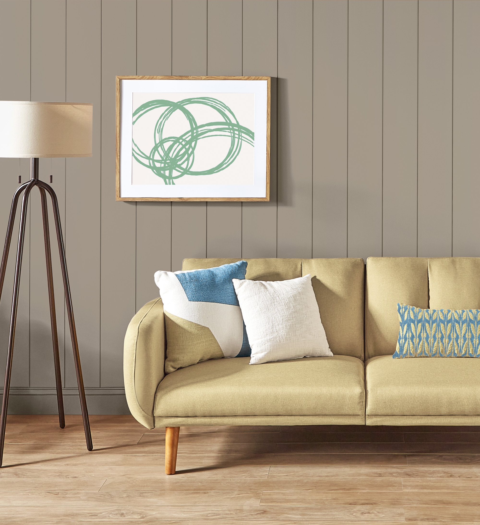
Rustic Greige
Alongside its ability to bring serenity to your paint ideas, Rustic Greige is admired by painters for its ease of application. The 'One-Coat Color of the Year' will elevate your entryway, bedroom, and living room paint ideas with only one application. So, you can spend less time painting and more time surrounded by its peaceful aesthetic.
'The beautiful, versatile Rustic Greige is all about the need to escape, relax and recharge,' Ashley adds. 'It’s about retreating to a calmer, simpler lifestyle inspired by the peace and clarity of tones derived from nature.'
Rustic Greige sits at the peak of Dutch Boy's three 2023 palettes – Plush, Wistful, and Botanic. And like, their Color of the Year, you can apply these paints in one smooth coat. Here's how.
Design expertise in your inbox – from inspiring decorating ideas and beautiful celebrity homes to practical gardening advice and shopping round-ups.
1. The Plush Palette
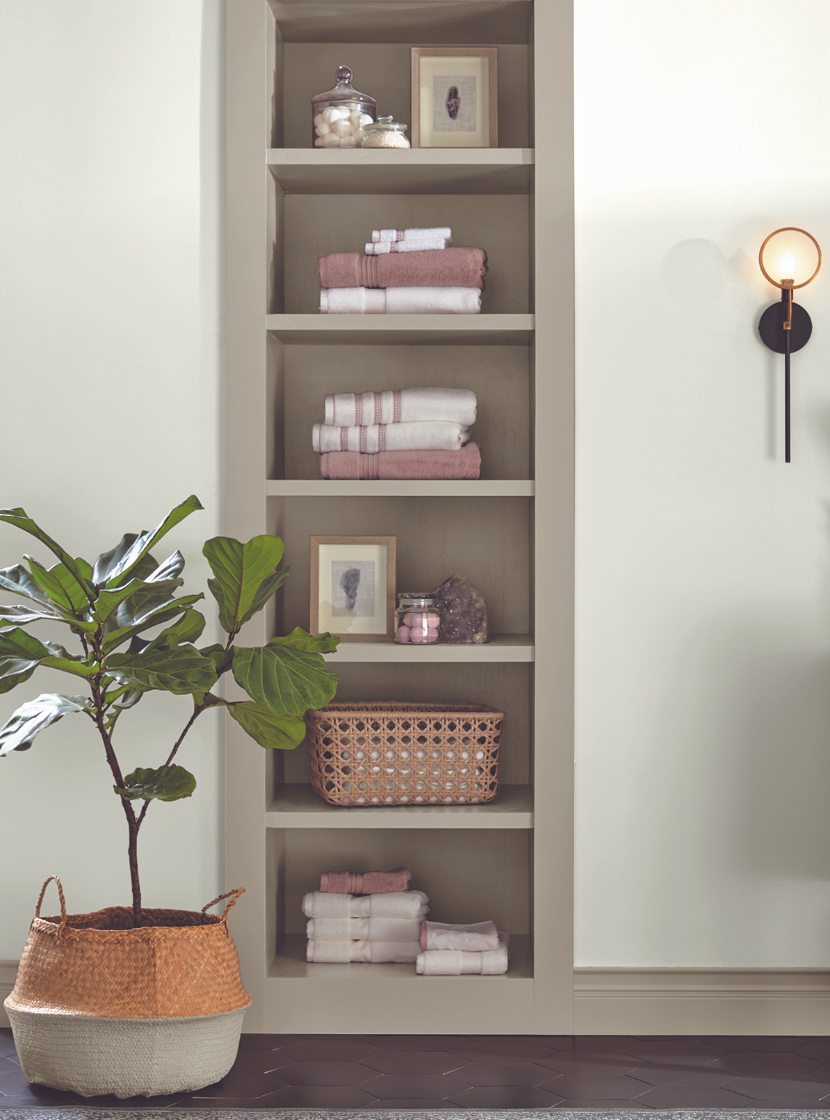
The Plush Palette
DutchBoy designed The Plush Palette to accentuate a space with a new-found sense of luxury that promotes mental, emotional, and spiritual health through minimal shades.
Stand-out colors from the palette include Ultra White (002W), Silvered Purple (446-4DB), and Ebony Sky (438-6DB) – a grounding kitchen color idea that will never to fall out of style.
2. The Wistful Palette
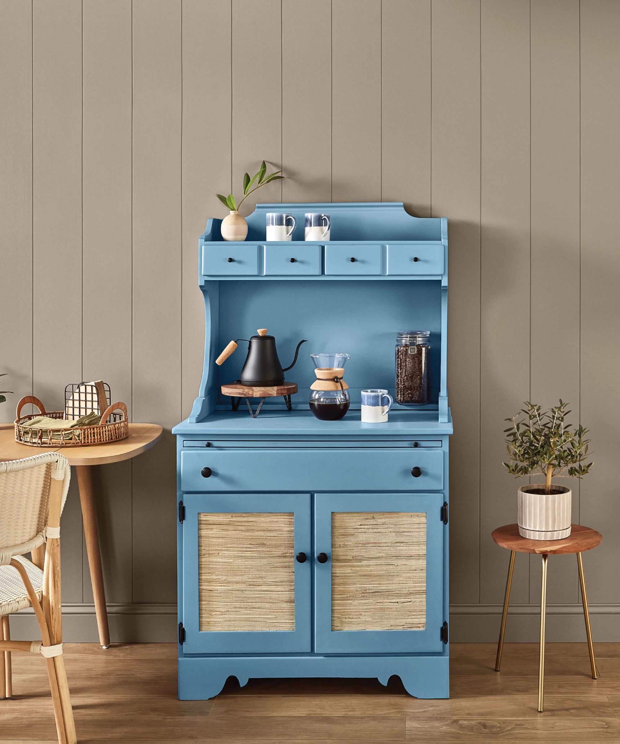
The Wistful Palette
The second color combination draws from the vintage and nostalgic. It encourages you to create a space that is as unique as your life through 'imaginative and restorative' hues.
Our favorites include Maize (317-3DB), Superhero (237-6DB), and energizing Glamorized Green (328-4DB).
3. Botanic Palette
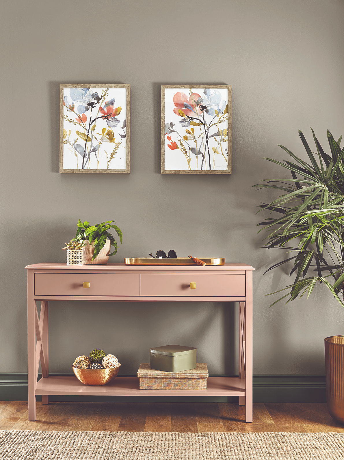
The Botanic Palette
The aptly-named Botanic collection is rooted in heritage – drawing inspiration from warm and sunny hues and romantic florals. The palette draws from the need to bring color from the outside indoors (an interior design trend showing no signs of slowing).
The color of the year, Rustic Greige, is the foundational neutral that ties Amber Wood (409-4DB), Industrialized (434-5DB), and Limestone Slate (422-6DB) together in expressions that are described as 'soulful, joyful and creative.'
While this may be the first time you hear about Rustic Greige, we expect it certainly won't be the last. 'Decorating with grey has been popular for many years, but we have seen a real shift, particularly since the pandemic, away from cool grey towards warmer, beige room ideas,' says Lucy Searle, Editor in Chief, Homes & Gardens.
'While beige doesn't typically summon up the image of a luxurious interior, it can be incredibly transformational because it's a warm neutral and there are so many accent colors for beige. Plus, it's the perfect backdrop for cozy room ideas.'
Megan is the Head of Celebrity Style News at Homes & Gardens, where she leads the celebrity/ news team. She has a history in interior design, travel, and news journalism, having lived and worked in New York, Paris, and, currently, London. Megan has bylines in Livingetc, The Telegraph, and IRK Magazine, and has interviewed the likes of Drew Barrymore, Ayesha Curry, Michelle Keegan, and Tan France, among others. She lives in a London apartment with her antique typewriter and an eclectic espresso cup collection, and dreams of a Kelly Wearstler-designed home.