This open-plan LA home centers around an awesome Noma-inspired kitchen
This Mar Vista home looks to Europe for its light and airy design, with one of the world's best chefs providing significant inspiration

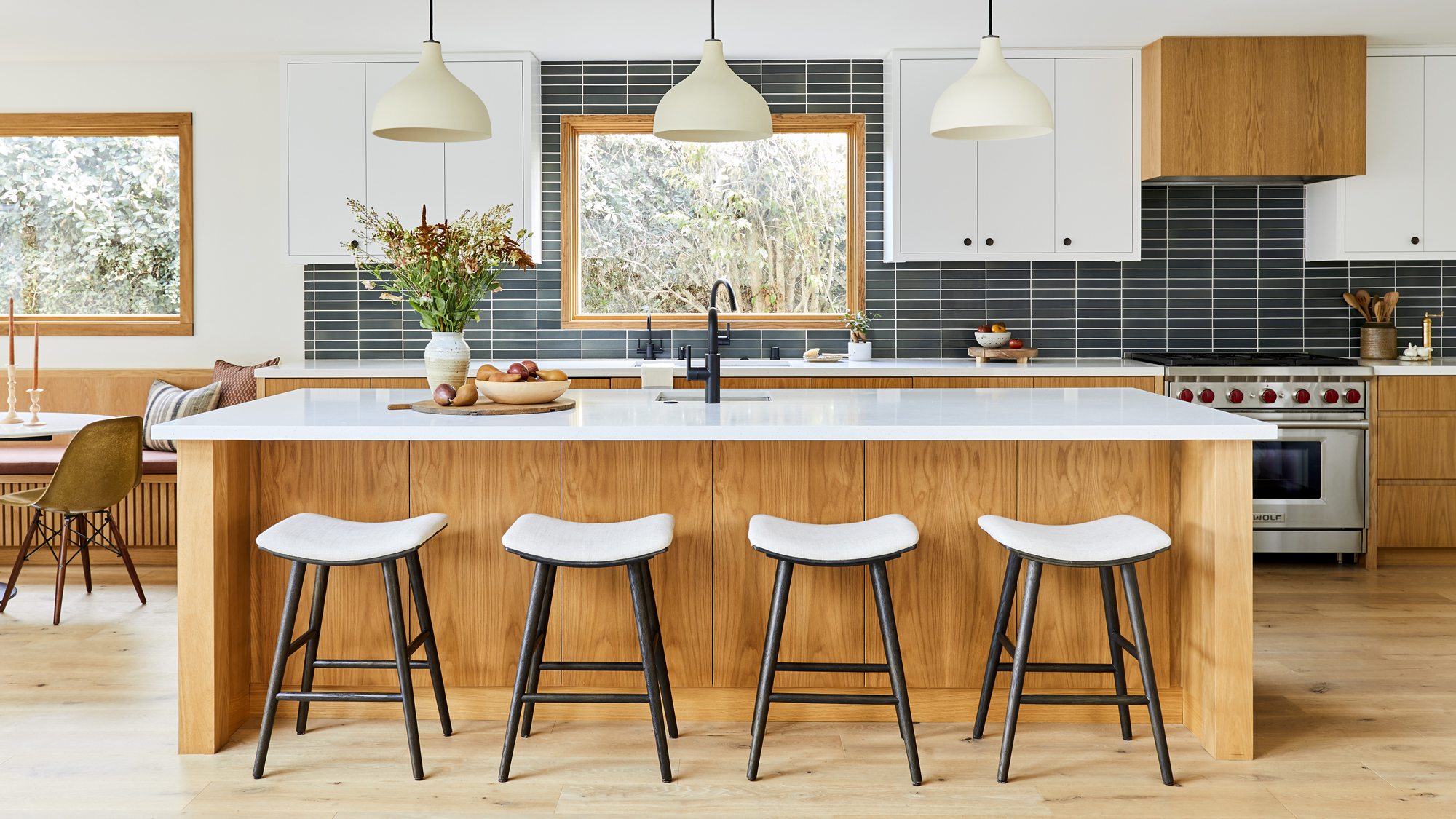
‘Open-plan’ is a relative understatement for this four bedroom home in Los Angeles’ Mar Vista neighbourhood.
When interior designer Ginny Macdonald took on the project, the clients asked her to bring the living room, dining room and kitchen together into a single main space. Macdonald not only did that, but added an extra dining nook and mini mudroom, and worked with an open approach to the home’s garden, accessible through large, glass sliding and bi-fold doors.
‘With the open connection between the indoor and outdoor spaces, we really focused the concept on a Japanese, Scandinavian modern design with European influences,’ said Macdonald. ‘We also wanted to stay true to the mid-century architecture of the house.’
Article continues below 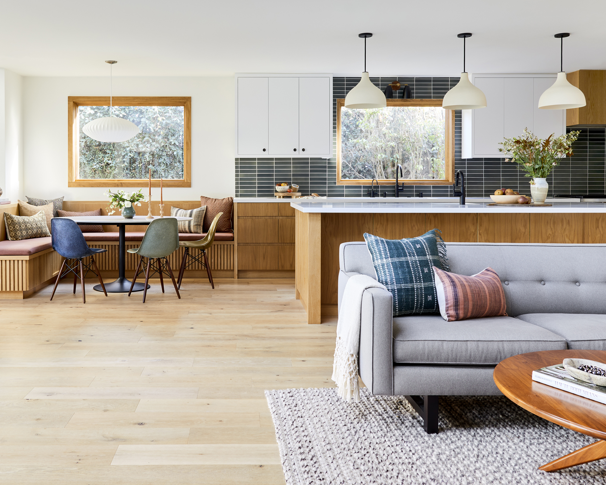
‘We used a neutral, earthy palette throughout the house with white oak being the feature for all the bespoke cabinetry.’
The result is an impressively light space that embraces the simplicity of modern European design, and takes inspiration from some of the world’s best homes, including that of the chef behind one of the most famous restaurants on the planet.
Kitchen
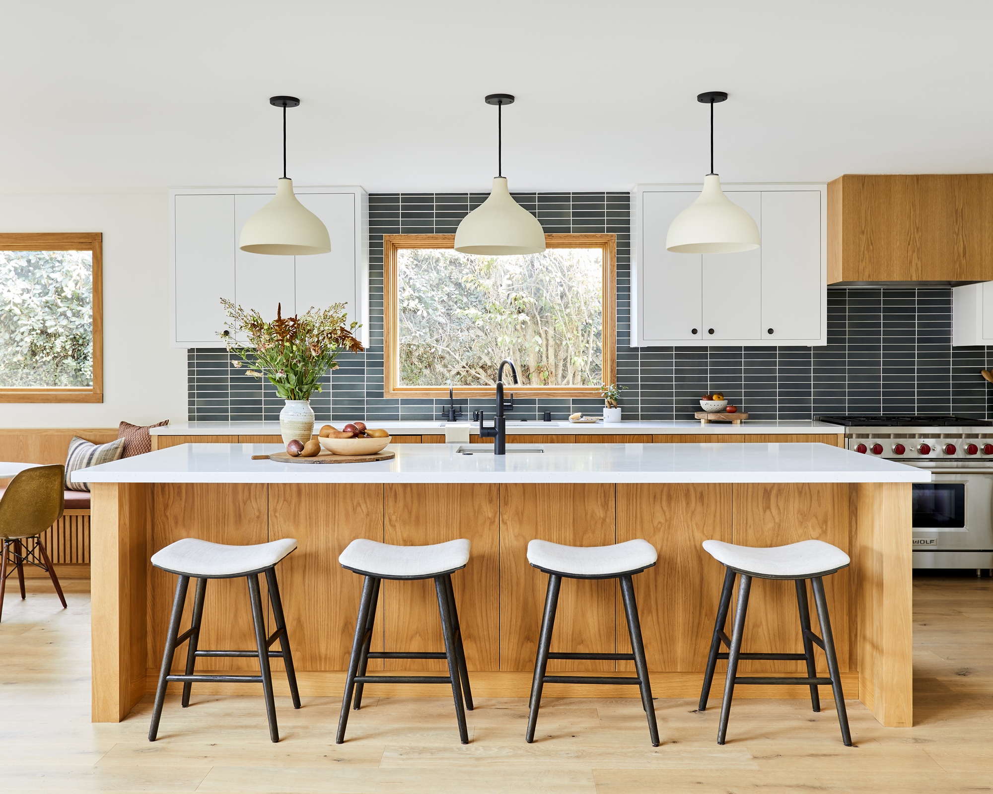
‘We were inspired by René Redzepi's kitchen that was designed by Garde Hvalsøe, so we had our carpenter fabricate the drawers to have fingerless pulls,’ said British-born Macdonald, who was more than happy to embrace kitchen ideas from Europe.
This handle-less European style of cabinetry – as seen in the Noma chef’s home kitchen in Denmark – is a hallmark of the visual simplicity that leads the room. Distractions from the woodwork’s golden tones and natural pattern are minimal, with a monochromatic scheme across the rest of the space.
Design expertise in your inbox – from inspiring decorating ideas and beautiful celebrity homes to practical gardening advice and shopping round-ups.
‘To break up some of the wood cabinetry, the uppers were painted in Benjamin Moore's White Dove, but we kept the hood highlighted in white oak. The kitchen backsplash tiles are from Heath Ceramics and were installed in a stacked formation.’
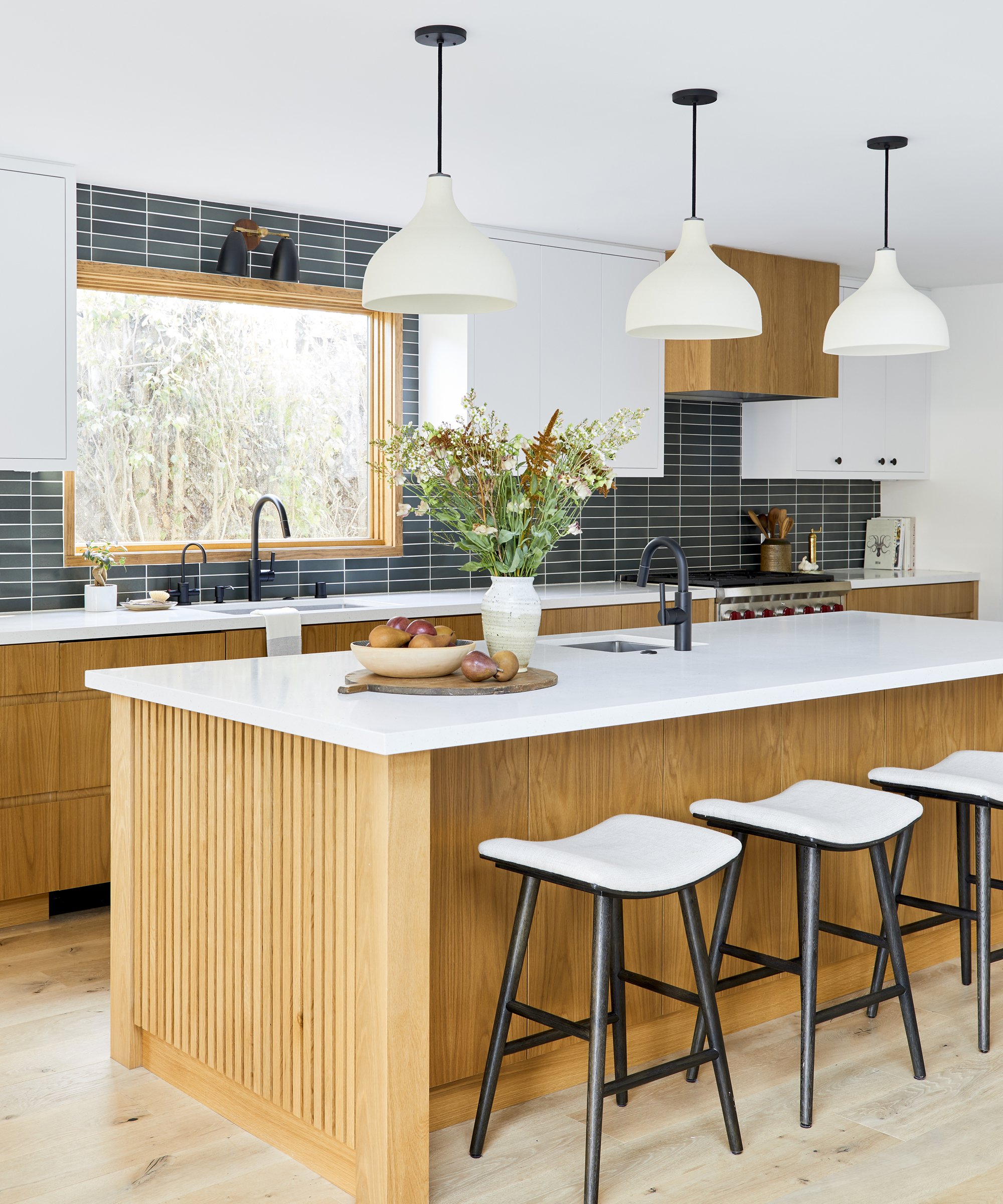
The centerpiece of the space is, of course, the pristine 10-foot island that features a white countertop made from speckled quartz, with slatted oak panels on either end – a real inspirational piece for anyone looking for kitchen island ideas.
‘With the island being so long, we were able to install three pendants above,’ says Macdonald. ‘These are an off-white ceramic fixture from Rejuvenation. I love that they aren't fully stark white, and they add a nice contrast to the upper cabinets.’
Dining nook
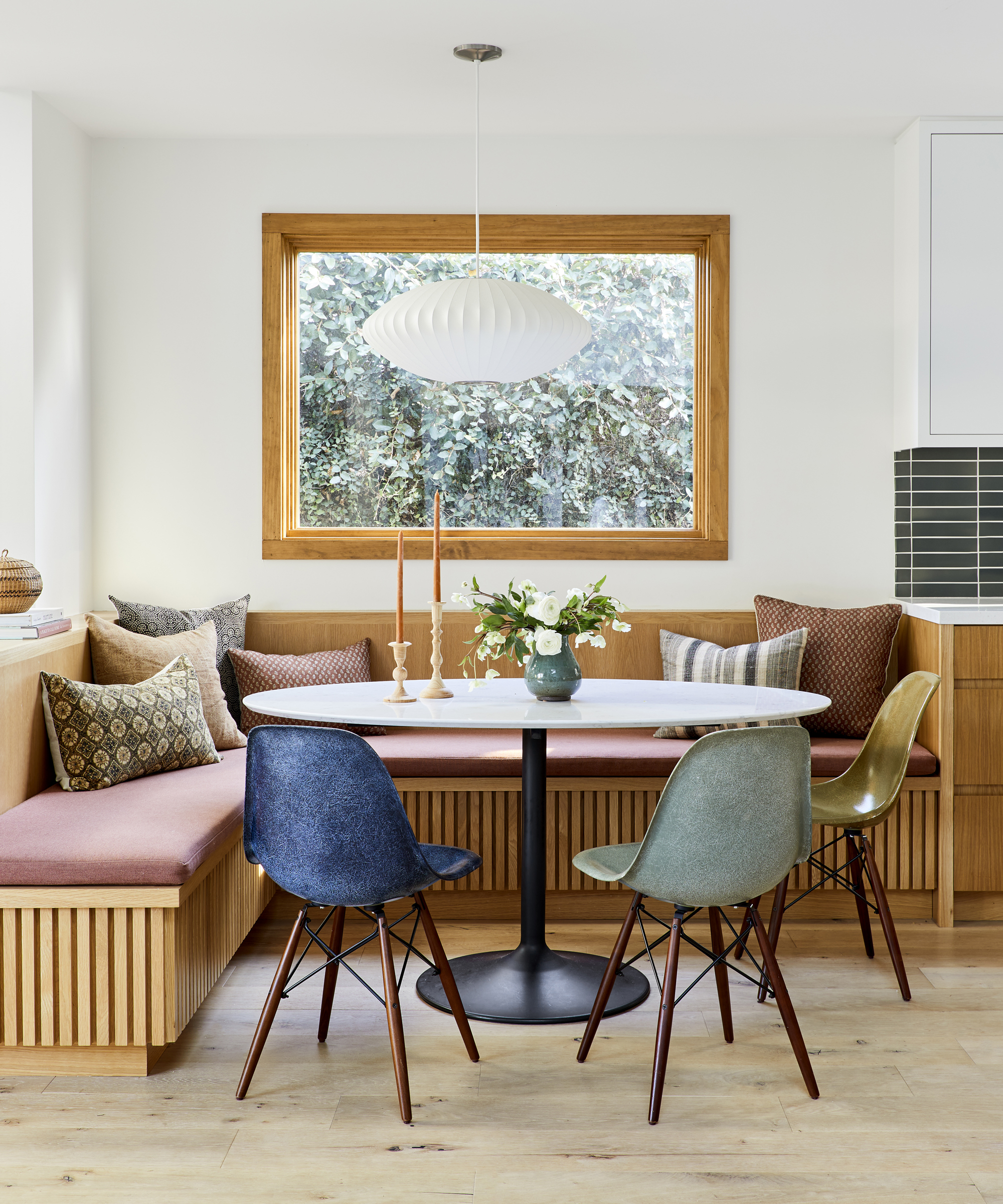
‘The dining nook is probably one of my favorite spots in the house,’ said Macdonald. It came about, however, somewhat accidentally.
‘We knew we wanted to add a built-in, and with the kitchen being a long, galley style, it suited being on the end. When we demoed, we had some unforeseen structural challenges that meant we had to keep the small built-out wall behind the bench. Rather than dwell on it, we made this into a divide between the kitchen and 'formal' dining room space.’
The L-shaped banquette seating surrounds a table made with the same quartz that tops the nearby island. ‘The toe-kick was purposefully designed to have a deep recess and gives the appearance that the whole bench is floating.... To add some earthy tones, we mixed in three different color Eames-style, fiberglass chairs from Modernica in mustard, green and blue.’
Dining Room
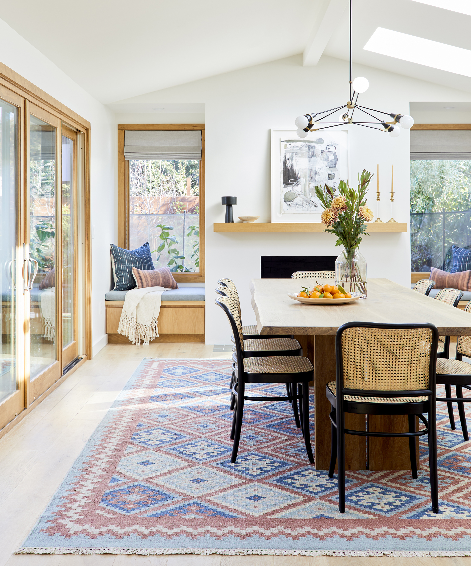
The lightest and brightest area of the space is dedicated to dining, but it has more than one use. ‘The 'formal' dining room – which is actually fairly cosy and casual – was already vaulted and had the fireplace built-out,’ said Macdonald, who added to this tall space by installing much larger windows, and really experimented with alternative dining room ideas by turning the space below them into reading benches with storage below for the clients' children.
Lighting was also carefully considered, with Macdonald opting for a contemporary chandelier design by Brendan Ravenhill. ‘We didn't want anything too heavy in here, as we wanted to keep the sightlines clear and have it feeling airy.’
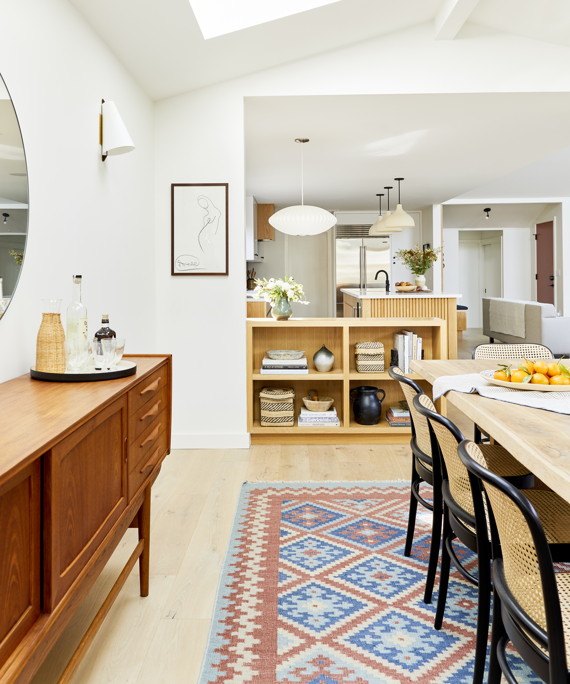
Below the sightline, things get a little warmer. A vintage teak credenza offers a ‘warm contrast to the other wood tones,’ said Macdonald, who plays it against the built-in oak shelving unit that backs the dining bench. Meanwhile, the dining table swaps the kitchen’s clean quartz for natural wood with uneven edges, and adds color to the whole room with a vibrant woven rug.
Boot bench
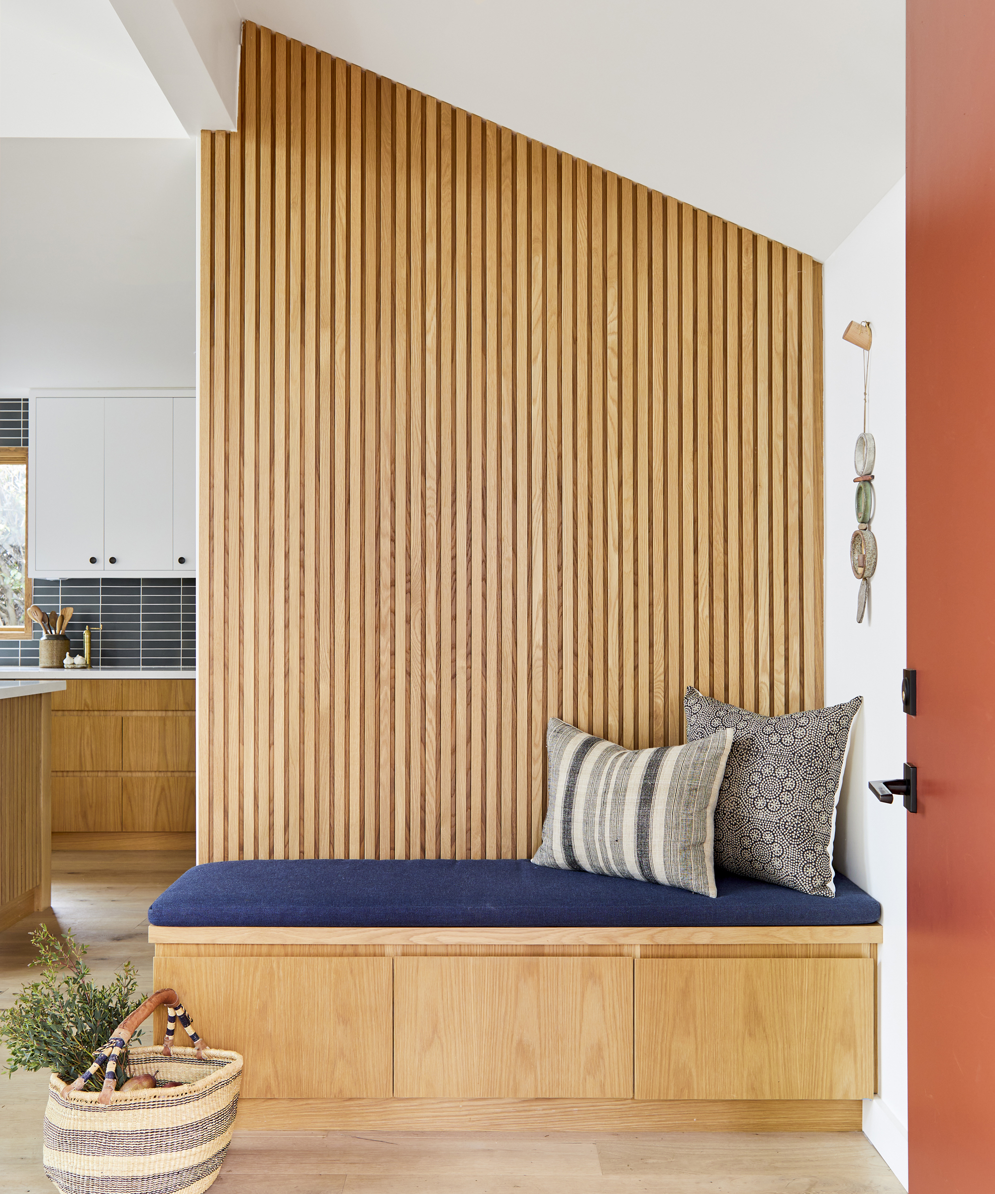
A small but important area of the space is the boot bench, which shuns traditional hallway ideas and acts like a mini mudroom on arrival into the house. The bench is built against a wall clad with more white oak, in a slatted panelling arrangement that echoes that on ends of the island. The bench is upholstered with blue fabric and features more handle-less cabinetry.
‘This wall was added to allow for a small divide between kitchen and entry, and provide an area for shoe storage and a bench to sit on,’ said Macdonald. ‘It was only natural that this became a highlight when you walk into the house.’
Main bathroom
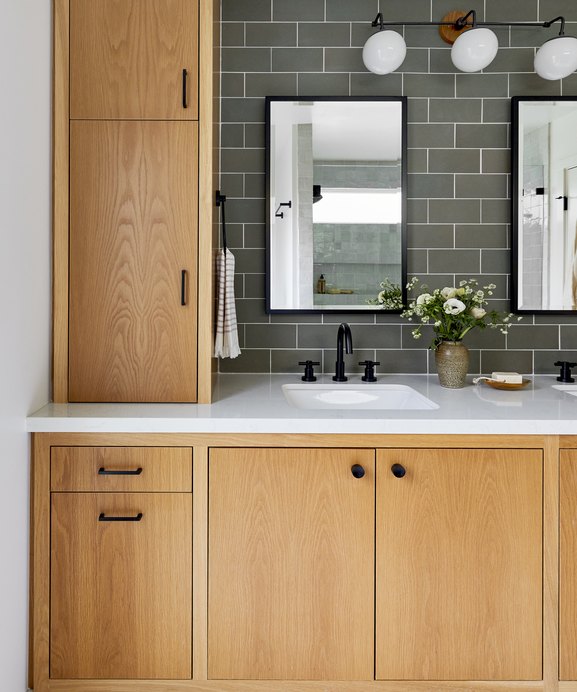
In the primary bathroom, we were able to create a full wall of cabinetry with linen closets, double sinks and pull-out laundry hampers’, explained Macdonald of her bathroom ideas. ‘Since we had the linen closets flanking the vanity, it formed the perfect cubby to add a full height feature tile for the backsplash. We used a dark green rectangle in a staggered formation from Heath Ceramics.
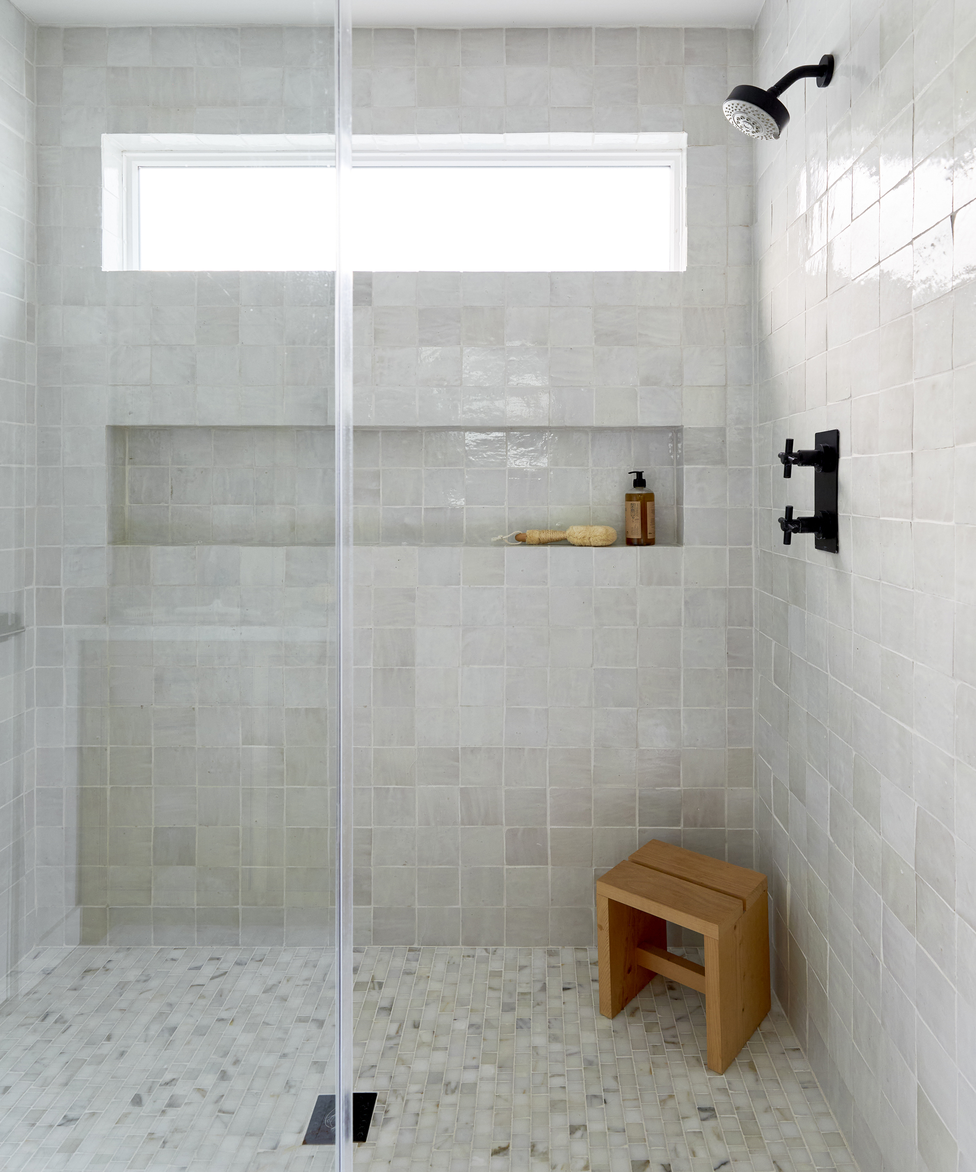
‘The shower area and flooring were kept neutral with a broken joint calacatta marble for the floor, and a square white zellige for the walls. Altogether it gives it a very zen vibe.’
Guest shower room
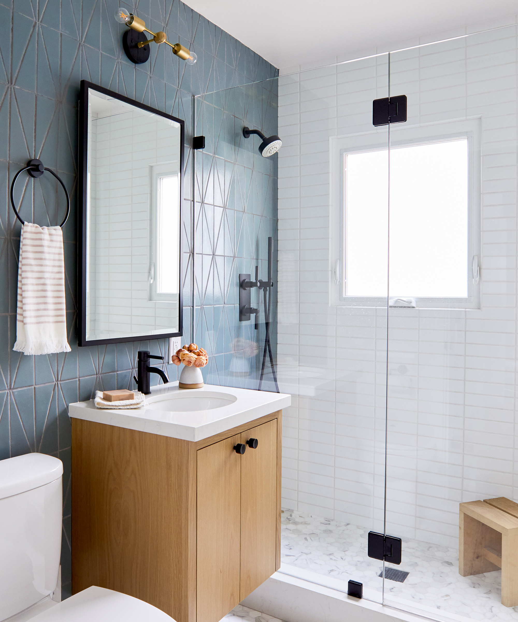
It is in the guest shower room, however, where contemporary tiling styles really come into their own. ‘A blue/green vertical stacked triangle from Fireclay was paired with a simple white horizontal tile and calacatta gold hex floor tiles,’ said Macdonald.
‘Since this bathroom is on the more conservative side, we designed the vanity as a wall mounted, floating piece so that it gives the illusion of having more space and air underneath.’
Kids' bathroom
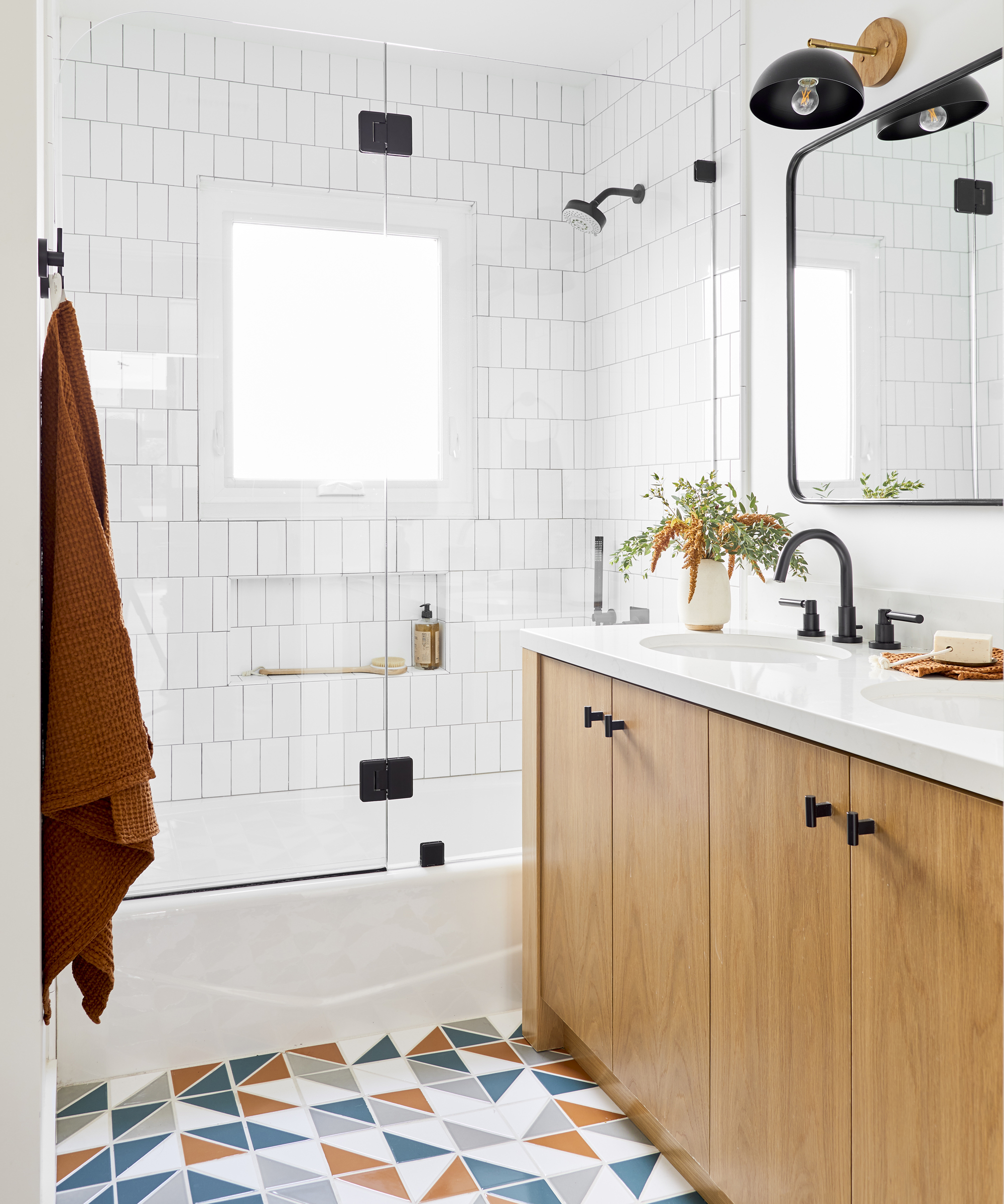
In the kids bathroom, Macdonald explained how she wanted to use tiles to create a ‘playful floor pattern’. This was achieved through a seemingly random pattern of orange, white, aqua blue and grey, that was actually pretty carefully orchestrated by Macdonald.
‘I literally laid most of this out in an adjacent room so that the installer could copy like-for-like – I'm sure they hated me!’
Interior design / Ginny Macdonald
Architecture / Stephen Cho
Contractor / Watson Bros Construction
Photography / Sara Tramp

Ailis started out at British GQ, where a month of work experience turned into 18 months of working on all sorts of projects, writing about everything from motorsport to interiors, and helping to put together the GQ Food & Drink Awards. She then spent three years at the London Evening Standard, covering restaurants and bars. After a period of freelancing, writing about food, drink and homes for publications including Conde Nast Traveller, Luxury London and Departures, she started at Homes & Gardens as a Digital Writer, allowing her to fully indulge her love of good interior design. She is now a fully fledged food PR but still writes for Homes & Gardens as a contributing editor.