Goodbye plain white ceilings – designers say color capping is the clever paint hack that makes a small living room feel taller
It creates the illusion of more space while adding plenty of charm

Design expertise in your inbox – from inspiring decorating ideas and beautiful celebrity homes to practical gardening advice and shopping round-ups.
You are now subscribed
Your newsletter sign-up was successful
Want to add more newsletters?
Contrary to popular belief, I think there is something so wonderfully intimate and cozy about a petite living room. A snug space designed for lounging? Perfection.
But when I moved into my own small living room, I wanted to find ways to create the illusion of height without having to resort to structural changes. Thankfully, I discovered the color capping trend just at the right moment.
Described as a tonal technique that graduates color up to the ceiling to 'draw the eye upward and create a sense of polish', this clever paint trick is the easiest way to make a small living room look bigger. But don't just take my word for it.
Article continues belowWhy you should 'color cap' your living room
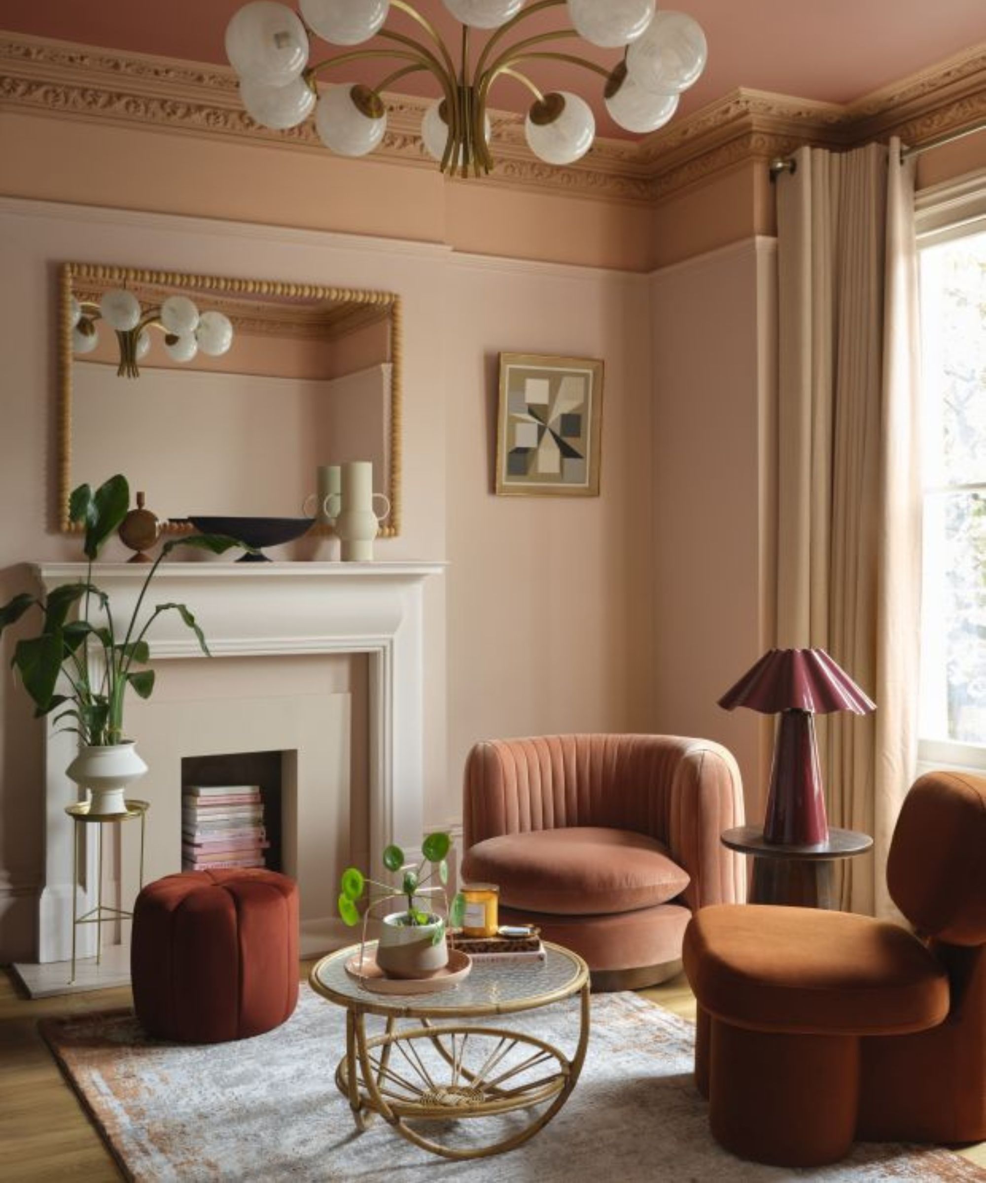
Simply put, this color trend is a paint technique that subtly creates a tonal escalation of color. And unlike color drenching, which washes a space in one bold hue, color capping works with subtle gradients from the same color family.
Typically, the idea is to start at the baseboards with the lightest hue, then graduate with a medium wash of color on the walls, and end with a richer ceiling paint.
'It can be cleverly used to create the illusion of more height and space,' explains Helen Shaw, director of marketing at Benjamin Moore. 'When done with care, a soft, tonal shift between the walls and ceiling allows the eye to travel upward without interruption, visually lifting the ceiling.'
'By avoiding stark contrasts or heavy dark tones overhead, and instead using mid-depth shades that gently graduate, the room feels more open and expansive while still retaining character and warmth.'
Design expertise in your inbox – from inspiring decorating ideas and beautiful celebrity homes to practical gardening advice and shopping round-ups.

An under-the-radar Benjamin Moore color, Queen Anne Pink is described as a pale peach with 'understated elegance' and has been used in the living room above on the lower third of the wall.
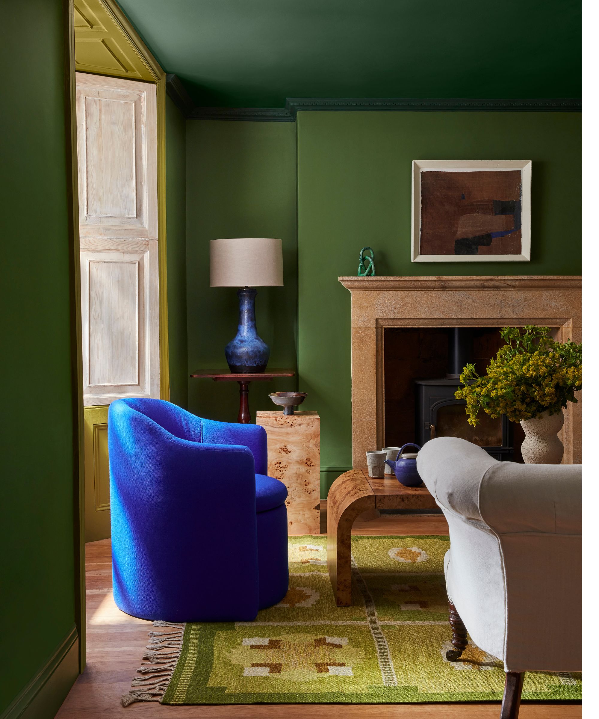
'For small living rooms where every inch matters, this illusion of expanded volume can be game-changing,' adds designer Nina Lichtenstein.
'The effect of color capping in a small living room is twofold: the ceiling feels like a natural extension of the space rather than a hard stop, and the darker cap overhead visually recedes, tricking the eye into perceiving greater height,' she adds.
Even in a neutral living room, just shifting a shade or two deeper at the top changes the proportions dramatically and creates a more dynamic living room color scheme.
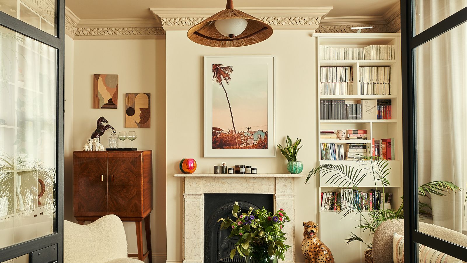
'Imagine walls in a creamy stone, molding in warm sand, and a ceiling in soft mushroom; the space suddenly feels cocooning and intimate, yet larger at the same time,' says Nina.
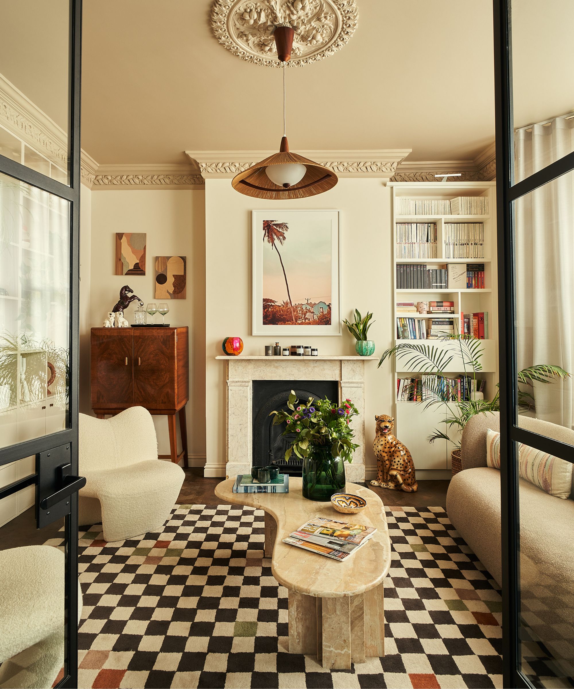
Equally, by wrapping the walls and ceiling in deepening shades of the same hue, the room feels cozier and serene, just like in this cozy transitional living room filled with vintage pieces by Vinterior, seen above.
'In a small living room, color capping can instantly make the space feel cozy and inviting,' adds Helen. 'This gentle wrap of color makes the space feel intentional and polished, while also enhancing the sense of comfort that a smaller room naturally provides.'
'Painting the ceiling a different color or even letting it bleed 10-12 inches down the wall creates this beautiful, cocooned effect,' agrees designer Kristina Khersonsky of STUDIO KEETA. 'It adds depth, warmth, and visual interest, especially in smaller spaces.'
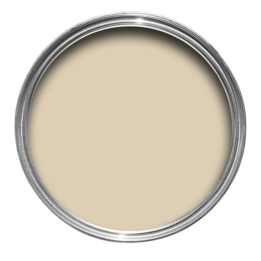
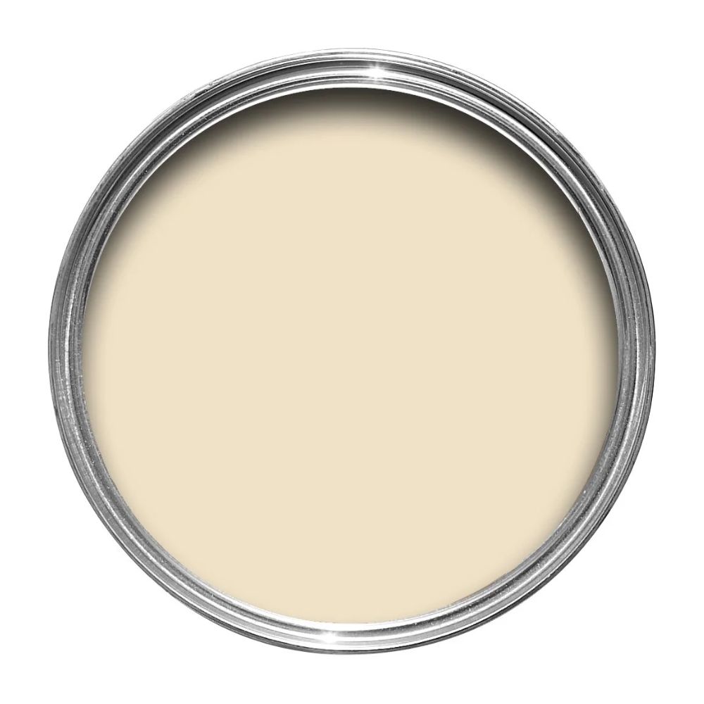
Matchstick is an under-the-radar Farrow & Ball paint named after the unbleached wood used on a matchstick. It is a warm neutral that doesn't read creamy or beige on the wall.
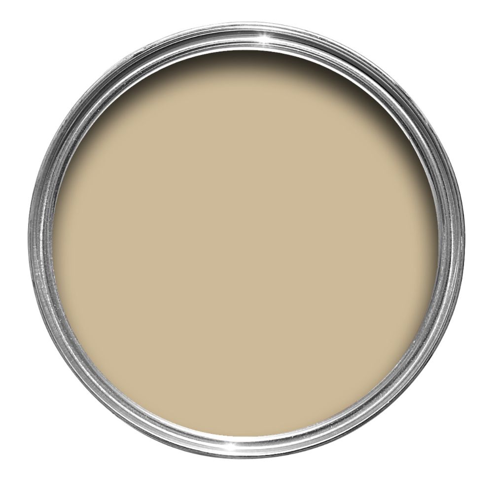
Cord is one of the best yellow paints in my book. It is earthy, versatile, and warm without looking like a classic 'sunshine' yellow, and creates a lovely gradient from Matchstick.
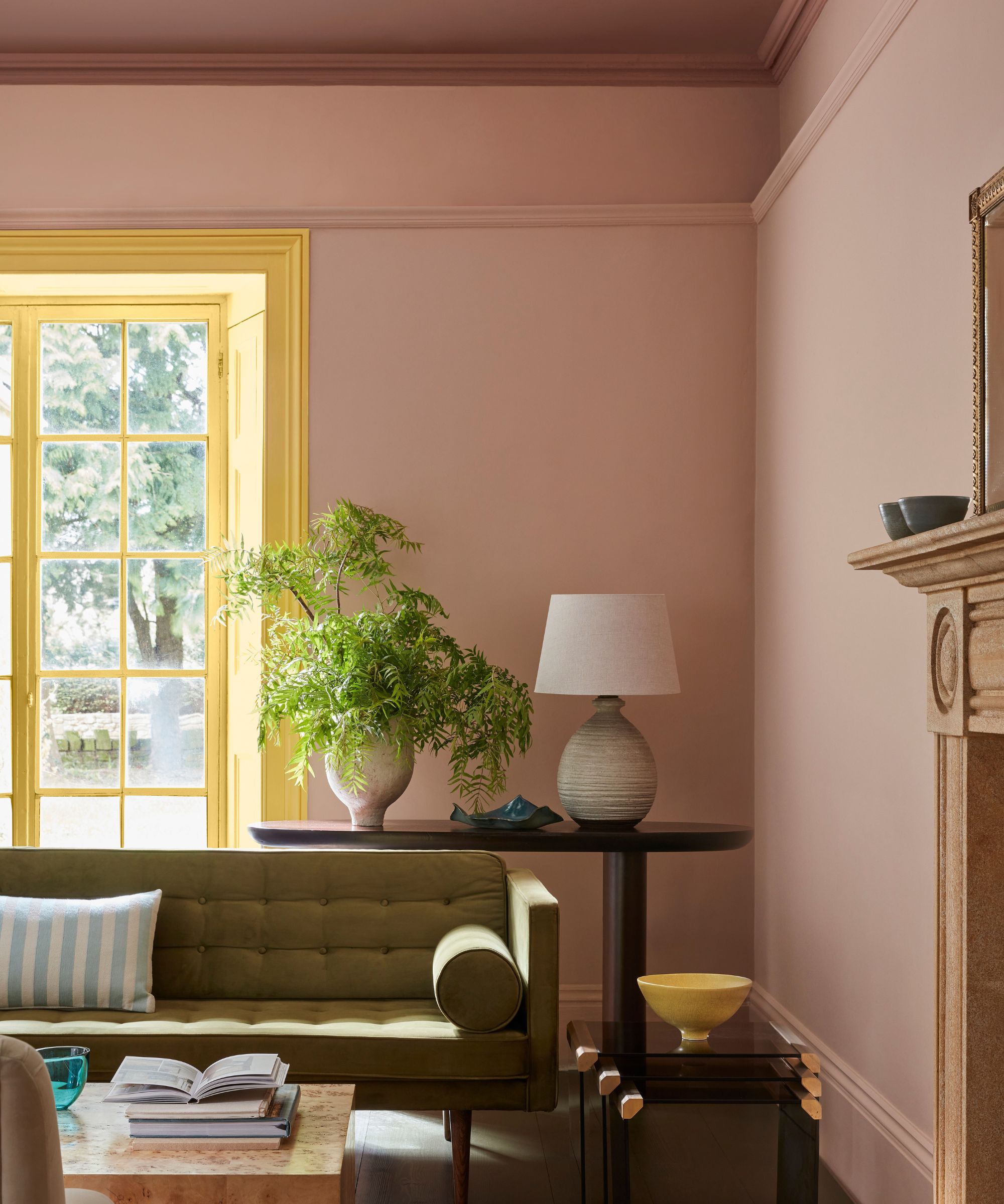
It can also be an incredible way to emphasize or even create the illusion of architectural detail. In period homes, using slightly different tones can highlight original moldings and cornices. In newer spaces, this color combination adds depth and sophistication even when the trim is minimal.
'It doesn’t have to be high-contrast either. Using two slightly different tones within the same color family can create a layered, architectural feeling,' Kristina continues. 'It’s an old-school technique rooted in Italian design and fresco work, but when modernized, it brings so much soul to a room.'
On the other hand, designer Nicole Forina counters, adding: 'I think color capping is a fantastic idea – especially when it’s done with high-contrast colors that highlight beautiful architectural moldings on the ceiling. It creates a sense of intimacy and balance in a space that might otherwise feel overwhelming with very high ceilings.'
'Either way, the key is restraint,' advises Nina. 'Choose hues that share undertones so the transitions read intentional and fluid and echo those tones in upholstery, drapery, or even a throw to unify the palette, ensuring the entire room feels cohesive from sofa to ceiling.'
The beauty of this technique is its flexibility. Whether you want a cozy, cocooned vibe or a more airy feel, color capping allows you to play with scale, mood, and architectural detail simultaneously. Plus, it’s a trick that works with virtually any room color, from soft neutrals to bold, statement hues.

Charlotte is the style and trends editor at Homes and Gardens and has been with the team since Christmas 2023. Following a 5 year career in Fashion, she has worked at many women's glossy magazines including Grazia, Stylist, and Hello!, and as Interiors Editor for British heritage department store Liberty. Her role at H&G fuses her love of style with her passion for interior design, and she is currently undergoing her second home renovation - you can follow her journey over on @olbyhome
