Designers who never follow trends swear by this color family to make their homes look timeless
If you want to create a timeless color scheme, look no further than decorating with a collection of blues

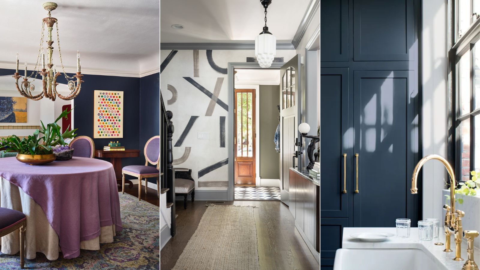
When we think of the most timeless colors, light neutrals such as warm whites and sandy earth tones are often the first to come to mind. However, there's another more colorful hue that designers assure is just as timeless.
I recently asked a selection of interior designers who don't tend to follow the latest trends which color they deem to be the most timeless. While I was expecting light neutrals to be the clear winner, decorating with blue is in fact what stood out.
If you're looking for a timeless color to incorporate into your home that endures beyond quickly passing color trends, read on. Designers say that various blues (most notably navy blue) are an enduring color choice that'll hold their own for years to come.
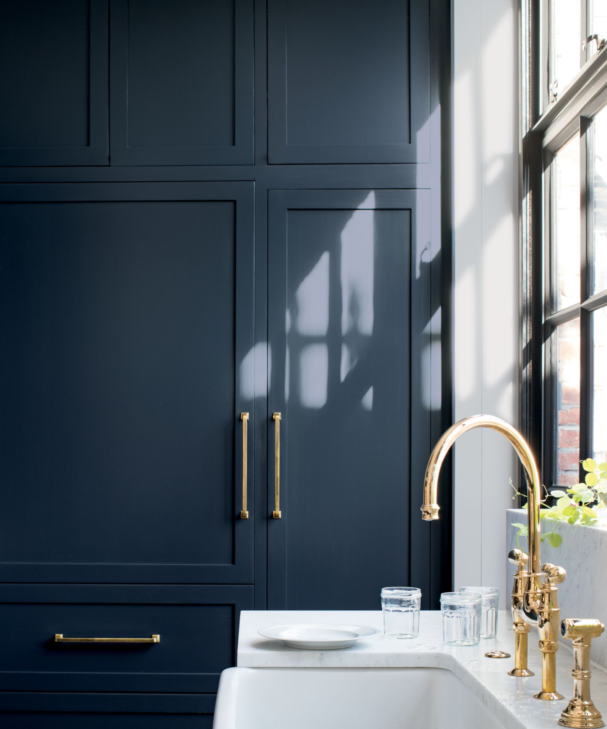
Benjamin Moore's Hale Navy
'A timeless home color is typically an off-white or pale neutral color, however picking a paint color for everlasting style has more to do with the architecture and emphasizing key characteristics. Typically, a navy blue can help with this, and Benjamin Moore's Hale Navy can achieve this look for generations to come,' suggests interior designer Sarah Latham of Latham Interiors.
Denver-based interior designer Nadia Watts also associates blue with timeless design, also favoring decorating with Benjamin Moore's Hale Navy: 'Hale Navy is a workhorse color, suitable for all types of rooms, walls, and ceilings. Navy goes with everything – it works really well as a neutral because it complements so many colors.'
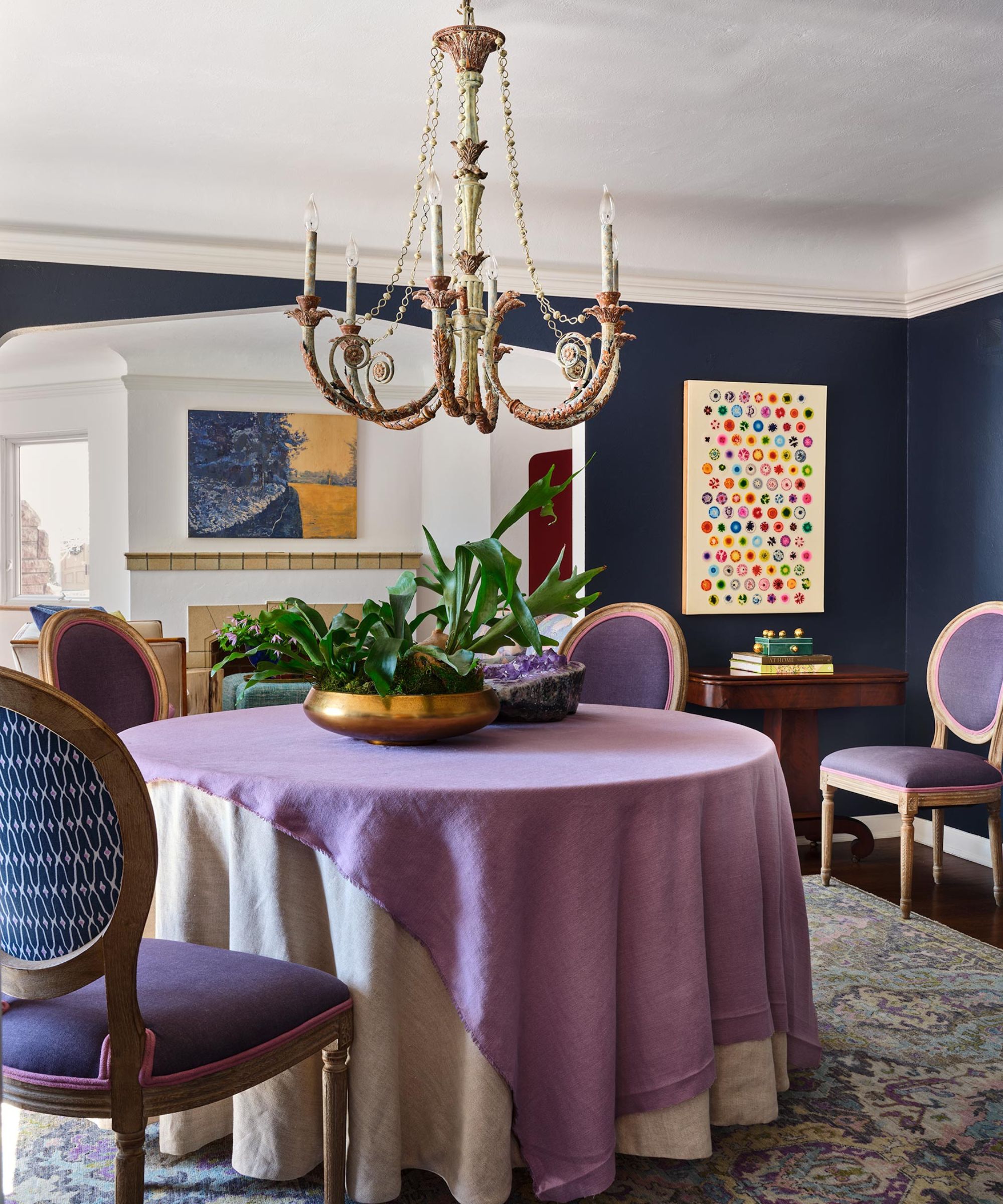
In the dining room pictured below, Nadia used Hale Navy across the walls, creating a sophisticated space with more depth than a palette of light neutrals. 'Hale Navy envelopes a room with timeless elegance and elevates everything around it. It looks beautiful with a wide range of wood tones making it a great choice if you have wood floors. It’s historical, classic, and clean. You really can’t go wrong with Hale Navy,' adds Nadia.
But why exactly does decorating with blue feel timeless? Blue is widely known as a color that's closely linked to the natural world, conjuring images of the sea and sky which give it enduring appeal. Similarly, the same can be said about decorating with green, another natural-world-inspired color that tends to feel stylish and beyond the trends.
Design expertise in your inbox – from inspiring decorating ideas and beautiful celebrity homes to practical gardening advice and shopping round-ups.
'To us, nothing says timeless more than nature-inspired palettes,' explains interior designer Patrick Fox of NYC-based Crafted Interiors. 'Emerald greens are definitely a trend, but if you opt for a more historical shade, you'll have a design to last. Farrow & Ball's Green Smoke is a favorite of ours as it has a slightly blue undertone which makes it ever-changing depending on the lighting. This color also translates beautifully into textiles and is great for upholstery pieces.'
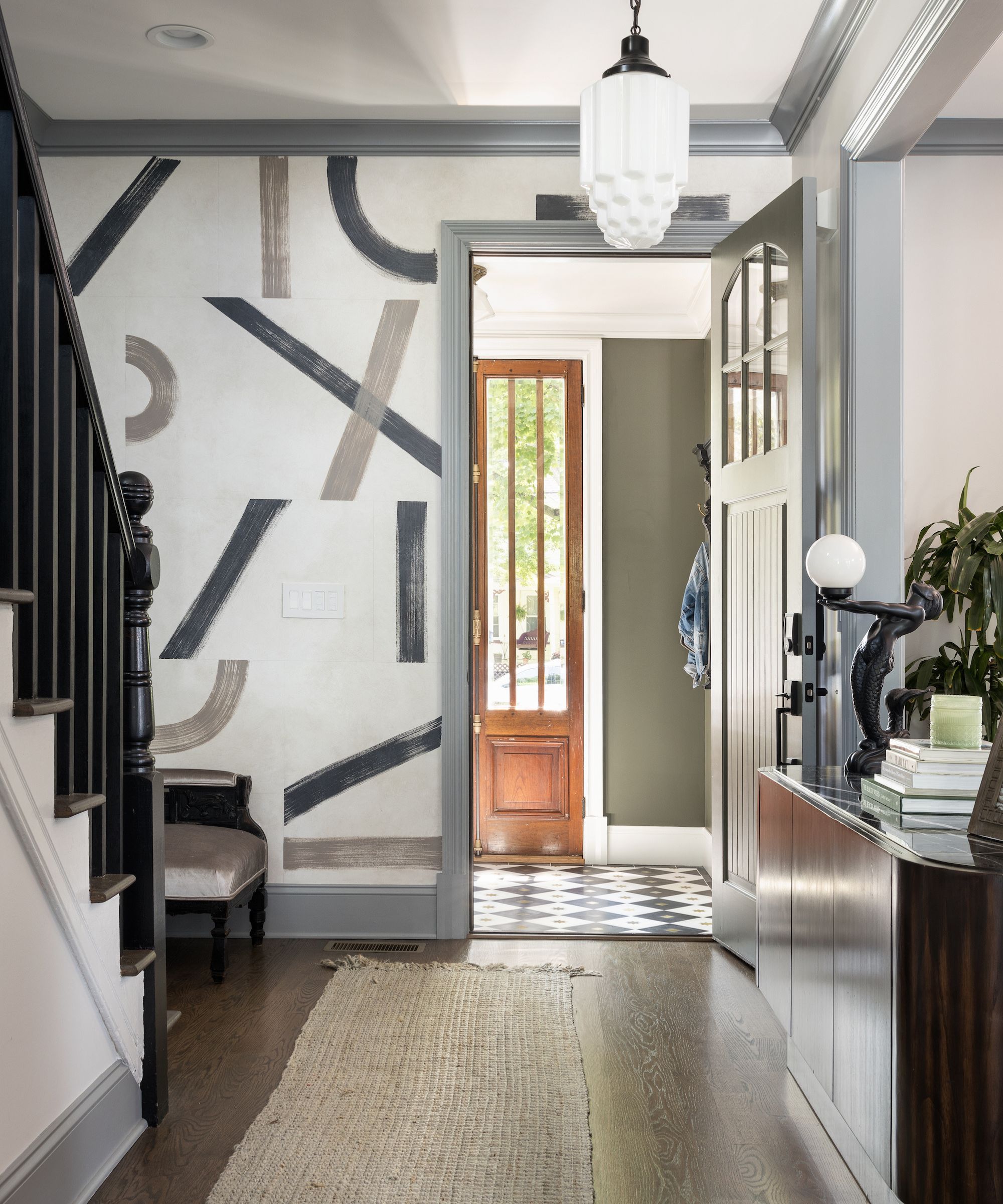
If you find that navy blue is too dark for your space, lighter and more muted blues can be just as effective in creating a timeless color scheme. From pale blue paints to dark blue paints, blue is a universally classic choice that offers something to all interior design styles.
'Cobblestone Path by Benjamin Moore is the quintessential French blue that exudes timeless charm for even the most fun spaces,' explains designer Jaclyn Isaac of Doni Douglas Design. 'It feels natural and at home in any classic color palette. For a subtle yet impactful touch, we love the idea of applying it to interior trim where you want a hint of color without overwhelming the space.'
Shop our favorite blue paints
If you're aiming to design a home that never dates, opting for blue paints is a great way to go, according to designers. Whether you prefer the sophisticated appeal of dark navy blue paints or the calming quality of lighter blue paints, we've rounded up a selection of our favorites below for you to shop.
After more help with mastering your timeless room color ideas? Take a look at the colors designers return to when they have trend fatigue. As well as navy blue, there are four other shades worth considering.

Emily is a freelance interior design writer based in Scotland. Prior to going freelance in the spring of 2025, Emily was Homes & Gardens’ Paint & Color Editor, covering all things color across interiors and home decor for the Homes & Gardens website. Having gained specific expertise in this area, Emily is well-versed in writing about the latest color trends and is passionate about helping homeowners understand the importance of color psychology in home design. Her own interior design style reflects the simplicity of mid-century design and she loves sourcing vintage furniture finds for her tenement flat.


