This Farrow & Ball color combination is a sophisticated celebration of 'Barbiecore'
Farrow & Ball's Color Curator Joa Studholme shares a stylish solution to the season's most provocative interior design trend

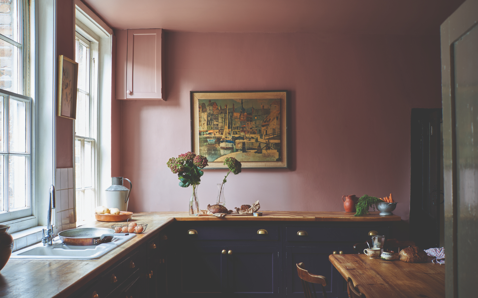
Barbiecore, the boldest trend of the summer, is not for the color shy. This nostalgic pink aesthetic has dominated social media – spurred primarily by Greta Gerwig’s aptly named movie, Barbie.
While Barbiecore is only a recent movement, it has already made headlines across the industries – influencing celebrity wardrobes and high fashion shows. It is no surprise; therefore, that pink is currently dominating interior design trends, too.
Though, in all its flirtatious fun, Barbiecore can be hard to get right. The trend is synonymous with over-indulgent color ideas – which may be popular now – but how can you ensure your pink stands the test of time? If anybody can make it possible, it is Joa Studholme.
Joa, the Color Curator at Farrow & Ball, has shared two color combinations that pay homage to the trend in the most sophisticated way possible. And even if Barbiecore passes, we expect these color combinations to endure many seasons ahead.
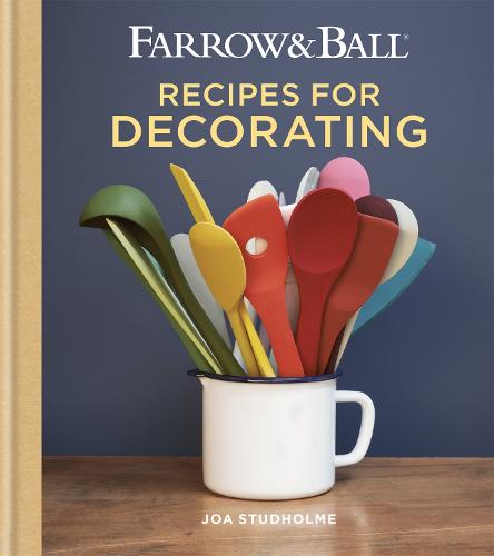
Joa Studhome is a Color Curator and author of Farrow & Ball titles including Recipes for Decorating and How to Decorate. Joa has been with Farrow & Ball for over 25 years – in that time, she’s developed world-renowned color ranges and consulted on design projects and trend all over the world, as well as helping countless color consultancy customers to transform their homes.
How to style Barbiecore – according to Farrow & Ball
'Pink has proved to be enduringly popular ever since ‘millennial pink’ became the color du jour for a certain generation. We have enjoyed blush pinks, baby pinks, and just the merest hint of pink, but right now, we are all yearning for some properly indulgent sugary pink in the home,' Joa says.
But when decorating a pink room in the Barbiecore era, she suggests two shades in particular: Sulking Room Pink and Archive color Fruit Fool. Below are the tones she recommends pairing them alongside.
Sulking Room Pink and Paean Black
Farrow & Ball's Sulking Room Pink and Paean Black
'Sulking Room Pink used on the walls of this kitchen certainly creates a wow factor but also feels fabulously inviting – it positively glows,' Joa explains.
Design expertise in your inbox – from inspiring decorating ideas and beautiful celebrity homes to practical gardening advice and shopping round-ups.
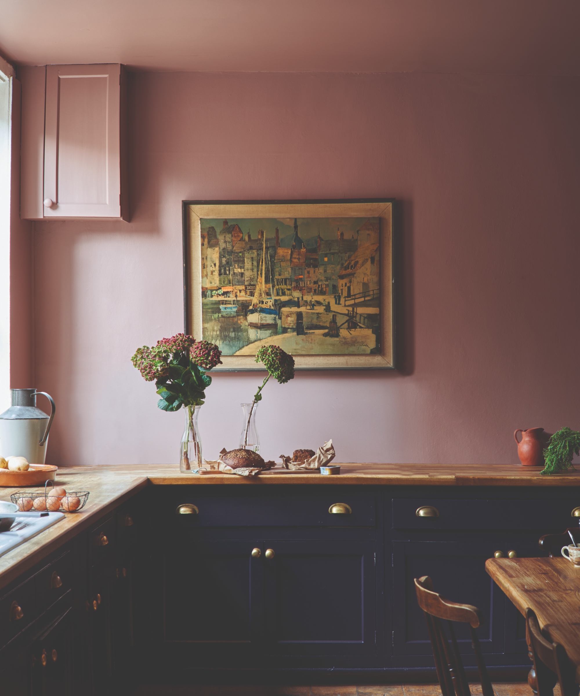
The image below exemplifies bold kitchen ceiling ideas by using Sulking Room Pink on the ceiling and the walls. This allows you to feel 'wrapped' in the pink's warmth, 'while the white used on the windows accentuates its pink tone' and creates a youthful feel. Much like that of Barbiecore.
Farrow & Ball's Sulking Room Pink and Paean Black
'Living with pink puts a skip in your step and brings you succor – and additionally, this room still feels perfectly grounded by the unexpected use of luxe Paean Black on the units,' Joa says.
Fruit Fool and Cola
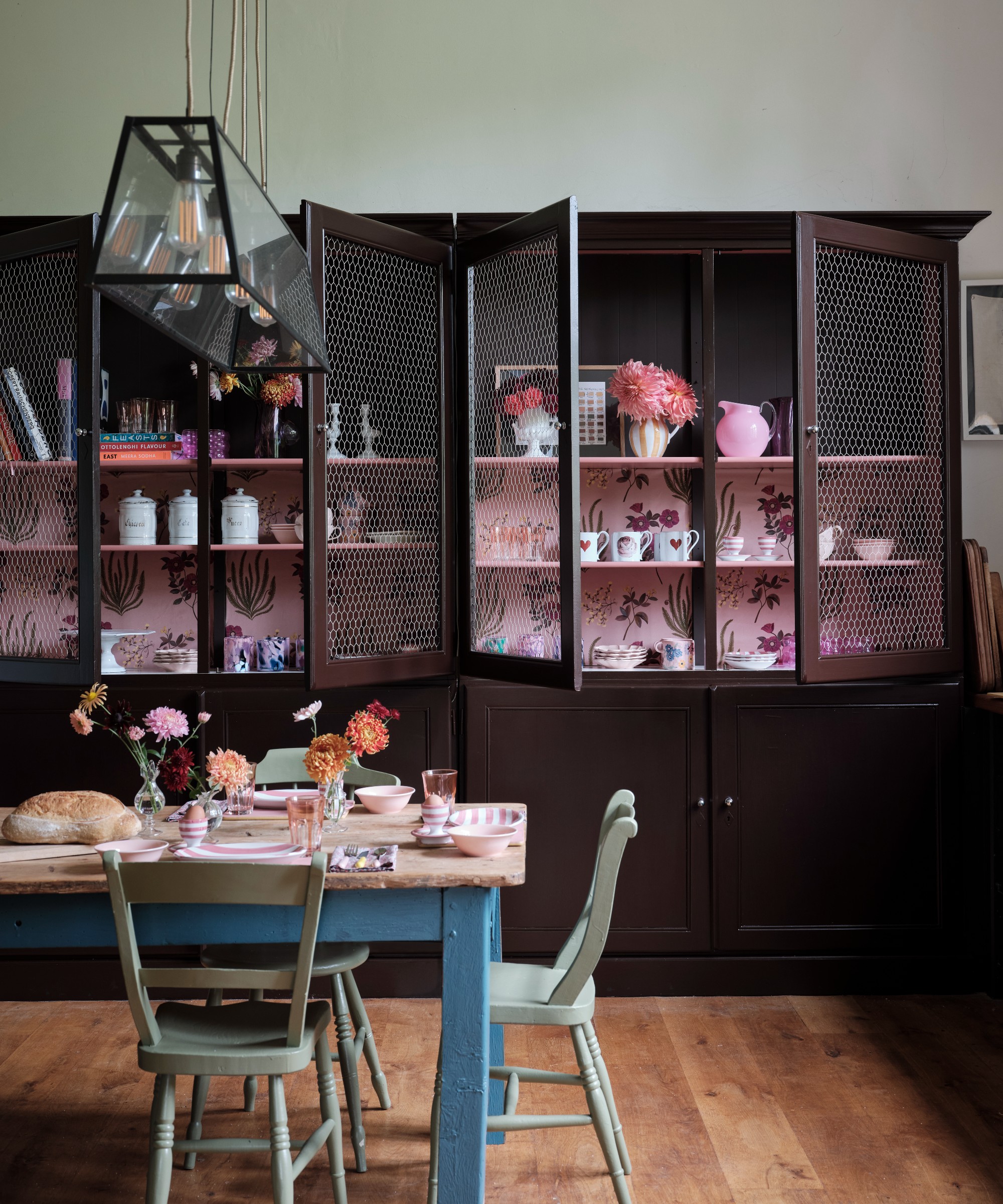
Farrow & Ball's Fruit Fool and Cola
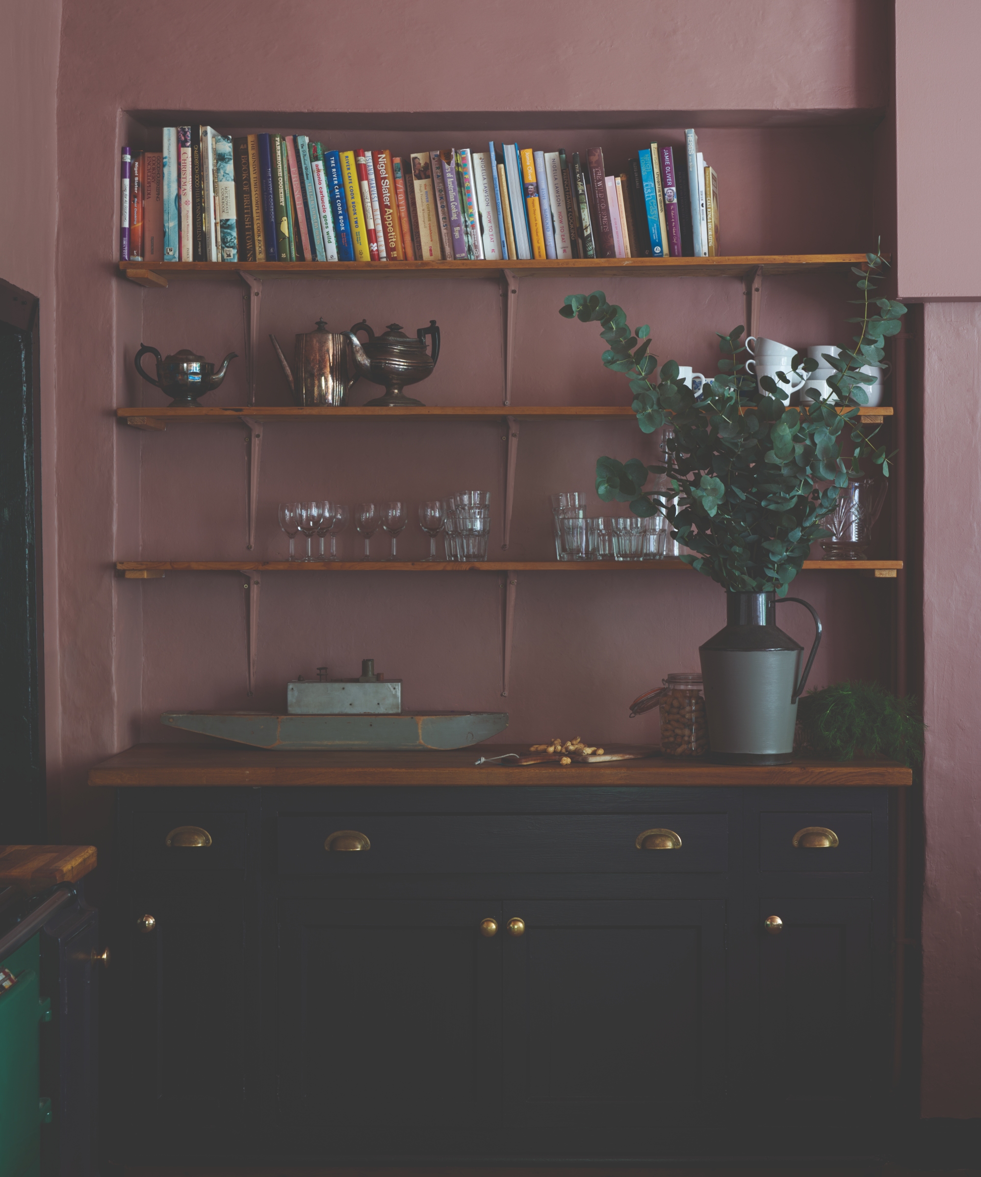
Alternatively, Fruit Fool's pink hues pair well with warm darks like rich brown Cola.
'Pink just makes you smile, and no more so than when you come across it in an unexpected place. Here, used in the back of a kitchen dresser, it can’t fail to raise your spirits, especially when combined with so many pink accessories,' Joa explains.
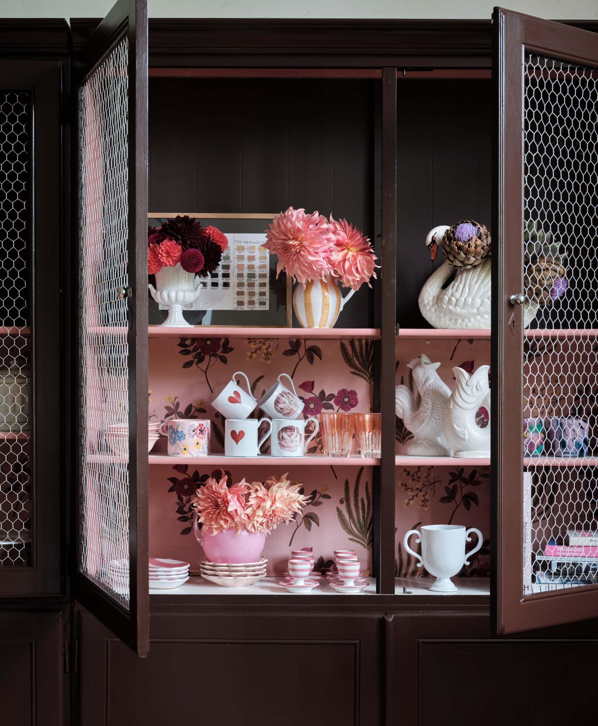
Farrow & Ball's Fruit Fool and Cola
Joa describes this pink and brown kitchen color idea as 'bohemian' – adding that the space felt somewhat botanic before adding the pink. 'If you combine any pink solely with white you get a totally different feel – one of fun and freedom.' This is everything we want and expect from Barbiecore.

Megan is the Head of Celebrity Style News at Homes & Gardens, where she leads the celebrity/ news team. She has a history in interior design, travel, and news journalism, having lived and worked in New York, Paris, and, currently, London. Megan has bylines in Livingetc, The Telegraph, and IRK Magazine, and has interviewed the likes of Drew Barrymore, Ayesha Curry, Michelle Keegan, and Tan France, among others. She lives in a London apartment with her antique typewriter and an eclectic espresso cup collection, and dreams of a Kelly Wearstler-designed home.
