'I wanted this home to be a museum of me. For people to walk in and their jaws drop' – tour the eccentric home of club king Glyn Fussel
Canine motifs and opulent glass stand out against a sophisticated color palette in this 1840s London home in the suburbs

Design expertise in your inbox – from inspiring decorating ideas and beautiful celebrity homes to practical gardening advice and shopping round-ups.
You are now subscribed
Your newsletter sign-up was successful
Want to add more newsletters?
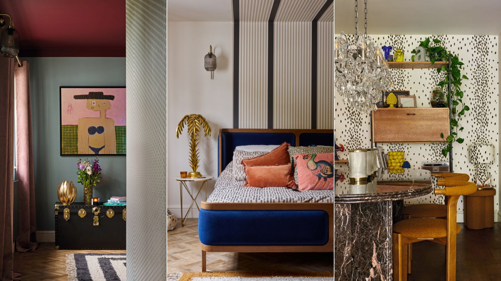
'Adult Camp Glamour' was the brief I gave myself when thinking about this house design,’ says the renowned events organizer, Glyn Fussell – known in the UK as the King of Clubbing. His 1840s home is on the edge of Epping Forest, bordering London and Essex is full of Dalmatian print, Murano glass, and opulent lighting. It’s safe to say he nailed it.
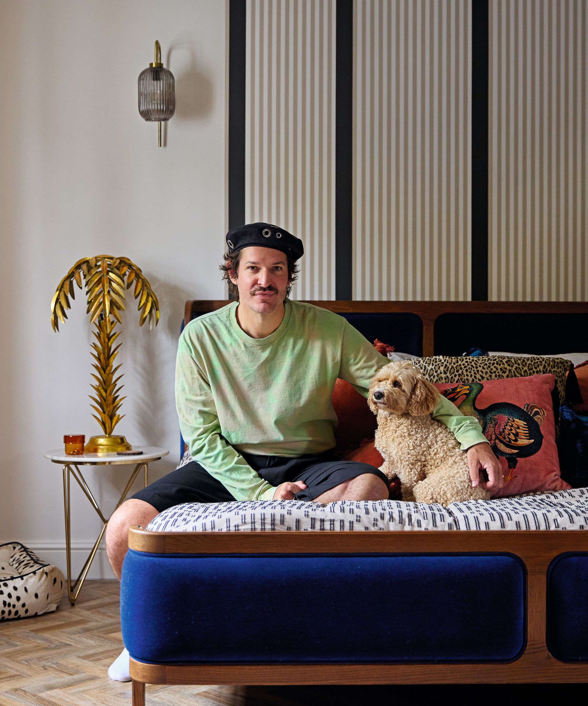
Wallsin Au Lait; Stripe wallpaper, Carte Blanche collection by Christopher John Rogers for Farrow & Ball.
But for the man behind the era-defining (and now defunct) LGBTQ+ club night/fancy dress extravaganza Sink the Pink, and Mighty Hoopla festival, which saw 60,000 people show up this summer to dance to live performances, the house was designed to be an antidote to his party lifestyle, and that’s where the ‘adult’ bit comes in.
‘As I was getting older, I had an urge to feel calm and safe,’ Glyn says. ‘To have a relaxing home that I could turn into a nest, that would balance out my work life.’ Glyn’s way of creating a haven – one ‘that people will still walk into and know immediately could only belong to me’ – centered around color.
Article continues below 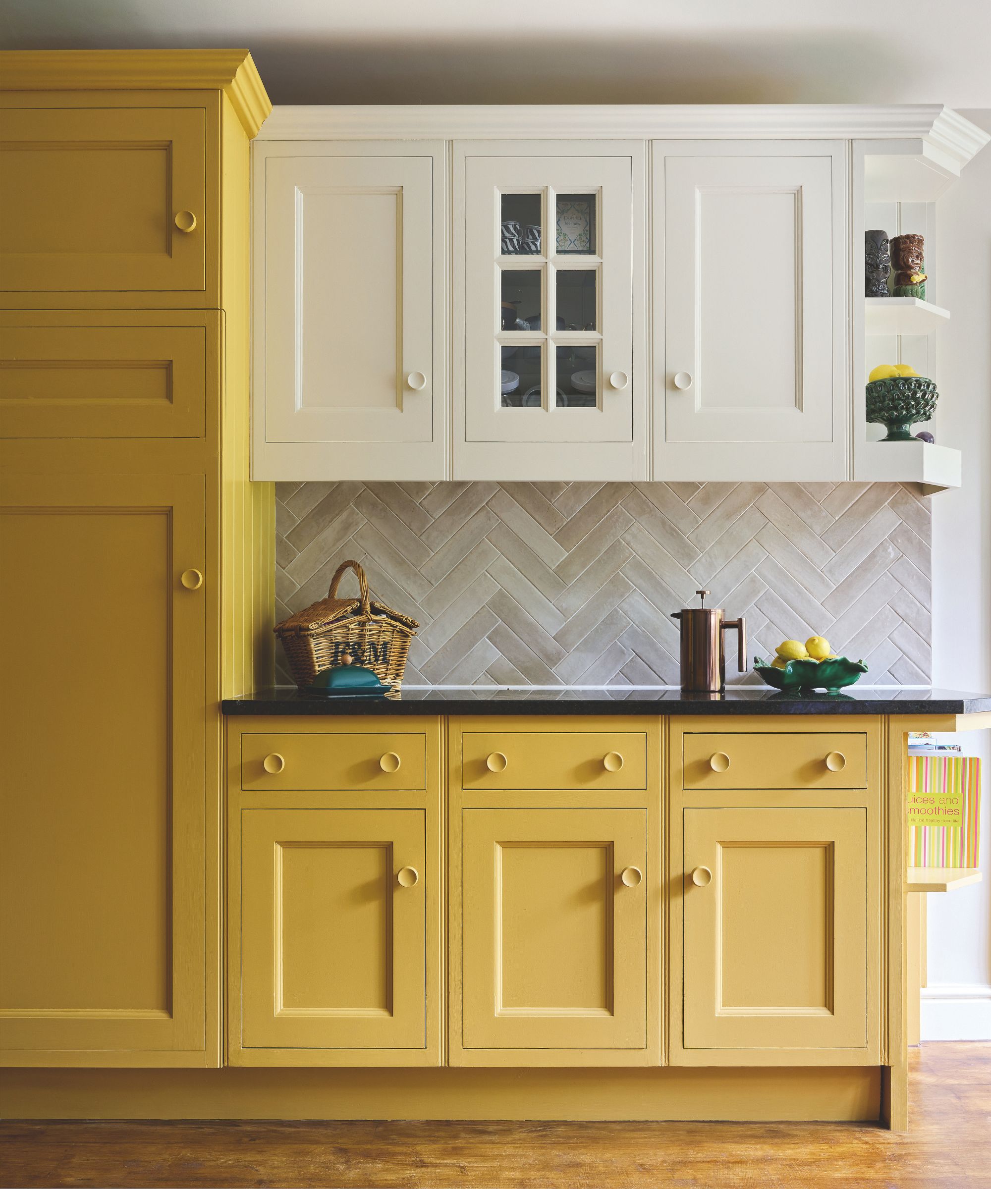
Units in India Yellow, Farrow & Ball. Hoxton tiles, Mandarin Stone.
He had been working with Farrow & Ball on its 'Painting with Pride' initiative, which was developed to decorate LGBTQIA+ venues with the Carte Blanche collection of papers and paints by Christopher John Rogers, helping create public places the queer community could feel at home in.
‘I am so excited to make these spaces great again,’ Glyn said of the partnership, which has since seen overhauls of gay landmarks like the Margate Arts Club and the Leslie-Lohman Museum of Art in New York. So it seemed only natural to have Farrow & Ball’s brand ambassador Patrick O’Donnell help Glyn with this project.
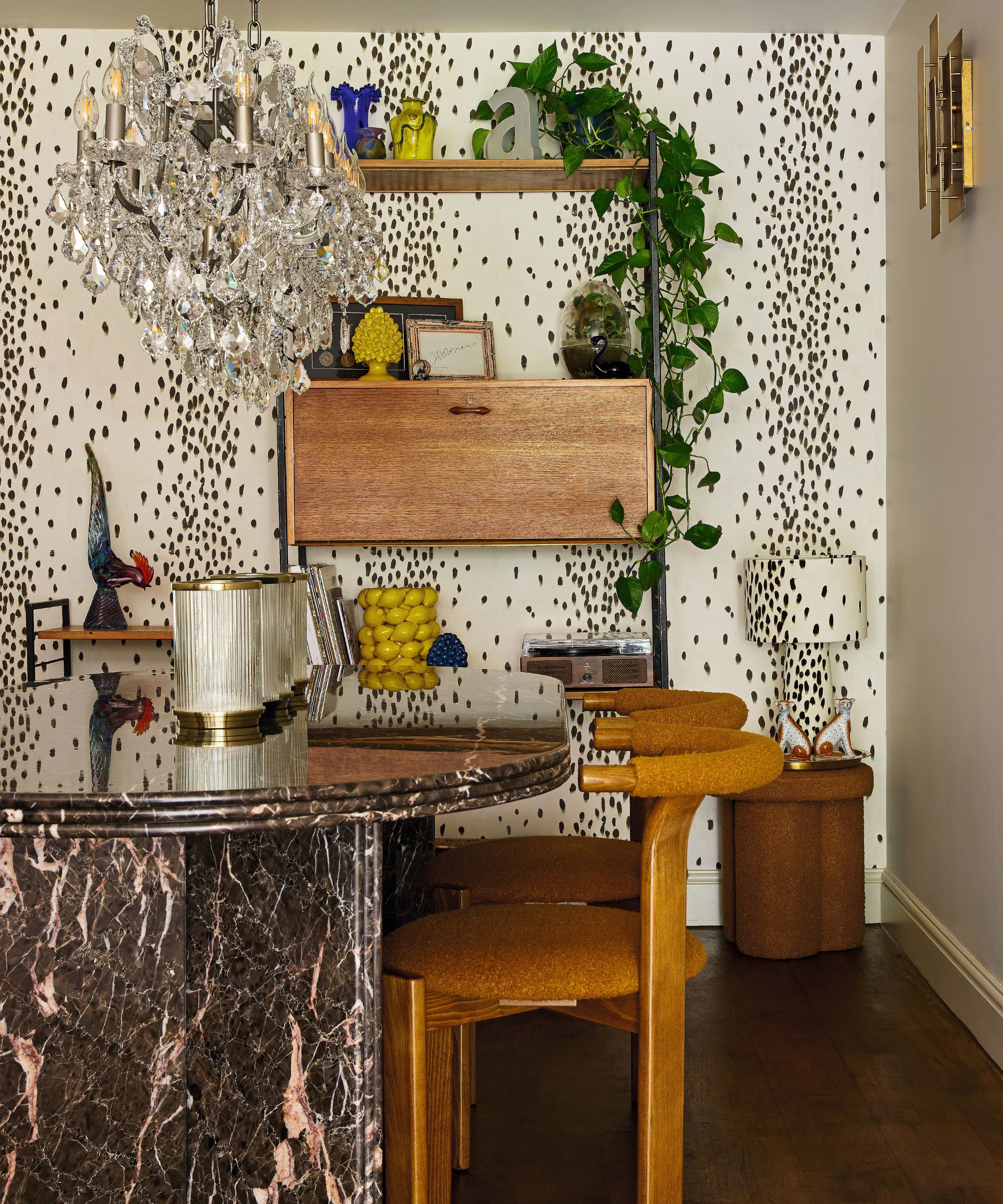
Tottenham Dalmatian wallpaper; lamp, both Poodle & Blonde. Dining table ; chairs, both Soho Home. Chandelier, Timothy Oulton. Vintage shelving unit, Vinterior.
‘Patrick gave me the confidence to go in some of the bold color directions I’d been considering,’ Glyn says. ‘He pushed me to paint the ceiling in the snug in Preference Red, a deep burgundy that makes the room feel like a camp theatre.’
The idea to pair this with the silvery blue tones of Sardine on the walls came from a vintage pinball machine Glyn owned, where the two colors worked in harmony, ‘but that I probably wouldn’t have thought to copy had Patrick not put it forward,’ Glyn says.
Design expertise in your inbox – from inspiring decorating ideas and beautiful celebrity homes to practical gardening advice and shopping round-ups.
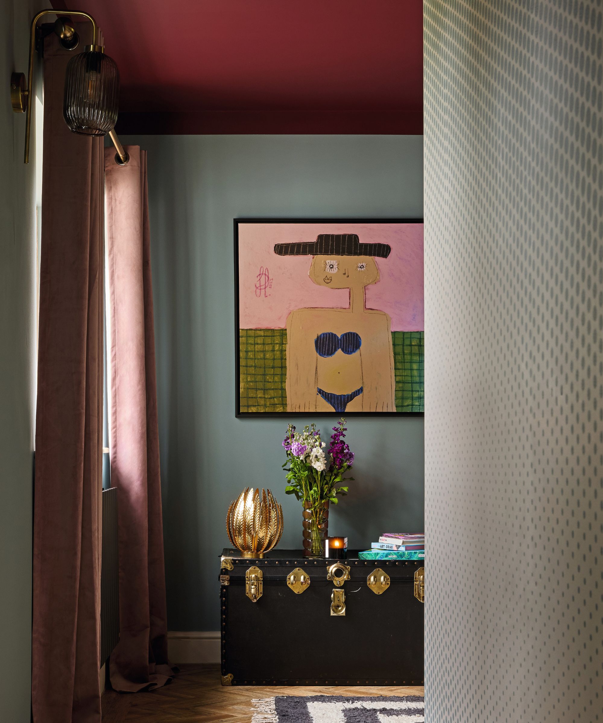
Walls in Sardine; ceiling in Preference Red, both Farrow & Ball. Dot wallpaper, Carte Blanche collection by Christopher John Rogers for Farrow & Ball. Artwork by Thierry Noir. Gold light, John Lewis & Partners.
‘I would never have gone with a yellow kitchen but I’m so glad he suggested it. The India Yellow paint we chose for the units has a mustard tone that people gravitate towards, and works well with the warm light of the chandelier and vintage sconces.’ Each room has its own color theme, but Glyn says it doesn’t feel disjointed as his personality and love of dogs and canine motifs runs throughout.
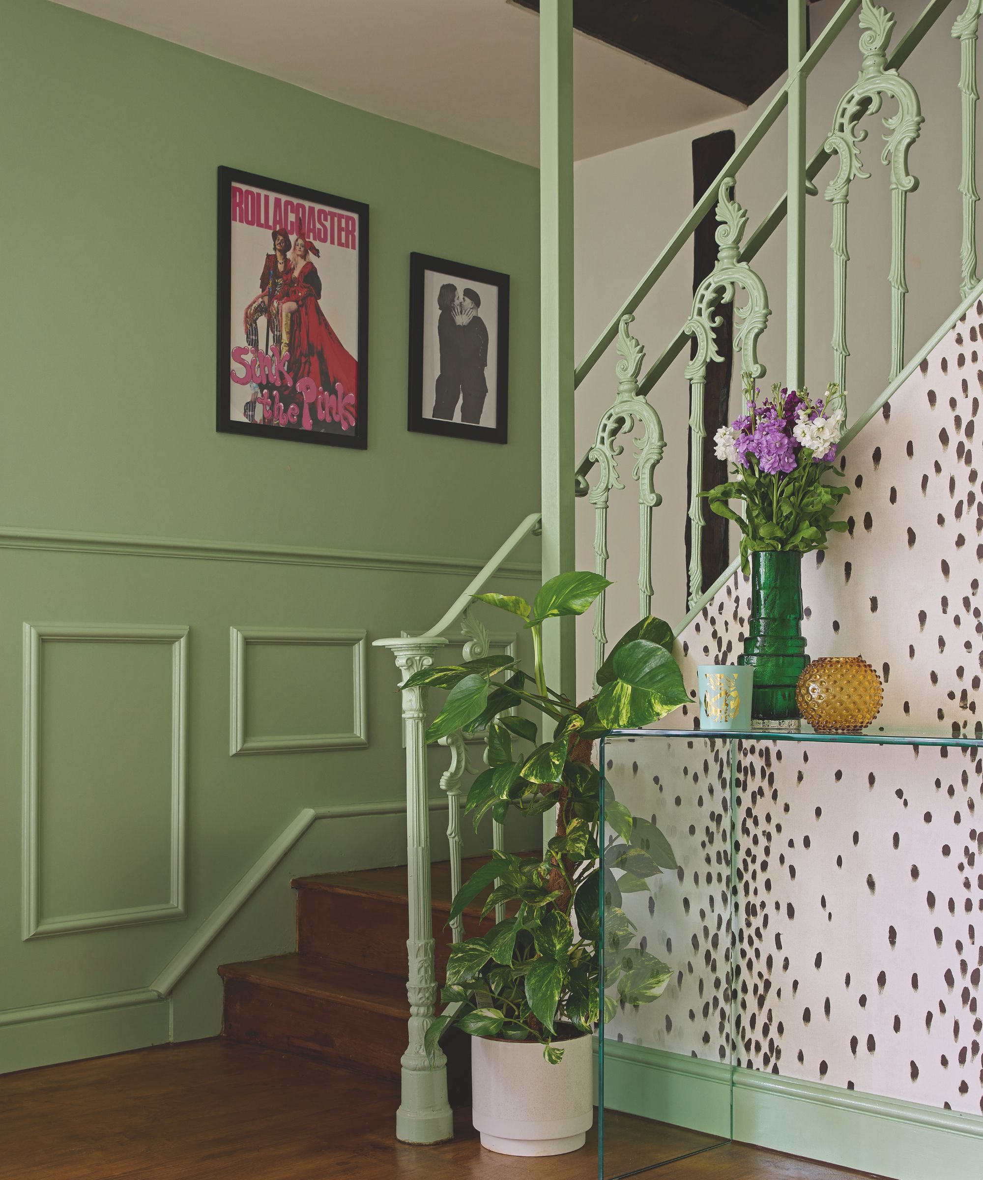
Walls in Whirlybird and James White, both Farrow & Ball. Wall art featuring Glyn shot by Rankin. Glassware, Geoffrey Baxter.
Some of his more outlandish ideas were reined in by his fiancé Jermaine, who suggested keeping the en suite and bedroom neutral. ‘They’re the places I feel most at peace as there is no overstimulation,’ Glyn says. It was Patrick’s idea to flow the Stripe wallpaper from behind the headboard and over the ceiling. ‘It has the cocooning effect of a being in a four-poster bed,’ Glyn says.
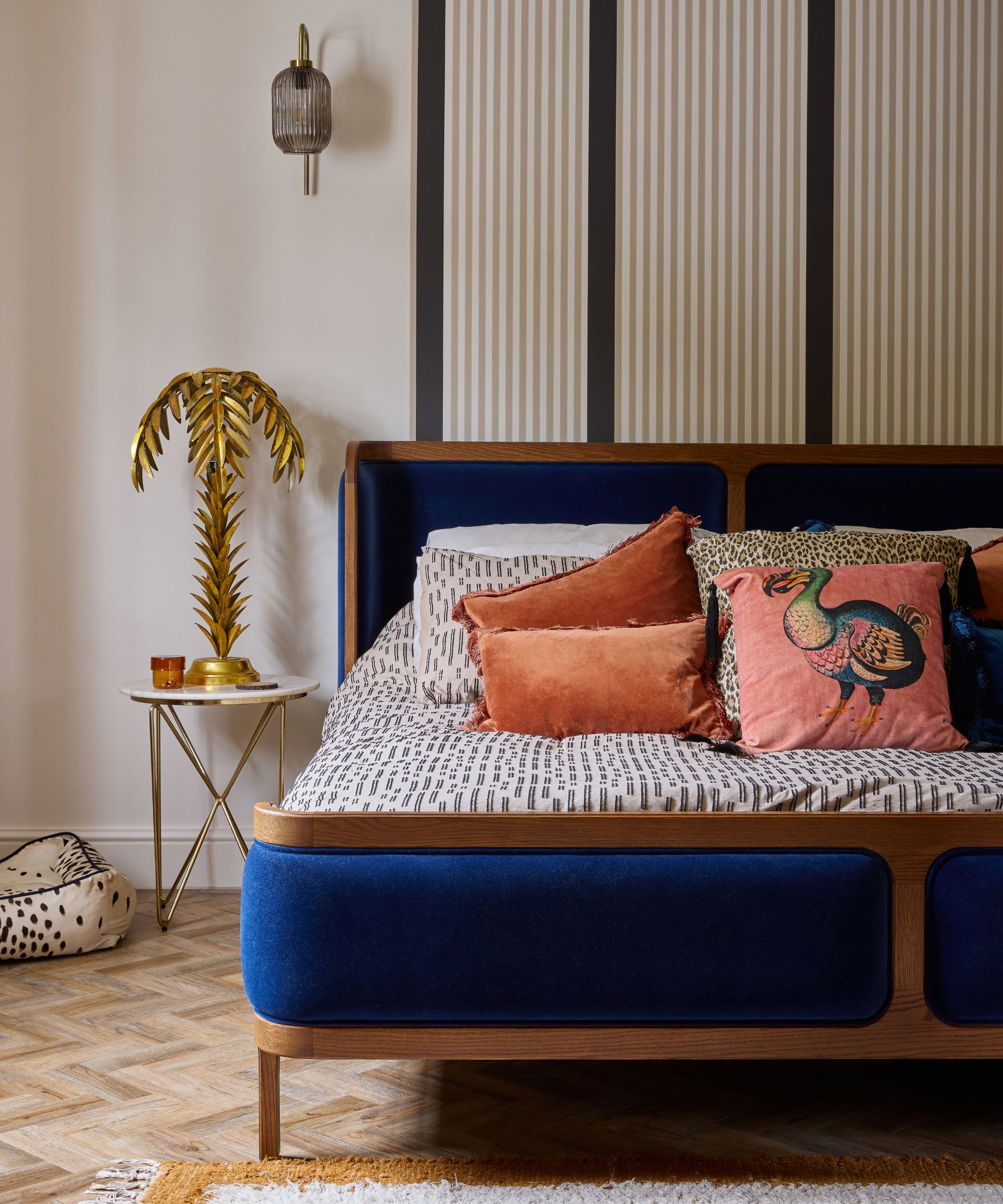
Wallsin Au Lait; Stripe wallpaper, Carte Blanche collection by Christopher John Rogers for Farrow & Ball.
It’s these decorative tricks that allow Glyn and his guests to be both uplifted and unwind. ‘That’s because upstairs is almost womb-like in the way the colors hold and soothe you, the house looks after you in that way. I wanted to prove that you could be playful and still grown up, that decor could be sophisticated without being boring. That glamour could be enriching, too.’
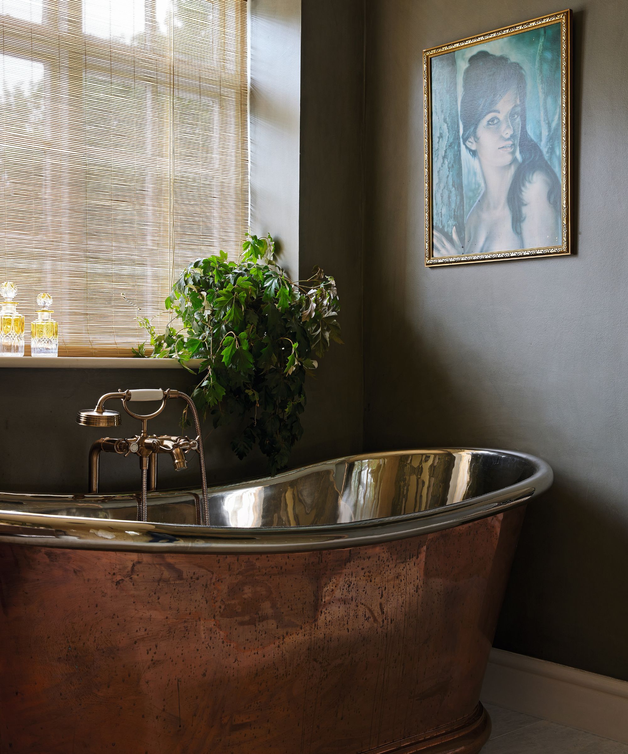
Walls in Cardamom from the Carte Blanche collection by Christopher John Rogers for Farrow & Ball. Bath, North Arch Bathrooms.
3 paint rules to take from this colorful project
Glyn Fussell shares the secrets he learned from Farrow & Ball’s Patrick O’Donnell
1. There is no such thing as just cream, or just white, and you need to look at the nuance when picking a neutral. In my hallway, I paired Farrow & Ball’s James White with the Whirlybird green because it has green undertones to it, so there is much more harmony.
2. There is a power in pairing primary colors together – they bounce off each other if you get them right. It works when one is really bold and one is more knocked back – if both are vibrant it can be overpowering.
3. Each room’s palette has to start with how the sunlight hits it. In a bright room, there will be glare that can dim even the brightest of shades, so you may need to go deeper in color than you feel comfortable with in order to counteract that.
Pip Rich is an interiors journalist and editor with 20 years' experience, having written for all of the UK's biggest titles. Most recently, he was the Global Editor in Chief of our sister brand, Livingetc, where he now continues in a consulting role as Executive Editor. Before that, he was acting editor of Homes & Gardens, and has held staff positions at Sunday Times Style, ELLE Decoration, Red and Grazia. He has written three books – his most recent, A New Leaf, looked at the homes of architects who had decorated with house plants. Over his career, he has interviewed pretty much every interior designer working today, soaking up their knowledge and wisdom so as to become an expert himself.
