5 ways to decorate with a caramel color scheme – the most stylish tone of the season
This season, we're admiring a gorgeous neutral that combines beige and brown

Design expertise in your inbox – from inspiring decorating ideas and beautiful celebrity homes to practical gardening advice and shopping round-ups.
You are now subscribed
Your newsletter sign-up was successful
Want to add more newsletters?
Want to know what the most popular color is for fall/winter 2022? This inspired choice will have us all re-painting our homes this month.
Understanding room color lies at the root of all interior design decisions. If in doubt, consulting the color wheel – and basic color theory – will ensure your decorating scheme flows effectively from room to room.
Color of the Month – how to use this bold neutral in your home
While rich caramel hues definitely belond to the neutral color family, they are anything but plain – there is a luxury to them that is at once refined but also bold. So whether you are decorating with neutrals or decorating with brown, this caramel shade is certainly one to welcome into your home. Here's why...
Article continues below1. Sleep soundly in a comforting space
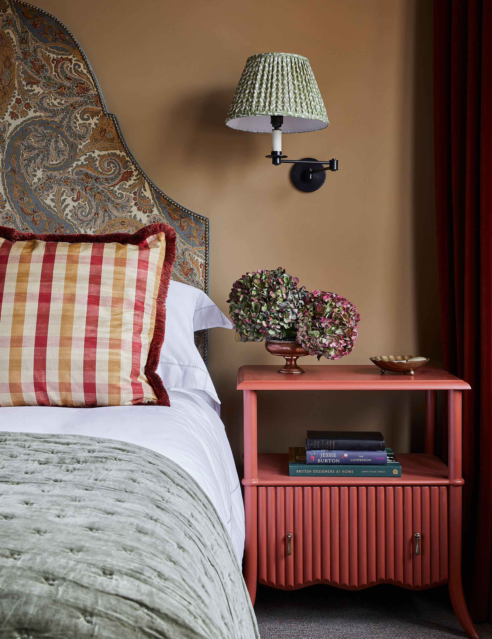
Walls in Caddie, Paint & Paper Library. Bedside table, Trove by Studio Duggan. Sconce, Vaughan. Shade, Fermoie
Laura Stephens chose a soothing café au lait hue for the walls in this bedroom which is brightened by a hot coral pink bedside table.
This sandy shade has such depth to it. It makes a room feel warm so is good for north-facing rooms and those that don’t get a lot of natural light,' says Laura Stephens, founder, Laura Stephens Interior Design. 'It works really well with both crisp whites and also colors closer in tone, such as burgundy and olive green. It also makes stronger colors like a royal blue pop against it. It’s so versatile.’
2. Relish in domestic bliss in a French country kitchen
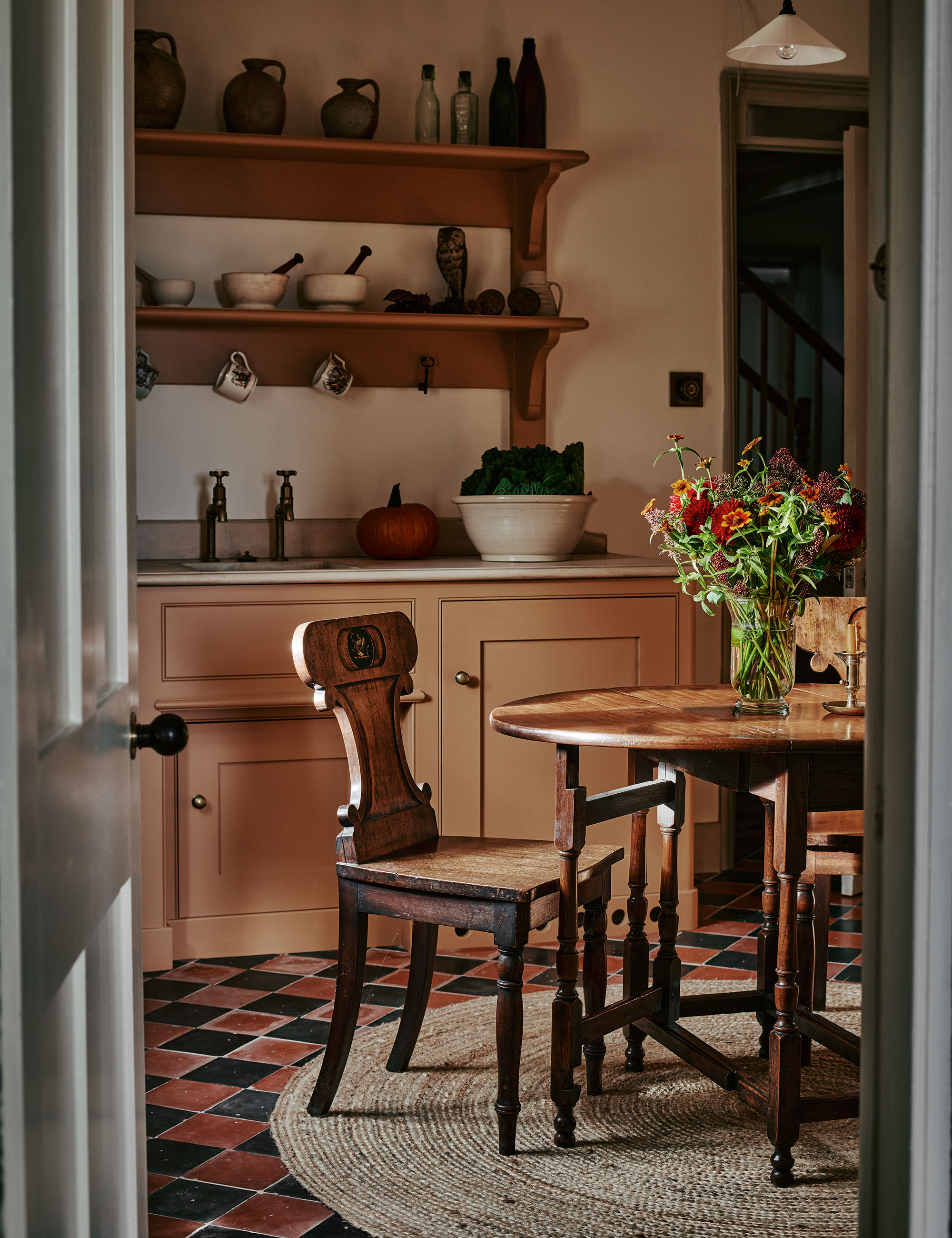
Cabinets in Wet Sand, Farrow & Ball. Joinery in Siberian larch, bespoke, Artichoke.
Painting the kitchen cabinets in this workaday hue is a clever way to conjure the feeling of a traditional hard-working country house kitchen of a bygone era, by Artichoke.
‘We feel this tone is perfect for domestic spaces, such as kitchens and pantries, where you don’t want the color to be a protagonist,' says Bruce Hodgson, founder, Artichoke. A client chose it for a recent project and it works really well in rooms that don’t benefit from lots of natural light, as it manages to be warm and welcoming without overpowering.’
Design expertise in your inbox – from inspiring decorating ideas and beautiful celebrity homes to practical gardening advice and shopping round-ups.
3. Decorate a cozy corner with caramel tones
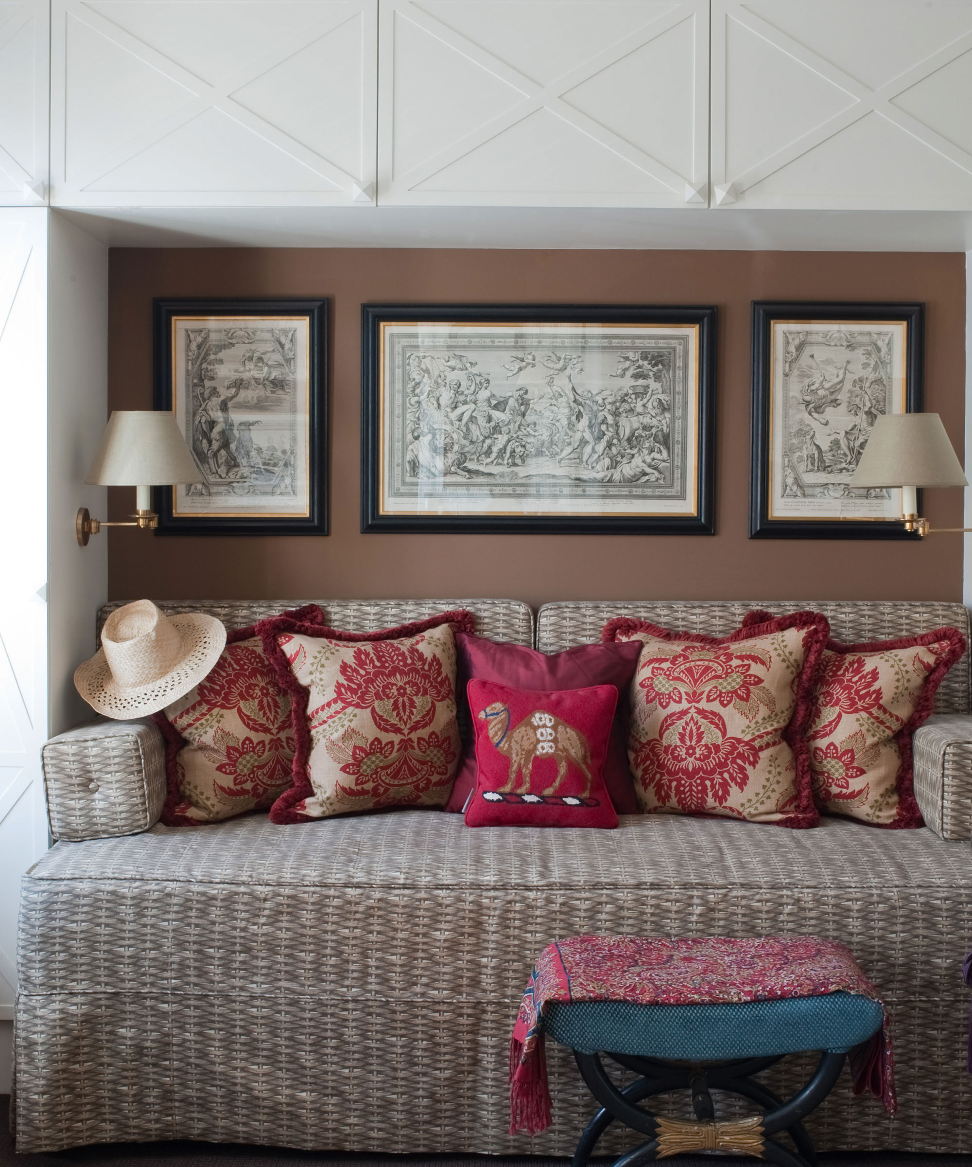
Walls in Hopsack, Paint & Paper Library. Fabric on sofa bed, Basket Weave, Paolo Moschino
Painting the inside of this alcove and adding lots of colorful cushions is a smart way to carve a comfortable niche in a dressing room-cum-guest room by Paolo Moschino.
‘I love to use sand colors in our interiors and they are like a white canvas and very easy to mix with other colours. They always create a welcoming atmosphere,' says the designer.
4. Curate a cocoon-like setting
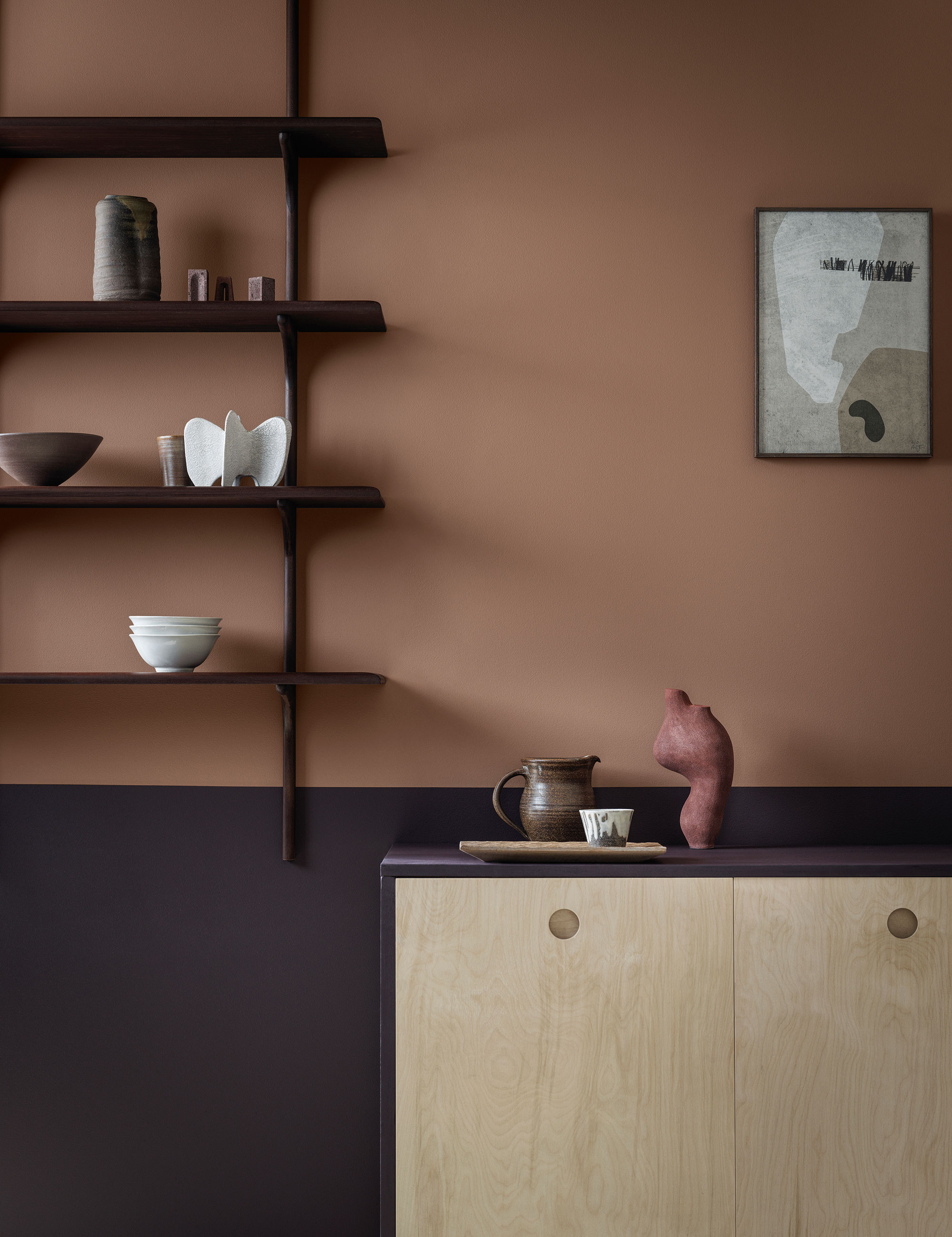
Walls in Saddle Stitch, Crown Paints
'This color creates a cocooning, cozy room aesthetic. It pairs beautifully with all natural materials like wood, stone, clay and natural fabrics like linen or jute,' says Justyna Korczynska, senior designer, Crown Paints.
Here, a warm tan, saturated with caramel tones, this hue manages to be neither too bright nor too overpowering.
5. Use caramel with black accents
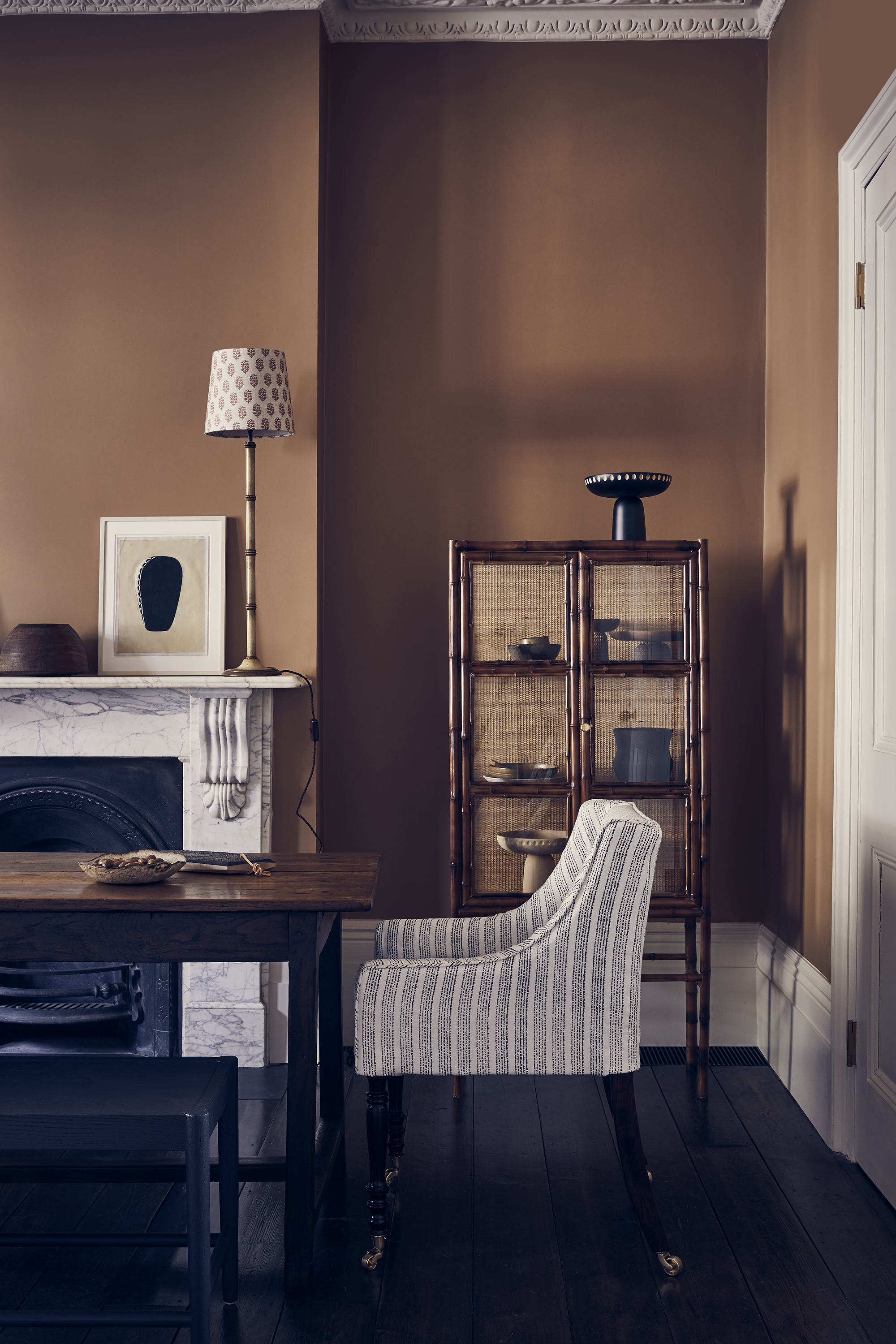
‘This shade instantly makes a room feel grounded,' says Natasha Bradley, director of interior design, Lick. 'If you’re looking to decorate a whole room in this color, I’d suggest the addition of a black accent somewhere within to tie it all together. To add softness I’d recommend matching woodwork, while also introducing green into the space as an accent. These color combinations will give a wonderful European twist while creating a calming aesthetic.’

Arabella is a freelance journalist writing for national newspapers, magazines and websites including Homes & Gardens, Country Life, The Telegraph and The Times. For many years she has specialized in writing about property and interiors, but she began her career in the early 2000s working on the newly launched Country Life website, covering anything from competitions to find the nation’s prettiest vicarage to the plight of rural post offices.