'It's one of those shades that is versatile enough to be used throughout an entire home' – why Sherwin-Williams Origami White could be the perfect crisp white for inside and out
Origami White is a refreshing white paint color with a touch of warmth – and according to experts, it works in practically every area of the home

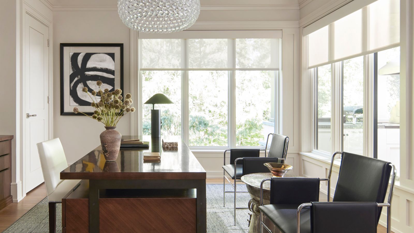
Sherwin-Williams' Origami White is a refreshing off-white paint color that exudes both crispness and warmth. It's the perfect middle ground white, ideal for accentuating architecture or using as a simple neutral backdrop.
Loved for its ability to uplift without straying into stark, it's a color that comes up often when I ask designers about their best white paints. It's a very clean white, with slightly purple undertones, so if you are looking for a fresh neutral that doesn't lean too warm, this is definitely one to consider.
Emily Kantz, Color Marketing Manager at Sherwin-Williams, describes Origami White as 'a clean, delicate off-white that brings warmth and softness to any space. While technically in the white color family, it has a slightly lower light reflectance value, which means it reflects a good amount of light but still has enough depth to feel grounded.'
Article continues below 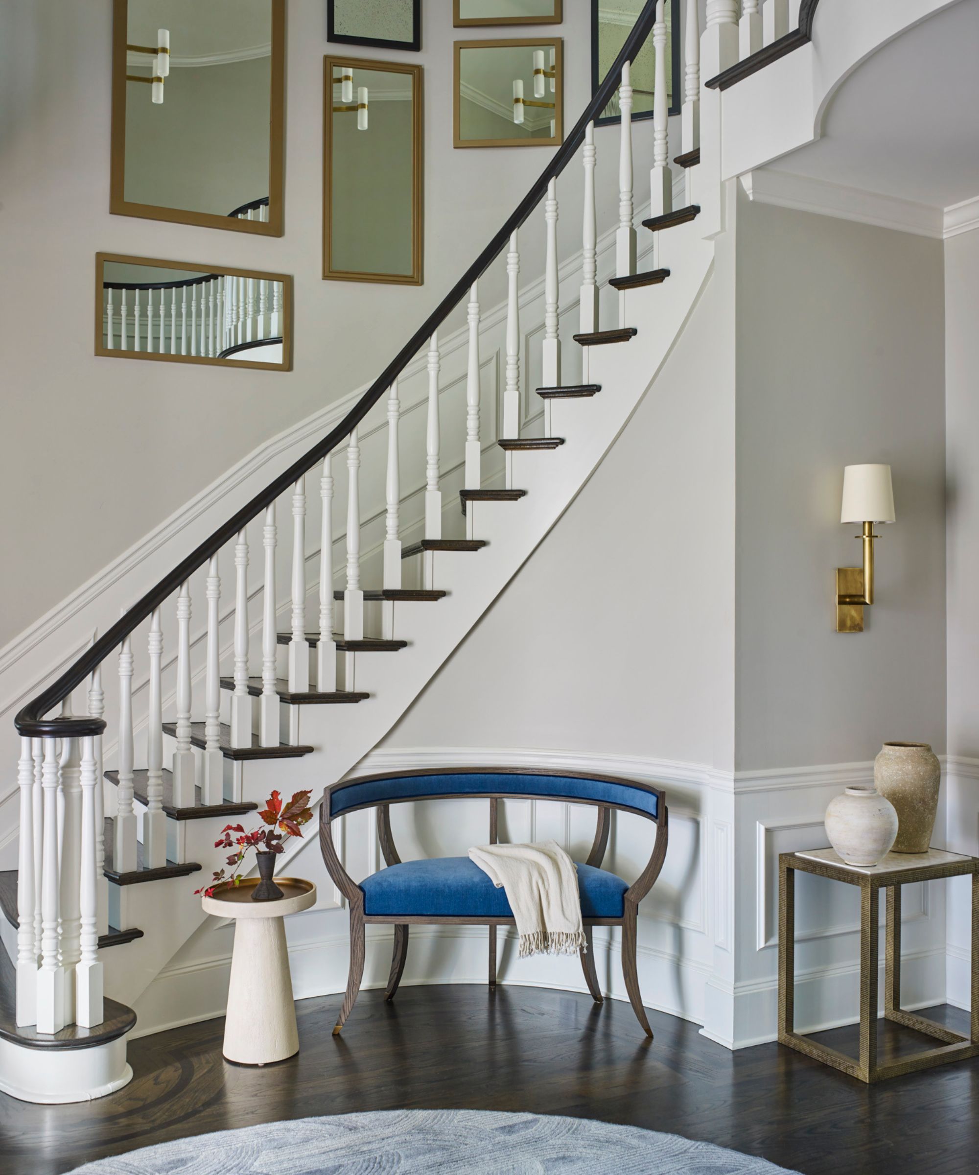
Origami White was voted one of the designers' favorite Sherwin-Williams paint colors due to its light-enhancing qualities and ability to translate in any space, of any style. Emily says it's 'one of those shades that is versatile enough to be used throughout an entire home. It works beautifully on walls, trim, cabinetry, and exteriors.'
Glenna Stone of Glenna Stone Interior Design says, 'Origami White is a staple in our palette – it’s crisp yet soft, with just enough cool undertone to feel fresh without being stark. We love how it subtly shifts depending on the light and the surrounding textures.'
'It could be an ideal entryway color, it brings a clean contrast to the dark floors and railing while letting the millwork shine. In living spaces, it acts as a quiet backdrop that lets us play with rich colors, sculptural furnishings, and layered materials. Whether we’re designing an airy office or a grand great room, Origami White creates a cohesive canvas that feels both tailored and inviting.'
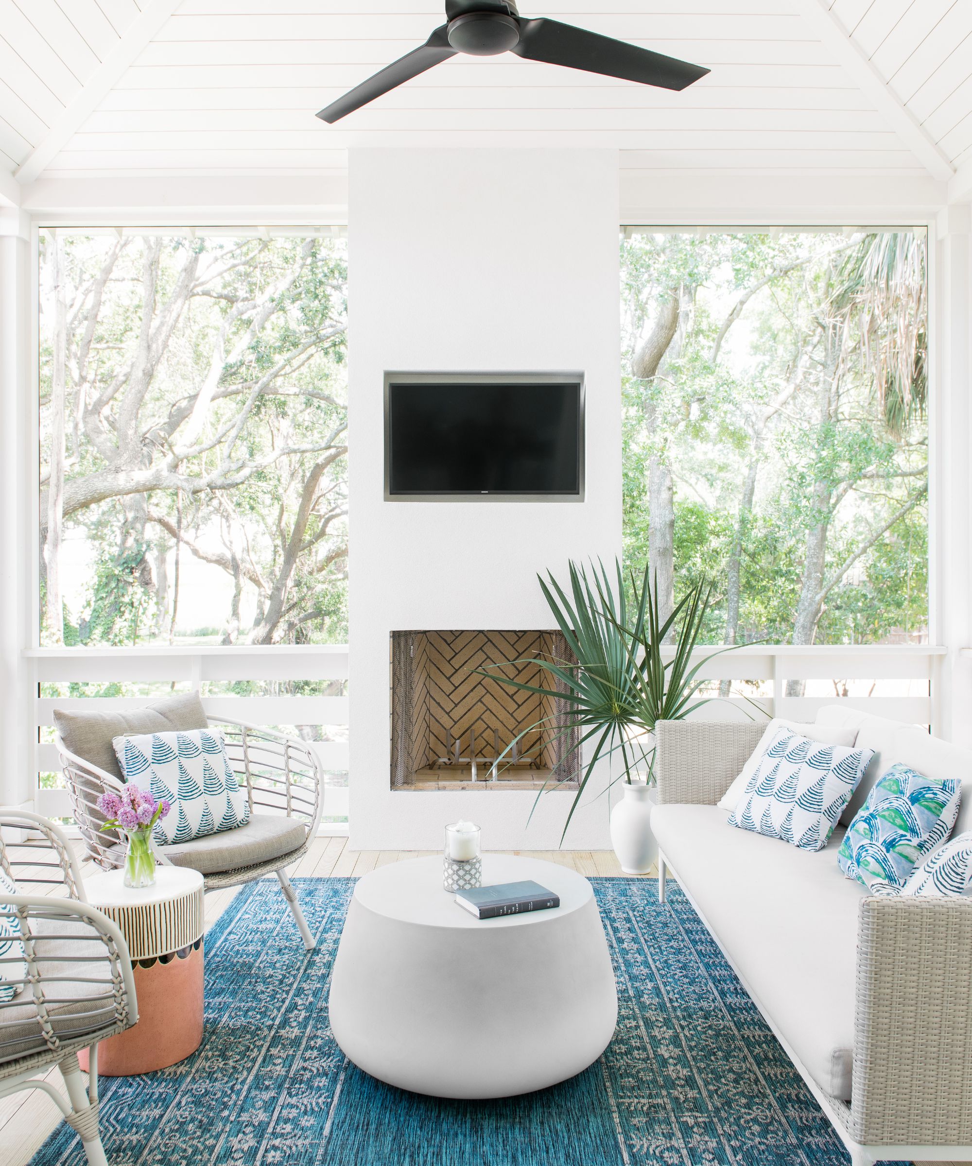
Suzanne Barrow, Principal Designer at Barrow Interiors, has used Origami White countless times in her interior projects, but says it's actually the best exterior paint color.
Design expertise in your inbox – from inspiring decorating ideas and beautiful celebrity homes to practical gardening advice and shopping round-ups.
Referring to the back porch idea pictured above, Suzanne explains, 'Our favorite application for Origami White is for exterior paint. We chose this color for our client because we wanted a warm white that did not feel stark. We wanted an off-white color that was soft and subtle, making it feel inviting without being overly bright.'
Despite being painted head-to-toe in the shade, the back porch feels welcoming and refreshing rather than harsh and clinical. The architecture has been accentuated, but the paint doesn't dominate the space, instead, it works side by side with the pops of blue and natural materials.
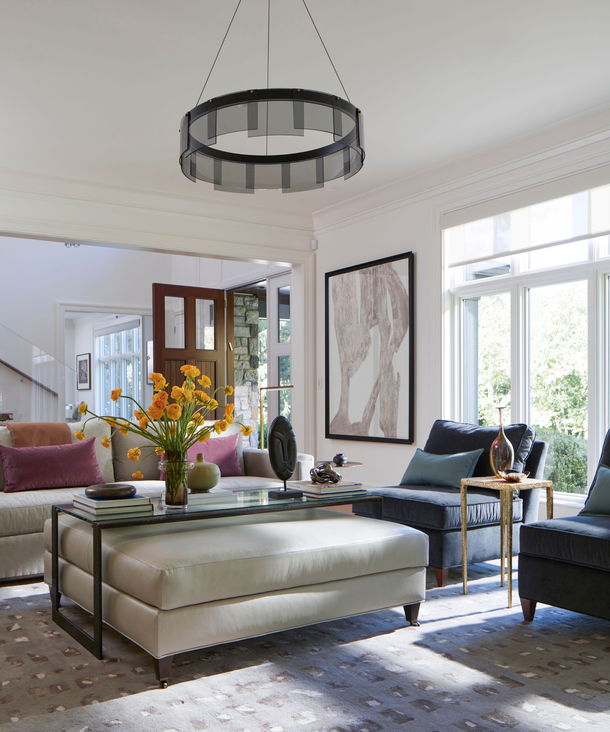
Choosing the best white paint is a minefield; the options are literally endless, but Origami White's depth makes it far easier to pair with other shades. Emily says, 'Because of its warmth, you can pair Origami White with earthy tones like dusty clays to soft browns; or for a more modern look, pair it with cooler greens such as Halcyon Green, deep blues, or charcoal grays. It's balanced tone makes it ideal for transitional interiors, blending traditional warmth with modern simplicity.'
The best decor to pair with Origami White
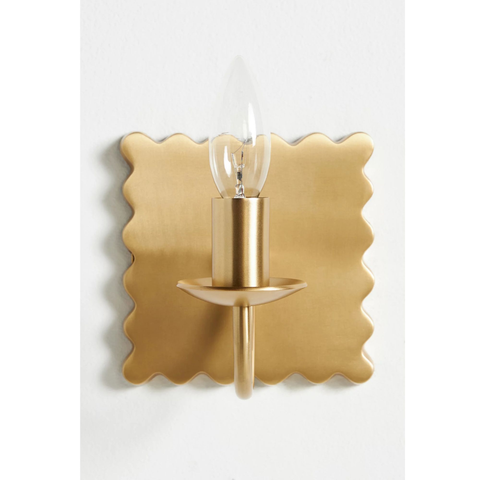
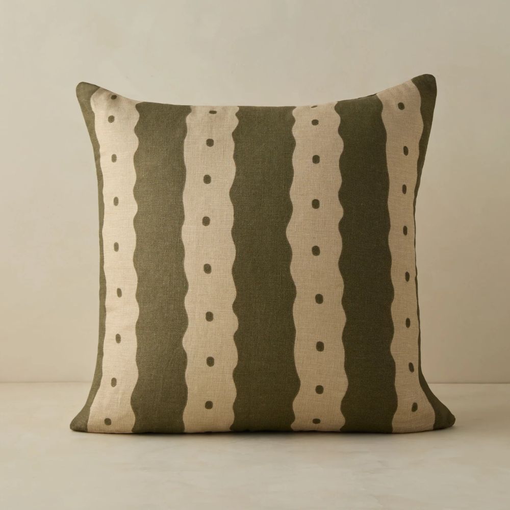
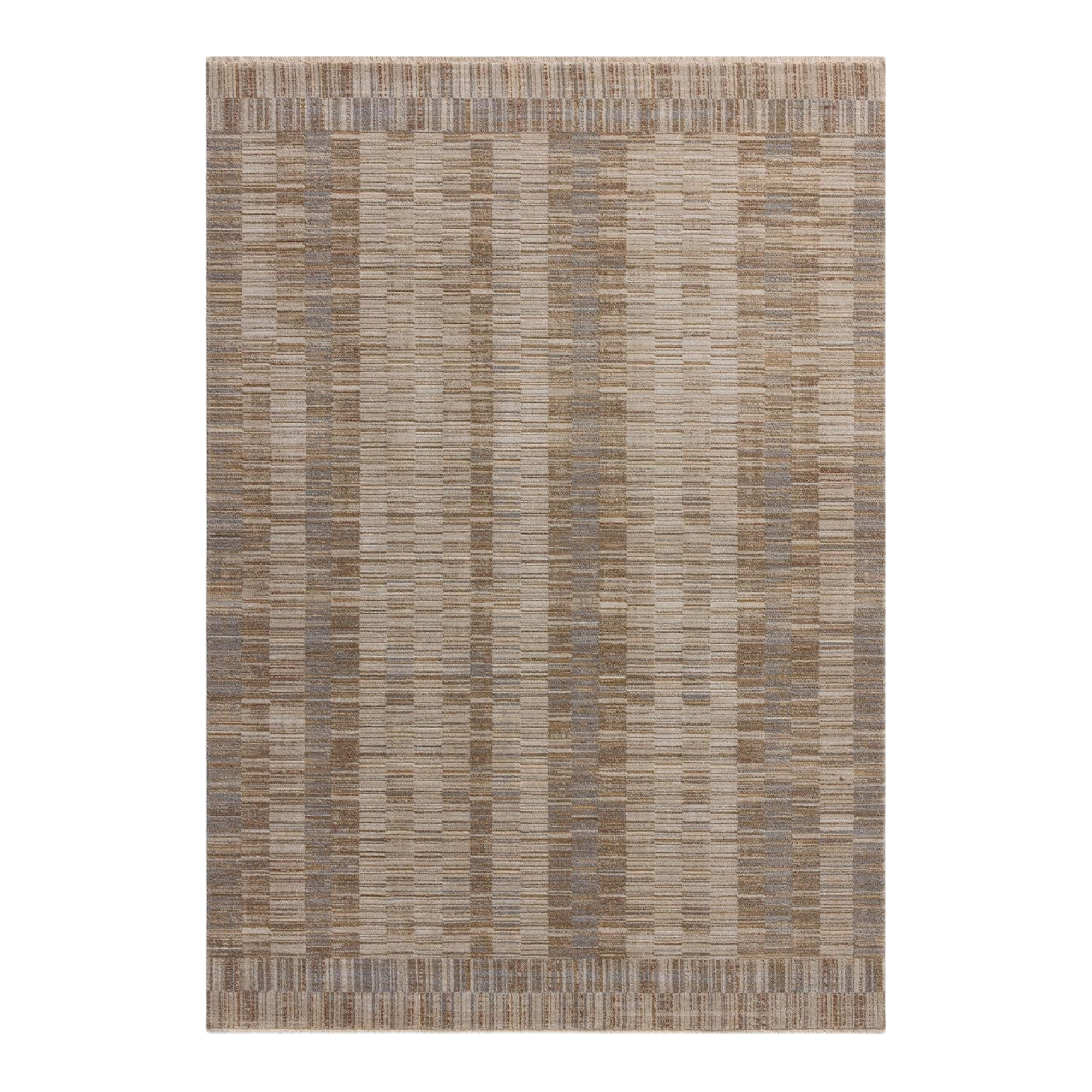
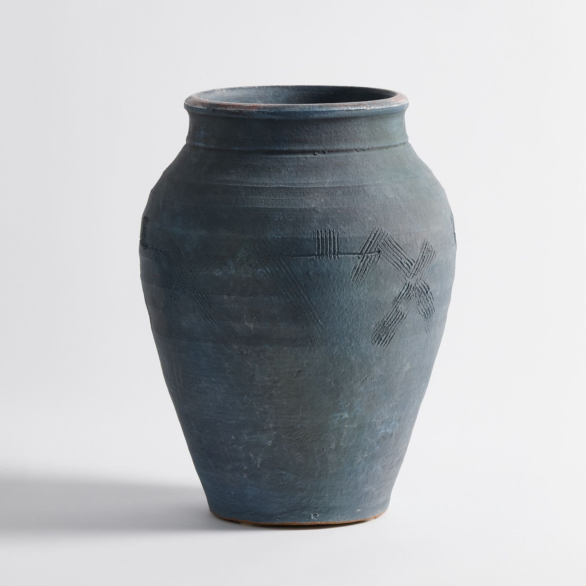
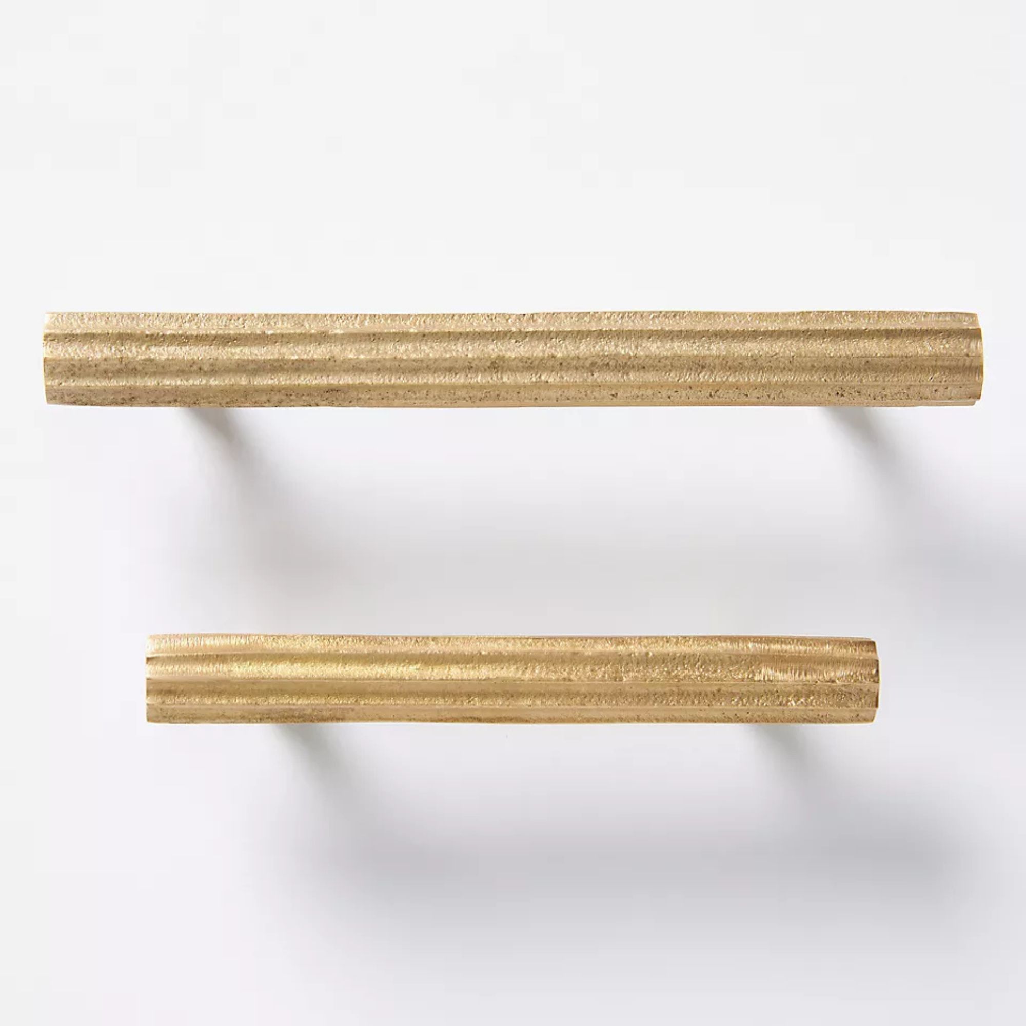
These six decor picks will pair beautifully with the clean, yet warm Origami White. From aged brass accents to textured rattan, your scheme will exude elegance with these pieces.
Searching for a white paint can feel like an endless task, which is why it's always helpful to narrow your search by hearing what shades designers swear by. Origami White has come up time and time again when I speak with designers about the best neutral paints, so this one is definitely worth ordering a sample of. It's a balanced shade, meaning it doesn't lean overly warm or cool, but all white paints are chameleons and can really change depending on the lighting in a space, or the colors you pair it with, so sampling first is a must.
