This New York City apartment's overhaul all started with a chair – here's a look inside the warm yet sophisticated space
With her 'Castle in the Clouds' project, interior designer Brittaney Elise created a serene, personalized escape 60 floors above the financial district's bustling streets

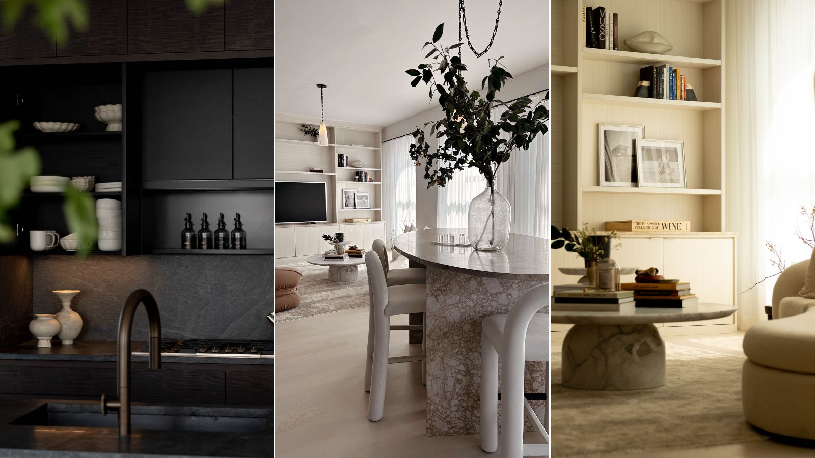
The heart of New York City's financial district doesn't typically evoke feelings of coziness and warmth. But 60 floors above the bustling sidewalks, you'll find a 'Castle in the Clouds' – a sleek, sophisticated apartment that still feels just like home.
Interior designer Brittaney Elise is the principal, founder, and CEO of BE. by Brittaney Elise – a high-end design firm based on the West Coast. Having designed for business leaders, companies, and celebrities across the country, she most recently crafted this city-center project for a high-profile beauty executive.
'Truly, when you walk into that space, it feels like a home. It doesn't feel like you're in the hustle and bustle of New York City. It doesn't feel like you're in this small space,' Brittaney tells H&G. 'I don't have a better way to describe it other than it gives you that comfort and that feeling of home. This project is really special to me. I love it. I love it, I love it, I love it so much.'
Article continues belowAfter Brittaney came across the perfect set of chairs for the living room early on, the design scheme took off – and the final result is the perfect blend of chic and cocooning. Here's a look inside this sanctuary-like home in the sky.
Step inside Brittaney's 'Castle in the Clouds'
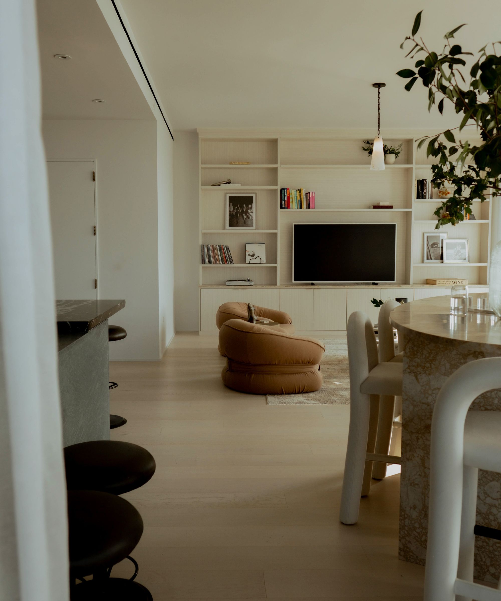
The apartment is largely open-plan, with the kitchen, dining room, and living room spaces blending seamlessly. Its design scheme is defined by a warm, inviting color palette, lush texture, 360-degree city views, and plenty of natural light. Brittaney says the space is a 'great representation' of her personal style, which she describes as 'warm, elevated, and clean, with a touch of eclecticism.'
'This [project] in particular has such a special place in my heart because the client really trusted my vision, and really allowed me to get creative. And I did incorporate a lot of personal style and taste, which has really grown on the client. This space reflects that warmth. It's definitely elevated, it's clean, and it's contemporary, but there's some unique bits and a little bit of eclectic,' she tells H&G.
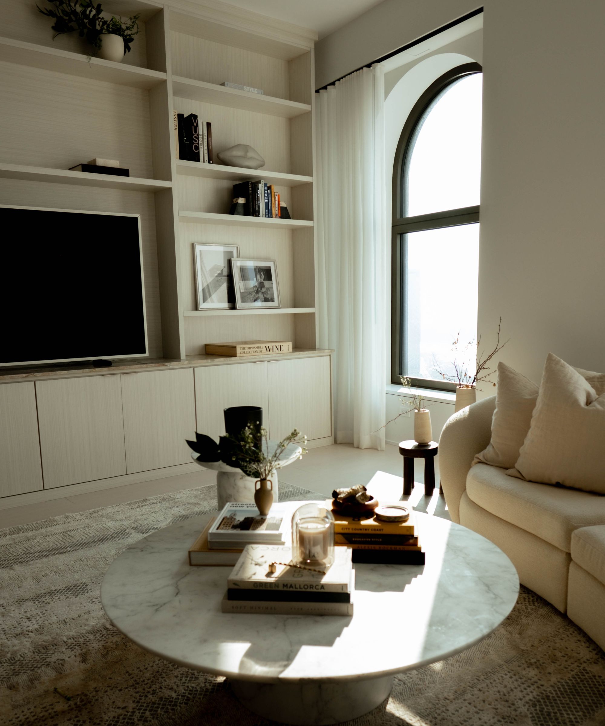
The apartment building's architecture lent Brittaney a hand during the design process, boasting expansive arched windows that span the whole open-plan space. Brittaney says 'they're even more gorgeous in person,' explaining that when walked into the space for the first time, she immediately knew she'd be featuring them front and center in the design scheme.
Design expertise in your inbox – from inspiring decorating ideas and beautiful celebrity homes to practical gardening advice and shopping round-ups.
'Incorporating natural light into any space is super important and high up on our priority list when working on a design. We went with floor-to-ceiling draperies in this space, and we did a double rod,' she says.
Because the home is surrounded by city lights, Brittaney also gave her client the option to close the space off with blackout shades. But as she notes, the 'linen privacy panels' she installed 'are never closed' – even at night, the family would much rather enjoy the views of New York City nightlife. 'It's mostly decorative, to be honest, to have the panels on each side,' she says. 'They just fill in and warm up the space.'
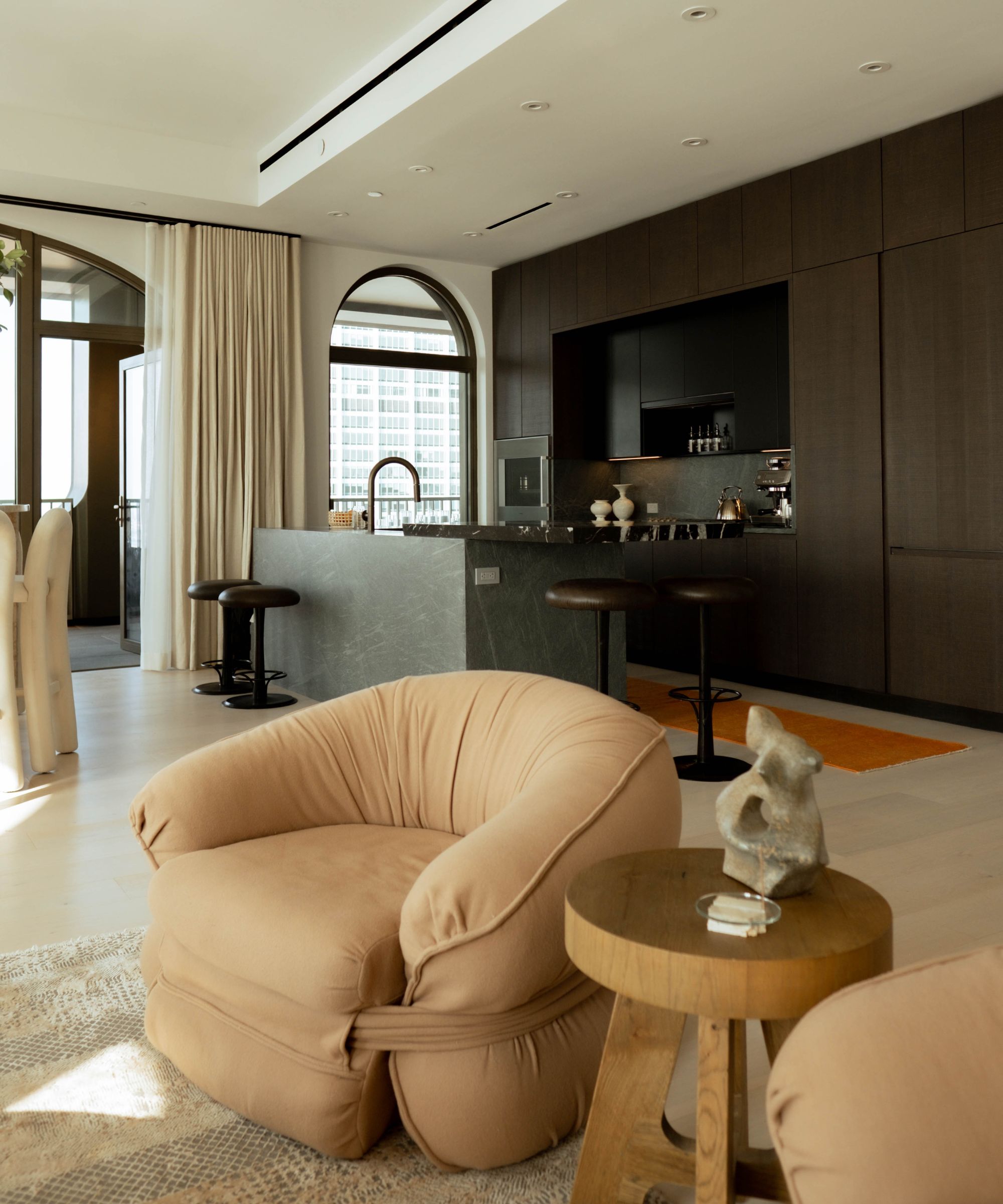
Successful design schemes often start with a single idea, whether its a color scheme, interior design style, or piece of furniture that sets off the process. And in this case, a stunning set of vintage armchairs, upholstered by The Row, made the rest of the plan clear to Brittaney.
'I texted the client, “I found these chairs, you need them – we need to put them into the space.” And they were like, “Yes, I love them. Absolutely. Let's do it.” So I had to work the entire design around these chairs,' says Brittaney.
From there, it was all about creating separation within the open-plan space. By using the window treatments, and by incorporating a few other clever design tricks, Brittaney made the kitchen, dining room, and living room feel like separate, discrete spaces. The curtains allow the homeowners to control the atmosphere in each space – the curtains can be drawn in the living room for a cozy movie night, but left open in the kitchen for a classy entertaining space, all at the same time.
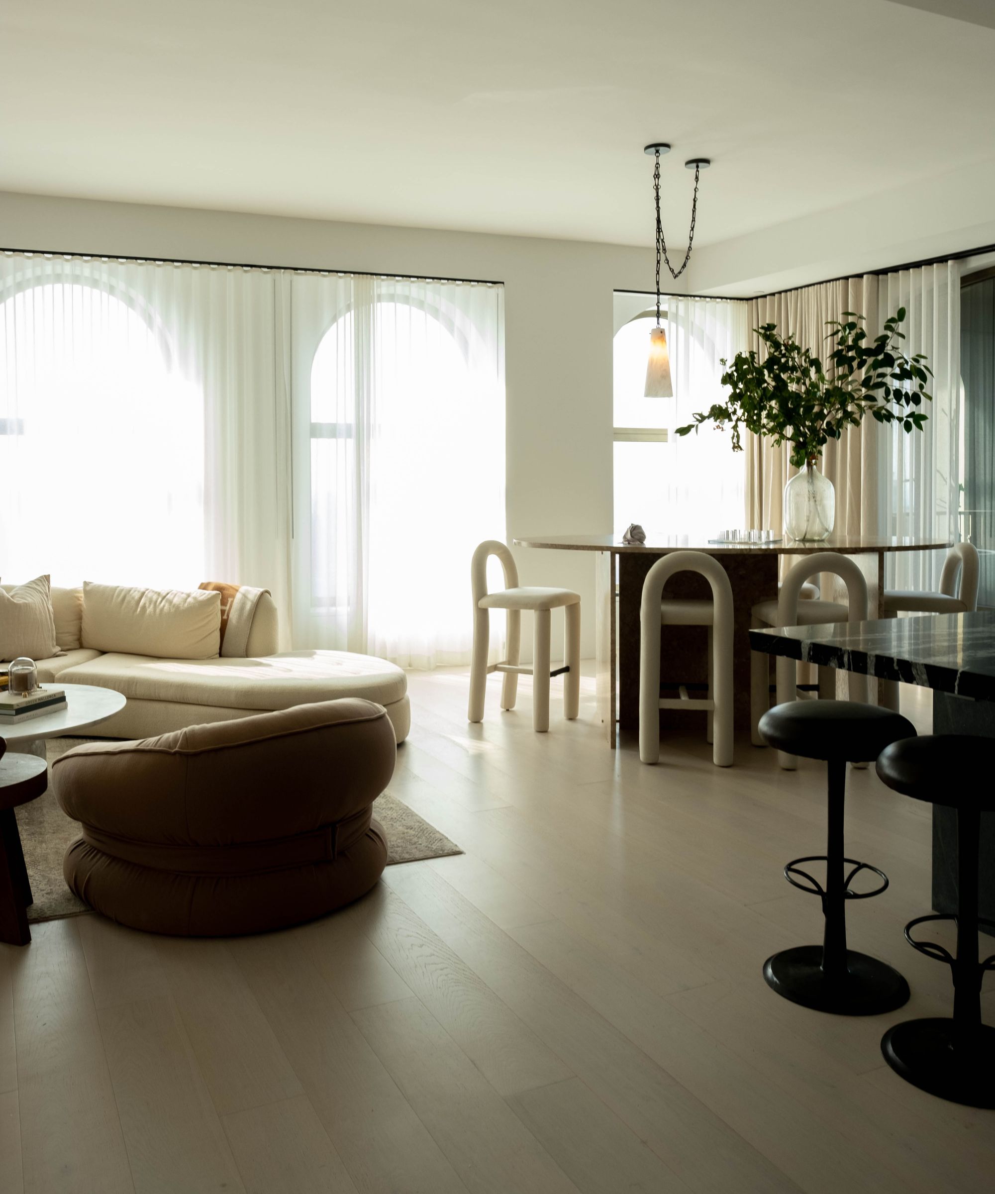
Aside from the window treatments, Brittaney said one other design feature helps loads to divide the three living spaces from one another – the seating.
'What we did is we incorporated different seating heights. So, at the kitchen island, you can see that there are two different heights of a counter stool and a bar stool happening. That was intentional, to get a different height and feel,' says Brittaney.
The bar stool height allows for easy entertaining, and laid-back conversation over a morning coffee. Meanwhile, the counter-height stools are perfect for a makeshift office space – a designated space for replying to morning emails and multitasking. In the living room, a lower seating arrangement (including a very low coffee table) signals a cozier, more serene environment to gather and relax with loved ones.
'And then the dining table – that’s not your standard dining table height. It's an oval shape, which creates something different, rather than your typical round or rectangle or square,' says Brittaney.
'[That's] at a bar height, so you're at an elevated, taller height in the dining area. You kind of oversee what's happening in the living room area at a lower height ... That was very intentional, and that's my probably best suggestion with zoning and creating a different feel and a different space where each base will kind of flow together,' she continues.
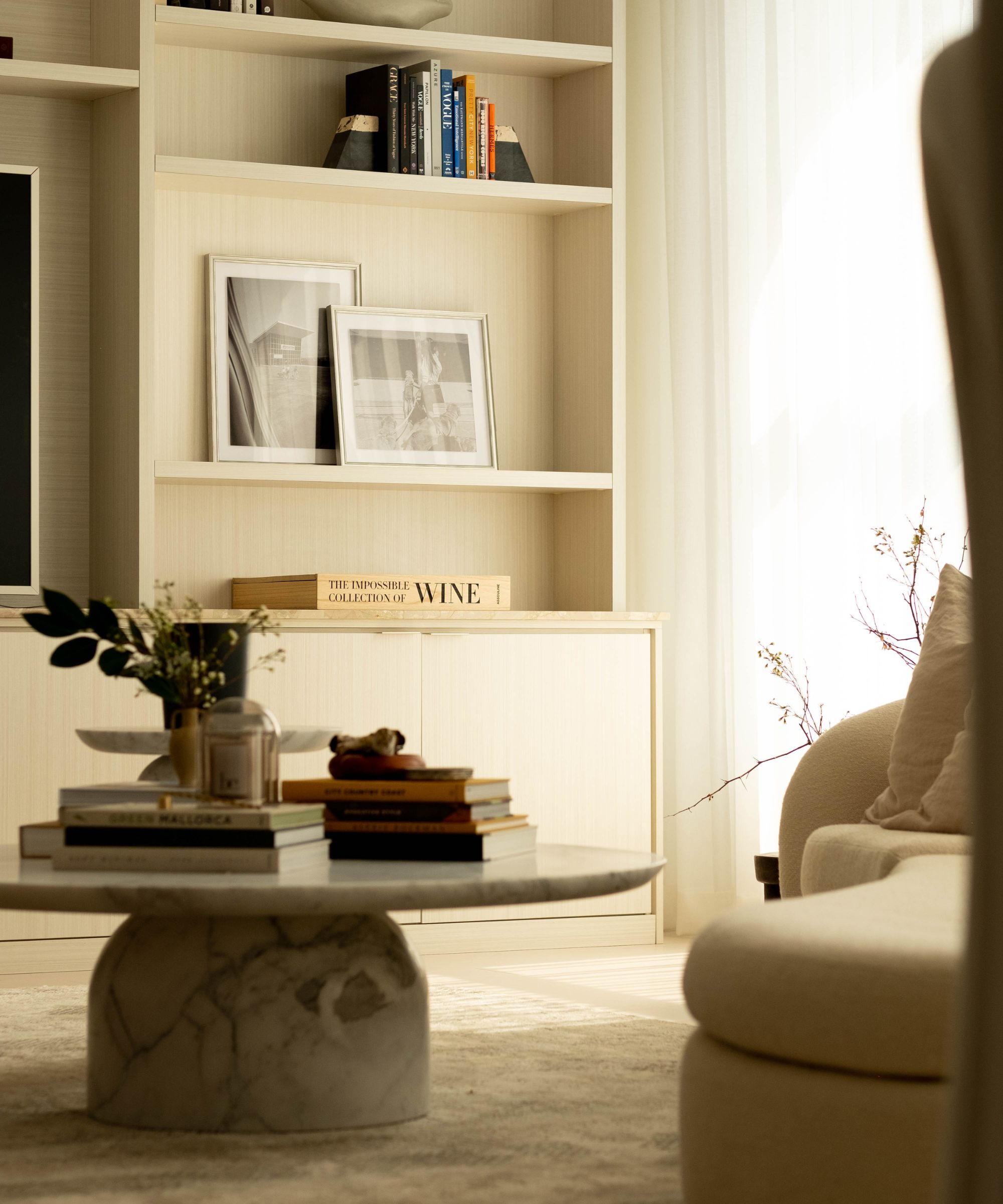
A cohesive color scheme also plays a starring role in this space, but each living area still takes on a palette of its own. 'We wanted to go for a rich warmth in this space. It is such a contemporary baseline and a contemporary canvas, so we wanted to bring in that low-exposure feeling while still embodying the feeling of cozy, comfort, and soft curves,' says Brittaney.
The team started with a 'base color' of cognac, and built from there, integrating mustard, coffee, taupe, and a bit of burgundy. A light, airy look in the living room is grounded by the armchairs and a statement area rug, and the black kitchen brings a bold, moody accent to the space.
Brought back to earth with warm, welcoming colors and plush yet chic furniture, this 'Castle in the Clouds' brings contemporary living to the next level. This project proves that natural lighting, transitional design, and classic furniture makes any space, even one surrounded by the city, feel like home.

Abby was the Interior Design News Editor at Homes & Gardens and is now studying for her Master's degree in Journalism at City University, London. Prior to joining our team, she worked with Better Homes & Gardens, where she wrote and edited content about home decor, gardening tips, food news, and more. She studied Journalism and English Literature at New York University and moved to London to pursue her love of writing in 2023.