Mixing patterns and prints in interior design – a 12-step masterclass
Getting the balance of right when mixing patterns and prints is vital to a room's success. Here's how


If, like us at H&G, you have a deep-seated love of interiors, mixing patterns in a room is just one of the many skills you need to master.
So who better for us to ask to give a masterclass than interior designer Penny Morrison and Charlotte Gaisford, British fabric and wallpaper designers, both of whom are known for their expert pattern combinations in interior design?
Article continues belowMixing patterns and prints in interior design
Follow Charlotte, Sophie and Penny's step-by-step masterclass to mix patterns and prints in a room successfully.
1. First rule: there are no rules

'I like mixing and matching patterns – I call it happy clashing,' says interior designer Sophie Ashby. 'There are no rules, but much like an art collection where you might have a sculpture, a photograph, a painting and a sketch, I quite like having a floral with a stripe and then maybe an abstract pattern and something more vintage and ethnic.'
2. Give patterns space to breathe

This according to Sophie Ashby, is key.
'If I was going to do a headboard in a floral fabric, I’d probably do plain cushions on the bed, or if I was going to do a plain sofa then I’d go to town on lots of different types of cushions. It’s exercising restraint and not having everything patterned, then you can really see the fabric that you’re dealing with.
'Often if we’re going to use a pattern on a piece of upholstery, I would then bind it with a plain trim. So if it was a floral pattern on a cushion, for example, I would then have a plain green trim, just to give it that sharpness and make you focus on the pattern. I would then use that trim colour elsewhere to link it in with the scheme.'
3. Start your scheme with a rug

'People always ask what you should start with when decorating a room and I always say a rug. Since rugs are the hardest thing to find matches for, if you start with bedroom or living room rug ideas and work from that then you’ve got your match before you begin,' says Penny.
'Creating a simple room scheme and them having a big colored or patterned rug can make a room – nothing pulls a room together quite like a rug does.
'When placing a rug, you want it to be at least halfway underneath the key furniture in the room. My favorite way to add impact with a rug - and this depends on the size of the room - is to go as large as possible, and to extend to about two feet from the walls. While I don't like lots of little rugs, it's lovely to add a smaller rug in front of a fireplace, as it protects the floor from ash. If you have a large room, with two seating areas, allow each to have its own rug, with the base floor showing through as this area will get stepped on a lot. Avoid cotton rugs as they don't have a luxurious depth, and they also tend to get grubby more quickly. Stick to wools and sisals.'
4. Create balance with pattern

'It’s important that you balance what color and pattern hits your eye when you enter a room,' says Penny. 'Pattern works wonderfully on one or two windows, but if you’ve got a room that’s got a row of three big windows then covering them with pattern will overpower one side of the space. In that case I would rather use the pattern somewhere else, like a sofa, chair or on the bed.
'People are so scared of mixing different things in case they don’t go but if you have the confidence to put together what you like and what your eye feels comfortable with then it’ll work for everybody else, too.'
Sophie Ashby continues: 'Usually pattern works best in touches, not as the main event. I tend to go for plain fabrics on big expanses of furniture like sofas, just because it can be too busy and full on otherwise.'
5. Start with the showstopper fabric

Tiger Blue
'I always choose my main fabric (usually for the curtains, or the headboard) first,' says Charlotte. 'These are the main focal points of the room. I am often asked for help choosing fabrics for rooms which have already been painted. To me this is a big no-no because the choices of fabric are immediately restricted.
'It is much harder to find a fabric that gels with you than paint and it is so easy to find a paint colour that goes with a fabric, as there are so many paint colours out there.'
6. Find other fabrics to mix with your showstopper fabric

'Once you have found your showstopper fabric you can then find other fabrics that will combine with your choice. It always amazes me how people focus only on choosing one fabric for a room by just looking for the curtain fabric,' says Charlotte.
'It is important to consider the other soft furnishings in the room that also need fabric: cushions, upholstery, window seats, headboard, valances and so on. It would all be very boring if you used the same fabric for all of these, so you need to think about the whole scheme.'
7. Keep the color palette simple

Amazing Mandarins DP
'I like to keep my color palette simple and only use two or three colors within a scheme,' says Charlotte.
'You might love a bold, bright shade but think it might be "too much" on the walls and that’s not always the case. My library is painted in arsenic, but it’s not really an overall color; the bookcases take up quite a lot of the space, and there are also breaks from the windows, so those provide balance and stop the bright color from overwhelming the room,' says Penny.
'Balance out colors and patterns with each other, too. For example, a colorful linen sofa works perfectly with patterned cushions, or a quite plain room lit up with a patterned ottoman. Upholster with one pattern on the sides and another on the top for an amazing focal point.'
Sophie Ashby is more adventurous with color: 'It’s great to try and use at least five colors in a space,' she says. 'I always have a baseline of neutrals – cream, black or brown – to give some contrast, and then you can play around with the other tones. It’s really good to have one fabric in the scheme which ties all of the colors together, so I’m always looking for that hero pattern which combines those five colors.'
If you need help with balancing a color scheme, the color wheel is a useful tool interior designers use to create perfect harmony.
8. Take pattern scale into account

'When choosing pattern you also need to take into account scale. Scale is important and can really help pull an idea together, the main thing being to mix the scales from large to small.
'Within the scale idea you also need to think about what type of pattern you want to use.
9. Narrow down your pattern choices
Ottoman dream pink
'I use this easy-to-remember way of choosing patterns which always works and ensures interest and contrast:'
- 'Choose one, two or three colors (I will go into this later)'
- 'Use only one large scale (showstopper) fabric'
- 'Choose medium or small-scale designs for all-over complementary patterns
- 'Find a pattern which reminds you of a stripe, but it isn’t necessarily a true stripe
- 'Pick a pattern which reminds you of spots, but it isn’t necessarily a spot. Remember – you can have as many smaller scaled fabrics as you like but the rule is to only use one large scale showstopper in the room'
Tip: 'Like many other designers, I tend to design patterns within a collection to be used together, so if you look within a collection you can usually find your complementary fabrics.'
10. Layer and mix patterns slowly

Troynorth trimmings, Ottoman red lampshade, Georgie Girl blue cushion
'Planning and decorating a room should be fun and enjoyable! Add things slowly and enjoy shopping for the different elements. Make the room an experience in its own right. I worry when people try and match things which are outside the room. They are just making life so difficult for themselves.
'To me, each room in my house is an experience, you open the door and are surprised and hopefully delighted. Be bold and brave, use the rules, maybe mix them up a bit every now and again, once you are confident, mix your patterns and go for it!'
11. Add interest with patterned vintage fabrics

'I love working with vintage fabrics, both directly and as a source of inspiration; Indian saris, Khadi fabric, West African textiles and Anglo-Indian chintzes,' says Penny. 'The wonderful thing about these, especially the African designs, is that they may be very old but they are actually do contemporary in style.
'When using vintage fabrics, you have to be aware that they can often be quite delicate – you could make cushions out of the, and then three months later they’ve fallen apart. Think outside the box with these textiles.
'If you’ve got a gorgeous but delicate piece of fabric, put it in a huge Perspex frame and make it stand on its own as artwork instead. For smaller pieces, you can incredibly effectively show off the fabric without damaging it by turning it into a tabletop. Simply put an under cloth of linen beneath it, then cover with a piece of glass.
'Another option for the larger pieces is to mount the vintage, on a board and turn it into a headboard. You won’t be touching it the whole time, but it still be comes the centerpiece of a room.
'It’s not always about using vintage in a room, it’s also about using vintage as inspiration to make something else new. Look at the wonderful designs inside the covers of old book, and at vintage Turkish or Indian tiles. Photograph these and you can simply take them into a digital printing company and have them made up into wallpaper or fabric.'
12. Mix opposites for impact – and balance
'Try to mix opposites,' advises Sophie Ashby. 'If you’re going to have a really large scale floral, then don’t use another large scale floral. Instead, try a tiny scale floral or, even better, a little geometric.'
Using pattern in a living room

From left to right: footstool in Red Beach Red, cushion in Betty Green, large lampshade: Pooky, small lampshades in Pretty Ayre Rose Solid, curtains in Charlotte Gaisford Rosie Open Red, cushion in Lulu Green, small chair in Eggs and Bacon D and Where’s Cocky DP, chair (foreground): Lulu Light Pink, rug Charlotte’s own existing rug. Paint: Edward Bulmer Invisible Green, wallpaper: Rosie Grey wallpaper
Looking for living room ideas in which to mix patterns?
'Keeping cohesion in mind when using many patterns In my drawing room (above and below), I chose contrasting colors of green, red and gold for a strong dramatic effect, but I put together six different patterned fabrics in the curtains, cushions and lampshade,' says Charlotte Gaisford.
'All the pattern here is in similar two colors which brings this scheme together to ensure that although the patterns are different scales they are not conflicting with each other.
'If you look closely, I chose the showstopper Rosie Open Red fabric for the curtains, the cushions are Betty Red (reads as a medium scale/stripe), Lulu Pink (reads as a spot) and there is a proper striped cushion, Poppy Dark Pink too.'

From left to right: Curtains in Charlotte Gaisford Rosie Open Red, cushions in (l-r) Betty Red, Lulu Light Pink, Poppy Dark Pink, Rosie Red, Lulu Pink, Betty Red, lampshade (Pooky)
'I had to keep the sofa, so the color scheme was created around it. Edward Bulmer Invisible Green paint completes this scheme. It is a bit of a statement colour but is so warm and welcoming in the room and works as a simple contrast amongst the pattern.
'As this is one of the main rooms in my home, I added plenty of textures and highlights through trimmings, pom poms and fringes too and tied these in with the blue skirting board paint color.
'You can see from this photo that the colour palette is simple, the patterns are different but connect in color and scale.'
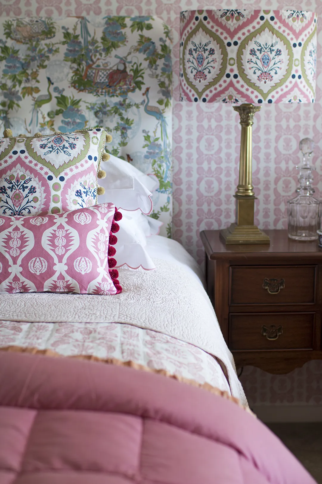
Using pattern in a bedroom

Charlotte Gaisford’s Pink Twin Guest Room: Charlotte Gaisford Pink Vases Wallpaper, headboard in Charlotte Gaisford Paxos Pink fabric, cushions in Charlotte Gaisford Pretty Ayre Burnt Raspberry, front cushion is an old John Lewis purchase), bright bedspread (Heals), pillowcases (Sophie Conran), lampshade (Pooky)
For bedroom ideas that mix patterns, Charlotte Gaisford has this advice: 'There is a simple strong color palette with bold pattern in my recently decorated pink spare bedroom. I used Pink Vases wallpaper as a showstopper pattern on the walls and then used Paxos Pink fabric on the headboards which could be classed as my stripe,' continues Charlotte.
'The cushions were Pretty Ayre Burnt Raspberry which reads as my spot. The little cushion at the front was a cushion bought many years ago which shows a stripe, albeit horizontal. It also provides a slight surprise to stop the scheme from being too coordinated.'

'The white bed linen creates a calm contrast with the strong colour and pattern. I really only used two colors in the main scheme, pinks and an ochre colour. I kept everything else neutral and I brought in some block color with a bright bedspread.
'Using and mixing scales is a great way of putting a room together. You really have to avoid mixing large scales together as this will lead to the fabric designs fighting with each other and can lead to design problems. If you use small, medium, large scales, spots and stripes it will all come together.'
Using pattern in a hallway

Charlotte Gaisford Ottoman Blue Wallpaper, curtain in Charlotte Gaisford Ginoo Dream Blue, chair in Charlotte Gaisford Georgie Girl 2 Pinky, cushion in Charlotte Gaisford Sharanshar Storm, (paint: Edward Bulmer French Blue
'I like to keep the colors simple in my own home, so that I can add in more over time, if I wish and change the look. I recently decorated my hallway which was a walk-through room; it was quite wide and it could not really be used for anything specific. I wanted to make it a more interesting space.
'I organised to have panelling put around the room and then wallpapered above it, in Ottoman Blue wallpaper. For me, this created a really strong effect and gave the room atmosphere and texture.
'I didn’t really need to add any other colors, but I added a pink chair as a highlight just to bring in a little more interest and a small amount of contrasting color and warmth, (any more would have detracted from the main space).
'One brightly colored patterned cushion would create the same effect and can really bring a whole scheme together and make it zing.'

'I then added an eye-catching rug from OKA to add even more warmth. This then became the showstopper pattern in this room scheme.
'The wallpaper provides the stripe effect and the fabric on the curtains (Ginoo dream blue), the small-scale spot (and perhaps, unusually, the less dominant pattern).
'The chair fabric is the medium scale ( Georgie Girl 2 Pinky) with the cushion (Sharanshar Storm).
'By using a limited color palette, I was able to mix pattern scales and add pattern in a less conventional way.'
