Sherwin Williams' color collection aims to improve well-being – and psychologists approve
The Living Well collection invites a sense of balance into your space – without sacrificing style

The question of how a color looks in a room has always felt important. However, as the concept of color psychology becomes more important, there is an ever-growing focus on how your paint makes you feel. And Sherwin Williams' new color collection is a natural celebration of this movement.
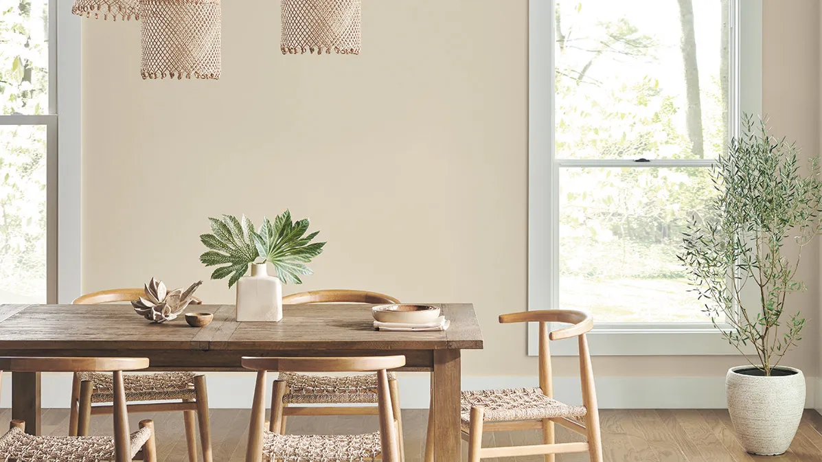
Enter Living Well – the aptly-named color collection by Ohio-based manufacturers Sherwin Williams. The label designed the 11-palette collection to bring a soothing sense of comfort to your paint ideas – and boost well-being in your home.
Notable palettes include 'Balance,' 'Renew,' and 'Focus' – all of which feature earthy neutrals, gray, and beige hues that sit at the peak of current color trends. So, you don't need to taint your home's style to prioritize well-being.


'Pairing exquisite color palettes with innovative paint formulas, Living Well is a smart choice for the well-being of your home,' says Sue Wadden, Sherwin-Williams Director of Color Marketing.
The color expert suggests these hues will aesthetically elevate your home whilst bringing a therapeutic feeling to every room of your home. But does science agree? In discussion with H&G, Psychologist and Well-being Consultant Lee Chambers responded to the palette – before you make the investment.
Sherwin Williams Living Well collection – what does psychology think?

'It is interesting to see Sherwin-Williams pairing palettes to states of mind we are looking to achieve,' Lee says. The Psychologist explains that their collection comes at a time when the world is full of uncertainty and challenges, so calming shades are 'more sought after than ever.'
'With well-being increasingly high on people's agenda, more people are looking beyond just a color – and are being more receptive to how they can design to generate a feeling that they [crave],' Lee says. Therefore, he suggests Sherwin Williams' neutrals are a natural choice.
'The benefit of neutrals is that they are unlikely to overstimulate us, and with anxieties raised, it is important that spaces give us a gradual drift towards well-being and focus, rather than an intense push that can make us feel either unsettled or somber,' Lee explains. He adds that these shades push us to slow down and create a space that allows us to feel relaxed.

'In a world filled with polarity, the moderation that neutrals provide is that comfortable middle ground where the world feels a little less serious, and troubles can pass us by,' he adds.
If Living Well is backed by science, who can surely disagree? We're rejuvenating our bedroom and living room paint ideas as we speak.
