Emma Sims-Hilditch reveals the 3 steps she takes to create a color scheme
The interior designer, who specializes in elegant, restful schemes, shares her approach to creating a color palette

Design expertise in your inbox – from inspiring decorating ideas and beautiful celebrity homes to practical gardening advice and shopping round-ups.
You are now subscribed
Your newsletter sign-up was successful
Want to add more newsletters?
Creating a color palette – whether for living room color schemes or a whole house – takes skill and know-how. But where to start? British interior designer Emma Sims-Hilditch is known for choosing color palettes that reflect nature and a home's surroundings.
Here, she explains how she creates a color palette.
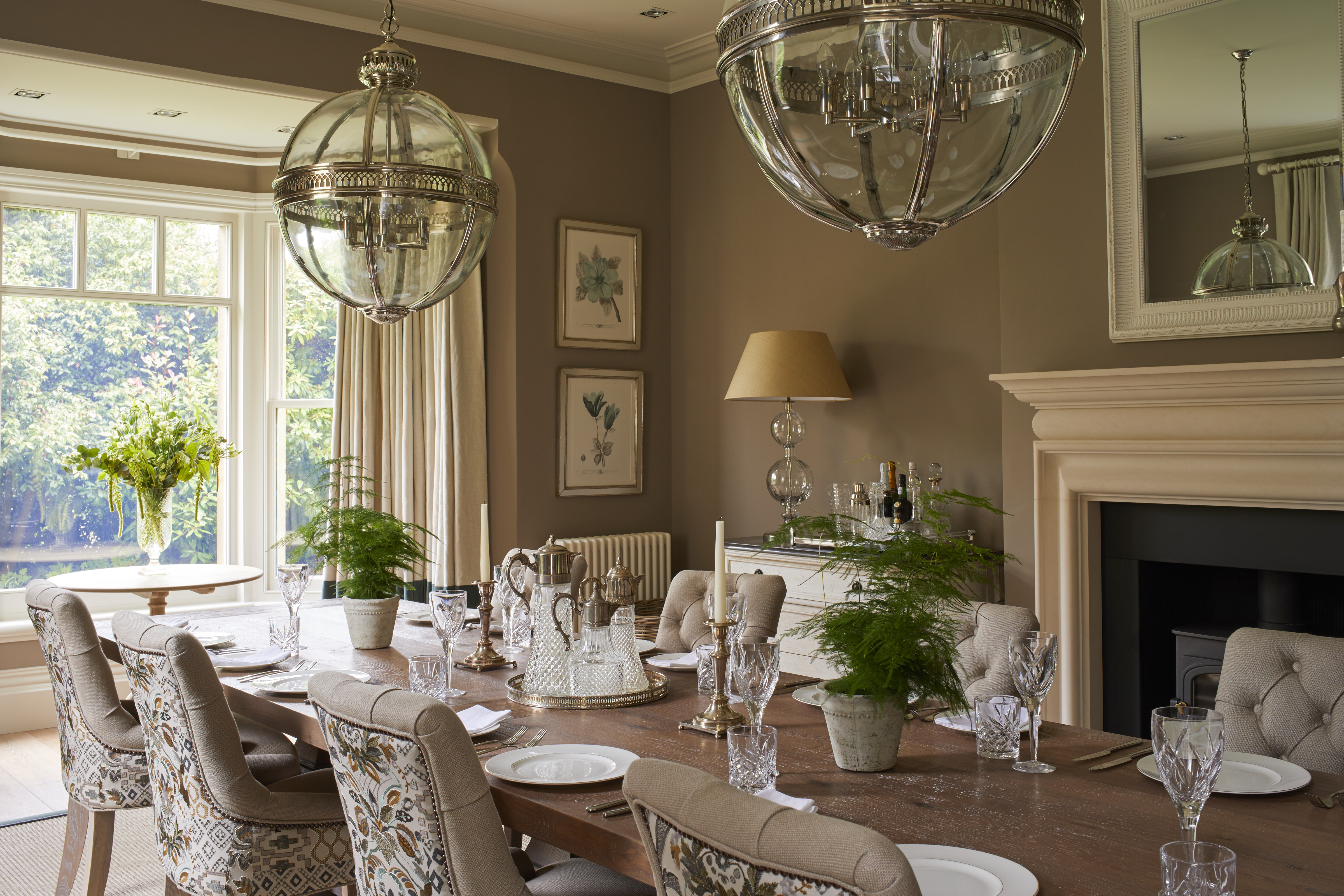
'Whether it’s the rusty leaves of an autumnal woodland, or the verdant green of rolling hills, color has the ability to communicate a feeling and enhance our mood.
Article continues below'At Sims Hilditch, we understand the transformative power of a color scheme. In many ways, our approach to a color palette is much like an artist, mixing colors on a palette. We draw our inspiration from the world around us, discovering hues in art and nature and translating them into a color scheme that fits seamlessly into a home.'
1. Be led by the history of your home
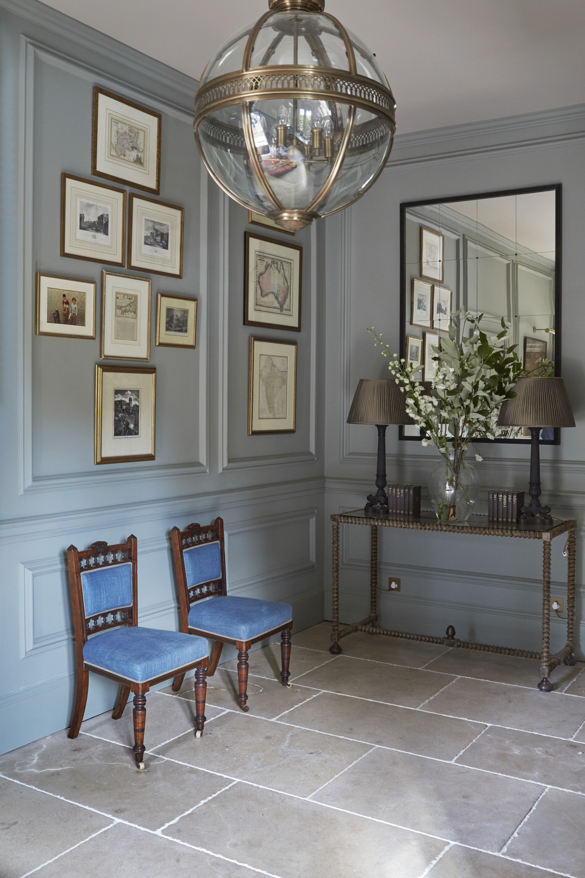
Interior design trends come and go – but Emma says that choosing color schemes with longevity is the best course.
'The Sims Hilditch ethos is simple; we embrace timeless, enduring styles that aren’t trend led and thus, wont date.
'The same can be said for our approach to color schemes, and our starting point is often the story of the home we are working on. We are currently working on a historic house in the heart of the North of England, a home that has been in the same family for 500 years.
Design expertise in your inbox – from inspiring decorating ideas and beautiful celebrity homes to practical gardening advice and shopping round-ups.
'The house itself has evolved with a mixture of Georgian, Regency and Victorian rooms and we are working with Farrow & Ball paints, whose colors have been inspired by historic houses. Little Greene also make light work of color choices, as each paint is categorized historically by the colors according to the fashions of the day, from the Georgian era right through to the 1970s.'

2. Embrace multi-tonal schemes
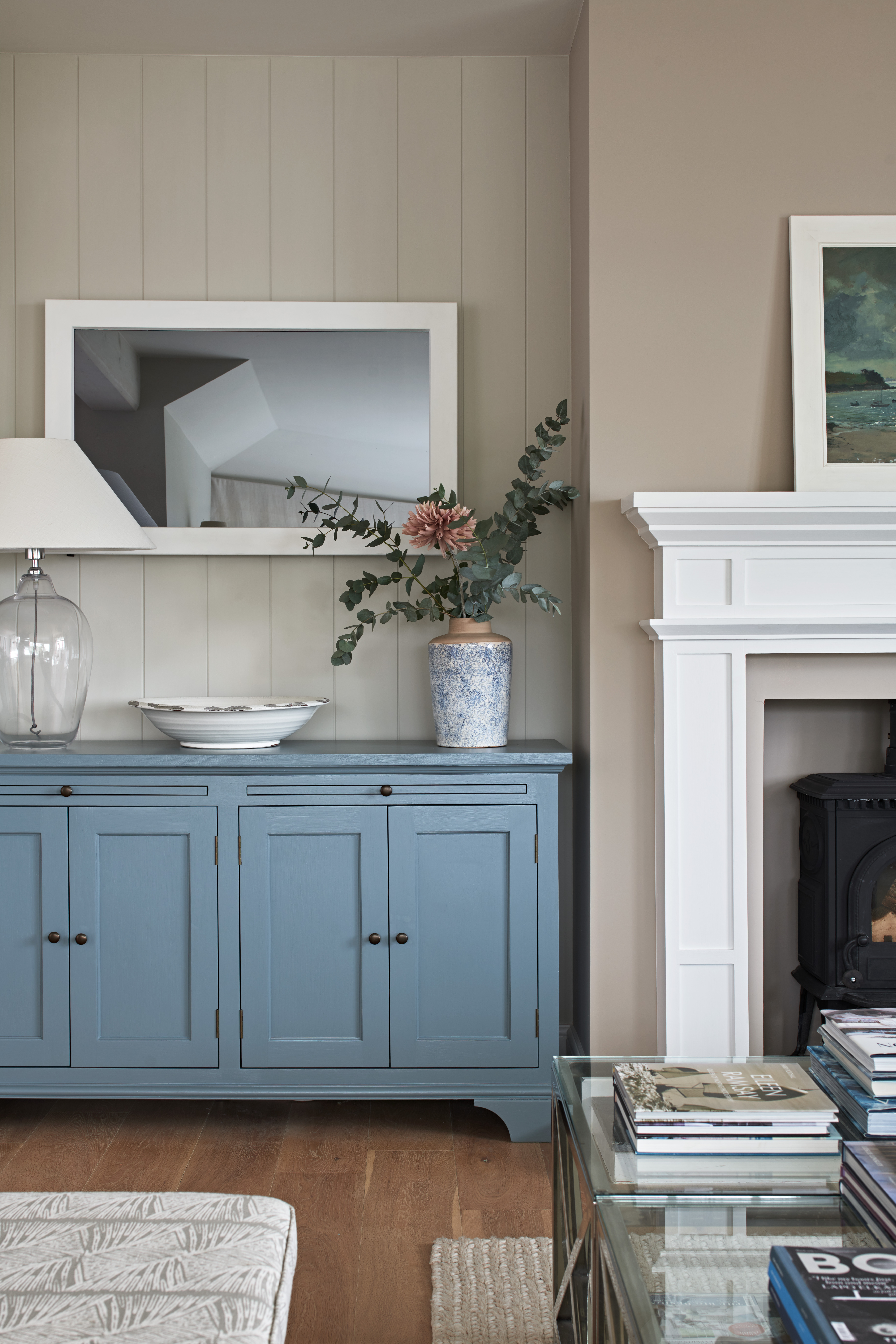
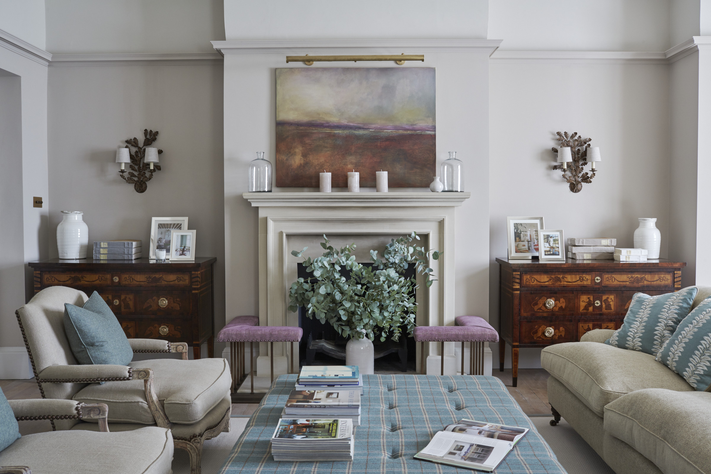
'When it comes to color combinations and palettes, we instinctively reach for analogous colors that work in harmony with each other; think Cerulean Blue and Magenta alongside Ultramarine.
'As they sit next to each other in the color wheel, the combination builds intensity whilst maintaining a natural flow of color from room to room.
'Lighting also plays a key part in our palette choices, for example, a particularly bold color scheme lends itself to softer, mood lighting that highlights key features in the room.'
3. Echo your surroundings
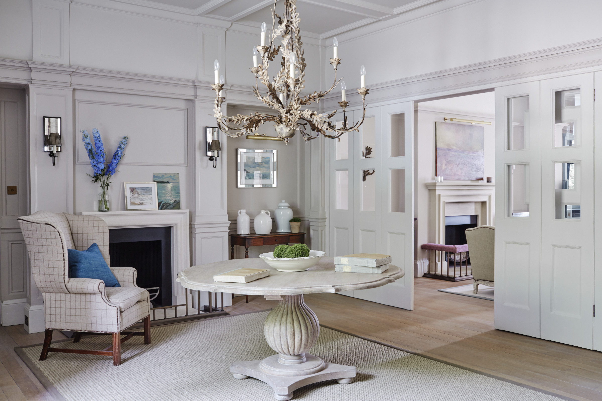
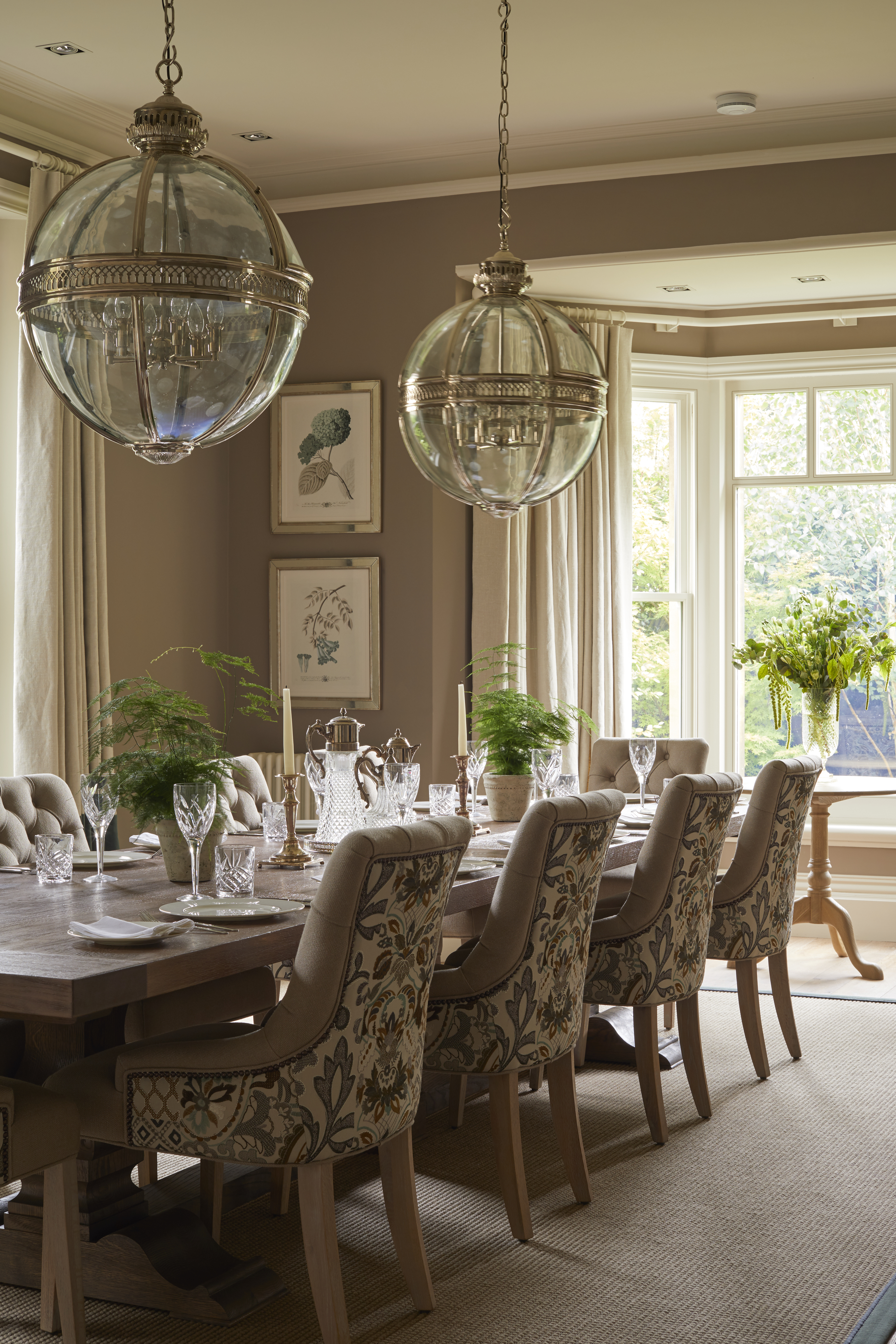
'The Sims Hilditch aesthetic is innately calm, understated and tonal and we will always be inspired by the landscape that surrounds a home. For example, a coastal property will likely suit clean, primary colors whilst a Cotswold country home lends itself to secondary, tertiary colors that create a more tonal effect.
'We have recently taken on a number of urban projects and apartments which require a different approach. City homes often work well with cool whites, such as Farrow & Ball’s School House White for walls and an All White for woodwork.
'So whether it’s color, lighting or furnishings, our ultimate aim is to create a space that feels like home from the very first moment you step through the door.'
Founded in 2009, the Sims Hilditch design practice has become one of the most trusted and respected in the industry. Its couture approach combines interior architecture, interior design and procurement management within one concept-to-completion, fully bespoke service. Creative Founder, Emma Sims-Hilditch is passionate about her belief that good design can transform not only how people live but also how they feel.