Michelle Dockery’s Use of Cardinal Red Is the Ultimate Secret to Making Delicate Powder Blue Feel Grounded and Expensive
Michelle's living room showcases a stunning set of pale blue sofas, but pops of red add plenty of flair to the design scheme

Design expertise in your inbox – from inspiring decorating ideas and beautiful celebrity homes to practical gardening advice and shopping round-ups.
You are now subscribed
Your newsletter sign-up was successful
Want to add more newsletters?
Pale blue is often used to bring depth and dimension to neutral schemes, but Michelle Dockery's London home pushes the boundaries of this delicate color.
In her living room, the Downton Abbey actress showcases a set of powder blue sofas – but a stunning contrast is created through vibrant pops of red decor. The result is a living room color scheme that looks timeless and yet fresh, with a sense of elegance that feels distinctly modern.
If you're tempted to recreate Michelle's look, you'll find a wealth of inspiration below – including cardinal red velvet pillow covers from Pottery Barn, and an all-important light blue velvet sofa from CB2.
Article continues belowA post shared by Emma Ainscough (@emma__ainscough)
A photo posted by on
Shop the Michelle Dockery-Inspired Living Room Edit
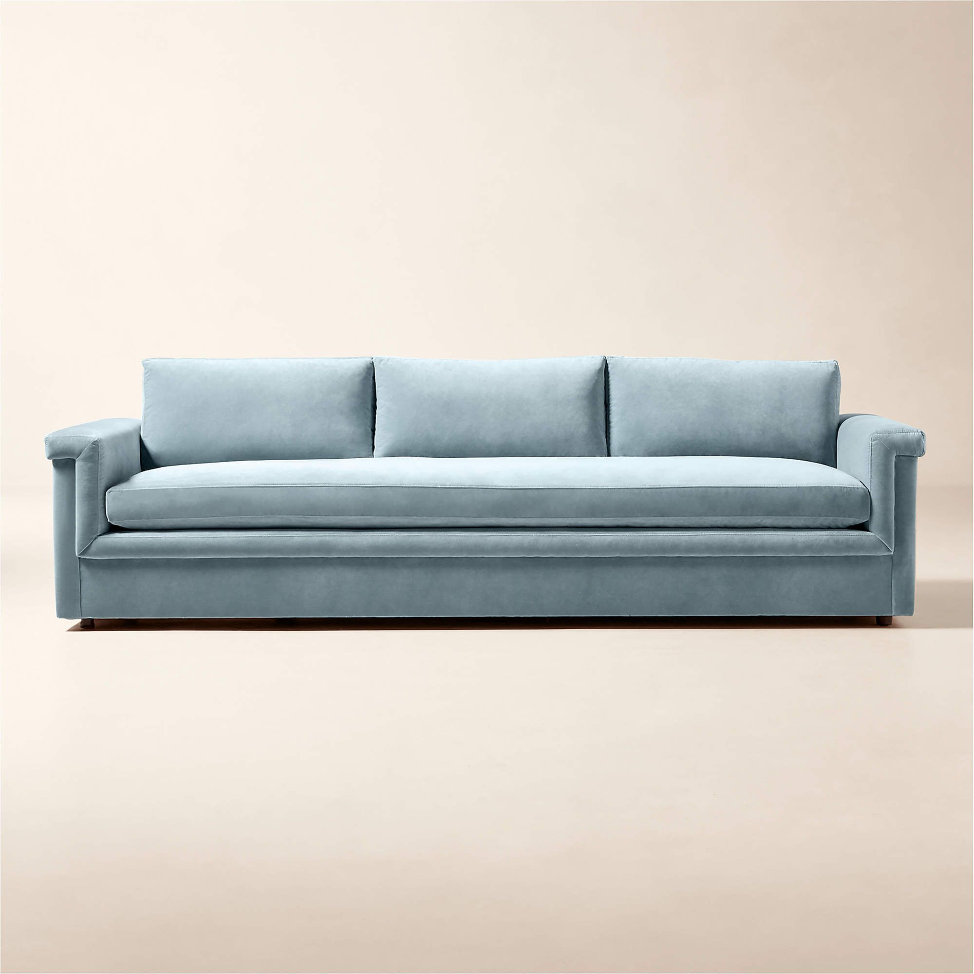
Michelle uses a split sectional in her living room, but you can get the look with this velvet sofa from CB2. It's a real statement piece: the color is timelessly stylish, while the silhouette feels contemporary.
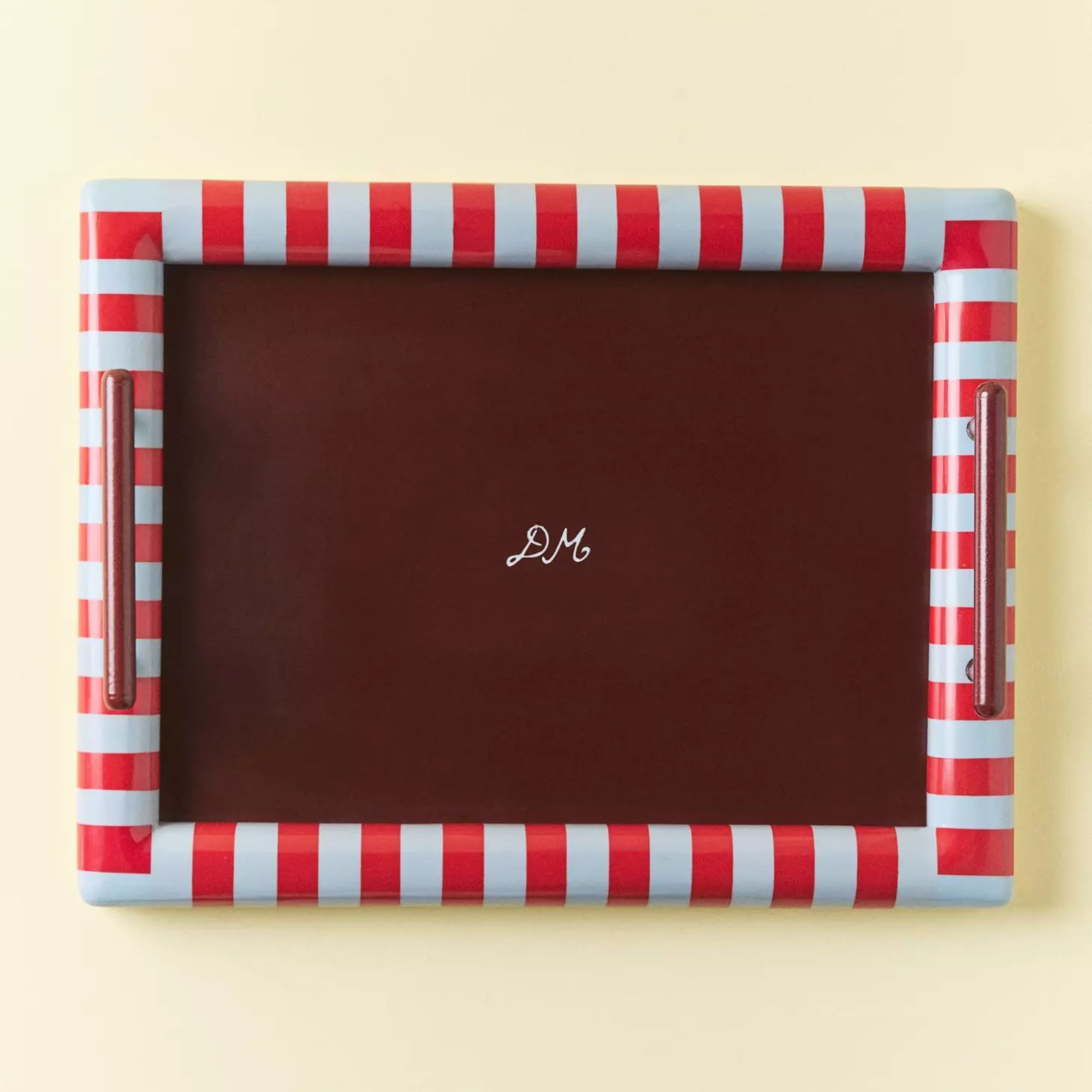
You can count on Damson Madder to serve up some bold color combinations, and this tray is a fine example. It's a great way to bring blue and red into your space, with a deep maroon shade thrown in.
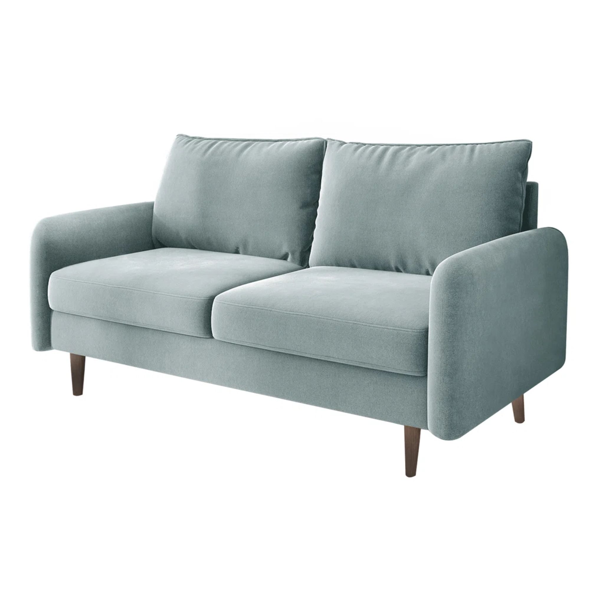
If you're working with a smaller space (or a limited budget), this loveseat is a brilliant way to channel Michelle's look. It's slim and compact, but it still feels elevated.
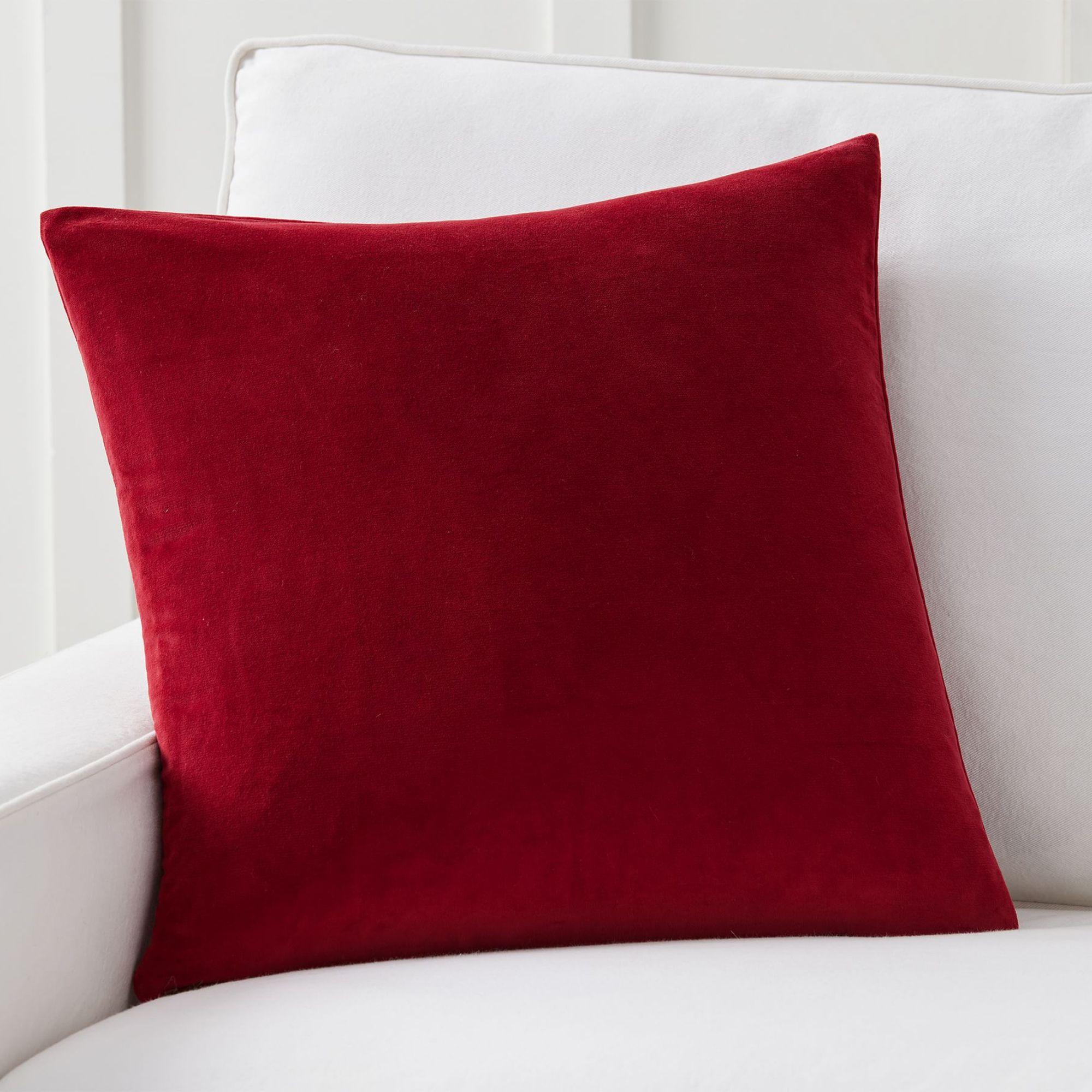
Bring some joy into your home with this vivid red pillow cover. It's ideal for adding dimension to any color scheme, but it's guaranteed to look spectacular against a breezy blue backdrop.
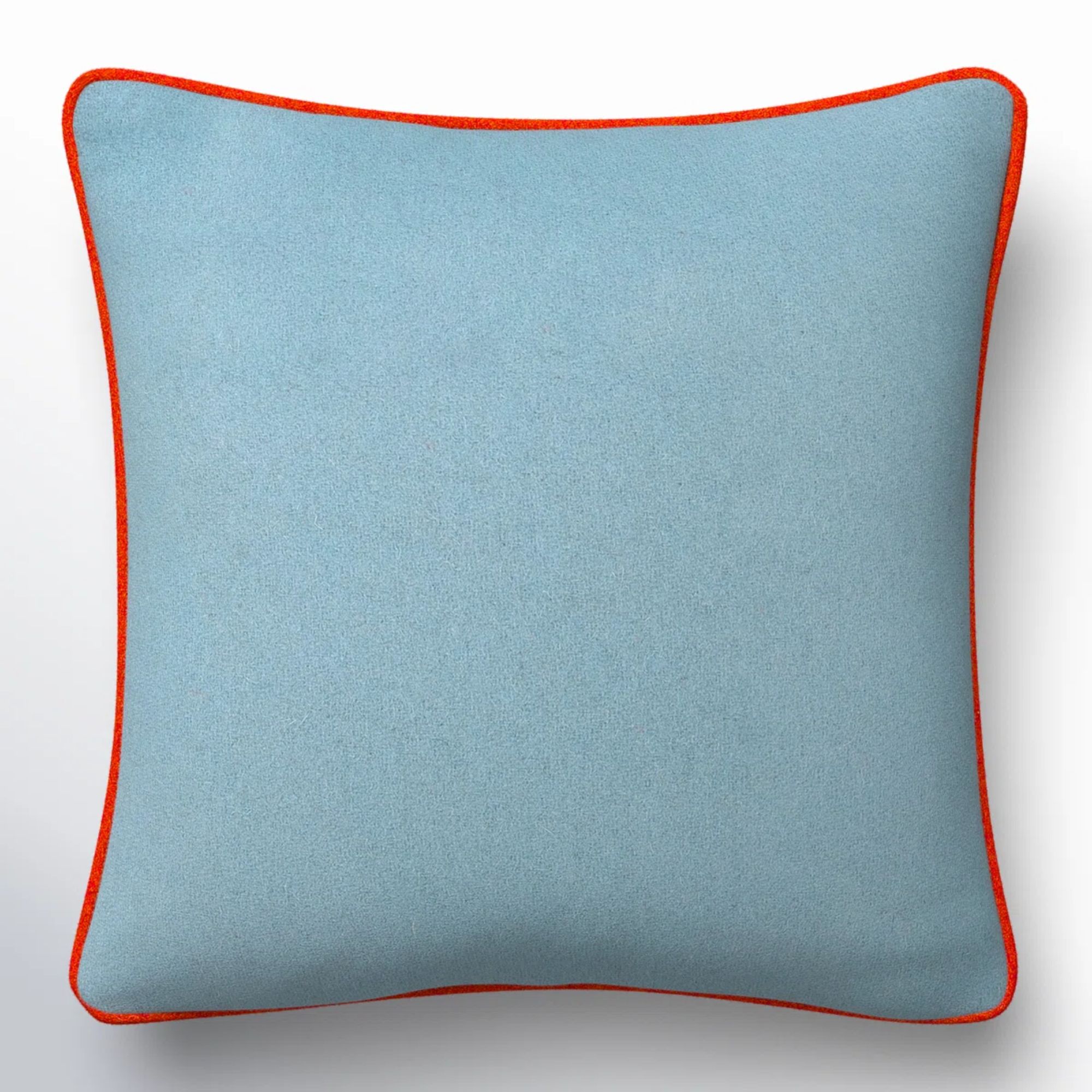
If you don't fancy investing in another sofa and some new soft furnishings, this pretty throw pillow is all you need to recreate Michelle's look. The subtle red piping provides the perfect color contrast.
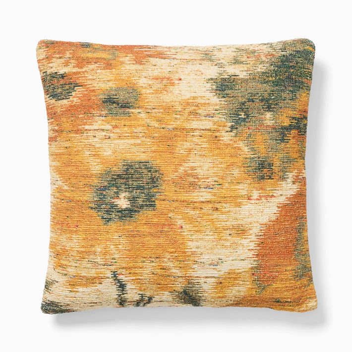
Blue and red might form the foundation of Michelle's space, but accent colors are also introduced to break up the look. She uses a yellow cushion like this one to make the room feel layered and warm.
You'd be forgiven for thinking that pale blue belongs in coastal homes or mansions plucked from the set of Bridgerton (or, indeed, Downton Abbey). It's guaranteed to look airy and elegant, but it can be difficult to ground a room that's awash in such a dainty hue.
Sometimes, of course, a breezy feeling is exactly the goal when decorating with blue, whether you're decorating a rustic bathroom or turning a bedroom into a soothing sanctuary. When it comes to living rooms, however, designers often want to make a bolder statement – and this is why unexpected color combinations like Michelle's play such a crucial role.
In Michelle's space, blue mohair seating serves as a natural focal point, but the design scheme is brought to life by the interplay between the blue and the colors surrounding it.
Most impactful are the gorgeous red cushions, which add dimension, flair, and an eye-catching accent color to the room. The velvet fabric pairs perfectly with the mohair sofas, introducing a welcome sense of tactility. These aren't just bold, contrasting colors; they're design details that feel luxurious and inviting.
Design expertise in your inbox – from inspiring decorating ideas and beautiful celebrity homes to practical gardening advice and shopping round-ups.
Naturally, color isn't the only consideration here: texture is just as important. Alongside the mohair couches, interior designer Emma Ainscough also clad the walls in cream linen fabric, placed a patterned jute rug underfoot, and finished off with a glossy resin side table and a set of opulent velvet curtains.
Jute, linen, velvet and resin might seem like yet another unlikely combination, but they seamlessly co-exist within Michelle's space. The softer fabrics maintain a sense of coziness and warmth, while both the glossy table and the woven rug introduce a more playful touch.
Just like the bold colors, these varied fabrics help to break up the space. The cream walls and blue seating risk creating a more one-dimensional backdrop, but the ingenious blend of accent colors and textures ensures that the room feels dynamic and character-rich.
According to designers, cool blue tones can be tricky to balance – but Michelle's space gets it right.
'Pale colors need a little tension, and the red cushions provide it; they warm up this space and keep the blue from feeling too precious,' explains Suzy Chase, creator of Decorating by the Book. 'The sofas feel calm but not sleepy – and what makes them sing is the contrast. Blue is uniquely good at this: it can handle different undertones in the same room and still feel harmonious.'
Layering also helps to create a kind of narrative that ties the room together.
'There's a a thoughtful color story here: a cool foundation, warm accents, and plenty of texture,' says Marissa Burrett, Lead Designer at DreamSofa. 'That combination gives the room depth and sophistication while keeping the atmosphere relaxed and inviting.' It looks like the baby blue trend is getting a vibrant makeover for 2026.
If you enjoy our celebrity news and interior design advice, why not sign up to our newsletter so you never miss the latest features?

Martha is a Content Editor on the Gardens team. Her love for lifestyle journalism began when she interned at Time Out Dubai when she was 15 years old; she went on to study English and German at Oxford, before covering property and interior design at Country & Town House magazine. To Martha, living beautifully is all about good food and lots of colorful home decor.