5 ways this glamorous kitchen in a 400 year old British stately home blends traditional with opulent
A brave, yet sensitive kitchen remodel turned a dated kitchen into a bold space for entertaining and family life

The owners of this 400-year-old stately home in Nottinghamshire spent eight years pondering whether to buy it, unsure their contemporary, colorful style would work in a historical setting.
This beautiful property had kept many of its original features, however was a little tired and in need of modernizing. The clients wanted to move the kitchen from a lower basement to the first floor.
See: Kitchen ideas – decor and decorating ideas for all kitchens

This would be more practical with four young children. It would also enjoy the amazing views from many windows. The client commissioned Martin Holliday, founder and design director of Chiselwood, due to his extensive experience of working on period and listed buildings.
'The sheer scale and grandeur of the room called for a brave design approach so their love of bold colors and glamorous, modern fixtures would sing against the original ornate panelling and plasterwork,' explains Martin.
Here are the clever ideas which turned an unmodernized kitchen to a glamorous space ready for entertaining.
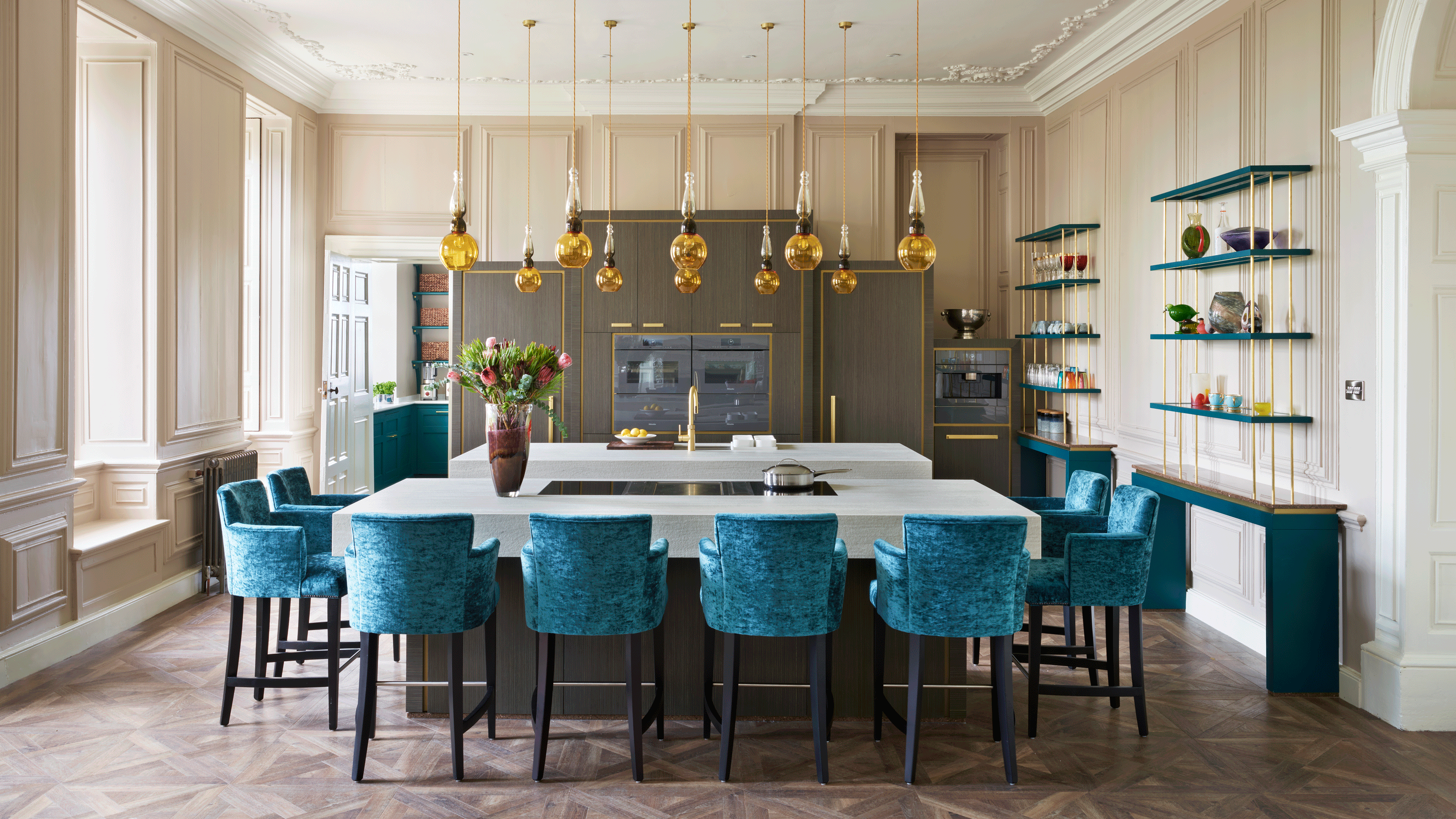
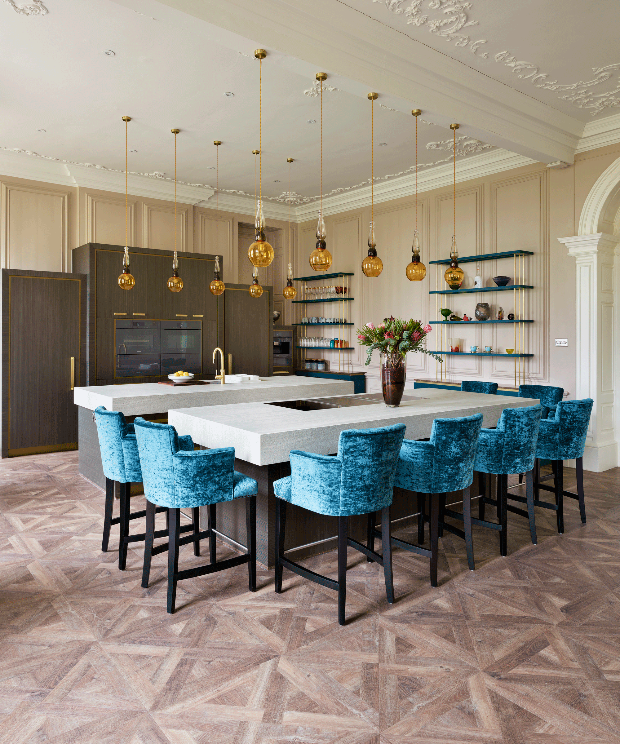
1. Double kitchen islands match the proportions of a grand space
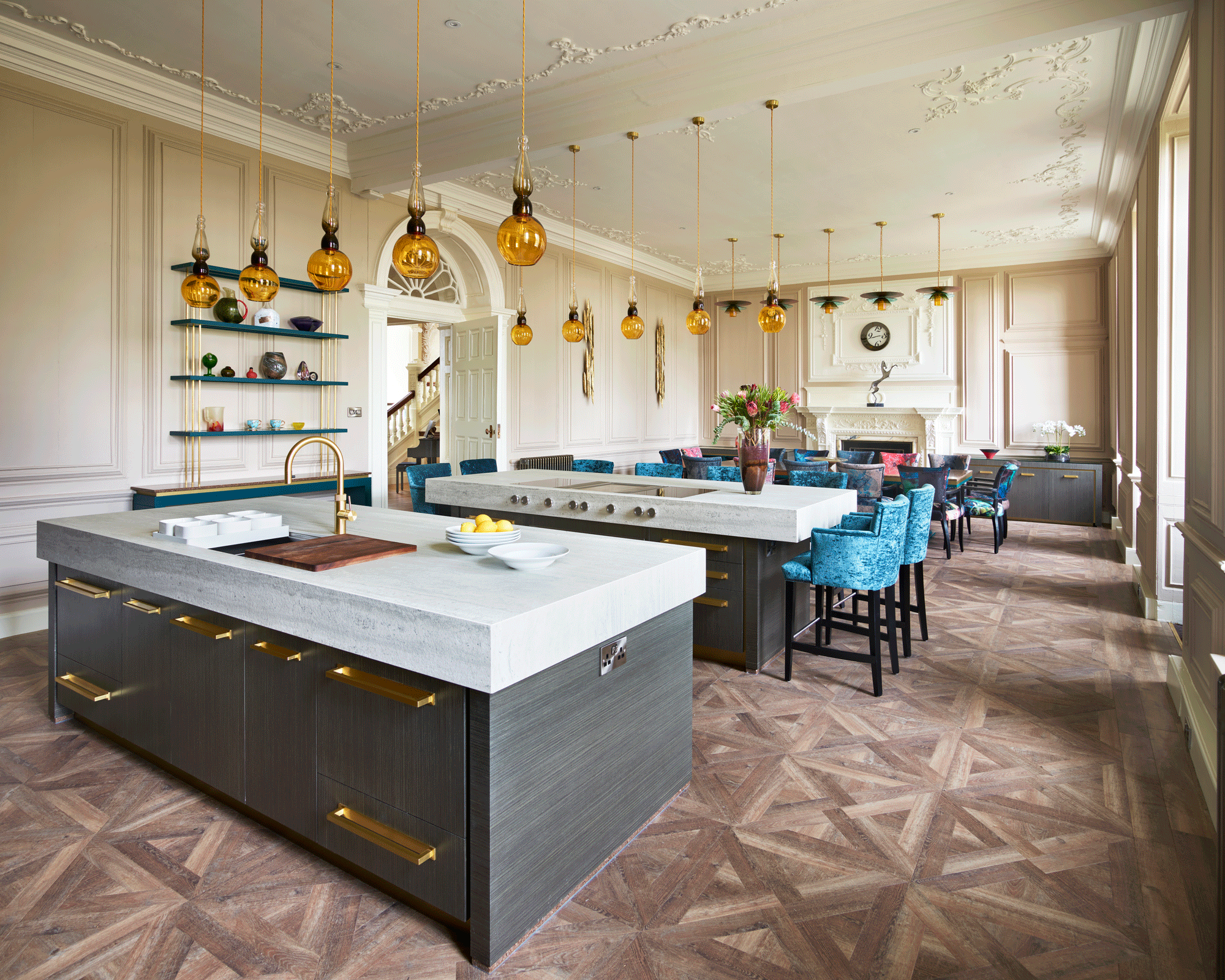
The kitchen space is separated by two island units, one with a teppanyaki and innovative Bora extraction for the couple, who love to entertain. The downdraft extraction, removed the need for ceiling ducts, which were impossible due to ceiling voids and cornice. The other island incorporates a sink and food preparation area.
'The idea of two islands stemmed from my intention to avoid interfering with the panelling in any way,' says Martin. 'They provide plenty of work surface without touching the walls and I’m proud there are only six screws in the panelling to stabilize the cabinetry.'
See: Kitchen island ideas – guaranteed to make a statement
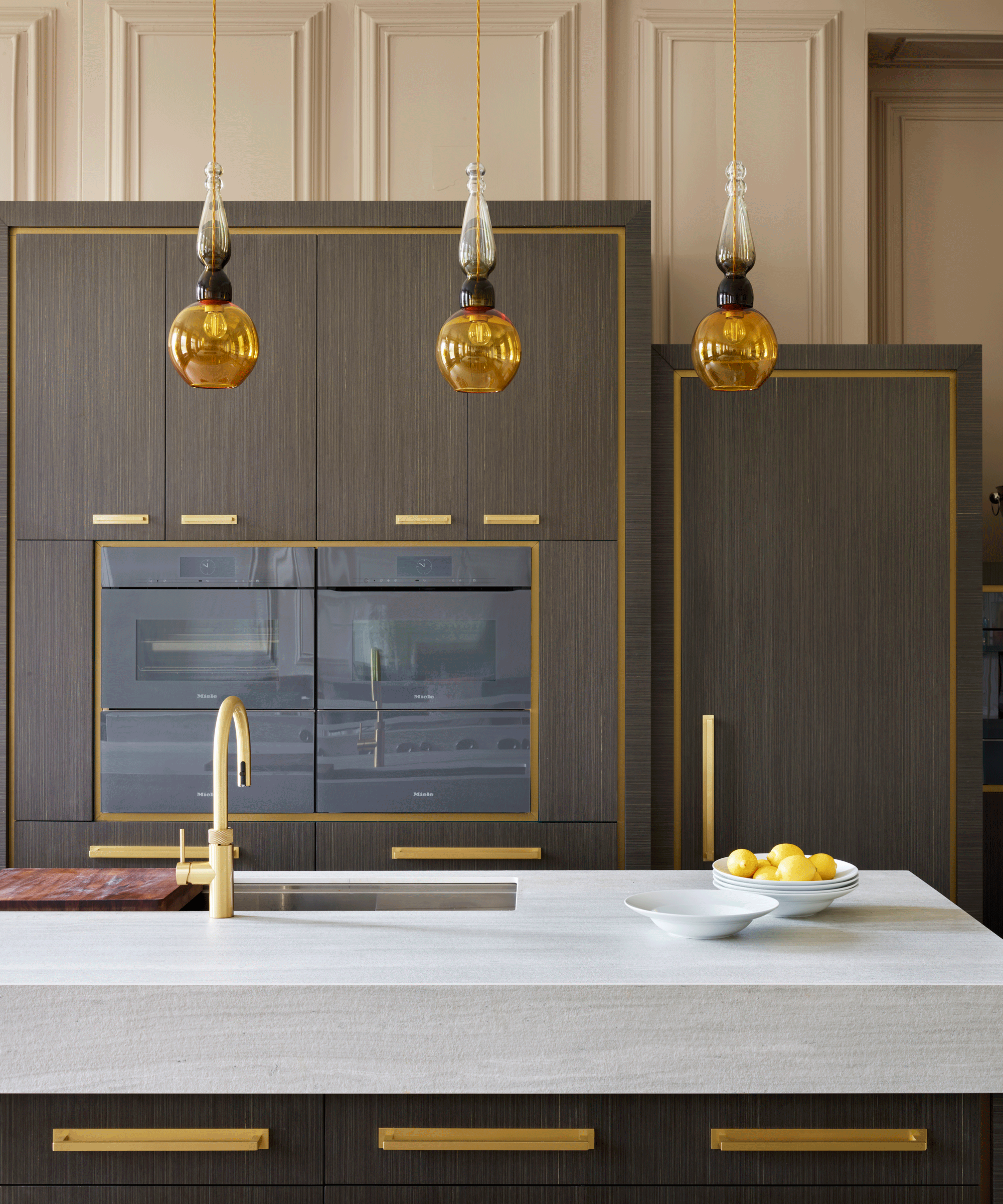
2. Chunky countertops create weight and grandeur
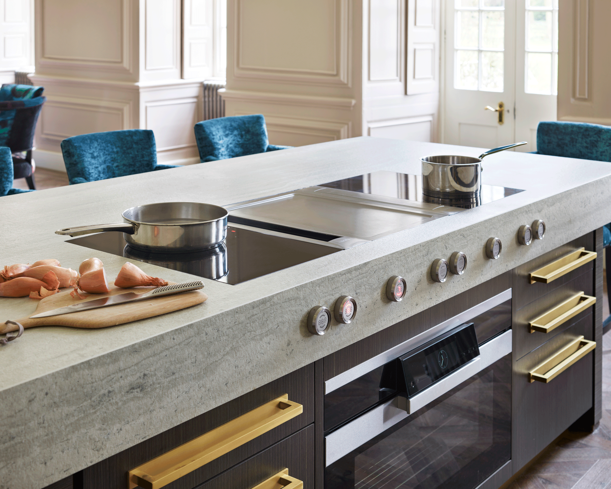
The main worktops are Strata Argentum sintered stone, which is man-made and incredibly resilient.
'It has a textured finish called Riverbed that makes it appear naturally formed by years of pummelling underwater. The chunky look is achieved by mitring deep strips around the perimeter. I wanted it to look like two large slabs of limestone, similar to those on the house’s stone exterior.'
See: Kitchen countertop ideas – worktop inspiration in marble, granite and composite materials
3. Custom-made furniture ensures a cohesive look
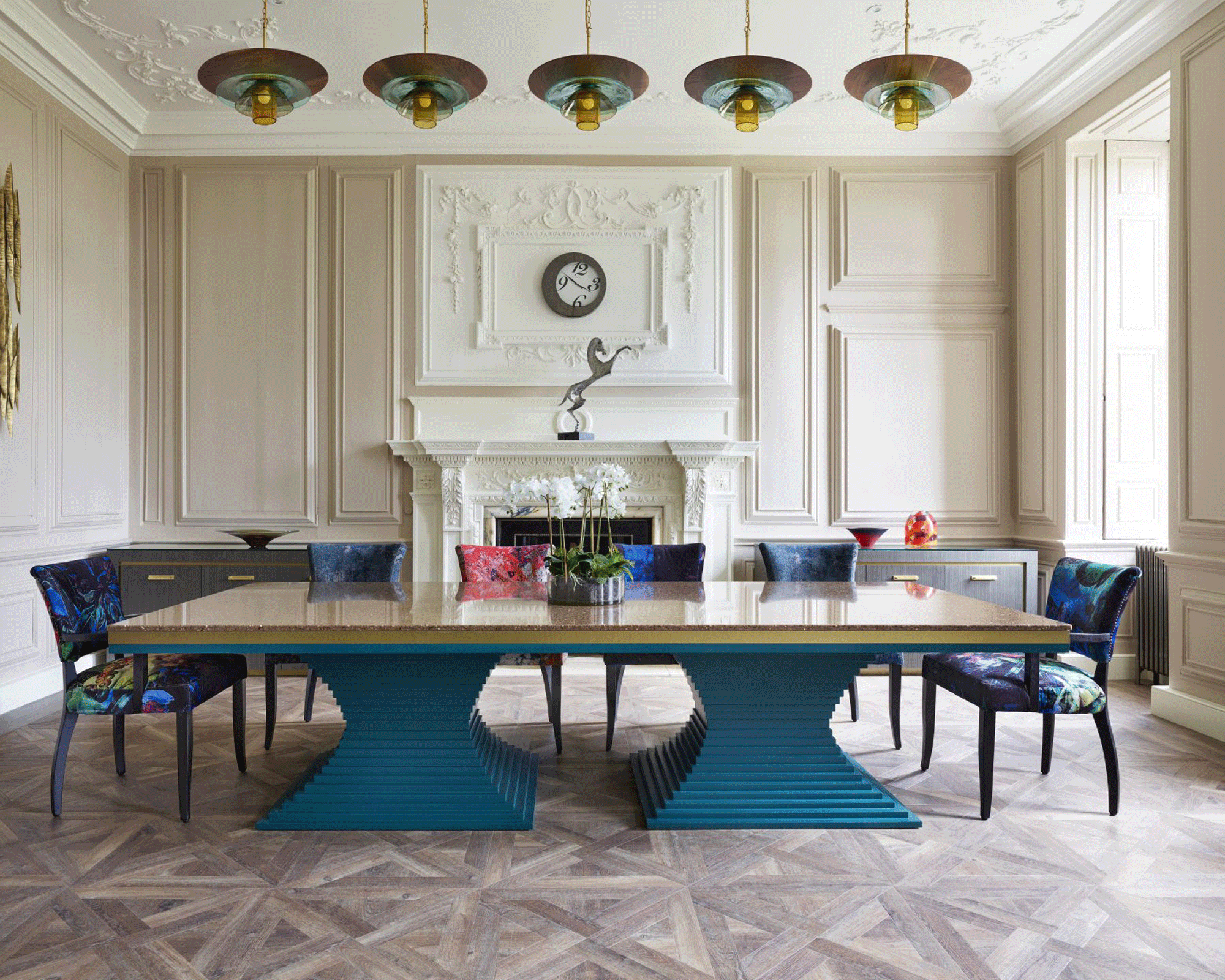
In the dining area there is a bespoke table, designed by Martin and made by Chiselwood. The clear advantage of going custom-made is that you can create a piece specific to you and your room’s specifications that you will never find elsewhere.
The stepped pedestal base is painted in Little Greene Mid Azure Green and topped in Rosslyn by Cambria. Woven brass finish trim is a design feature below the table surface. The result is a unique piece of furniture which is a talking point in the room.
4. Statement lighting celebrates high ceilings
It’s common to choose one dramatic piece for a statement light but Martin shows the striking effect that can be achieved by having a cluster of individual pendants hanging together.
These pendant lights by Curiousa & Curiousa, positioned above both central islands and the dining table, dial up the glamor and decadence and the amber globes tie in the kitchen’s brass accents giving it a unified look.
See: Kitchen lighting ideas – to set the scene for cooking, eating and entertaining
5. A color-coordinated pantry keeps clutter out of sight
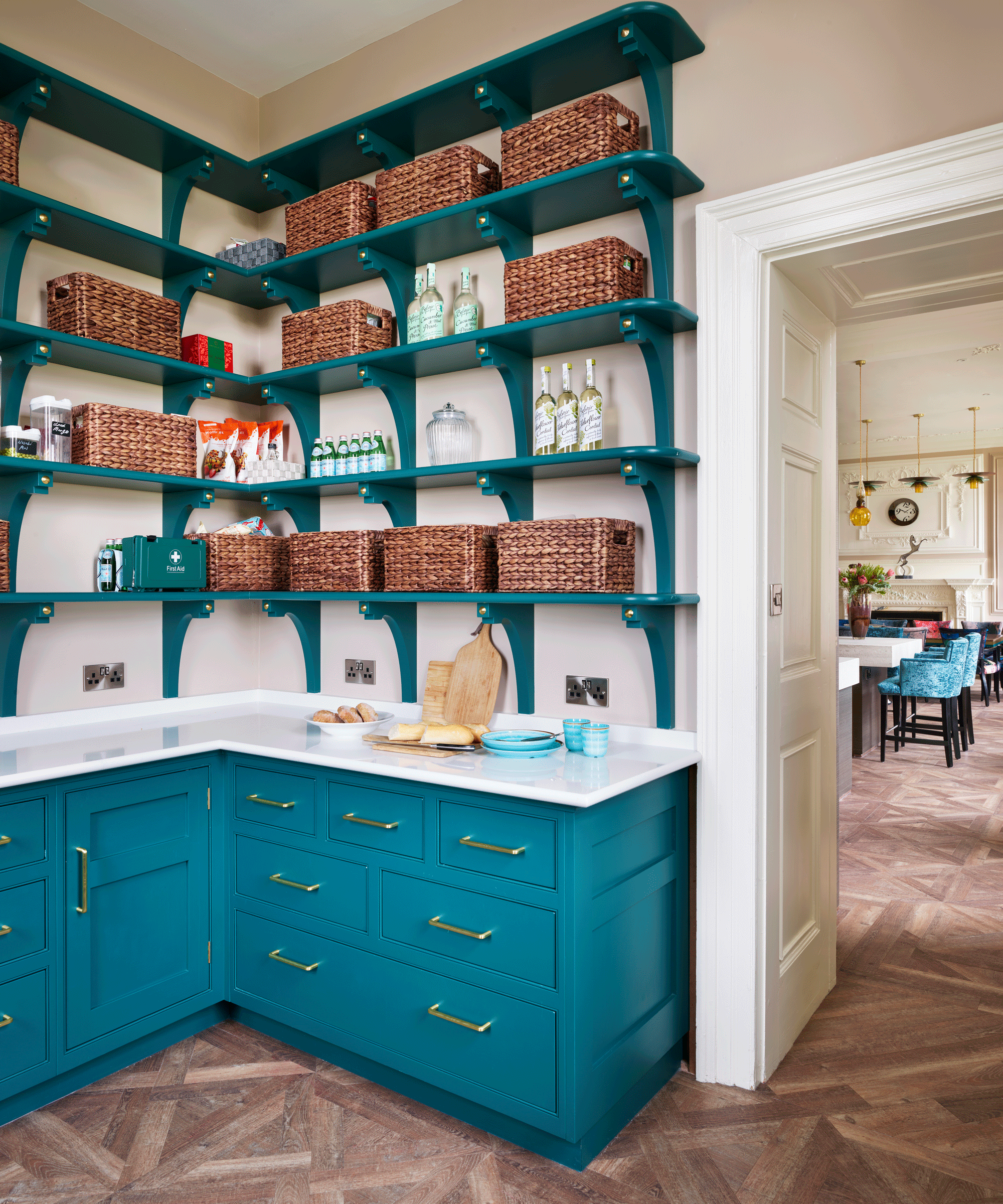
A pantry is now high on the wishlist of anyone designing a new kitchen and Martin ensured it looks as glamorous as the main area, painted in Little Greene Mid Azure Green to match the pedestal of the dining table, creating a visual connection between both spaces.
See: Pantry ideas – versatile storage that’s equally suited to modern life
The butler's pantry located behind the kitchen space is of a more traditional format. By having low cupboards, sink and worktop with walls of shelving, the space is perfect for storage and additional food preparation – keeping clutter out of view.
