How do you update a heritage NYC apartment without losing the charming original details? Designer Joshua Smith knows
'No trends were considered in this design process as it was about classic and timeless.'

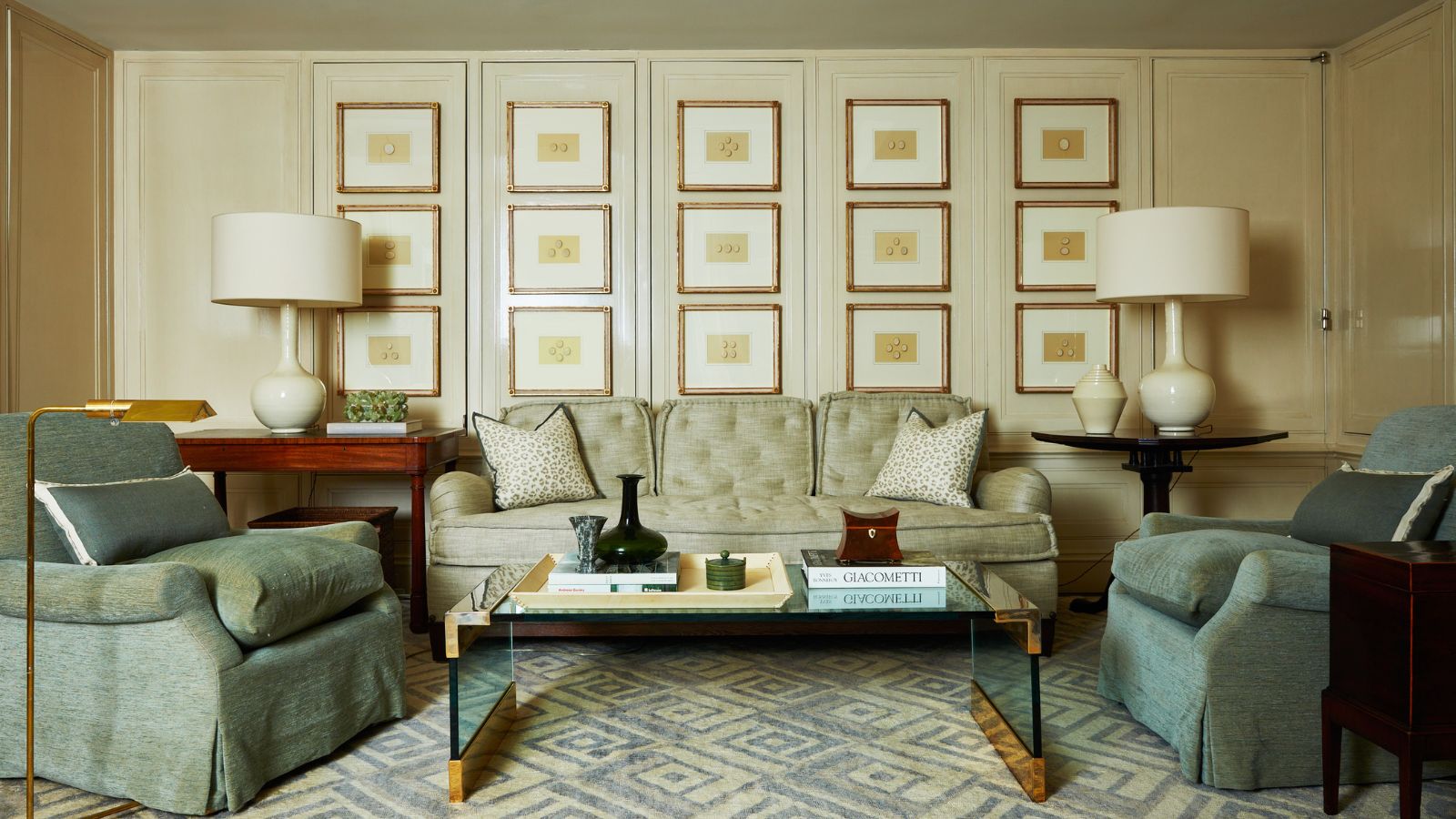
This elegant Brownstone apartment has one of the world's most coveted addresses. Opposite The Met on 5th Avenue, Upper East Side, NYC, it's part of a block that dates from 1926, with all the classic period detailing you'd expect from such a historic gem. Apartments in this location are highly sought after and following a major redesign of the interiors, this one ranks among the best.
The owners called on interior designer Joshua Smith to update the house design, keen to preserve the home's charm but conscious there were many areas that required improvement.
'For inspiration, we looked at the classic NYC Upper East Side,' says the designer. 'We wanted timeless, elevated, and elegant but not stuffy or pretentious. As beautiful as the home is, it’s very livable. Each space is used daily and all maintain harmony and balance, perfect for escaping the bustling city outdoors.'
Take the tour, as designer Joshua Smith explains how his transitional designs, balancing old and new elements, were at the heart of the updated schemes.
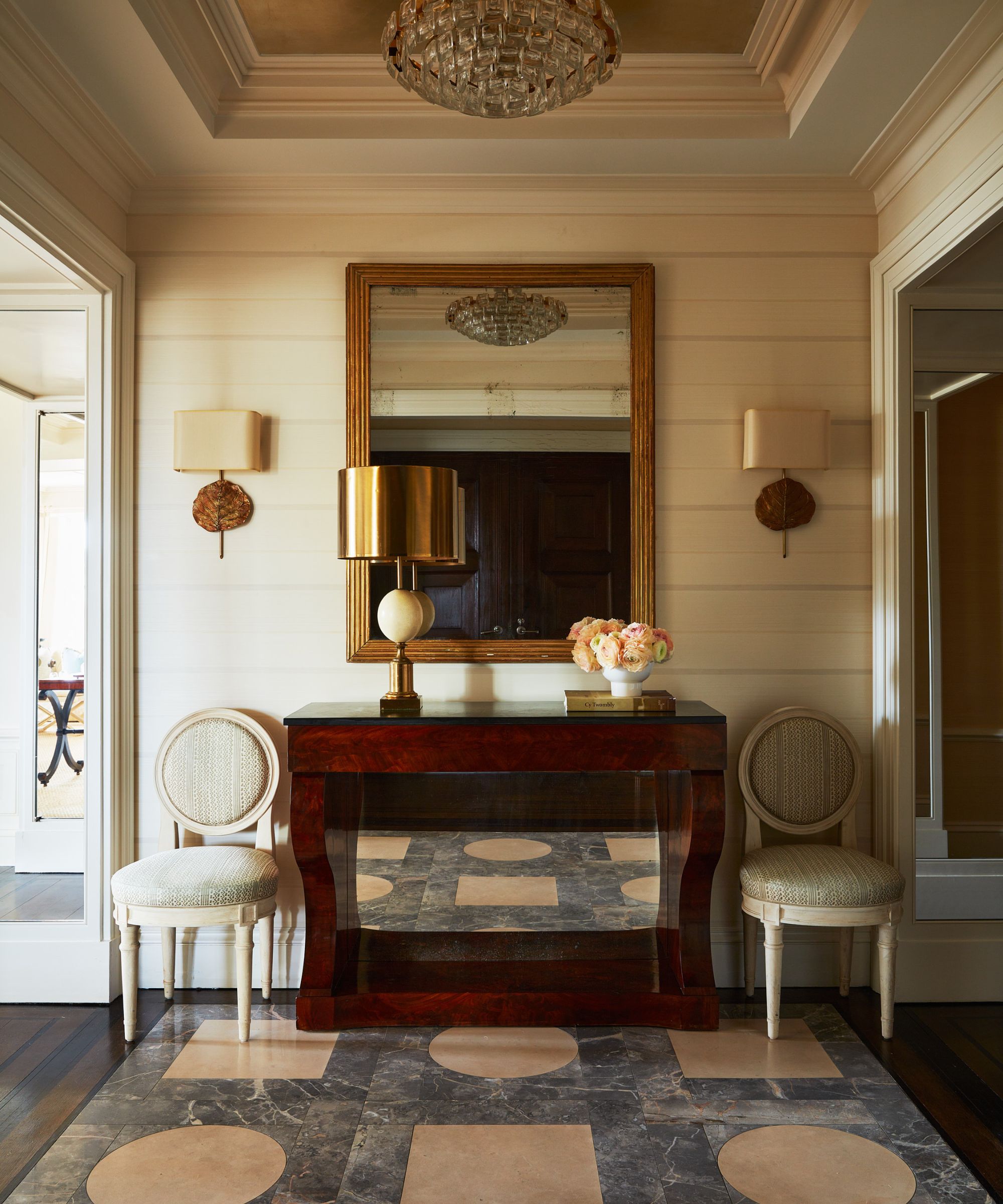
'It was important to consider the architecture and its relationship to the interior design,' explains Joshua Smith, recalling his starting points. 'It's in a prewar building and across from The Met, which is why we chose to mix antiques with comfortable furniture. It was also important that we do it in a way that felt fresh, light and serene.'
This approach is clear in the entryway ideas, where the foyer, pictured above, has a livable and relaxed, yet classic appeal.
'We wanted to create a sense of arrival,' explains the designer. 'Sometimes in NYC apartments, there isn't much architectural interest. Here we wanted to create an architectural moment with the different ceiling colors. We chose an antique French mirror and the sconces echo the gilt feeling. The lamp is a vintage 1940s brass lamp. We flanked the side with Swedish chairs covered in Fortuny fabric to soften the room. We layered it in a way that felt welcoming and visually interesting.'
Design expertise in your inbox – from inspiring decorating ideas and beautiful celebrity homes to practical gardening advice and shopping round-ups.
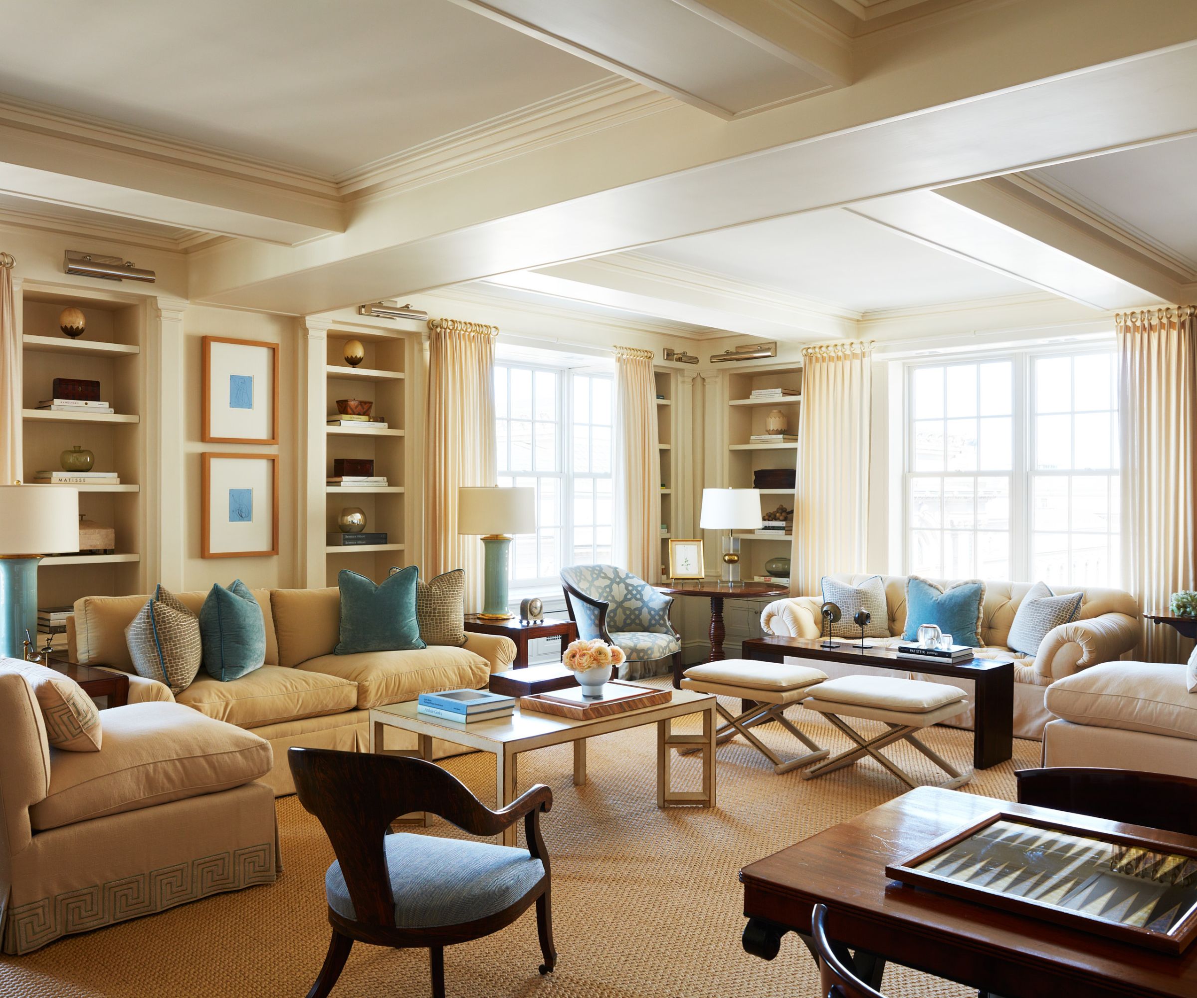
'The key with working with prewar NYC apartments,' says Joshua, 'is they have big formal living rooms.'
Large formal living rooms present many challenges, but the living room ideas here involved creating zones to give each part of the room purpose and visually divide the space. There's a desk area, a first seating area and coffee table, while at the other end of the room is a grand piano. The designer also added contemporary touches to balance the more traditional style elements. The striking lamps, used both to punctuate and unite the spaces, are from Christopher Spitzmilner.
'We used a light sisal rug to add texture and warmth to the formal room,' explains the designer. 'And kept the formality with antiques, then used a barrel back chair and silk velvets from Romo Fabrics. It was important to think about the details, such as adding fringe to pillows in contrasting colors or different welting.'

Joshua Smith started his eponymous design firm in 2012 after a career in real estate where he discovered his passion for interior design. Along the way, he earned his certification as a professional coach and meditation teacher, with both playing a pivotal role in his design philosophy. For instance, in this Fifth Avenue apartment, he wanted to create a space that was harmonious and balanced the hustle and bustle of the busy streets outside. The color palette he used is soft, with hues of blues, tans, and creams that create a tranquil environment.
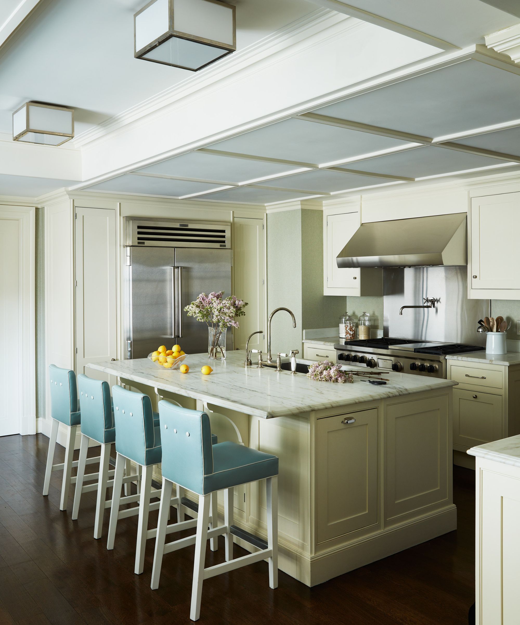
Kitchen ideas play to the strengths of the original architecture here, with the simple cabinets reflecting the classic Upper East Side paneled ceiling. 'We chose to go very functional in terms of how the clients live,' explains designer Joshua. 'The barstools are custom-made with the same vegan leather as the banquette, with a white contrasting welting and white buttons to give it visual interest. No trends were considered in this design process as it was about classic and timeless.'
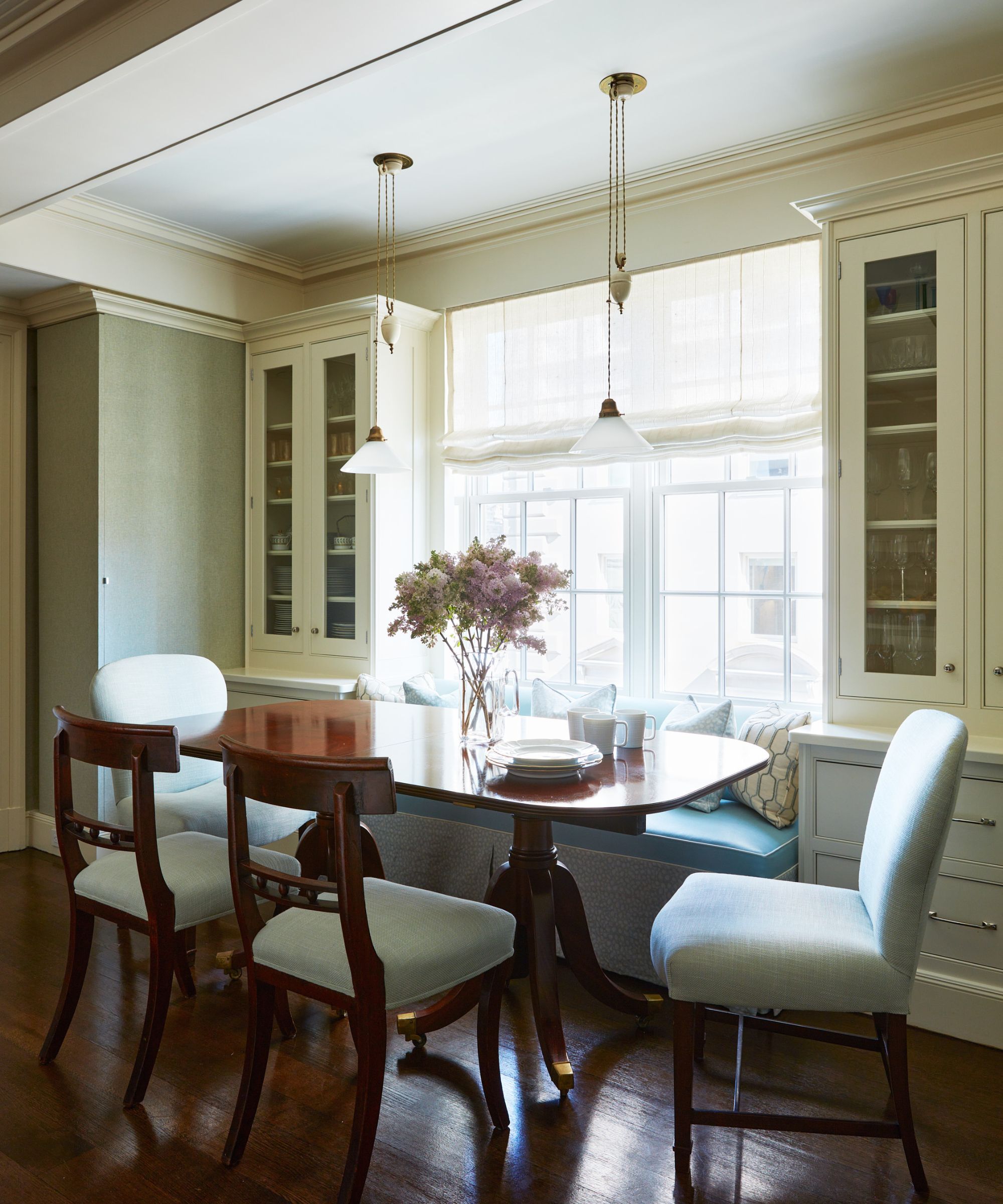
This area in the kitchen is the central part of the house. We wanted to have it be soft and transitional in terms of color. As he considered the options for eat-in kitchen ideas, Joshua Smith came up with the idea of a custom banquette in vegan leather with contrasting welt. 'The combo with the mismatched antique chairs made for a beautiful story,' he says. The fabrics were from Kravet and Schumacher, wallpaper by Philip Jefferies.
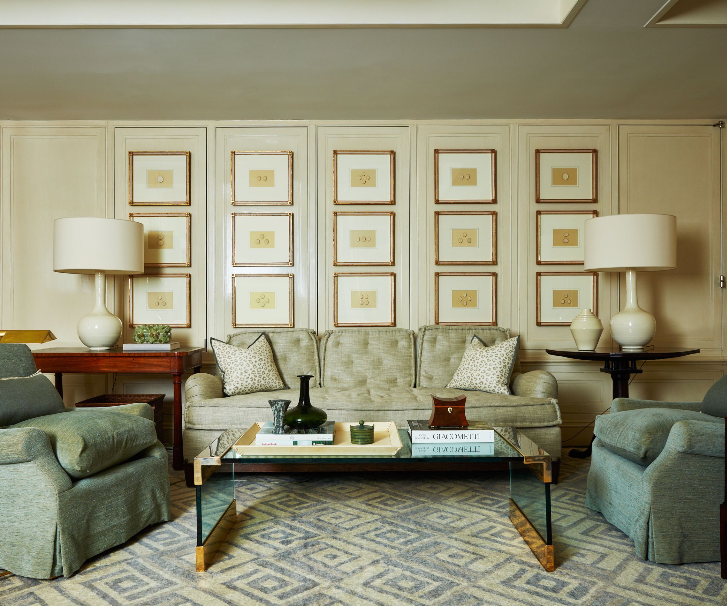
Dining room ideas double up as home library ideas in this apartment, with space for an inviting seating and reading area on one side of the room.
'The carpet was our starting point. Custom-designed with a green and cream diamond pattern, it’s approachable and formal without being intimidating,' says designer Joshua Smith. 'Starting with a geometric pattern moved the room from period to fresh and young. We chose a 1940s Lucite glass table with a brass base and sides, adding coordinating vintage porcelain lamps with Holland & Sherry wool shades to bring unity. The cameos in gilt frames were sourced from an antique dealer.'
The designer has unfinished business in this room, however. 'The only things I would change in this apartment are the club chairs in the library,' he says. 'If we wanted to be more playful we could have gone with a small-scale pattern. We should have upholstered those in Fortuny.'
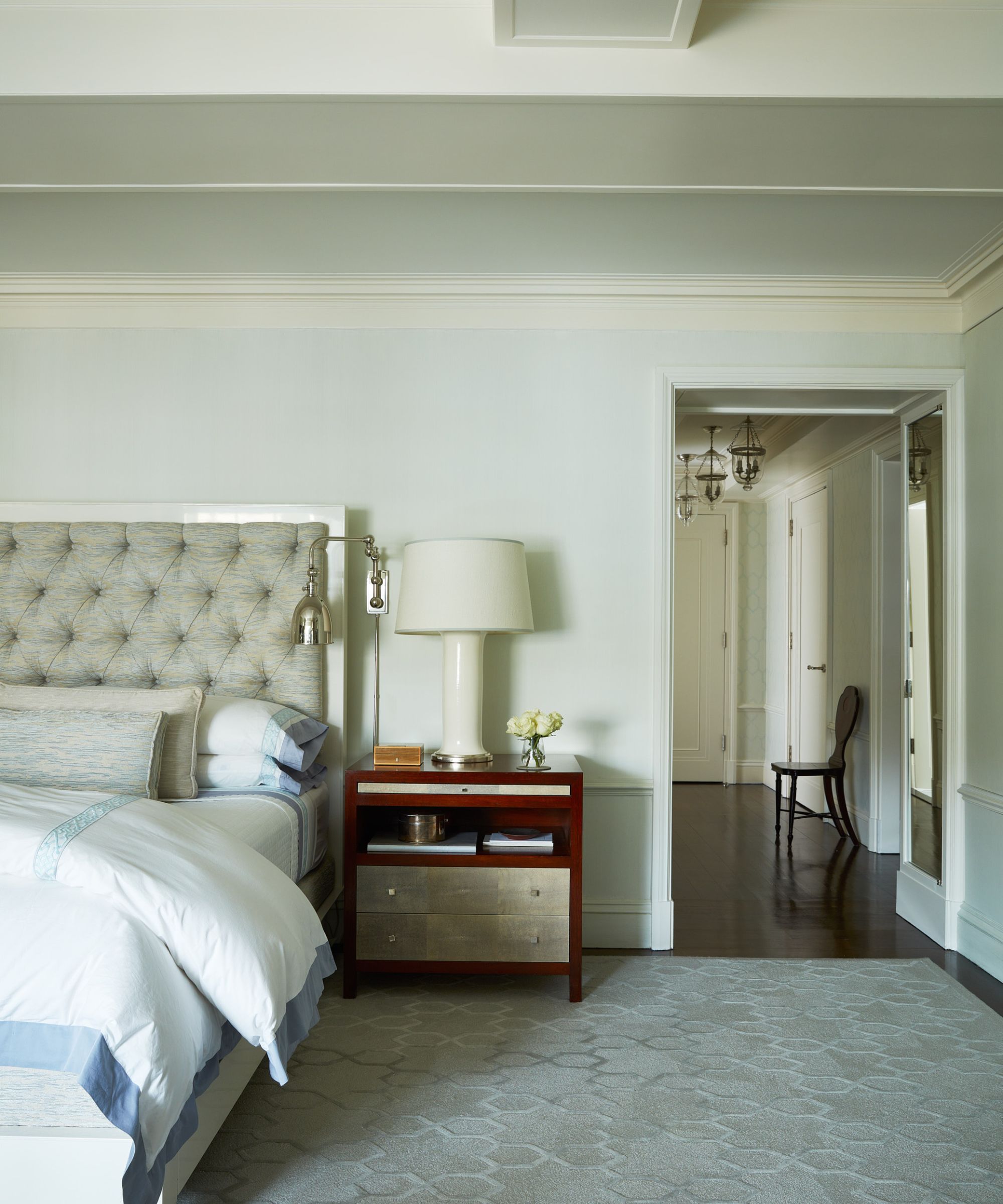
Anyone looking for bedroom ideas with an elevated look will find plenty to inspire them in this space.
'The primary bedroom is my favorite. It looks beautiful but when you walk into the room your shoulders drop,' says Joshua. 'It took us 12 tries to get the perfect ethereal softness on the walls. It’s serene and beautiful, and layered with rich textures and fabrics to bring in a modern touch.'
The designer chose a custom-designed bed by Dune. 'I wanted to go with a modern bed to make it fresh and youthful. A Sabina Fay Braxton fabric is used on the headboard as well as the front pillow, and diamond tufting adds visual interest without going heavily patterned. On the nightstand is a Christopher Spitzmilner lamp and custom shade.'
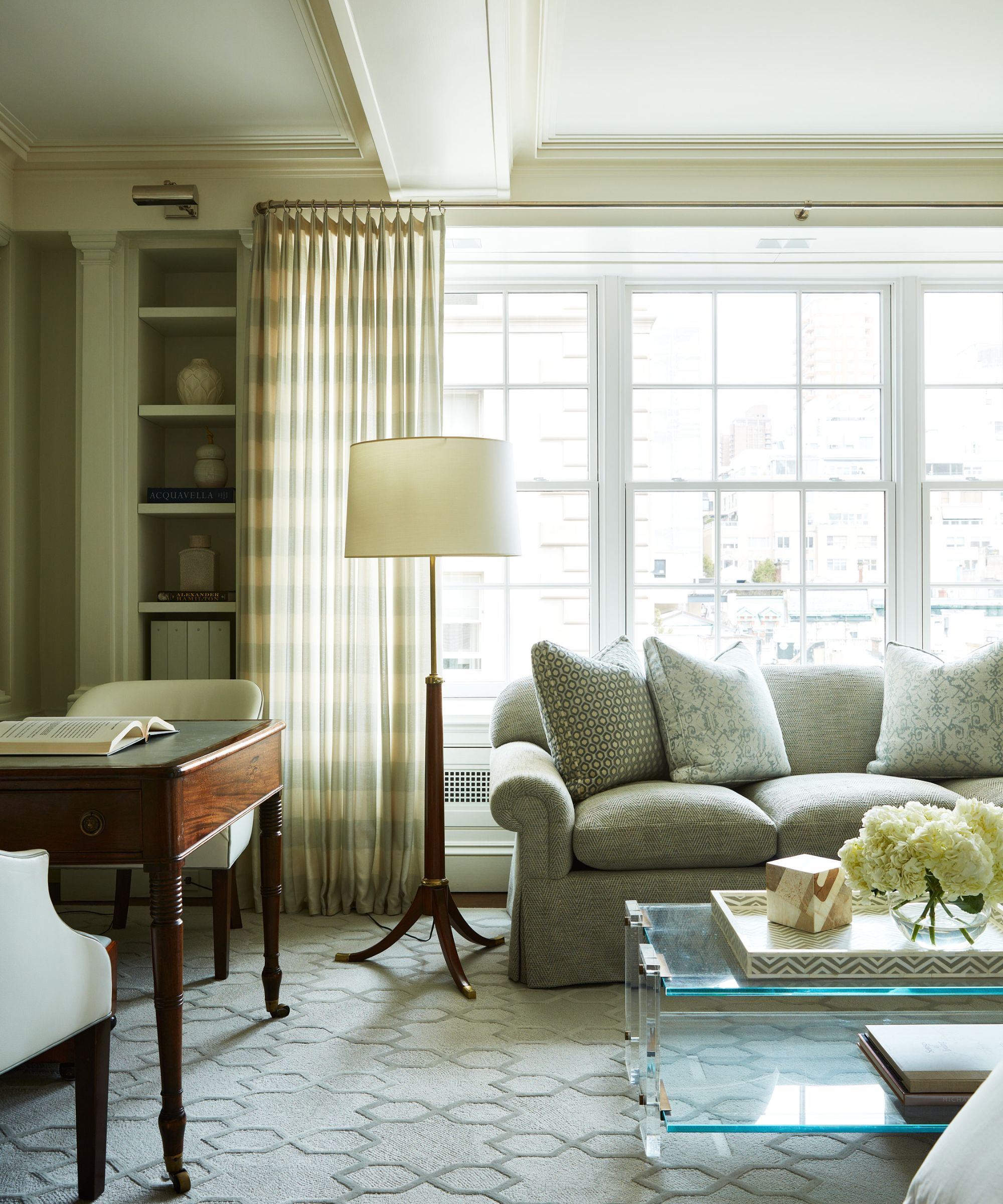
Bedroom layout ideas can become complicated in large-scale rooms. Not so here, as opposite the bed is a seating area with a leather-topped antique desk and leather chair, making perfect use of the space. 'The vintage lamp adds an almost sculptural moment,' says the designer, 'While a gorgeous sofa in a chevron pattern is paired with a modern mid-century table layered with trays.'
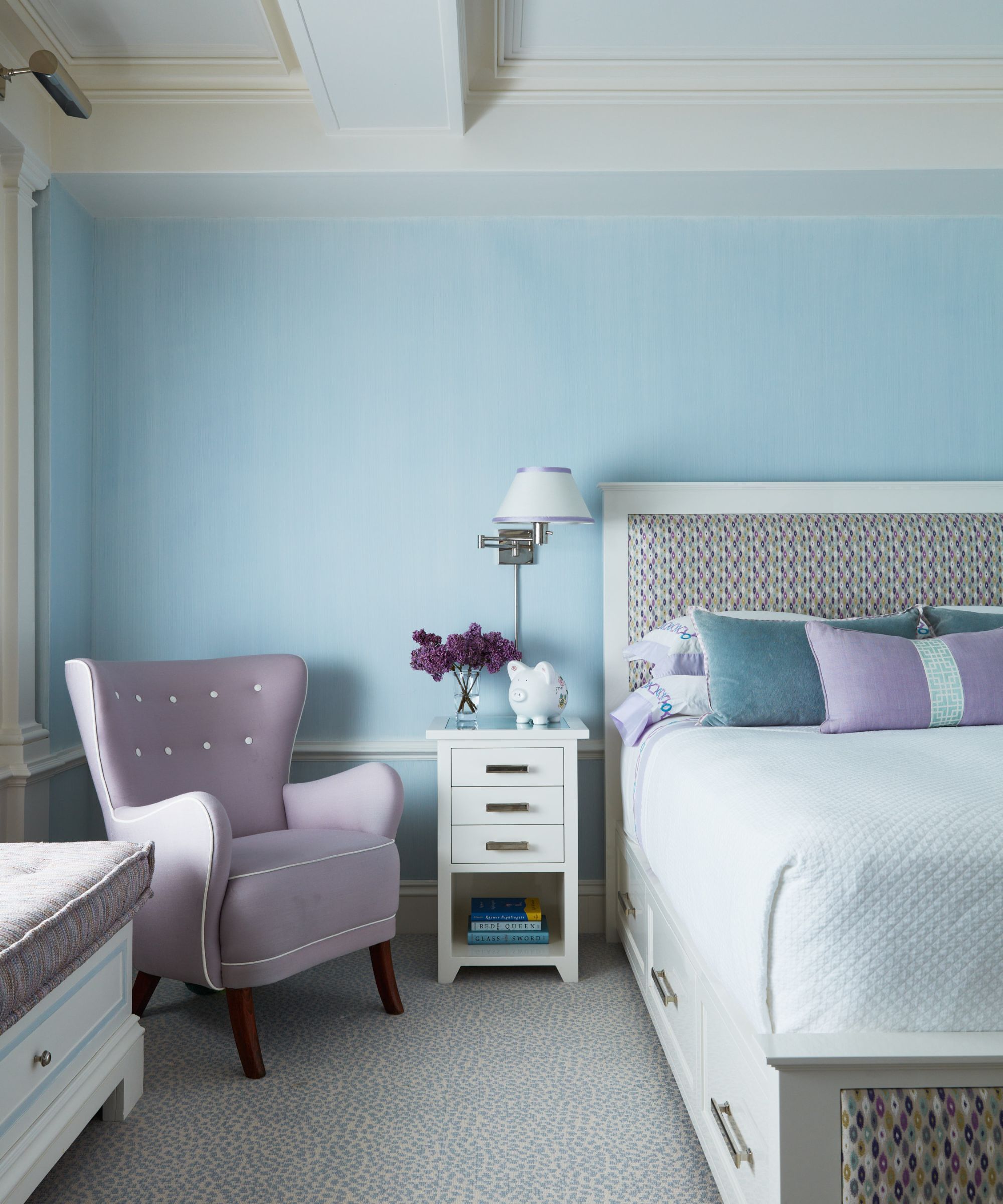
'We opted to go for a more interesting color combo in the guest room, by using lavender blue and aqua, and doing custom paint watercolor stripes on the walls,' says the designer.
The Romo fabric on the custom bed was the start of this room's bedroom color ideas. Next to the bed is a vintage curved-back 1940s chair in a contemporary purple wool fabric. the nightstand is also custom-made in a white lacquer finish.
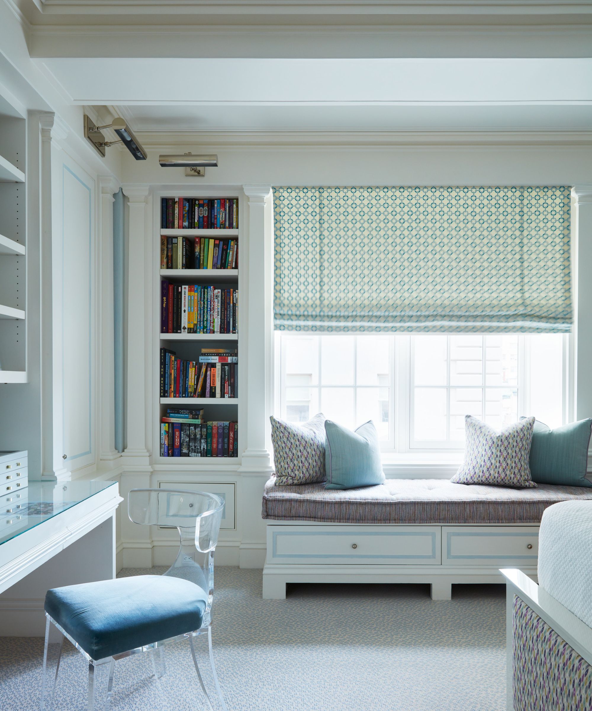
'The detailed millwork in the guest room is in keeping with the other millwork throughout the house, with a custom marble floor and baseboards. A vintage bench is upholstered in a Schumacher velvet with white contrasting button tufting on top.
'The Lucite chair is upholstered in a Kravet velvet and the tufted Greek edge banquet cushion is a Rogers & Goffigon. The Roman shade was Schumacher,' says designer Joshua.
What is the secret of this successful redesign, to what does it owe its calm, refined elegance? Simply this:
'No trends were considered in this design process as it was about classic and timeless,' says designer Joshua Smith. 'The clients were very involved in the process and their overall reaction was that it was better than they could have envisioned or imagined. They loved the cohesiveness as you flowed from room to room throughout the entire home.'
Interior design: Joshua Smith
Photographs: Tim Lenz
Karen sources beautiful homes to feature on the Homes & Gardens website. She loves visiting historic houses in particular and working with photographers to capture all shapes and sizes of properties. Karen began her career as a sub-editor at Hi-Fi News and Record Review magazine. Her move to women’s magazines came soon after, in the shape of Living magazine, which covered cookery, fashion, beauty, homes and gardening. From Living Karen moved to Ideal Home magazine, where as deputy chief sub, then chief sub, she started to really take an interest in properties, architecture, interior design and gardening.
