'I get texts from the homeowner saying that she keeps pinching herself' – how this design team loosened up a formal 1930s layout to create a layered and livable Upper East Side apartment
Architects Andrew Magnes and Chris Boskey collaborated with Nate Berkus Associates to remodel an uptown apartment with a relaxed feel for their formerly downtown clients

Design expertise in your inbox – from inspiring decorating ideas and beautiful celebrity homes to practical gardening advice and shopping round-ups.
You are now subscribed
Your newsletter sign-up was successful
Want to add more newsletters?
A family of five in Flatiron: it has a nice ring to it. But after living downtown for years in an open-concept apartment, the parents longed for structure – maybe even a separate kitchen with doors, so the whole home wouldn't sound or smell like a restaurant whenever they fried an egg.
They still loved their home, however. And so it made sense, after purchasing an Upper East Side apartment in a 1930s building, to work with Andrew Magnes Architecture, the firm behind their Flatiron home. Coincidentally, the family had a personal connection to Nate Berkus Associates (their cousin recently worked with the firm on a renovation the family adored), making the A-list design firm an obvious fit to finesse the interiors.
Simply put, it was a gut. 'They were really excited about the light that was coming in and just the layout of building – and the location was half a block from Central Park,' says Andrew. But the apartment itself had its original prewar layout, tailored to a lifestyle that no longer exists. There were staff corridors, maids’ rooms (plural), a large formal dining room – all in all, more structure than the parents had in mind.
Article continues below 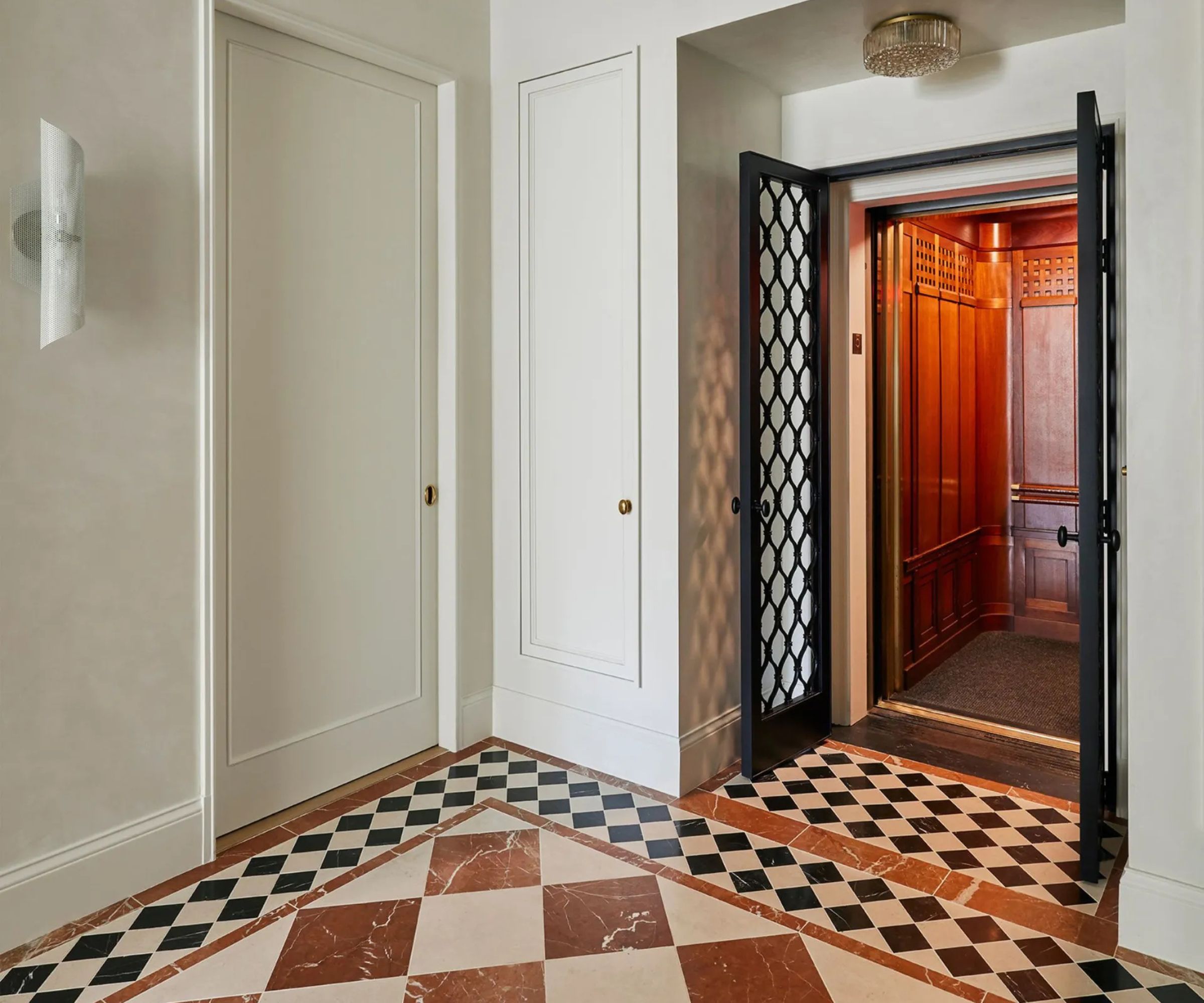
Tasked with injecting a traditional look while breaking down all that formality, Andrew was busy breaking another barrier, too: for the first time in his career, he teamed up with his life partner, architect Chris Boskey, on the renovation.
Andrew, who studied art, approached the design through visual language (materiality, color, spatial composition), while Chris brought a different perspective. 'He's really interested in details, not from an aesthetic point of view, but how they work, what they're doing, and why things are built a certain way,' says Andrew.
Together they proposed bold changes. The complete gut renovation led to downsizing a large entryway and tackling the excessive dining room. 'A lot of these prewar Upper East Side apartments have very large dining rooms, and it's just not how people live now,' says Andrew, who reimagined the space as a modern family room.
The dining table moved into a graciously sized living room, a more casual feel for the family's contemporary lifestyle. Beyond the practical, there were plenty of indulgences–a dressing room for one parent, an office with a pocket bar for the other –but the ultimate treat was an updated kitchen (complete with closing doors, of course).
Design expertise in your inbox – from inspiring decorating ideas and beautiful celebrity homes to practical gardening advice and shopping round-ups.
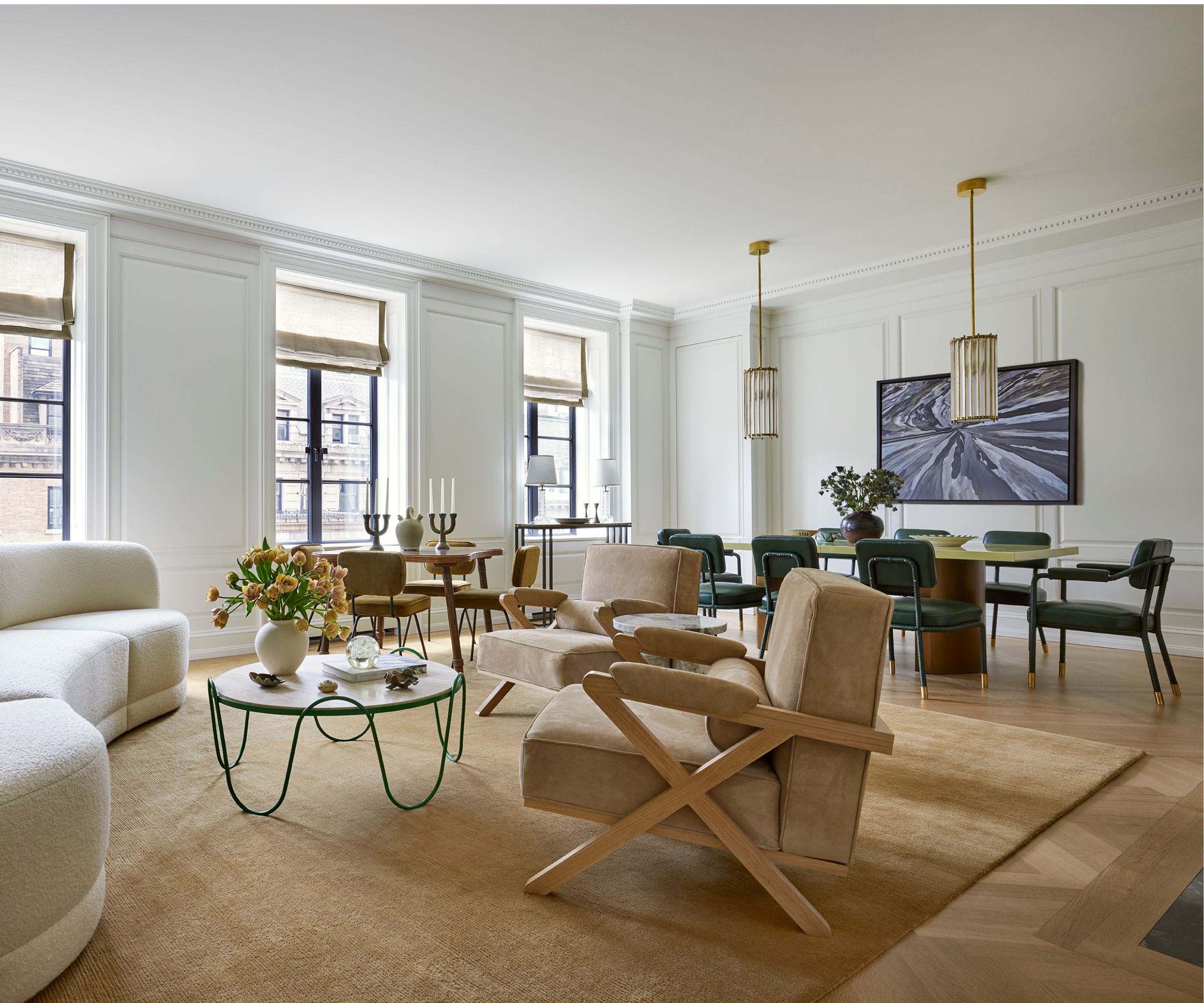
The results of their partnership are easily seen in the sunlit living room, where traditional architectural detailing (inspired by a tapestry of prewar buildings visible through the windows, from Beaux Arts to Neo-Federal) functions beautifully. 'It just kind of happens more organically between us,' says Andrew.
Painted in Benjamin Moore’s Snowfall White OC-118 to maximize sunlight, crisply paneled walls and a custom dentil cornice merge with large casement windows. Clever planning allowed hidden storage behind wall panels and ample space for window shades (thank Chris), all with balanced proportions and artful cohesion (thank Andrew).
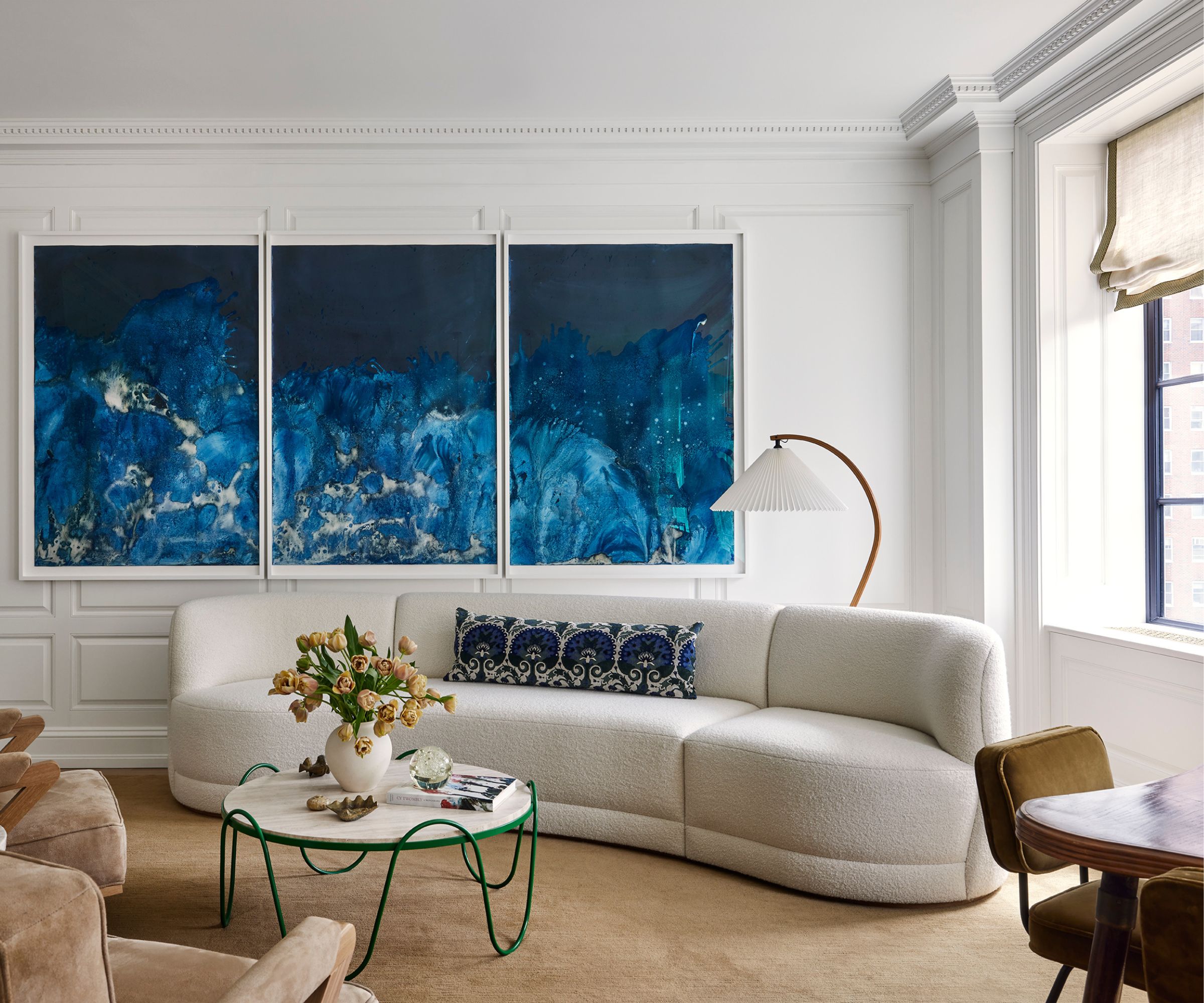
At the same time, another balanced approach coursed through furnishing, decor, and finishes. 'It was our job to bridge their modern tendencies with the vintage architecture and create a space that felt both fresh and enduring,' says Lauren Buxbaum Gordon, a partner at Nate Berkus Associates who led the renovation.
The result is an eclectic mix. Comfortable vintage pieces range from French and Swedish from the 1940s to Italian from the 1950s, plus new upholstered pieces in classic and modern designs (like the living room's curvy white Estudio Furnishings sofa in a textured 'Snowdrift' wool from Rose Uniacke). Materials leaned into the building's history, nodding to what may have been lost over time: herringbone and marble flooring, oak paneling, brass hardware. They even painted some doors black, adding a stroke of Art Deco glamour.
Nothing feels terribly precious, and the ease belies the rigor. 'A lot of thought and experience goes into every selection to make sure that the interior can handle wear and tear and still look incredible years later,' adds Lauren.
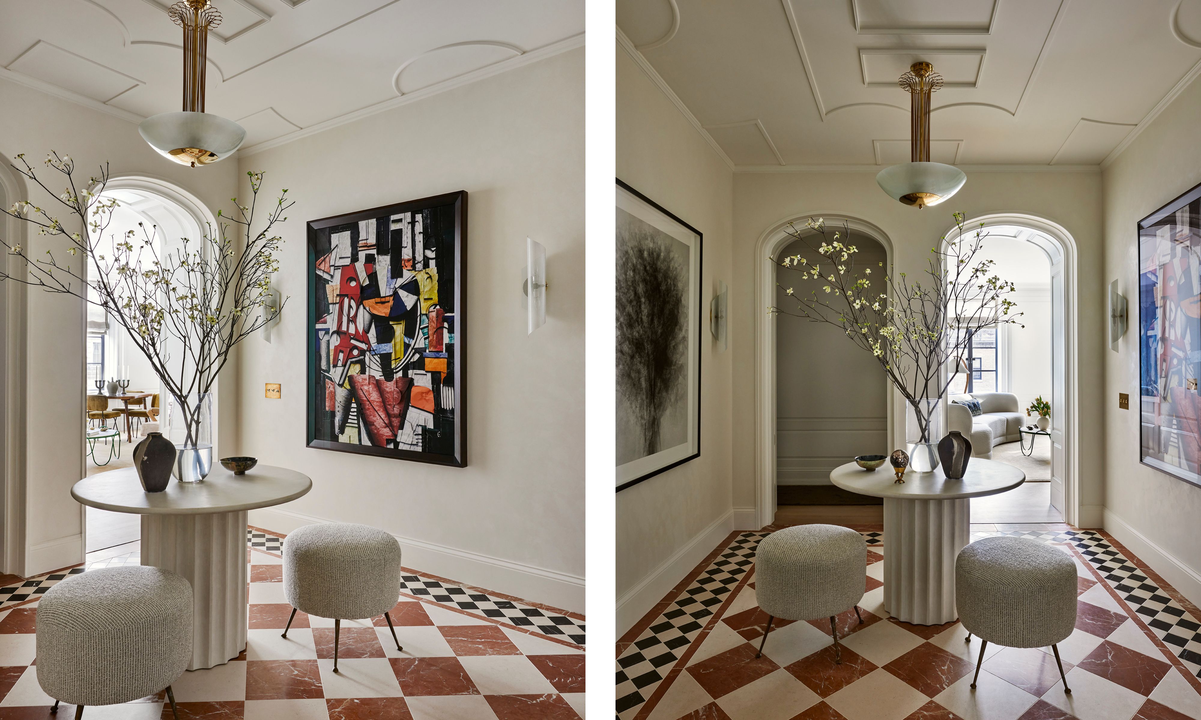
Even still, Lauren's team pursued some grand gestures. The resized entry, which connects two wings through arched doorways, is certainly the most distinctive space, drawing from Gio Ponti’s 1927 villa L’Ange Volant outside Paris. 'It was an image that I had been revisiting for years, waiting for the right apartment and the right client to implement our own interpretation of it,' says Lauren.
For her team, it was a chance to take something vintage and make it modern. They weren’t sure if the client would green-light the wild marble flooring, still classic but leaning funkier and more colorful, but the client gave an immediate yes.
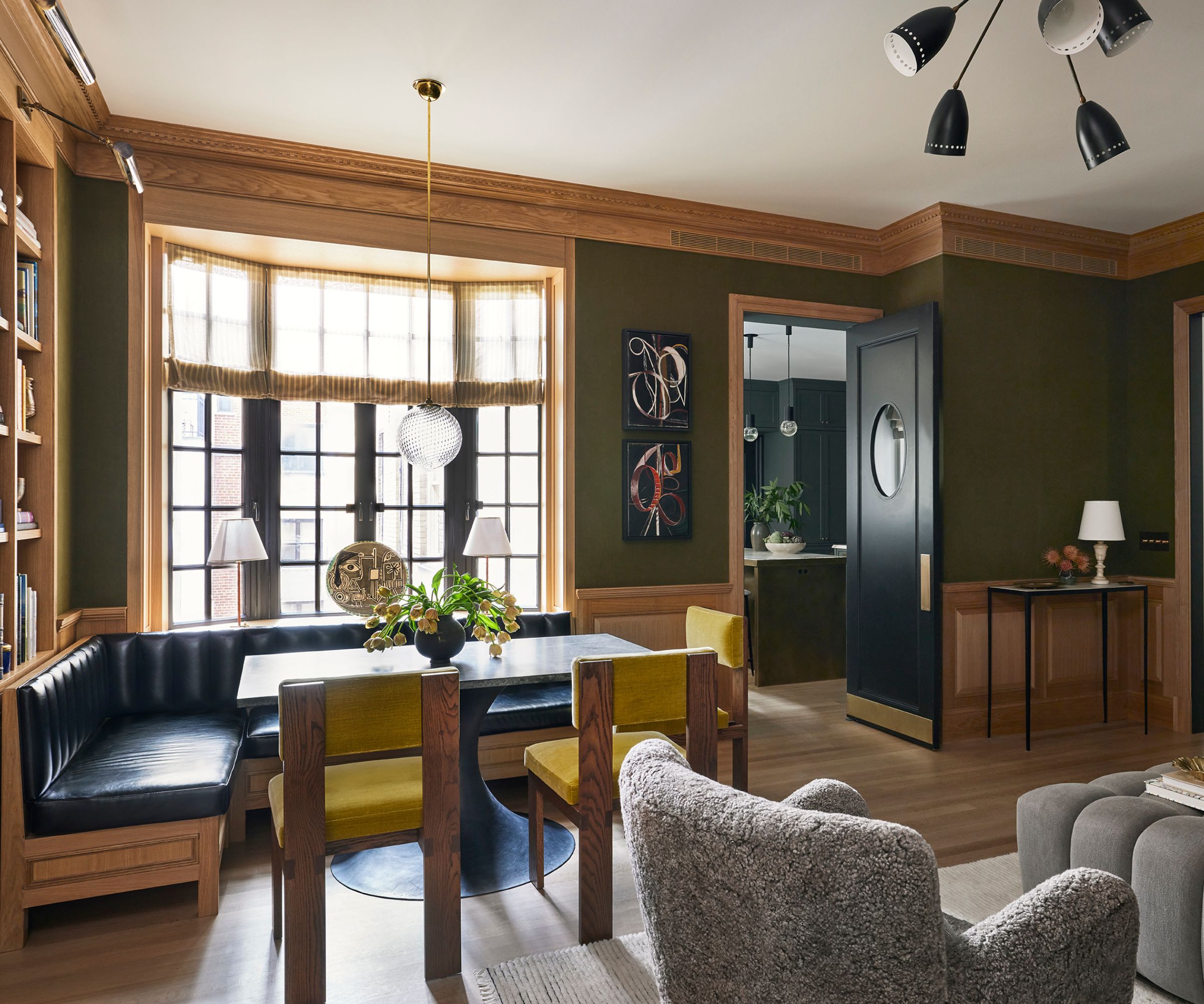
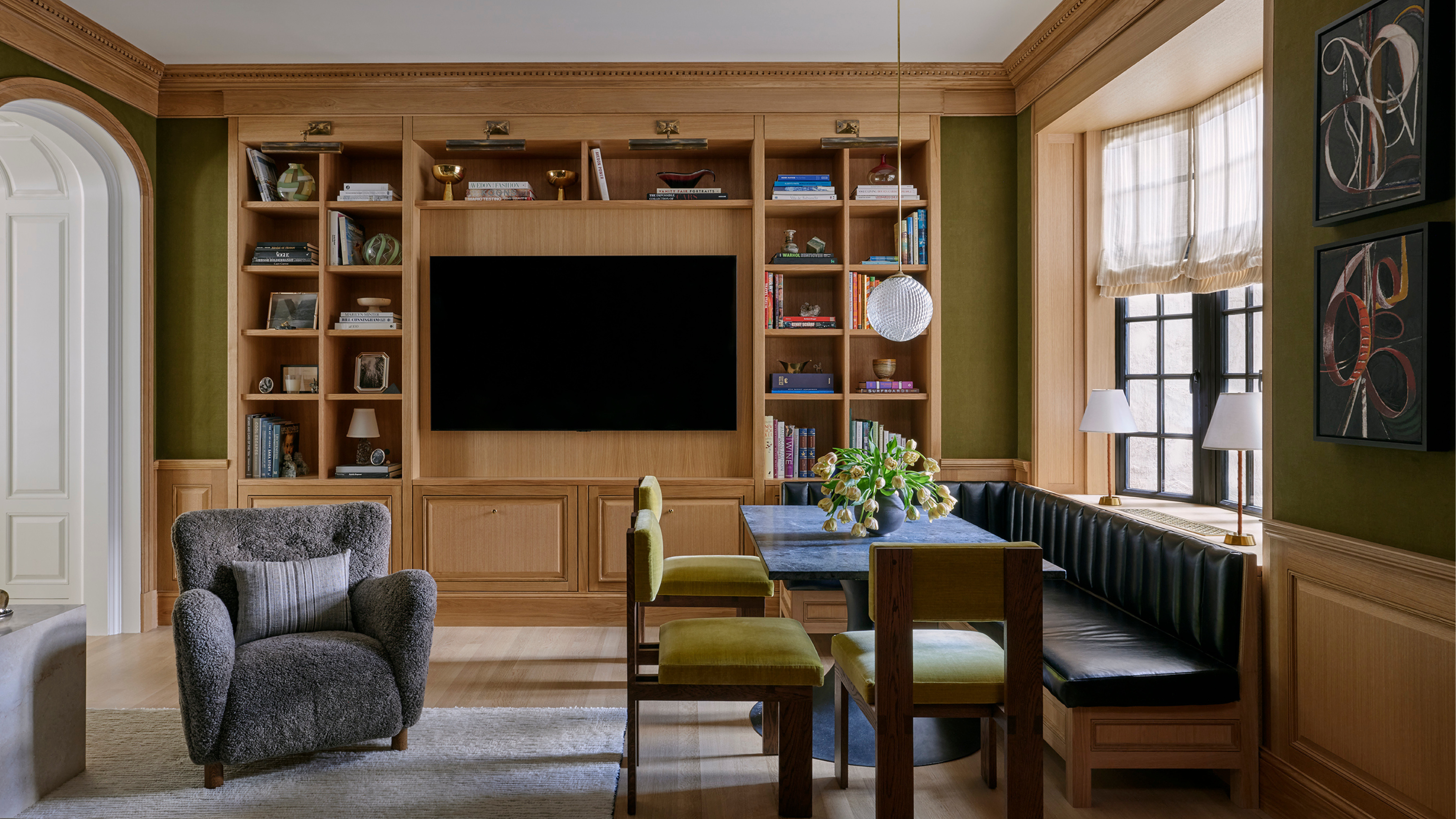
But one space took some convincing: the owners didn't think the family room would get much use. Lauren was surprised – it was the first time a client voiced anything like that during planning. 'So we sought out to prove them wrong with comfortable lounge seating, a built-in bookcase to house the TV and accommodate storage needs,' she says.
It worked. Nearly every day, the family gathers at the breakfast nook, which aligns with the bookcase and incorporates a banquette and dining table. Surrounded by warm wooden details – Andrew and Chris matched the dentil cornice in the living room, rendered here in solid oak–and cozy green wallcoverings (a paper-backed Delave Linen from MM Design), the room is a standout of the project.
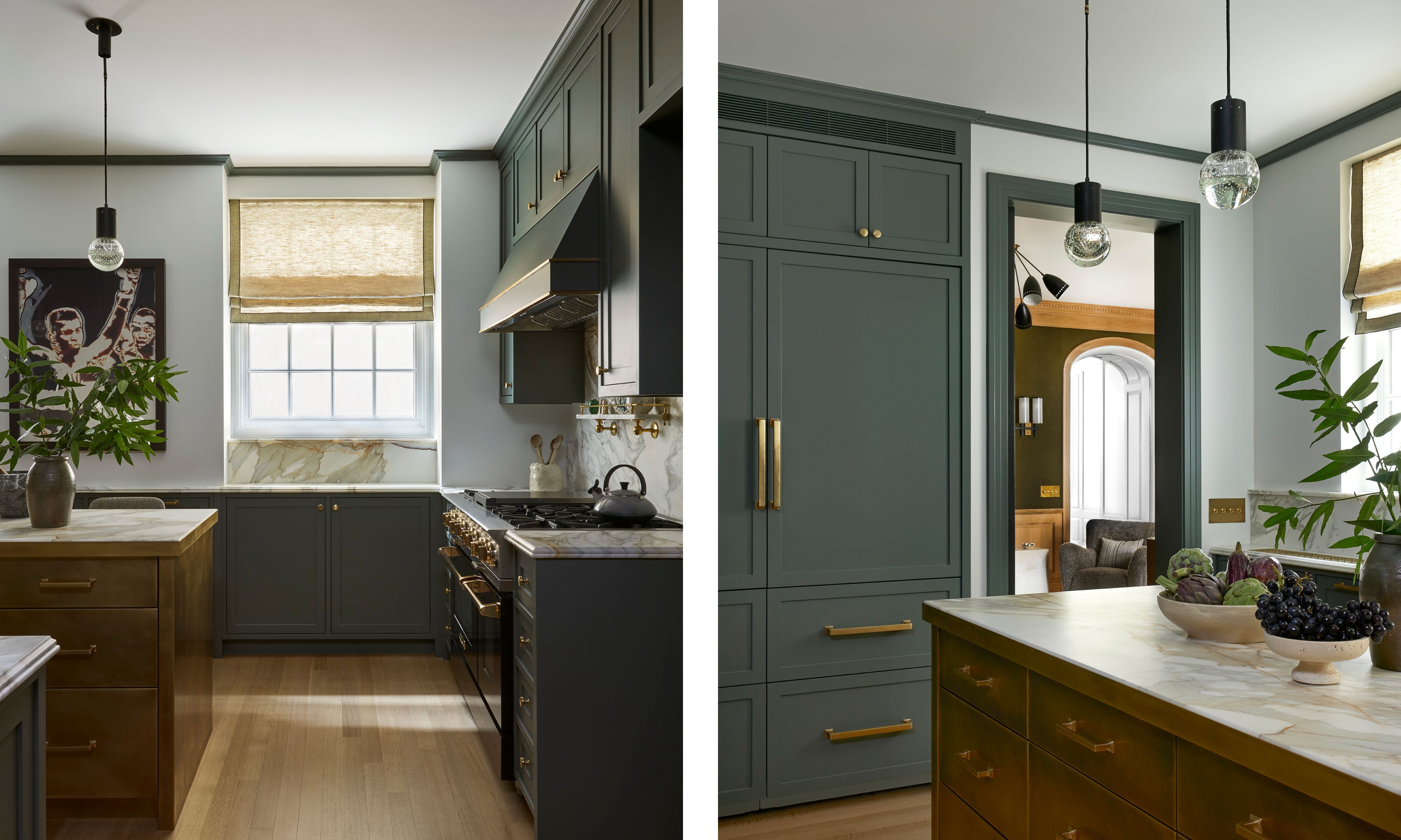
And of course, there’s the kitchen, which connects directly to the family room. Andrew and Chris gave the kitchen more prominence, reclaiming space once used for a staff corridor and butler’s pantry, enlarging the room to fit a brass-wrapped island with seating.
'We spent a lot of time in our in like 3D renderings placing the veining in a way that was going to be most impactful, and deciding which surfaces should be more active with stone and which surfaces should be less active,' says Andrew.
And for the coveted kitchen doors, the owners got three: a refinished service door leads to the fire stairs; a new pocket door leads to the corridor; and, for a touch of nostalgia, a swinging door separates the family room, complete with an oval glass lite window that nods to the owners’ memory of a classic NYC apartment.
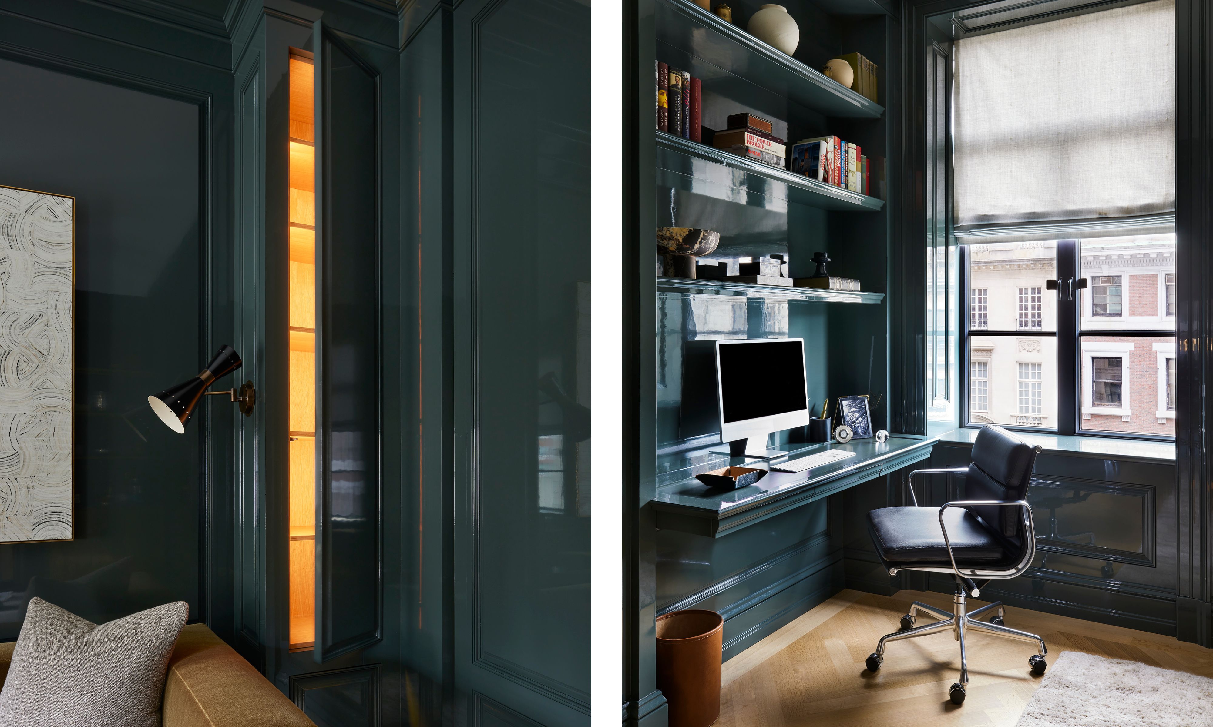
The remaining apartment leans heavily into the family’s personality. The home office is like a retreat within the home, complete with disguised storage behind wall panels and a pocket minibar for after-hours.
'We looked at several inspiration images and ultimately decided on lacquering the walls in a high gloss green to appeal to both the vintage and modern, and incorporated hidden storage on either side of the sofa,' says Lauren, who used Farrow & Ball's Studio Green for the base.
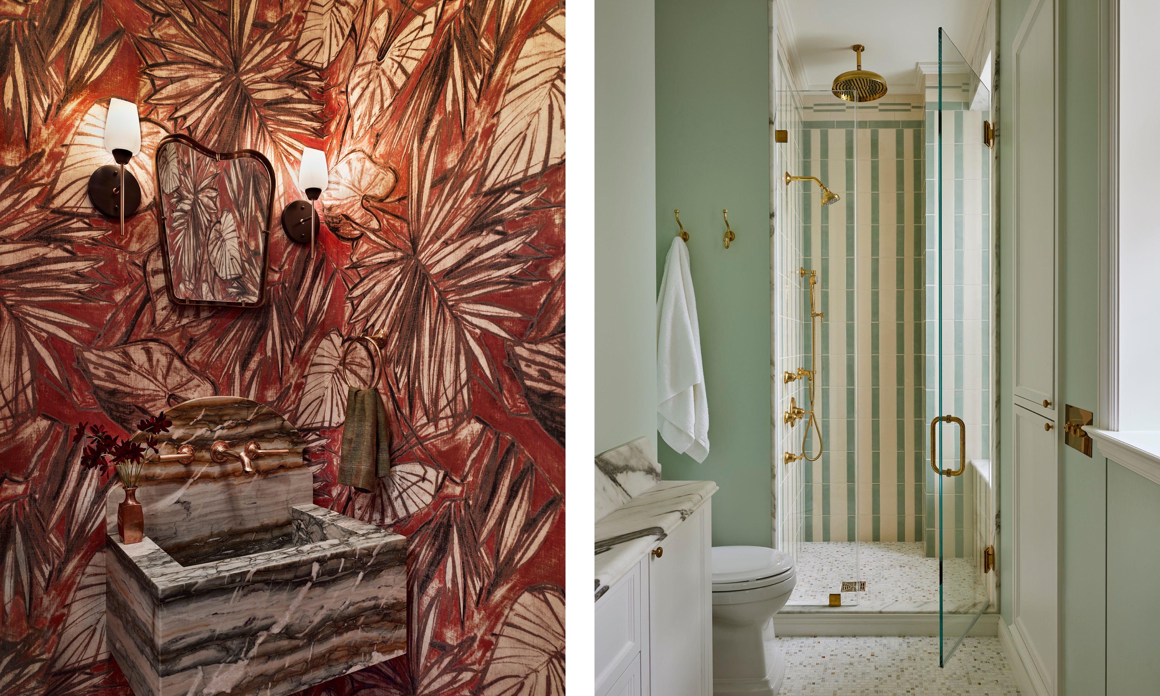
Color palettes lean more playful in the children’s rooms toward the back of the house, and especially in the bathrooms, where Lauren’s team made the most of tiles in fun patterns.
'We made a concerted effort to add color and pattern in a way that felt vintage but fresh,' says Lauren, who used a mix of green and white Elements Field Tiles from Ann Sacks to create stripes in one daughter's ensuite. Other spots take even more risk, like a powder room with a painterly Pierre Frey's Water Lily wallpaper in terracotta.
The design team took some leaps along the way, but it's ultimately the special blend of bespoke, vintage, and modern details that defines this project–all while working with three different voices (three's company, if you will) that blend beautifully to create a home unique to the family. 'I get texts from [the client] saying that she keeps pinching herself,' says Andrew. 'She just can't believe this is where she lives now.'
Shop the look

Keith Flanagan is a New York–based journalist covering design, hospitality, and interiors. He was formerly an editor at Livingetc and Time Out New York.
