Benjamin Moore's French Canvas is a 'stylish off-white' – here's why designers love it for pared-back yet cozy spaces
Here's all you need to know about decorating with this cozy white paint

Design expertise in your inbox – from inspiring decorating ideas and beautiful celebrity homes to practical gardening advice and shopping round-ups.
You are now subscribed
Your newsletter sign-up was successful
Want to add more newsletters?
If you've ever embarked on choosing a white paint for a home decor project, you can likely attest to just how complex it can be, with so many shades and subtle differences between them.
Benjamin Moore's French Canvas is one white paint that seems to be gaining traction, and for good reason. Interior color experts say that its undertones of gray and green allow it to read differently depending on a room's lighting, so it's certainly one to have on your radar.
Below, we've rounded up all you need to know about this white paint, including the best rooms to use it in, as explained by designers.
Article continues belowWhat color is French Canvas?
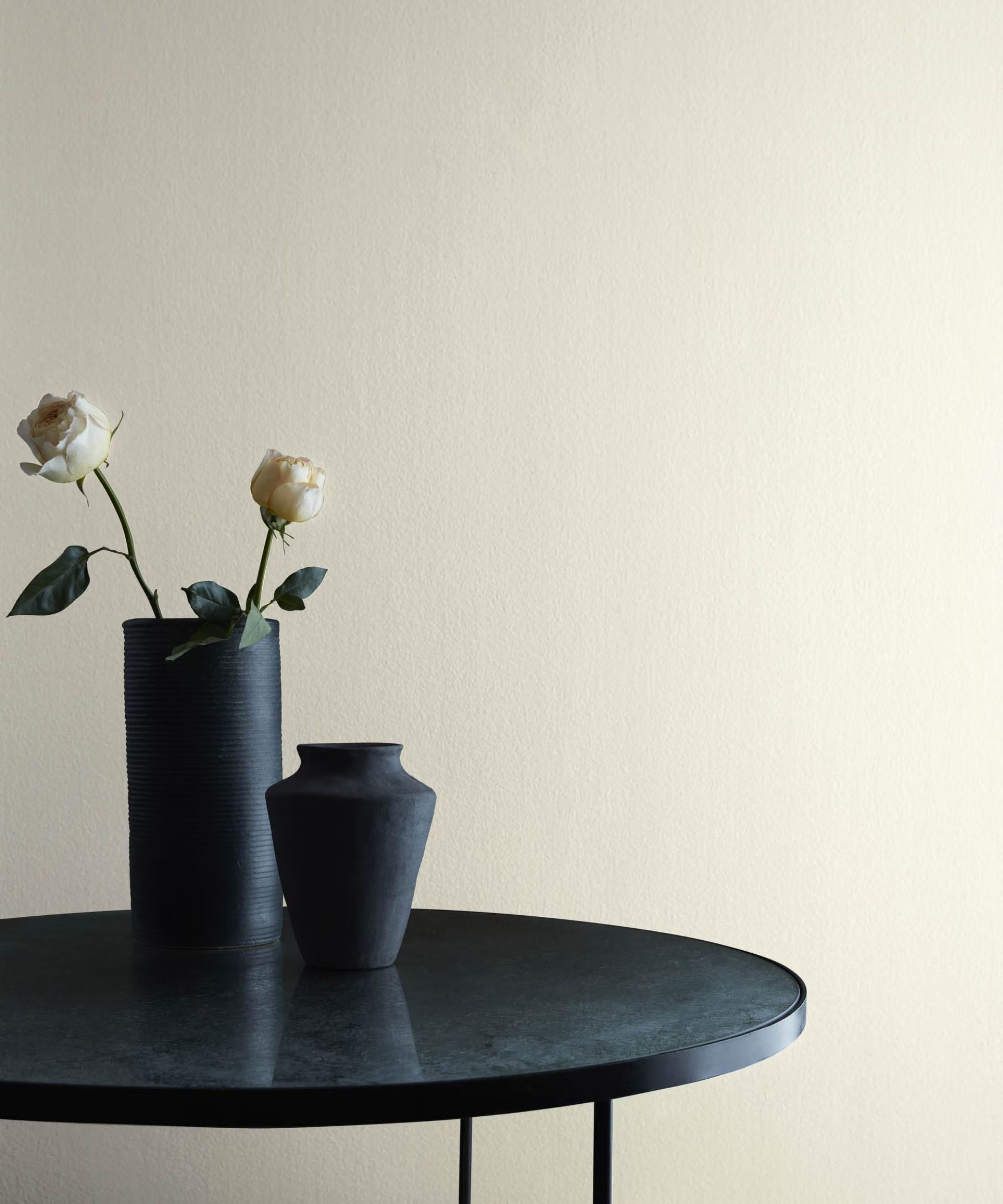
French Canvas comes under the category of an off-white paint. Off-whites can range from warm to cool with many different undertones, and French Canvas' undertones are green-toned, which are said to provide balance in varying lighting settings:
'French Canvas is a stylish off-white with green-gray undertones,' explains Helen Shaw, Director of Marketing (International), Benjamin Moore. 'The nuanced composition of this hue allows it to read cool in a north-facing room yet be perfectly balanced in south or east-facing rooms where there is plenty of natural light.'
While this paint is technically an off-white, some designers consider it more of a beige due to its depth-adding undertones: 'Benjamin Moore’s French Canvas is a warm, earthy beige with subtle hints of gray, giving it a sophisticated, neutral tone,' says designer Soledad Alzaga.
How to decorate with Benjamin Moore's French Canvas
Off-white paints such as French Canvas are incredibly versatile to use throughout the home. Whether your style favors farmhouse decor or modern decorating, French Canvas provides a neutral, calming backdrop across each.
Design expertise in your inbox – from inspiring decorating ideas and beautiful celebrity homes to practical gardening advice and shopping round-ups.
'French Canvas is a really exciting neutral because it features a complex mix of green and gray in its undertones, yet it's still very bright and inviting. As the name suggests, this is a perfect paint color to use with a French country or Parisian-inspired design motif,' says interior designer Kathy Kuo.
Since this paint is so understated, it can work in pretty much any room, from social spaces to quieter rooms that aim to feel calm. Below, Soledad Alzaga shares some of the best rooms to use this paint:
'I love how it feels both elegant and inviting, making it a perfect choice for living rooms or bedrooms where you want a cozy yet refined look. This shade pairs with wood tones, soft whites, and muted metallics, creating a timeless, balanced look. I could see using it in a space with plenty of natural light, where it would highlight the room’s warmth without feeling too heavy.'
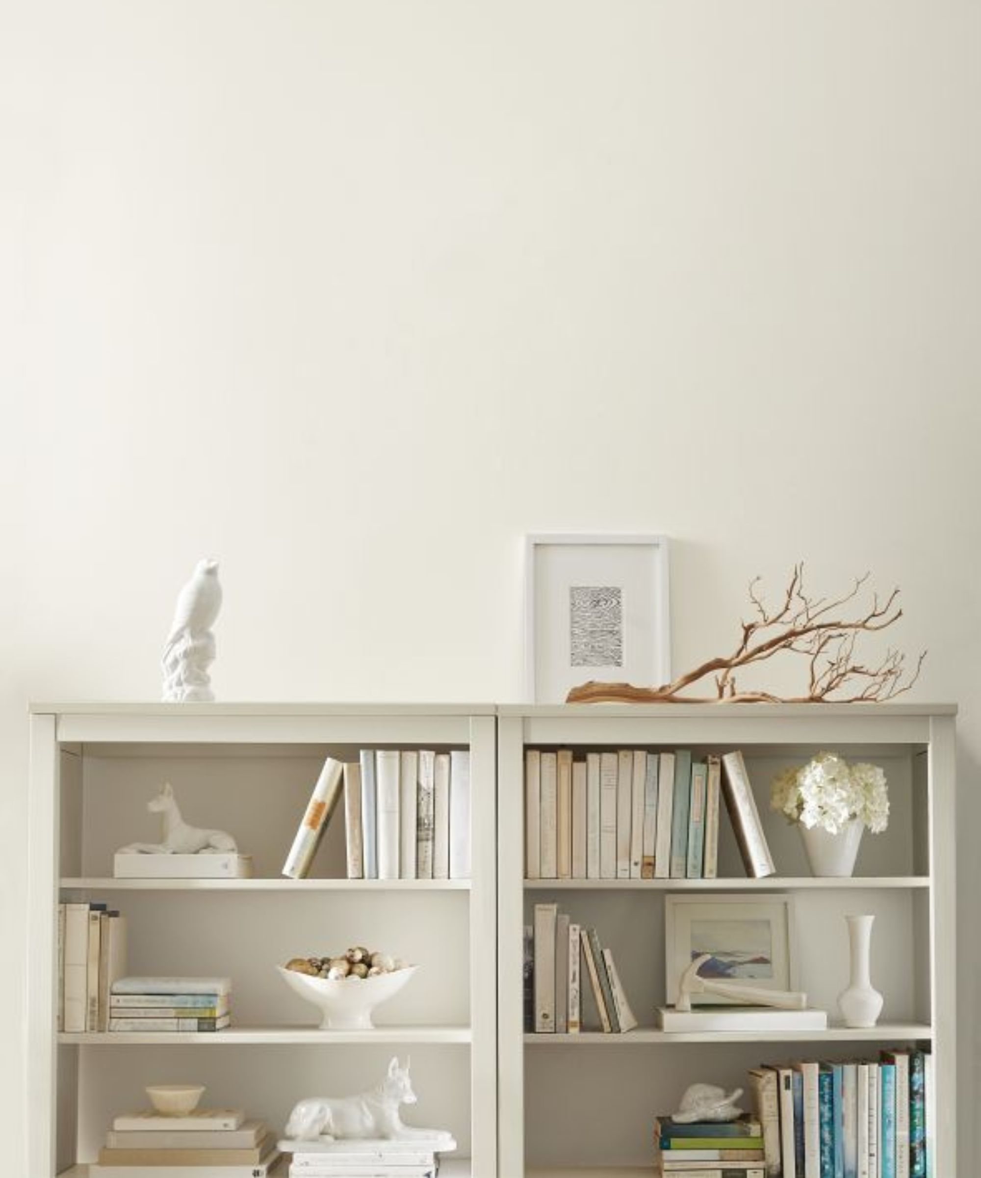
Beyond the walls, French Canvas works equally well when used across woodwork, according to Helen Shaw: 'French Canvas works particularly well on woodwork such as skirting boards, picture rails, and doors and pairs well with walls in a muted blue such as Franklin Lakes. This color combination will create a sense of calm in living spaces whilst adding interest and drawing the eye to architectural features in a space.'
'A dusty lilac such as Porcelain brings understated warmth and color to a room when used alongside French Canvas. This color pairing works particularly well for a whimsical, dreamy take on the vintage mauve bedroom,' adds Helen.
Lastly, you can't go wrong with using this white paint for bathroom color ideas. White is often chosen for these functional spaces, but it's important to land on the right shade of white. Crisp white paints without the depth of undertones can leave these rooms feeling clinical, whereas shades like French Canvas feel cozier and more welcoming.
'I used this in a remodel of a mid-century ranch home in the primary bathroom,' says the interior designer Sarah Storms. 'What I love about this paint color is the depth of color and the inherent warmth that it brings without being gray, greige, or beige. It’s very sophisticated in nature and works with light, natural white oak floors. It pairs really beautifully with olives, bronze, and linens.'
If you're on the hunt for a welcoming white paint, Benjamin Moore's French Canvas is a great place to start. If you do try it out, make sure to test it with swatches so you can see how the color appears throughout the day.

Emily is a freelance interior design writer based in Scotland. Prior to going freelance in the spring of 2025, Emily was Homes & Gardens’ Paint & Color Editor, covering all things color across interiors and home decor for the Homes & Gardens website. Having gained specific expertise in this area, Emily is well-versed in writing about the latest color trends and is passionate about helping homeowners understand the importance of color psychology in home design. Her own interior design style reflects the simplicity of mid-century design and she loves sourcing vintage furniture finds for her tenement flat.
