Best Farrow & Ball pink paints – 7 favorite shades among designers, from plaster tones to moody pinks
Farrow & Ball has a renowned range of pink paints, and designers say these are the best among them

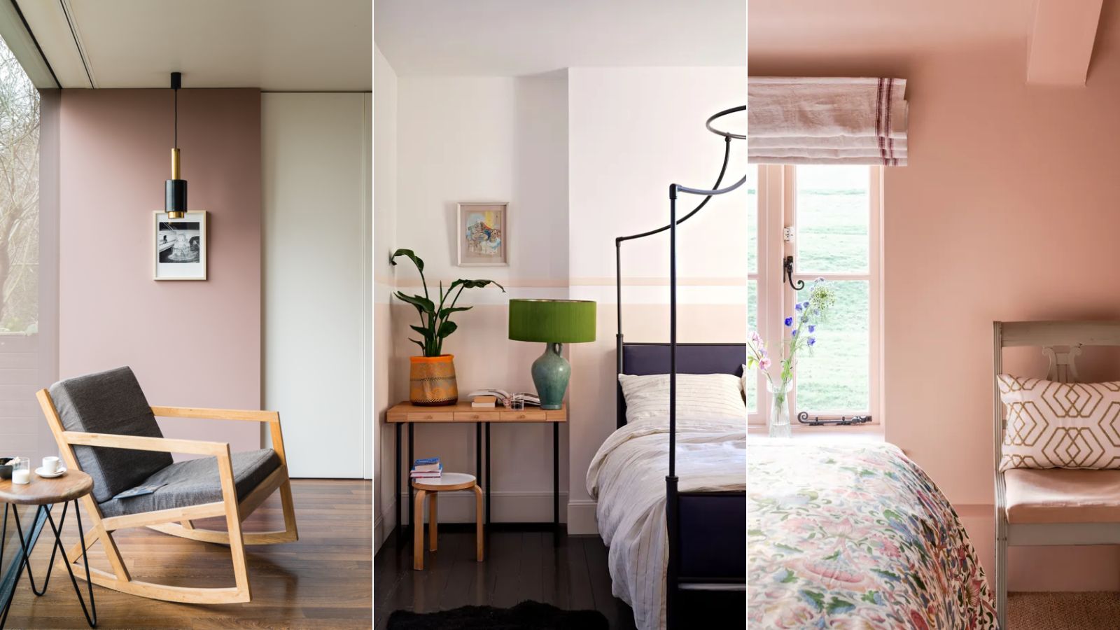
Pink paints work surprisingly well across many rooms and interior design styles. From blush pinks to plaster pinks, there's plenty of variety of pink paints to choose from, and Farrow & Ball has some of the very best among them.
Boosting rooms with a soft and warming glow, Farrow & Ball's pink paints are known to be flattering and liveable, from the moody Sulking Room Pink to the plaster tones of Setting Plaster.
We asked interior designers for their take on the best Farrow & Ball pink paints, which we've rounded up below. If you're looking for pink paints to incorporate into your interior scheme, these suggestions have you covered. Consider opting for one of the more mellow, grounding pinks to refresh neutral rooms and you'll soon see the benefit of this cozy and comforting hue.
Article continues below7 best Farrow & Ball pink paints
Tailor Tack
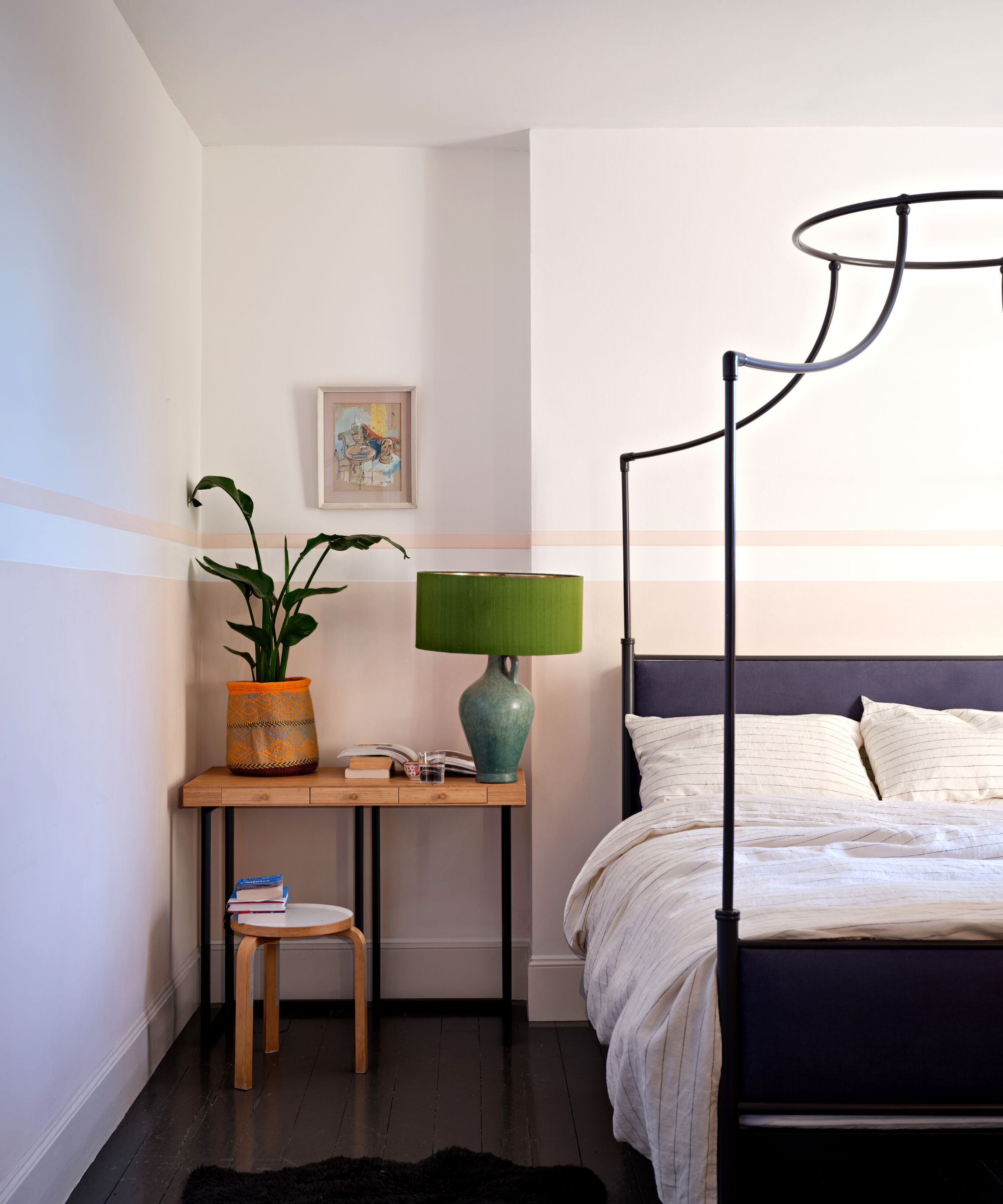
Farrow & Ball's lightest shade of pink paint, Tailor Tack works as a light neutral paint, filling rooms with a subtle pink glow.
'Farrow & Ball's Tailor Tack has become a go-to for me when I'm looking for a neutral kissed by pink,' says Chicago-based designer Rebecca Bobroff of Rebecca Bobroff Design. 'Pair Tailor Tack with Wimborne White for a dreamy undertone match and subtle elegance.'
In this bedroom, Tailor Tack is used on the lower walls to add interest while maintaining a calming and undisturbed sleep space.
Setting Plaster
Setting Plaster is one of Farrow & Ball's most well-known pink paints. A variation of plaster pink, aptly named Setting Plaster is a good option if you want your pink scheme to have an earthy feel that doesn't feel too saccharine.
Design expertise in your inbox – from inspiring decorating ideas and beautiful celebrity homes to practical gardening advice and shopping round-ups.
'My favorite Farrow & Ball color is Setting Plaster,' says interior designer Roger Higgins of Nashville-based R. Higgins Interiors. 'It’s a subtle shade of pink and works well with all colors without becoming too feminine or youthful.'
Orange County designer Olga Doykhen is also a fan of decorating with Setting Plaster. Talking about plaster tones such as this one, she adds: 'These shades stand out for their nuanced complexity, offering more depth than typical pink paints. I'd choose these hues to compliment any room, but especially a library, dining room, or bedroom.'
'What makes these shades so appealing is their subtle warmth and earthiness, reminiscent of sun-baked clay or weathered terracotta,' Olga continues. 'This quality allows them to act as sophisticated neutrals while still imparting a soft, rosy glow to a space.'
Peignoir
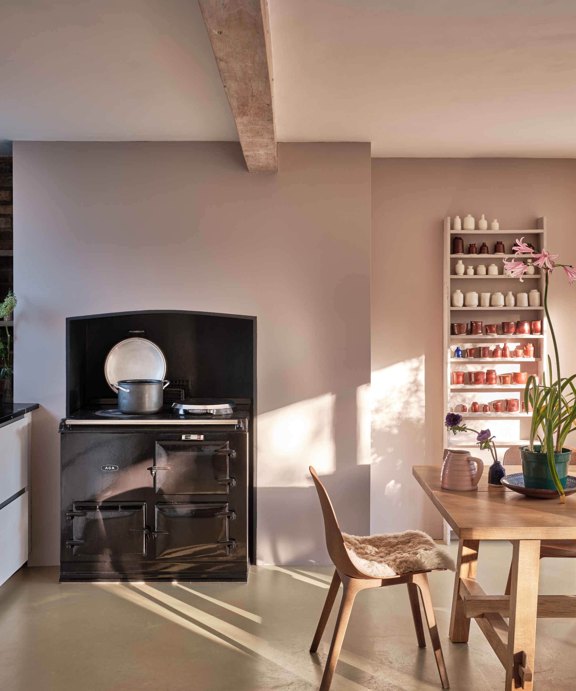
If you're looking for a pink paint that leans slightly more purple, Farrow & Ball's Peignoir makes a great choice. With gray undertones, this paint grounds spaces with its in-between hue.
'One of our current favorite pink paints from Farrow & Ball is Peignoir,' says Miranda Cullen, principal designer and founder of Inside Stories. 'This is a very romantic shade that resembles more of a gray rose than a bright pink.'
'Some pink shades can feel loud and manufactured, but this shade has a natural depth and a subtle tone that is easy to layer into designs,' adds Miranda. 'It’s a very buildable shade that is enhanced or muted by surrounding colors and decor.'
Templeton Pink
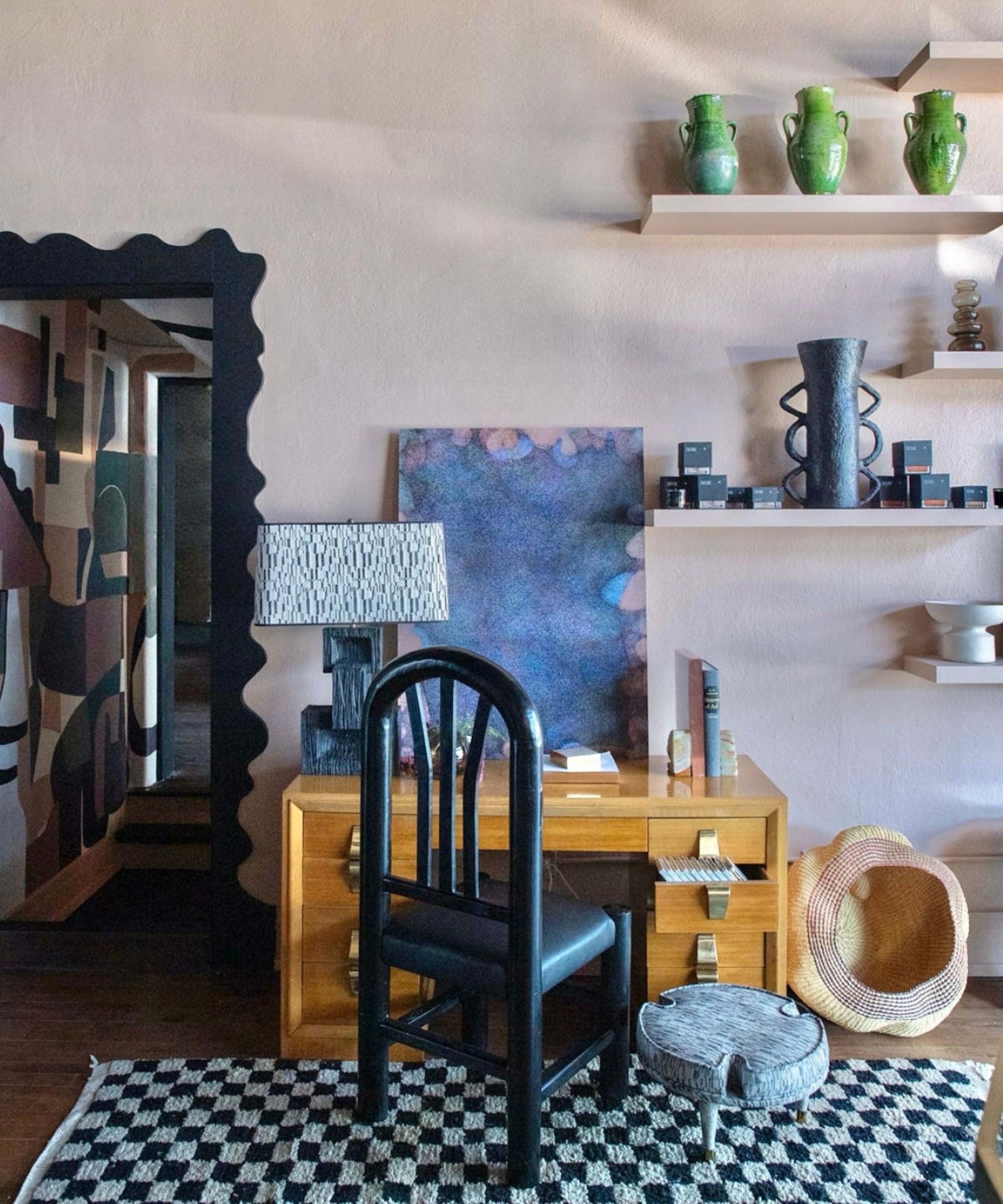
Templeton Pink is another of Farrow & Ball's pink paints that falls into the plaster pink category. With plenty of warmth, Templeton Pink is said to have a historical feel. There are many ways to decorate with plaster tones such as Templeton Pink, but it works well with color drenching to create a cozy, cocooned space.
'Our absolute favorite Farrow & Ball Pink is Templeton Pink,' says Elizabeth Mollen, Chicago-based interior designer and CEO of Stone Textile Studio. 'When designing our home store and showroom, The Vault Creative, we knew we did not want to do white walls. After testing many colors, Templeton Pink was the obvious choice – it’s the perfect neutral. We painted our custom built-ins and shelving the same color as the walls.'
Pink Ground
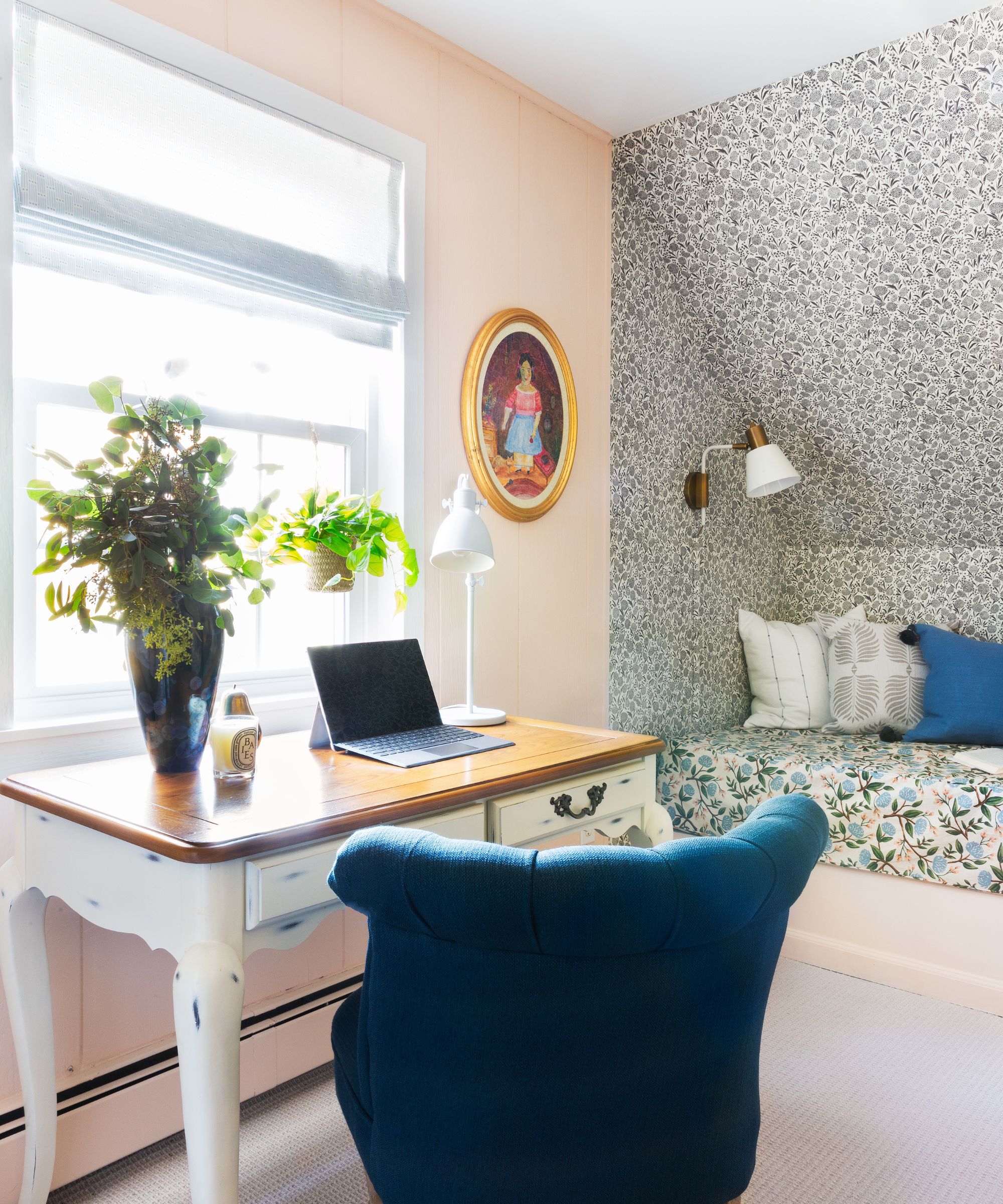
'My favorite pink paint by Farrow & Ball is Pink Ground,' says Diane Rath, founder and principal designer at The Rath Project. 'It has a bit of yellow-brown to it which makes it feel slightly more sophisticated and grown up. It serves as a beautiful backdrop for patterns and other colors and makes whoever is in the room look quite attractive in its warmth.'
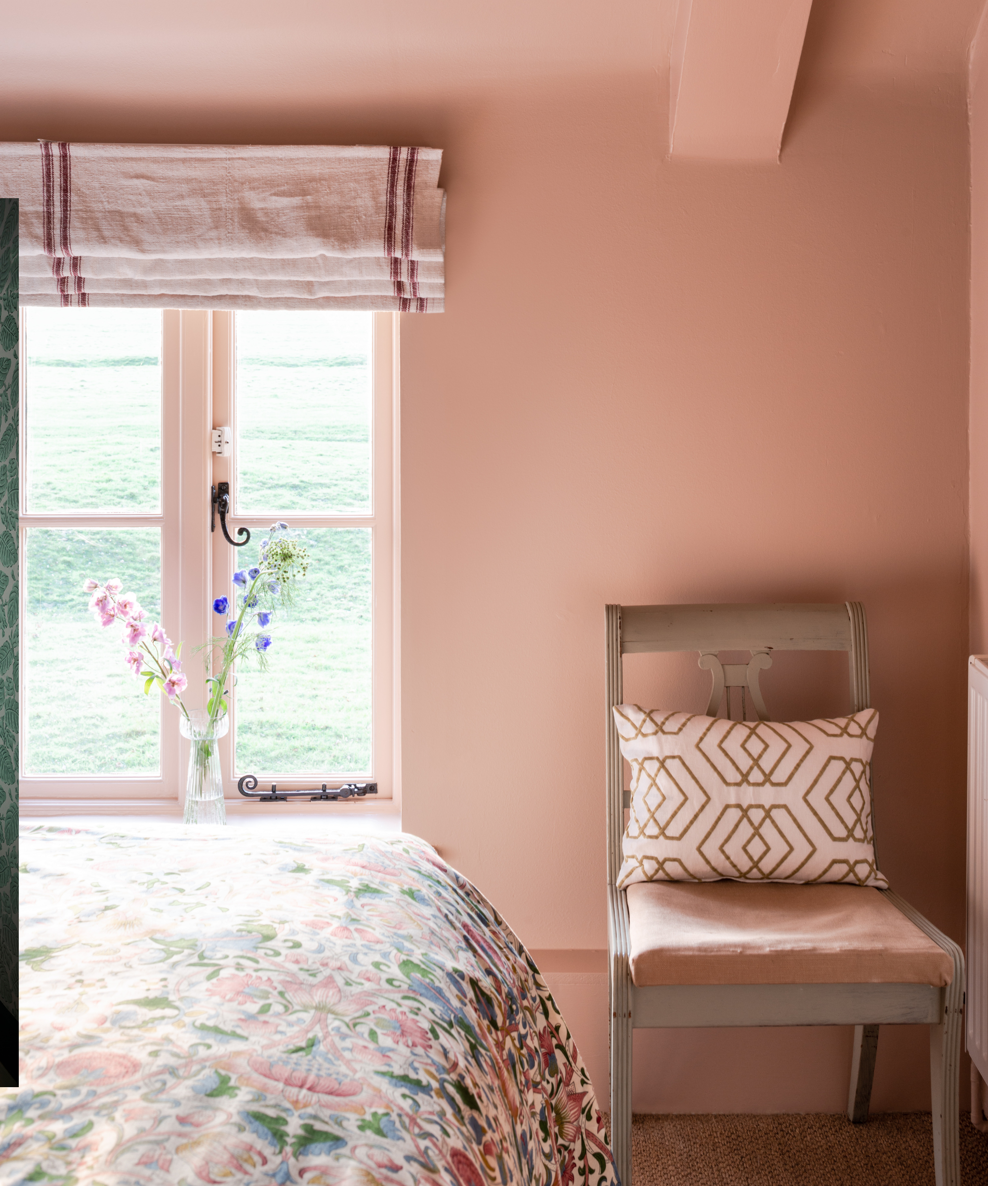
In this bedroom, this blush pink paint was used across the walls, adding warmth and a comforting feel to the cozy space. There are plenty of other ways to decorate with Pink Ground, from kitchens to powder rooms.
Sulking Room Pink
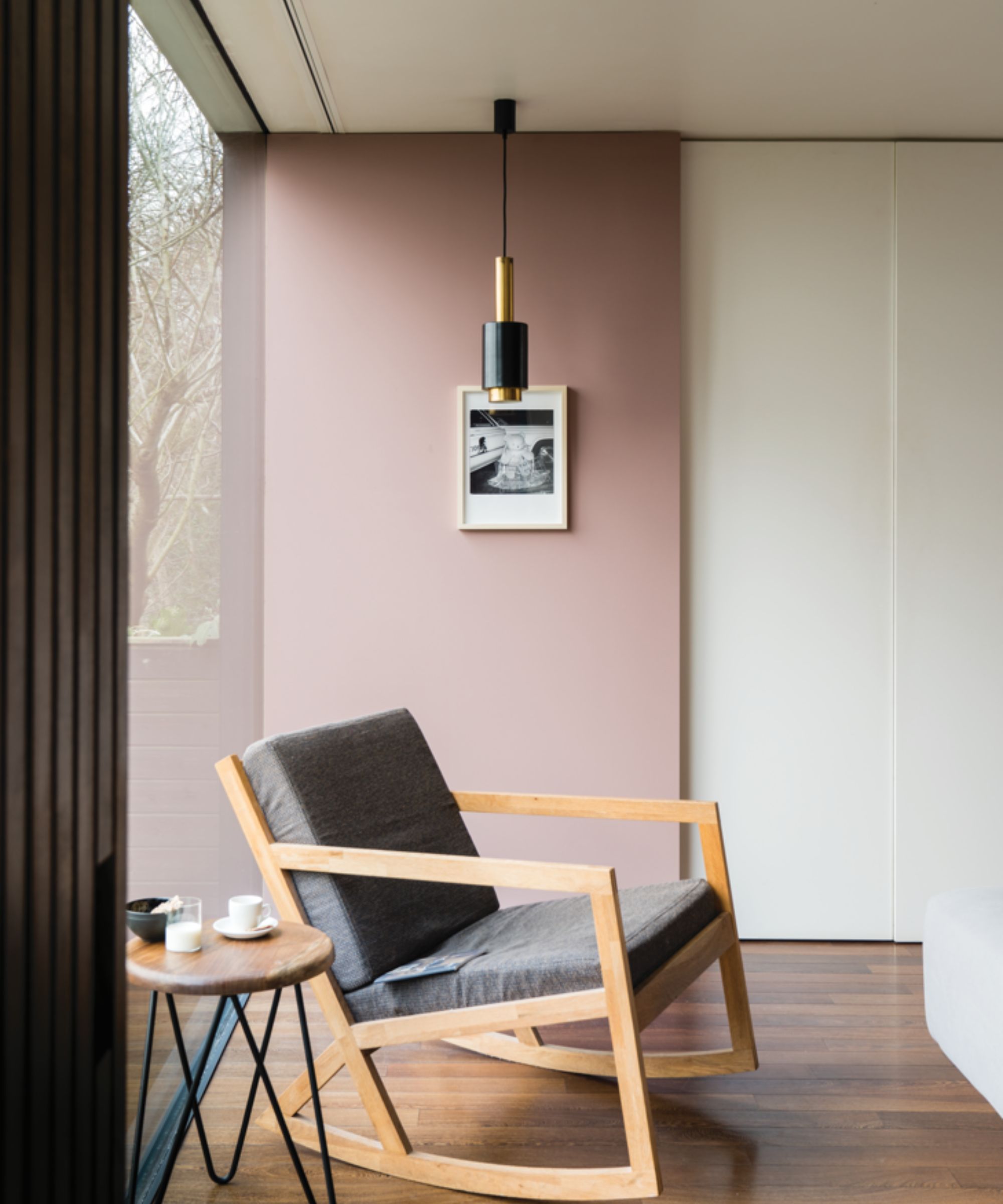
If you're looking for a moodier, darker pink paint, you can't go wrong with Sulking Room Pink. A popular shade among designers, Sulking Room Pink adds plenty of depth to rooms – a sophisticated way to decorate with pink.
'I love it because it's a "moody" pink,' shares Lina Galvao, co-founder of design studio Curated Nest. 'Pink is associated with happy, bright spaces, dopamine decor, and Barbie; but this shade of pink is more like a mauve, with undertones of cool browns and purple.'
'It's a sophisticated, warm shade that could easily carry any serious adult space,' Lina continues. 'For a classic look, this color would pair well with creamy whites with warm undertones. For drama, pair it with a dark green with blue undertones, and for sweet vintage, pair it with sage green.'
Middleton Pink
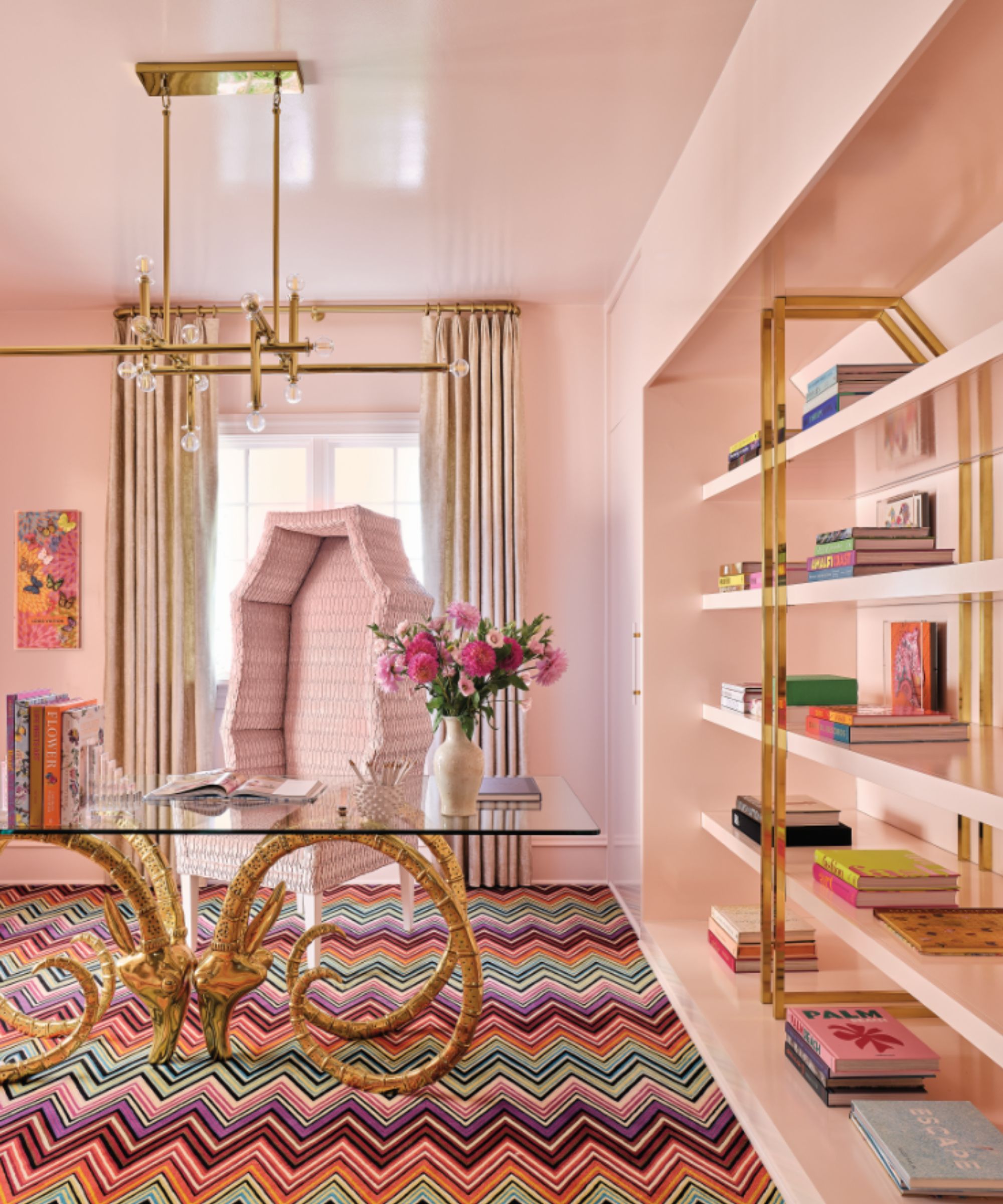
Middleton Pink is more of a classic pastel pink that feels feminine and nostalgic. While this color works well with gold accents in a lively home office, it would also work well in a kids' room or for an unexpected hit of color in a powder room.
'Farrow & Ball's Middleton Pink is pretty and feminine with a bold sophistication that sets it apart from your ordinary pinks,' shares interior designer Gray Walker of Gray Walker Interiors. 'The tinge of a clay undertone warms it so it becomes more soothing and restful.'
Farrow & Ball's pink paints are popular for good reason. From earthy plaster pinks to pastel tones, its shades cover the whole range of pink, depending on how muted or lively you wish to go.

Emily is a freelance interior design writer based in Scotland. Prior to going freelance in the spring of 2025, Emily was Homes & Gardens’ Paint & Color Editor, covering all things color across interiors and home decor for the Homes & Gardens website. Having gained specific expertise in this area, Emily is well-versed in writing about the latest color trends and is passionate about helping homeowners understand the importance of color psychology in home design. Her own interior design style reflects the simplicity of mid-century design and she loves sourcing vintage furniture finds for her tenement flat.