'The house looked nothing like them' – how this designer transformed a dark and dated space into a colorful, nature-inspired family home
Designed for a busy family, this expansive estate was made brighter, lighter, and more functional for all

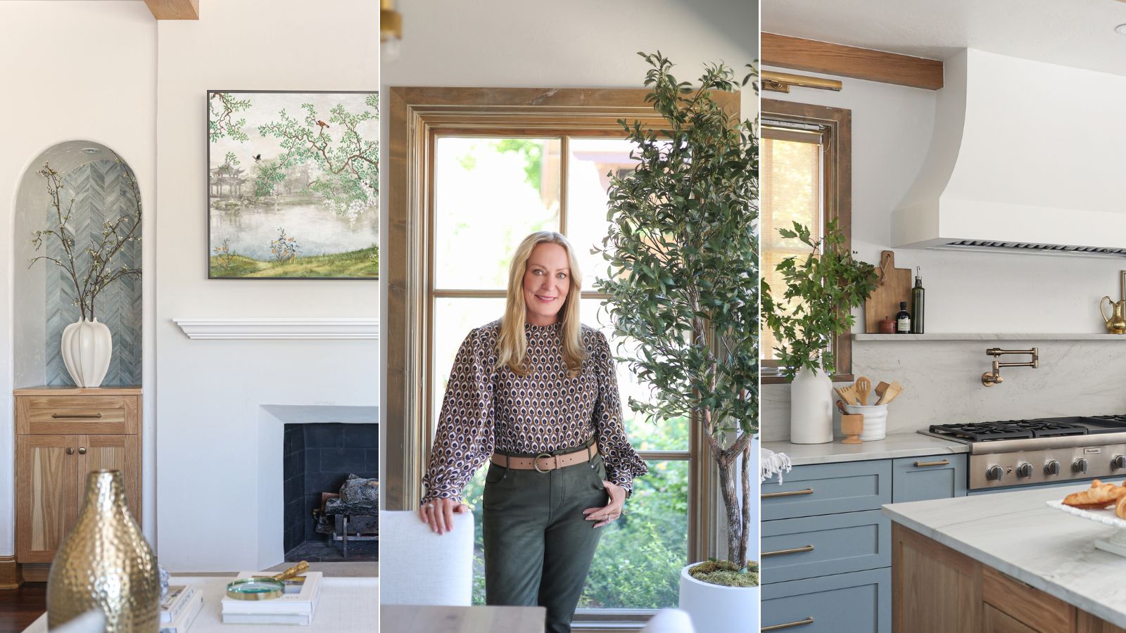
In interior design, color can feel quite intimidating. Even if you love a bright, bold hue, committing to it in your home takes courage. And committing to a whole-home color scheme that incorporates an unexpected shade is a risky move – one that, when executed successfully, has show-stopping results.
When Valerie Helgeson, lead designer and founder of Oklahoma City-based Design Directions, was tasked with renovating this expansive estate, she had function-forward, fresh design front of mind. Wanting to brighten up the dark and gloomy 'before,' and make the design scheme work for the family's active lifestyle, she altered the floor plan and gave every room a light, airy, nature-inspired jolt. And a vibrant, calming shade of blue was the perfect jumping-off point.
The home's 'after' accentuates the surrounding environment, and makes life easier and more relaxing for its owners. To hear a bit more about the inspiration behind the renovation, and the intricate details that made the final reveal sing, H&G sat down with Valerie. This is what she had to say about the stylish yet homey Oklahoma retreat.
Article continues below 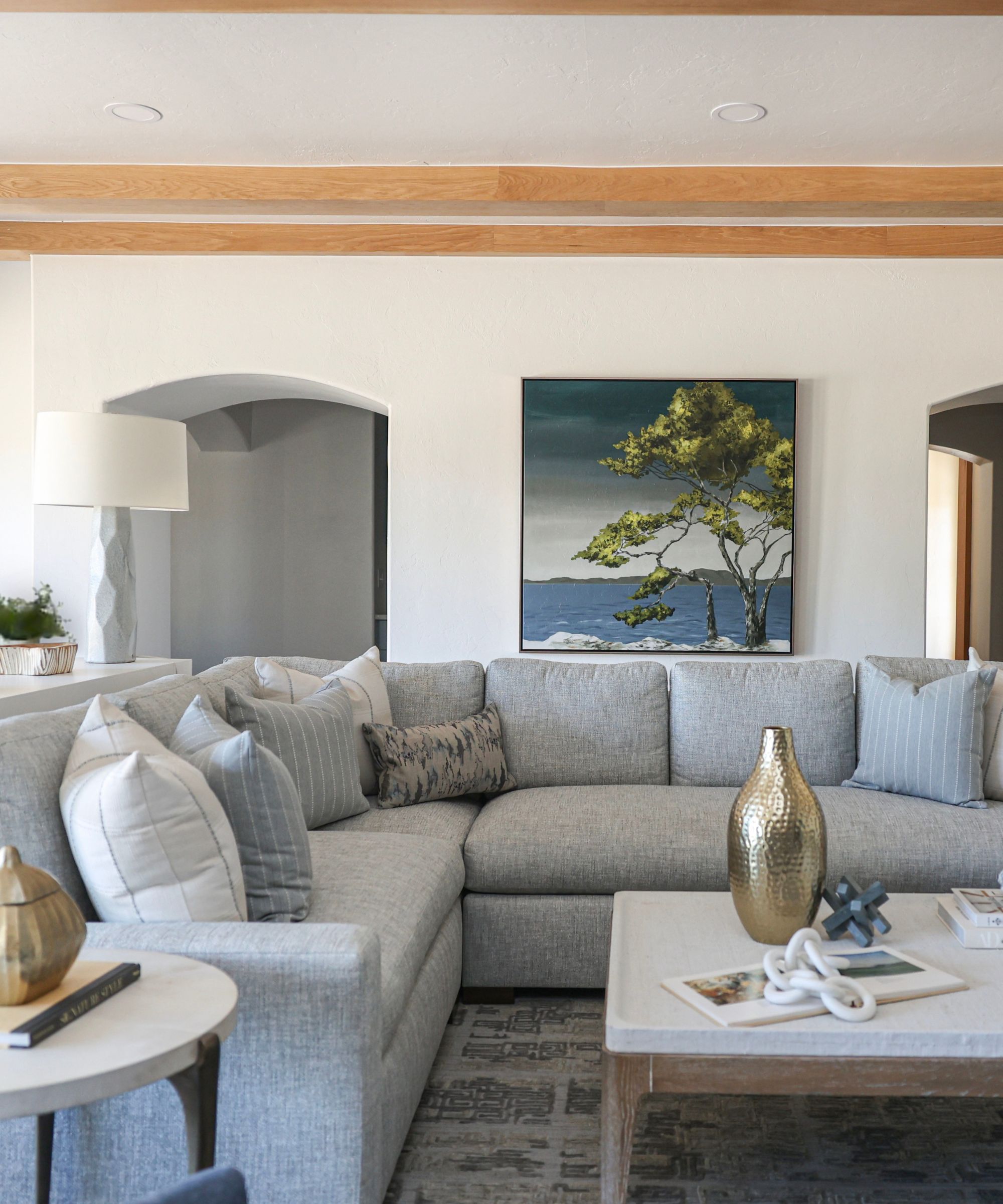
Valerie had worked with this family on their previous home, so when she first came across this Oklahoma property, she immediately knew the 'house looked nothing like them.' Luckily, they had lived in the space for a couple of years, so when they called up Design Directions, they had a few key renovation priorities in mind.
The kitchen wasn't quite working for their busy lifestyle, and there were plenty of 'funky spaces' throughout the home that made everyday life more challenging. Aside from altering the floor plan to make the home more functional, Valerie says her 'number one' priority was to 'make it beautiful, brighter, and lighter' overall. 'I wanted it to feel authentic to them,' she tells H&G. And much of that work started with the home's exterior.
'This home was probably intended to be this grand, European estate,' says Valerie. 'C’mon. We’re in the middle of Oklahoma – that just doesn’t fly. The development where this home is, it’s a luxury development, but it used to be a cattle ranch. So let's get authentic. I wanted home to be authentic, and authentic to this family – to look and feel like them, which is light and easygoing. And of course, I’m all about organization and function.'
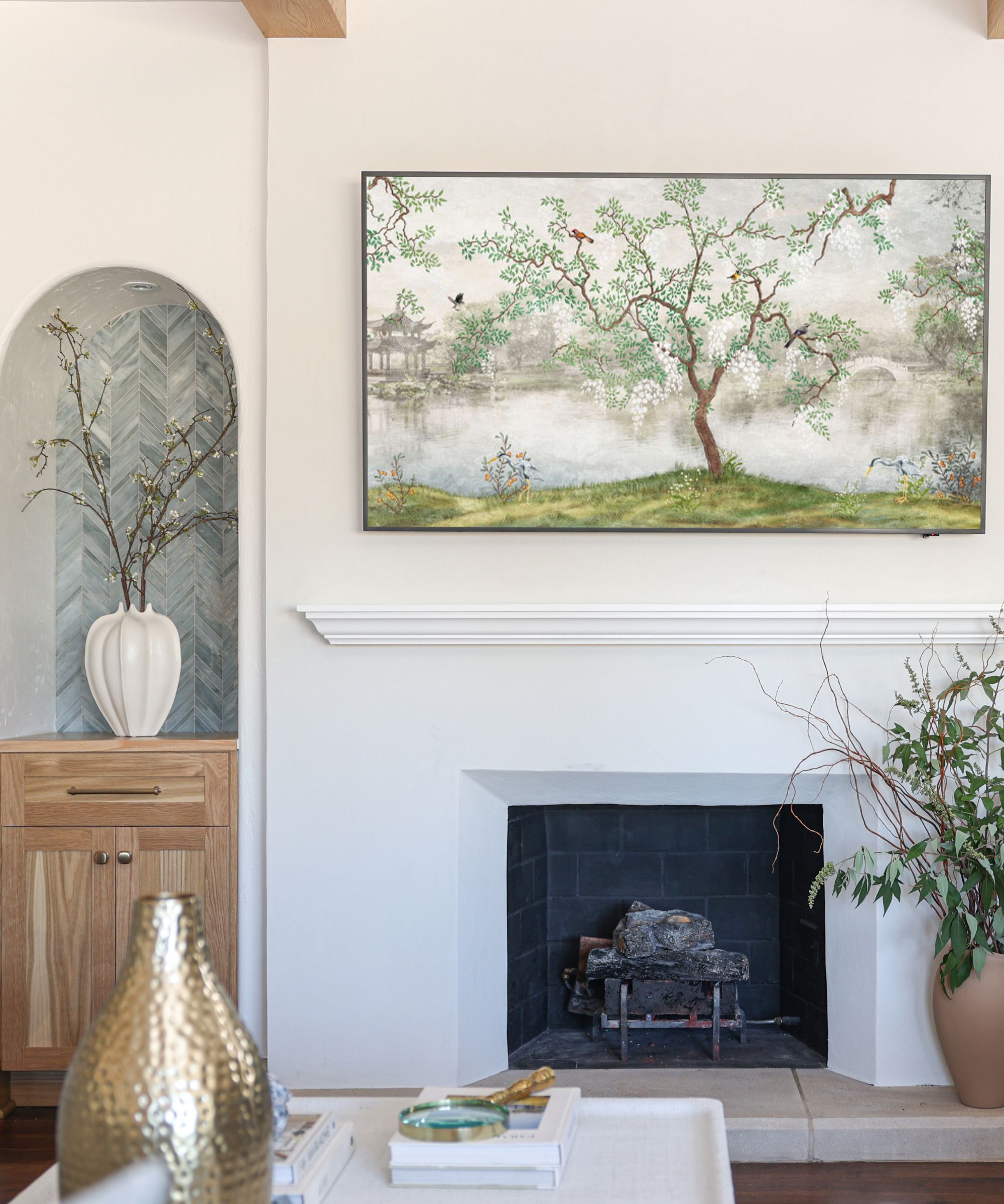
The Europe-inspired exterior didn't carry much into the final design scheme, but certain architectural features were brought in for cohesion and class. Elegant, swooping archways make their way throughout the open-plan living room, appearing in doorways, cabinets, and a unique alcove next to the fireplace. Valerie says that this feature was, quite simply, pretty, adding that it the repeating motif brought 'more architectural interest' to the home.
Design expertise in your inbox – from inspiring decorating ideas and beautiful celebrity homes to practical gardening advice and shopping round-ups.
'I always like it when there are partners – elements that partner with each other across the room, that play with each other. Taking those into the kitchen – the arched entry going into the butler's pantry, and then that arch on the cabinet doors just carried all the way across,' she says. A characterful white oak finish also threads throughout the entire space, adding nature-inspired charm: 'We used that white oak on the beams, the white oak on the island, the white oak on that little niche next to the fireplace, too.'
Overall, the interior and exterior of the home blend seamlessly into one, despite the qualms that Valerie originally had about the atmosphere. 'The outside is so traditional and formal, and the inside is casual ... but they coexist,' she says. 'They get along just fine. I think if the outside is the formal, traditional, European estate, the inside is the cozy estate gatehouse.'
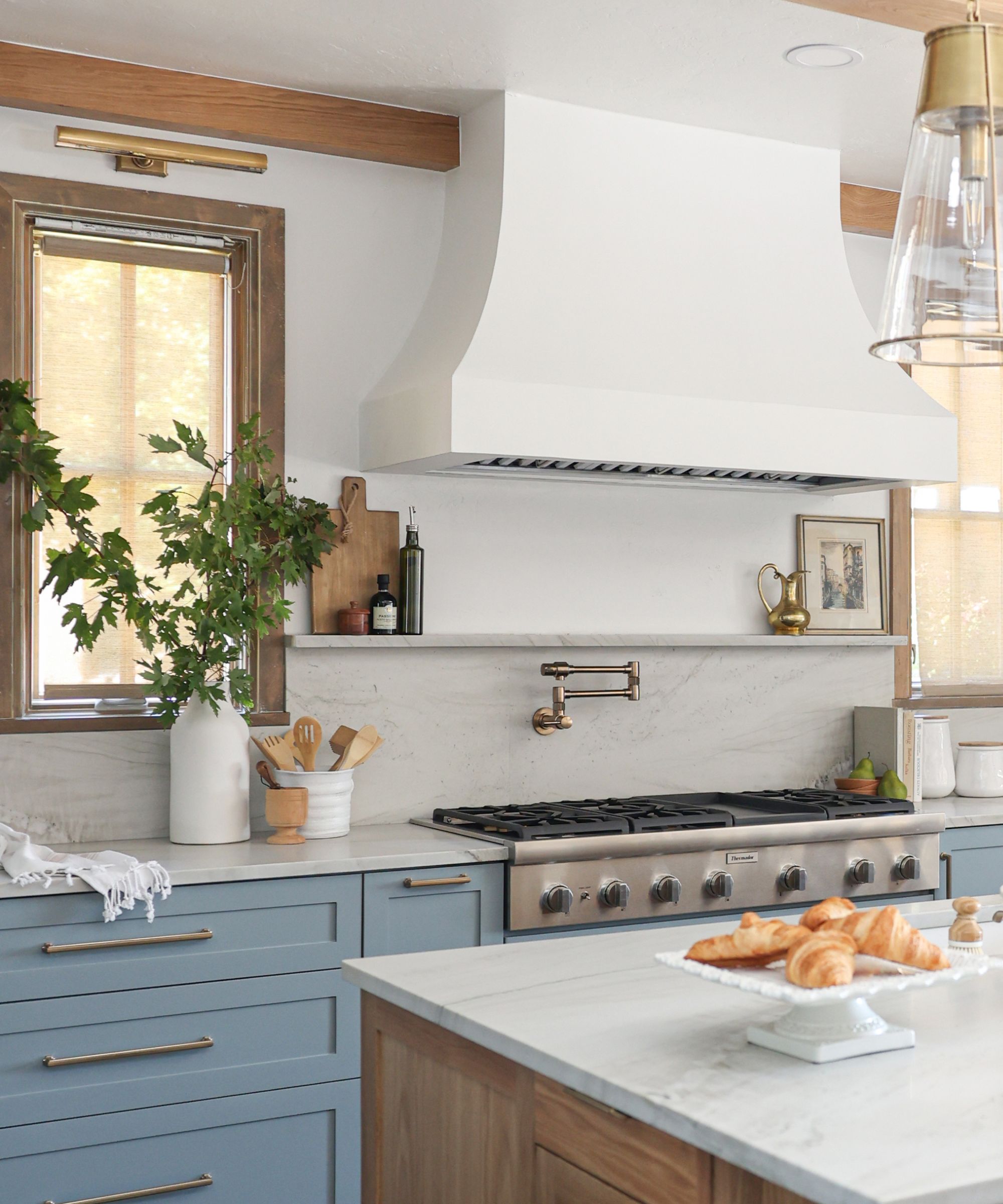
A light, uplifting blue paint makes its way throughout the whole home, tying the open-plan kitchen and dining room to the primary bedroom and bathroom. 'That shade of blue is just so cheery and welcoming, and it feels homey. I think it just works with so many different families and styles,' she says. Valerie also shares that the clients loved the shade, especially given its easy harmony with the home's natural environment.
'There's a swimming pool outside those windows, and beyond that is a lake. So [we took] color cues from the outside. Part of the time in Oklahoma, things are dormant, so the grasses and the trees bring in that kind of straw color. And literally, around this neighborhood, there are wheat fields. When you see those wheat fields up against a bright, blue sky, you know those colors work great together,' she says.
Bringing the outdoors into design schemes comes naturally to Valerie, in part because she started her career in sunny California. 'You could throw the doors open, and easily move from outside to inside,' she says. And while the warm weather doesn't last quite as long in Oklahoma, she wanted to accentuate the 'spectacular' outside area, which features the pool and a large cabana.
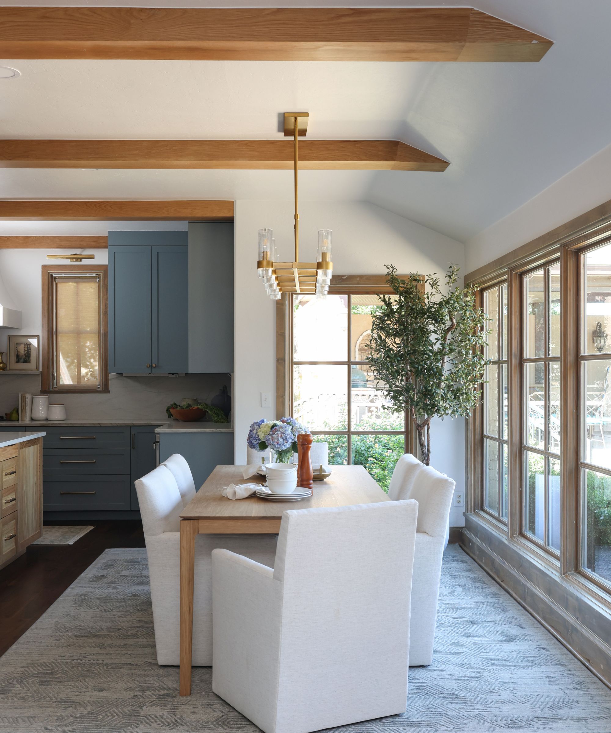
Successfully zoning an open-plan space, especially one that includes a living room, dining room, and kitchen, requires careful organization. And in this home, the room's small size (relative to the rest of the property) made the balance even trickier. Valerie shares that the furniture did most of the heavy lifting when it came to crafting a layout.
'All along, we wanted all of those spaces to be interactive,' she says. 'The way we have that sectional creates this entry area that comes directly off of the main foyer, so that carries on the hallway area visually. The swivel chairs are meant so that people can interact with people in the kitchen or the living room or the dining area. And the kitchen can see what's going on everywhere.'
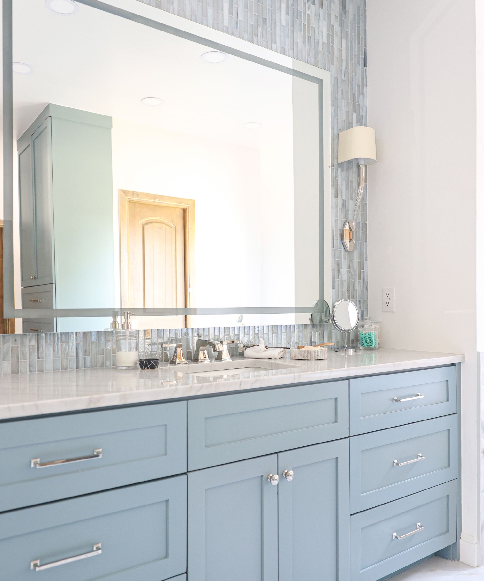
The fresh blue hue carries into the primary suite, where the name of the game was relaxation. 'I really wanted this space to be a retreat for them,' says Valerie.
'The blue color was always intended to impart that, or evoke calm, so carrying it in there made perfect sense. And then when I found that tile, it was just perfect – it has this falling water look, that look of when rain sheets down a window. It looked so good with the blue that we already loved for the rest of the house. It was just a no-brainer.'
Each detail of the primary bathroom was meant to inspire a spa-like feel, starting with ambient lighting. With a considered mix of functional and task lighting, all on dimmer switches, every nook and cranny is lit with intention – even the shower niches. Dual shower heads and an air-therapy bathtub elevate the space even further.
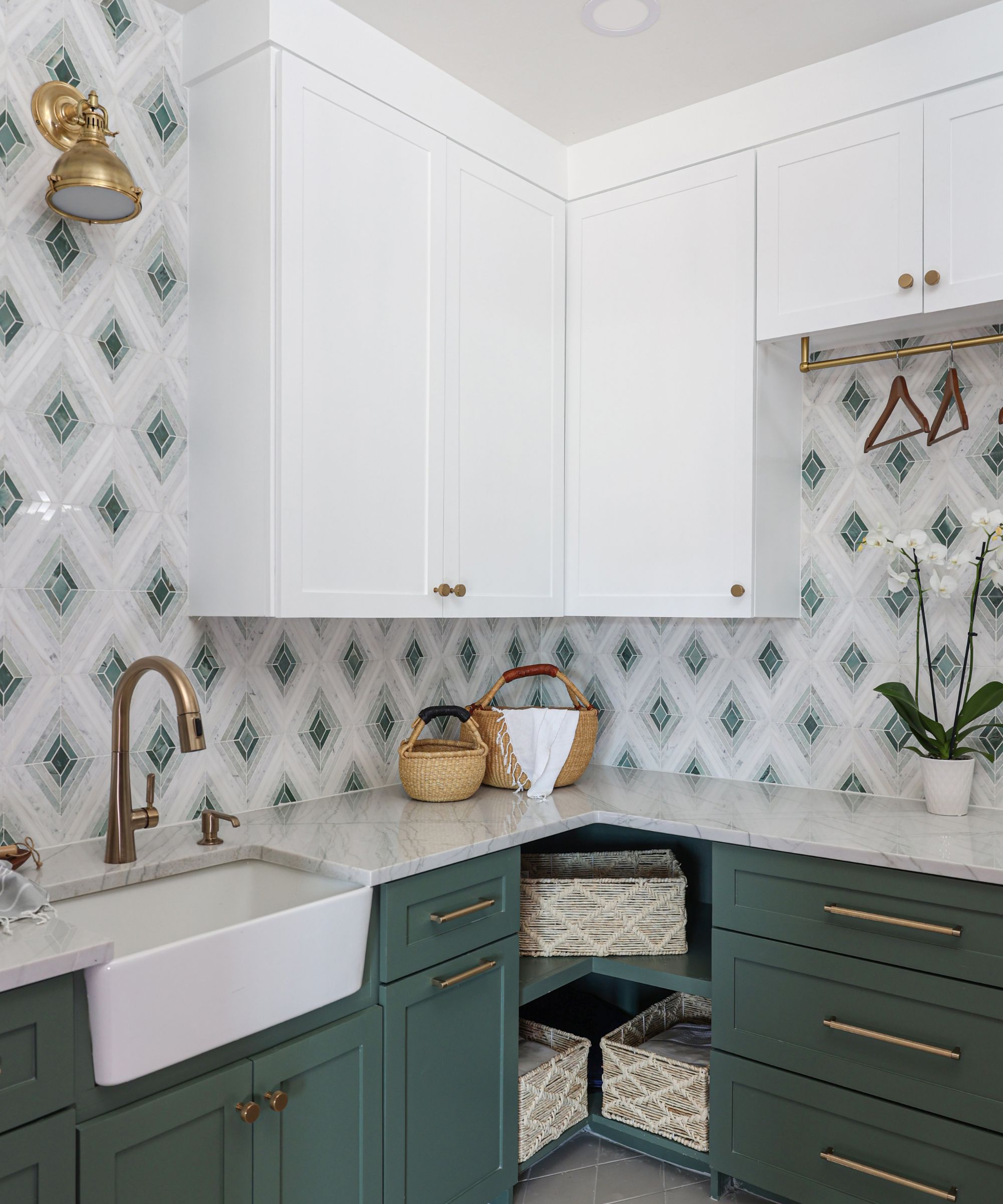
Even this home's most functional spaces got a bit of playful color – and the laundry room is a peak example. 'Most people consider that chore kind of a drag, so theoretically, if you make the laundry room bright, cheery, and fun, maybe laundry is going to be more fun. I don't know if that's true or not, but it's certainly a fun place to add a little pizzazz,' says Valerie.
'That space is their main point of entry and exit every day, going out to their garage. It’s the drop zone, it’s the mudroom, and it is the space for a ton of laundry. When we were originally interviewing them about what they wanted in the home, we knew that they were receptive to a little bit of green – we just didn't know how much green they would tolerate,' she adds.
After showing the clients the tile samples (which now line the room's backsplash), and making up a 3D rendering, it was an immediate yes. 'They were all in,' she says. 'It’s just so fun. When the tile went up and they painted the cabinets in the green, it was just like, “Yay! That's so cool.”'
Get the look
With bursts of fresh color throughout, and considered architectural charm, this Oklahoma renovation did not disappoint. Fit and functional for the whole home, while still feeling sleek and stylish, it's ready for anything family life has to throw at it.

Abby was the Interior Design News Editor at Homes & Gardens and is now studying for her Master's degree in Journalism at City University, London. Prior to joining our team, she worked with Better Homes & Gardens, where she wrote and edited content about home decor, gardening tips, food news, and more. She studied Journalism and English Literature at New York University and moved to London to pursue her love of writing in 2023.
