This subtle interior design trend is at the core of this hotel's redesign – and it's incredibly easy to bring into your home
In this hotel remodel, designer Cortney Bishop focused on gradient patterns to bring color, texture and depth

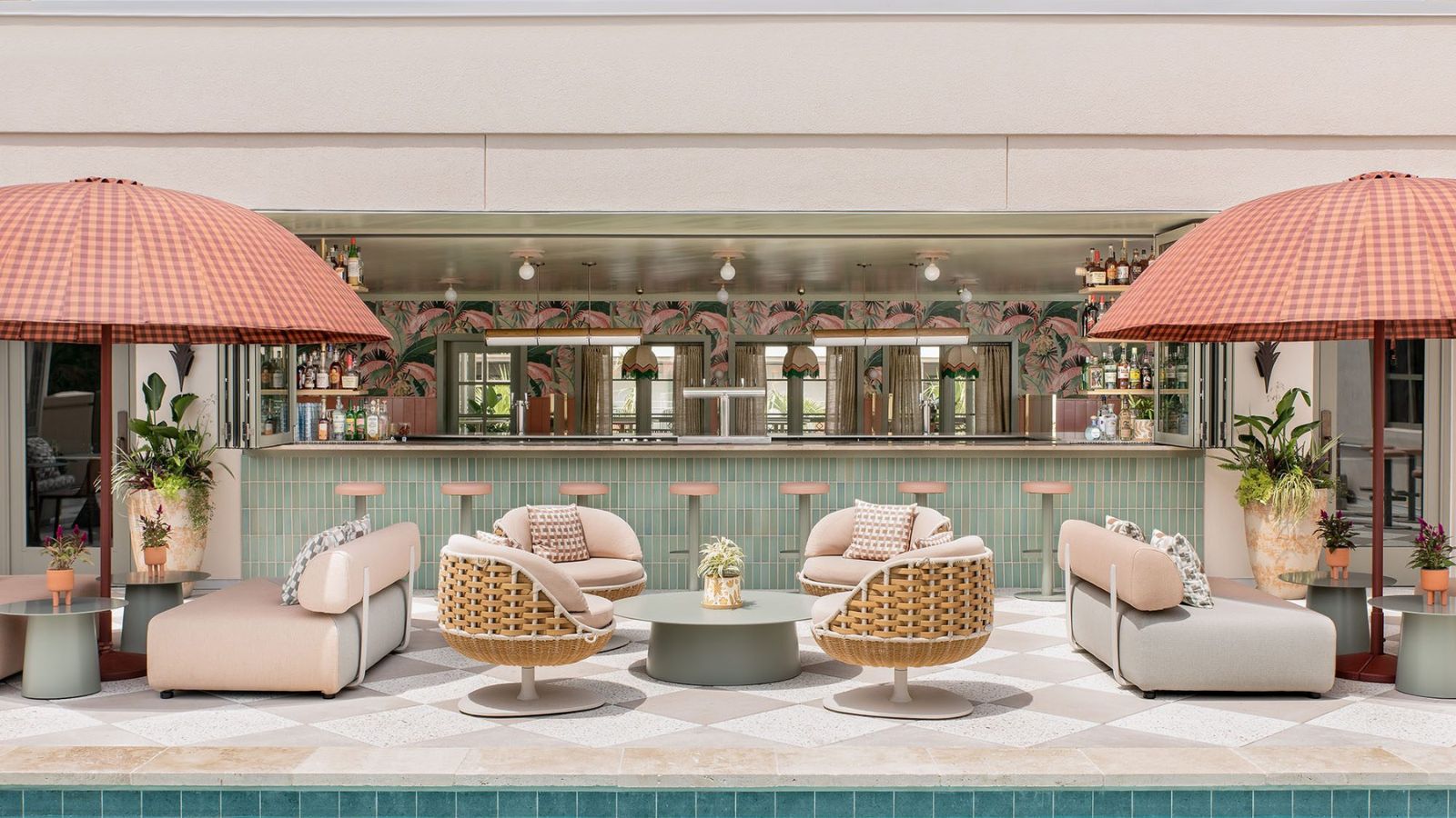
There's an irresistible allure to gradients. They're an art form that hails back to ancient mosaics but can feel so fresh and modern and appear in many interior design trends for 2024. Imagine transitioning colors softly blending into one another like a perfect sunset or the unfolding layers of an ocean wave. It's a concept that can transform floors, walls, and tiles into something incredibly dynamic and visually immersive. A gradient transition, whether textural or with color, always moves the eye and creates subtle dynamism.
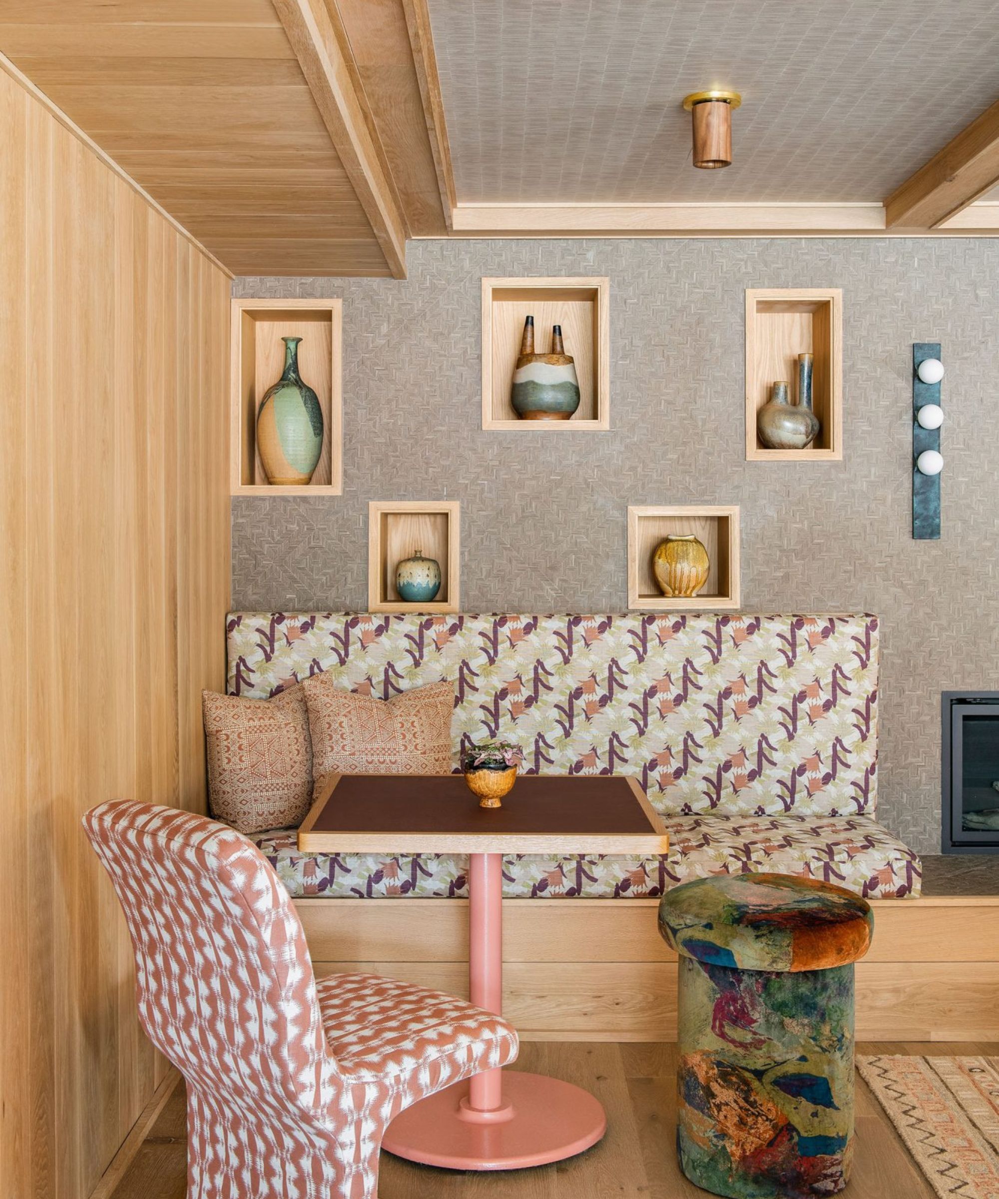
I had the pleasure of creating such an effect at the Ryder Hotel, a sanctuary of southern cool situated amidst the vibrant rhythms of Charleston, South Carolina. There, warm earth tones, light-stained woods, and eclectic textiles come together to create spaces that feel both elevated and welcoming.
The hotel is a tapestry of experiences - from the bustling coffee shop on the ground floor to the inviting fireplace on the mezzanine level. We upholstered banquettes and sofas in my bespoke fabric collection, Harwood House, which is a testimony to the powerful effect that textures and colors can have on a space. I am always thinking about complementary gradients, even in the weave of my fabric or the complement of one shape to the next in a pattern.
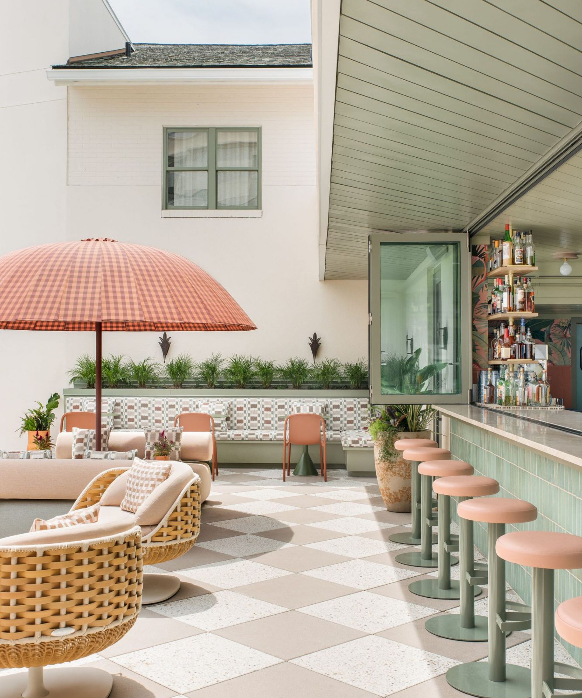
The idea of incorporating gradients in flooring is deeply rooted in my design ethos. Imagine walking through a space where the floors beneath you subtly change hues, as if you are walking from one experience into another.
The Ryder's pool deck and courtyard serve as a social hub where the flooring provides an inviting tapestry of color that harmonizes with its retro umbrellas, custom designed DEDON daybeds, and an irresistible tropical palm mural by Headspace. Gradient colors and textures flow together from frothy pink to a deep plum, and you can visually move from one shade to the other with a unique, textural refinement like a transition from gloss to matte.
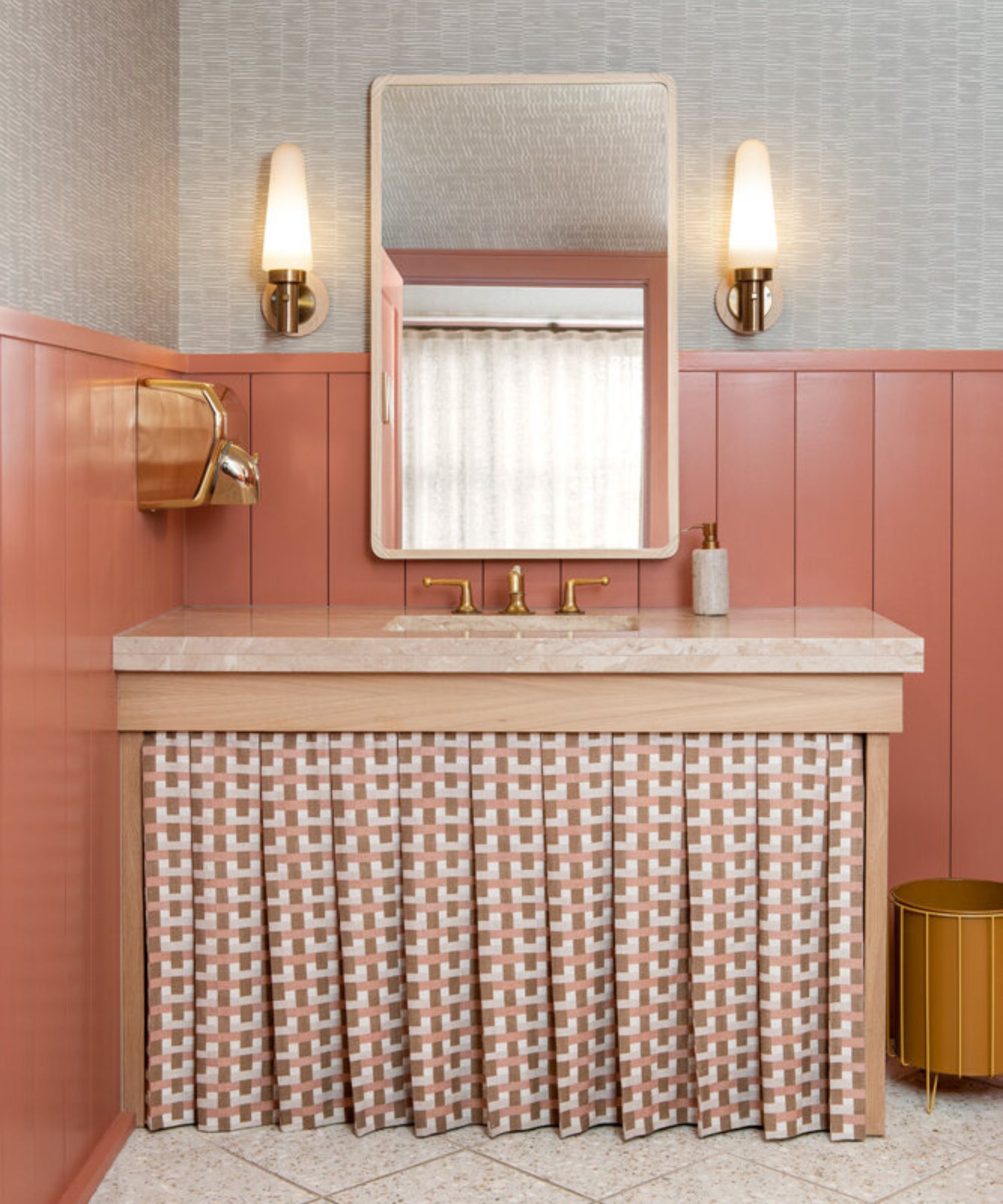
In a world where walls are traditionally a single, static color, gradients are transformative. You can set an evolving mood with a wall that changes its shade from one corner to the other, creating a backdrop that not only tells a story but also elevates the entire room.
Take, for example, kitchen backsplash or tiles in a bathroom; a gradient can make these spaces feel as if they're genuinely alive. Ann Sacks tiles provide many variations for my projects and can bind my gradient strategy together with a complimentary texture that carries color from one space into the next. Simply using paint and two tones a subtle or bold gradient can make a room feel more alive.
Design expertise in your inbox – from inspiring decorating ideas and beautiful celebrity homes to practical gardening advice and shopping round-ups.
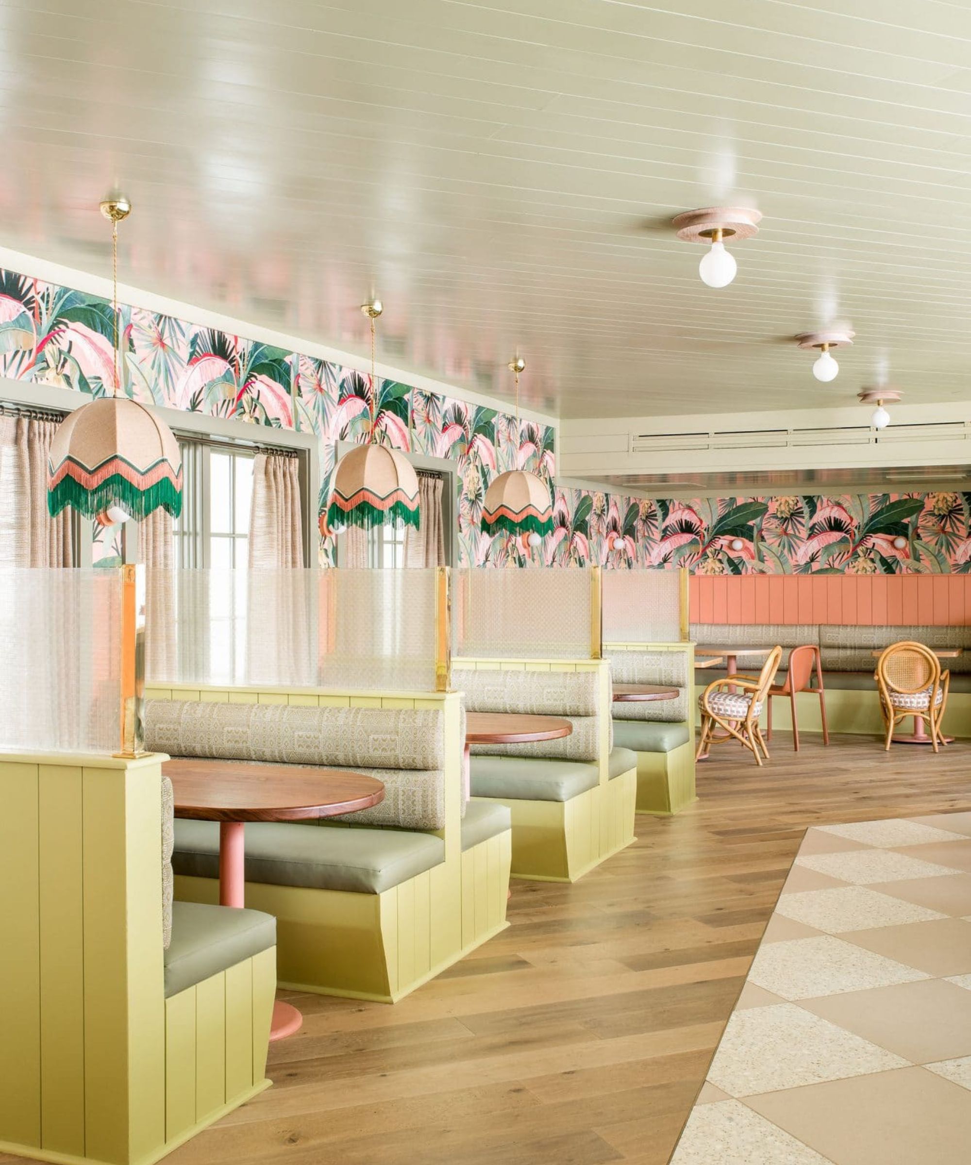
Gradients aren't for every space or every mood - they're a bold statement, one that asserts itself and demands attention. They work exceptionally well in spaces that you want to feel dynamic, open, and filled with movement. Consider gradients in areas that serve as focal points, or in places that naturally draw people together. Remember, the effect should enrich the space, not overwhelm it. Entryways and indoor-to-outdoor transitional spaces are always a safe and sensuous canvas for gradient transitions, both with color and texture.
As with any design element, gradients require a level of balance and harmony to effectively bring a space to life. Whether you're considering a gradient for your floors, walls, or tiles, keep in mind the overall atmosphere you want to create. A gradient should add to the beauty and the feel of the space, just as we achieved with the different layers of muted color and light textures and experiences at the Ryder Hotel.
The next time you're contemplating a refresh for your interiors, don't shy away from the poetic allure of gradients – they could be just the splash of dynamic charm your space needs.
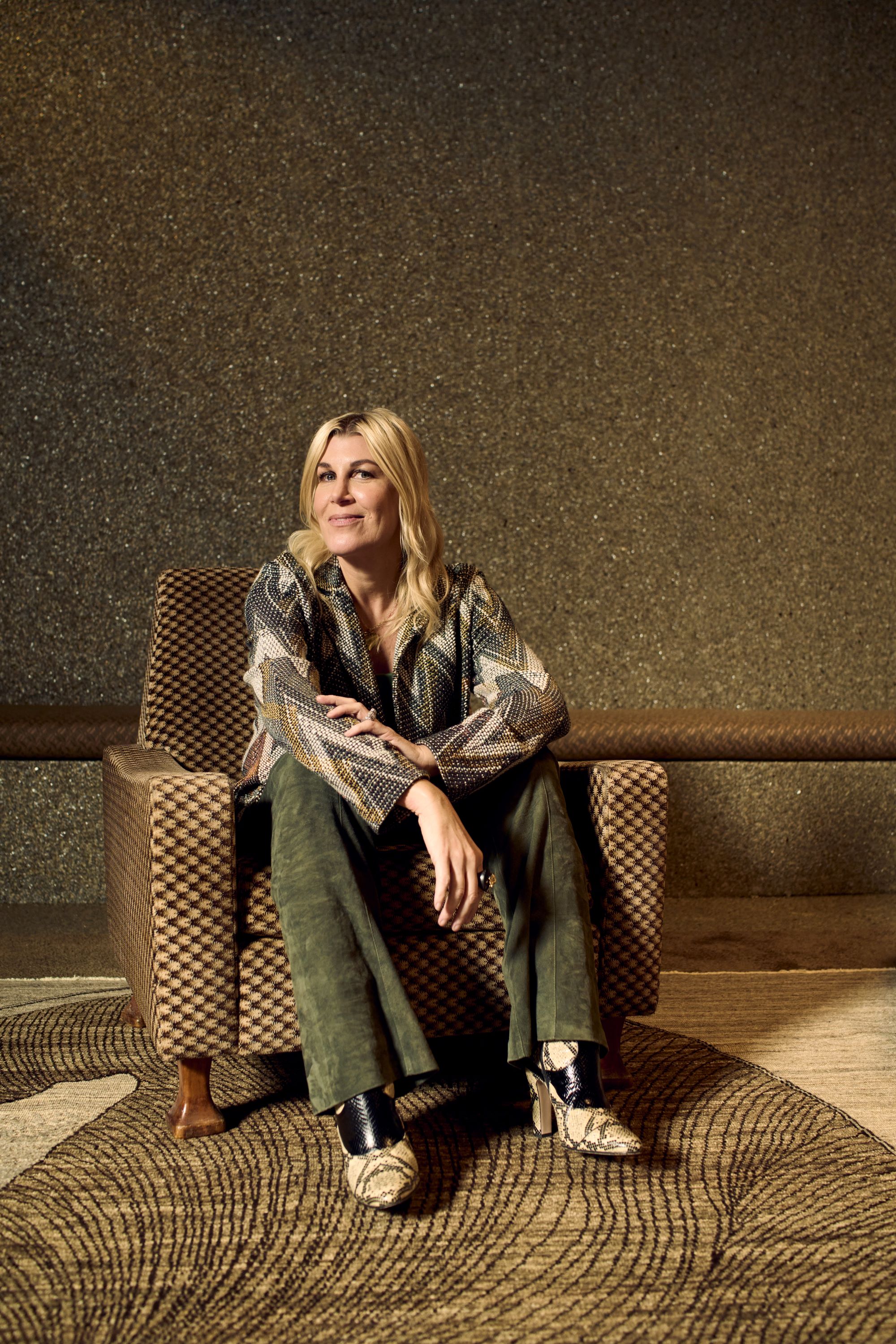
Cortney Bishop, principal design and owner of Cortney Bishop Design, founded the full-service interior design firm in 2007. She holds a BBA in business marketing from the University of Georgia, and pursued her design career by blending her passions for travel, art, fashion and music. Her wide-ranging talent and innate ability to mix patterns and hues has resulted in a robust portfolio of diverse, inspiring residential and commercial projects, each reflective of a client’s lifestyle, personality and aesthetic. Cortney regularly contributes to Homes & Gardens.