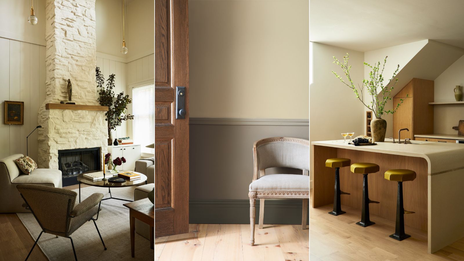
How designers decorate with Benjamin Moore's Bleeker Beige, the 'comforting neutral hue'
This deep yet balanced beige shade makes any interior feel warm and welcoming. Here's how interior designers put it to use

Design expertise in your inbox – from inspiring decorating ideas and beautiful celebrity homes to practical gardening advice and shopping round-ups.
You are now subscribed
Your newsletter sign-up was successful
Want to add more newsletters?
Decorating with neutrals is a popular choice for homeowners and interior designers alike, as the shades deliver a timeless versatility that's in high demand. But finding the perfect hue for your home can prove quite tricky. Too light and airy, and you lose out on a welcome sense of warmth, but go too dark and you'll be left craving a bit of sunshine.
Some neutral paint shades strike the balance between cozy and fresh, and Benjamin Moore's Bleeker Beige is a shining example. A warm and welcoming beige with gray undertones, the hue is well-loved by the experts. Here's how interior designers decorate with the popular Benjamin Moore shade, and how you can bring it into your own home.
How to decorate with Bleeker Beige
Interior designers find that decorating with Bleeker Beige comes quite easily – the shade's adaptability and style-compliant undertones make it a classic choice. Here's how the experts use Bleeker Beige in their own projects, and how they suggest you style it.
1. Pair with earthy hues

Hannah Yeo, senior manager of color marketing at Benjamin Moore, says that Bleeker Beige is 'a medium buff hue with pleasing gray undertones.' Due to its light reflectance value (LRV) of 51, she adds that it's a 'mid-tone' that pairs perfectly with creamy off-whites.
'Bleeker Beige is a comforting neutral hue that brings a classic vibe into the space. It’s flexible, adaptable and can easily be paired with other colors such as earthy greens, ochre and spice hues, as well as other neutral colors like cream, brown and black,' says Hannah.
Bringing organic, earthy-toned shades into the mix alongside Bleeker Beige makes for a cohesive and calming design scheme. Opt for lush textures and materials to take the look one step further.
2. Channel historical allure
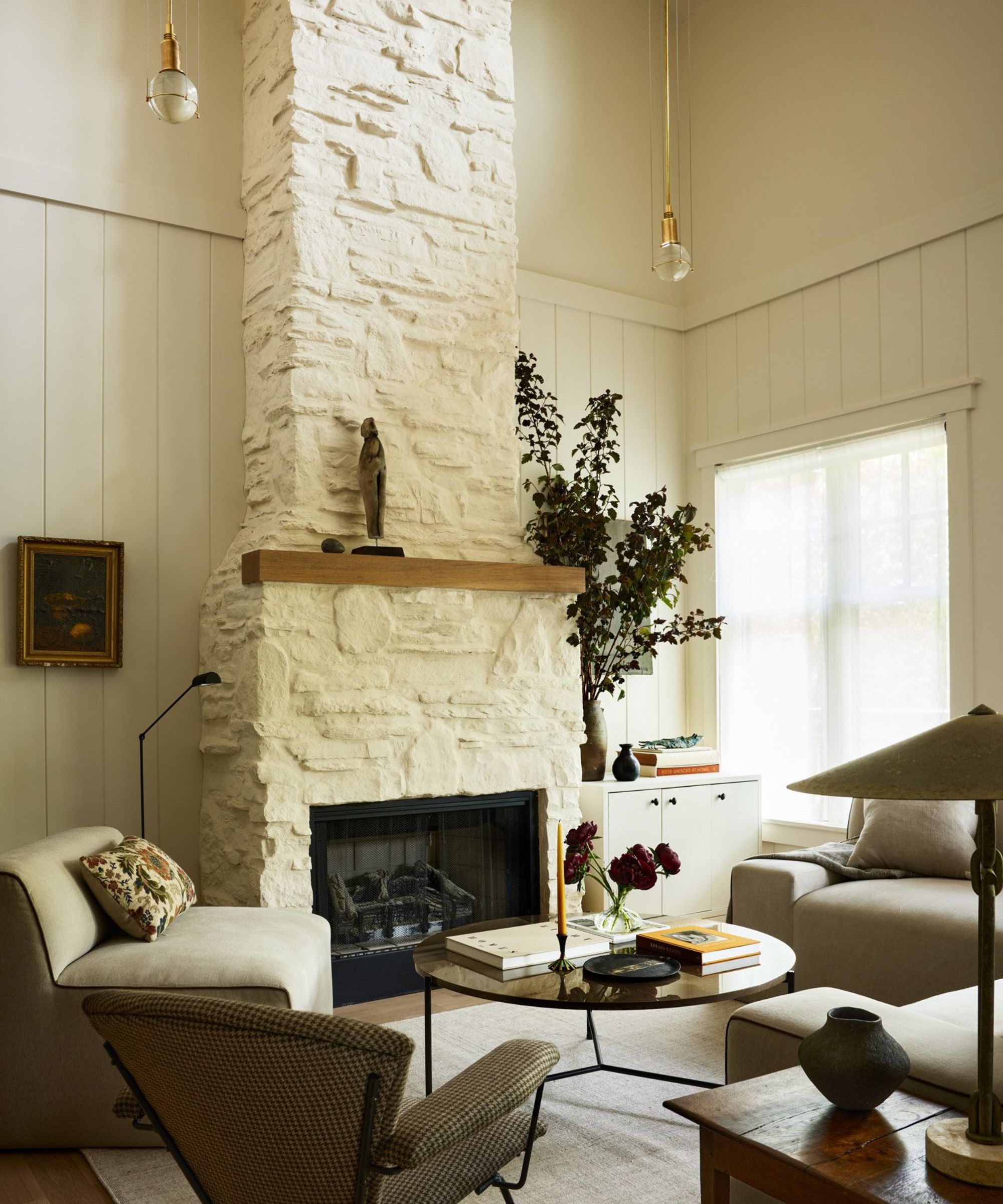
Blair Moore, creative director and principal designer of Moore House Design, says she 'adores' Bleeker Beige, calling it 'a standout choice' for her team's Rhode Island-based 'Minimalist Club' project, pictured here. The team paired the beige tone with 'warm wood tones, greens and creams' for an overall earthy look. Blair says that the tone updates the homes' historic features, bringing warmth and charm.
Design expertise in your inbox – from inspiring decorating ideas and beautiful celebrity homes to practical gardening advice and shopping round-ups.
'There's an undeniable charm to applying a warm undertone hue to the walls, especially over a cooler blue tone, which beautifully illuminates the room in the afternoon sunlight. I particularly enjoy incorporating these warm tones into our modern and colonial-style homes, as it infuses the space with a touch of historical allure,' says Blair.

Blair Moore is an award-winning designer, as well as the creative director and principal of Moore House and Moore House Design.
3. Layer with muted greens (and try out pinks)
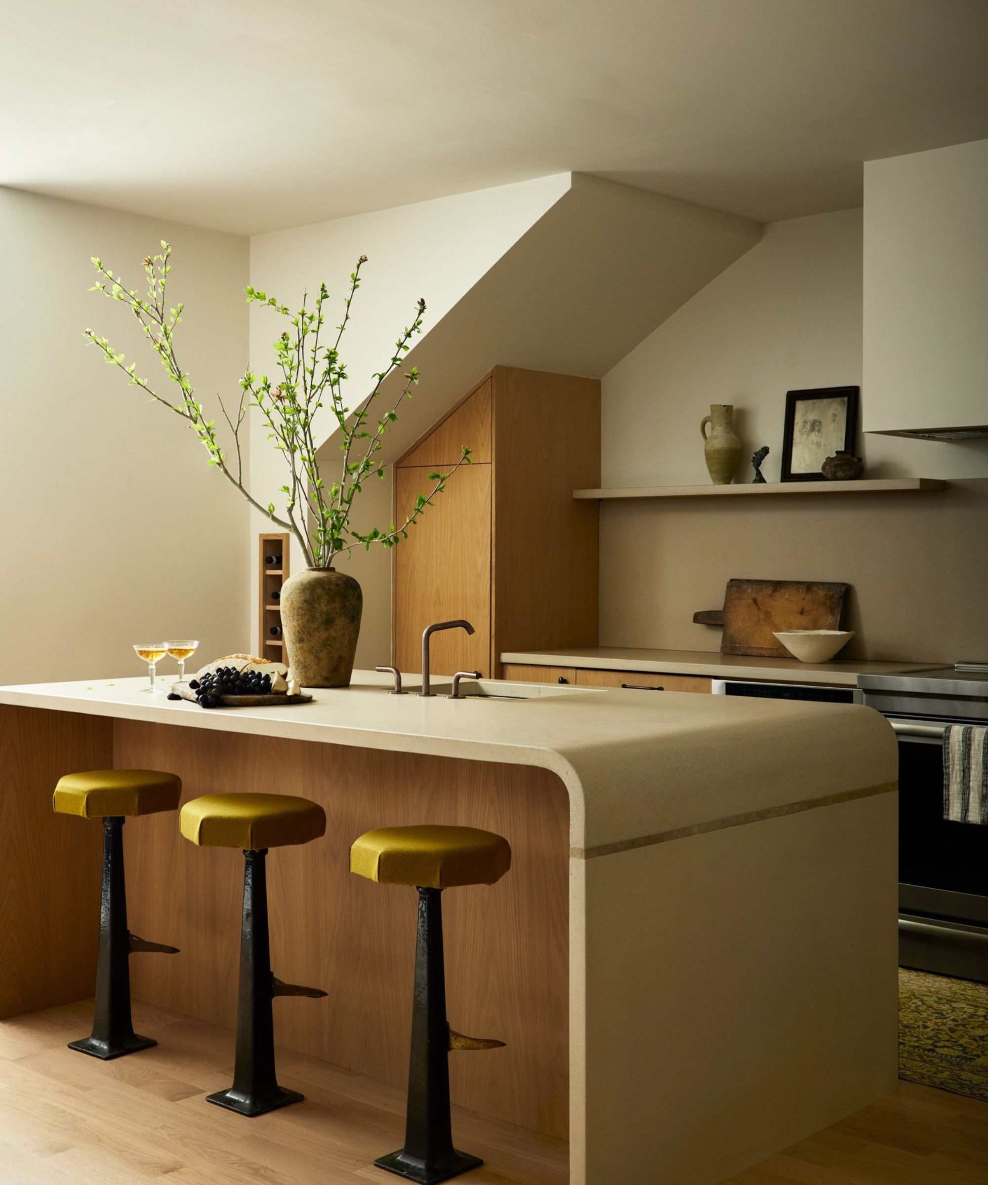
Lauren Lothrop Caron, interior designer and founder of New York City- and Seattle-based Studio Laloc, says that Bleeker Beige is a 'wonderful neutral mid-tone beige that works well in both modern design and historic homes.' She agrees that embracing the warm, organic look works well with this pared-back shade.
'Bleeker Beige pairs well with many shades of green, muted pinks and it can look crisp and chic when paired with a warm white painted trim,' says Lauren. She suggests pairing Bleeker Beige with other Benjamin Moore favorites, particularly Odessa Pink, Peale Green, Narragansett Green or Cloud White.

Lauren Lothrop Caron is the founder of Studio Laloc, a full-service interior design and architecture studio based in New York City and Seattle.
Whether paired with fresh, vibrant shades like pink or green, or balanced with creamy whites, Benjamin Moore's Bleeker Beige has proved a tempered and timeless hue. With a little dash of design expertise, it'll help your home feel like a sanctuary – calm and welcoming, all year round.

Abby was the Interior Design News Editor at Homes & Gardens and is now studying for her Master's degree in Journalism at City University, London. Prior to joining our team, she worked with Better Homes & Gardens, where she wrote and edited content about home decor, gardening tips, food news, and more. She studied Journalism and English Literature at New York University and moved to London to pursue her love of writing in 2023.
