I asked 3 interior designers for their must-try paint colors in 2025 – they are all the perfect 'in-between' shades
These paint colors rank highly on designers' decorating wish lists

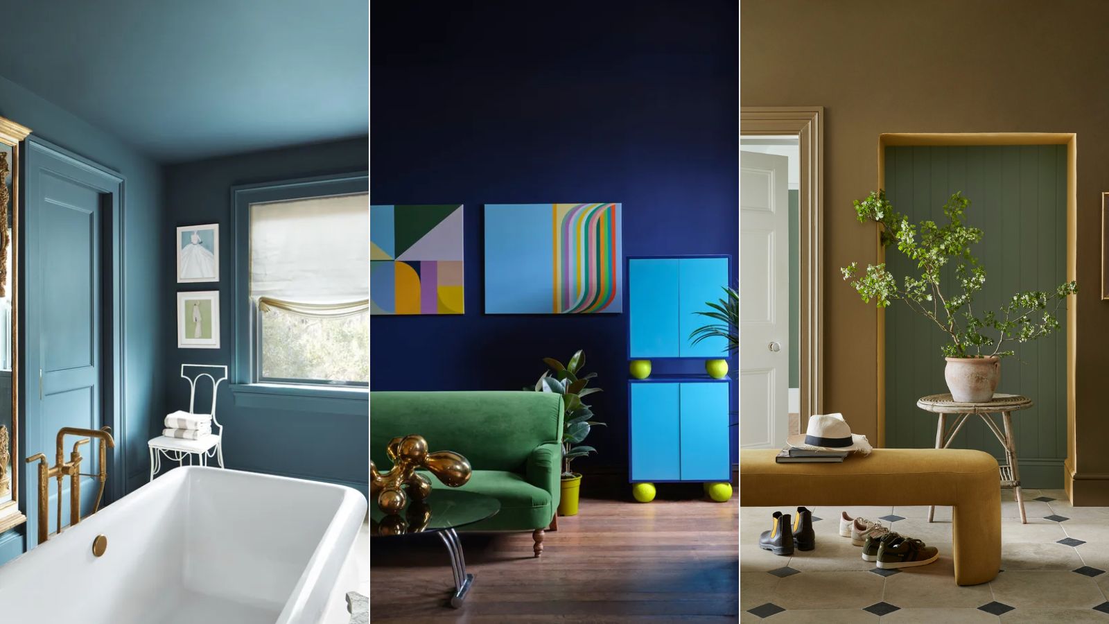
The world of paint colors is vast. With endless shades from leading paint brands – from colorful and statement to timeless neutrals – landing on the right shade for your next decorating project can feel overwhelming, to say the least.
While next year's paint trends give us a good steer in the color-selection process, sometimes hearing directly from designers helps us make sense of the wide array of options available.
As H&G's paint and color editor, I asked three interior designers which specific paint color they have their eye on to try out next. Spoiler: each of them is an 'in-between' color, a color trend I'm loving right now and expect to see lots more of in 2025. Read on to spark some inspiration for your next room color ideas.
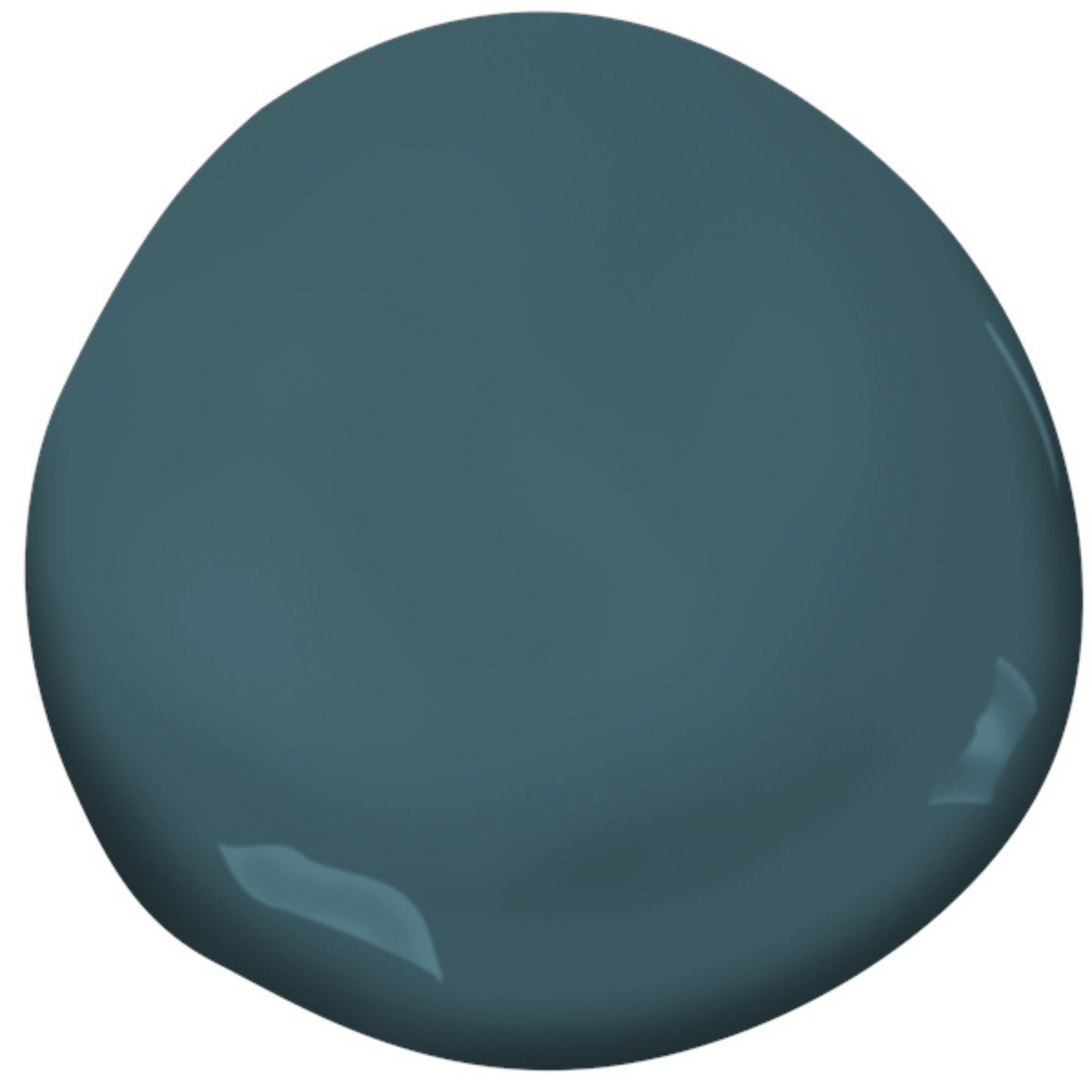
Article continues belowStained Glass, Benjamin Moore
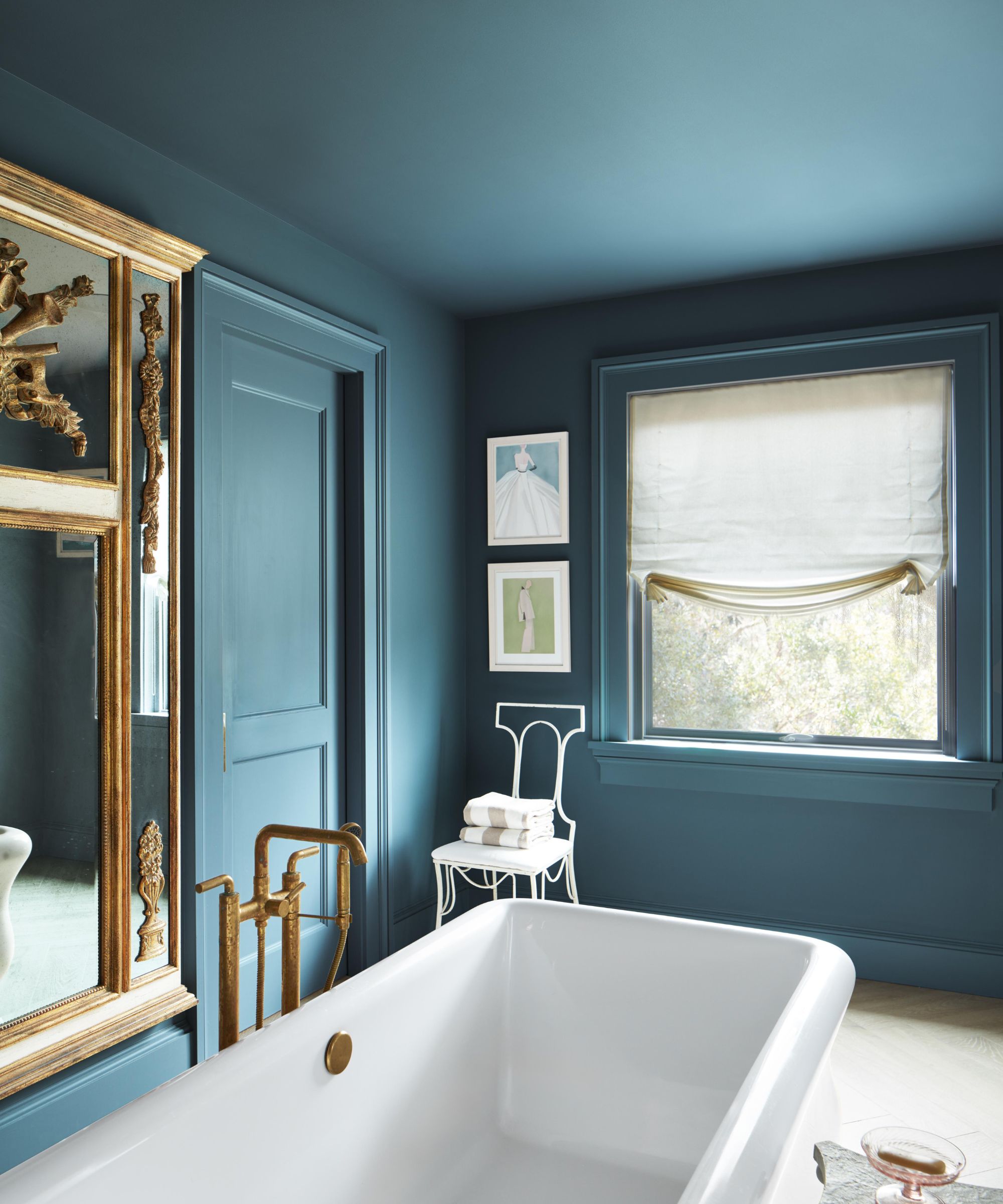
'I have always been drawn to “in-between” colors and Benjamin Moore’s Stained Glass is the perfect in-between color. It just so happens that my two favorite colors are green and blue and Stained Glass is the ideal combination of the two.'
'The gemstone teal feels luxurious and elevated, and the muted tone brings it down to earth and allows it to work well with an array of other colors; bold and impactful while also being serene. A bit green, a bit blue, it’s the right combination for any style. I plan to try this color in my own house – it would be beautiful on kitchen cabinets and would also work well on the ceiling or walls of a dining room, living room, or study.'
Nadia Watts, founder of Nadia Watts Interior Design
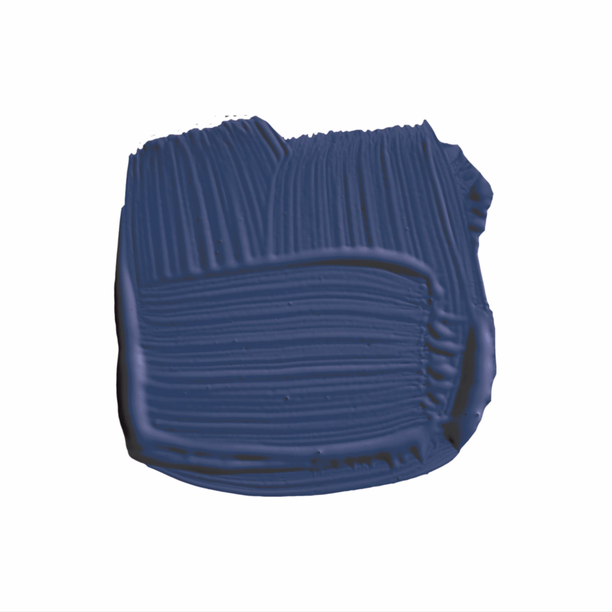
Blue Maize, Farrow & Ball
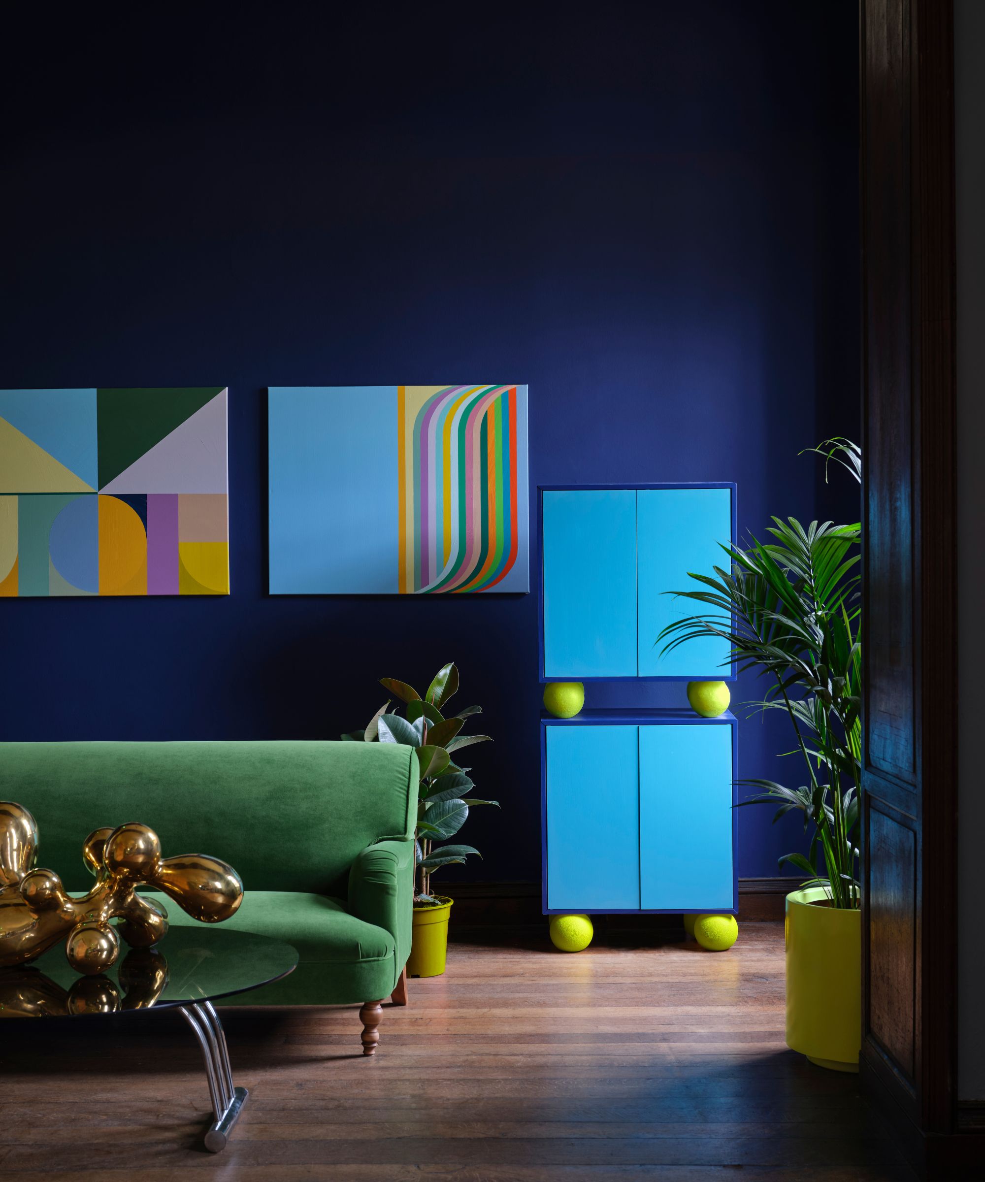
Farrow & Ball's Blue Maize is a rich blue paint with a slight tint of purple that feels fresh and uplifting, and it's one paint color that interior designer Kristina Khersonsky is looking forward to trying out:
Design expertise in your inbox – from inspiring decorating ideas and beautiful celebrity homes to practical gardening advice and shopping round-ups.
'I’ve been drawn to deep, sultry blues lately. Currently, deep plums and browns are having a moment but the right shade of deep blue can be as evocative and moody.
'I'm also looking forward to using Masterpiece Theatre by Backdrop. It is a baroque-inspired olive brown with a subtle hint of yellow. At first glance, it reads brown but the more you look at it, the more complex the color gets. You can’t quite place the tone which is why it’s so interesting.'
Kristina Khersonsky, founder and principal designer at LA-based STUDIO KEETA
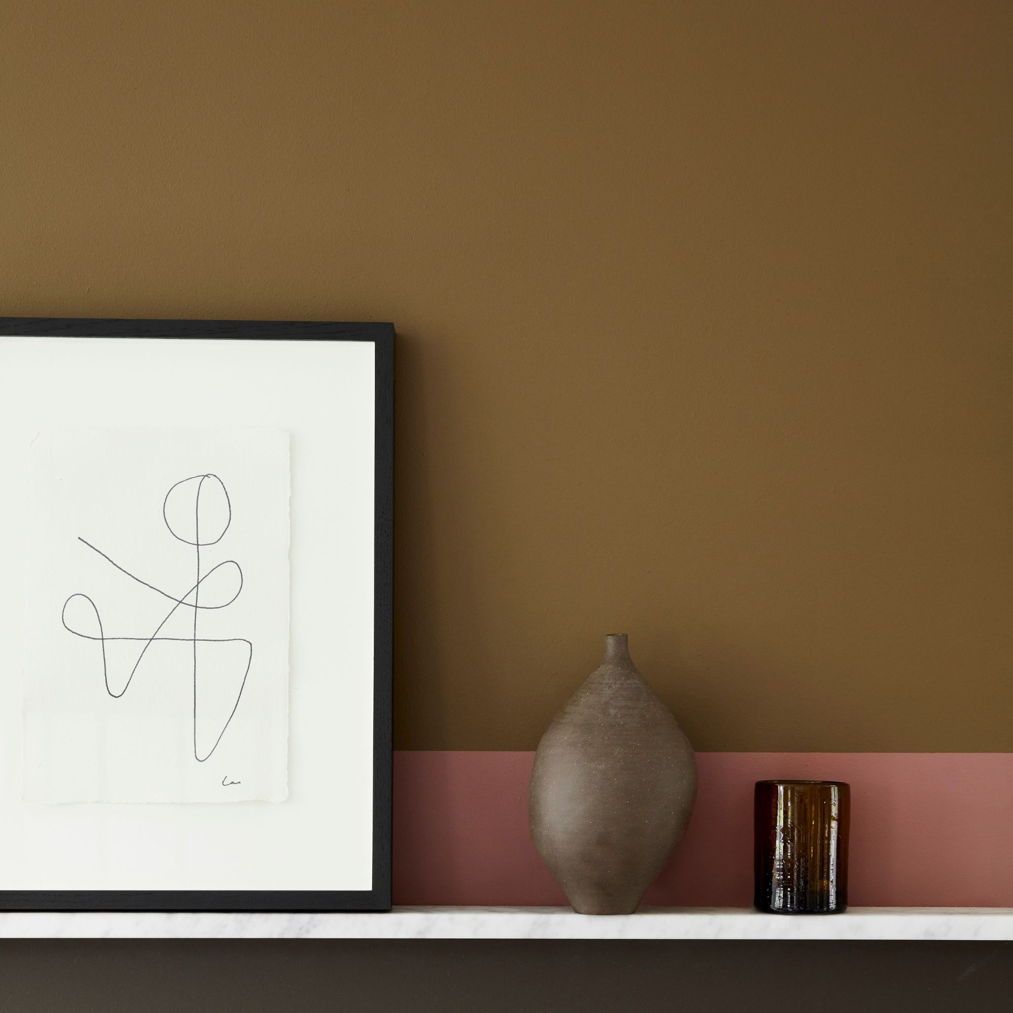
Light Bronze Green, Little Greene
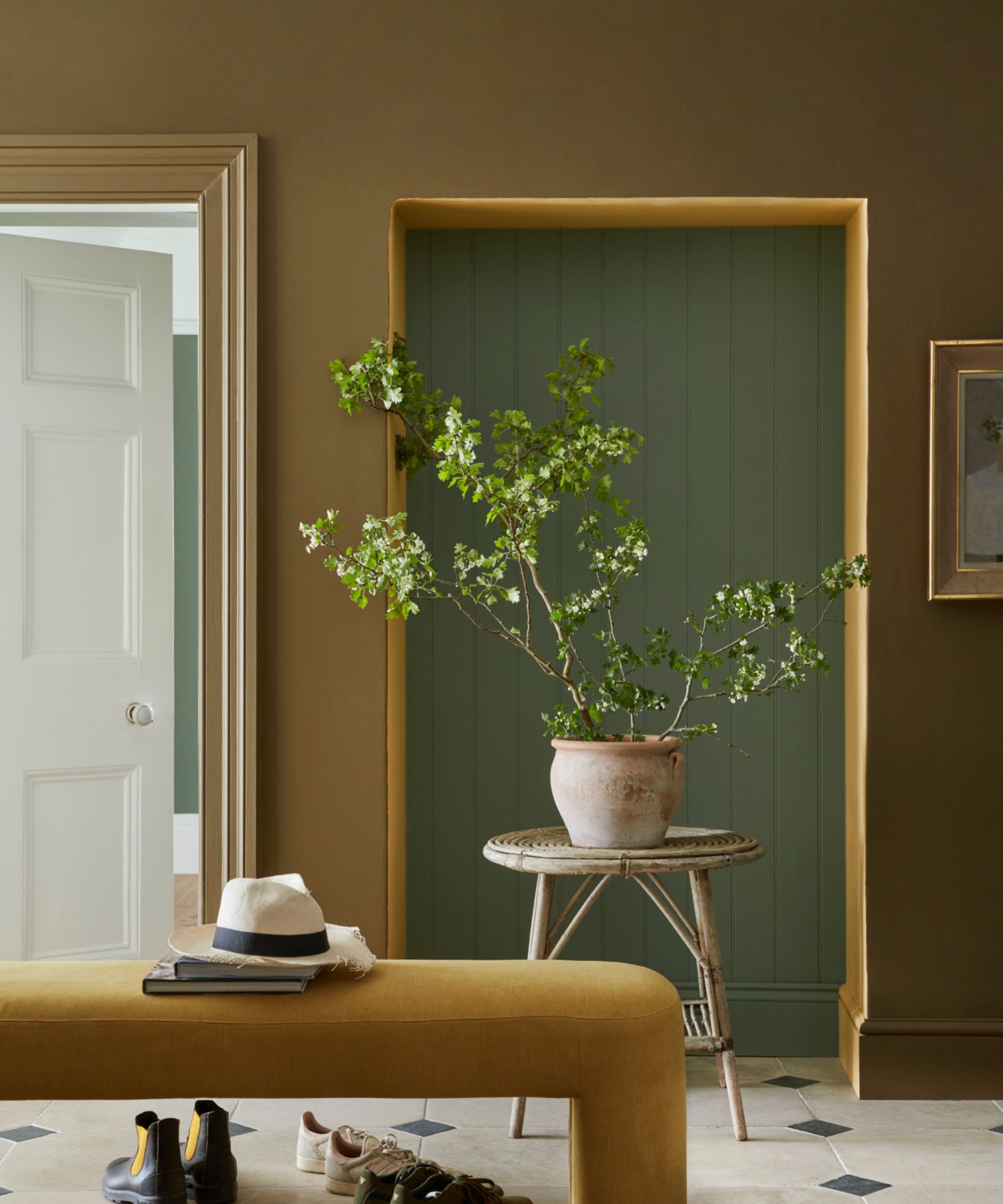
'Light Bronze Green by Little Greene is a color I’m really excited to work with. It’s a unique shade that sits between a soft green and a warm bronze, creating a rich yet calming effect. I love how it brings warmth to a room without being too intense, making it perfect for spaces that need depth but still want to feel inviting.
'What’s great about this color is how versatile it is. It works beautifully as a subtle backdrop in living rooms or bedrooms, but it can also be used as a striking accent on cabinetry, feature walls, or architectural details. The warm undertones give it a sense of luxury, while its earthy tone keeps it grounded and timeless. It’s a color that complements both natural materials, like wood, and more industrial elements, like metal and stone. I'm looking forward to using it in upcoming projects to create spaces that feel both sophisticated and relaxed.'
Melissa Read, Creative Director at Studio Burntwood
Whether you prefer a cool color scheme or a warm color scheme, there's something to be said for 'in-between' colors right now. Whether it's a blue with a purple tint or a brownish-green, in-between paint colors feel so stylish right now and they can feel more interesting than 'true' colors.
Emily is a freelance interior design writer based in Scotland. Prior to going freelance in the spring of 2025, Emily was Homes & Gardens’ Paint & Color Editor, covering all things color across interiors and home decor for the Homes & Gardens website. Having gained specific expertise in this area, Emily is well-versed in writing about the latest color trends and is passionate about helping homeowners understand the importance of color psychology in home design. Her own interior design style reflects the simplicity of mid-century design and she loves sourcing vintage furniture finds for her tenement flat.
